

Silver color is a light, metallic-looking neutral that resembles polished metal and soft gray reflections in real life. In digital design, the most common reference is hex #c0c0c0—right between light gray and that "chrome-like" feel people associate with modern hardware.
Because silver shifts with lighting, texture, and surrounding colors, it can read as sleek and premium or cool and distant if it's overused. Below, you'll find the exact codes, conversions, best pairings, shades, and practical places where silver works especially well.
Silver Color: Codes & Values
If you want a reliable, widely recognized "silver" for screens, start with the standard digital value below and build metallic realism with gradients, highlights, and texture.
| Parameters | VALUE |
| HEX Code | #C0C0C0 |
| RGB DECIMAL | 192, 192, 192 |
| RGB PERCENTAGE | 75.3%, 75.3%, 75.3% |
| CMYK | 0%,0%,0%,25% |
| HSL | 0°, 0%, 75% |
| HSV (HSB) | 0°, 0%, 75% |
| Web Safe | #CCCCCC |
Key Color Space Explanations:
- HEX - HEX is a 6-digit code used on the web to define a specific shade in sRGB. Silver is commonly represented as #c0c0c0.
- RGB - RGB mixes red, green, and blue light for screens and digital interfaces. Silver uses equal channel values (192, 192, 192) to create a neutral, light gray.
- CMYK - CMYK is used for print, combining cyan, magenta, yellow, and black ink. Silver is typically approximated with low ink coverage like 0%,0%,0%,25% unless a metallic ink or foil is used.
- HSL - HSL describes a shade by hue, saturation, and lightness, which can feel more intuitive for tweaking tones. Silver has 0% saturation and around 75% lightness, making it a neutral.
- Web Safe - Web-safe values come from a limited palette that historically reduced banding on older displays. The closest web-safe match to silver is #cccccc.
Use these codes as your "base silver," then adjust the finish (matte vs. chrome) with subtle gradients and shadows depending on the material you want to mimic.
Silver Color Conversions
Need silver in a different format for UI, print prep, or color tooling? Here are the most common conversions in one place.
| Parameters | VALUE | CSS |
| HEX | #c0c0c0 | #c0c0c0 |
| RGB DECIMAL | 192, 192, 192 | rgb(192,192,192) |
| RGB PERCENTAGE | 75.3%, 75.3%, 75.3% | rgb(75.3%,75.3%,75.3%) |
| CMYK | 0%,0%,0%,25% | cmyk(0%,0%,0%,25%) |
| HSL | 0°, 0%, 75% | hsl(0°,0%,75%) |
| HSV (or HSB) | 0°, 0%, 75% | -- |
| Web Safe | cccccc | #cccccc |
| CIE-LAB | 77.4, 0.0, 0.0 | -- |
| XYZ | 50.1, 52.7, 57.4 | -- |
| xyY | 0.313, 0.329, 52.7 | -- |
| CIE-LCH | 77.4, 0.0, 0° | -- |
| CIE-LUV | 77.4, 0.0, 0.0 | -- |
| Hunter-Lab | 72.6, 0.0, 0.0 | -- |
| Binary | 11000000 11000000 11000000 | -- |
Want to generate Silver Color photos or posters? Try Media.io's AI Image Generator now!
Silver Color Meaning & Symbolism
Silver is widely associated with modernity, precision, and a polished, premium feel. Because it resembles metal, it often signals technology, craftsmanship, and understated luxury in everyday visuals and products. In daily life, it's used when you want something to feel sleek and capable without being loud.
Psychological Effects
Silver tends to influence how "efficient" and structured a design feels at first glance.
- Clarity - Silver can make layouts feel clean and organized, especially with strong typography and generous spacing.
- Professionalism - It often reads as efficient and business-like, which is why it shows up in interfaces and corporate materials.
- Cool Distance - Heavy use can come across as cold, distant, or overly formal.
- Sterile Vibe - If everything stays neutral and reflective, a page or room may feel sterile rather than welcoming.
- Supportive Neutral - Silver meaning tends to work best as a secondary surface (backgrounds, borders, dividers) instead of the main "hero" color.
Positive Associations
Used with intention, silver communicates premium quality without needing to shout.
- Modernity - Silver signals a contemporary look that feels current and streamlined.
- Precision - Its metal-like character suggests exactness, engineering, and attention to detail.
- Polished Luxury - It can add a refined, premium finish while staying understated.
- Technology - Silver is often linked to high-tech products and sleek hardware aesthetics.
- Craftsmanship - Because it resembles real metal, it naturally hints at build quality and careful manufacturing.
Cultural Significance Across the World
Across many contexts, silver connects to objects that represent value, achievement, and the future.
- Metalwork Traditions - Silver is linked to metalwork and crafted objects, highlighting skill and artistry.
- Currency & Value - Its connection to coins and precious materials makes it feel "worth something."
- Awards & Achievement - Trophies and ceremonial items reinforce ideas of recognition and status.
- Innovation - It's commonly used to imply the future, invention, and engineered precision.
Design Applications
Silver is easiest to use when you treat it as a flexible neutral that can lean cool or warm depending on nearby tones and lighting. The goal is usually to add structure and polish while keeping contrast and readability in check.
Graphic Design Tips
- Use silver as a supporting neutral for backgrounds, frames, and UI "chrome," then let one deep accent carry the brand mood.
- Build a metallic feel with subtle gradients and controlled highlights instead of relying on a flat fill.
- For print, remember CMYK silver usually looks like gray—use metallic ink, spot varnish, or foil if you need real shine.
- Pair silver surfaces with darker typography (like deeper grays) to keep body text crisp and readable.
- Keep spacing and alignment tight; silver looks best when the layout feels engineered and intentional.
If silver starts feeling "flat," add depth with a darker edge, a soft highlight, and a single warm or deep accent so the palette doesn't look sterile.
Silver Color in Photography & Video
- Watch reflections: silver surfaces pick up nearby colors, so your background and wardrobe choices matter.
- Use soft, directional lighting to reveal gentle highlights rather than harsh hotspots.
- Separate subject and background with contrast (darker backdrops often make silver details pop).
- Protect detail in editing: overexposure can wash silver into plain white, especially on shiny objects.
- When color grading, keep neutrals balanced—strong tints can make silver look dirty or unintentionally blue.
Recommended Tool for Image Enhancement: When incorporating silver color into your photography projects, Media.io's AI Image tools can help you achieve more refined results. With AI-powered color enhancement, photo colorization, image upscaling, and old photo restoration, you can easily enrich silver color tones, improve overall image quality, and highlight the color's elegant and sophisticated aesthetic.
Color Combinations
Silver pairs well with deep tones that add contrast and with soft neutrals that keep the look airy. The combinations below cover balanced options for modern branding, UI accents, and refined palettes.
Complementary Colors
Silver is close to neutral, so high-contrast complements usually come from pairing it with a deep, saturated anchor rather than relying on a strict hue opposite.
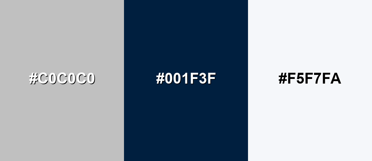
Complementary Palette Example: Try silver with midnight navy for depth and a soft white highlight for a crisp, premium finish.
Analogous Color Schemes
Analogous colors sit adjacent to each other on the color wheel, creating harmonious, cohesive palettes with subtle variation.
Cool neighboring neutrals: silver with blue-gray and misty light gray feels calm and tech-forward.
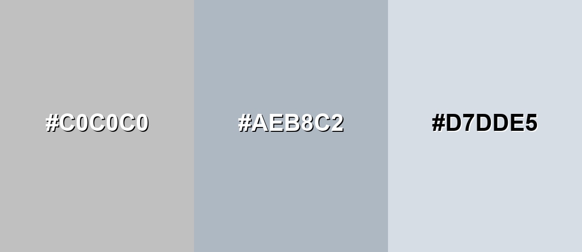
- Silver: #C0C0C0
- Blue Gray: #AEB8C2
- Misty Gray: #D7DDE5
Warm neighboring neutrals: silver with greige and pale taupe adds softness without losing the clean look.
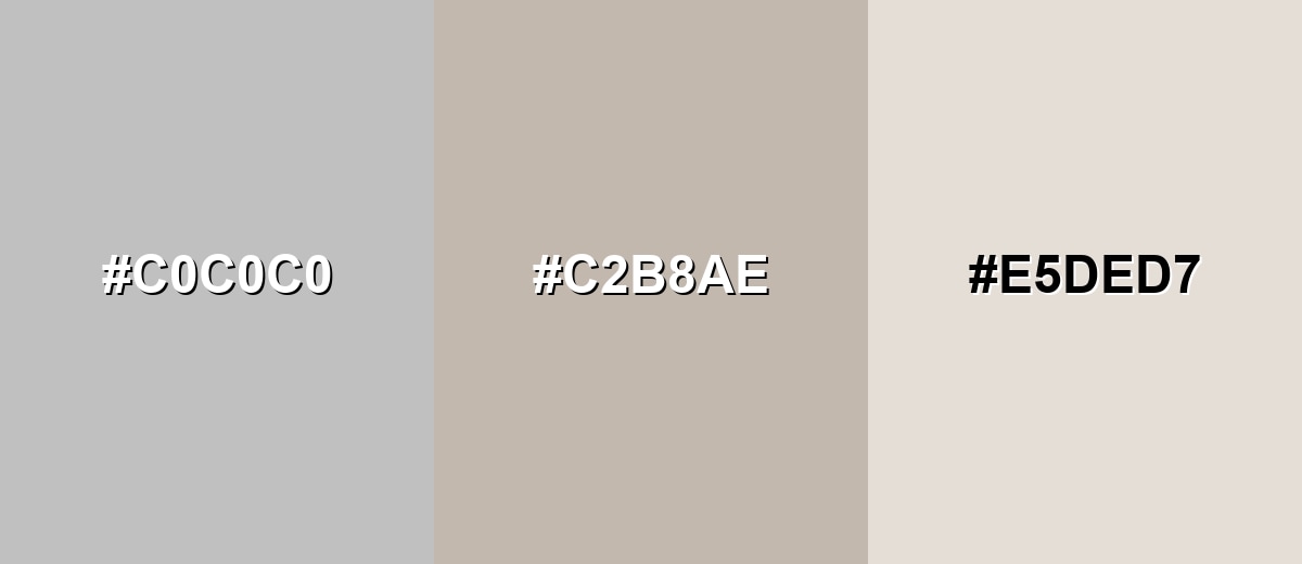
- Silver: #C0C0C0
- Soft Greige: #C2B8AE
- Pale Taupe: #E5DED7
Triadic & Tetradic Combinations
Triadic palettes bring energy while keeping balance, especially when the accents are slightly muted.
Silver with deep wine and muted teal creates a modern, editorial contrast that still feels controlled.
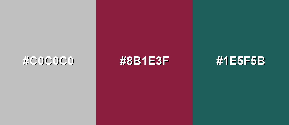
- Silver: #C0C0C0
- Deep Wine: #8B1E3F
- Muted Teal: #1E5F5B
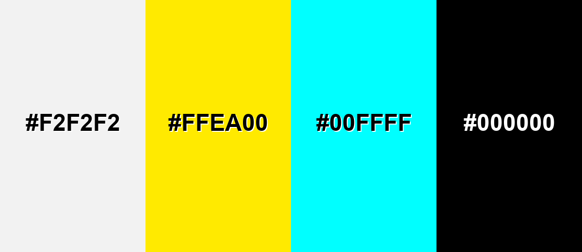
Colors to Avoid
While silver color is remarkably versatile, certain combinations can create problematic visual effects:
- Near-White Gray (#F2F2F2) - Too close in value to silver, so buttons, borders, and surfaces can disappear and feel unfinished.
- Neon Yellow (#FFEA00) - The intensity can make silver look dull and can create an overly harsh, attention-grabbing contrast.
- Pure Cyan (#00FFFF) - Highly saturated cyan can clash with silver's neutral refinement and may read as cheap or overly digital.
- Flat Black (#000000) - Very stark contrast can feel severe; without careful spacing and typography, the palette may look heavy and unfriendly.
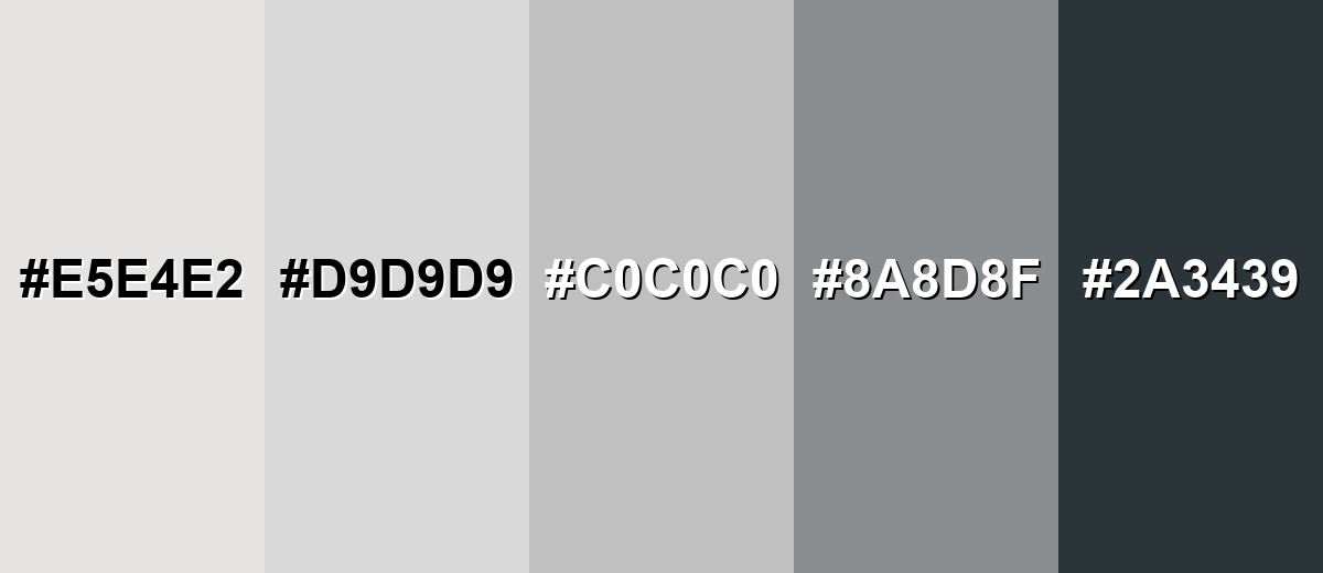
Shades, Tints & Variations of Silver Color
Silver isn't just one flat gray—its range runs from bright, almost-white "platinum" tints to darker, industrial tones like gunmetal. Knowing these variations helps you control contrast, mood, and realism (especially when you're aiming for a metallic finish).
- Platinum (#E5E4E2) - A very light, near-neutral metallic tint that feels airy and high-end. It's best used for Luxury packaging backgrounds, minimal UI surfaces, soft highlight areas.
- Light Silver (#D9D9D9) - A gentle, bright gray that keeps the silver feel while staying subtle. It's best used for Cards, panels, dividers, and background fills where you want quiet structure.
- Classic Silver (#C0C0C0) - The standard reference silver that reads as neutral gray with a metallic association. It's best used for UI chrome, product frames, neutral accents, and balanced palettes.
- Steel Gray (#8A8D8F) - A deeper industrial gray that suggests strength and engineered materials. It's best used for Text on light silver surfaces, icons, outlines, and durable product styling.
- Gunmetal (#2A3439) - A dark, blue-leaning gray that feels technical and modern. It's best used for High-contrast typography, navigation, and premium tech branding accents.
Industry Applications
Silver appears across industries because it reads as neutral, capable, and polished. It's especially useful when you want a modern look that supports content rather than competing with it.
Fashion & Beauty
- Use silver accents in product photography to emphasize highlights, texture, and clean silhouettes.
- Pair silver finishes with minimal backdrops for a sleek, editorial feel that doesn't distract from the subject.
- For packaging, silver details can suggest premium quality without leaning too ornate.
- In jewelry and accessories, silver reads modern and understated—ideal for minimalist styling.
Interior Design & Decor
- Bring silver in through hardware, fixtures, mirrors, and frames to add a crisp, modern edge.
- Balance silver with warm woods, off-whites, or soft textiles so the space doesn't feel cold.
- Use light silver tones to create subtle structure on walls, trims, or decorative panels.
- Combine silver with deeper anchors for contrast when you want a more dramatic, "designed" look.
Branding & Marketing
- Use silver for secondary brand elements (borders, badges, product frames) to communicate technical confidence.
- In UI and SaaS visuals, silver works well for separators, disabled states, and gentle surface gradients.
- For corporate and finance branding, silver can add polish when paired with deeper, stable tones.
- In event materials, silver accents help invitations and signage feel refined and premium.
Conclusion
Silver is a refined neutral that takes on its personality from metal, light, and whatever colors surround it. That's exactly why it works so well in design: #c0c0c0 gives you a dependable starting point for clean backgrounds, subtle UI surfaces, and premium accents—while deeper anchors or warmer neutrals keep the look from turning sterile. Use it as structure, add contrast where it matters, and silver becomes an easy, modern tool across digital, print, and real-world spaces.
Design Smarter with AI: Media.io is an online AI studio that empowers creators with advanced image generation and enhancement tools. From text-to-image and image-to-image creation to AI upscaling and color optimization, it enables fast, creative, and professional results—all in your browser.

Frequently Asked Questions About Silver Color
A common standard hex value for silver in digital design is #c0c0c0. It represents an even, neutral light gray that's widely recognized as silver on the web.
Silver is typically shown as RGB 192, 192, 192. Because all three channels match, it reads as a neutral gray with a metallic association.
They can look similar, but silver usually implies a metallic or reflective quality, while gray is purely neutral. In flat digital fills, silver often appears as a specific light gray, and the metallic feel comes from gradients, highlights, or texture.
Deep tones like navy, charcoal, and burgundy give silver strong contrast and a premium feel. Softer options like off-white, greige, and pale blue-grays create clean, calm palettes for interfaces and interiors.
Use subtle gradients, controlled highlights, and realistic shadows instead of a single flat fill. Adding a darker edge and a small bright highlight can create the reflective look people associate with metal.
Yes, but treat it as a background or supporting surface and ensure text and icons have enough contrast. Use darker typography and test contrast ratios, since light silver shades can cause readability issues when paired with light text.


