

 TL;DR:
Seafoam green is a calming, light blue-green color (Hex: #9FE2BF) best used as a soft foundation in wellness, coastal, and minimalist designs alongside darker anchors for structural contrast.
● Use Hex #9FE2BF for UI and web design, RGB (159, 226, 191) for screens, and CMYK (30%, 0%, 15%, 11%) for print, ensuring you pair it with deeper tones like charcoal or navy to prevent washed-out readability issues.
● Complement this color with sand beige, soft blush, or muted lavender, but avoid pairing it with neon lime, pure red, electric blue, or jet black, which create harsh clashes or visually weaken the pastel.
● In photography or physical spaces, incorporate warm neutrals and natural textures like wood or linen, as cool lighting or isolated use can make the color appear sterile and clinical.
Ask AI for a summary
 ChatGPT
 Perplexity
 Gemini
 Claude
 Grok
Grok
Seafoam green color is a light, airy blue-green that looks like sunlit ocean foam or softened mint with a hint of aqua. Its hex code is #9FE2BF, giving it a fresh feel that stays gentle rather than loud.
It's often read as calming, clean, and approachable with an easy coastal vibe. Because it sits between green and blue, it can shift cooler or warmer depending on nearby colors and lighting—so pairing and contrast matter.
Seafoam Green Color: Codes & Values
If you're designing for web, print, or branding, these are the most useful technical values for seafoam green, including its screen and print equivalents.
| Parameters | VALUE |
| HEX Code | #9FE2BF |
| RGB DECIMAL | 159, 226, 191 |
| RGB PERCENTAGE | 62%, 89%, 75% |
| CMYK | 30%,0%,15%,11% |
| HSL | 149°, 54%, 75% |
| HSV (HSB) | 149°, 30%, 89% |
| Web Safe | #99CCCC |
Key Color Space Explanations:
- HEX - HEX is the most common way to specify seafoam green for web and UI work. Use #9fe2bf anywhere you can paste a hex value in design tools or CSS.
- RGB - RGB defines the red, green, and blue light values used on screens. Seafoam green is 159, 226, 191, which is why it reads bright but soft.
- CMYK - CMYK is used for printing with cyan, magenta, yellow, and black inks. The CMYK mix helps you approximate seafoam green in print, though paper and coatings can shift the result.
- HSL - HSL describes hue, saturation, and lightness, which is helpful when building consistent tints and shades. Seafoam green sits around 149° with moderate saturation and high lightness.
- Web Safe - Web safe is a legacy palette that aims for consistent rendering on older displays. The closest web-safe match to seafoam green is #99cccc.
For quick workflows, use the HEX value for UI and web styling, RGB for on-screen color matching, and CMYK when you need a print-friendly starting point.
Seafoam Green Color Conversions
Need seafoam green color in a different color format? Use this conversion chart to copy values into design apps, style guides, and dev handoffs.
| Parameters | VALUE | CSS |
| HEX | #9fe2bf | #9fe2bf |
| RGB DECIMAL | 159, 226, 191 | rgb(159,226,191) |
| RGB PERCENTAGE | 62%, 89%, 75% | rgb(62%,89%,75%) |
| CMYK | 30%,0%,15%,11% | cmyk(30%,0%,15%,11%) |
| HSL | 149°, 54%, 75% | hsl(149°, 54%, 75%) |
| HSV (or HSB) | 149°, 30%, 89% | -- |
| Web Safe | 99cccc | #99cccc |
| CIE-LAB | 84.7, -28.0, 10.4 | -- |
| XYZ | 50.9, 65.5, 59.1 | -- |
| xyY | 0.290, 0.373, 65.5 | -- |
| CIE-LCH | 84.7, 29.9, 159.6° | -- |
| CIE-LUV | 84.7, -32.6, 20.5 | -- |
| Hunter-Lab | 80.9, -25.8, 9.7 | -- |
| Binary | 10011111 11100010 10111111 | -- |
Want to generate seafoam green color photos or posters? Try Media.io's AI Image Generator now!
Seafoam Green Meaning & Symbolism
Seafoam green is commonly linked with freshness, ease, and a light, restorative energy. It feels airy and clean without the sharpness of brighter greens, which makes it a popular choice for spaces and visuals meant to feel welcoming. In everyday life, this often translates to a sense of calm, clarity, and quiet optimism.
Psychological Effects
This blue-green balance can subtly steer how a layout, room, or product is perceived.
- Calming Mood - The soft, cool tone can make spaces and screens feel quieter and less visually demanding.
- Approachable Energy - In branding and UI, it often reads friendly and low-pressure, which helps reduce friction for new users.
- Clean, Organized Feel - Its lightness can suggest tidiness and clarity, especially alongside simple layouts and consistent spacing.
- Room-Opening Effect - In interiors, seafoam can reflect light gently, making smaller rooms appear more open and airy.
- Risk of Washed-Out Contrast - Used too broadly (or under cool lighting), it can feel watery or sterile and may need darker anchors for readability.
Positive Associations
These are the themes people most often connect to seafoam green in everyday design and decor.
- Nature And Water - It's frequently tied to coastlines, spa-like environments, and breathable outdoor themes.
- Freshness - The mint-aqua balance gives a "just cleaned" impression without feeling sharp or neon.
- Gentle Care - Common in wellness and skincare because it signals softness, reassurance, and trust.
- Quiet Optimism - It can feel uplifting in a subtle way—bright enough to look positive, muted enough to stay calm.
- Retro Charm - Seafoam green often shows up in mid-century and vintage styling, especially with warm creams and soft accents.
Cultural Significance Across the World
Meanings shift by region and context, but a few patterns show up consistently.
- Coastal Lifestyle - In many markets, it instantly suggests seaside travel, summer air, and relaxed living.
- Health And Hygiene - Blue-greens are widely used in personal care and home categories to communicate cleanliness and safety.
- Modern Minimalism - In contemporary design, seafoam supports a "light, uncluttered" look when paired with neutral typography.
- Vintage Design Language - Across retro-inspired visuals, it's a recognizable signal for mid-century palettes and nostalgic product styling.
Design Applications
Seafoam green is most effective when you treat it as a soft foundation and then add contrast for structure. It can work as a background, a panel fill, or an accent, depending on how saturated and dark the surrounding palette is.
Graphic Design Tips
- Use seafoam green for supportive UI surfaces like cards, tags, and filters where you want a calm, "easy" feel.
- Pair it with darker anchors (deep charcoal, navy, or deep teal tones) so headings and icons stay crisp.
- Introduce one warm accent in the wider palette to keep the overall look human and not too cool.
- For print layouts, keep plenty of negative space—seafoam looks clean and premium when it has room to breathe.
- Don't rely on color alone for UI states; reinforce meaning with labels, borders, or icons for accessibility.
Pro tip: If seafoam green is your background, choose a slightly deeper supporting shade for buttons and dividers so the interface doesn't feel "foggy" on bright displays.
Seafoam Green in Photography & Video
- Watch white balance: a cooler WB can push seafoam toward aqua, while warmer lighting makes it read more minty.
- Use seafoam as a set color for calm lifestyle scenes—bath, skincare, coastal travel, and airy interiors.
- For product shots, add a darker prop or backdrop edge so the subject doesn't blend into the pastel.
- In color grading, keep saturation controlled; seafoam looks best when it stays soft rather than neon-bright.
- Pair seafoam tones with natural textures (wood, linen, stone) to avoid a sterile, overly "clinical" look.
Recommended Tool for Image Enhancement: When incorporating seafoam green into your photography projects, Media.io's AI Image tools can help you achieve more refined results. With AI-powered color enhancement, photo colorization, image upscaling, and old photo restoration, you can easily enrich seafoam green tones, improve overall image quality, and highlight the color's elegant and sophisticated aesthetic.
Color Combinations
Seafoam green plays nicely with both cool and warm companions, but it looks best when you add at least one darker anchor for contrast. Use the palettes below as starting points, then adjust saturation to match your layout or brand tone.
Complementary Colors
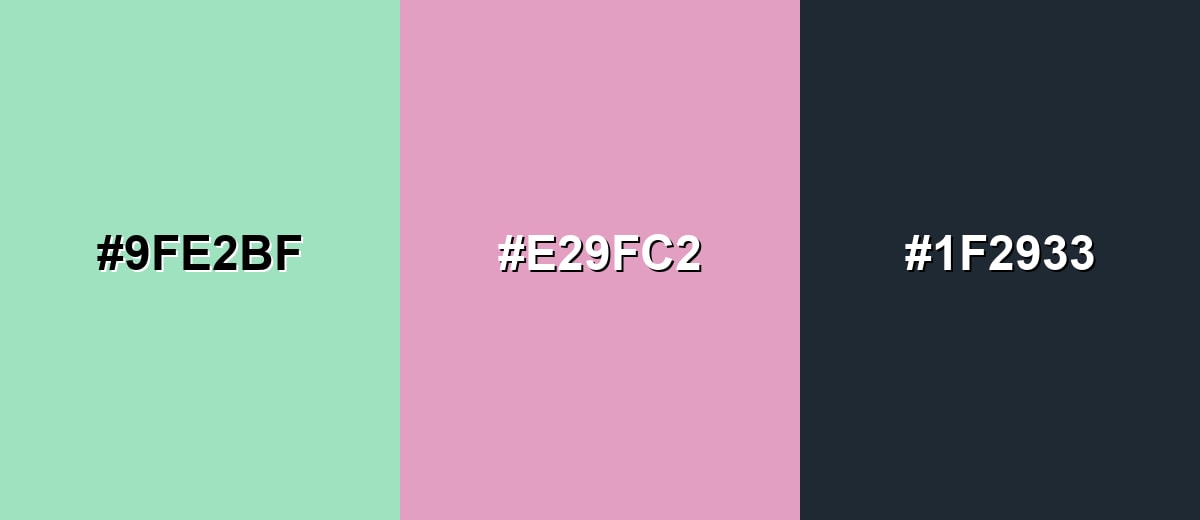
A complementary pairing adds energy by placing seafoam green across from a soft pink-purple. Keeping both tones slightly muted prevents the palette from feeling overly sweet.
Complementary Palette Example: Try seafoam green with a gentle orchid accent and a deep charcoal base for balance.
Analogous Color Schemes
Analogous colors sit adjacent to each other on the color wheel, creating harmonious, cohesive palettes with subtle variation.
Blue-leaning analogous tones create a breezy, water-inspired look that feels cohesive and modern.
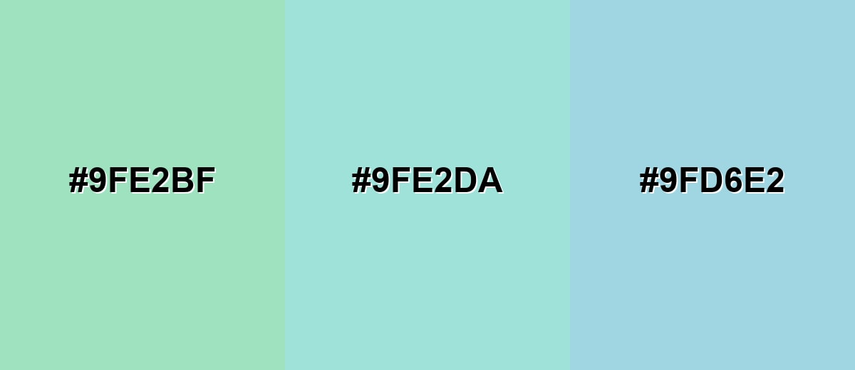
- Seafoam Green: #9FE2BF
- Pale Aqua: #9FE2DA
- Mist Blue: #9FD6E2
Green-leaning analogous tones feel fresher and more botanical, ideal for natural and lifestyle themes.
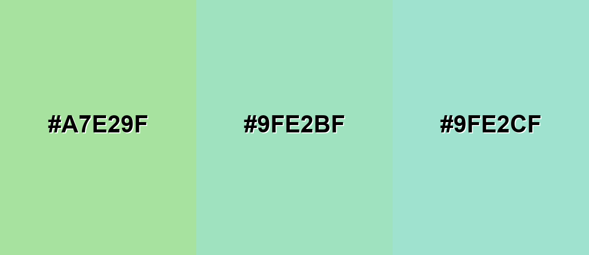
- Fresh Mint: #A7E29F
- Seafoam Green: #9FE2BF
- Light Teal: #9FE2CF
Triadic & Tetradic Combinations
A triadic palette gives variety while keeping the overall feel playful and balanced.
Combine seafoam green with a sandy neutral and a soft purple for a calm, design-forward trio.
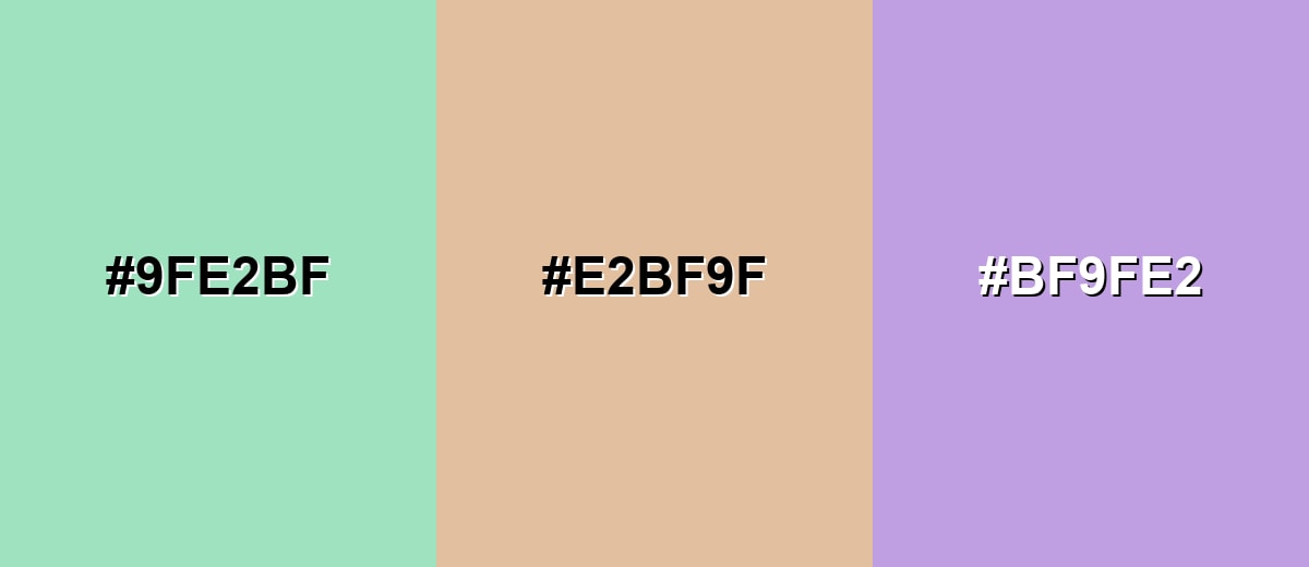
- Seafoam Green: #9FE2BF
- Sand Beige: #E2BF9F
- Lavender Mauve: #BF9FE2
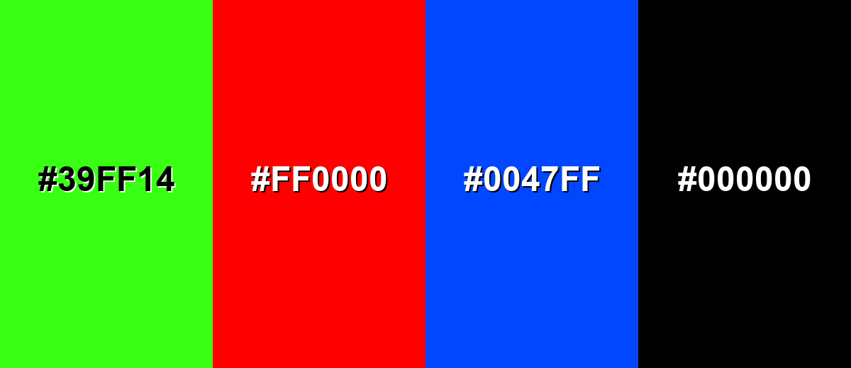
Colors to Avoid
While seafoam green is remarkably versatile, certain combinations can create problematic visual effects:
- Neon Lime (#39FF14) - Its extreme brightness can overpower seafoam green and create a harsh, highlighter-like clash.
- Pure Red (#FF0000) - The contrast is aggressive and can feel seasonal or alarm-like rather than calm and clean.
- Electric Blue (#0047FF) - Highly saturated blues can make seafoam green look grayish and weak, especially on screens.
- Jet Black (#000000) - The jump from soft pastel to absolute black can look too stark; deep charcoal usually blends more smoothly.
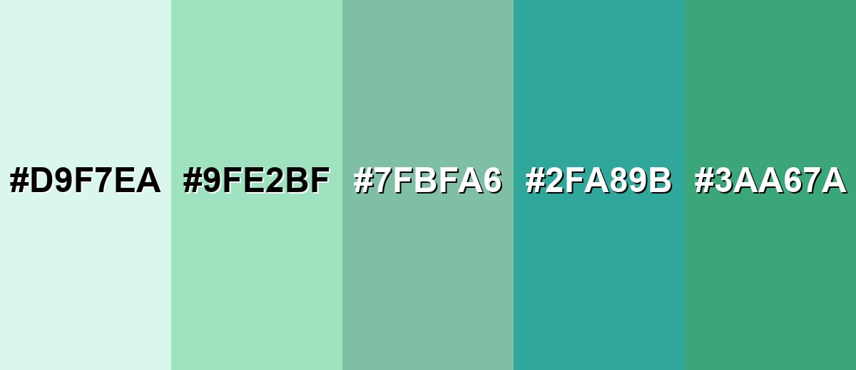
Shades, Tints & Variations of Seafoam Green
Seafoam green isn't just one "minty-aqua" color—there's a whole range from barely-there pastels to deeper, more defined blue-greens. Using a few variations helps you build hierarchy (backgrounds, buttons, borders, and highlights) without leaving the same color family.
- Pale Seafoam (#D9F7EA) - A barely-there, airy tint that reads clean and spacious with a subtle green-blue hint. It's best used for Large backgrounds, negative space, soft UI sections, and bright interiors.
- Seafoam Green (#9FE2BF) - The classic seafoam look: fresh, light, and balanced between mint and aqua. It's best used for Primary accents, brand supporting tone, cards, highlights, and gentle decorative elements.
- Dusty Seafoam (#7FBFA6) - A muted, grayer take that feels more mature and less beachy. It's best used for Typography accents, subdued backgrounds, product UI, and calmer home palettes.
- Seafoam Teal (#2FA89B) - A stronger, deeper blue-green that keeps the seafoam character while adding clarity and weight. It's best used for Buttons, navigation elements, charts, and contrast-friendly supporting blocks.
- Deep Seafoam (#3AA67A) - A darker green-leaning shade that feels grounded and slightly more natural than the pastel base. It's best used for Headings, icons, borders, and pairing with light seafoam backgrounds for hierarchy.
Industry Applications
Seafoam green is flexible across industries because it can signal cleanliness and calm without looking overly clinical. The trick is choosing the right depth and pairing it with strong contrast where clarity matters.
Fashion & Beauty
- Clean-label visuals and soothing skincare lines that want a gentle, trustworthy tone.
- Ingredient callouts and background blocks on product pages that need a fresh, airy feel.
- Soft gradients in ads and social creatives that look modern without feeling loud.
- Pairing with warm neutrals to keep beauty branding approachable rather than cold.
Interior Design & Decor
- Bathrooms and bedrooms where a light, relaxing atmosphere is the goal.
- Kitchen cabinetry or tile for a vintage-inspired or coastal look.
- Textiles and decor accents that brighten neutral rooms without overwhelming them.
- Balancing with warm woods, linen textures, and off-whites to avoid a sterile vibe.
Branding & Marketing
- Wellness and self-care identities that need calm energy and easy readability.
- Minimal packaging where "soft freshness" is part of the product promise.
- Retro-inspired brands when paired with cream, blush, or warm metallic accents.
- Web and app UI panels, cards, and sections that should feel uncluttered and welcoming.
Conclusion
Seafoam green stands out for its soft balance of minty freshness and cool aqua calm, making it an easy color to live with in both digital and physical design. Start with #9FE2BF as a light foundation, then add a darker anchor for readability and structure, plus a warm accent to keep the palette feeling human. With smart contrast and a few well-chosen shade variations, seafoam green delivers a clean, modern look that still feels relaxed and approachable—perfect for wellness, lifestyle, minimalist branding, and airy interiors.
Design Smarter with AI: Media.io is an online AI studio that empowers creators with advanced image generation and enhancement tools. From text-to-image and image-to-image creation to AI upscaling and color optimization, it enables fast, creative, and professional results—all in your browser.

Frequently Asked Questions About Seafoam Green Color
Seafoam green is a light blue-green that resembles the pale, frothy tint of ocean foam. It sits between mint and aqua, usually reading soft, fresh, and airy.
A widely used digital hex value for seafoam green is #9fe2bf. Small shifts in display settings and surrounding colors can make it look slightly more green or more blue.
It is a balanced blue-green, but it can lean either way depending on what you place next to it. Warm neutrals make it feel greener, while cool grays and blues pull it toward aqua.
It pairs well with deep charcoal, navy, warm cream, sand, soft blush, and muted lavender. For a clean modern look, combine it with off-white and a dark neutral for contrast.
Use it for backgrounds, cards, or subtle accents, then rely on dark text and clear borders for structure. Avoid light text on seafoam green, and reinforce important states with icons or labels, not just the tint.
The closest web-safe approximation is #99cccc. It is slightly cooler and more cyan-leaning than many modern seafoam green definitions.


