

Misty blue color is a light, muted blue with a soft gray haze—like a distant sky seen through morning fog. Its HEX code is #A9C3DA, which gives it an understated, airy look on screens and in print.
It's often read as calm, gentle, and quietly professional rather than bold. Because it sits between blue and gray, it can shift cooler or warmer depending on lighting and surrounding tones—so pairing and contrast choices matter.
Misty Blue Color: Codes & Values
Here are the standard color codes for misty blue, so you can match it accurately across web, UI, and print workflows.
| Parameters | VALUE |
| HEX Code | #A9C3DA |
| RGB DECIMAL | 169, 195, 218 |
| RGB PERCENTAGE | 66.3%, 76.5%, 85.5% |
| CMYK | 23%,11%,0%,15% |
| HSL | 208°, 40%, 76% |
| HSV (HSB) | 208°, 22%, 85% |
| Web Safe | #99CCCC |
Key Color Space Explanations:
- HEX - HEX is the most common way to specify this shade in web design and digital tools. Use #a9c3da in CSS, design systems, and brand guidelines.
- RGB - RGB defines misty blue using red, green, and blue light for screens. It is useful for UI work, video, and any display-based design.
- CMYK - CMYK is used for printing with ink percentages. The CMYK values help you approximate the same look in brochures, packaging, and posters.
- HSL - HSL describes hue, saturation, and lightness, making it easier to create lighter tints or deeper tones. It is especially handy for theming and consistent UI states.
- Web Safe - Web safe is the closest legacy palette match used on older systems. For misty blue, the nearest web-safe value is #99cccc.
Use HEX or RGB for anything screen-based, and switch to CMYK when you're preparing files for print so the final color stays as close as possible.
Misty Blue Color Conversions
If you need misty blue in different formats for design tools, CSS, or print specs, use the conversion chart below as a quick reference.
| Parameters | VALUE | CSS |
| HEX | #a9c3da | #a9c3da |
| RGB DECIMAL | 169, 195, 218 | rgb(169,195,218) |
| RGB PERCENTAGE | 66.3%, 76.5%, 85.5% | rgb(66.3%,76.5%,85.5%) |
| CMYK | 23%,11%,0%,15% | cmyk(23%,11%,0%,15%) |
| HSL | 208°, 40%, 76% | hsl(208°,40%,76%) |
| HSV (or HSB) | 208°, 22%, 85% | -- |
| Web Safe | 99cccc | #99cccc |
| CIE-LAB | L* 77.6, a* -4.0, b* -14.4 | -- |
| XYZ | 48.6, 52.5, 74.0 | -- |
| xyY | x 0.277, y 0.300, Y 52.5 | -- |
| CIE-LCH | L 77.6, C 15.0, H 254° | -- |
| CIE-LUV | L* 77.6, u* -14.4, v* -21.7 | -- |
| Hunter-Lab | L 72.5, a -3.5, b -14.9 | -- |
| Binary | 10101001 11000011 11011010 | -- |
Want to generate misty blue color photos or posters? Try Media.io's AI Image Generator now!
Misty Blue Meaning & Symbolism
Misty blue is commonly linked with calm thinking, clarity, and a steady, reassuring presence. Because it is softened with gray, it often feels more approachable and less formal than darker blues. In everyday life, it tends to read as clean, quiet, and balanced, which is why it shows up in backgrounds, home decor, and modern interfaces.
Psychological Effects
As a muted, low-noise color, misty blue tends to support focus rather than compete for attention.
- Calm Focus - Helps reduce visual intensity, making reading and long sessions feel easier.
- Gentle Clarity - Encourages a "clear head" mood without the sharpness of brighter blues.
- Quiet Professionalism - Communicates restraint and reliability, especially in modern UI surfaces.
- Approachable Distance - Feels composed and tidy, though it can read slightly cool if overused.
- Balance Through Accents - Warmer accents or deeper anchors keep it from feeling sterile next to cool grays.
Positive Associations
In day-to-day design, misty blue is often chosen for a clean, steady impression.
- Trust - A softer take on classic blue that still feels dependable.
- Ease - Suggests comfort and "room to breathe," especially in minimal layouts.
- Cleanliness - Commonly linked to fresh, orderly spaces and well-structured interfaces.
- Stability - Works as a steady base color that doesn't swing overly trendy.
- Gentle Modernity - Feels contemporary without the harsh edge of high-saturation palettes.
Cultural Significance Across the World
Blue meanings shift by context, but misty, gray-softened blues often point to quiet weather, air, and calm atmospheres.
- Modern Trust Signals - Blue frequently appears in technology and services to suggest reliability.
- Air & Atmosphere - Misted blues can evoke haze, distance, and open sky in visual storytelling.
- Soft Formality - The gray undertone can feel less ceremonial than darker corporate blues.
- Context Matters - Interpretation varies by audience and setting, so messaging should guide the final palette.
Design Applications
Misty blue is easiest to use as a supporting tone: backgrounds, panels, and large areas where you want softness without losing a professional feel. Its gray undertone makes it flexible across both cool and warm palettes.
Graphic Design Tips
- Use misty blue for backgrounds and large surfaces to keep layouts airy and readable.
- Pair it with one deeper "anchor" color for headings, dividers, and hierarchy.
- Keep accent colors muted or warm to avoid making the overall look feel cold.
- In branding systems, treat misty blue as a secondary tone that supports the primary brand color.
- For print, request a proof—muted blues can shift noticeably under different lighting and paper stocks.
If your design starts to feel washed out, add structure with a deeper tone for type and UI borders, then keep misty blue for spacious sections like cards, panels, and content blocks.
Misty Blue in Photography & Video
- Works beautifully for soft backdrops, foggy landscapes, and "clean air" lifestyle visuals.
- Use it in wardrobe or set styling to create calm, minimal scenes without stark whites.
- In color grading, a gentle blue cast can make highlights feel cooler and more modern—use sparingly to avoid a sterile look.
- Pair misty blue scenes with warmer skin-tone balancing to keep portraits natural.
- For product shots, misty blue backgrounds can make neutral packaging and metallic details stand out.
Recommended Tool for Image Enhancement: When incorporating misty blue into your photography projects, Media.io's AI Image tools can help you achieve more refined results. With AI-powered color enhancement, photo colorization, image upscaling, and old photo restoration, you can easily enrich misty blue tones, improve overall image quality, and highlight the color's elegant and sophisticated aesthetic.
Color Combinations
Misty blue pairs best with warm, muted accents and calm neighboring blues, plus one deeper anchor tone for contrast. Use the palettes below as a starting point, then adjust saturation to match your medium and lighting.
Complementary Colors
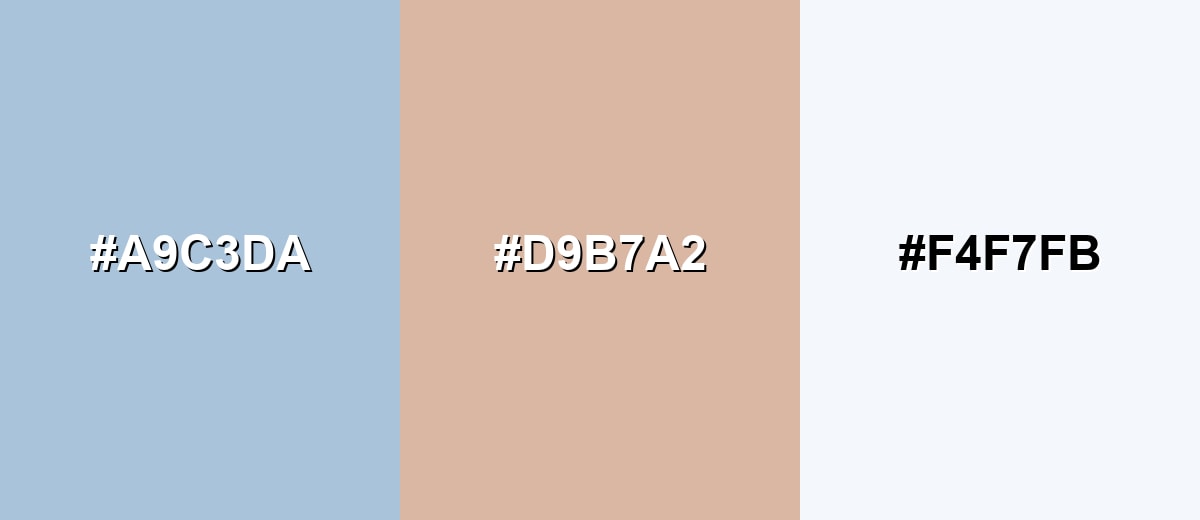
A soft warm complement brings out misty blue's airy quality and keeps it from feeling too cold. Add a clean near-white to give the palette breathing room.
Complementary Palette Example: Try misty blue with a muted peach and a cloud-like white for balanced, modern contrast.
Analogous Color Schemes
Analogous colors sit adjacent to each other on the color wheel, creating harmonious, cohesive palettes with subtle variation.
Lean cooler with a teal-tinged neighbor and a soft periwinkle for a smooth, breezy gradient.
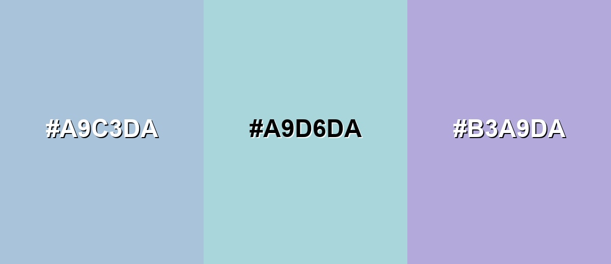
- Misty Blue: #A9C3DA
- Fog Teal: #A9D6DA
- Powder Periwinkle: #B3A9DA
For a more grounded look, pair it with a blue-gray and a lighter sky tint to keep things subtle and layered.
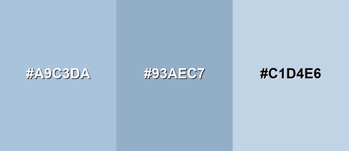
- Misty Blue: #A9C3DA
- Steel Blue Gray: #93AEC7
- Pale Sky: #C1D4E6
Triadic & Tetradic Combinations
A triadic palette adds variety while staying soft and controlled.
Combine misty blue with a dusty rose and a misty sage for a balanced, lifestyle-friendly mix.
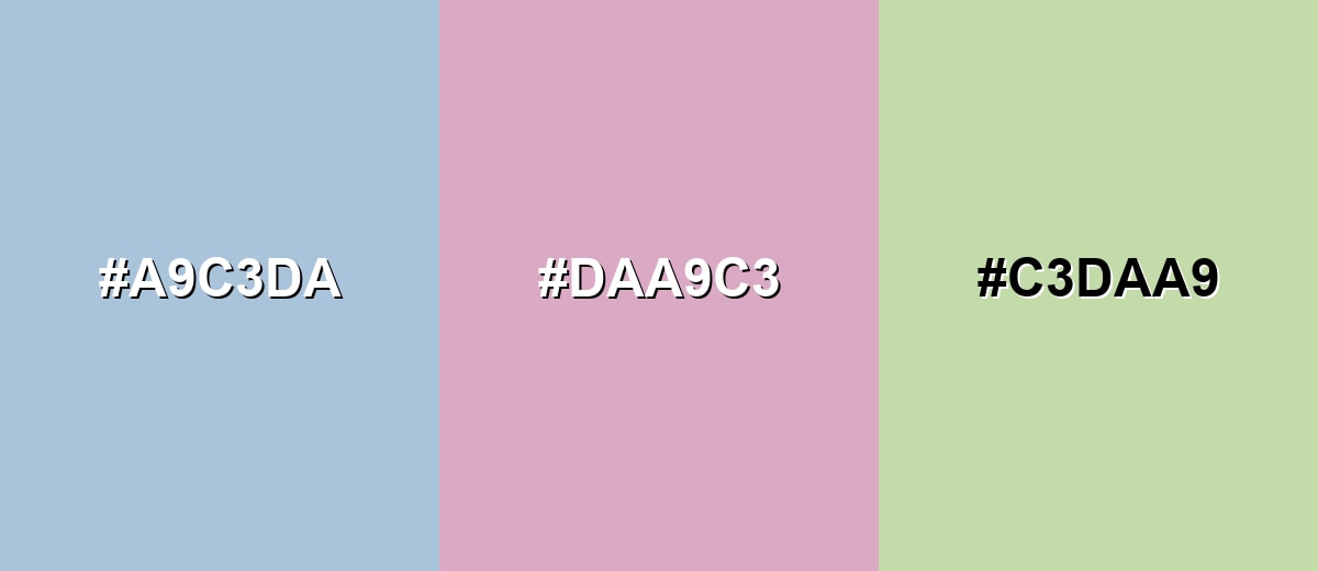
- Misty Blue: #A9C3DA
- Dusty Rose: #DAA9C3
- Misty Sage: #C3DAA9
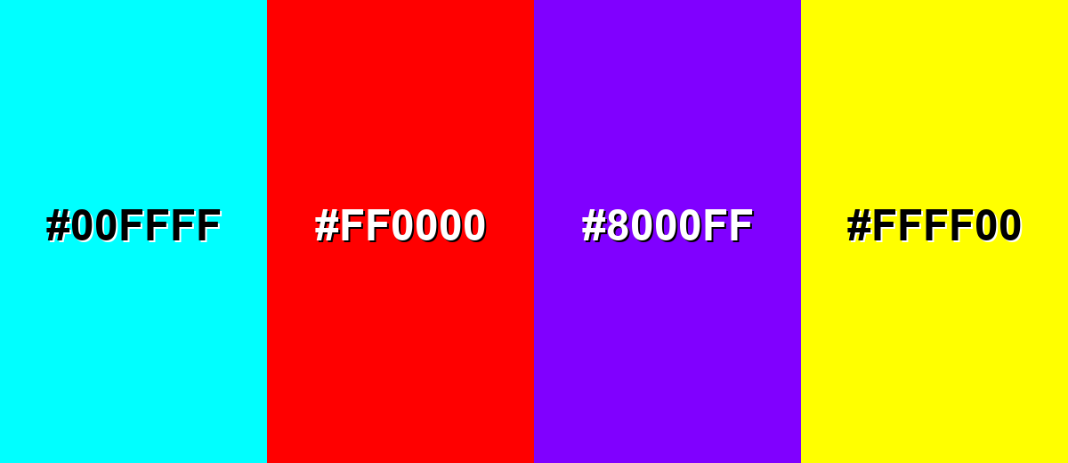
Colors to Avoid
While misty blue is remarkably versatile, certain combinations can create problematic visual effects:
- Neon Cyan (#00FFFF) - Overpowers the soft, hazy look and makes the palette feel harsh and electronic.
- Pure Red (#FF0000) - Creates aggressive contrast that can look unbalanced next to a muted blue-gray.
- Vivid Purple (#8000FF) - The saturation jump feels abrupt and can make misty blue look washed out.
- Bright Yellow (#FFFF00) - High-intensity yellow tends to vibrate visually against cool, pale blues.
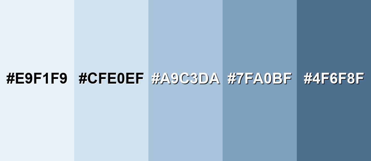
Shades, Tints & Variations of Misty Blue
Misty blue has a useful range—from almost-white tints for open, minimal backgrounds to deeper, moodier tones that add structure and contrast. Knowing these variations makes it easier to build consistent UI states, layered layouts, or room palettes that still feel soft.
- Icy Mist (#E9F1F9) - An ultra-light tint that feels almost white, with a cool blue breath. It's best used for Large backgrounds, minimal layouts, and airy negative space..
- Pale Misty Blue (#CFE0EF) - A light tint that stays gentle but reads more clearly blue than gray. It's best used for Cards, section blocks, and subtle UI surfaces..
- True Misty Blue (#A9C3DA) - The classic misty blue balance: soft, gray-muted, and calm. It's best used for Brand foundations, background fields, and supportive accents..
- Dusty Denim (#7FA0BF) - A deeper, slightly grayer tone that adds structure without becoming heavy. It's best used for Buttons, headers, outlines, and supporting typography..
- Stormy Blue (#4F6F8F) - A darker, moodier variation with stronger contrast and more visual weight. It's best used for Text, icons, hero overlays, and anchors for accessibility..
Industry Applications
Because it feels calm and modern, misty blue fits many industries as a background, secondary brand tone, or UI surface. It is especially effective when the goal is clarity and trust without looking overly corporate.
Fashion & Beauty
- Use it as a "clean backdrop" color for editorial layouts and product pages.
- Works well for skincare, wellness, and minimalist beauty packaging where softness matters.
- Pairs naturally with gentle, muted accents for a refined, lifestyle-friendly palette.
- Great for seasonal capsules that aim for airy, calm styling instead of bold contrast.
Interior Design & Decor
- Ideal for bedrooms and bathrooms when you want a restful, breathable feel.
- Helpful in home offices to keep the room light while still focused.
- Looks especially "misty" in matte or eggshell finishes under natural light.
- Balance with warmer neutrals if the space starts to feel chilly or overly cool.
Branding & Marketing
- Fits SaaS and product design as a calm UI surface that reduces visual strain.
- Strong for healthcare and wellness brands aiming for reassurance and clarity.
- Useful in education products for reading-heavy pages and supportive highlights.
- Works in finance and professional services as a softer alternative to deep corporate blues.
Conclusion
Misty blue is a soft, foggy blue-gray that feels calm, clean, and quietly confident—making it an easy win for backgrounds, UI surfaces, and modern branding. Start with #A9C3DA, then build balance with warm muted accents and at least one deeper tone to keep your layout readable and grounded. Whether you're designing a product interface, print piece, or a relaxing interior palette, misty blue delivers a gentle mood without sacrificing a professional finish.
Design Smarter with AI: Media.io is an online AI studio that empowers creators with advanced image generation and enhancement tools. From text-to-image and image-to-image creation to AI upscaling and color optimization, it enables fast, creative, and professional results—all in your browser.

Frequently Asked Questions About Misty Blue Color
Misty blue is a light, desaturated blue with a noticeable gray haze. It resembles a pale sky or distant water seen through mist, which keeps it soft and understated.
A common digital reference for misty blue is #a9c3da. It is a muted, airy shade that stays light while still reading clearly as blue.
It is often used for backgrounds, UI surfaces, and calming brand accents. Because it is light and muted, it supports content well without pulling too much attention.
Muted peach, soft sage, lavender, and clean off-whites pair well with misty blue. A deeper slate or stormy blue is useful as an anchor for text and contrast.
Misty blue is generally cool, but its gray undertone can make it feel neutral in certain lighting. Warm accents can shift the overall palette to feel more inviting.
Use dark text and icons (like deep slate or stormy blue) rather than white for small sizes. For buttons, keep enough contrast between the fill, label, and surrounding background, and test key states like hover and disabled.


