

Yellow green color is a bright, spring-like green with a clear yellow undertone—similar to new leaves catching sunlight. A common reference point is #9ACD32, which sits between lime and olive on the spectrum.
Designers often use yellow green to communicate freshness, youthful energy, and an outdoorsy vibe. Since it can swing warmer or cooler depending on lighting and surrounding tones, getting the right codes and pairings matters—this guide covers all of it.
Yellow Green Color: Codes & Values
Here are the core yellow green color codes you can copy into design tools, dev handoff notes, and print specs.
| Parameters | VALUE |
| HEX Code | #9ACD32 |
| RGB DECIMAL | 154, 205, 50 |
| RGB PERCENTAGE | 60.4%, 80.4%, 19.6% |
| CMYK | 25%,0%,76%,20% |
| HSL | 80°, 61%, 50% |
| HSV (HSB) | 80°, 76%, 80% |
| Web Safe | #99CC33 |
Key Color Space Explanations:
- HEX: A six-digit code used on the web and in design tools to define the exact on-screen appearance of yellow green.
- RGB: Describes how much red, green, and blue light is mixed to display the shade on digital screens.
- CMYK: A print-focused mix of cyan, magenta, yellow, and black ink values used for packaging and other physical materials.
- HSL: Defines the hue angle plus saturation and lightness, which is useful when adjusting the tone while keeping the same general hue.
- Web Safe: The nearest web-safe alternative intended to reduce color shifts on older displays and constrained palettes.
If you're designing for screens, start with HEX/RGB; for packaging and physical materials, confirm the CMYK with a test swatch since paper and lighting can change how yellow green lands.
Yellow Green Color Conversions
Need the same shade in a different format? Use these yellow green color conversions for quick copy/paste across tools and workflows.
| Parameters | VALUE | CSS |
| HEX | #9acd32 | #9acd32 |
| RGB DECIMAL | 154, 205, 50 | rgb(154,205,50) |
| RGB PERCENTAGE | 60.4%, 80.4%, 19.6% | rgb(60.4%,80.4%,19.6%) |
| CMYK | 25%,0%,76%,20% | cmyk(25%,0%,76%,20%) |
| HSL | 80°, 61%, 50% | hsl(80°, 61%, 50%) |
| HSV (or HSB) | 80°, 76%, 80% | -- |
| Web Safe | 99cc33 | #99cc33 |
| CIE-LAB | 76.6, -39.0, 66.8 | -- |
| XYZ | 35.7, 50.7, 10.9 | -- |
| xyY | 0.367, 0.521, 50.7 | -- |
| CIE-LCH | 76.6, 77.3, 120.3° | -- |
| CIE-LUV | 76.6, -25.4, 81.8 | -- |
| Hunter-Lab | 71.2, -32.2, 40.0 | -- |
| Binary | 100110101100110100110010 | -- |
Want to generate Yellow Green Color photos or posters? Try Media.io's AI Image Generator now!
Yellow Green Color Meaning & Symbolism
Yellow green color commonly represents fresh growth, renewal, and high energy. Because it sits close to the look of young plants, it often reads as lively and optimistic in everyday visuals. In day-to-day context, Yellow Green Color meaning is frequently tied to nature, movement, and a slightly playful edge.
Psychological Effects
Yellow green tends to feel lively and stimulating, so it's best used with balance and clear hierarchy.
- Stimulating Energy - It feels active and upbeat without being as aggressive as pure yellow.
- Progress Cues - In UI and branding, it can suggest speed, vitality, and forward momentum.
- Attention Grabbing - It's strong for highlights, statuses, and calls to action when contrast is handled well.
- Visual Fatigue Risk - Large blocks can become tiring on backlit screens because the shade is so bright.
- Acidic Feel When Overdone - If pushed too neon or paired with harsh contrast, it may feel loud, impatient, or slightly sharp.
Positive Associations
Because it resembles sunlit plant growth, yellow green is often read as fresh, natural, and optimistic.
- Fresh Growth - Closely linked to new leaves, springtime, and renewal.
- Nature Forward - A quick visual shortcut for outdoor, botanical, and eco-friendly themes.
- Youthful Mood - Carries a playful edge that can feel modern and energetic.
- Healthy Vibes - Often used to signal clean, plant-forward, wellness-oriented messaging.
- High Visibility - Works well for accents that need to stand out fast in busy layouts.
Cultural Significance Across the World
Meaning shifts by context, so pairing the color with the right imagery and typography helps keep the message clear.
- Springtime Cues - Commonly connected with gardening, seasonal change, and fresh starts.
- Eco Associations - Frequently used in sustainability visuals, conservation graphics, and nature branding.
- Caution Signals - Some audiences may link yellow-leaning greens with caution and sharp visibility.
- Context Dependent - Its symbolism can swing playful, sporty, or "natural," depending on the overall design system.
Design Applications
Yellow green is best treated as a high-impact accent: it grabs attention quickly and brings a natural, energetic feel. The key is controlling how much you use and what you pair it with so it stays fresh rather than overpowering.
Graphic Design Tips
- Use yellow green as an accent for highlights, badges, and active states to create instant focus.
- Ground it with deep anchors (like a purple counterpoint) or clean neutrals so the palette feels controlled.
- Avoid using it for body text on white or very light backgrounds—contrast can fail even if it looks bright.
- For status indicators, use icons, labels, or patterns in addition to color so meaning isn't hue-only.
- Test across devices—perceived brightness and "neon-ness" can vary from screen to screen.
Use yellow green for highlights, badges, active states, or secondary buttons when you want a lively, modern tone.
Yellow Green Color in Photography & Video
- Yellow green reads most "fresh" in natural daylight, especially with plant textures and outdoor scenes.
- If the tone starts to feel too acidic, reduce saturation slightly and add neutral space in the frame.
- Balance bright yellow green with deeper anchors so it doesn't overpower skin tones or key subjects.
- For product shots, run test swatches and check results under different lighting to avoid unexpected shifts.
- When using it as an overlay or graphic element, prioritize readability by pairing it with darker supporting tones.
Recommended Tool for Image Enhancement: When incorporating yellow green color into your photography projects, Media.io's AI Image tools can help you achieve more refined results. With AI-powered color enhancement, photo colorization, image upscaling, and old photo restoration, you can easily enrich yellow green color tones, improve overall image quality, and highlight the color's elegant and sophisticated aesthetic.
Color Combinations
Because yellow green sits between warm and cool, it pairs well with deep opposites, neighboring greens and yellows, and a few balanced brights. Use the palettes below as starting points, then adjust saturation and spacing to fit your layout.
Complementary Colors
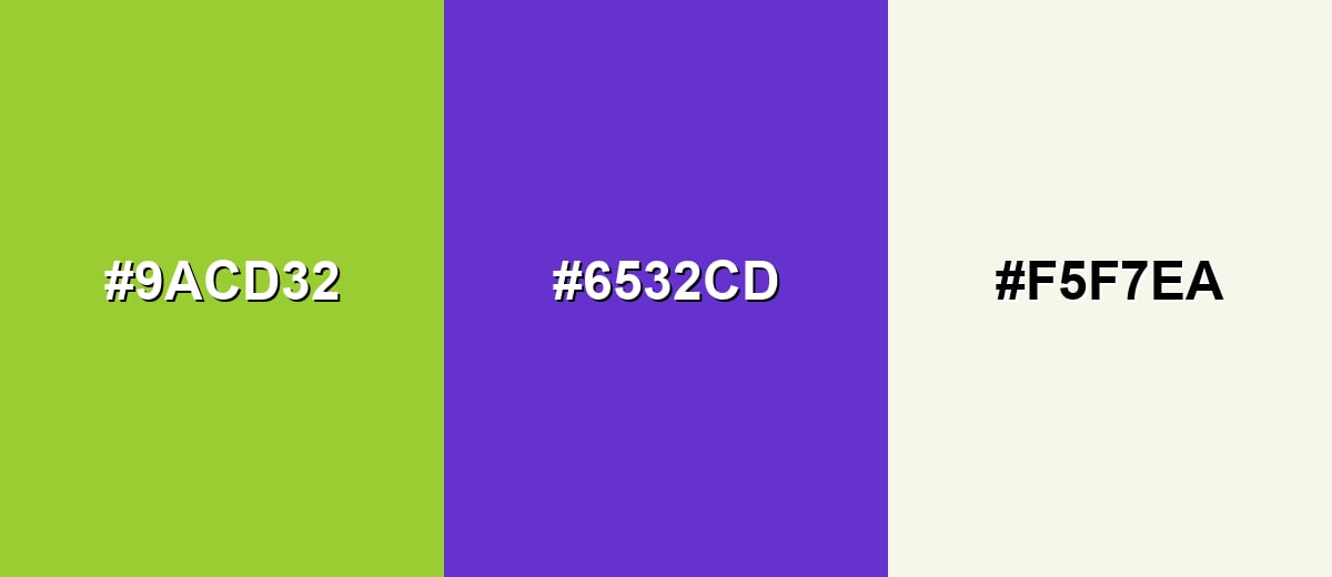
A complementary palette uses the opposite hue to create strong contrast and instant focus. With yellow green, the opposite leans into purple, which helps the green feel cleaner and less overpowering.
Complementary Palette Example: Try yellow green with a rich purple and a soft off-white to keep the contrast bold but usable in real layouts.
Analogous Color Schemes
Analogous colors sit adjacent to each other on the color wheel, creating harmonious, cohesive palettes with subtle variation.
Analogous Scheme 1: a sunny yellow-green range that feels fresh, botanical, and cohesive.
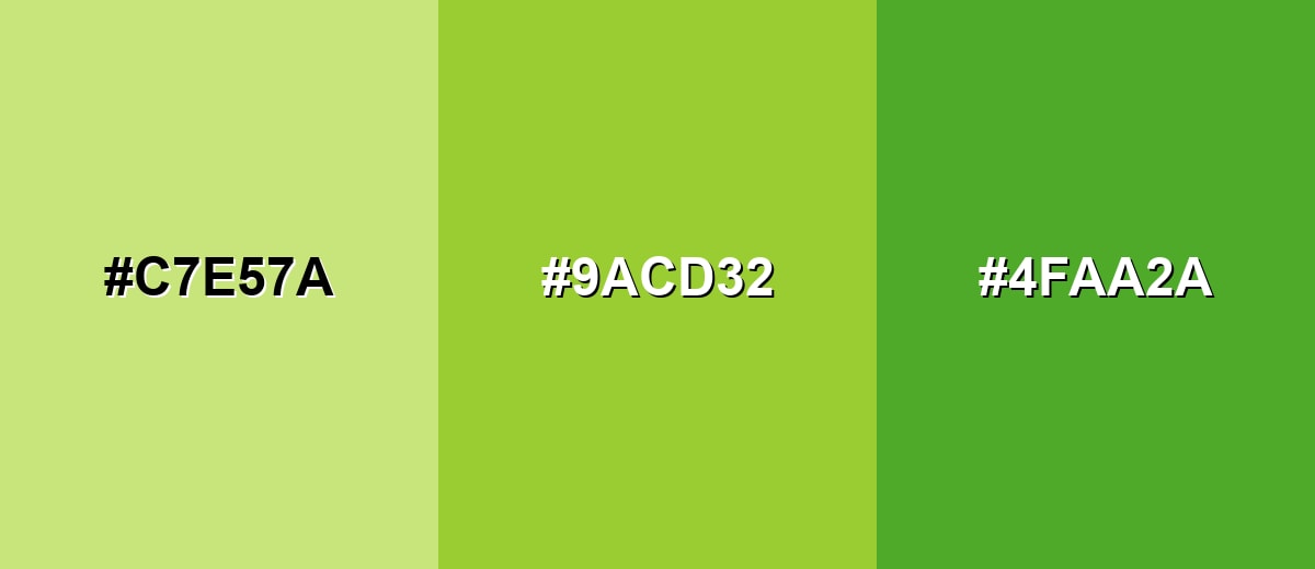
- Soft Lime Tint: #C7E57A
- Yellow Green: #9ACD32
- Leaf Green: #4FAA2A
Analogous Scheme 2: a warmer, slightly earthy set that reads more natural and grounded.
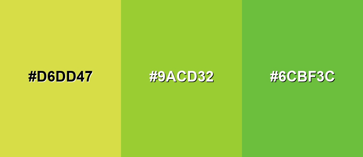
- Spring Yellow: #D6DD47
- Yellow Green: #9ACD32
- Mossy Green: #6CBF3C
Triadic & Tetradic Combinations
A triadic scheme spaces hues evenly for a lively but balanced look.
Use yellow green with a clean teal and a vivid magenta for energetic branding, illustrations, or sports-style graphics.
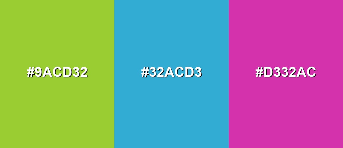
- Yellow Green: #9ACD32
- Bright Teal: #32ACD3
- Vivid Magenta: #D332AC
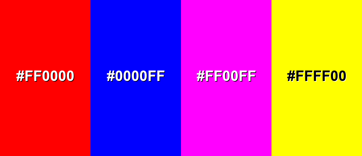
Colors to Avoid
While yellow green color is remarkably versatile, certain combinations can create problematic visual effects:
- Pure Red (#FF0000) - The pairing can create a harsh, vibrating contrast that feels urgent and reduces readability, especially in UI.
- Pure Blue (#0000FF) - This combination can look overly primary and unrefined, and it often fights for attention rather than creating hierarchy.
- Neon Magenta (#FF00FF) - Both hues are intense, so together they can feel noisy and distracting unless used very sparingly.
- Bright Yellow (#FFFF00) - Too much shared brightness can wash out edges and make elements blend, lowering contrast and clarity.
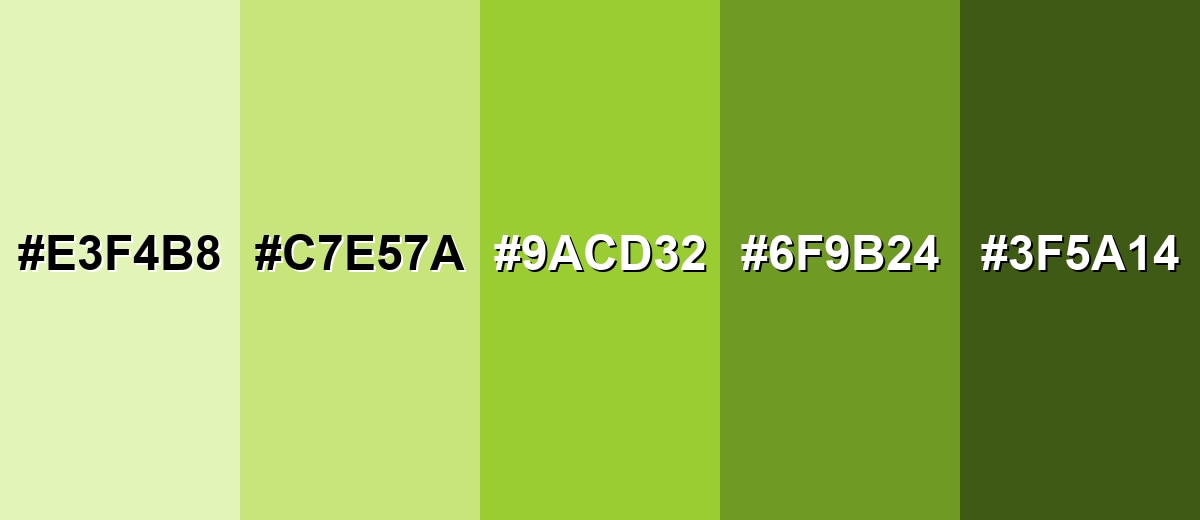
Shades, Tints & Variations of Yellow Green Color
Yellow green isn't just one "loud" accent—there's a whole range from airy tints to grounded, olive-leaning darks. Using variations helps you keep the fresh vibe while building hierarchy, improving readability, and making the palette easier to live with across UI, print, and interiors.
- Pale Yellow Green (#E3F4B8) - A light, airy tint that keeps the fresh feel with much softer intensity. It's best used for Backgrounds, subtle highlights, and large surfaces where you want a gentle natural tone..
- Soft Yellow Green (#C7E57A) - A friendlier, less punchy version of the base shade with an easy spring vibe. It's best used for UI panels, illustration fills, and interior accents that need brightness without glare..
- Classic Yellow Green (#9ACD32) - The vivid, recognizable yellow-leaning green that reads fresh and energetic. It's best used for Accents, badges, calls to action, and brand elements that benefit from high visibility..
- Deep Yellow Green (#6F9B24) - A darker, more grounded take that feels more earthy and stable. It's best used for Text over light tints, outdoor-themed branding, and print where extra depth helps..
- Dark Olive Green (#3F5A14) - A shadowed, olive-leaning variation that works as an anchor for brighter tints. It's best used for Typography, outlines, and contrast support when the main shade is used in large areas..
Industry Applications
Yellow green shows up anywhere a brand wants to signal energy, growth, and a connection to nature or activity. It's especially effective when supported by calm neutrals or a deep complementary tone so it doesn't overpower the message.
Fashion & Beauty
- Use it as a high-visibility accent on sporty apparel graphics where energy and movement are the message.
- Pair it with deeper anchors to keep looks sharp and readable in logos, tags, and small-label applications.
- Lean into softer tints for a more premium, wearable feel that stays fresh without turning neon.
- Keep plenty of neutral space so the palette doesn't feel noisy in lookbooks, campaigns, or product pages.
Interior Design & Decor
- Bring it in through cushions, art, planters, or small furniture pieces for a sunny, natural pop.
- Choose softer variations for larger surfaces, since the fully saturated base can feel intense over time.
- Balance with clean neutrals to make the space feel fresh rather than overpowering.
- Use deeper olive-leaning tones as anchors for outlines, trim details, or contrast support.
Branding & Marketing
- Works well for health and wellness visuals that rely on fresh ingredient cues and plant-forward systems.
- Fits sports and fitness branding where dynamic UI highlights and stat callouts need instant visibility.
- Strong for sustainability messaging—especially when you lean into softer tints to avoid a synthetic neon look.
- Effective in food and beverage for citrus, herb, and freshness cues, with warm accents used sparingly.
Conclusion
Yellow green is a lively, yellow-leaning green that reads fresh, natural, and energetic at a glance—making #9ACD32 a smart choice for accents, highlights, and brand moments that need visibility fast. The key is restraint: balance it with deep anchors or soft neutrals, and consider tints or deeper variations when you need something easier on the eyes (especially in UI or large areas). With thoughtful pairings and a quick contrast check, yellow green works beautifully across wellness, sustainability, sports, seasonal campaigns, packaging, and even interior accents—while keeping the overall message clear and approachable.
Design Smarter with AI: Media.io is an online AI studio that empowers creators with advanced image generation and enhancement tools. From text-to-image and image-to-image creation to AI upscaling and color optimization, it enables fast, creative, and professional results—all in your browser.

Frequently Asked Questions About Yellow Green Color
It's a bright green with a noticeable yellow undertone, similar to new spring leaves or fresh plant growth in sunlight.
A widely used reference hex value for yellow green is #9acd32.
It's often associated with growth, renewal, freshness, and energy, which is why it appears in nature themes and active, upbeat designs.
Deep purples (like #6532cd), soft off-whites (like #f5f7ea), and calm teals (like #32acd3) balance it well and help control its intensity.
It can be tricky for body text because it's bright and can lack contrast on light backgrounds. It works better as an accent, with darker text such as #3f5a14 for readability.
Use lighter tints like #c7e57a or #e3f4b8, reduce saturation in your design tool, and add neutral space so the shade doesn't dominate the layout.


