

 TL;DR:
Jade (#00A86B) is a balanced, medium blue-green best utilized as a fresh design accent, requiring a shift to a deeper shade like #007A4D to maintain accessibility and readability for text or navigation elements.
● Apply HEX #00A86B for standard digital highlights, but use CMYK (100%, 0%, 36%, 34%) with mandatory physical proofing for print, as paper brightness and absorption will shift its temperature.
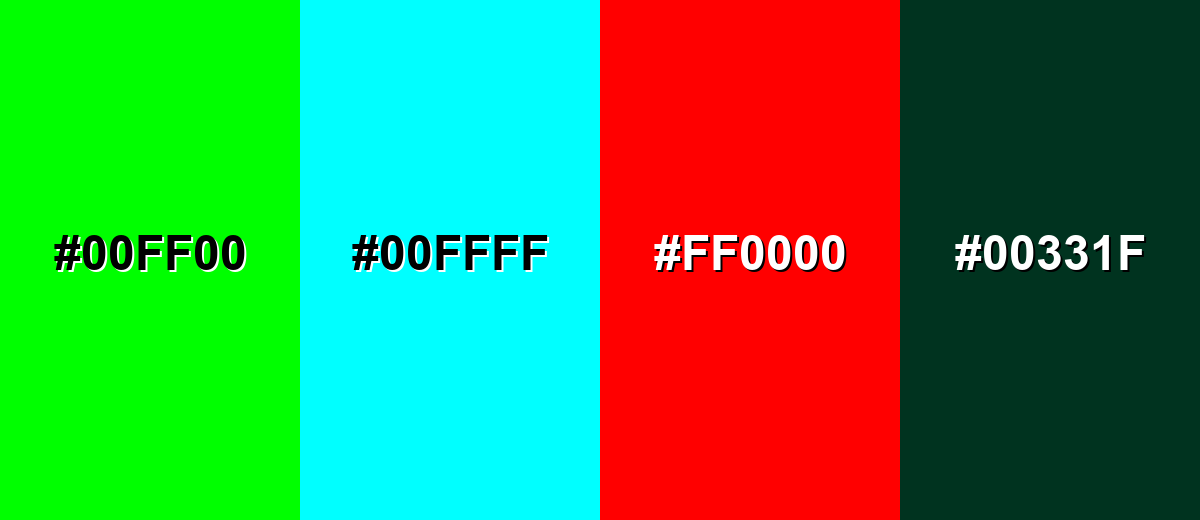
● Avoid pairing jade with Neon Green (#00FF00) or Pure Cyan (#00FFFF) to prevent harsh visual clashes, and exclude Deep Forest (#00331F) to keep the layout from appearing dull or muddy.
● Designate jade as a success or calm highlight token in minimalist design systems, pairing it with light neutrals and natural textures to prevent heavy applications from feeling clinically sterile.
Ask AI for a summary
 ChatGPT
 Perplexity
 Gemini
 Claude
 Grok
Grok
Jade color is a medium blue-green that looks like polished jade stone, sitting between emerald and teal. A popular reference point for it is the hex code #00A86B, which reads as fresh, natural, and quietly vibrant.
Often associated with balance, renewal, and steady confidence, jade keeps its clarity best in clean lighting and modern digital palettes. Below, you'll find practical codes, conversions, palettes, and real-world ways to use jade in design.
Jade Color: Codes & Values
If you want a reliable "jade" that looks crisp across modern screens, start with the reference swatch and build tints/shades from there.
| Parameters | VALUE |
| HEX Code | #00A86B |
| RGB DECIMAL | 0, 168, 107 |
| RGB PERCENTAGE | 0%, 65.9%, 42.0% |
| CMYK | 100%,0%,36%,34% |
| HSL | 158°, 100%, 33% |
| HSV (HSB) | 158°, 100%, 66% |
| Web Safe | #009966 |
Key Color Space Explanations:
- HEX is the most common way to specify jade in web and UI work. Use #00A86B to match this exact digital swatch.
- RGB describes how much red, green, and blue light your screen mixes to display jade. Here it uses no red, strong green, and moderate blue for a crisp blue-green.
- CMYK is used for print and describes ink percentages. This mix relies heavily on cyan with low magenta and moderate yellow, plus black to deepen it.
- HSL helps you adjust jade by intuition: hue controls the green-teal direction, saturation controls vividness, and lightness controls how pastel or deep it looks. It is useful for building consistent shade ramps.
- Web Safe is the nearest legacy palette match for older displays. #009966 keeps the same general feel while snapping to the classic 216-color set.
Use HEX for most digital design, RGB for motion/video or screen-based workflows, and CMYK when you need predictable print output—then proof if color accuracy matters.
Jade Color Conversions
These conversions help you keep jade consistent when moving between CSS, print specs, and color-managed workflows.
| Parameters | VALUE | CSS |
| HEX | #00a86b | #00a86b |
| RGB DECIMAL | 0, 168, 107 | rgb(0,168,107) |
| RGB PERCENTAGE | 0%, 65.9%, 42.0% | rgb(0%,65.9%,42.0%) |
| CMYK | 100%,0%,36%,34% | cmyk(100%,0%,36%,34%) |
| HSL | 158°, 100%, 33% | hsl(158°, 100%, 33%) |
| HSV (or HSB) | 158°, 100%, 66% | -- |
| Web Safe | 009966 | #009966 |
| CIE-LAB | 61.0, -51.0, 21.2 | -- |
| XYZ | 16.68, 29.11, 18.64 | -- |
| xyY | 0.259, 0.452, 29.11 | -- |
| CIE-LCH | 61.0, 55.2, 157.4° | -- |
| CIE-LUV | 61.0, -52.8, 36.6 | -- |
| Hunter-Lab | 53.9, -37.5, 15.6 | -- |
| Binary | 00000000 10101000 01101011 | -- |
Want to generate Jade Color photos or posters? Try Media.io's AI Image Generator now!
Jade Color Meaning & Symbolism
Jade is widely linked with balance, growth, and a calm kind of prosperity. Because it blends green with a cool blue undertone, it often reads as natural but refined, like something clean and well cared for. In everyday life, jade tends to signal stability, freshness, and thoughtful simplicity.
Psychological Effects
Jade supports calm focus and a "clean" mood without feeling overly bright.
- Grounded Calm - Jade can feel steady and reassuring, helping spaces and layouts feel settled rather than noisy.
- Fresh Energy - Its blue-green character reads as healthy and renewed, making designs feel crisp and cared for.
- Clear Focus - Jade often supports clarity, especially in organized layouts with plenty of breathing room.
- Modern Coolness - In minimal systems, heavy jade use can come across as cool or emotionally distant without warm materials.
- Clinical Risk - When too saturated or paired with harsh contrast, jade may feel sterile instead of comforting.
Positive Associations
When used with light neutrals and natural textures, jade's symbolism becomes easy to read at a glance.
- Balance - A middle-ground color that feels composed and measured rather than extreme.
- Renewal - Suggests growth and a fresh start, like clean air and healthy plants.
- Stability - Communicates steady confidence, making it a strong anchor color in brand systems.
- Care - Often linked with wellbeing and thoughtful simplicity in products and services.
- Refined Nature - Feels natural but polished, bridging organic themes and modern design.
Cultural Significance Across the World
The meaning of jade can shift by region and tradition, so it's best treated as a broad signal of calm value.
- Harmony - The gemstone jade is often connected with a sense of balance and peaceful alignment.
- Protection - In jewelry and ornament traditions, jade can symbolize safeguarding and steadiness.
- Good Fortune - Jade is sometimes associated with prosperity and positive outcomes, especially in craft contexts.
- Craft & Heritage - Its long history in art and ornament gives jade a timeless, collected feel.
Design Applications
Jade is versatile because it's vivid enough to stand out, but natural enough to feel familiar. You can use it as a hero accent, a supportive background, or a brand anchor depending on how much energy you want.
Graphic Design Tips
- Use jade (#00A86B) as an accent color for key UI actions, badges, or highlights so it stays meaningful.
- For readability on light backgrounds, switch to a deeper jade like #007A4D for text, icons, and nav elements.
- Pair jade with light neutrals to keep layouts breathable and modern, especially in minimalist designs.
- Create depth by using tints for backgrounds and deeper shades for foreground elements rather than changing hue.
- In print, proof jade on your actual stock—paper brightness and absorption can shift the final look.
Pro tip: if you're building a design system, define jade as your "success/calm highlight" token and keep the rest of the palette neutral so jade reads consistently across screens.
Jade Color in Photography & Video
- Jade pops beautifully in clean, even lighting—avoid mixed lighting that can push it too green or too cyan.
- For product shots, jade backgrounds work best with simple props and soft whites to keep the scene polished.
- In video grading, keep saturation controlled; overly vivid jade can look clinical in skin-tone scenes.
- Use jade as a wardrobe or set accent to signal freshness without the intensity of neon greens.
- When color-correcting, adjust lightness first; small shifts in exposure can change jade's perceived temperature.
Recommended Tool for Image Enhancement: When incorporating jade color into your photography projects, Media.io's AI Image tools can help you achieve more refined results. With AI-powered color enhancement, photo colorization, image upscaling, and old photo restoration, you can easily enrich jade color tones, improve overall image quality, and highlight the color's elegant and sophisticated aesthetic.
Color Combinations
Jade is easiest to style when you decide whether you want it to feel fresh and minimal, or bold and energetic. The palettes below give you practical starting points for contrast, harmony, and clear hierarchy.
Complementary Colors
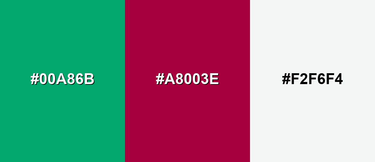
A complementary pairing balances jade with a red-purple opposite to create punchy contrast. Use it for calls to action, highlights, or modern editorial layouts where you want jade to pop.
Complementary Palette Example: Combine Jade with a deep Rose Magenta and a soft neutral to keep the contrast clean.
Analogous Color Schemes
Analogous colors sit adjacent to each other on the color wheel, creating harmonious, cohesive palettes with subtle variation.
A calm green-to-teal flow for serene, nature-forward layouts.
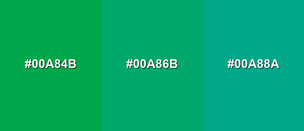
- Emerald Leaf: #00A84B
- Jade: #00A86B
- Seafoam Teal: #00A88A
A brighter, modern mix that leans aquatic and fresh without feeling neon.
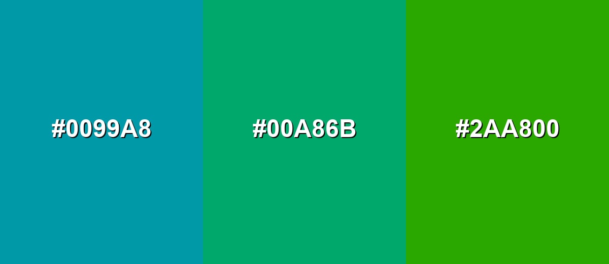
- Lagoon Blue: #0099A8
- Jade: #00A86B
- Spring Lime: #2AA800
Triadic & Tetradic Combinations
Triadic palettes keep balance while adding variety, making them useful for dashboards, illustrations, and brand systems with multiple categories.
Pair Jade with a warm Amber and a rich Purple for a lively, well-spaced look.
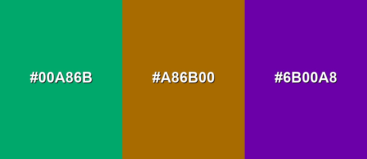
- Jade: #00A86B
- Amber Brown: #A86B00
- Royal Purple: #6B00A8
Colors to Avoid
While jade color is remarkably versatile, certain combinations can create problematic visual effects:
- Neon Green (#00FF00) - Its extreme saturation competes with jade and can make the palette feel harsh and unrefined.
- Pure Cyan (#00FFFF) - It sits too close in temperature and brightness, causing a loud, aquatic clash instead of clean harmony.
- Pure Red (#FF0000) - The contrast is aggressive and can overpower jade, especially in UI elements and small accents.
- Deep Forest (#00331F) - This dark green can turn the combination muddy, reducing clarity and making jade look dull.
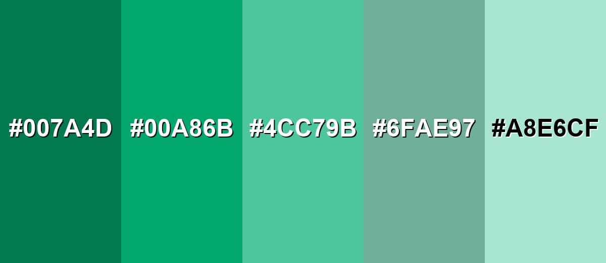
Shades, Tints & Variations of Jade Color
Jade isn't just one swatch—it has a useful range from deep, contrast-friendly greens to pale, airy tints. Having a few dependable variations makes it easier to design consistent UI states, backgrounds, and brand accents without drifting away from the "jade" feel.
- Deep Jade (#007A4D) - A darker, more grounded take on jade with stronger contrast and a more serious tone. It's best used for Text, icons, navigation bars, and primary UI elements on light backgrounds.
- Classic Jade (#00A86B) - The reference jade shade: crisp, balanced, and distinctly blue-green. It's best used for Brand accents, buttons, highlights, and feature blocks.
- Soft Jade (#4CC79B) - A lighter, friendlier jade that feels airy while staying recognizable. It's best used for Secondary buttons, cards, tags, and subtle emphasis areas.
- Dusty Jade (#6FAE97) - A muted variation with a slightly gray cast for a calmer, more mature look. It's best used for Background panels, large surfaces, and understated branding systems.
- Pale Jade (#A8E6CF) - A gentle tint that reads fresh and clean with minimal visual weight. It's best used for Page backgrounds, UI sections, and soft gradients with dark text.
Industry Applications
Jade works well in industries that benefit from trust, care, and a modern natural vibe. It can feel premium without being flashy, which makes it flexible across digital products and physical spaces.
Fashion & Beauty
- Beauty and skincare: Signals freshness and balance, especially when paired with off-whites and soft grays.
- Wellness and self-care: Creates a calm, clean atmosphere for app screens, packaging, and content layouts.
- Hospitality and spas: Reads "relaxation" fast when used in visuals for spa menus, robes, and brand photography.
- Sustainable products: Supports nature-forward positioning while still looking contemporary and polished.
Interior Design & Decor
- Hospitality and spas: Supports relaxing interior palettes with stone, wood, and warm metal finishes.
- Wellness and self-care: Helps rooms feel organized and breathable when balanced with light neutrals.
- Sustainable products: Works well alongside natural materials for a modern eco aesthetic.
- Beauty and skincare: Fits clean, minimalist interiors where you want "fresh" without sterile whites.
Branding & Marketing
- Tech and SaaS: Works for success states, onboarding highlights, and friendly brand accents.
- Finance and services: Offers a softer alternative to navy or bright green for a stable, approachable identity.
- Sustainable products: Reinforces modern nature cues without leaning too rustic or earthy.
- Wellness and self-care: Builds trust and care signals for campaigns, landing pages, and product labels.
Conclusion
Jade stands out as a polished blue-green that feels both natural and modern—easy to trust, pleasant to look at, and flexible across UI, print, and interiors. Start with #00A86B for a clean reference, then adjust with deeper shades like #007A4D for accessibility and lighter tints for calm backgrounds. For palettes, you can keep things serene with nearby greens and teals or add energy with a strong opposite accent. Used with intention, jade brings clarity, stability, and a refined sense of renewal to almost any design.
Design Smarter with AI: Media.io is an online AI studio that empowers creators with advanced image generation and enhancement tools. From text-to-image and image-to-image creation to AI upscaling and color optimization, it enables fast, creative, and professional results—all in your browser.

Frequently Asked Questions About Jade Color
Jade is a medium green with a noticeable blue undertone, so it often looks like a blend of emerald and teal. It tends to feel clean, polished, and natural rather than earthy or olive.
Jade usually sits between green and teal, depending on the specific shade. Many modern jade swatches lean slightly teal because the blue component is strong enough to cool the green.
For the jade shade used on this page (#00A86B), the RGB decimal values are 0, 168, 107. This creates a vivid blue-green that stays clear on screens.
Jade can work for larger headings or accents, but it may be too light for small body text on white backgrounds. If you want jade-like text that stays readable, use a deeper shade such as #007A4D.
Jade pairs well with warm neutrals, soft whites, charcoal tones, and warm metals. For stronger contrast, pair it with a red-purple accent, or use an amber and purple triadic palette for more variety.
The closest web-safe match to #00A86B is #009966. It keeps a similar blue-green feel while fitting the classic web-safe palette steps.


