

 TL;DR:
Classic web Khaki (HEX #F0E68C) is a practical, muted yellow-brown with a subtle green undertone that serves as a stable, grounding base color for minimalist, heritage, or outdoor-themed designs.
● Pair standard khaki with dark neutrals like charcoal for readable typography and cool accents like periwinkle or denim blue, while strictly avoiding highly saturated hues like pure red, neon green, or electric cyan that clash with its calm warmth.
● To prevent interfaces or photos from looking flat or muddy, establish clear lightness contrast between stacked earth tones, use darker text rather than adding more colors, and actively manage white balance to avoid unwanted yellow casts.
● Rely on the RGB values (240, 230, 140) for digital interface layouts, switch to CMYK (0%, 4%, 42%, 6%) for predictable print reproduction, and use HSL (54°, 77%, 75%) to easily generate lighter UI backgrounds or darker olive variations for visual hierarchy.
Ask AI for a summary
 ChatGPT
 Perplexity
 Gemini
 Claude
 Grok
Grok
Khaki color is a muted yellow-brown with a soft green undertone, often compared to dry grass or dusty sand. The classic web khaki shade is #F0E68C, which gives it a warm, earthy look that's easy on the eyes.
Because it feels practical and grounded, khaki shows up everywhere from UI backgrounds to heritage-inspired branding and calm interior palettes. Below, you'll find its key color codes, smart pairings, shade ideas, and contrast tips for everyday design use.
Khaki Color: Codes & Values
If you want khaki color to look consistent across screens and tools, start with the standard digital values below.
| Parameters | VALUE |
| HEX Code | #F0E68C |
| RGB DECIMAL | 240, 230, 140 |
| RGB PERCENTAGE | 94.1%, 90.2%, 54.9% |
| CMYK | 0%,4%,42%,6% |
| HSL | 54°, 77%, 75% |
| HSV (HSB) | 54°, 42%, 94% |
| Web Safe | #FFFF99 |
Key Color Space Explanations:
- HEX is the six-digit code used most often for web and UI styling. Use it to apply khaki consistently across CSS, design tools, and templates.
- RGB defines the red, green, and blue light values used on screens. It is the most practical format for digital graphics, video, and interface work.
- CMYK is used for print production and describes ink percentages. Converting to CMYK helps khaki reproduce more predictably on paper and packaging.
- HSL describes hue, saturation, and lightness, which is useful for adjusting a tone without changing its character. It is a quick way to create lighter or deeper variations of khaki.
- Web Safe values approximate the shade using the classic browser-safe palette. It is mainly helpful for legacy constraints or very strict rendering environments.
Use HEX/RGB for digital layouts, lean on HSL when you're building tints and shades, and reference CMYK when khaki needs to match more closely in print.
Khaki Color Conversions
Need khaki in a different format for your workflow? Here are the most common conversions in one place.
| Parameters | VALUE | CSS |
| HEX | #f0e68c | #f0e68c |
| RGB DECIMAL | 240, 230, 140 | rgb(240,230,140) |
| RGB PERCENTAGE | 94.1%, 90.2%, 54.9% | rgb(94.1%,90.2%,54.9%) |
| CMYK | 0%,4%,42%,6% | cmyk(0%,4%,42%,6%) |
| HSL | 54°, 77%, 75% | hsl(54°, 77%, 75%) |
| HSV (or HSB) | 54°, 42%, 94% | -- |
| Web Safe | ffff99 | #ffff99 |
| CIE-LAB | 90.3, -9.0, 44.9 | -- |
| XYZ | 68.96, 77.03, 36.08 | -- |
| xyY | 0.379, 0.423, 77.03 | -- |
| CIE-LCH | 90.3, 45.8, 101.3° | -- |
| CIE-LUV | 90.3, 10.9, 61.0 | -- |
| Hunter-Lab | 87.8, -9.0, 35.0 | -- |
| Binary | 11110000 11100110 10001100 | -- |
Want to generate Khaki Color photos or posters? Try Media.io's AI Image Generator now!
Khaki Color Meaning & Symbolism
Khaki is commonly linked with usefulness, stability, and a natural, low-key style. Because it sits between beige, yellow, and muted green, it often reads as grounded and approachable in everyday visuals. This Khaki Color meaning tends to show up when you want a calm, practical message rather than a flashy one.
Psychological Effects
Khaki's strength is subtlety: it supports content without fighting for attention.
- Steady Mood - Khaki can make designs feel stable and relaxed, especially as a background tone.
- Soft Warmth - It adds lived-in warmth that takes the edge off bright or sterile layouts.
- Functional Energy - The utilitarian vibe can quietly reinforce "built to work" messaging in tools and product pages.
- Mature Structure - With deep neutrals, khaki feels organized and grown-up without turning cold.
- Risk Of Flatness - Overuse can look dusty or bland, particularly if the interface lacks contrast and hierarchy.
Positive Associations
When used intentionally, khaki communicates practicality with a natural edge.
- Dependability - It often reads as reliable and "no-nonsense," ideal for straightforward brands.
- Approachability - The muted tone feels friendly and easy to look at for long-form content.
- Outdoorsy Feel - It hints at terrain, travel, and everyday readiness without being overly themed.
- Understated Taste - Khaki suggests simplicity and restraint, especially in minimal palettes.
- Heritage Style - Its workwear roots can add a classic, timeless character to modern visuals.
Cultural Significance Across the World
Khaki is widely recognized thanks to its long history in uniforms and workwear.
- Workwear Heritage - Khaki's popularity in durable clothing reinforces ideas of function and endurance.
- Uniform Recognition - Its historical use in uniforms connects it with readiness and utility in many regions.
- Modern Minimalism - In contemporary styling and interiors, khaki often signals calm simplicity rather than luxury flash.
- Nature-Forward Aesthetic - Across design trends, it's frequently used to echo natural materials and outdoor settings.
Design Applications
Khaki works best as a flexible base tone that supports content and lets stronger accents stand out. It is especially useful when you want warmth without the intensity of orange or the starkness of plain gray.
Graphic Design Tips
- Use It As A Base - Apply khaki to sections, cards, or backgrounds to create warmth without distraction.
- Pair With Dark Neutrals - Combine khaki with charcoal-like text for cleaner readability and a more modern finish.
- Keep Accents Focused - Add one cool accent to create hierarchy (links, badges, primary CTA states).
- Separate With Value - If you stack multiple earth tones, make sure lightness changes are obvious so blocks don't blend.
- Proof Contrast Early - Khaki can look "soft" fast, so test text and icon contrast before you finalize components.
Pro tip: If khaki starts feeling a little dull, don't immediately add more colors—tighten contrast first (darker type, clearer dividers), then introduce a single cool accent for clarity.
Khaki Color in Photography & Video
- Natural Backdrops - Khaki works beautifully in outdoor scenes (sand, fields, stone) as a cohesive supporting tone.
- Skin-Friendly Warmth - As a subtle grade, it can add warmth without pushing images too orange.
- Great For Lifestyle Edits - Khaki pairs well with denim blues, dark neutrals, and muted greens for grounded storytelling.
- Control Saturation - Keep saturation in check so the look stays earthy rather than yellow.
- Watch White Balance - Different lighting can shift khaki quickly, so adjust WB to avoid a muddy cast.
Recommended Tool for Image Enhancement: When incorporating khaki color into your photography projects, Media.io's AI Image tools can help you achieve more refined results. With AI-powered color enhancement, photo colorization, image upscaling, and old photo restoration, you can easily enrich khaki color tones, improve overall image quality, and highlight the color's elegant and sophisticated aesthetic.
Color Combinations
Because khaki sits in a warm yellow-green range, it pairs well with deep neutrals, muted blues, and soft natural tones. Use the combinations below to build palettes that feel balanced, modern, and easy to read.
Complementary Colors
A complementary palette pairs khaki with a cooler opposite tone to create clear contrast without becoming harsh. This is a strong option for callouts, links, and brand accents on earthy layouts.
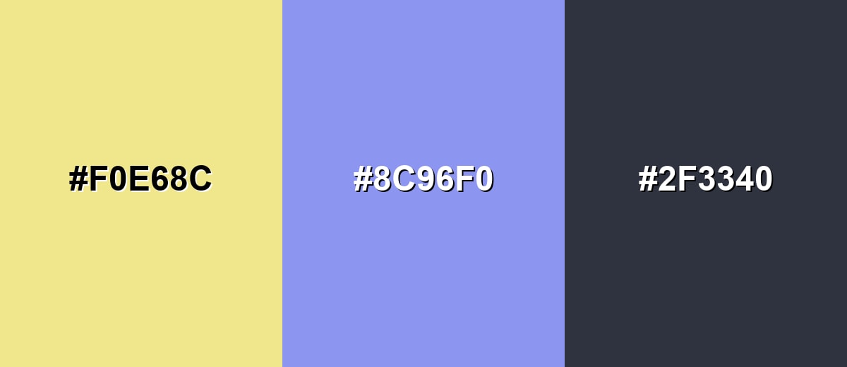
Complementary Palette Example: Combine Khaki with Soft Periwinkle and Charcoal for a balanced warm-cool look.
Analogous Color Schemes
Analogous colors sit adjacent to each other on the color wheel, creating harmonious, cohesive palettes with subtle variation.
Khaki with Warm Sand and Pale Olive keeps the palette sunlit and natural.
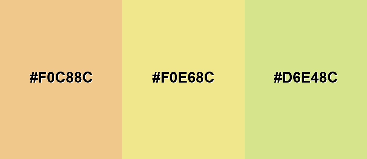
- Warm Sand: #F0C88C
- Khaki: #F0E68C
- Pale Olive: #D6E48C
Khaki with Golden Wheat and Mossy Olive feels earthy and slightly vintage.
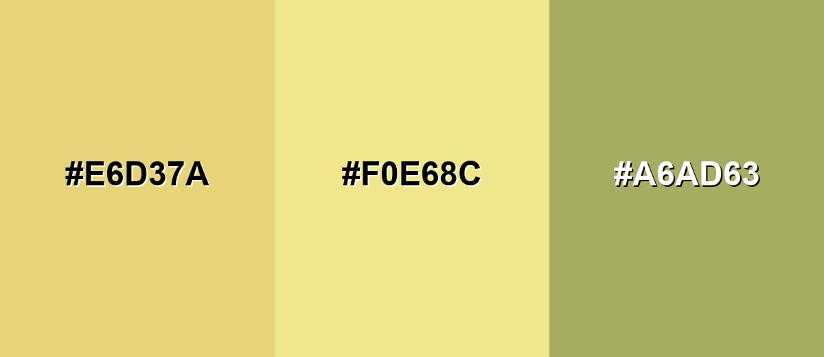
- Golden Wheat: #E6D37A
- Khaki: #F0E68C
- Mossy Olive: #A6AD63
Triadic & Tetradic Combinations
A triadic scheme uses three evenly spaced hues for variety while staying balanced.
Try Khaki with Light Aqua and Soft Orchid for a playful but controlled mix.
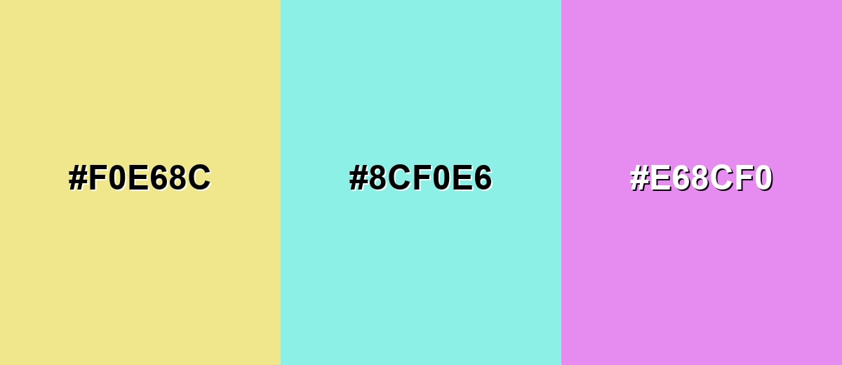
- Khaki: #F0E68C
- Light Aqua: #8CF0E6
- Soft Orchid: #E68CF0
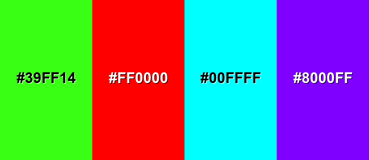
Colors to Avoid
While khaki color is remarkably versatile, certain combinations can create problematic visual effects:
- Neon Green (#39FF14) - The brightness overwhelms khaki and can make the palette feel unrefined and hard to look at.
- Pure Red (#FF0000) - This high-intensity pairing can look jarring and create a stop-sign effect that fights khaki's calm tone.
- Electric Cyan (#00FFFF) - The saturation is too sharp against khaki's muted warmth, often leading to a cheap or unbalanced look.
- Vivid Purple (#8000FF) - A strong purple can clash with khaki's yellow-green bias and make layouts feel noisy unless carefully muted.
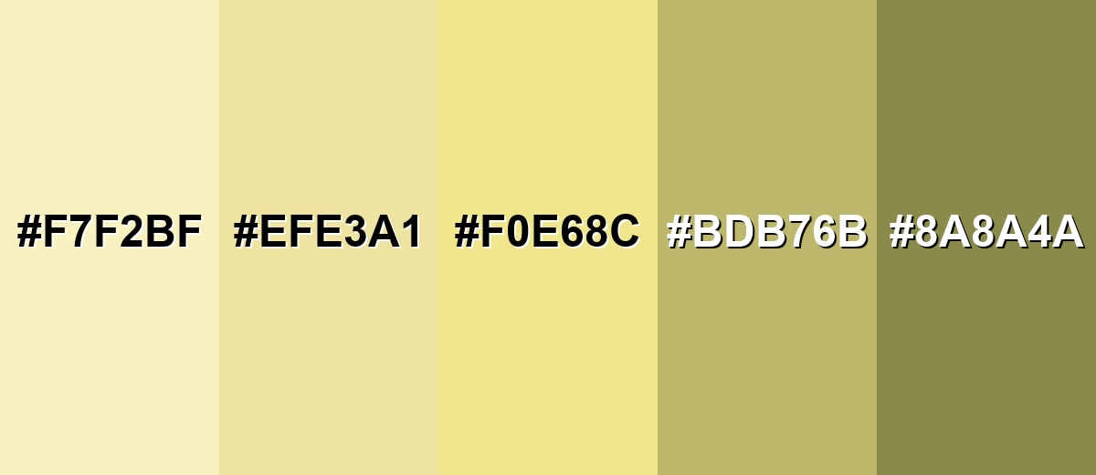
Shades, Tints & Variations of Khaki Color
Khaki isn't just one shade—it spans from creamy, near-neutral tints to deeper olive-leaning tones with more weight. Having a small khaki range makes it easier to build hierarchy in UI, create depth in branding, and keep interiors feeling warm without looking monotone.
- Pale Khaki (#F7F2BF) - A light, creamy tint that keeps the khaki character while feeling brighter and airier. It's best used for Soft page backgrounds, large sections, and minimal layouts that need warmth.
- Soft Khaki (#EFE3A1) - A gentle mid-light variation that looks slightly richer than standard khaki. It's best used for Cards, subtle highlights, and UI surfaces where pure white feels too stark.
- Classic Khaki (#F0E68C) - The familiar khaki most people recognize: muted, warm, and slightly green-leaning. It's best used for Base palettes, neutral branding, and supportive background blocks.
- Dark Khaki (#BDB76B) - A deeper, more olive-leaning shade with stronger visual weight. It's best used for Borders, headings, icons, and darker UI elements that still feel earthy.
- Olive Khaki (#8A8A4A) - A muted, green-brown shade that pushes khaki toward olive and feels more rugged. It's best used for Outdoor themes, utility branding, and contrast accents on light khaki backgrounds.
Industry Applications
Khaki appears across many industries because it reads as neutral, natural, and functional. It can support premium styling, practical messaging, or an outdoors theme depending on the surrounding palette and typography.
Fashion & Beauty
- Timeless Basics - Khaki feels classic and wearable, making it a reliable anchor for seasonal collections.
- Easy Pairing - It sits comfortably next to denim blues, crisp whites, and dark neutrals in lookbooks and product grids.
- Workwear Energy - The utilitarian association helps reinforce "durable" and "everyday" positioning.
- Clean Product Presentation - As a backdrop, khaki can keep pages warm and premium without overpowering the item.
Interior Design & Decor
- Warm Neutral Surfaces - Khaki is a solid option for large areas like walls, textiles, and repeated patterns.
- Airy With Off-Whites - Pairing it with off-white details keeps spaces bright while still feeling grounded.
- Depth With Dark Materials - Dark woods and matte black accents make khaki feel more intentional and modern.
- Catalog & Swatch Layouts - It works well in room-scene graphics and paint previews where calm readability matters.
Branding & Marketing
- Outdoor & Lifestyle Positioning - Khaki naturally supports themes like terrain, durability, and everyday readiness.
- Natural Product Messaging - Muted earth tones can suggest wholesome ingredients and a less processed feel in packaging systems.
- Approachable Digital Tools - Used sparingly, khaki softens SaaS interfaces for tags, dividers, and secondary navigation.
- Minimal Marks - It complements simple typography and understated logos because it already carries a distinct mood.
Conclusion
Khaki is an earthy, muted yellow-brown that brings a calm, dependable feel to modern design—whether you're building a UI, shaping a brand, or refining an interior palette. With #F0E68C as a clear reference point, it's easy to apply consistently, then expand into lighter tints or deeper olive-leaning shades for hierarchy. For the cleanest results, pair khaki with deep neutrals for readability, and add a controlled cool accent when you need sharper contrast. Used thoughtfully, khaki delivers warmth and function without stealing the spotlight.
Design Smarter with AI: Media.io is an online AI studio that empowers creators with advanced image generation and enhancement tools. From text-to-image and image-to-image creation to AI upscaling and color optimization, it enables fast, creative, and professional results—all in your browser.

Frequently Asked Questions About Khaki Color
Khaki is a muted yellow-brown with a subtle green undertone, often compared to dusty sand, dry grass, or light earth. It is usually used as a warm neutral in design and styling.
A commonly used web khaki is #f0e68c. Other khaki variations exist, such as darker olive-leaning shades used in fashion and interiors.
Khaki is often associated with practicality, durability, and a grounded, outdoorsy feeling. It can also suggest simplicity and a no-frills approach, especially in minimalist palettes.
Khaki sits between beige/tan and muted green. Compared with beige, it often looks slightly greener; compared with olive, it is usually lighter and more yellow.
Deep neutrals like charcoal, cool tones like soft periwinkle or muted blues, and natural companions like sand and pale olive tend to pair well. The best choice depends on whether you want a calm, earthy look or stronger contrast.
Dark neutrals such as charcoal typically provide clearer readability on standard khaki. For accessibility, avoid light text on classic khaki and use deeper khaki shades if you need a light-on-dark style.


