

Chestnut color is a warm reddish-brown that looks like polished chestnut shells, worn leather, or sunlit hardwood. A common reference point for this shade is #954535, which sits between red-brown and cocoa.
It's often perceived as grounded, reliable, and comforting with a mature, heritage feel. Below, you'll find practical codes, conversions, palette ideas, and real-world ways to use chestnut in modern design.
Chestnut Color: Codes & Values
Use these standard color values to match chestnut consistently across web, UI, and print work.
| Parameters | VALUE |
| HEX Code | #954535 |
| RGB DECIMAL | 149, 69, 53 |
| RGB PERCENTAGE | 58.43%, 27.06%, 20.78% |
| CMYK | 0%,54%,64%,42% |
| HSL | 10°, 48%, 40% |
| HSV (HSB) | 10°, 64%, 58% |
| Web Safe | #993333 |
Key Color Space Explanations:
- HEX - The HEX value #954535 is the standard way to specify chestnut for web design and digital assets.
- RGB - RGB (149, 69, 53) mixes strong red with moderate green and low blue to create a warm, earthy red-brown.
- CMYK - CMYK (0%,54%,64%,42%) is used for print workflows and helps keep the tone rich rather than washed out on paper.
- HSL - HSL (10°, 48%, 40%) describes a low-angle red hue with mid saturation and a medium-dark lightness for a grounded look.
- Web Safe - The closest web-safe match is #993333, helpful when you need a legacy-safe palette for older displays.
For most digital design, start with HEX (#954535) or RGB, then fine-tune with HSL/HSV when you need quicker control over brightness and saturation.
Chestnut Color Conversions
If you're moving between tools (Photoshop, Figma, print templates, or CSS), these conversions help you keep chestnut looking consistent.
| Parameters | VALUE | CSS |
| HEX | #954535 | #954535 |
| RGB DECIMAL | 149, 69, 53 | rgb(149,69,53) |
| RGB PERCENTAGE | 58.43%, 27.06%, 20.78% | rgb(58.43%,27.06%,20.78%) |
| CMYK | 0%,54%,64%,42% | cmyk(0%,54%,64%,42%) |
| HSL | 10°, 48%, 40% | hsl(10°,48%,40%) |
| HSV (or HSB) | 10°, 64%, 58% | -- |
| Web Safe | 993333 | #993333 |
| CIE-LAB | 39.5, 32.0, 25.6 | -- |
| XYZ | 15.14, 10.90, 4.67 | -- |
| xyY | 0.493, 0.355, 10.90 | -- |
| CIE-LCH | 39.5, 41.0, 38.7° | -- |
| CIE-LUV | 39.5, 59.8, 21.0 | -- |
| Hunter-Lab | 33.0, 26.6, 14.0 | -- |
| Binary | 10010101 01000101 00110101 | -- |
Want to generate Chestnut Color photos or posters? Try Media.io's AI Image Generator now!
Chestnut Color Meaning & Symbolism
Chestnut is commonly linked with warmth, steadiness, and a sense of craftsmanship. Because it resembles wood, earth, and leather, it often feels familiar and dependable in everyday life.
Psychological Effects
Chestnut is a steady, reassuring color that adds warmth without feeling flashy.
- Grounded - Chestnut tends to make a layout feel stable and "anchored," especially when used in headers or key UI accents.
- Comforting - Its warm red-brown undertone can soften a modern interface and make it feel more human and approachable.
- Premium - Chestnut often reads like natural materials (wood, leather), which can add a subtle quality signal in branding.
- Serious - Heavy use can feel formal or old-fashioned, so it's best balanced with lighter neutrals and whitespace.
- Visually Dense - In small sizes or low-contrast situations, chestnut may look muddy, so contrast testing matters.
Positive Associations
These are the "good vibes" chestnut typically brings to products, spaces, and visuals.
- Craftsmanship - Suggests hand-finished detail, care, and made-to-last quality.
- Reliability - Feels dependable and steady, making it useful for trust-led brand systems.
- Warmth - Adds inviting, cozy energy without the intensity of bright reds or oranges.
- Natural - Connects quickly to earth tones and organic textures like grain, stone, and leather.
- Timelessness - Leans classic rather than trendy, which helps designs age well.
Cultural Significance Across the World
Chestnut's symbolism varies, but it often circles back to nature, heritage, and practical strength.
- Nature - Often tied to wood, soil, and outdoor landscapes, making it feel familiar and grounded.
- Harvest Season - Commonly associated with autumn styling and warm, seasonal palettes.
- Honesty - Because it feels unpretentious and practical, it can suggest sincerity and straightforward value.
- Resilience - Its sturdy, earthy look can imply endurance and durability across many contexts.
Design Applications
Chestnut is versatile because it can act like a warm neutral while still carrying distinct character. It's ideal for adding depth, highlighting natural textures, or balancing cooler palettes.
Graphic Design Tips
- Use chestnut for headers, navigation, or badges when you want a grounded, premium tone without using pure black.
- Pair it with off-white backgrounds for strong readability and a softer feel than black-on-white.
- Balance chestnut with a cool counter-tone (like teal) to keep layouts from feeling too heavy.
- Keep body text in a high-contrast neutral; use chestnut for hierarchy (buttons, labels, section titles).
- Avoid stacking too many dark browns together—separation and spacing help chestnut stay clean.
Pro tip: If a design starts to feel "muddy," lighten the background and reserve #954535 for just one job—either the primary accent or the main heading color, not both.
Chestnut Color in Photography & Video
- Chestnut tones look especially rich in warm lighting—great for lifestyle shots, interiors, and food scenes.
- In shadows, chestnut can deepen quickly; lift midtones slightly to keep texture visible (wood grain, leather, hair).
- For product photography, add a light neutral surface nearby to maintain clear contrast and accurate color perception.
- In video grading, use chestnut as a "warm anchor" and introduce a cool accent in highlights for a modern look.
- When shooting on mobile, avoid over-saturation; chestnut can turn overly red if skin-tone warmth is pushed too far.
Recommended Tool for Image Enhancement: When incorporating chestnut color into your photography projects, Media.io's AI Image tools can help you achieve more refined results. With AI-powered color enhancement, photo colorization, image upscaling, and old photo restoration, you can easily enrich chestnut color tones, improve overall image quality, and highlight the color's elegant and sophisticated aesthetic.
Color Combinations
Chestnut pairs best with balanced neutrals, muted greens, and cool blue-greens that offset its warmth. The combinations below are reliable starting points for branding palettes, interiors, and UI themes.
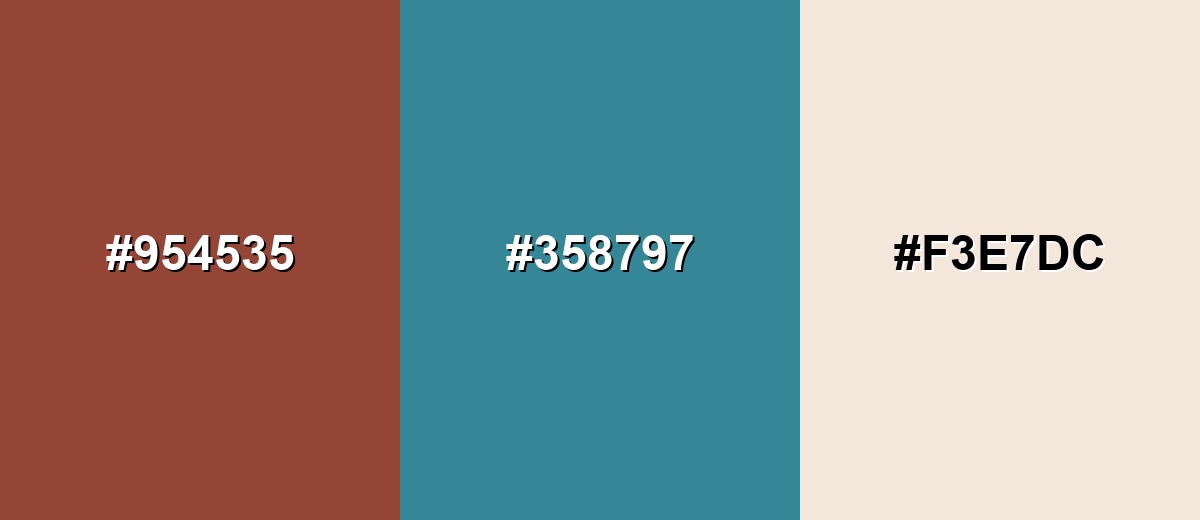
Complementary Colors
A blue-green complement creates clear contrast while keeping the palette sophisticated rather than loud.
Complementary Palette Example: Use Chestnut with Deep Teal and Warm Ivory for a grounded, modern look that still feels natural.
Analogous Color Schemes
Analogous colors sit adjacent to each other on the color wheel, creating harmonious, cohesive palettes with subtle variation.
A warm, related trio that moves from deep red-brown to golden brown for cozy, tonal layouts.
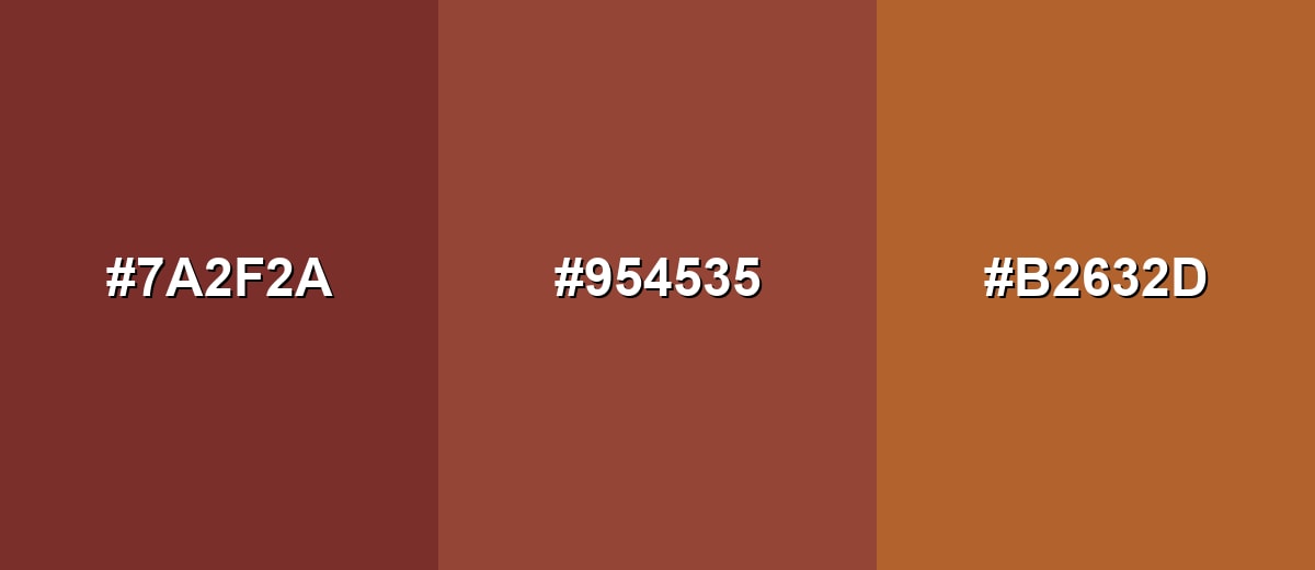
- Deep Brick: #7A2F2A
- Chestnut: #954535
- Golden Russet: #B2632D
An earthy scheme that leans more cocoa and copper, ideal for understated, material-led design.
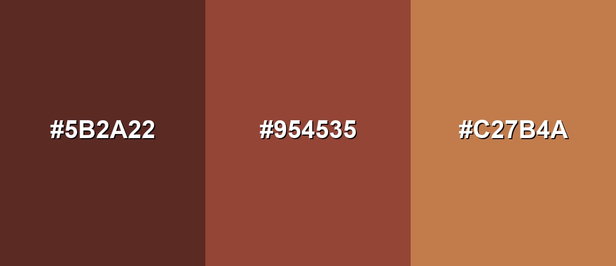
- Dark Cocoa: #5B2A22
- Chestnut: #954535
- Copper Tan: #C27B4A
Triadic & Tetradic Combinations
A triadic palette adds variety while staying controlled when the supporting tones are slightly muted.
Try Chestnut with Leaf Green and Royal Purple to create energetic contrast for illustrations, campaigns, or bold UI accents.
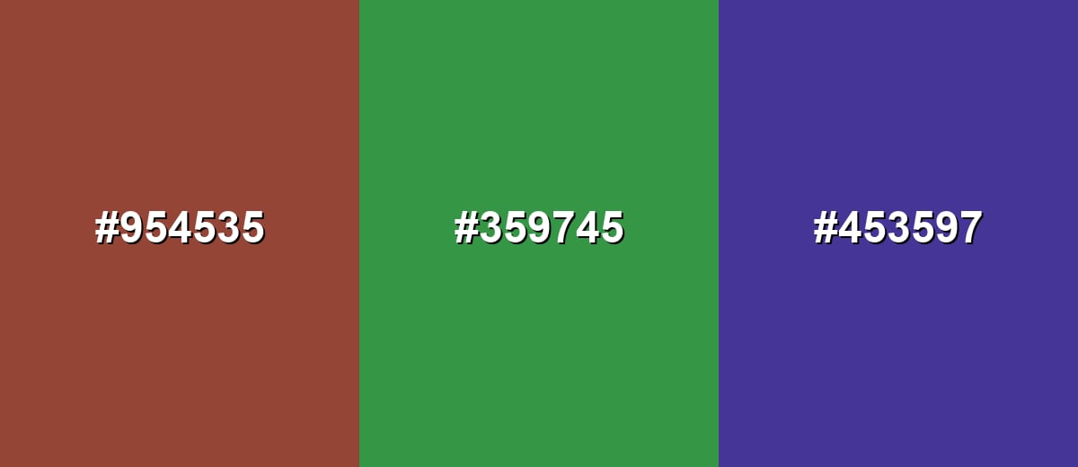
- Chestnut: #954535
- Leaf Green: #359745
- Royal Purple: #453597
Colors to Avoid
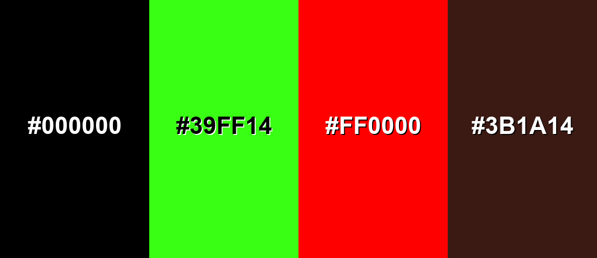
While chestnut color is remarkably versatile, certain combinations can create problematic visual effects:
- Pure Black (#000000) - Next to chestnut, pure black can make the palette feel heavy and reduce the warmth that gives the shade its character.
- Neon Green (#39FF14) - The high intensity creates a harsh clash and can make chestnut look dull or dirty by comparison.
- Vivid Red (#FF0000) - A fully saturated red competes with chestnut's red undertone, often resulting in a loud, uneven hierarchy.
- Dark Umber (#3B1A14) - Too close in value, it can flatten interfaces and muddy edges, especially in shadows or low-quality prints.
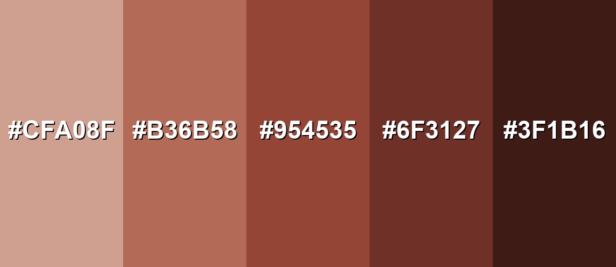
Shades, Tints & Variations of Chestnut Color
Chestnut isn't just one brown—its range includes airy tints, friendly mid-tones, and deep espresso-like shades. Having a few variations makes it easier to build hierarchy (backgrounds, surfaces, accents, and text) without losing that warm, natural identity.
- Pale Chestnut (#CFA08F) - A softened, airy tint that keeps the red-brown identity but feels lighter and more spacious. It's best used for Backgrounds, large surfaces, soft UI panels, and subtle gradients.
- Soft Chestnut (#B36B58) - A friendly mid-light version that reads warm and approachable without feeling too dark. It's best used for Cards, secondary sections, illustrations, and lifestyle branding accents.
- Classic Chestnut (#954535) - The balanced reference shade: warm, earthy, and strong enough to anchor a palette. It's best used for Primary accents, buttons, key UI elements, and brand identifiers.
- Deep Chestnut (#6F3127) - A darker, richer tone that brings more depth and a slightly more traditional feel. It's best used for Headings, borders, icons, and premium packaging details.
- Espresso Chestnut (#3F1B16) - A near-espresso shade with chestnut warmth, designed for strong contrast and mood. It's best used for High-contrast accents, dark-mode surfaces, and dramatic photography overlays.
Industry Applications
Because it sits comfortably in the natural-material range, chestnut fits many industries that rely on trust, craft, or warmth. It can be subtle and neutral-like, or bold when paired with cool tones.
Fashion & Beauty
- Use it in hair-tone visuals and color charts to communicate warm, believable brunettes.
- Works naturally for leather goods, footwear, and accessories where material cues matter.
- Fits fall collections and editorial palettes that lean cozy and heritage-inspired.
- Keep highlights warm and soft so chestnut doesn't read flat in product photos.
Interior Design & Decor
- Ideal for wood finishes, cabinetry accents, and furniture details that need warmth and depth.
- Use lighter chestnut tints on larger surfaces to avoid shrinking the feel of a room.
- Pairs well with cream and muted greens for calm, natural spaces.
- Great for textile touches (pillows, rugs) when you want a rustic-modern balance.
Branding & Marketing
- Strong fit for artisan goods and heritage branding where "made-to-last" is the message.
- Popular for coffee, chocolate, baked goods, and craft packaging—rich without being loud.
- Combine with a cool counterbalance like muted teal to keep campaigns feeling modern.
- Leave a clean off-white area for label text and product details to maintain clarity.
Conclusion
Chestnut (#954535) is a warm reddish-brown that feels natural, sturdy, and quietly expressive—perfect when you want something more human than black but more grounded than bright color. It shines in branding, UI accents, print, and interiors because it echoes familiar materials like wood and leather, and it pairs beautifully with light neutrals plus a cool counter-tone (especially teal) for clean contrast. If you want a palette that communicates craft, reliability, and timeless warmth, chestnut is an easy, practical choice.
Design Smarter with AI: Media.io is an online AI studio that empowers creators with advanced image generation and enhancement tools. From text-to-image and image-to-image creation to AI upscaling and color optimization, it enables fast, creative, and professional results—all in your browser.

Frequently Asked Questions About Chestnut Color
Chestnut is a warm reddish-brown inspired by chestnut shells and natural materials like wood and leather. It usually sits between brown and muted red, giving it a cozy, grounded look.
A widely used HEX reference for chestnut is #954535. Depending on the palette and lighting, you may also see lighter tints or deeper variations used in design.
For #954535, the RGB values are 149, 69, 53 and the CMYK values are 0%,54%,64%,42%. These are useful for matching chestnut across screens and print materials.
Chestnut pairs well with warm ivory, cream, and other soft neutrals, plus cool contrasts like teal or blue-green. Muted greens and deep purples can also work for more expressive palettes.
Chestnut is generally warm because of its red and orange undertones. It can appear deeper and more neutral in low light or when surrounded by cooler hues.
Use it for accents, buttons, or headings rather than small body text, and test contrast against the exact background you plan to use. Pairing it with off-white backgrounds and clear spacing helps it stay readable and refined.


