

Tangerine color is a bright, juicy orange that looks like the peel of a ripe tangerine—warm, vibrant, and slightly golden. A common digital reference for it is the hex code #f28500.
People often read it as cheerful, energetic, and friendly, which makes it stand out without feeling harsh. This guide covers its meaning, color codes, combinations, shades, and practical ways to use it in modern design.
Tangerine Color: Codes & Values
If you want tangerine to look consistent across screens and print, start with these core values and reuse them across your tools.
| Parameters | VALUE |
| HEX Code | #F28500 |
| RGB DECIMAL | 242, 133, 0 |
| RGB PERCENTAGE | 94.9%, 52.2%, 0% |
| CMYK | 0%,45%,100%,5% |
| HSL | 33°, 100%, 47% |
| HSV (HSB) | 33°, 100%, 95% |
| Web Safe | #FF9900 |
Key Color Space Explanations:
- HEX is the six-digit code used on the web and in design tools to specify this exact tangerine tone. Use #f28500 to keep the hue consistent across screens.
- RGB defines the light-based mix for displays using red, green, and blue values. It is the most common format for UI, video, and digital graphics.
- CMYK is used for print, describing how inks combine on paper. It helps you plan for how tangerine will reproduce in brochures, packaging, and posters.
- HSL describes hue, saturation, and lightness, which is handy for building matching tints and deeper shades. Designers often use it to create systematic palettes.
- Web Safe is the closest legacy web-safe approximation for consistent rendering on older systems. For tangerine, the nearest match is #ff9900.
Use HEX for web/UI specs, RGB for screen-based motion and graphics, CMYK for print, and HSL/HSV when you need quick tints and shades that stay on-brand.
Tangerine Color Conversions
Need tangerine in a different format? Here are the most common conversions you can copy into design tools, CSS, and print workflows.
| Parameters | VALUE | CSS |
| HEX | #f28500 | #f28500 |
| RGB DECIMAL | 242, 133, 0 | rgb(242,133,0) |
| RGB PERCENTAGE | 94.9%, 52.2%, 0% | rgb(94.9%,52.2%,0%) |
| CMYK | 0%,45%,100%,5% | cmyk(0%,45%,100%,5%) |
| HSL | 33°, 100%, 47% | hsl(33°,100%,47%) |
| HSV (or HSB) | 33°, 100%, 95% | -- |
| Web Safe | ff9900 | #ff9900 |
| CIE-LAB | 63.15, 33.80, 71.20 | -- |
| XYZ | 45.12, 33.62, 4.20 | -- |
| xyY | 0.55, 0.41, 33.62 | -- |
| CIE-LCH | 63.15, 78.70, 64.30 | -- |
| CIE-LUV | 63.15, 88.10, 61.40 | -- |
| Hunter-Lab | 58.00, 29.90, 54.20 | -- |
| Binary | 11110010 10000101 00000000 | -- |
Want to generate Tangerine Color photos or posters? Try Media.io's AI Image Generator now!
Tangerine Color Meaning & Symbolism
Tangerine is commonly associated with warmth, enthusiasm, and a welcoming sense of momentum. It sits between orange and yellow, so it often feels lively and optimistic while still grounded and practical. In everyday life, it reads as upbeat and attention-getting, making it a popular choice for highlights and friendly messages.
Psychological Effects
In visual design, tangerine is often used to wake up a layout and nudge attention in the right direction.
- Energetic - Adds motion and drive without feeling as intense as pure red.
- Approachable - Softens the tone of a page, making brands and messages feel friendlier.
- Attention-Grabbing - Naturally pulls the eye, which makes it effective for CTAs and labels.
- Playful - Can make a design feel more casual and social, especially in youth-oriented visuals.
- Overstimulating When Overused - In large blocks, it can feel loud on screens, so it works best as an accent.
Positive Associations
Because it's fruit-inspired and sunny, tangerine tends to signal "good vibes" in everyday visuals.
- Warmth - Brings a cozy, welcoming feel to both digital and print designs.
- Optimism - Leans slightly golden, which reads as bright, positive, and forward-looking.
- Freshness - Suggests citrus, zest, and lightness—great for upbeat packaging and campaigns.
- Friendliness - Feels inviting rather than strict, making messaging more approachable.
- Momentum - Communicates "go" energy for launches, promos, and product updates.
Cultural Significance Across the World
Meaning can shift by context, but tangerine is widely recognized as a warm, high-visibility orange with upbeat personality.
- Seasonal Harvest Vibes - Often tied to harvest themes and cheerful seasonal styling in many places.
- Fresh Food Cues - Commonly connected to fruit, flavor, and appetizing warmth in visual culture.
- Visibility & Safety - Shows up in settings where you need a bright, high-impact hue that's easy to spot.
- Playful Everyday Messaging - Frequently used for invitations, packaging, and callouts meant to feel positive.
Design Applications
Tangerine works best when you want a warm focal point that feels modern and optimistic. It's bold in small doses, and more versatile than it looks when you manage contrast and surrounding saturation.
Graphic Design Tips
- Use tangerine as an accent for CTAs, badges, and key UI states instead of making it the main background.
- Pair it with calm neutrals to keep layouts breathable and avoid visual fatigue.
- For strong, modern contrast, place it next to cool blues (especially in buttons and headers).
- Build a system of tints/shades for hover, pressed, and disabled states so the UI stays consistent.
- In print, run a proof when possible—bright oranges can shift depending on paper and color profile.
Pro tip: If your layout feels "too loud," keep the tangerine for one job (like actions or highlights) and let typography + spacing do the rest.
Tangerine Color in Photography & Video
- Use tangerine as a wardrobe or prop color to create a warm focal point against cooler backgrounds.
- In color grading, push oranges gently—over-saturation can turn skin tones too hot or unnatural.
- Try pairing tangerine highlights with teal/blue shadows for a crisp, cinematic contrast.
- For product shots, add soft off-white surfaces so the orange reads clean instead of muddy.
- In motion graphics, use tangerine for lower-thirds, badges, or transitions that need instant visibility.
Recommended Tool for Image Enhancement: When incorporating tangerine color into your photography projects, Media.io's AI Image tools can help you achieve more refined results. With AI-powered color enhancement, photo colorization, image upscaling, and old photo restoration, you can easily enrich tangerine color tones, improve overall image quality, and highlight the color's elegant and sophisticated aesthetic.
Color Combinations
Tangerine pairs well with both cool contrasts and warm neighbors. The palettes below offer practical options for branding, UI accents, illustration, and interiors, from high-energy mixes to calmer, more refined sets.
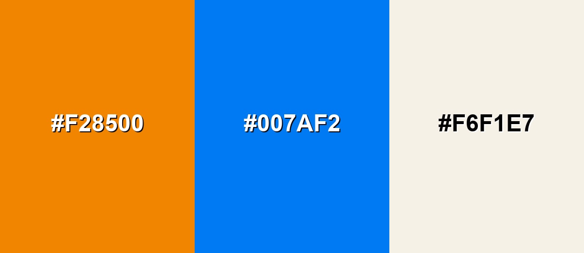
Complementary Colors
A complementary match adds maximum contrast by pairing tangerine with a blue opposite on the color wheel. This approach feels energetic and modern, especially for calls to action and focal points.
Complementary Palette Example: Try Tangerine with a vivid azure and a soft off-white to keep the contrast strong but readable.
Analogous Color Schemes
Analogous colors sit adjacent to each other on the color wheel, creating harmonious, cohesive palettes with subtle variation.
A warm analogous set that moves from amber through tangerine into a red-orange for a seamless, sunny gradient.
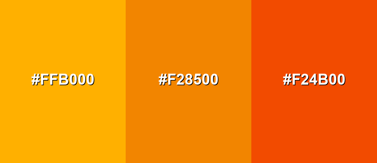
- Amber: #FFB000
- Tangerine: #F28500
- Vermilion: #F24B00
A softer neighboring palette with peach and a deeper orange-red for a friendly, approachable look.
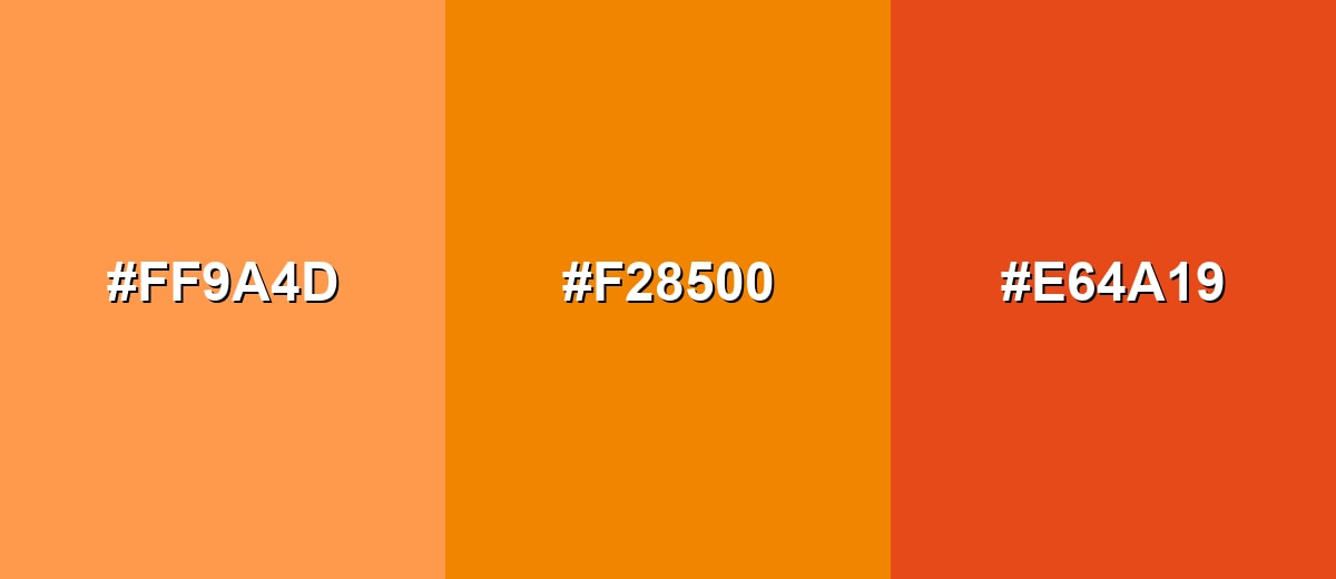
- Peach: #FF9A4D
- Tangerine: #F28500
- Burnt Orange Red: #E64A19
Triadic & Tetradic Combinations
A triadic palette balances tangerine with two evenly spaced hues for a lively, playful system.
Use Tangerine with jade green and electric violet to create strong separation between elements in graphics and UI.
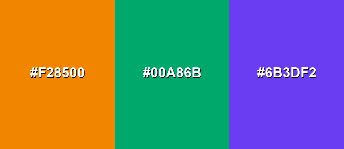
- Tangerine: #F28500
- Jade Green: #00A86B
- Electric Violet: #6B3DF2
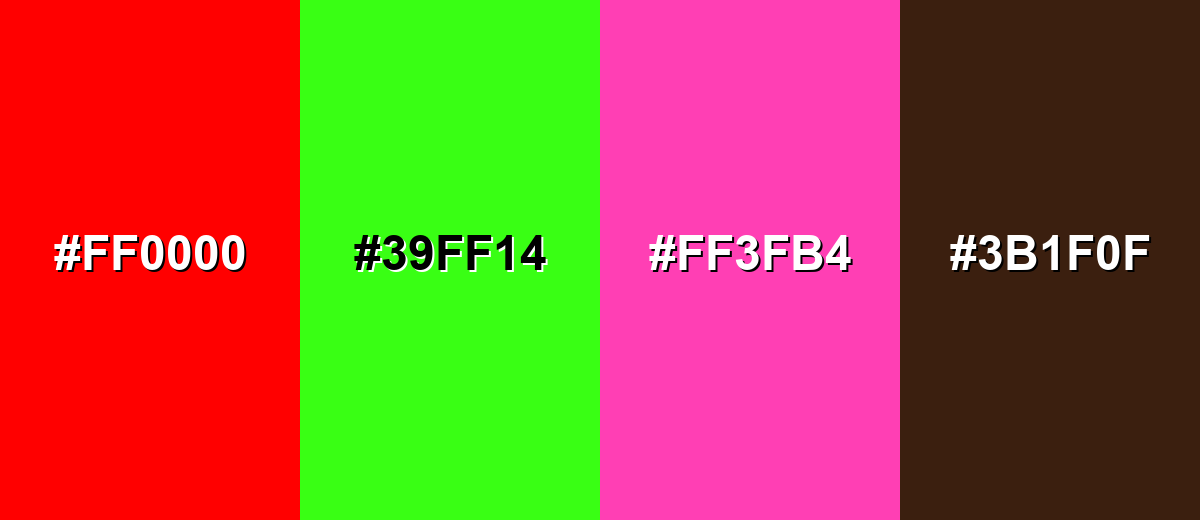
Colors to Avoid
While tangerine color is remarkably versatile, certain combinations can create problematic visual effects:
- Pure Red (#FF0000) - Both hues compete for attention at the same intensity, which can feel aggressive and reduce readability in UI and signage.
- Neon Green (#39FF14) - The pairing can look harsh and overly saturated, making designs feel noisy or unpolished.
- Hot Pink (#FF3FB4) - Together they can skew overly playful and chaotic, especially for large areas or branding that needs clarity.
- Deep Brown (#3B1F0F) - This combination can turn heavy and muddy, muting tangerine's brightness and reducing its fresh, lively feel.
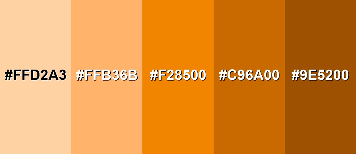
Shades, Tints & Variations of Tangerine Color
Tangerine isn't just one "orange"—it has a useful range from soft, creamy tints to deeper, grounded shades. These variations help you create hierarchy in UI, build smoother gradients, and keep the palette warm without overwhelming the design.
- Soft Apricot (#FFD2A3) - A light, creamy tint that keeps the warmth but feels gentle and airy. It's best used for Backgrounds, section panels, and soft gradients behind text..
- Light Tangerine (#FFB36B) - A brighter tint that reads friendly and sunny while staying less intense than the pure hue. It's best used for Hover states, highlights, and supportive accents in UI..
- Classic Tangerine (#F28500) - The vivid, fruit-like orange that balances brightness with a golden warmth. It's best used for Primary accents, badges, callouts, and brand highlights..
- Deep Tangerine (#C96A00) - A darker, richer version that feels more grounded and mature. It's best used for Headers, icons, and emphasis elements where you need less glare..
- Burnt Tangerine (#9E5200) - A warm, brown-leaning shade that adds depth and a more earthy tone. It's best used for Outlines, shadows, and autumnal palettes or rustic branding..
Industry Applications
Because it's warm, energetic, and easy to spot, tangerine fits naturally into visual systems that need quick impact. The key is balance—pair it with clean typography and calmer supporting colors so it stays readable and intentional.
Fashion & Beauty
- Use it for seasonal drops that lean sunny, citrusy, or summer-forward.
- Works as a punchy accent in lookbooks, labels, and social graphics.
- Pairs well with warm neutrals for a modern, wearable palette.
- Great for highlighting "new" or "limited" tags on beauty product pages.
Interior Design & Decor
- Ideal for accent walls, pillows, rugs, and décor pieces in neutral rooms.
- Looks grounded next to natural materials like light wood and stone-like finishes.
- Use in small, repeated touches to make the space feel intentional (not chaotic).
- Deep tangerine shades can add warmth in autumnal or rustic styling.
Branding & Marketing
- Perfect for promotional banners and limited-time callouts that need quick visibility.
- Strong choice for friendly, modern consumer brands that want warmth without harshness.
- In UI, use it for primary actions or highlights—sparingly—to guide attention.
- In packaging, it signals freshness and appetite appeal, especially for food and beverage.
Conclusion
Tangerine stands out as a vivid orange that feels warm, upbeat, and instantly noticeable. With its signature golden energy, #F28500 is a smart pick for accents in branding, UI, packaging, and creative content—especially when you want attention without the harshness of red. For the cleanest results, use it with high-contrast text, lean on tints and deeper shades for hierarchy, and pair it with cool blues for crisp contrast or nearby warm tones for smooth, sunny palettes.
Design Smarter with AI: Media.io is an online AI studio that empowers creators with advanced image generation and enhancement tools. From text-to-image and image-to-image creation to AI upscaling and color optimization, it enables fast, creative, and professional results—all in your browser.

Frequently Asked Questions About Tangerine Color
Tangerine is a bright, fruit-inspired orange with a warm, slightly golden look. A common reference value is #f28500.
It is primarily orange, but it leans a bit toward yellow compared with deeper oranges. That extra warmth is what gives it a sunny, lively feel.
Cool blues create strong contrast, while warm neighbors like amber and peach create smooth blends. Neutrals like soft off-white also help it look clean and modern.
A strong complementary direction is a vivid blue opposite on the wheel, such as #007af2. This pairing is popular for modern interfaces and bold brand palettes.
Use very dark text for readability in most cases, especially for body copy. For small UI elements, test contrast carefully and avoid mid-gray text that can look washed out.
The closest classic web-safe approximation to this tangerine is #ff9900. It is useful when you need a simple, widely supported fallback.


