

Spearmint color is a soft, minty green with a cool, watery hint that feels clean and lightly sweet, like fresh spearmint leaves.
A widely used digital reference for this shade is #A8E6CF—often read as refreshing, gentle, and modern. Below, you'll find its codes, conversions, pairing ideas, shades, and practical ways to use it in design.
Spearmint Color: Codes & Values
Here are the most-used spearmint color codes for digital design, UI work, and quick brand styling.
| Parameters | VALUE |
| HEX Code | #A8E6CF |
| RGB DECIMAL | 168, 230, 207 |
| RGB PERCENTAGE | 66%, 90%, 81% |
| CMYK | 27%,0%,10%,10% |
| HSL | 158°, 55%, 78% |
| HSV (HSB) | 158°, 27%, 90% |
| Web Safe | #99FFCC |
Key Color Space Explanations:
- HEX - HEX is the most common way to specify a screen-ready shade in web and app design. Use #a8e6cf in CSS and design tools to match this spearmint tone.
- RGB - RGB mixes red, green, and blue light for digital displays. Spearmint uses 168, 230, 207, which creates a light, cool green with a gentle blue lift.
- CMYK - CMYK is used for printing and represents ink percentages. The values 27%,0%,10%,10% are a starting point, but printed results can vary by paper and profile.
- HSL - HSL describes hue, saturation, and lightness, which helps when building palettes and tints. At 158°, 55%, 78%, spearmint sits in the green-cyan range with a soft, airy lightness.
- Web Safe - Web-safe values are older display-safe approximations made from a limited set of RGB steps. The closest web-safe match here is #99ffcc.
Use HEX or RGB for web/UI, lean on HSL for quick tint-and-shade adjustments, and treat CMYK as a proof-and-tweak starting point for print.
Spearmint Color Conversions
If you're matching spearmint across tools, these conversions make it easier to stay consistent from CSS to print prep.
| Parameters | VALUE | CSS |
| HEX | #a8e6cf | #a8e6cf |
| RGB DECIMAL | 168, 230, 207 | rgb(168,230,207) |
| RGB PERCENTAGE | 66%, 90%, 81% | rgb(66%,90%,81%) |
| CMYK | 27%,0%,10%,10% | cmyk(27%,0%,10%,10%) |
| HSL | 158°, 55%, 78% | hsl(158°,55%,78%) |
| HSV (or HSB) | 158°, 27%, 90% | -- |
| Web Safe | 99ffcc | #99ffcc |
| CIE-LAB | 86.9, -25.5, 5.2 | -- |
| XYZ | 55.8, 69.6, 69.4 | -- |
| xyY | 0.286, 0.357, 69.6 | -- |
| CIE-LCH | 86.9, 26.0, 168.5° | -- |
| CIE-LUV | 86.9, -30.6, 11.9 | -- |
| Hunter-Lab | 83.4, -22.9, 4.9 | -- |
| Binary | 10101000 11100110 11001111 | -- |
Want to generate Spearmint Color photos or posters? Try Media.io's AI Image Generator now!
Spearmint Color Meaning & Symbolism
Spearmint is commonly associated with freshness, clarity, and a gentle sense of renewal. Because it sits between green and cyan, it also carries a light, watery cleanliness that feels modern and approachable. In everyday life, this often translates into visuals that suggest wellness, neatness, and easy breathing room.
Psychological Effects
Spearmint tends to calm the eye while still feeling bright and "awake."
- Calm Focus - Helps layouts feel organized and less visually heavy, which is useful for dashboards and content-dense pages.
- Clean Atmosphere - Creates a sense of tidy space and clarity, especially when paired with strong typography.
- Gentle Reassurance - Reads as friendly and trustworthy, making it a safe choice for supportive UI states and brand accents.
- Fresh Energy - Adds a "breath of air" effect without the intensity of brighter greens.
- Cool Clinical Risk - In large blocks, it can feel chilly or sterile unless balanced with warmer neutrals or contrasting accents.
Positive Associations
In design, spearmint usually communicates soft modernity rather than loud trendiness.
- Freshness - Suggests crisp, newly refreshed visuals, like clean scent cues and herbal notes.
- Wellness - Commonly linked to self-care, routines, and a light "healthy" mood.
- Clarity - Supports a clear, breathable hierarchy when used for panels, tags, and highlights.
- Approachability - Feels human and gentle, helping brands soften their tone without looking childish.
- Modern Cleanliness - Sits in a contemporary green-cyan zone that looks sleek and updated on screens.
Cultural Significance Across the World
Meanings vary by context, but spearmint tends to stay in the "clean and refreshing" lane.
- Herbal & Garden Cues - Often tied to herbs, leaves, and fresh-picked ingredients in everyday visuals.
- Hygiene & Clean Scents - Frequently seen in personal care and "fresh" product categories, reinforcing neatness.
- Water & Airy Lightness - Its green-cyan position can read as watery and breathable, especially in minimalist design.
- Soft Modern Style - Common in contemporary branding where a calm, friendly tone matters more than tradition or formality.
Design Applications
Spearmint works best when you want a light, refreshing look that still feels professional. Start by deciding whether it's a background tone or a supporting accent, then build contrast and warmth around it.
Graphic Design Tips
- Use #A8E6CF as an accent color for callouts, badges, and section headers to keep pages feeling airy.
- Pair it with a darker anchor color for readability so your layouts don't drift into "too pastel" territory.
- Try it in soft gradients and overlays for clean, modern hero sections without heavy saturation.
- Keep spacing generous—spearmint looks best with whitespace and simple composition.
- In print projects, proof early; light mint shades can shift depending on paper whiteness and coating.
Pro tip: If spearmint is your main background, reserve deeper companion shades for headings, dividers, and CTAs so the design still has clear structure.
Spearmint Color in Photography & Video
- Use spearmint props or wardrobe for a fresh, clean vibe in lifestyle shoots and product demos.
- In color grading, a subtle lift in green-cyan tones can create a calm, "cool daylight" mood.
- For skincare, wellness, or SaaS videos, spearmint backgrounds help scenes feel neat and modern without distractions.
- Balance it with warmer skin tones and natural textures so visuals don't look overly clinical.
- When used as an overlay or lower-third, keep text and icons dark for reliable contrast.
Recommended Tool for Image Enhancement: When incorporating spearmint color into your photography projects, Media.io's AI Image tools can help you achieve more refined results. With AI-powered color enhancement, photo colorization, image upscaling, and old photo restoration, you can easily enrich spearmint color tones, improve overall image quality, and highlight the color's elegant and sophisticated aesthetic.
Color Combinations
Spearmint pairs easily because it is light and cool, but it looks best with a clear anchor and a deliberate accent. Use the palettes below to create balance, contrast, and a consistent mood across screens or print pieces.
Complementary Colors
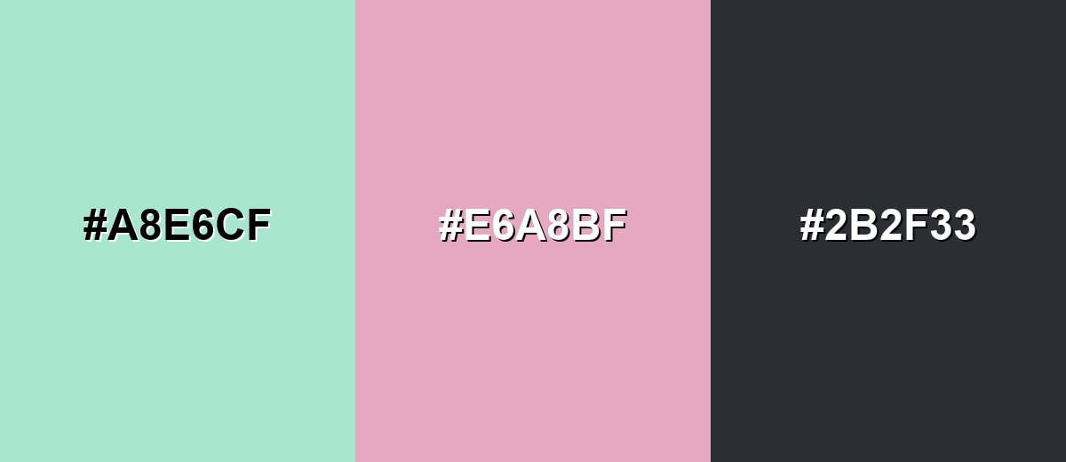
A complementary pairing places spearmint opposite a soft rose-magenta for lively contrast without harshness. This is a strong choice for modern branding, editorial graphics, and hero sections that need a focal point.
Complementary Palette Example: Try spearmint with a muted rose accent and a deep neutral for structure and readability.
Analogous Color Schemes
Analogous colors sit adjacent to each other on the color wheel, creating harmonious, cohesive palettes with subtle variation.
A soft green-to-aqua flow keeps the look cohesive and airy for calm layouts.
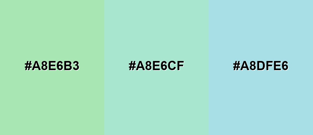
- Mint Leaf: #A8E6B3
- Spearmint: #A8E6CF
- Powder Cyan: #A8DFE6
A slightly warmer mint with a watery aqua variation adds depth without breaking the soothing feel.
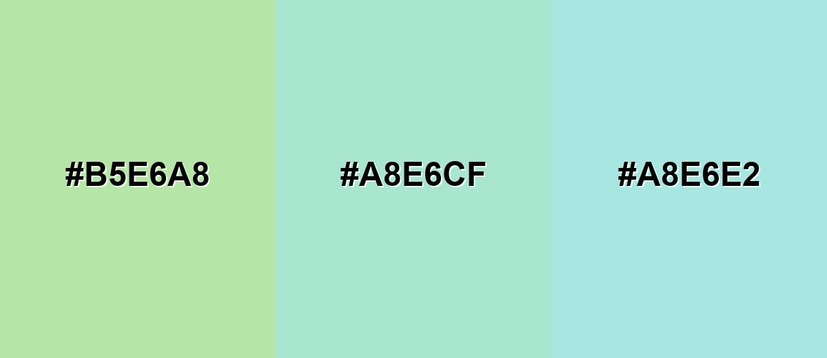
- Pale Lime Mint: #B5E6A8
- Spearmint: #A8E6CF
- Aqua Mist: #A8E6E2
Triadic & Tetradic Combinations
A triadic palette uses three evenly spaced hues for balance and energy.
Pair spearmint with a soft lavender and a warm sand tone for a friendly, contemporary mix.
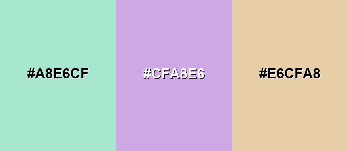
- Spearmint: #A8E6CF
- Soft Lavender: #CFA8E6
- Warm Sand: #E6CFA8
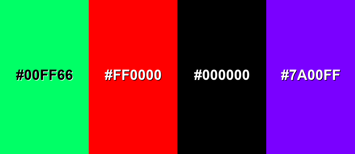
Colors to Avoid
While spearmint color is remarkably versatile, certain combinations can create problematic visual effects:
- Neon Green (#00FF66) - This is much louder and more saturated than spearmint, so the combo can look noisy and undermine the calm, clean feel.
- Pure Red (#FF0000) - The contrast is extremely sharp and can feel like an error state, which is risky for branding and general UI accents.
- Pure Black (#000000) - High contrast can work, but pure black often makes spearmint look overly pastel and can create a harsh, clinical vibe.
- Electric Purple (#7A00FF) - The intensity competes with spearmint and can make the palette feel unbalanced unless used very sparingly.
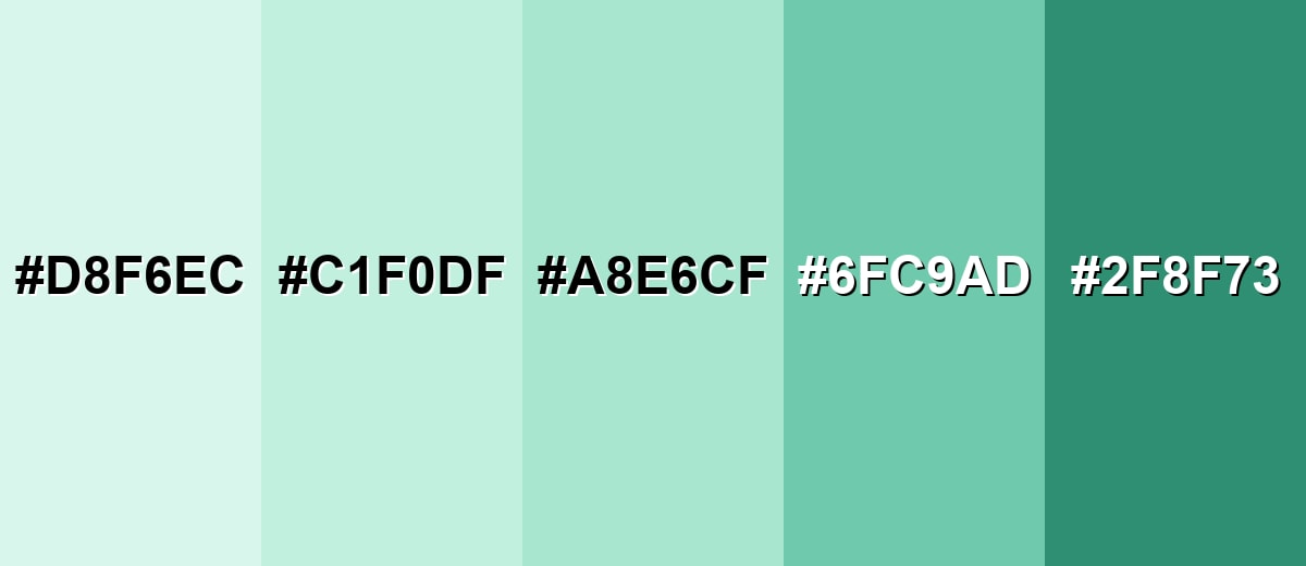
Shades, Tints & Variations of Spearmint Color
Spearmint isn't just one look—it can range from barely-there mint tints to deeper teal-leaning shades. Having a small, consistent range helps you build hierarchy (backgrounds, fills, buttons, and emphasis) without drifting away from the same fresh mood.
- Icy Spearmint (#D8F6EC) - A very light tint that keeps the mint freshness while feeling airy and minimal. It's best used for Page backgrounds, large panels, soft gradients, and subtle section breaks..
- Light Spearmint (#C1F0DF) - A gentle tint that reads clean and friendly without looking washed out. It's best used for Cards, badges, UI fills, and quiet highlight states..
- Classic Spearmint (#A8E6CF) - The balanced reference shade: fresh, cool, and modern with a soft presence. It's best used for Primary accent, brand support color, and calm feature areas..
- Deep Spearmint (#6FC9AD) - A stronger, more grounded version that adds weight while staying in the same family. It's best used for Buttons, charts, icon fills, and elements that need more separation..
- Dark Spearmint (#2F8F73) - A darker teal-leaning shade that offers higher contrast and a more serious tone. It's best used for Headings, outlines, navigation accents, and high-contrast UI components..
Industry Applications
Because it suggests freshness and ease, spearmint fits many industries that want a clean, human feel. The key is to match its softness with the right contrast and typography for your audience.
Fashion & Beauty
- Use spearmint accents on packaging to signal "fresh," "light," or "clean routine" benefits.
- Pair it with soft neutrals in lookbooks for an airy, modern editorial feel.
- Bring it into UI for beauty apps as gentle highlights, tags, and filter states.
- Balance with deeper tones for premium lines so it doesn't skew too sweet or pastel.
Interior Design & Decor
- Spearmint walls or cabinetry can make small rooms feel brighter and more open.
- It pairs well with warm natural textures (wood, rattan, linen) to avoid a cool, clinical vibe.
- Try it in bathrooms, kitchens, or reading nooks where a clean, calm atmosphere helps.
- Use deeper spearmint shades for accents (trim, décor, rugs) to add structure and contrast.
Branding & Marketing
- Great for wellness, lifestyle, and eco-adjacent branding that aims to feel approachable and modern.
- Works nicely on landing pages as section backgrounds, especially with dark, readable text colors.
- Helpful in SaaS and productivity marketing for reducing "busy" page feelings and improving perceived simplicity.
- In print campaigns, proof on your final paper stock—light mints can shift depending on coating and whiteness.
Conclusion
Spearmint is a soft mint-green that feels clean, modern, and easy on the eyes—perfect for airy backgrounds, gentle UI accents, and brands that want a calm, friendly voice. With a consistent base like #A8E6CF, plus a few deeper companion shades for contrast, you can keep layouts readable and polished without losing that fresh, light mood. Whether you're building a palette for web, print, or interiors, spearmint works best when it's balanced with a strong anchor color and used intentionally for hierarchy.
Design Smarter with AI: Media.io is an online AI studio that empowers creators with advanced image generation and enhancement tools. From text-to-image and image-to-image creation to AI upscaling and color optimization, it enables fast, creative, and professional results—all in your browser.

Frequently Asked Questions About Spearmint Color
Spearmint is a light, cool mint-green with a slight blue cast, similar to fresh spearmint leaves or mint-flavored packaging. A common digital reference is #a8e6cf.
It often sits between the two. Spearmint typically looks a bit cleaner and slightly more green than many seafoam tones, but still keeps a cool, watery feel.
It is usually read as fresh, clean, gentle, and modern. Spearmint color symbolism often supports themes like wellness, clarity, and lightness when used with balanced contrast.
Soft rose (#e6a8bf) creates pleasing contrast, charcoal (#2b2f33) adds structure, and gentle neighbors like #a8e6b3 or #a8dfe6 keep the palette calm and cohesive.
Spearmint is usually too light for body text on white backgrounds. It works better for fills, highlights, and accents, while darker tones like #2b2f33 or #2f8f73 are more reliable for readable text.
The closest web-safe approximation to #a8e6cf is #99ffcc. It is a bit brighter, so expect a slightly more vivid mint look.


