

 TL;DR:
Sage (#9CAF88) is a muted, gray-toned green that functions best as a versatile background neutral, requiring dark typography and warm neutral pairings to prevent the desaturated hue from appearing dull or washed out.
● Use HEX #9CAF88 for screens and CMYK (11%, 0%, 22%, 31%) for print, reserving darker variations like Deep Sage (#6F8261) or Dark Sage (#4C5C44) for UI buttons, borders, and text to ensure adequate visual contrast.
● Pair sage with muted tones like dusty violet or slate blue, and explicitly avoid high-chroma colors like neon green (#39FF14), hot magenta, or electric blue, which will clash harshly and make the soft sage look dirty or chaotic.
● If the color appears too flat or gray on digital displays, adjust it by slightly increasing the HSL saturation without altering the base hue, maintaining its dusty identity rather than shifting into heavier, yellow-leaning olive tones.
Ask AI for a summary
 ChatGPT
 Perplexity
 Gemini
 Claude
 Grok
Grok
Sage color is a muted green with a gentle gray cast, similar to dried sage leaves in natural light. A common reference for it is the hex code #9CAF88, which sits between soft green and cool neutral.
People often read sage as calm, grounded, and quietly fresh rather than loud or bright. Because it's a desaturated, pigment-like tone, it can shift warmer or cooler depending on lighting and nearby hues—so pairings and contrast matter.
Sage Color: Codes & Values
If you're matching sage across web, UI, and print, these are the most practical code values to start from.
| Parameters | VALUE |
| HEX Code | #9CAF88 |
| RGB DECIMAL | 156, 175, 136 |
| RGB PERCENTAGE | 61.18%, 68.63%, 53.33% |
| CMYK | 11%,0%,22%,31% |
| HSL | 89°, 20%, 61% |
| HSV (HSB) | 89°, 22%, 69% |
| Web Safe | #999999 |
Key Color Space Explanations:
- HEX - HEX is the most common code for screens and web design. Use #9caf88 to match a standard sage tone in CSS and design tools.
- RGB - RGB mixes red, green, and blue light to create the on-screen result. Sage here is made from a moderate amount of green, softened by red and blue.
- CMYK - CMYK is used for printing with cyan, magenta, yellow, and black inks. Converting sage to CMYK helps keep it consistent across print materials and packaging.
- HSL - HSL describes hue, saturation, and lightness, which is useful for adjusting a tone without changing its base identity. Sage typically keeps low saturation and mid lightness for a calm, dusty look.
- Web Safe - Web-safe values are older, limited screen-safe approximations. The closest web-safe match to this sage is #999999, which reads more neutral and less green.
Use HEX/RGB for digital layouts, CMYK when you're prepping print files, and HSL/HSV when you want to nudge sage lighter, darker, warmer, or cooler without losing its muted identity.
Sage Color Conversions
Need sage in a specific format for your toolchain? Here are the most common conversions in one place.
| Parameters | VALUE | CSS |
| HEX | #9caf88 | #9caf88 |
| RGB DECIMAL | 156, 175, 136 | rgb(156,175,136) |
| RGB PERCENTAGE | 61.18%, 68.63%, 53.33% | rgb(61.18%,68.63%,53.33%) |
| CMYK | 11%,0%,22%,31% | cmyk(11%,0%,22%,31%) |
| HSL | 89°, 20%, 61% | hsl(89°,20%,61%) |
| HSV | 89°, 22%, 69% | -- |
| Web Safe | 999999 | #999999 |
| CIE-LAB | 69.2, -12.8, 18.5 | -- |
| XYZ | 33.8, 40.3, 29.2 | -- |
| xyY | 0.319, 0.381, 40.3 | -- |
| CIE-LCH | 69.2, 22.5, 125.0° | -- |
| CIE-LUV | 69.2, -20.0, 24.0 | -- |
| Hunter-Lab | 63.5, -8.2, 10.7 | -- |
| Binary | 100111001010111110001000 | -- |
Want to generate Sage Color photos or posters? Try Media.io's AI Image Generator now!
Sage Color Meaning & Symbolism
Sage color is commonly associated with calm, balance, and a sense of natural ease. Because it's a softened green, it often feels restorative and tidy rather than energetic. In everyday life, sage works as a steady backdrop—present enough to read as green, but muted enough to behave like a neutral.
Psychological Effects
Its low saturation helps designs feel quieter and more breathable.
- Reduced Visual Noise - Sage tends to soften harsh layouts, making screens and rooms feel less busy.
- Calm, Slower Pace - It can make a space or interface feel more relaxed and organized.
- Clean, Healthy Vibe - Sage adds "fresh" energy without the intensity of bright greens.
- Neutral-Like Stability - Because it sits between green and gray, it often reads steady and dependable.
- Low-Contrast Risk - In some settings it can look dull, faded, or slightly cold if you don't add contrast.
Positive Associations
Sage's symbolism often comes from nature, home, and everyday simplicity.
- Calm - A gentle tone that supports rest, clarity, and an uncluttered feel.
- Balance - A middle-ground green that feels composed rather than loud.
- Natural Ease - The herbal, garden-inspired look suggests organic simplicity.
- Restoration - A restorative mood that fits wellness-adjacent visuals and soothing spaces.
- Approachability - Soft enough to feel friendly and livable in branding and interiors.
Cultural Significance Across the World
Meanings can shift, but sage often borrows symbolism from herbs, gardens, and renewal themes.
- Herbal Roots - Linked with plants and practical home use, giving it a familiar, grounded feel.
- Garden & Craft Cues - Often used to signal handmade, natural, or craft-forward styling.
- Renewal - Commonly connected with gentle "refresh" and reset themes in visual design.
- Soft Cleansing - Suggests light purification and tidy simplicity, especially with minimalist layouts.
Design Applications
Sage is easiest to use when you treat it like a quiet green-neutral. It supports other hues, softens harsh layouts, and brings a natural mood without demanding attention.
Graphic Design Tips
- Use sage as a background tint to make layouts feel calmer than pure gray.
- Pair it with warm, light neutrals for an airy look that still feels organic.
- Keep typography dark and confident—sage is soft, so your type shouldn't be.
- Introduce one deeper supporting tone to prevent the palette from feeling washed out.
- In brand systems, let sage play the "support" role and use a stronger accent for calls-to-action.
Pro tip: if sage starts reading too gray on screens, try slightly increasing saturation (without changing the hue) and double-check contrast at real device brightness.
Sage Color in Photography & Video
- Use sage as a wardrobe or prop color to add natural mood without stealing attention from skin tones.
- In product shots, sage backdrops work well for clean, minimalist setups with soft shadows.
- For editing, keep greens muted so the herbal look stays "dusty" instead of neon.
- Balance sage scenes with a warm highlight in lighting to avoid a cool, flat cast.
- When color grading, use deeper sage tones for contrast in details like foliage, ceramics, or textiles.
Recommended Tool for Image Enhancement: When incorporating sage color into your photography projects, Media.io's AI Image tools can help you achieve more refined results. With AI-powered color enhancement, photo colorization, image upscaling, and old photo restoration, you can easily enrich sage color tones, improve overall image quality, and highlight the color's elegant and sophisticated aesthetic.
Color Combinations
Because sage sits between green and gray, it pairs well with both warm neutrals and softened accent hues. The combinations below show reliable ways to build palettes for UI, interiors, and brand systems without making the overall look too busy.
Complementary Colors
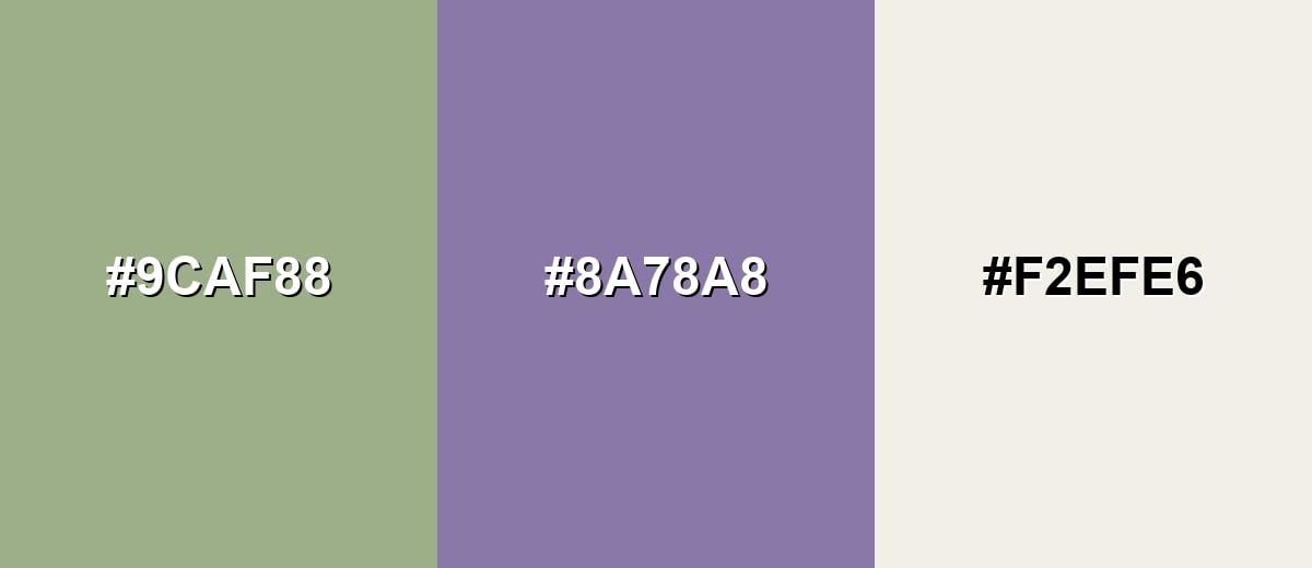
A complementary palette balances sage with a muted purple family accent. Keeping the complement dusty (instead of neon) makes the contrast feel refined rather than loud.
Complementary Palette Example: Use Sage as the base, add Dusty Violet for contrast, and finish with Warm Linen to keep the palette light and usable.
Analogous Color Schemes
Analogous colors sit adjacent to each other on the color wheel, creating harmonious, cohesive palettes with subtle variation.
Sage with Moss and Soft Celery for a garden-like, tonal blend.
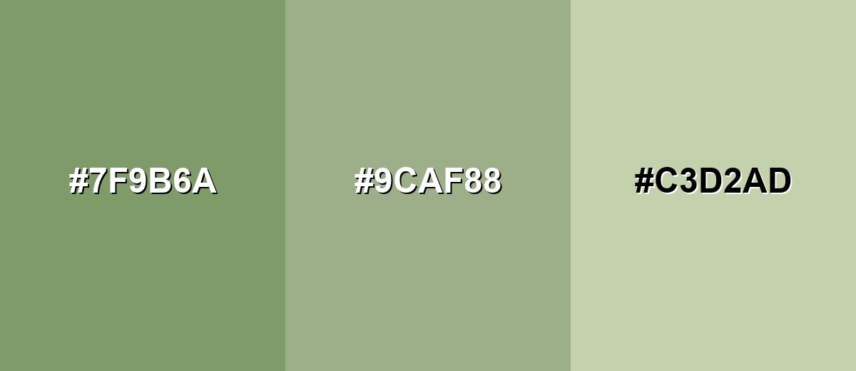
- Moss Green: #7F9B6A
- Sage: #9CAF88
- Soft Celery: #C3D2AD
Sage with Seafoam and Olive Gray for a cooler, modern natural palette.
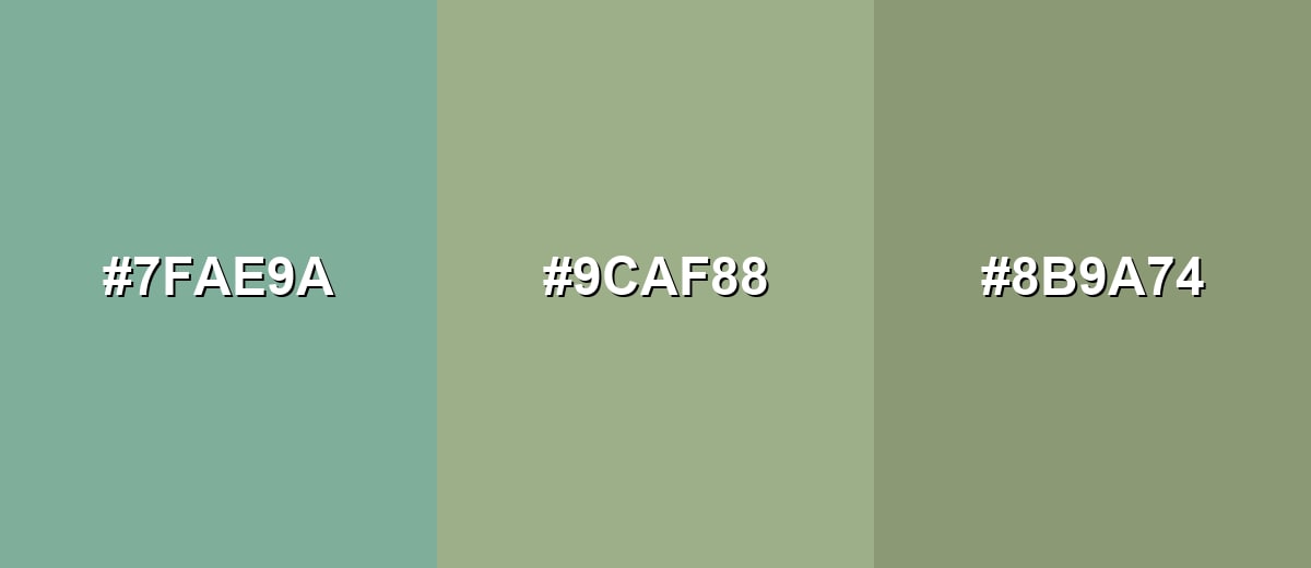
- Seafoam: #7FAE9A
- Sage: #9CAF88
- Olive Gray: #8B9A74
Triadic & Tetradic Combinations
A triadic scheme adds two accents that stay balanced around the wheel.
Try Sage with Slate Blue and Dusty Rose for a soft, editorial contrast that still feels calm.
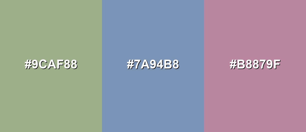
- Sage: #9CAF88
- Slate Blue: #7A94B8
- Dusty Rose: #B8879F
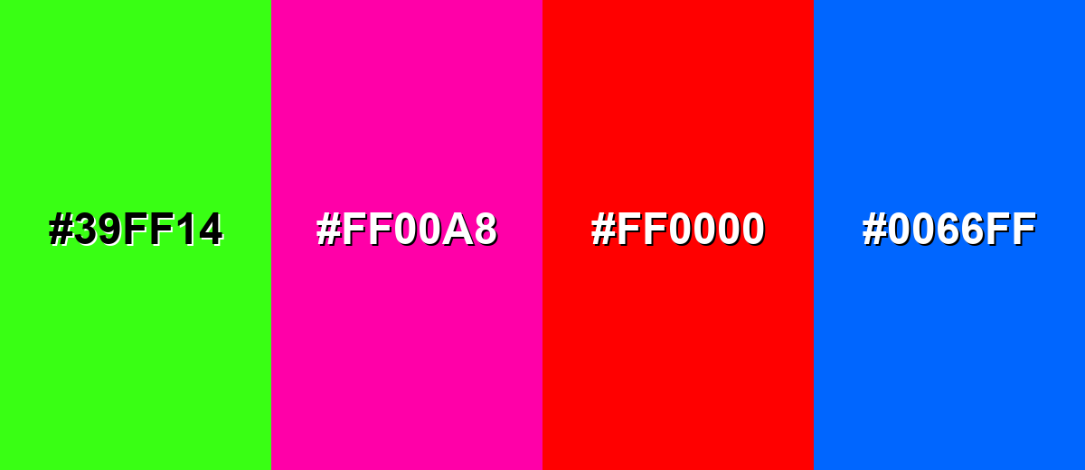
Colors to Avoid
While sage color is remarkably versatile, certain combinations can create problematic visual effects:
- Neon Green (#39FF14) - The saturation jump makes sage look dull and dirty by comparison, which can flatten the overall palette.
- Hot Magenta (#FF00A8) - This intense pink creates a harsh clash with sage's softness, often reading chaotic in UI and branding.
- Pure Red (#FF0000) - Strong red can overpower sage and push the combination into a holiday-like vibe unless carefully muted.
- Electric Blue (#0066FF) - The high-chroma blue feels modern and loud, which can fight sage's quiet, earthy character.
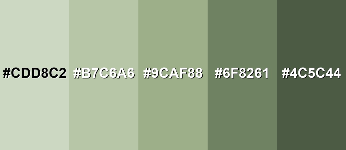
Shades, Tints & Variations of Sage Color
Sage has a surprisingly useful range—airy tints for big backgrounds, mid tones for calm surfaces, and deeper shades that hold up next to bold type and dark accents. Having a few sage variations ready makes it much easier to build consistent UI states, room palettes, or brand systems.
- Light Sage (#CDD8C2) - A pale, airy version that keeps the herbal feel while behaving almost like a neutral. It's best used for Large backgrounds, soft panels, and spacious interiors where you want calm without heaviness..
- Pale Sage (#B7C6A6) - A gentle mid-light tint that reads more clearly green than gray. It's best used for Cards, secondary sections, and textiles where you want subtle warmth and freshness..
- Classic Sage (#9CAF88) - The balanced reference tone: muted green with a gray undertone and comfortable softness. It's best used for Primary brand support tone, wall paint inspiration, and calm UI surfaces..
- Deep Sage (#6F8261) - A deeper, more grounded version that holds up better next to dark accents and strong typography. It's best used for Buttons, navigation, icon fills, and cabinetry where you need more visual weight..
- Dark Sage (#4C5C44) - A shadowed sage that leans earthy and mature, with a forest-like depth. It's best used for Text accents, borders, headers, and premium packaging where contrast and richness matter..
Industry Applications
Sage shows up across industries because it communicates restraint and natural confidence. It can feel modern or timeless depending on your typography, materials, and how much contrast you introduce.
Fashion & Beauty
- Personal care packaging accents paired with warm neutrals for a clean, grounded look.
- Background tones for beauty and wellness product pages where readability stays the priority.
- Capsule wardrobe color stories that pair easily with everyday staples.
- Lookbook layouts that feel calm and consistent from page to page.
Interior Design & Decor
- Paint inspiration for bedrooms, living spaces, and calmer work areas.
- Cabinetry and built-ins for a modern, understated finish.
- Decor palettes that feel soft and lived-in rather than stark.
- Catalog and lookbook styling that needs a natural, repeatable base color.
Branding & Marketing
- Dashboard surfaces and filters where you want a low-stress interface.
- Muted illustration systems that won't dominate charts, icons, or data visuals.
- Eco-forward labels and seasonal campaigns that avoid loud greens while staying natural.
- Minimalist packaging that feels steady, approachable, and craft-forward.
Conclusion
Sage color (#9CAF88) is a muted green-gray that's easy to live with: calm enough to act like a neutral, but still fresh enough to signal nature and balance. When you build with sage, the biggest win comes from smart contrast—pair it with warm, light neutrals for clarity, introduce a dusty accent for interest, and keep a deeper sage shade on hand for crisp UI details. Used thoughtfully, sage creates modern, breathable palettes that feel grounded across web design, interiors, branding, and everyday visual storytelling.
Design Smarter with AI: Media.io is an online AI studio that empowers creators with advanced image generation and enhancement tools. From text-to-image and image-to-image creation to AI upscaling and color optimization, it enables fast, creative, and professional results—all in your browser.

Frequently Asked Questions About Sage Color
Sage is a muted green with noticeable gray undertones, similar to the look of dried sage leaves. It sits between green and neutral, which makes it feel calm and versatile.
A widely used hex reference for sage is #9caf88. It's a soft, desaturated green that works well in both digital design and style palettes.
Sage pairs nicely with warm neutrals (linen, cream, beige), muted purples (dusty violet), soft blues (slate blue), and earthy accents (terracotta or brick). The best pairings keep saturation moderate so sage stays balanced.
Sage can read either way depending on the undertone and surrounding hues. Next to warm whites and wood tones it feels warmer, while next to cool grays and blues it can feel cooler and more modern.
Sage is typically lighter and grayer, with a softer, dusty finish. Olive usually looks deeper and yellower, with a more earthy and sometimes heavier feel.
Use sage mainly for backgrounds, panels, and large surfaces, then set text in a dark neutral (charcoal or near-black). For buttons or small UI elements, choose a deeper sage shade and always check contrast with your font size and weights.


