

Burnt orange is a rich, earthy orange that looks like orange peel deepened with a touch of brown, similar to baked clay or dried autumn leaves. A common reference for it is HEX #cc5500.
People often read it as warm, energetic, and grounded at the same time. Because it sits between orange and brown in pigment-like mixtures, it tends to feel more natural and less loud than brighter oranges—this guide covers its meaning, codes, combinations, shades, and practical uses.
Burnt Orange Color: Codes & Values
If you want burnt orange to look consistent across screens and print, start with these core color codes for the #CC5500 reference shade.
| Parameters | VALUE |
| HEX Code | #CC5500 |
| RGB DECIMAL | 204, 85, 0 |
| RGB PERCENTAGE | 80%, 33%, 0% |
| CMYK | 0%,58%,100%,20% |
| HSL | 25°, 100%, 40% |
| HSV (HSB) | 25°, 100%, 80% |
| Web Safe | #CC6600 |
Key Color Space Explanations:
- HEX - HEX is the most common way to specify burnt orange for web and UI work. Use #cc5500 to match this reference swatch consistently across screens.
- RGB - RGB describes how much red, green, and blue light make the tone on digital displays. Higher red with some green and no blue creates its warm, earthy look.
- CMYK - CMYK is used for printing and indicates how inks mix on paper. The high yellow with some magenta and black helps keep it warm while adding a muted, baked feel.
- HSL - HSL explains the hue family plus how vivid and how light it is. Burnt orange sits around 25° with full saturation and a mid-range lightness, which is why it feels bold but grounded.
- Web Safe - Web safe is a simplified palette used by older display constraints. The closest web-safe match to this shade is #cc6600.
Use HEX/RGB for web and product UI, switch to CMYK for print files, and lean on HSL/HSV when you're adjusting brightness or building consistent shade ramps.
Burnt Orange Color Conversions
Need burnt orange in different color models for design systems, printing, or color grading? Here are the most common conversions for #cc5500.
| Parameters | VALUE | CSS |
| HEX | #cc5500 | #cc5500 |
| RGB DECIMAL | 204, 85, 0 | rgb(204,85,0) |
| RGB PERCENTAGE | 80%, 33%, 0% | rgb(80%,33%,0%) |
| CMYK | 0%,58%,100%,20% | cmyk(0%,58%,100%,20%) |
| HSL | 25°, 100%, 40% | hsl(25°,100%,40%) |
| HSV (or HSB) | 25°, 100%, 80% | -- |
| Web Safe | cc6600 | #cc6600 |
| CIE-LAB | 51.1, 44.5, 60.8 | -- |
| XYZ | 28.19, 19.35, 2.25 | -- |
| xyY | 0.566, 0.389, 19.35 | -- |
| CIE-LCH | 51.1, 75.3, 53.8° | -- |
| CIE-LUV | 51.1, 99.0, 44.2 | -- |
| Hunter-Lab | 44.0, 41.0, 27.5 | -- |
| Binary | 11001100 01010101 00000000 | -- |
Want to generate Burnt Orange color photos or posters? Try Media.io's AI Image Generator now!
Burnt Orange Color Meaning & Symbolism
Burnt orange is widely associated with warmth, resilience, and down-to-earth confidence. It blends the friendliness of orange with the steadiness of brown, so it often feels welcoming rather than flashy. In everyday life, it shows up when people want energy that still feels natural and reliable—think cozy spaces, craft materials, and bold-but-approachable branding.
Psychological Effects
Because it reads as warm and slightly muted, burnt orange can shift attention and mood without shouting.
- Encouraging Energy - On screens and in visual layouts, burnt orange tends to feel active and encouraging.
- Clear Emphasis - It can help calls to action stand out, especially when paired with cool tones that create clear separation.
- Cozy Comfort - In interiors and product design, it can make spaces feel cozier and more lived-in.
- Material Warmth - It pairs well with natural textures (wood, leather, linen) because the hue already suggests warmth and depth.
- Visual Weight - If overused, it may feel heavy, dated, or overly seasonal, so it's often stronger as an accent with breathing room.
Positive Associations
When used thoughtfully, burnt orange brings personality while still feeling practical and approachable.
- Warmth - Feels welcoming and human, making designs seem friendly rather than cold.
- Resilience - Suggests toughness and endurance, like fired clay or weathered materials.
- Grounded Confidence - Reads bold but not flashy, helping brands feel sure of themselves without being loud.
- Creativity - Often linked to handmade and craft aesthetics, reinforcing an artsy, maker vibe.
- Approachability - Balances energy with stability, which can make messaging feel optimistic but reliable.
Cultural Significance Across the World
Across many contexts, burnt orange is tied to seasonal change, earthy materials, and warmth.
- Autumn & Harvest - Commonly associated with autumn-inspired palettes and harvest-time visuals.
- Clay & Pottery - Frequently linked to clay, ceramics, and a handmade, rustic feel.
- Firelight Warmth - Echoes the look of embers and warm light, adding a homelike atmosphere.
- Practical Energy - Often used to signal warmth, approachability, and creative energy without feeling luxurious or icy.
Design Applications
Burnt orange is easiest to use when you treat it as a strong accent and let neutrals or cool hues do the supporting work. Below are practical ways to apply it across UI, branding, and physical spaces without losing readability or balance.
Graphic Design Tips
- Use burnt orange for primary buttons, highlights, progress states, or promotional tags when you want a warm attention cue.
- Pair it with cool blues or teals to create crisp contrast and a more modern look.
- Keep body text in dark neutrals; reserve burnt orange for emphasis, headings, and hierarchy.
- In print, proof your colors—paper and ink can make burnt orange look brighter or smokier than expected.
- When using it as a background, leave plenty of whitespace and choose light text only if contrast testing passes.
Pro tip: if #CC5500 feels too intense in large areas, keep it for accents and build your base with soft neutrals—then bring burnt orange back for the moments you want users to notice first (buttons, labels, key callouts).
Burnt Orange Color in Photography & Video
- Lean into golden-hour lighting to naturally enhance burnt orange tones in skin, wood, and landscapes.
- Use wardrobe or props (ceramics, leather, textiles) to add controlled pops of burnt orange in a neutral scene.
- For product shots, pair burnt orange with cool blue backdrops to make the subject feel sharper and more premium.
- In color grading, watch saturation—burnt orange can clip or look muddy if shadows get too warm.
- For video overlays (lower-thirds, badges), keep burnt orange as an accent so it doesn't compete with faces or key footage.
Recommended Tool for Image Enhancement: When incorporating burnt orange color into your photography projects, Media.io's AI Image tools can help you achieve more refined results. With AI-powered color enhancement, photo colorization, image upscaling, and old photo restoration, you can easily enrich burnt orange color tones, improve overall image quality, and highlight the color's elegant and sophisticated aesthetic.
Color Combinations
Burnt orange pairs best with tones that either cool it down (blues/teals), support its earthiness (sands/browns), or add controlled contrast (greens/purples). These palettes give you reliable starting points for layouts, branding systems, and style guides.
Complementary Colors
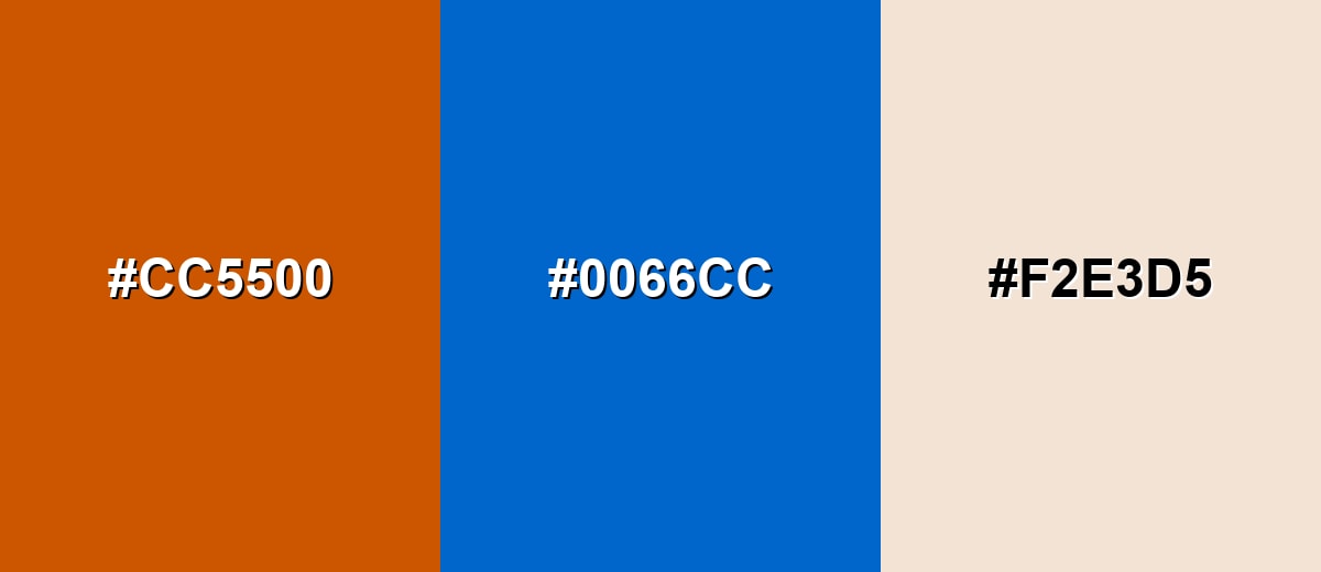
A complementary pairing uses the hue opposite on the color wheel, creating strong contrast and crisp separation. With burnt orange, blue-based partners can make CTAs, headers, and focal areas feel clearer and more modern.
Complementary Palette Example: Use Burnt Orange with Ocean Blue, then soften the look with a light sand neutral for breathing room.
Analogous Color Schemes
Analogous colors sit adjacent to each other on the color wheel, creating harmonious, cohesive palettes with subtle variation.
A warm analogous set that moves from Rust Red through Burnt Orange into Golden Ochre for a smooth, earthy gradient.
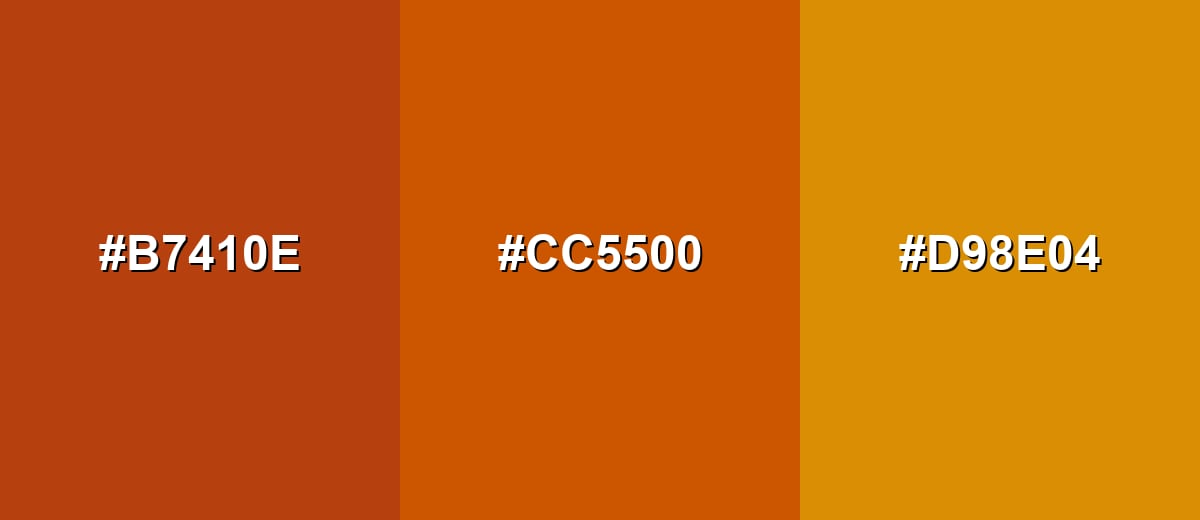
- Rust Red: #B7410E
- Burnt Orange: #CC5500
- Golden Ochre: #D98E04
A deeper, clay-like analogous option using Terracotta and Warm Umber to make the palette feel grounded and natural.
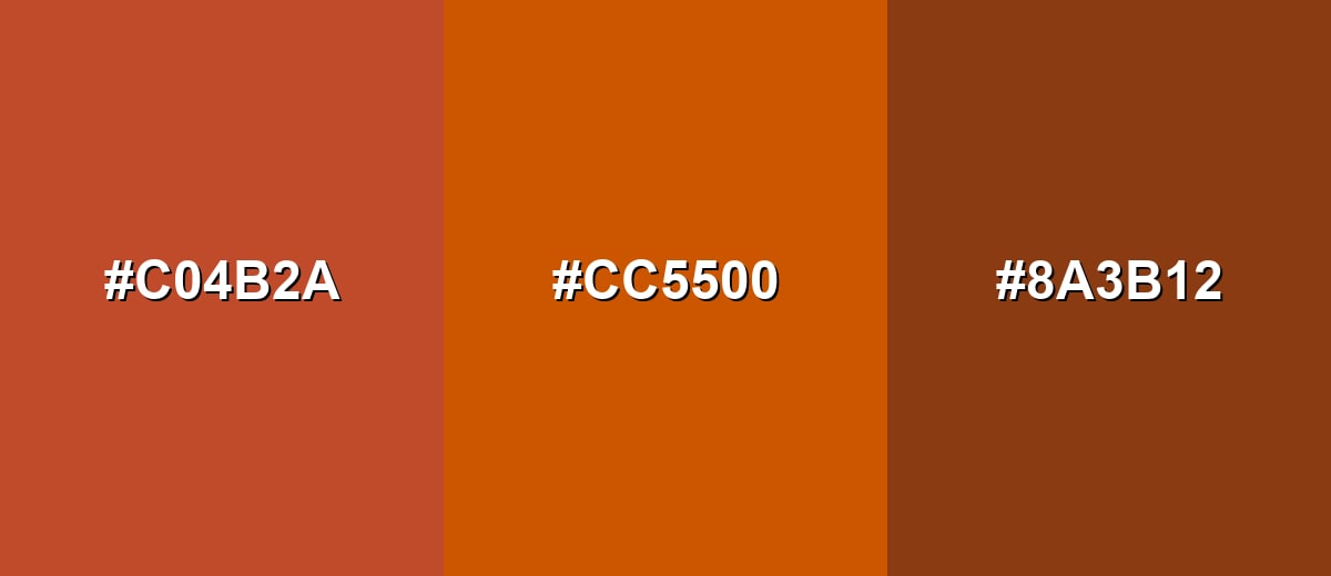
- Terracotta: #C04B2A
- Burnt Orange: #CC5500
- Warm Umber: #8A3B12
Triadic & Tetradic Combinations
A triadic scheme picks three evenly spaced hues for variety while staying balanced.
Combine Burnt Orange with Jade Green and Royal Purple for a lively palette that still feels intentional when one shade leads and the others support.
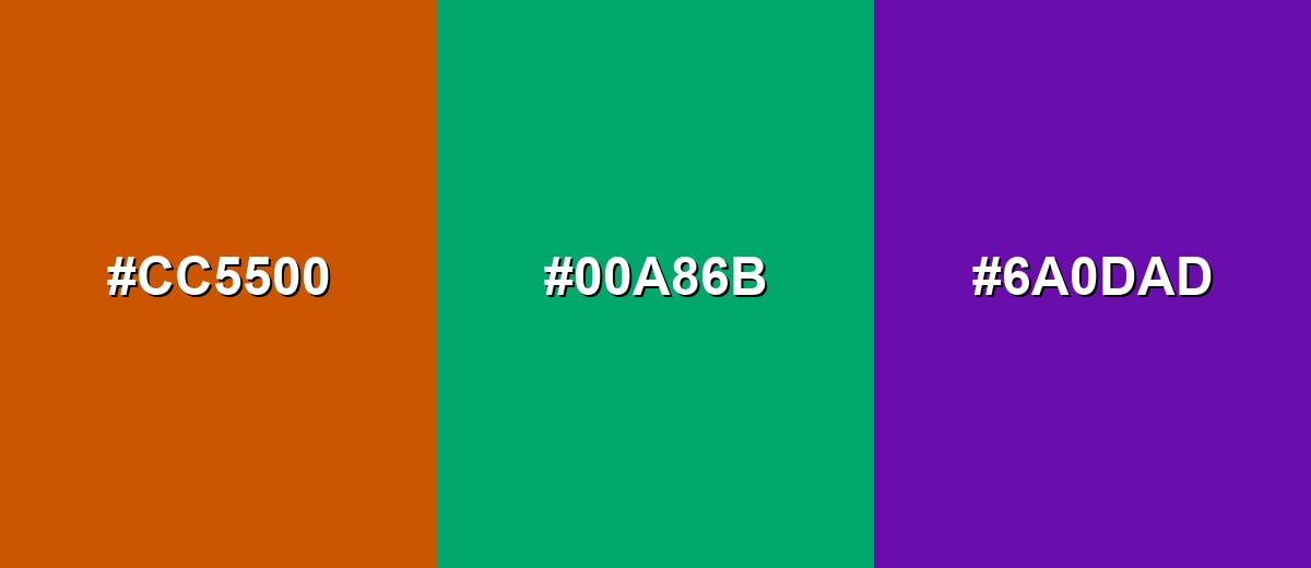
- Burnt Orange: #CC5500
- Jade Green: #00A86B
- Royal Purple: #6A0DAD
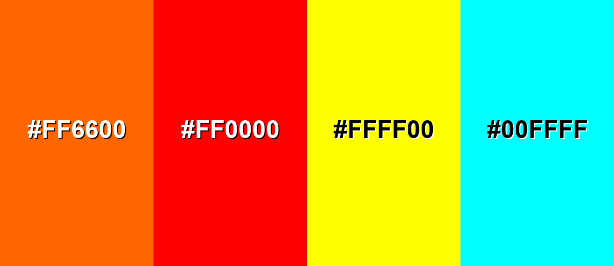
Colors to Avoid
While burnt orange color is remarkably versatile, certain combinations can create problematic visual effects:
- Neon Orange (#FF6600) - Too close in hue but much brighter, which can make burnt orange look dull or muddy by comparison.
- Pure Red (#FF0000) - Creates a loud, high-tension pairing that can feel aggressive and distract from content.
- Bright Yellow (#FFFF00) - Strong vibration and glare in many contexts; can reduce legibility and make layouts feel harsh.
- Electric Cyan (#00FFFF) - Extremely saturated contrast that can look unbalanced and overly digital next to an earthy orange-brown.
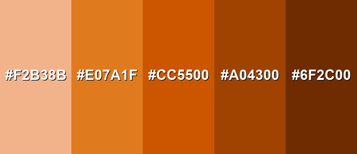
Shades, Tints & Variations of Burnt Orange Color
Burnt orange isn't just one look—it spans from soft, creamy tints to deep, smoky browns. Having a small range of related shades makes it easier to build UI states, brand systems, and backgrounds that feel consistent without looking flat.
- Soft Apricot (#F2B38B) - A lighter, creamy version that keeps the warmth while feeling more airy and friendly. It's best used for Backgrounds, large sections, subtle highlights, and packaging that needs a softer touch..
- Warm Amber (#E07A1F) - A brighter, more golden take that looks sunlit and energetic without going neon. It's best used for Buttons, icons, badges, and illustration accents where you want clear emphasis..
- Burnt Orange (#CC5500) - The core reference shade: deep orange with a brown undertone that feels bold yet grounded. It's best used for Hero accents, brand highlights, callouts, and key UI elements when used with good contrast.
- Deep Rust (#A04300) - A darker, more muted version that leans earthy and slightly smoky. It's best used for Headings, dividers, shadows, and premium packaging where you want warmth with weight..
- Dark Sienna (#6F2C00) - A very deep brown-orange that reads almost like warm brown in low light. It's best used for Text on light backgrounds, outlines, and grounding elements in rustic or natural palettes.
Industry Applications
Because it balances warmth and earthiness, burnt orange fits many visual systems—from digital interfaces to physical products—especially when a brand wants to feel energetic but trustworthy.
Fashion & Beauty
- Works well as an accent color in fall-to-winter collections without feeling too neon or playful.
- Pairs naturally with warm neutrals (tan, cream) for a cozy, wearable palette.
- Shows up strongly in accessories like bags, belts, and shoes where earthy tones feel premium.
- In beauty visuals, it adds warmth to campaign backgrounds and can complement golden lighting.
Interior Design & Decor
- Great for accent walls, textiles, ceramics, or statement furniture to add warmth without shrinking the room.
- Looks especially natural next to wood tones, leather, linen, and matte finishes.
- Balances nicely with light neutrals to keep spaces bright and breathable.
- Can be used in small doses (pillows, vases, art) to create an inviting focal point.
Branding & Marketing
- Ideal for outdoor, craft, food, and lifestyle brands that want energy with a grounded feel.
- Stays "seasonless" when anchored by off-whites and cooled down with deep blues.
- Works as a signature accent in logos, packaging details, and campaign graphics.
- In digital marketing, it's effective for badges and CTAs—just keep contrast and spacing in check.
Conclusion
Burnt orange brings together warmth and earthiness in a way that feels bold, friendly, and dependable—especially when you treat it as an accent rather than a wall-to-wall fill. With a consistent reference like HEX #CC5500, plus the right supporting partners (cool blues for contrast, sands and browns for balance), you can build palettes that read clearly in UI, branding, print, and even photo/video work. Keep contrast and hierarchy in mind, explore the shade range for depth, and burnt orange will add personality without overpowering your message.
Design Smarter with AI: Media.io is an online AI studio that empowers creators with advanced image generation and enhancement tools. From text-to-image and image-to-image creation to AI upscaling and color optimization, it enables fast, creative, and professional results—all in your browser.

Frequently Asked Questions About Burnt Orange Color
Burnt orange is a deep orange with a brown undertone, similar to baked clay or a toasted orange peel. It feels warmer and more grounded than bright orange.
A common HEX reference for burnt orange is #cc5500. Depending on the palette and medium, nearby variations may also be called burnt orange.
RGB is 204, 85, 0 and CMYK is 0%,58%,100%,20%. RGB is best for screens, while CMYK is used for print production.
Cool blues and teals create strong contrast, while sand-like neutrals and warm browns support an earthy look. Greens and purples can also work well in controlled triadic palettes.
Yes, it can work well as a CTA accent because it feels warm and attention-grabbing. Make sure the text contrast is strong and do not rely on it alone to communicate status.
Bright orange is more vivid and playful, while burnt orange is muted and earthier. Rust typically shifts darker and redder, resembling oxidized metal, whereas burnt orange stays more clearly orange-brown.


