

Bright orange color is a vivid, punchy orange that looks like a fresh citrus peel or a glowing sunset highlight. Its HEX code is #FF7A00, giving it a warm, highly saturated look that stands out quickly on screens and in print.
People often perceive it as energetic, friendly, and attention-grabbing, though it can feel intense when overused. This guide covers meaning, codes, combinations, shades, and practical ways to use bright orange.
Bright Orange Color: Codes & Values
Use these standard values to match bright orange accurately across web, UI, and print workflows.
| Parameters | VALUE |
| HEX Code | #FF7A00 |
| RGB DECIMAL | 255, 122, 0 |
| RGB PERCENTAGE | 100%, 47.8%, 0% |
| CMYK | 0%,52%,100%,0% |
| HSL | 29°, 100%, 50% |
| HSV (HSB) | 29°, 100%, 100% |
| Web Safe | #FF6600 |
Key Color Space Explanations:
- HEX - HEX is the most common code used in web and UI design. Use #ff7a00 to reproduce bright orange consistently in digital layouts.
- RGB - RGB defines how much red, green, and blue light your screen emits. Bright orange uses high red, mid green, and no blue for a strong warm glow.
- CMYK - CMYK is used for print, mixing cyan, magenta, yellow, and black inks. This orange typically relies on heavy yellow with a solid magenta component.
- HSL - HSL describes hue, saturation, and lightness in a way that is easy to adjust for themes. Keeping the hue near 29° preserves the orange identity while you tune lightness for backgrounds or accents.
- Web Safe - Web Safe is the closest legacy-safe approximation from the 216-color palette. For this shade, the nearest match is #ff6600.
For consistent results, set #FF7A00 as your base token, then build tints/shades for states (hover, pressed, backgrounds) while keeping contrast checks in place.
Bright Orange Color Conversions
This conversion table helps you switch between common color models without guessing, whether you're designing for screens, print, or color-managed workflows.
| Parameters | VALUE | CSS |
| HEX | #FF7A00 | #ff7a00 |
| RGB DECIMAL | 255, 122, 0 | rgb(255,122,0) |
| RGB PERCENTAGE | 100%, 47.8%, 0% | rgb(100%,47.8%,0%) |
| CMYK | 0%,52%,100%,0% | cmyk(0%,52%,100%,0%) |
| HSL | 29°, 100%, 50% | hsl(29°, 100%, 50%) |
| HSV (or HSB) | 29°, 100%, 100% | -- |
| Web Safe | FF6600 | #ff6600 |
| CIE-LAB | 65.8, 46.5, 73.0 | -- |
| XYZ | 48.2, 35.1, 4.2 | -- |
| xyY | 0.550, 0.401, 35.1 | -- |
| CIE-LCH | 65.8, 86.6, 57.6° | -- |
| CIE-LUV | 65.8, 111.2, 59.4 | -- |
| Hunter-Lab | 59.3, 46.0, 36.9 | -- |
| Binary | 11111111 01111010 00000000 | -- |
Want to generate bright orange color photos or posters? Try Media.io's AI Image Generator now!
Bright Orange Meaning & Symbolism
Bright orange commonly represents enthusiasm, warmth, and momentum. In everyday life, it is often used to draw attention quickly, from interface highlights to safety and activity cues. This is why bright orange color meaning is closely tied to visibility and upbeat energy.
Psychological Effects
These are the most common ways bright orange tends to "feel" in design and everyday viewing.
- Lively - Bright orange tends to feel lively and encouraging.
- Encouraging - It can make messages seem more approachable than pure red.
- Urgent - It still feels urgent enough for calls-to-action and alerts.
- Friendly - In branding and UI, it often reads as friendly and modern, especially when paired with clean neutrals or deep blues.
- Intense - Used too heavily, it can feel loud, impatient, or visually tiring, particularly on large backgrounds or high-contrast patterns.
Positive Associations
When used with balance, bright orange is usually read as upbeat and motivating.
- Enthusiasm - Bright orange commonly represents enthusiasm.
- Warmth - Its strong warmth gives layouts a welcoming, sunlit feel.
- Momentum - Bright orange is closely tied to momentum, making it useful for action-focused moments.
- Visibility - It is often used to draw attention quickly, which helps with scanability and hierarchy.
- Approachability - It can make messages seem more approachable than pure red while staying energetic.
Cultural Significance Across the World
Like most colors, the meaning shifts with context, but a few themes show up often.
- Harvest - Orange is frequently associated with harvest.
- Celebration - It is also linked to warmth and celebration in many places.
- Caution - Because it is highly noticeable, it is widely linked to caution in public signage and equipment.
- Visibility - Its strong visibility makes it a practical choice for quick recognition under varied conditions.
Design Applications
Bright orange works best when you want instant focus without the heaviness that red can bring. The key is to treat it as a high-impact accent and let surrounding tones support readability and balance.
Graphic Design Tips
- Calls-To-Action - Use it for primary or secondary call-to-action buttons when you need instant focus.
- Quick Scanning - Apply it to badges, highlights, and notifications that need quick scanning.
- Brand Accents - Use it for brand accents when you want energetic, friendly positioning.
- Illustrations - Add it to illustrations and icons where warmth and motion matter.
- Hierarchy - Reserve it for one primary action per view to avoid competing CTAs.
For a cleaner layout, keep bright orange as an accent, add breathing room around it, and balance the page with clean neutrals or deep blues so the hierarchy stays obvious.
Bright Orange in Photography & Video
- Highlight Moments - Use it like a "glowing sunset highlight" tone to draw the eye to key elements.
- Accent-First - Treat it as a high-impact accent instead of a full-frame background to keep visuals comfortable.
- Contrast Control - Pair it with deep navy or charcoal-style darks (as a look) for crisp contrast and a modern feel.
- Readability - Avoid using it for long body text overlays; it's better for tags, buttons, and small emphasis areas.
- Color Accuracy - For print outputs from photo/video designs, request proofs when accuracy matters since oranges can shift with paper warmth and ink limits.
Recommended Tool for Image Enhancement: When incorporating bright orange into your photography projects, Media.io's AI Image tools can help you achieve more refined results. With AI-powered color enhancement, photo colorization, image upscaling, and old photo restoration, you can easily enrich bright orange tones, improve overall image quality, and highlight the color's elegant and sophisticated aesthetic.
Color Combinations
Because bright orange is intense, the best combinations either counterbalance it with cool hues or support it with nearby warm tones. These palettes are designed to help you build clear contrast, smooth gradients, and dependable accent systems.
Complementary Colors
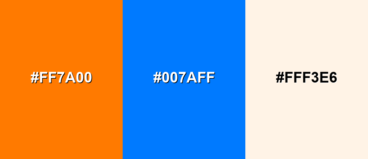
A complementary pairing puts bright orange opposite a blue tone to create maximum contrast and instant punch. It is a reliable choice for CTAs, sports-style graphics, and bold headers.
Complementary Palette Example: Use bright orange with vivid azure for high contrast, then soften the layout with a warm off-white.
Analogous Color Schemes
Analogous colors sit adjacent to each other on the color wheel, creating harmonious, cohesive palettes with subtle variation.
Analogous Warm Spectrum: amber and red-orange keep the energy while creating smooth transitions.
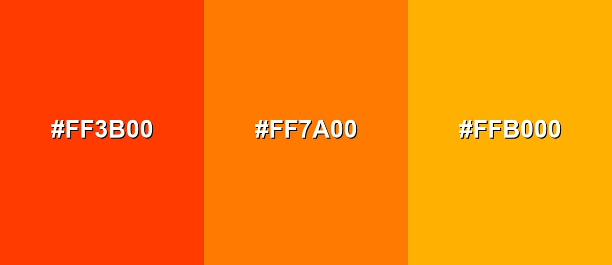
- Red-Orange: #FF3B00
- Bright Orange: #FF7A00
- Amber: #FFB000
Analogous Citrus Blend: tangerine and marigold build a friendly, sunny palette for highlights and illustrations.
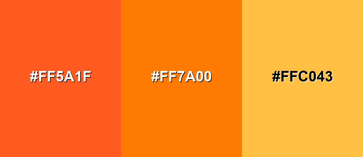
- Tangerine: #FF5A1F
- Bright Orange: #FF7A00
- Marigold: #FFC043
Triadic & Tetradic Combinations
A triadic palette uses three evenly spaced hues for balance and variety.
Triadic Pop: pair bright orange with teal-green and violet for a playful, modern contrast that still feels structured.
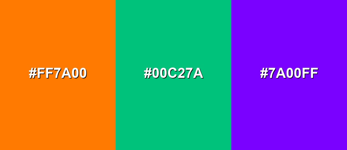
- Bright Orange: #FF7A00
- Teal-Green: #00C27A
- Electric Violet: #7A00FF
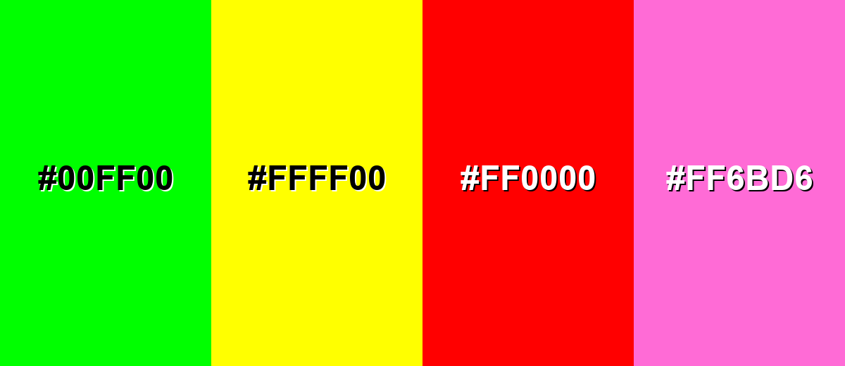
Colors to Avoid
While bright orange is remarkably versatile, certain combinations can create problematic visual effects:
- Neon Green (#00FF00) - Both are highly saturated and compete for attention, creating visual vibration that can feel chaotic.
- Pure Yellow (#FFFF00) - The hues are too close in brightness, so edges can blur and text or icons may lose definition.
- Pure Red (#FF0000) - The pairing can look aggressive and makes it harder to establish hierarchy between two urgent warm accents.
- Hot Pink (#FF6BD6) - Together they can read as overly loud and reduce readability in UI, especially when used in large blocks.
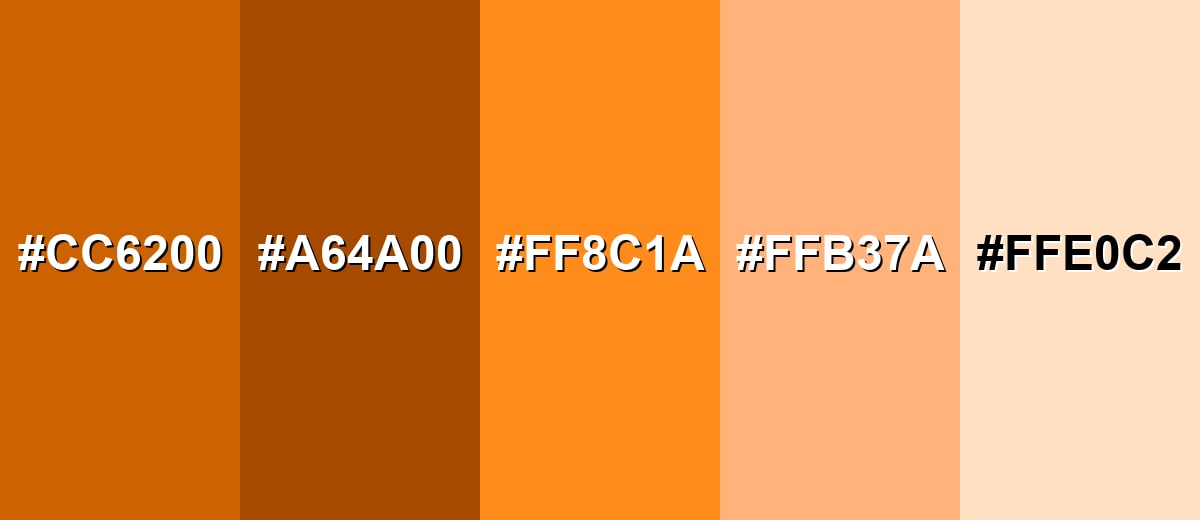
Shades, Tints & Variations of Bright Orange
Bright orange has a surprisingly usable range—from deeper, grounded shades to soft, warm tints that behave like gentle neutrals. Having a few variations ready makes it easier to build hover states, backgrounds, gradients, and brand accents without losing the core orange identity.
- Deep Orange (#CC6200) - A darker, slightly muted version that keeps the warmth while feeling more grounded. It's best used for Headers, icons, and brand accents where you want impact with less glare.
- Burnt Orange (#A64A00) - A richer, earthier orange that leans toward a warm brown undertone. It's best used for Packaging, editorial layouts, and backgrounds where you need warmth without high saturation.
- Tangerine Tint (#FF8C1A) - A lighter, fruit-like orange that stays vivid but feels a bit softer than the base shade. It's best used for Hover states, secondary buttons, and gradient steps.
- Apricot (#FFB37A) - A warm pastel orange with a friendly, approachable feel. It's best used for Cards, subtle highlights, and background panels in warm UI themes.
- Pale Peach (#FFE0C2) - A very light orange-tinted neutral that reads clean and warm. It's best used for Page backgrounds, large sections, and soft contrast behind text and imagery.
Industry Applications
Bright orange shows up anywhere visibility, energy, and fast recognition matter. Here are practical ways it translates into real design systems and everyday touchpoints.
Fashion & Beauty
- Accent-First - Use bright orange as a high-impact accent rather than an all-over block to keep the look comfortable.
- Warm Neutrals - Pair it with warm off-white styling to soften intensity while keeping the color punchy.
- Approachable Tints - Lean on softer options like Apricot (#FFB37A) and Pale Peach (#FFE0C2) for a friendlier, more subtle warmth.
- Quick Focus - Use it where you want instant focus and fast recognition, since it stands out quickly.
Interior Design & Decor
- Small Surfaces - Use it on small surfaces (pillows, chair accents, signage) instead of full walls for a cleaner result.
- Natural Materials - Pair with natural materials like light wood, stone, or matte black to keep it grounded.
- Cool Balance - Add plants or cool-toned accents to prevent the room from feeling too hot visually.
- Fast Focal Point - Bright orange creates a warm focal point quickly, so it's ideal when a space needs an instant highlight.
Branding & Marketing
- Energetic Positioning - Bright orange signals energy and approachability, which works well for friendly, modern brands.
- Accent In Systems - Use it as an accent in logos, packaging details, or key brand moments rather than as the only brand tone.
- Confident Contrast - Balance it with blue hues for confident contrast, or with neutrals (off-white, light gray) for cleanliness.
- Clear Campaigns - For campaigns, combine it with strong photography and simple typography to keep the message clear.
Conclusion
Bright orange (#FF7A00) is a high-visibility, high-energy color that's best treated as a deliberate accent—perfect for calls-to-action, highlights, badges, and brand moments that need instant focus. Pair it with deep blues for crisp complementary contrast, or build smooth warm transitions with nearby oranges like amber and red-orange. When you keep large areas balanced with softer tints (like apricot or pale peach) and run quick contrast checks for readability, bright orange becomes a reliable tool for clearer hierarchy, faster scanning, and bold, friendly design.
Design Smarter with AI: Media.io is an online AI studio that empowers creators with advanced image generation and enhancement tools. From text-to-image and image-to-image creation to AI upscaling and color optimization, it enables fast, creative, and professional results—all in your browser.

Frequently Asked Questions About Bright Orange Color
Bright orange is a vivid, highly saturated orange that sits between red and yellow. It is commonly used as an attention-grabbing accent in design because it reads warm, energetic, and easy to spot.
A common HEX value for bright orange is #ff7a00. Small shifts in the green channel can produce slightly different bright oranges, so always check the exact code used in your brand or UI system.
It is often associated with enthusiasm, friendliness, and motion, and it is also used to signal visibility and urgency in practical contexts. The meaning depends on where it appears, how much is used, and what it is paired with.
Deep blues and blue-cyans create strong complementary contrast, while warm neighbors like amber and red-orange create smooth, energetic blends. Neutral off-whites, charcoals, and light grays help it look modern and readable.
It is usually better as a background, button, or highlight rather than body text. For accessibility, test contrast with your chosen text color; dark text often reads more clearly on bright orange than white text, especially at smaller sizes.
Bright orange is vivid but still within a typical sRGB range used in branding and interfaces. Neon oranges push closer to fluorescent intensity, and safety oranges are selected specifically for maximum visibility under varied lighting and real-world conditions.


