

Russet color is a warm reddish-brown shade that looks like dried autumn leaves, baked clay, or oxidized copper. Its signature digital value is #80461B, a deep brown-red that reads earthy and natural on screen.
Often linked to warmth, resilience, and a grounded outdoorsy mood, russet sits between brown and orange in most pigment palettes. Below, you'll find its key codes, conversions, pairings, shade ideas, and practical design tips.
Russet Color: Codes & Values
If you're building a palette for web, print, or brand assets, these are the most useful russet color codes to keep everything consistent.
| Parameters | VALUE |
| HEX Code | #80461B |
| RGB DECIMAL | 128, 70, 27 |
| RGB PERCENTAGE | 50.2%, 27.5%, 10.6% |
| CMYK | 0%,45%,79%,50% |
| HSL | 26°, 65%, 30% |
| HSV (HSB) | 26°, 79%, 50% |
| Web Safe | #996633 |
Key Color Space Explanations:
- HEX - HEX is the most common code for screens and web design. Use it when you need a precise value for UI elements, graphics, and CSS.
- RGB - RGB defines the red, green, and blue light used to display the tone on digital devices. It is useful for animations, overlays, and fine-tuning on-screen visuals.
- CMYK - CMYK is the standard for printing and packaging because it describes ink percentages. It helps keep russet consistent when moving from screen to physical materials.
- HSL - HSL expresses the hue, saturation, and lightness in a way that is intuitive for designers. It is handy for creating lighter tints, darker shades, and balanced themes.
- Web Safe - Web safe is the closest legacy-safe approximation for older display constraints. It is mainly used for quick matching when strict compatibility is needed.
Use HEX for most digital work, RGB when you're dialing in on-screen effects, and CMYK anytime russet needs to print consistently across packaging, stationery, or labels.
Russet Color Conversions
Need russet in a different format for your design tool or workflow? Here are the most common conversions in one place.
| Parameters | VALUE | CSS |
| HEX | #80461b | #80461b |
| RGB DECIMAL | 128, 70, 27 | rgb(128,70,27) |
| RGB PERCENTAGE | 50.2%, 27.5%, 10.6% | rgb(50.2%,27.5%,10.6%) |
| CMYK | 0%,45%,79%,50% | cmyk(0%,45%,79%,50%) |
| HSL | 26°, 65%, 30% | hsl(26°,65%,30%) |
| HSV (or HSB) | 26°, 79%, 50% | -- |
| Web Safe | 996633 | #996633 |
| CIE-LAB | 35.7, 23.5, 35.6 | -- |
| XYZ | 11.3, 9.1, 2.1 | -- |
| xyY | 0.502, 0.404, 9.1 | -- |
| CIE-LCH | 35.7, 42.7, 56.6° | -- |
| CIE-LUV | 35.7, 44.2, 29.6 | -- |
| Hunter-Lab | 30.2, 16.2, 16.6 | -- |
| Binary | 10000000 01000110 00011011 | -- |
Want to generate Russet Color photos or posters? Try Media.io's AI Image Generator now!
Russet Color Meaning & Symbolism
Russet is commonly seen as warm, earthy, and reliable, with a natural ruggedness that feels practical rather than flashy. In everyday design, Russet Color meaning often points to comfort, craftsmanship, and a sense of grounded authenticity.
Psychological Effects
Because russet sits close to familiar natural materials, it tends to feel steady and approachable in visual design.
- Grounded Comfort - Reminiscent of soil, leather, brick, and wood, russet creates a lived-in, welcoming mood.
- Warmth Without Noise - Its brown base with a red-orange lift adds heat without the sharp intensity of bright reds.
- Durability & Trust - Often read as sturdy and dependable, making it useful for heritage or craft-forward branding.
- Tactile Quality - Russet subtly signals texture and materiality, helping products feel more “real” and hands-on.
- Visual Weight - In heavy use, it can feel dense or old-fashioned, so contrast and spacing matter in UI.
Positive Associations
These upbeat cues are why russet shows up so often in earthy palettes and autumn-inspired creative work.
- Craftsmanship - Suggests handmade quality and thoughtful construction rather than mass-produced shine.
- Resilience - Feels weathered-in and strong, like materials that age well over time.
- Warm Hospitality - Helps scenes and layouts feel inviting, relaxed, and easy to settle into.
- Nature Connection - Echoes outdoor tones (clay, bark, dried leaves) for an authentic, organic vibe.
- Classic Simplicity - Reads practical and timeless, supporting understated design that still has character.
Cultural Significance Across the World
Russet's symbolism is closely tied to textiles, seasonal storytelling, and heritage aesthetics.
- Rustic Textiles - Historically linked to practical clothing and cloth, reinforcing simplicity and utility.
- Autumn & Harvest - Commonly used to reference changing leaves and seasonal warmth in visual narratives.
- Heritage & Tradition - Fits craft and legacy contexts where authenticity matters more than flash.
- Natural Materials - Often paired with wood, leather, and uncoated paper looks to emphasize tactility.
Design Applications
Russet is easiest to work with when you treat it as a grounding anchor rather than a high-energy accent. The sections below show practical ways to apply it across digital design, branding, and physical spaces.
Graphic Design Tips
- Use russet as the main anchor color, then add light neutrals to keep layouts breathable and premium.
- Pair it with a cool blue-green contrast for a modern edge without losing the earthy tone.
- Reserve highly saturated accents for small highlights so russet stays refined and “craft-forward.”
- In UI graphics (icons, labels, badges), keep background-light and type-contrast high for clarity.
- For print, proof early—warm browns can shift on different papers, especially textured or uncoated stocks.
Pro tip: If your design starts to feel too brown-heavy, lighten the surrounding surfaces (cream or parchment-like) and use russet mainly for hierarchy—headers, callouts, and brand marks—rather than full-page fills.
Russet Color in Photography & Video
- Use russet props (ceramics, leather, wood) to create a cozy, story-driven scene that feels natural.
- Balance warmth with a cooler counter-tone in the frame to avoid an overly orange/brown cast.
- In grading, protect skin tones—russet-heavy warmth can push faces too red if you overdo saturation.
- For product shots, russet backgrounds can add richness, but keep subject edges crisp with clean lighting.
- When overlaying text on russet footage, choose high-contrast type and test readability across frames.
Recommended Tool for Image Enhancement: When incorporating russet color into your photography projects, Media.io's AI Image tools can help you achieve more refined results. With AI-powered color enhancement, photo colorization, image upscaling, and old photo restoration, you can easily enrich russet color tones, improve overall image quality, and highlight the color's elegant and sophisticated aesthetic.
Color Combinations
Russet pairs best with tones that either cool it down (blue-green hues) or lift it up (soft neutrals and warm oranges). Use the palettes below as starting points for web, branding, interiors, and illustration.
Complementary Colors
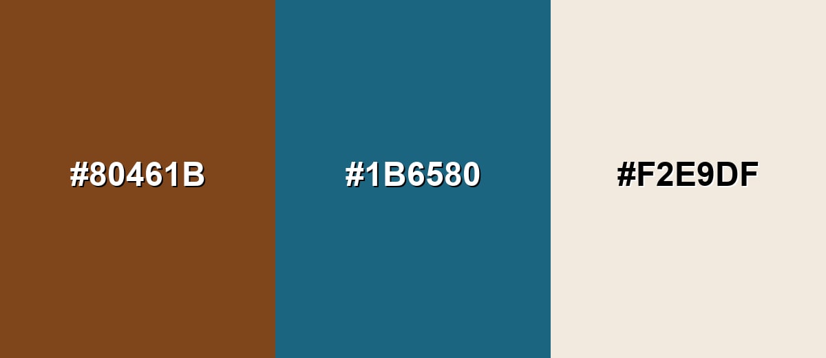
A complementary pairing adds crisp contrast by placing russet opposite a blue-green tone. This balance helps russet feel modern while keeping its earthy character.
Complementary Palette Example: Use Russet as the anchor, Deep Teal for contrast, and Parchment as a clean buffer.
Analogous Color Schemes
Analogous colors sit adjacent to each other on the color wheel, creating harmonious, cohesive palettes with subtle variation.
This warm analogous set leans red and copper for a cohesive, autumn-friendly look.
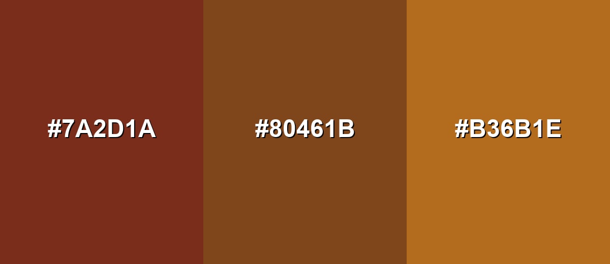
- Brick Brown: #7A2D1A
- Russet: #80461B
- Copper: #B36B1E
A slightly deeper analogous scheme that moves from mahogany into a burnt orange edge.
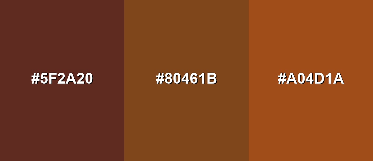
- Mahogany: #5F2A20
- Russet: #80461B
- Burnt Orange: #A04D1A
Triadic & Tetradic Combinations
A triadic palette creates energy while keeping the palette balanced across warm and cool zones.
Pair Russet with Forest Green and Indigo for a bold, versatile three-way contrast.
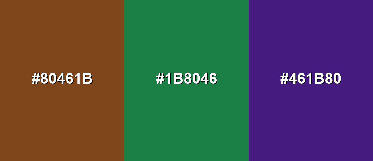
- Russet: #80461B
- Forest Green: #1B8046
- Indigo: #461B80
Colors to Avoid
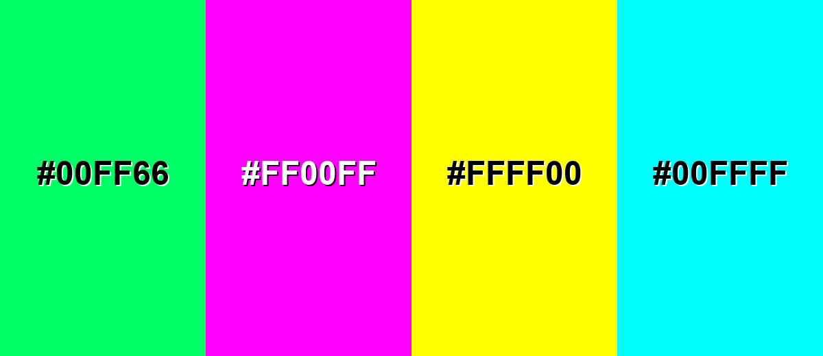
While russet color is remarkably versatile, certain combinations can create problematic visual effects:
- Neon Green (#00FF66) - The saturation is so high that it overpowers russet and makes the palette feel harsh and unstable.
- Hot Magenta (#FF00FF) - This creates a loud clash that can feel playful in the wrong way for most earthy, grounded themes.
- Pure Yellow (#FFFF00) - The brightness can flatten russet and reduce perceived richness, especially in large blocks.
- Bright Cyan (#00FFFF) - The contrast is extreme and can look digital and cold next to russet's natural, muted warmth.
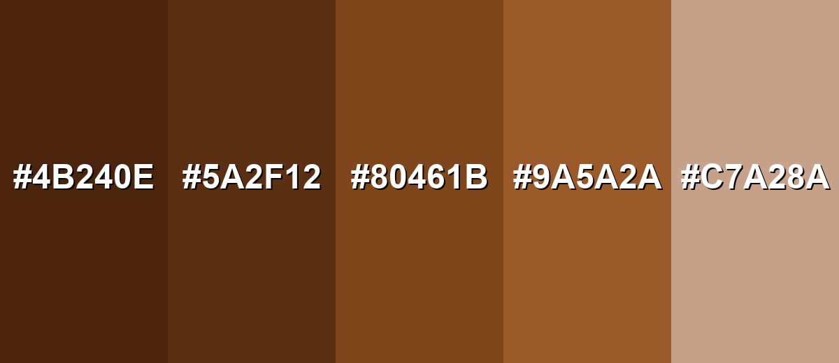
Shades, Tints & Variations of Russet Color
Russet isn't just one look—it has a useful range from deep, dramatic browns to soft clay-like tints. Exploring these variations makes it easier to build hierarchy in UI, create depth in branding, or keep interiors warm without feeling heavy.
- Dark Russet (#4B240E) - A deep, near-umber take on russet that feels sturdy and dramatic. It's best used for Great for headers, borders, and grounding accents in light layouts.
- Deep Russet (#5A2F12) - A richer shade that keeps the warmth while increasing depth and contrast. It's best used for Works well for buttons, icons, and premium packaging details.
- Classic Russet (#80461B) - The recognizable reddish-brown balance that sits between brown and orange. It's best used for Ideal as a primary brand tone or a key accent in earthy palettes.
- Muted Russet (#9A5A2A) - A softer version with a little more lightness, making it easier to pair with neutrals. It's best used for Good for backgrounds, cards, and large surfaces where you want warmth without heaviness.
- Light Russet (#C7A28A) - A pale, dusty variation that reads like sunlit clay or weathered terracotta. It's best used for Best for subtle backgrounds, gradients, and supportive UI surfaces.
Industry Applications
Because russet feels natural and dependable, it shows up in industries that benefit from warmth, tactility, and a sense of craft. These examples can help you decide where it fits and how to frame it visually.
Fashion & Beauty
- Leather-like tones for accessories and footwear that feel premium and long-lasting.
- Autumn-ready outerwear palettes that photograph well in natural light.
- Warm neutral wardrobes that add depth without relying on black.
- Product photography backgrounds that flatter natural materials and textures.
Interior Design & Decor
- Accent textiles, ceramics, and decorative finishes that bring instant warmth to a room.
- Rustic-modern palettes paired with wood and stone materials.
- Seasonal styling that stays timeless rather than overly trendy.
- Warm focal points (pillows, throws, wall accents) balanced with light neutrals.
Branding & Marketing
- Heritage-inspired logos, badges, and monograms with a handcrafted edge.
- Craft, artisanal, and maker-style labels that feel authentic and tactile.
- Editorial-style brand palettes paired with clean neutrals for readability.
- Warm, dependable brand systems that emphasize tradition and durability.
Conclusion
Russet stands out as a warm, reddish-brown that feels grounded, sturdy, and naturally inviting—ideal when you want an earthy base tone with real personality. With its reliable core value of #80461B, russet works beautifully as an anchor in branding, UI, photography, interiors, and packaging, especially when you balance it with soft neutrals or cool blue-green contrast for clarity. Use deeper russet shades for structure and emphasis, lighter variations for backgrounds, and you'll get a palette that stays modern, readable, and easy to build around.
Design Smarter with AI: Media.io is an online AI studio that empowers creators with advanced image generation and enhancement tools. From text-to-image and image-to-image creation to AI upscaling and color optimization, it enables fast, creative, and professional results—all in your browser.

Frequently Asked Questions About Russet Color
Russet is a warm reddish-brown that resembles baked clay, dried leaves, or oxidized copper. It sits between brown and orange, with a muted, earthy feel.
A commonly used hex code for russet in digital design is #80461b. It produces a deep brown-red that stays warm without looking overly bright.
They are related but not identical. Rust usually looks brighter and more orange, while russet tends to be deeper and browner, with a more subdued finish.
Russet pairs well with soft neutrals (parchment and warm off-whites), cool blue-greens for contrast, and nearby warm tones like copper and burnt orange for a cohesive look.
Use it as an anchor for navigation, selected states, or badges, and balance it with a light background. Add a cool teal or blue-green to keep the interface feeling fresh and structured.
Russet is often associated with warmth, resilience, and natural materials. It can help brands and visuals feel dependable, handcrafted, and grounded rather than glossy or overly technical.


