

Tiffany blue color is a light, bright blue-green that feels clean, airy, and softly tropical. It's best known for its polished, gift-like vibe and modern elegance.
A dependable reference for this shade is #81D8D0, a balanced mix of minty green and cool aqua. Below, you'll find the exact color codes, conversions, matching palettes, shades, and practical ways to use it in design.
Tiffany Blue Color Color: Codes & Values
If you want a Tiffany-like aqua that stays bright but not neon, these are the most-used color values to keep your work consistent across screens and print.
| Parameters | VALUE |
| HEX Code | #81D8D0 |
| RGB DECIMAL | 129, 216, 208 |
| RGB PERCENTAGE | 51%, 85%, 82% |
| CMYK | 40%,0%,4%,15% |
| HSL | 175°, 53%, 68% |
| HSV (HSB) | 175°, 40%, 85% |
| Web Safe | #99CCCC |
Key Color Space Explanations:
- HEX - HEX is the most common way to specify this shade for web and UI work. Use #81d8d0 to match a typical Tiffany-like aqua tone.
- RGB - RGB defines the light mixture used on screens. The values 129, 216, 208 create a bright aqua that stays soft instead of neon.
- CMYK - CMYK is used for print mixing with inks. The 40%,0%,4%,15% breakdown is a practical starting point, though real prints may shift by paper and press.
- HSL - HSL describes the shade by hue, saturation, and lightness, which is handy for making tints and tones. Tiffany blue sits near 175° with moderate saturation and a light feel.
- Web Safe - Web safe is the closest legacy screen-safe approximation. #99cccc is a nearby match when you need a simplified palette.
Use HEX/RGB for digital layouts, switch to HSL when building lighter tints or deeper tones, and start with CMYK values for print tests on your final paper stock.
Tiffany Blue Color Color Conversions
These conversions make it easier to move Tiffany blue between design tools, CSS, and print workflows without losing the look you approved.
| Parameters | VALUE | CSS |
| HEX | #81d8d0 | #81d8d0 |
| RGB DECIMAL | 129, 216, 208 | rgb(129,216,208) |
| RGB PERCENTAGE | 51%, 85%, 82% | rgb(51%,85%,82%) |
| CMYK | 40%,0%,4%,15% | cmyk(40%,0%,4%,15%) |
| HSL | 175°, 53%, 68% | hsl(175°,53%,68%) |
| HSV (or HSB) | 175°, 40%, 85% | -- |
| Web Safe | 99cccc | #99cccc |
| CIE-LAB | 81.0, -28.5, -4.0 | -- |
| XYZ | 45.05, 58.41, 68.54 | -- |
| xyY | 0.262, 0.340, 58.41 | -- |
| CIE-LCH | 81.0, 28.8, 188.0° | -- |
| CIE-LUV | 81.0, -40.0, -1.9 | -- |
| Hunter-Lab | 76.4, -25.2, -4.1 | -- |
| Binary | 10000001 11011000 11010000 | -- |
Want to generate tiffany blue color color photos or posters? Try Media.io's AI Image Generator now!
Tiffany Blue Color Meaning & Symbolism
Tiffany blue is widely linked with freshness, clarity, and a polished sense of celebration. Because it feels both airy and upscale, it often signals care, quality, and a modern kind of elegance in everyday visuals.
Psychological Effects
In most contexts, this blue-green reads as calm, light, and reassuring.
- Calm Confidence - It tends to feel soothing without becoming sleepy, making it easier to build a relaxed mood.
- Clean & Organized - The cool clarity can signal hygiene and order, especially in minimal layouts.
- Spacious Feeling - Its brightness can make pages and rooms feel more open and airy.
- Friendly Emphasis - As an accent, it highlights key UI states without the urgency of loud warm colors.
- Cool-Heavy Risk - Used too broadly, it can feel chilly or overly delicate, so it benefits from warmer balance.
Positive Associations
Designers often choose Tiffany blue when they want "fresh meets refined" in one color.
- Freshness - The aqua-mint mix suggests crisp air, water, and a newly cleaned look.
- Clarity - It supports a clear, easy-to-scan visual hierarchy when paired with high-contrast type.
- Celebration - The gift-ready feel can hint at special moments and thoughtful details.
- Modern Elegance - It reads premium when supported by simple typography and restrained palettes.
- Comfort - The soft cool tone can feel reassuring in interfaces, labels, and informational design.
Cultural Significance Across the World
Context matters—pairings and industry cues can shift how people interpret the shade.
- Luxury Gift Cues - Modern recognition is strongly shaped by high-end retail and iconic packaging aesthetics.
- Coastal & Water Imagery - Blue-green tones often connect to ocean, pools, and relaxed travel visuals.
- Clean Living - In wellness and product design, it can suggest freshness, purity, and routine-friendly clarity.
- Minimalist Trend - In contemporary design systems, it complements bright whites and simple grids for a modern look.
Design Applications
Tiffany blue is easy to recognize, but it works best when you give it a clear job—accent, background, or supporting tone—so the overall design stays balanced and readable.
Graphic Design Tips
- Use it as an accent for highlights, icons, active states, or subtle emphasis rather than large text blocks.
- Pair it with warm neutrals for a premium feel, or add a deep teal for stronger hierarchy and contrast.
- Avoid placing it next to other bright blue-greens unless you want a sporty, high-energy look.
- For packaging, matte finishes feel refined, while glossy finishes make the color look brighter and more saturated.
- For accessibility, use very dark text on Tiffany blue backgrounds and verify contrast before publishing.
Pro tip: treat #81D8D0 as your "signature accent," then build structure with a deeper supporting shade and keep typography clean and high-contrast for that crisp, gift-ready finish.
Tiffany Blue Color in Photography & Video
- Use Tiffany blue props or backgrounds to create a clean, airy set—especially in bright, natural light.
- In product shots, it works well as a soft color wash that keeps reflective surfaces looking fresh rather than harsh.
- For lifestyle video, balance the cool tone with warmer materials (wood, cream fabrics) to avoid a clinical feel.
- When color grading, watch for green shifts on different displays and keep skin tones neutral.
- Reserve Tiffany blue for key moments (titles, overlays, packaging details) so it feels intentional and premium.
Recommended Tool for Image Enhancement: When incorporating tiffany blue color into your photography projects, Media.io's AI Image tools can help you achieve more refined results. With AI-powered color enhancement, photo colorization, image upscaling, and old photo restoration, you can easily enrich tiffany blue color tones, improve overall image quality, and highlight the color's elegant and sophisticated aesthetic.
Color Combinations
Tiffany blue pairs beautifully with warm neutrals, soft pinks, and deeper teals. These palettes show reliable options for branding, UI accents, and coordinated visuals.
Complementary Colors
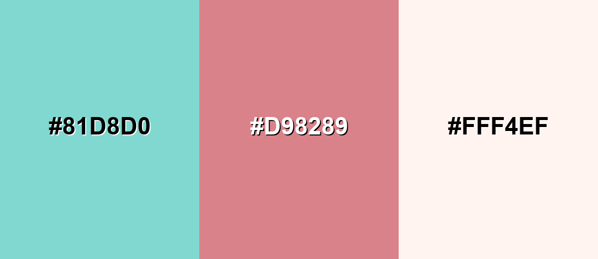
A rosy red-pink sits opposite this aqua on the wheel, creating lively contrast that still feels elegant when kept slightly muted.
Complementary Palette Example: Use tiffany blue with a dusty rose and a soft ivory base for balanced, gift-like contrast.
Analogous Color Schemes
Analogous colors sit adjacent to each other on the color wheel, creating harmonious, cohesive palettes with subtle variation.
Mint to aqua hues create a smooth, spa-like gradient that feels fresh and cohesive.
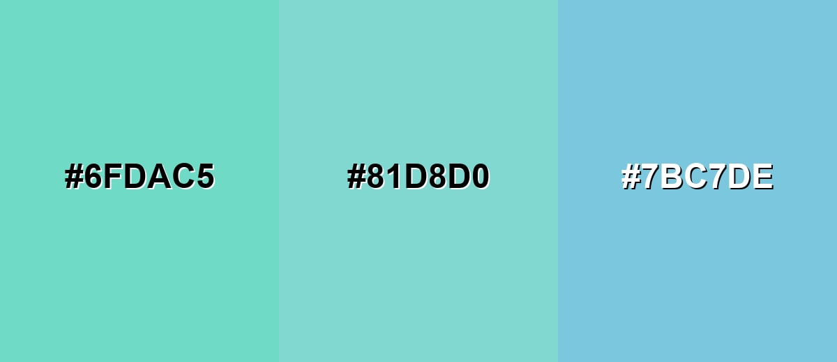
- Fresh Mint: #6FDAC5
- Tiffany Blue: #81D8D0
- Aqua Sky: #7BC7DE
Cool teals and light blue tones keep the look modern, clean, and slightly more energetic.
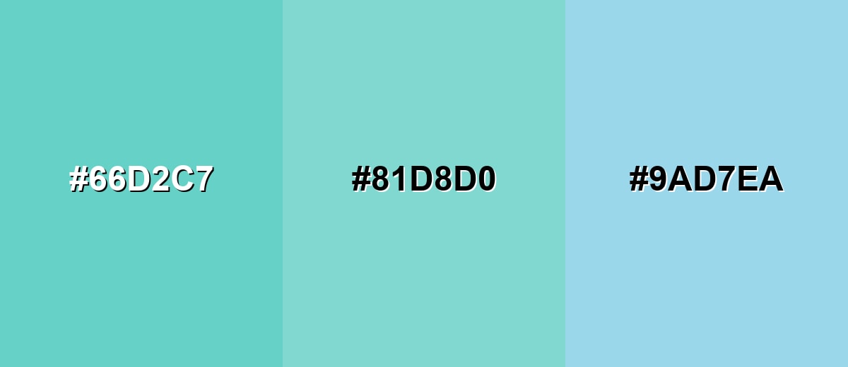
- Bright Teal: #66D2C7
- Tiffany Blue: #81D8D0
- Icy Blue: #9AD7EA
Triadic & Tetradic Combinations
A triadic palette adds two evenly spaced accents for variety without chaos.
Pair tiffany blue with a soft golden yellow and a light orchid purple for playful, balanced contrast.
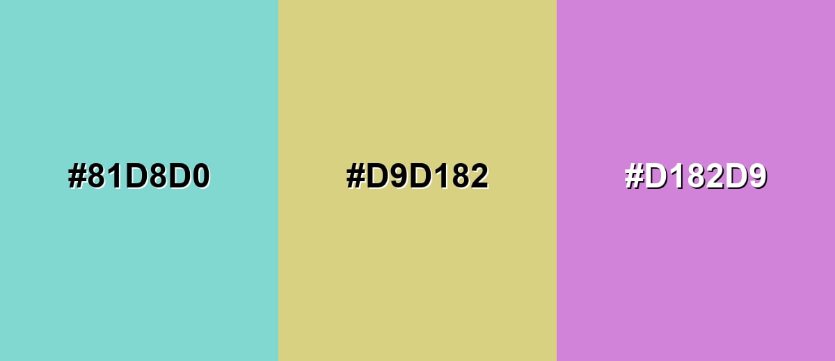
- Tiffany Blue: #81D8D0
- Soft Gold: #D9D182
- Light Orchid: #D182D9
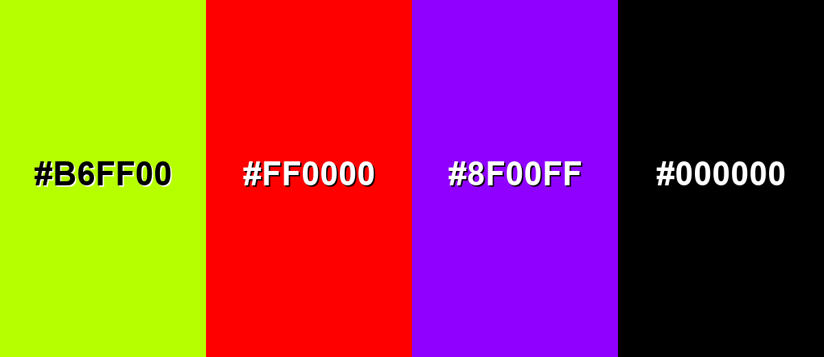
Colors to Avoid
While tiffany blue color is remarkably versatile, certain combinations can create problematic visual effects:
- Neon Lime (#B6FF00) - Both are high-impact and can vibrate visually, making layouts feel noisy and harder to read.
- Pure Red (#FF0000) - The contrast becomes harsh and can feel alarm-like, which fights the calm, refined tone.
- Electric Purple (#8F00FF) - Strong saturation competes with the airy aqua and can push the palette into a cartoonish look.
- Deep Black (#000000) - The jump is extremely stark; it can make the aqua feel overly bright unless softened with a charcoal instead.
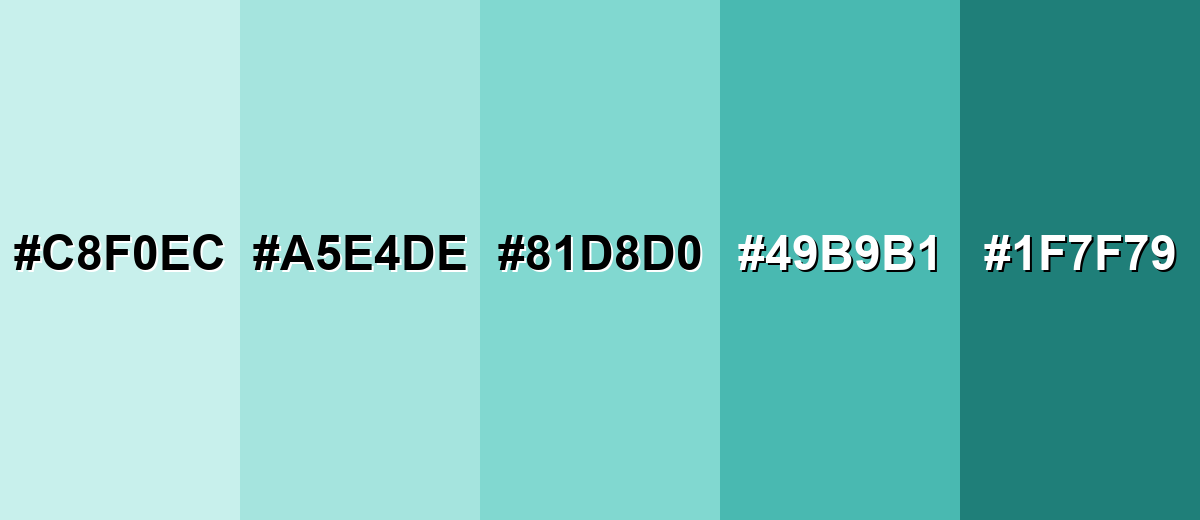
Shades, Tints & Variations of Tiffany Blue Color
Tiffany blue isn't just one fixed swatch—its tints and deeper variations help you build backgrounds, accents, and accessible contrast without losing that signature airy feel.
- Pale Tiffany (#C8F0EC) - A very light tint that keeps the same airy character with a softer, more pastel finish. It's best used for Large backgrounds, cards, and calm interior paint accents where you want minimal intensity.
- Light Tiffany (#A5E4DE) - A gentle, slightly stronger tint that still feels clean and friendly. It's best used for UI panels, secondary backgrounds, subtle patterns, and wellness-style branding.
- Tiffany Blue (#81D8D0) - The classic bright aqua that balances cool clarity with a soft, polished feel. It's best used for Brand accents, highlights, packaging details, and hero graphics.
- Deep Tiffany (#49B9B1) - A richer teal-leaning shade that adds weight while staying within the same family. It's best used for Buttons, navigation, icons, and headings where you need stronger contrast than the base shade.
- Dark Teal (#1F7F79) - A dark supporting shade that reads grounded and mature next to the brighter aqua. It's best used for Text over light tints, outlines, charts, and accessibility-friendly UI components.
Industry Applications
Because it feels clean and special at the same time, Tiffany blue fits into a wide range of visual systems—from premium packaging to calm, friendly UI moments.
Fashion & Beauty
- Use it in clean, fresh palettes for skincare, spa, and lifestyle visuals.
- Apply it as a soothing background for informational labels and routine steps.
- Lean on minimal typography and lots of white space to keep it refined, not cute.
- Use deeper supporting tones for product names and small text to maintain readability.
Interior Design & Decor
- Works well on small surfaces like cabinets, tile accents, vases, or a feature wall in bright rooms.
- Combine with off-white, soft beige, and light woods to keep the space inviting.
- Add a darker anchor tone in rugs, hardware, or frames so the room doesn't feel overly pastel.
- For event decor, it stays bright in daylight and soft under indoor lighting when balanced with neutrals.
Branding & Marketing
- Support premium positioning by pairing Tiffany blue with warm neutrals and minimal typography.
- Use it as a signature accent for recognition on packaging, tags, and social graphics.
- For UI-led brands, apply it to highlight states, badges, and selected controls with a calm tone.
- In retail packaging, matte finishes read refined, while glossy finishes push it brighter for seasonal sets.
Conclusion
Tiffany blue stands out as a bright, airy blue-green that instantly feels fresh, polished, and modern. With #81D8D0 as a reliable reference, you can keep branding, UI, interiors, and print materials consistent while still exploring lighter tints and deeper supporting shades for contrast. It shines most when used as an accent—balanced by warm neutrals, deeper teal anchors, or soft complementary pinks—and when you check readability so the elegance doesn't get lost. If you apply tiffany blue color color meaning thoughtfully, it becomes a versatile choice for everything from gift-ready packaging to calm, clean digital experiences.
Design Smarter with AI: Media.io is an online AI studio that empowers creators with advanced image generation and enhancement tools. From text-to-image and image-to-image creation to AI upscaling and color optimization, it enables fast, creative, and professional results—all in your browser.

Frequently Asked Questions About Tiffany Blue Color Color
It is a light, bright blue-green that sits between aqua and mint. It usually appears clean and airy rather than deep or muted.
A commonly used reference hex for tiffany blue is #81d8d0. Small shifts may appear across screens and print materials, so it is smart to test in context.
RGB is 129, 216, 208 for screens. For print starting values, CMYK is 40%,0%,4%,15%, though final output can vary by paper and calibration.
Warm neutrals like ivory and beige keep it elegant, while dusty rose adds complementary contrast. Deeper teals also work well as anchors for text, buttons, and structure.
It is often associated with freshness, clarity, and a gift-like sense of refinement. Depending on the palette, it can also suggest calm, cleanliness, and modern simplicity.
It can be, especially with very dark text for readability. For smaller text or dense UI, use a dark teal or near-black and verify contrast before publishing.


