

 TL;DR:
Off white (#F8F4E8) is a warm, near-white neutral best utilized as a supportive background to reduce visual glare in digital layouts and print media without appearing clinical.
● Pair this shade with deep navy or charcoal for text readability, deliberately avoiding pure white (which creates visual inconsistency) and jet black (which causes overly harsh contrast).
● Prevent the layout from appearing flat or washed out by introducing depth through soft shadows, subtle borders, or paper grain textures rather than adding competing colors.
● Always test off white across different device screens and request physical print proofs, as its delicate undertones shift significantly based on ambient lighting and uncoated paper stocks.
Ask AI for a summary
 ChatGPT
 Perplexity
 Gemini
 Claude
 Grok
Grok
Off white is a near-white neutral that looks like white softened with a hint of warmth, often reading as creamy or lightly beige in real life. A common reference for this tone is #f8f4e8, which stays bright while avoiding the sharp glare of pure white.
People tend to perceive it as calm, clean, and welcoming, making it feel more lived-in than stark white. Because it sits close to white, its undertone can shift with lighting and nearby materials—so it helps to test it in context.
Off White Color: Codes & Values
If you want a dependable off white for digital design, these values are a solid starting point for style guides, UI kits, and templates.
| Parameters | VALUE |
| HEX Code | #F8F4E8 |
| RGB DECIMAL | 248, 244, 232 |
| RGB PERCENTAGE | 97%, 96%, 91% |
| CMYK | 0%,2%,7%,3% |
| HSL | 45°, 53%, 94% |
| HSV (HSB) | 45°, 6%, 97% |
| Web Safe | #FFFFFF |
Key Color Space Explanations:
- HEX - HEX is the most common way to specify this shade for screens and web design. Use it in CSS, design tools, and digital style guides for consistent results.
- RGB - RGB describes how much red, green, and blue light combine to create the tone on a display. It is useful for UI work, motion graphics, and any screen-based workflow.
- CMYK - CMYK represents ink percentages used in many print processes. It helps you estimate how off white may reproduce on paper, where stock and coatings can shift the final look.
- HSL - HSL frames the tone by hue, saturation, and lightness, which can feel more intuitive for tweaking warmth and softness. It is handy for generating tints and coordinated palettes.
- Web Safe - Web-safe values reflect a simplified palette from older display standards. Off white typically rounds to pure white in that set, so always preview on modern devices when accuracy matters.
Use HEX for web and UI, RGB for screen-based workflows, and CMYK when you're preparing print files—then confirm the final look with real device previews or print proofs.
Off White Color Conversions
Need off white in another format? Here are quick conversions you can copy into your design tool or workflow.
| Parameters | VALUE | CSS |
| HEX | #f8f4e8 | #f8f4e8 |
| RGB DECIMAL | 248, 244, 232 | rgb(248,244,232) |
| RGB PERCENTAGE | 97%, 96%, 91% | rgb(97%,96%,91%) |
| CMYK | 0%,2%,7%,3% | cmyk(0%,2%,7%,3%) |
| HSL | 45°, 53%, 94% | hsl(45°,53%,94%) |
| HSV (or HSB) | 45°, 6%, 97% | -- |
| Web Safe | ffffff | #ffffff |
| CIE-LAB | 95.4, 0.6, 7.1 | -- |
| XYZ | 87.9, 92.0, 86.1 | -- |
| xyY | 0.321, 0.336, 92.0 | -- |
| CIE-LCH | 95.4, 7.1, 85.2 | -- |
| CIE-LUV | 95.4, 3.0, 10.2 | -- |
| Hunter-Lab | 95.9, 0.7, 7.4 | -- |
| Binary | 11111000 11110100 11101000 | -- |
Want to generate Off White color photos or posters? Try Media.io's AI Image Generator now!
Off White Color Meaning & Symbolism
Off white usually represents quiet simplicity, comfort, and understated quality. It keeps the clean impression of white while adding softness, so it can feel more human and less clinical. In everyday life, it often signals a relaxed, natural look that works across modern, classic, and minimalist styles.
Psychological Effects
Off white tends to influence mood through brightness, warmth, and low visual noise.
- Calm Focus - Its gentle brightness supports concentration by keeping the background quiet and uncluttered.
- Reduced Glare - Compared to pure white, it feels easier on the eyes for long reading sessions and large surfaces.
- Welcoming Warmth - A creamy undertone can make interfaces and rooms feel more inviting and lived-in.
- Trustworthy Neutrality - It communicates "clean" without the clinical edge, which can feel more approachable in branding.
- Risk Of Flatness - Without contrast, texture, or shadow, it can look washed out and make components blend together.
Positive Associations
When used well, off white reads premium, natural, and quietly confident.
- Simplicity - A pared-back base that helps content, products, and photos take center stage.
- Comfort - Softer than stark white, it suggests ease and a relaxed atmosphere.
- Craft - Often associated with paper, linen, wool, and ceramics, giving a subtle handmade feel.
- Cleanliness - Keeps the "fresh" impression of white while feeling less sterile.
- Understated Quality - A common premium cue in packaging and editorial design when paired with refined accents.
Cultural Significance Across the World
Because it's close to white, off white often borrows white's symbolism, but with a more material, natural twist.
- Clean Starts - Near-whites are frequently tied to newness and clarity, especially in modern design contexts.
- Natural Materials - Off white is linked to linen, uncoated paper, and ceramics, suggesting warmth and authenticity.
- Everyday Minimalism - It aligns with minimalist aesthetics that favor calm, breathable layouts over strong decoration.
- Tradition & Craft - The "paper-like" look can hint at heritage, editorial culture, and careful making without being loud.
Design Applications
Off white is most useful as a supporting neutral. It gives layouts a bright foundation while keeping the overall look warmer and more forgiving than pure white.
Graphic Design Tips
- Use It As A Background - Apply off white to page backgrounds and large panels to reduce harsh white glare.
- Build Clear Hierarchy - Pair it with darker typography and icons so headings, labels, and body text stay distinct.
- Add Soft Separation - Use subtle borders and gentle shadows to define cards and sections without heavy lines.
- Let Accents Carry Personality - Keep off white as the "canvas," then introduce one or two controlled accent colors for emphasis.
- Preview In Real Context - Test under different lighting and on multiple screens, since undertones can shift next to images and materials.
Pro tip: If your layout looks "too plain," don't rush to add more color—add depth first (paper grain, soft gradients, thin borders, or gentle shadows) so off white still feels intentional and premium.
Off White Color in Photography & Video
- Safer Highlights - Off white backdrops can reduce clipping and harsh bounce compared to pure white.
- Flattering Warmth - A creamy tint can soften skin tones and keep product shots from feeling overly clinical.
- Better Subject Separation - Add a touch of shadow or a slightly darker neutral to prevent light subjects from blending into the background.
- Consistent Editorial Look - It matches paper-inspired aesthetics for lifestyle content, lookbooks, and long-form visuals.
- Lighting Matters - Warmer bulbs can push it beige; cooler daylight can make it look cleaner—white balance is key.
Recommended Tool for Image Enhancement: When incorporating off white color into your photography projects, Media.io's AI Image tools can help you achieve more refined results. With AI-powered color enhancement, photo colorization, image upscaling, and old photo restoration, you can easily enrich off white color tones, improve overall image quality, and highlight the color's elegant and sophisticated aesthetic.
Color Combinations
Off white pairs best with grounded darks, muted naturals, and a few controlled accents. The palettes below show reliable options for contrast, harmony, and easy layering.
Complementary Colors
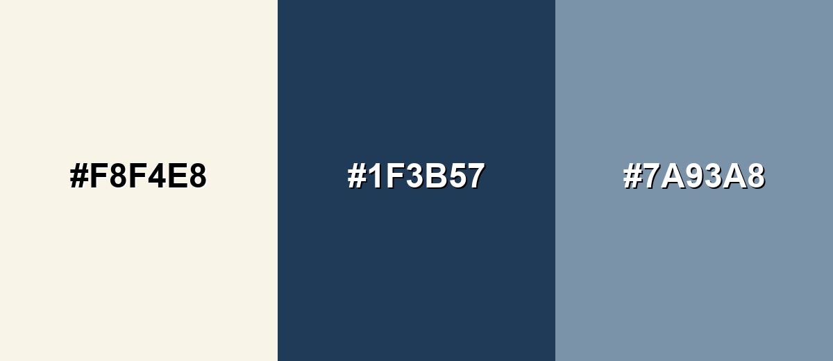
A complementary match balances off white warmth with a cool blue counterpart, creating crisp contrast without looking harsh. This is a strong choice for headers, navigation, and editorial layouts.
Complementary Palette Example: Use Off White as the base, Deep Slate Blue for primary text and structure, and Soft Steel Blue for secondary elements and calm accents.
Analogous Color Schemes
Analogous colors sit adjacent to each other on the color wheel, creating harmonious, cohesive palettes with subtle variation.
Warm neutrals keep the look cohesive and cozy, ideal for product pages and lifestyle visuals.
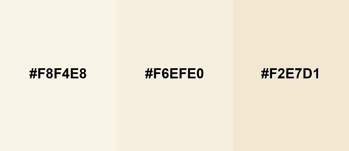
- Off White: #F8F4E8
- Cream Linen: #F6EFE0
- Light Sand: #F2E7D1
A slightly greener analog set feels fresh and organic, working well with natural textures and calm UI themes.
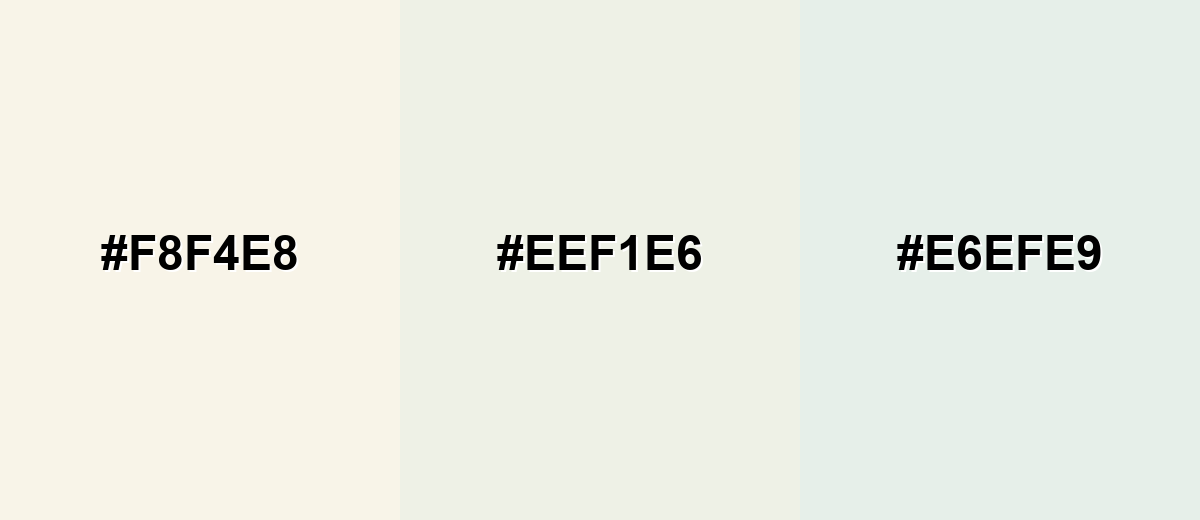
- Off White: #F8F4E8
- Pale Sage: #EEF1E6
- Mist Mint: #E6EFE9
Triadic & Tetradic Combinations
Triadic palettes add variety while staying balanced, especially when off white remains the main surface tone.
Combine Off White with Muted Teal and Dusty Violet to get a modern, creative look that still feels soft.
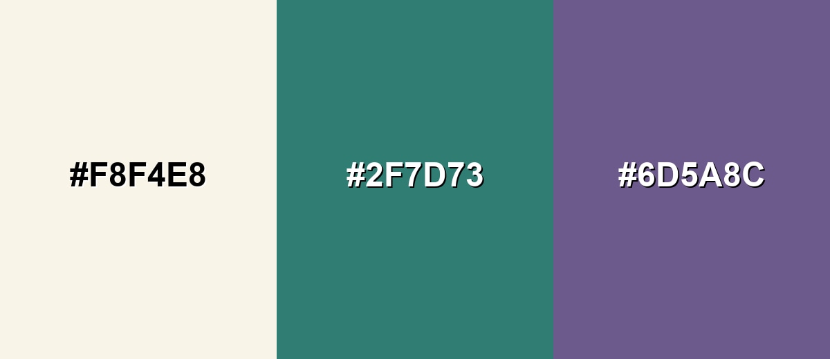
- Off White: #F8F4E8
- Muted Teal: #2F7D73
- Dusty Violet: #6D5A8C
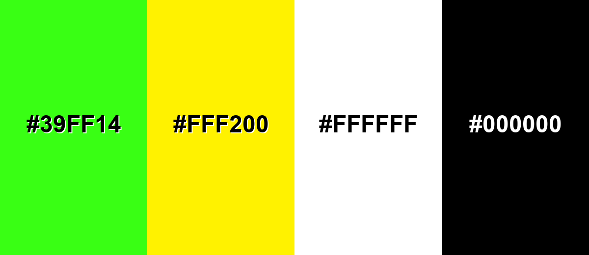
Colors to Avoid
While off white color is remarkably versatile, certain combinations can create problematic visual effects:
- Neon Green (#39FF14) - The saturation is so intense that it can make off white look dingy and can overwhelm minimalist layouts.
- Electric Yellow (#FFF200) - Both tones are very bright, so the pairing can feel glaring and reduce readability in large areas.
- Pure White (#FFFFFF) - Side-by-side, the difference can be too subtle, making panels and components look inconsistent rather than intentional.
- Jet Black (#000000) - The contrast can be overly stark, which may introduce a harsh, high-tension look unless it is softened with intermediate neutrals.
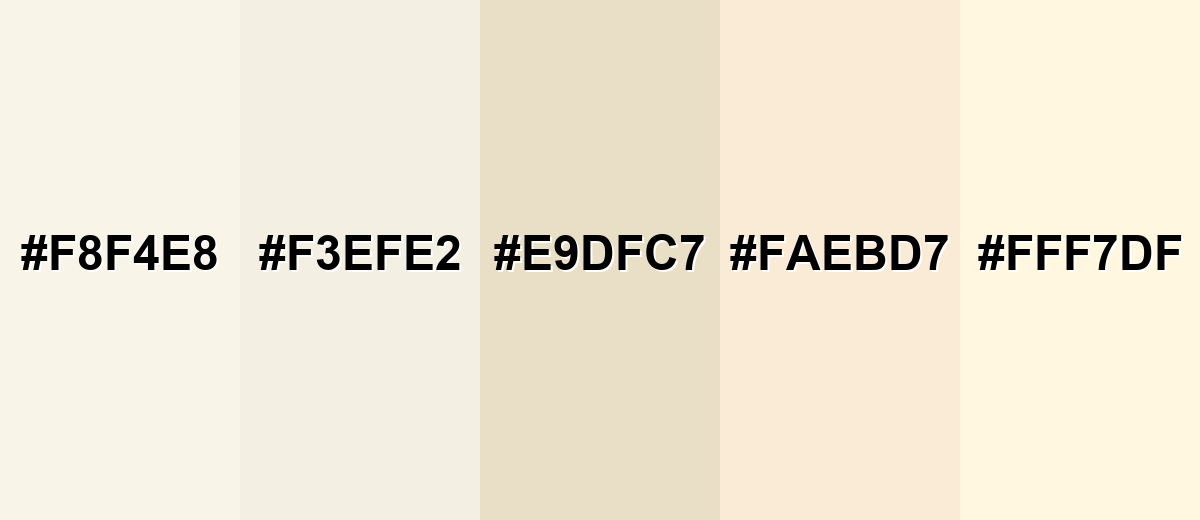
Shades, Tints & Variations of Off White Color
Off white isn't just one "almost white" tone—it spans creamy tints, paper-like neutrals, and brighter ivories. Having a few variations on hand makes it easier to create depth, layer surfaces, and keep designs from feeling flat.
- Soft Off White (#F8F4E8) - A warm near-white with a gentle creamy cast that stays bright without feeling sharp. It's best used for all-purpose background for web pages, templates, and minimalist brand systems.
- Alabaster (#F3EFE2) - Slightly deeper and more muted, with a balanced neutral undertone. It's best used for walls, UI surfaces, and product photography backdrops where you want subtle depth.
- Warm Parchment (#E9DFC7) - A paper-like neutral that reads more beige, especially in warm lighting. It's best used for borders, section backgrounds, and packaging designs that aim for a natural feel.
- Antique White (#FAEBD7) - A classic warm tint with a noticeable creamy warmth and a vintage vibe. It's best used for lifestyle branding, editorial layouts, and soft retro-inspired palettes.
- Ivory Tint (#FFF7DF) - A brighter, cleaner variation that stays warm but moves closer to true white. It's best used for highlight areas, gentle gradients, and light UI components that still need warmth.
Industry Applications
Because it is neutral and easy on the eyes, off white shows up across many fields as a base tone, a background, or a premium-looking substrate.
Fashion & Beauty
- Clean Product Aesthetic - Used for labels and packaging to feel fresh, soft, and premium without looking sterile.
- Material-Forward Styling - Works well with linen, cotton, and knit textures where a warm near-white looks natural.
- Soft Contrast Pairings - Helps muted accents feel refined rather than loud in campaign visuals.
- Editorial Backgrounds - A go-to backdrop tone that keeps attention on makeup shades and skincare finishes.
Interior Design & Decor
- Wall & Base Color - A reliable alternative to stark white that feels warmer in real spaces.
- Plays Well With Materials - Complements wood, stone, and warm metals for an inviting, balanced look.
- Lighting-Friendly - Adapts across daylight and artificial lighting, with undertones shifting subtly throughout the day.
- Balances Dark Accents - Softens the impact of deeper tones so rooms feel cozy instead of high-contrast.
Branding & Marketing
- Premium Minimalism - Common in wellness, home goods, and beauty brands that want clean with warmth.
- Content-First Layouts - Great for editorial pages and product grids where readability and breathing room matter.
- Refined Accent Support - Helps a single bold accent look more intentional and sophisticated.
- Print-Friendly Feel - Evokes paper and natural substrates, though proofing is key because stock can shift the tone.
Conclusion
Off white stands out as a near-white neutral that keeps the clarity of white while adding a soft, warm edge. Using #F8F4E8 as a dependable reference makes it easier to design backgrounds that feel calm and welcoming, then build contrast with deeper accents for text, navigation, and highlights. Whether you're designing a UI, planning packaging, or styling a space, off white works best when you add intentional separation—through darker typography, subtle borders, and a bit of texture—so the result feels polished instead of washed out.
Design Smarter with AI: Media.io is an online AI studio that empowers creators with advanced image generation and enhancement tools. From text-to-image and image-to-image creation to AI upscaling and color optimization, it enables fast, creative, and professional results—all in your browser.

Frequently Asked Questions About Off White Color
Off white is a near-white neutral that includes a small amount of warm or cool undertone, such as beige, cream, or gray. It looks softer than pure white and often feels more natural on large surfaces.
It can be either, depending on the undertone. Many popular options lean warm and creamy, but some versions lean cool and slightly gray, which can feel more modern and crisp.
Deep blues, soft greens, muted teals, warm browns, and dusty pinks tend to pair well. Off white also works with other gentle neutrals, as long as you keep enough separation to avoid a washed-out look.
A dark, slightly softened tone such as deep navy or charcoal usually reads better than pure black while still providing strong contrast. For smaller UI text, prioritize clarity and test contrast to keep it comfortable and accessible.
Off white is the broad category for near-whites with an undertone. Ivory often looks a touch cleaner and lighter, while cream typically looks richer and more yellow, especially in warm lighting.
It can, but the final appearance depends heavily on paper stock and finish. Off white may shift warmer or darker on uncoated paper, so proofing is recommended for packaging and brand-critical print work.


