

Apricot color is a soft orange-peach shade that looks like the ripe fruit: warm, creamy, and slightly pink. The most common digital reference is #FBCEB1, a friendly tone that feels upbeat without being loud.
In design, apricot often reads as approachable and comforting, shifting warmer under yellow light and a bit more blush in cool daylight. Below, you'll find its key color codes, conversions, pairings, shade ideas, and practical contrast tips.
Apricot Color: Codes & Values
These are the standard values you'll use to keep apricot consistent across screens, design tools, and print handoffs.
| Parameters | VALUE |
| HEX Code | #FBCEB1 |
| RGB DECIMAL | 251, 206, 177 |
| RGB PERCENTAGE | 98.4%, 80.8%, 69.4% |
| CMYK | 0%,18%,30%,2% |
| HSL | 24°, 90%, 84% |
| HSV (HSB) | 24°, 30%, 98% |
| Web Safe | #FFCC99 |
Key Color Space Explanations:
- HEX - HEX is the six-digit code used on the web to define an exact shade. For apricot, #fbceb1 is the standard reference for consistent screen display.
- RGB - RGB mixes red, green, and blue light to create the final tone on screens. Apricot uses high red with balanced green and lower blue for a warm, creamy result.
- CMYK - CMYK is used for printing and describes ink percentages. Apricot prints as a light, warm tint, so paper choice and finishing can noticeably shift it.
- HSL - HSL describes hue, saturation, and lightness, which can feel more intuitive for tweaking. Apricot sits around a warm orange hue with high lightness.
- Web Safe - Web-safe values are legacy screen-friendly approximations. The nearest web-safe match to apricot is #ffcc99.
For everyday design work, use HEX for web/UI, RGB for screen comps, and CMYK for print proofs—then sanity-check the final result on the actual device or paper stock.
Apricot Color Conversions
If you're moving between apps (or handing off to print), these conversions help keep your apricot color values aligned.
| Parameters | VALUE | CSS |
| HEX | #fbceb1 | #fbceb1 |
| RGB DECIMAL | 251, 206, 177 | rgb(251,206,177) |
| RGB PERCENTAGE | 98.4%, 80.8%, 69.4% | rgb(98.4%,80.8%,69.4%) |
| CMYK | 0%,18%,30%,2% | cmyk(0%,18%,30%,2%) |
| HSL | 24°, 90%, 84% | hsl(24°, 90%, 84%) |
| HSV (or HSB) | 24°, 30%, 98% | -- |
| Web Safe | ffcc99 | #ffcc99 |
| CIE-LAB | 86.1, 11.0, 20.6 | -- |
| XYZ | 69.7, 67.8, 51.0 | -- |
| xyY | 0.370, 0.360, 67.8 | -- |
| CIE-LCH | 86.1, 23.3, 61.5° | -- |
| CIE-LUV | 86.1, 30.4, 26.5 | -- |
| Hunter-Lab | 82.3, 11.7, 17.8 | -- |
| Binary | 11111011 11001110 10110001 | -- |
Want to generate Apricot Color photos or posters? Try Media.io's AI Image Generator now!
Apricot Color Meaning & Symbolism
Apricot is commonly linked with warmth, friendliness, and a gentle sense of energy. Because it sits between peach and light orange, it often reads as nurturing and optimistic rather than intense. In everyday life, Apricot Color meaning frequently points to approachability and comfort, which is why it shows up in welcoming spaces and soft branding.
Psychological Effects
Apricot tends to "soften" a design and make it feel more human at first glance.
- Approachability - Adds a friendly, welcoming tone that makes layouts feel less rigid.
- Gentle Optimism - Delivers upbeat energy without the urgency of brighter oranges.
- Warmth - Helps balance cool materials and colors by adding a subtle glow.
- Over-Sweetness - If used in large blocks without neutrals, it can feel sugary or childish.
- Contrast Sensitivity - Very light apricot backgrounds can reduce readability unless paired with dark text.
Positive Associations
Because it's fruit-inspired and light, apricot often signals comfort and ease.
- Comfort - Creates a cozy, calming mood that feels easy to "live with."
- Friendliness - Makes brands and interfaces feel personable and approachable.
- Warm Energy - Suggests a sunny boost without looking loud or aggressive.
- Soft Sweetness - Conveys a gentle, pleasant vibe that suits lifestyle visuals.
- Freshness - Borrows cues from fruit and harvest themes for a natural feel.
Cultural Significance Across the World
Apricot is generally interpreted positively and tends to avoid strong formal symbolism.
- Harvest & Abundance - Fruit-like tones often connect to ripeness, plenty, and seasonal warmth.
- Everyday Positivity - Reads as casual and uplifting, not political or ceremonial.
- Food & Hospitality - Works well in contexts that hint at sweetness, comfort, and sharing.
- Wellness & Care - Frequently appears in soft "self-care" aesthetics, especially with creamy neutrals.
Design Applications
Apricot works best when you want warmth without the intensity of bright orange. It plays well with both modern minimal layouts and cozy, handcrafted styles, depending on the supporting palette.
Graphic Design Tips
- Use apricot as a background tint for friendly onboarding screens, empty states, or callouts, then anchor it with deep navy or charcoal text.
- For brand accents, apply it to buttons, badges, or illustrations where you want an approachable signal rather than a warning or urgent action.
- Treat apricot as a light background: choose dark text (navy, charcoal, deep brown) and avoid mid-gray typography that can wash out.
- If apricot is used for UI states, back it up with icons or labels so meaning is not carried by hue alone.
- Apricot is strong for skincare, bakery, and lifestyle packaging because it suggests softness and warmth—test on the actual stock for best accuracy.
Pro tip: when apricot is your "mood" color, keep your layout structure neutral and let apricot do the emotional work in small, intentional areas (headers, cards, highlights).
Apricot Color in Photography & Video
- Lean into golden-hour lighting to make apricot tones look richer and more dimensional.
- For product shots, pair apricot props with simple creamy surfaces to keep the scene soft and premium.
- In color grading, boost warmth slightly but protect highlights—apricot can clip and turn chalky if pushed too far.
- Apricot works well for skin-adjacent palettes; keep whites neutral to avoid an overly orange cast.
- Use apricot as a background or wardrobe accent, then balance with a darker element for depth and separation.
Recommended Tool for Image Enhancement: When incorporating apricot color into your photography projects, Media.io's AI Image tools can help you achieve more refined results. With AI-powered color enhancement, photo colorization, image upscaling, and old photo restoration, you can easily enrich apricot color tones, improve overall image quality, and highlight the color's elegant and sophisticated aesthetic.
Color Combinations
Apricot is flexible: it can feel airy with light neutrals, grounded with deep blues, or playful with pastel partners. These palettes show reliable options for branding, UI accents, interiors, and illustration.
Complementary Colors
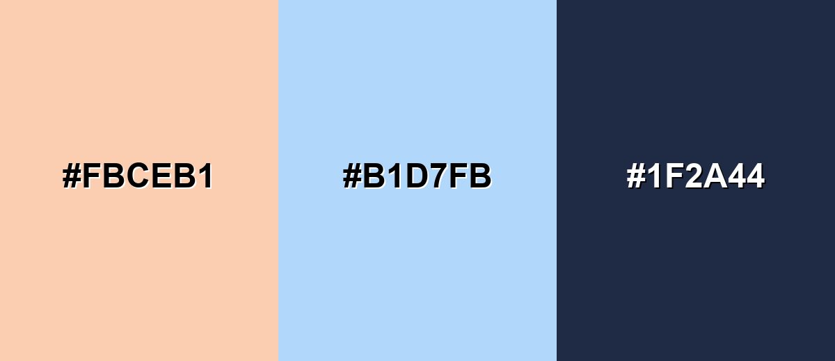
A complementary pairing uses the opposite side of the color wheel to create crisp contrast. With apricot, a soft blue brings balance while a deep neutral keeps the palette usable for text and layout structure.
Complementary Palette Example: Try apricot with a light sky blue and navy for a bright, modern look that still feels calm.
Analogous Color Schemes
Analogous colors sit adjacent to each other on the color wheel, creating harmonious, cohesive palettes with subtle variation.
Analogous warm peaches and creams create a soft, cohesive palette for cozy, welcoming visuals.
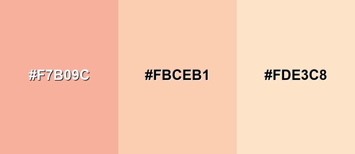
- Coral Blush: #F7B09C
- Apricot: #FBCEB1
- Buttercream: #FDE3C8
Apricot with warm yellow and clay tones feels sunlit and grounded, great for natural or handcrafted themes.
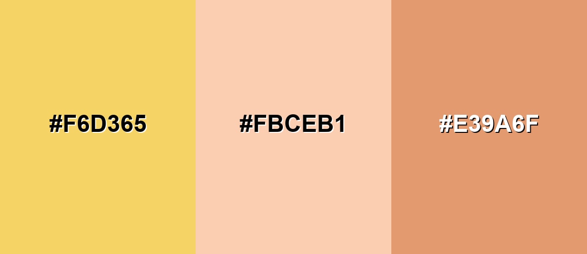
- Sunlit Honey: #F6D365
- Apricot: #FBCEB1
- Soft Terracotta: #E39A6F
Triadic & Tetradic Combinations
A triadic palette spaces hues evenly, keeping things lively without becoming chaotic.
Apricot with mint and lavender makes a playful pastel trio that works well for illustrations, seasonal campaigns, and youth-focused brands.
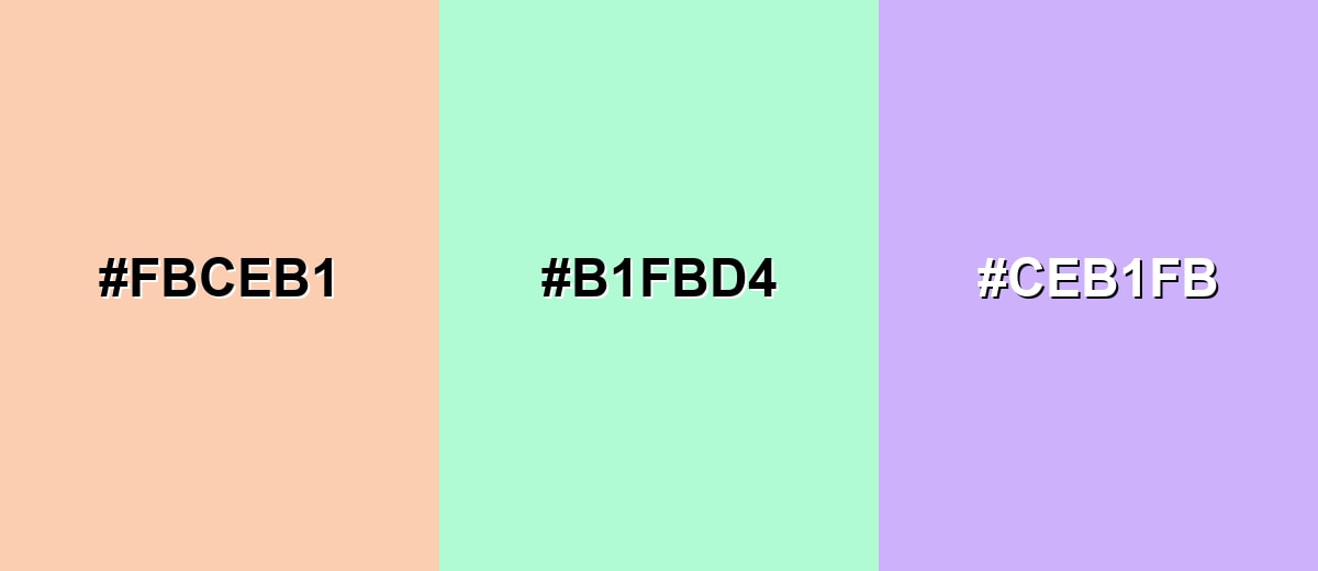
- Apricot: #FBCEB1
- Mint: #B1FBD4
- Lavender: #CEB1FB
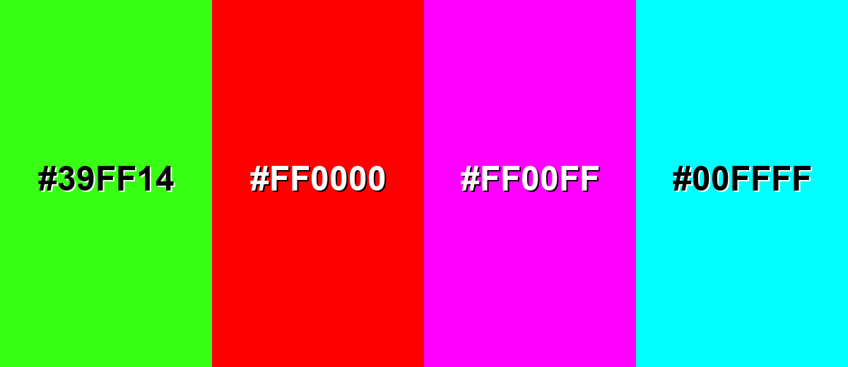
Colors to Avoid
While apricot color is remarkably versatile, certain combinations can create problematic visual effects:
- Neon Green (#39FF14) - The neon intensity competes with apricot's softness and can make layouts feel chaotic.
- Pure Red (#FF0000) - Red pushes the palette into a harsh, urgent direction and can overpower apricot in UI elements.
- Bright Magenta (#FF00FF) - High-saturation magenta clashes with apricot's muted warmth and can look unrefined in branding.
- Bright Cyan (#00FFFF) - Vivid cyan creates a sharp, electric contrast that often breaks the gentle, cozy mood apricot is chosen for.
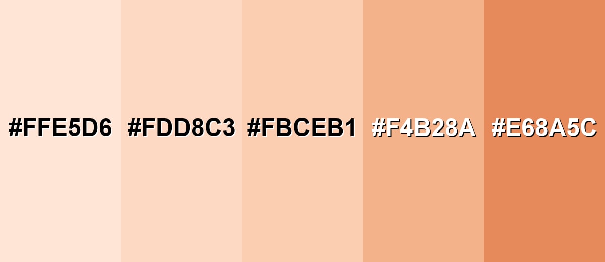
Shades, Tints & Variations of Apricot Color
Apricot has a surprisingly usable range—from airy, barely-there tints to deeper, earthier options. Exploring these variations helps you keep the same warm personality while adjusting contrast, mood, and emphasis across a full design system.
- Light Apricot (#FFE5D6) - A very pale apricot tint that reads airy and clean with just a hint of warmth. It's best used for Backgrounds, soft sections, and subtle UI surfaces..
- Soft Apricot (#FDD8C3) - A balanced pastel that stays warm without turning too pink or too orange. It's best used for Cards, banners, illustrations, and gentle highlights..
- Classic Apricot (#FBCEB1) - The recognizable apricot tone: creamy orange-peach with a friendly, sunny feel. It's best used for Primary accents, brand warmth, and lifestyle visuals..
- Deep Apricot (#F4B28A) - A richer, more saturated version that adds presence while remaining approachable. It's best used for Buttons, call-to-action accents, and warm gradients..
- Burnt Apricot (#E68A5C) - A warm, earthy shade with a touch of terracotta that feels grounded and mature. It's best used for Headings, icons, borders, and autumn-inspired palettes..
Industry Applications
Because apricot sits in a warm, light range, it is often used to signal comfort, friendliness, and soft energy. It can work as an accent, a background tint, or a supportive palette component depending on the industry.
Fashion & Beauty
- Use apricot to create a soft, healthy-glow feel in campaign visuals and product photography.
- On packaging, it supports a gentle, caring message—especially for skincare and self-care lines.
- Pair apricot with creamy neutrals to keep the look clean, modern, and not overly sweet.
- Use deeper apricot variations for premium accents (labels, borders, small typography areas).
Interior Design & Decor
- Apricot textiles and ceramics add warmth without dominating a room.
- It pairs naturally with wood, linen, warm whites, and matte black accents for balance.
- In smaller spaces, use it on one feature surface or soft furnishings to avoid a sugary feel.
- It helps "soften" cooler finishes like concrete, metal, and white tile.
Branding & Marketing
- Apricot fits approachable identity systems and friendly product launches that avoid harsh neon tones.
- In UI, it's great for onboarding screens, supportive highlights, and empty states with readable dark type.
- For food and beverage (especially bakery and café brands), it reinforces warmth and gentle sweetness.
- Use it as a consistent accent color for badges, illustrations, and seasonal visuals to keep brand tone cohesive.
Conclusion
Apricot is a warm orange-peach shade that brings a gentle, welcoming mood to digital designs, branding, packaging, and interiors. With #FBCEB1 as a reliable starting point, you can keep it consistent across tools, then build contrast by pairing it with soft blues or deeper tones for structure. If you want a cozier direction, lean into creamy neutrals and warmer neighbors; if you want playful energy, pastel pairings can make apricot feel light and modern. Used with thoughtful contrast and balance, apricot communicates warmth without the intensity of brighter oranges.
Design Smarter with AI: Media.io is an online AI studio that empowers creators with advanced image generation and enhancement tools. From text-to-image and image-to-image creation to AI upscaling and color optimization, it enables fast, creative, and professional results—all in your browser.

Frequently Asked Questions About Apricot Color
Apricot is a light orange-peach shade with a creamy, slightly pink undertone. It resembles the outside flesh of a ripe apricot and usually feels warm and soft rather than bold.
A commonly used hex code for apricot is #fbceb1. It translates to RGB 251, 206, 177 for screen-based design.
Apricot is generally warm because it sits near orange on the color wheel. Its pinkish softness can make it feel less hot than bright orange, but it still reads as warm in most settings.
Deep navy, soft blues, warm whites, and gentle greens pair especially well with apricot. These combinations keep the palette balanced and help apricot feel modern rather than overly sweet.
Use apricot as a background tint and place dark text on top, such as navy or charcoal. Avoid mid-gray typography and support important UI states with icons or labels so meaning is not carried by hue alone.
Peach usually leans slightly more pink and can look lighter or more pastel, while apricot often leans more orange with a creamy warmth. In practice, both overlap, so checking the exact HEX/RGB values is the best way to confirm.


