

 TL;DR:
Burgundy (HEX #800020) is a deep, purplish-red color that serves as a premium visual anchor in design when balanced with light neutrals.
● Unlike maroon, which features an earthy and brown-leaning base, burgundy possesses cooler, wine-like purple undertones.
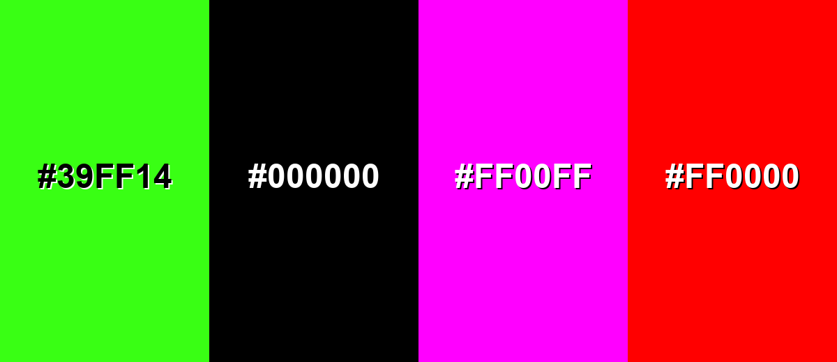
● Prevent readability loss and visual clashing by avoiding pairings with pure black (#000000), pure red (#FF0000), pure magenta (#FF00FF), or neon green (#39FF14).
● Verify physical print outputs on varying paper types, as the color appears significantly darker and flatter on uncoated matte stocks compared to coated materials.
Ask AI for a summary
 ChatGPT
 Perplexity
 Gemini
 Claude
 Grok
Grok
Burgundy is a deep, dark red with a subtle purple-brown undertone, similar to red wine or dried berries.
A common digital reference for it is #800020, and it's often chosen when you want a look that feels confident, mature, and quietly luxurious.
Burgundy Color: Codes & Values
Use these burgundy color codes to match the shade accurately across web, apps, and print projects.
| Parameters | VALUE |
| HEX Code | #800020 |
| RGB DECIMAL | 128, 0, 32 |
| RGB PERCENTAGE | 50.2%, 0%, 12.5% |
| CMYK | 0%,100%,75%,50% |
| HSL | 345°, 100%, 25% |
| HSV (HSB) | 345°, 100%, 50% |
| Web Safe | #990033 |
Key Color Space Explanations:
- HEX - HEX is the most common way to reference burgundy in web design and digital tools. Use it when styling UI elements, backgrounds, and brand assets consistently.
- RGB - RGB defines the red, green, and blue light values used on screens. It helps you reproduce the same burgundy tone in apps, video, and web graphics.
- CMYK - CMYK is used for ink-based printing like packaging and brochures. Converting to CMYK helps avoid unexpected shifts when burgundy is printed on different paper stocks.
- HSL - HSL describes hue, saturation, and lightness in a way many designers find intuitive. It's useful for building lighter or darker variants while keeping the same overall character.
- Web Safe - Web safe values are older, limited-display approximations. They're mainly helpful when you want a closest-match fallback for legacy environments.
For most workflows, start with HEX (#800020) on digital and convert to RGB/CMYK as needed to keep burgundy consistent across your assets.
Want to generate Burgundy color photos or posters? Try Media.io's AI Image Generator now!
Burgundy Color Conversions
This conversion table helps you translate burgundy color values between popular design and color-management systems.
| Parameters | VALUE | CSS |
| HEX | #800020 | #800020 |
| RGB DECIMAL | 128, 0, 32 | rgb(128,0,32) |
| RGB PERCENTAGE | 50.2%, 0%, 12.5% | rgb(50.2%,0%,12.5%) |
| CMYK | 0%,100%,75%,50% | cmyk(0%,100%,75%,50%) |
| HSL | 345°, 100%, 25% | hsl(345°, 100%, 25%) |
| HSV (or HSB) | 345°, 100%, 50% | -- |
| Web Safe | 990033 | #990033 |
| CIE-LAB | 25.9, 49.0, 21.2 | -- |
| XYZ | 9.17, 4.69, 1.80 | -- |
| xyY | 0.586, 0.299, 4.69 | -- |
| CIE-LCH | 25.9, 53.4, 23.4° | -- |
| CIE-LUV | 25.9, 78.8, 9.7 | -- |
| Hunter-Lab | 21.7, 40.1, 9.8 | -- |
| Binary | 10000000 00000000 00100000 | -- |
Burgundy Color Meaning & Symbolism
Burgundy is commonly linked with sophistication, depth, and self-assured taste. It sits close to red but feels more grounded and reserved, which is why it often reads as premium in everyday design choices. In daily life, the Burgundy color meaning tends to show up when people want warmth and authority without the urgency of bright reds.
Psychological Effects
Because it's dark, saturated, and wine-leaning, burgundy tends to feel intentional rather than impulsive.
- Authority - Burgundy communicates confidence and seriousness without the aggressive feel of bright red.
- Craftsmanship - It often suggests tradition, quality materials, and careful attention to detail.
- Comfort - In warm pairings, it can feel intimate and welcoming, especially in lifestyle or interior visuals.
- Depth - Burgundy adds visual weight and richness, helping key elements feel established and "anchored."
- Formality Risk - Overuse can make a layout feel heavy or gloomy unless it's balanced with light space and clean type.
Positive Associations
When used thoughtfully, burgundy can elevate a design and make it feel premium and long-lasting.
- Luxury - A classic "premium" signal that feels refined rather than flashy.
- Maturity - Suggests experience, stability, and a confident sense of taste.
- Warmth - Brings a cozy richness that works well with soft textures and warm neutrals.
- Trust - Reads as established and dependable, making it popular for heritage-inspired brands.
- Elegance - Adds a subtle dramatic touch that still feels polished and controlled.
Cultural Significance Across the World
Its meaning can shift by context, but the overall impression is typically celebratory, ceremonial, and upscale.
- Wine Tradition - The name ties directly to red wine culture, reinforcing associations with dining, celebration, and refinement.
- Status & Ceremony - Historically, rich dark reds were linked with formal wear and prestige because dyes could be costly and hard to maintain.
- Classic Romance - Burgundy is often used to signal a deeper, more dramatic romance than bright red.
- Modern Premium Design - In branding today, it's widely read as mature, elegant, and slightly dramatic rather than playful.
Design Applications
Burgundy is easiest to use when you treat it as a strong anchor: it adds drama, depth, and focus. The key is balancing it with light neutrals and clear typography so it stays readable and modern.
Graphic Design Tips
- Hierarchy first - Use burgundy for key UI moments (primary actions, selected states, badges) instead of covering the whole page.
- Keep backgrounds light - Pair it with off-white surfaces so content stays airy and easy to scan.
- Limit the palette - Burgundy looks best with simple supports; too many bold colors can make it feel crowded.
- Print testing matters - Check burgundy on coated vs. uncoated paper; it can print darker and flatter on matte stocks.
- Use finishes for premium feel - Embossing or spot finishes can add richness without introducing extra hues.
Pro tip: build a small set of consistent burgundy variants (darker for headers, classic for CTAs, lighter for hover/secondary accents) so your layouts stay cohesive across pages and devices.
Burgundy Color in Photography & Video
- Watch lighting temperature - Warm light makes burgundy feel richer, while cool light can pull out its purple undertone.
- Protect shadow detail - Deep burgundy fabrics and props can lose texture; lift shadows slightly to keep the material visible.
- Use as a focal accent - A burgundy subject against neutral backgrounds draws attention without looking overly loud.
- Balance skin tones - If burgundy dominates the frame, counter it with soft neutrals to keep faces natural and not overly red.
- Grade consistently - Keep saturation controlled so burgundy stays "wine-like" rather than drifting into pure red.
Recommended Tool for Image Enhancement: When incorporating burgundy color into your photography projects, Media.io's AI Image tools can help you achieve more refined results. With AI-powered color enhancement, photo colorization, image upscaling, and old photo restoration, you can easily enrich burgundy color tones, improve overall image quality, and highlight the color's elegant and sophisticated aesthetic.
Color Combinations
Burgundy pairs beautifully with cool greens, soft neutrals, and certain deep blues. Use these burgundy color palettes as starting points, then adjust lightness to match your layout and contrast needs.
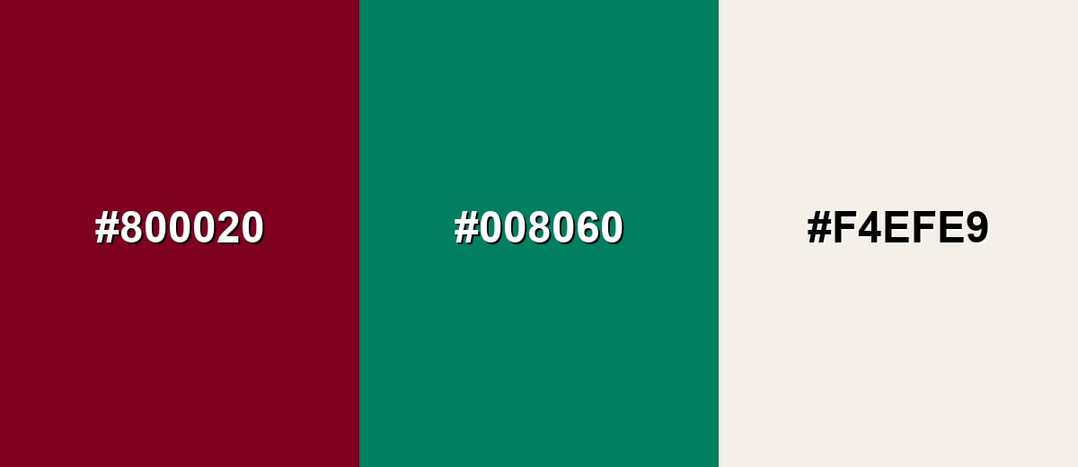
Complementary Colors
A complementary palette uses a green-leaning counterpart to create crisp contrast while still feeling elegant. Adding a warm neutral keeps the overall look balanced and usable in real layouts.
Complementary Palette Example: Try burgundy with deep teal and warm ivory for a refined, high-contrast palette.
Analogous Color Schemes
Analogous colors sit adjacent to each other on the color wheel, creating harmonious, cohesive palettes with subtle variation.
For a moody, seamless look, blend burgundy with darker wine and plum tones.
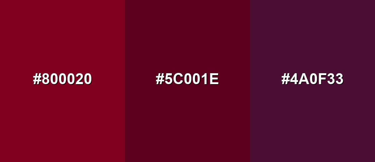
- Burgundy: #800020
- Dark Wine: #5C001E
- Deep Plum: #4A0F33
For a warmer feel, pair burgundy with cranberry red and a mahogany brown.
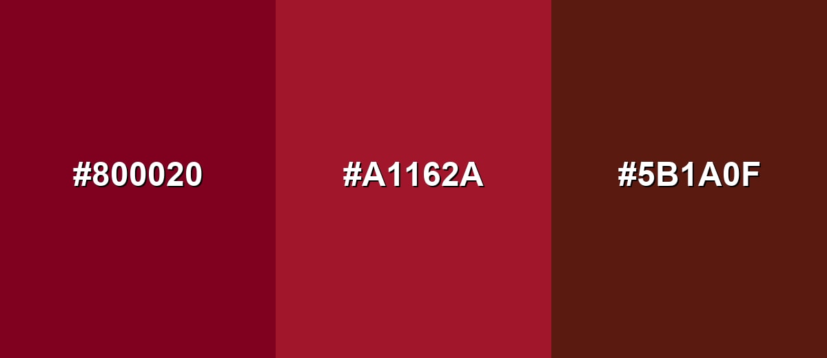
- Burgundy: #800020
- Cranberry: #A1162A
- Mahogany: #5B1A0F
Triadic & Tetradic Combinations
A triadic scheme adds energy while keeping the palette structured.
Balance burgundy with olive green and deep blue to get contrast that still feels mature.
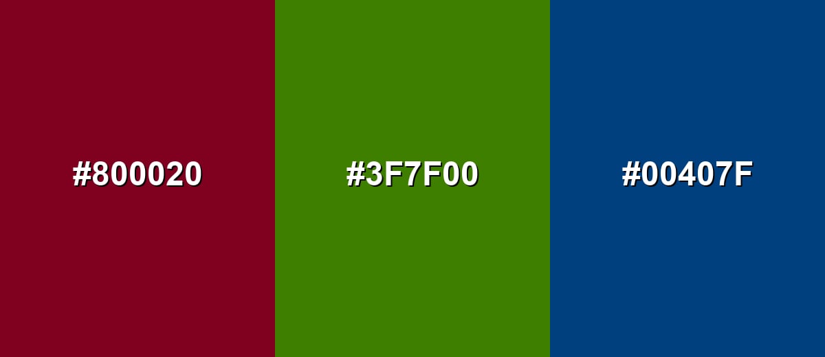
- Burgundy: #800020
- Olive Green: #3F7F00
- Deep Blue: #00407F
Colors to Avoid
While burgundy color is remarkably versatile, certain combinations can create problematic visual effects:
- Neon Green (#39FF14) - The intensity clashes with burgundy's refined tone and can look harsh or overly sporty.
- Pure Black (#000000) - Together they can feel heavy and reduce readability unless you add lighter neutrals and spacing.
- Pure Magenta (#FF00FF) - Both are saturated and compete for attention, often creating a loud, unbalanced look.
- Pure Red (#FF0000) - The hues are too close but not the same, which can make burgundy look muddy or accidental.
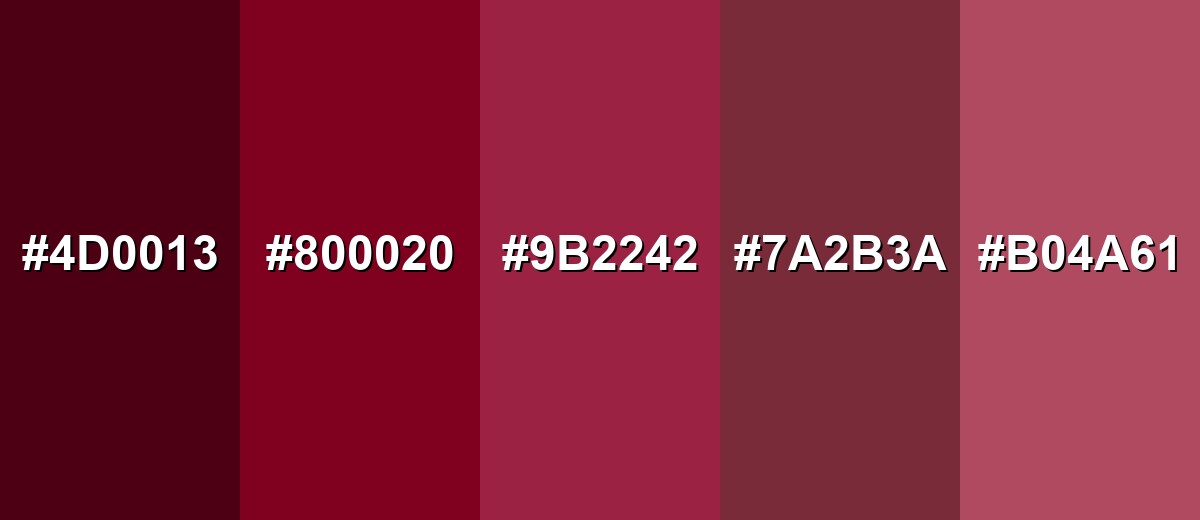
Shades, Tints & Variations of Burgundy Color
Burgundy isn't a single fixed tone—it ranges from near-black wine shades to softer berry tints. Having a few reliable variants makes it easier to build contrast, create clear UI states, and keep branding consistent across different backgrounds.
- Dark Burgundy (#4D0013) - A deeper, near-black wine tone that feels dramatic and serious. It's best used for Headers, luxury packaging, and high-impact accents where you want strong depth..
- Classic Burgundy (#800020) - The familiar wine-inspired burgundy with a rich red base and subtle purple undertone. It's best used for Brand anchors, buttons, editorial highlights, and hero sections when balanced with light neutrals..
- Burgundy Rose (#9B2242) - A slightly rosier burgundy that feels warmer and more approachable. It's best used for Lifestyle branding, beauty visuals, and soft accents in modern palettes..
- Muted Burgundy (#7A2B3A) - A toned-down, dusty version that reads calmer and less formal. It's best used for Background panels, large UI areas, and interiors where you want burgundy's mood without heavy saturation..
- Light Burgundy (#B04A61) - A lighter, blended berry tone that feels friendly and contemporary. It's best used for Secondary buttons, illustrations, gradients, and subtle emphasis in content-heavy layouts..
Industry Applications
Because burgundy feels premium and grounded, it shows up across industries that want trust, warmth, and a polished finish. The best results come from pairing it with clean neutrals and using it to support hierarchy.
Fashion & Beauty
- Use burgundy for outerwear, eveningwear, and formal pieces when you want a timeless, elevated look.
- It's a strong choice for leather goods and accessories, especially when paired with soft neutrals for contrast.
- For beauty visuals, rosier burgundy variations can feel warmer and more approachable while still reading premium.
- Keep styling sophisticated by pairing burgundy with cream, camel, or charcoal so it doesn't turn too heavy.
Interior Design & Decor
- Bring it in through accent walls, lounge seating, rugs, or drapery to add depth without darkening the whole room.
- Layer textures (wood, velvet, matte paint) so burgundy looks rich instead of flat.
- Use warm lighting to enhance the wine tone; cooler lighting will emphasize the purple undertone.
- In hospitality, burgundy works well for menus and wayfinding where you want an upscale, cozy atmosphere.
Branding & Marketing
- Burgundy is ideal for premium product lines, heritage positioning, and craft-focused identities.
- Use it as an anchor color while letting neutrals handle most backgrounds to keep the brand modern.
- Apply it to key moments in web/app UI (primary actions, top bars, emphasis labels) and verify text/icon contrast.
- For packaging (wine, coffee, chocolate, gift boxes), burgundy looks especially polished with one warm neutral alongside it.
Conclusion
Burgundy stands out for its wine-like depth—close to red, but calmer, more refined, and naturally premium. With #800020 as a dependable reference, you can build everything from dramatic, near-black accents to softer berry variations for modern UI, branding, print, and interiors. The easiest way to make burgundy work is to balance it with light neutrals for readability, then add contrast thoughtfully (like teal or deep blues) so the palette feels rich without overpowering your message.
Design Smarter with AI: Media.io is an online AI studio that empowers creators with advanced image generation and enhancement tools. From text-to-image and image-to-image creation to AI upscaling and color optimization, it enables fast, creative, and professional results—all in your browser.

Frequently Asked Questions About Burgundy Color
Quick answers to the most common questions about burgundy color codes, meaning, and practical use.
Burgundy is a deep, dark red with subtle purple-brown undertones, often compared to red wine. It looks richer and more muted than bright red.
A widely used burgundy hex code is #800020. Depending on the exact shade you need, some palettes may use lighter berry variants or darker wine tones.
It's closer to red, but it carries a noticeable purple influence. Lighting and nearby hues can push it to look warmer (more red-brown) or cooler (more wine-purple).
It pairs well with warm neutrals like ivory and beige, cool greens like teal, and deep blues like navy. For a softer look, combine it with blush or dusty rose tones.
Use it as an accent for buttons, highlights, or headers, then balance with off-white backgrounds and clear typography. Always check contrast for text and icons so key actions remain easy to read.
Maroon is typically more brown-leaning and earthy, while burgundy tends to feel wine-like with a cooler, slightly purplish undertone. In practice, the exact difference depends on the specific codes used.


