
Anthracite color is a deep, cool-leaning gray with a subtle blue-green cast, inspired by the smoky, matte look of hard coal.
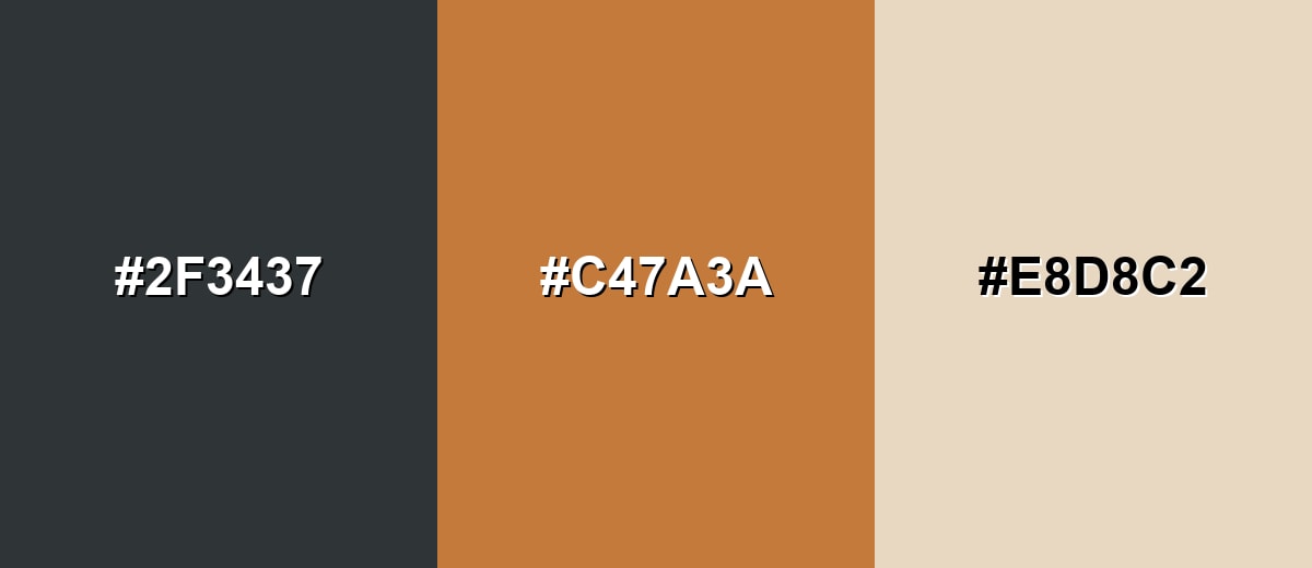
A reliable on-screen reference is #2F3437, which reads darker than standard gray without tipping into flat black—calm, modern, and quietly authoritative.
Anthracite Color: Codes & Values
If you want anthracite to look consistent across web, UI, and print mockups, these are the core values to start with.
| Parameters | VALUE |
| HEX Code | #2F3437 |
| RGB DECIMAL | 47, 52, 55 |
| RGB PERCENTAGE | 18.4%, 20.4%, 21.6% |
| CMYK | 15%,5%,0%,78% |
| HSL | 203°, 8%, 20% |
| HSV (HSB) | 203°, 15%, 22% |
| Web Safe | #333333 |
Key Color Space Explanations:
- HEX - HEX is the most common way to specify a screen color in web design. Use #2f3437 to reproduce this anthracite tone in CSS and design tools.
- RGB - RGB defines how much red, green, and blue light is used on digital displays. The values 47, 52, 55 keep anthracite dark while preserving a cool, stony depth.
- CMYK - CMYK is used for ink-based printing and indicates cyan, magenta, yellow, and black levels. These percentages help approximate anthracite on paper, though results vary by stock and coating.
- HSL - HSL describes hue, saturation, and lightness, which is useful for building harmonious palettes. Anthracite sits around 203° with low saturation, making it easy to pair with both warm and cool accents.
- Web Safe - Web-safe values are a legacy set of screen-safe colors used for consistency on older displays. The closest match to anthracite here is #333333.
Use HEX/RGB for screens, and CMYK as a starting point for print proofs—then adjust based on paper and lighting.
Anthracite Color Conversions
Need anthracite in different formats for design tools, CSS, or print specs? Here are the most common conversions in one place.
| Parameters | VALUE | CSS |
| HEX | #2f3437 | #2f3437 |
| RGB DECIMAL | 47, 52, 55 | rgb(47,52,55) |
| RGB PERCENTAGE | 18.4%, 20.4%, 21.6% | rgb(18.4%,20.4%,21.6%) |
| CMYK | 15%,5%,0%,78% | cmyk(15%,5%,0%,78%) |
| HSL | 203°, 8%, 20% | hsl(203°, 8%, 20%) |
| HSV (or HSB) | 203°, 15%, 22% | -- |
| Web Safe | 333333 | #333333 |
| CIE-LAB | 21.0, -0.6, -2.4 | -- |
| XYZ | 3.5, 3.8, 4.6 | -- |
| xyY | 0.30, 0.32, 3.8 | -- |
| CIE-LCH | 21.0, 2.5, 256° | -- |
| CIE-LUV | 21.0, -1.0, -3.6 | -- |
| Hunter-Lab | 19.5, -0.5, -2.0 | -- |
| Binary | 00101111 00110100 00110111 | -- |
Want to generate Anthracite Color photos or posters? Try Media.io's AI Image Generator now!
Anthracite Color Meaning & Symbolism
Anthracite is commonly linked with stability, restraint, and understated strength. Because it sits close to black but remains visibly gray, it often feels serious and refined without becoming harsh. In everyday life, Anthracite Color meaning tends to be about practicality, reliability, and a modern, minimal look.
Psychological Effects
Anthracite's low saturation makes it easy on the eyes while still feeling premium.
- Calm Focus - Helps reduce visual noise so content, products, and photos take center stage.
- Controlled Mood - Creates a tidy, structured feel in layouts, dashboards, and navigation.
- Professional Tone - Communicates competence and maturity without the harshness of pure black.
- Soft Authority - Feels confident and "serious," but more forgiving than absolute black on screens.
- Potential Coldness - In dim spaces or heavy use, it can read distant unless warmed up with neutrals or texture.
Positive Associations
Because it's coal-inspired and material-like, anthracite naturally signals durability.
- Stability - Suggests steadiness and reliability in brand systems and environments.
- Restraint - Feels minimal and intentional, especially in modern UI and editorial design.
- Sophistication - Adds polish without drawing attention away from key elements.
- Practicality - Reads functional and grounded, which works well for product-focused visuals.
- Modernity - Often associated with contemporary design, clean lines, and refined materials.
Cultural Significance Across the World
Anthracite is less about tradition and more about the modern, industrial world it's named after.
- Industry - Connected to coal, manufacturing, and infrastructure through its name and visual character.
- Durability - Commonly linked with stone, metal, graphite, and long-lasting materials.
- Minimalism - In contemporary design culture, it often signals a clean, reduced aesthetic.
- Neutral Sophistication - Used globally as an alternative to black for a softer, more refined look.
Design Applications
Anthracite works best as a grounding base tone. It supports bright accents, cleans up busy compositions, and gives typography a crisp, premium feel when contrast is handled carefully.
Graphic Design Tips
- Use anthracite as your main "structure" color for headers, frames, and grid systems.
- Pair it with warm off-whites or sandy neutrals to keep the design from feeling chilly.
- Introduce one clear accent color for buttons, highlights, or brand moments to create hierarchy.
- Avoid stacking multiple near-dark grays together—edges can get muddy and separation disappears.
- In print layouts, anthracite can replace black to soften the overall page without losing weight.
Pro tip: If anthracite is your background, choose an off-white (not pure white) for text—this keeps contrast high while feeling easier on the eyes.
Anthracite Color in Photography & Video
- Use anthracite backdrops to make skin tones and product colors pop without harsh black crush.
- Watch shadow detail—lift blacks slightly so textures stay visible in dark fabrics and surfaces.
- Balance cool anthracite scenes with warmer practical lights (lamps, tungsten) for a welcoming mood.
- For product shots, matte anthracite surfaces reduce glare and feel more premium than glossy black.
- In video grading, keep anthracite neutrals consistent so accent colors don't shift scene to scene.
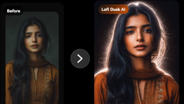
Recommended Tool for Image Enhancement: When incorporating anthracite color into your photography projects, Media.io's AI Image tools can help you achieve more refined results. With AI-powered color enhancement, photo colorization, image upscaling, and old photo restoration, you can easily enrich anthracite color tones, improve overall image quality, and highlight the color's elegant and sophisticated aesthetic.
Color Combinations
Anthracite is flexible because it behaves like a neutral with a cool undertone. The combinations below show reliable ways to add warmth, contrast, or subtle harmony while keeping a modern look.
Complementary Colors
A warm orange-copper accent creates strong contrast against anthracite's cool base. This pairing feels energetic but still refined, especially when balanced with a light neutral.
Complementary Palette Example: Use Anthracite for structure, Copper Orange for focal points, and Soft Sand to keep the overall design breathable.
Analogous Color Schemes
Analogous colors sit adjacent to each other on the color wheel, creating harmonious, cohesive palettes with subtle variation.
Blue-leaning grays and muted teals keep the palette cool, cohesive, and technical.
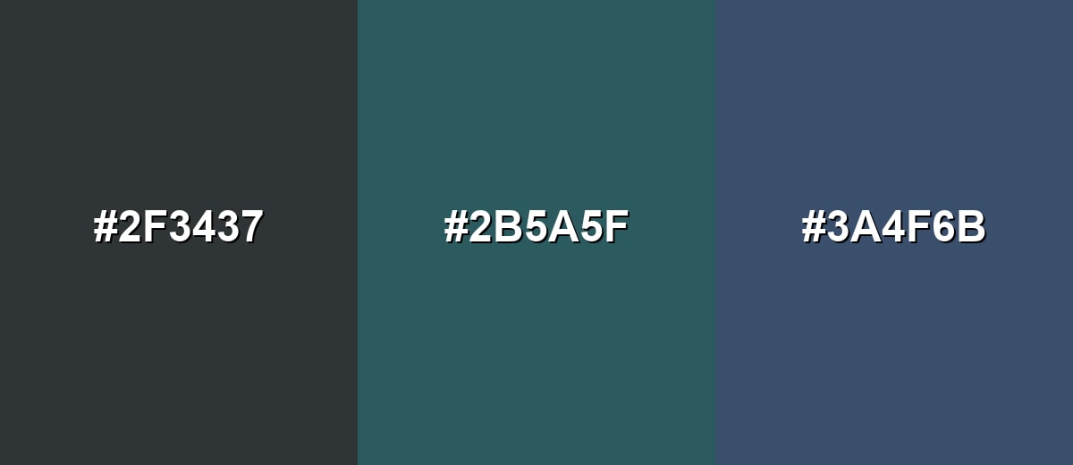
- Anthracite: #2F3437
- Deep Teal: #2B5A5F
- Steel Blue: #3A4F6B
Natural green-gray and dark blue tones create a calm, outdoorsy feel without losing the modern edge.
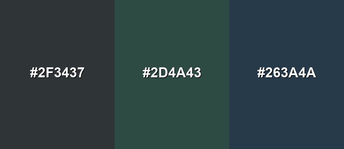
- Anthracite: #2F3437
- Pine Gray: #2D4A43
- Midnight Blue: #263A4A
Triadic & Tetradic Combinations
A triadic setup adds variety while keeping contrast predictable.
Muted magenta and olive-lime add personality to anthracite without making the scheme look loud.
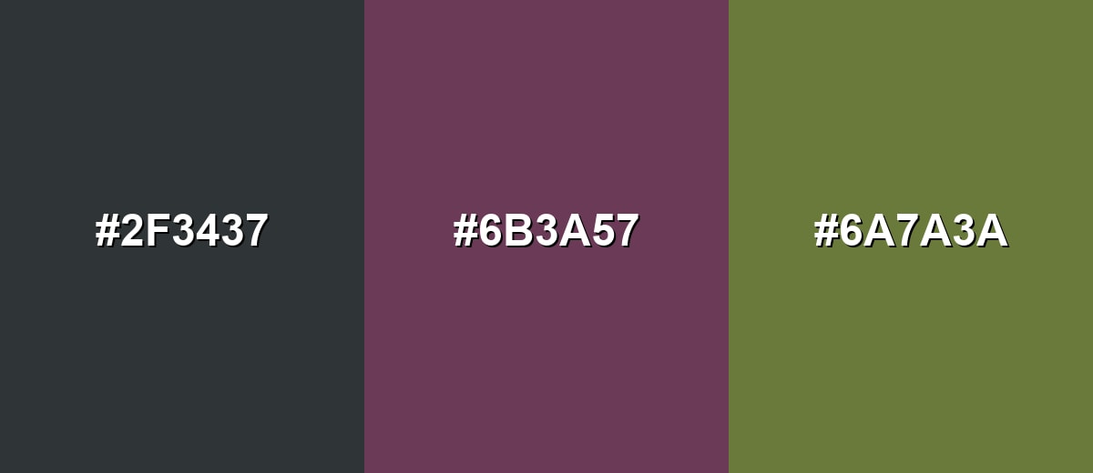
- Anthracite: #2F3437
- Muted Magenta: #6B3A57
- Olive Lime: #6A7A3A
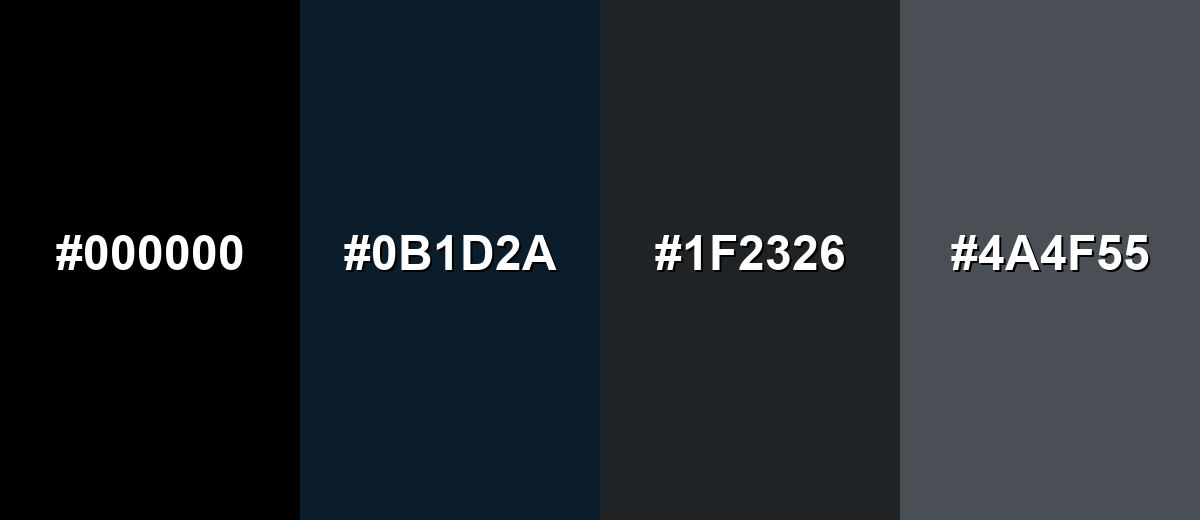
Colors to Avoid
While anthracite color is remarkably versatile, certain combinations can create problematic visual effects:
- True Black (#000000) - Too close in value, which can make anthracite look dusty and reduce separation in UI elements.
- Deep Navy (#0B1D2A) - Creates a heavy, nearly monochrome mix that can feel overly dark and low-contrast in many layouts.
- Charcoal (#1F2326) - Another near-dark neutral that often blends into anthracite, causing muddy edges and unclear hierarchy.
- Cool Mid Gray (#4A4F55) - Sits too close on the gray scale, so components can look flat unless you add a clearer accent or lighter neutral.
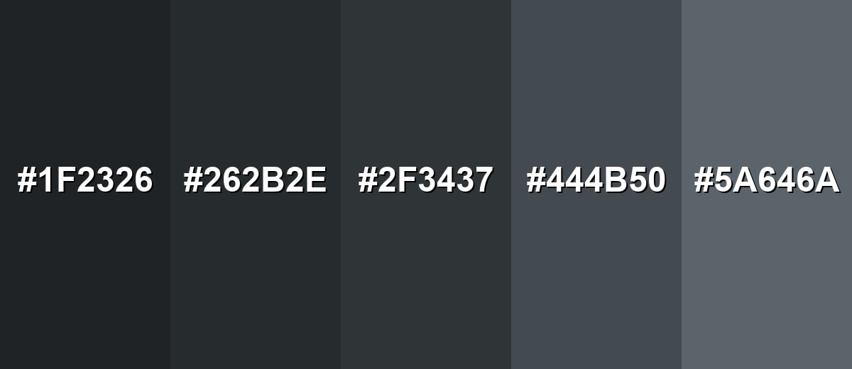
Shades, Tints & Variations of Anthracite Color
Anthracite isn't just one dark gray—there's a whole usable range, from near-black "jet" tones to lighter, airier variations. Having a few options makes it easier to build hierarchy (backgrounds, cards, borders, text) without leaving the same color family.
- Jet Anthracite (#1F2326) - A near-black anthracite that keeps a slight cool cast. It's best used for High-contrast headers, premium packaging, and dark UI surfaces where you still want a softer look than pure black.
- Deep Anthracite (#262B2E) - A darker, denser version that reads solid and technical. It's best used for Navigation bars, product backdrops, and industrial-themed branding systems.
- Classic Anthracite (#2F3437) - A balanced anthracite with a restrained blue-green undertone. It's best used for Primary brand neutral, typography, and general-purpose backgrounds.
- Soft Anthracite (#444B50) - A lighter option that keeps the mood but increases readability and flexibility. It's best used for Secondary backgrounds, cards, dividers, and UI components that need separation without stark contrast.
- Light Anthracite Gray (#5A646A) - A mid-to-dark gray inspired by anthracite, with a cooler, airy feel. It's best used for Text on light surfaces, large interior areas, and subtle chart elements when paired with strong labels.
Industry Applications
Because it's neutral, modern, and easy to anchor with accents, anthracite fits into many industries—especially anywhere you want a serious tone without the intensity of pure black.
Fashion & Beauty
- Works as a versatile base for outerwear, tailoring, and minimalist wardrobes.
- Pairs cleanly with both muted palettes and brighter seasonal accent colors.
- Photographs well for e-commerce thanks to visible depth (less "flat" than black).
- Feels polished and modern in packaging for fragrance, skincare, and grooming lines.
Interior Design & Decor
- Popular on cabinetry, fixtures, and feature walls for a crisp, architectural look.
- Looks especially balanced with warm lighting, cream textiles, and light oak.
- Plays nicely with brushed metal finishes for a subtle industrial edge.
- Helps anchor open spaces by adding contrast without dominating the room.
Branding & Marketing
- Used as a primary neutral to communicate reliability and sophistication.
- Supports bold accent colors for CTAs and brand highlights without visual chaos.
- Great for editorial-style layouts where photography needs a stable frame.
- In dark-mode UI, it reduces glare compared with pure black while staying premium.
Conclusion
Anthracite is a deep, cool-leaning gray that delivers the structure of black with a softer, more livable edge. With #2F3437 as a dependable reference, it's easy to reproduce across UI design, branding systems, interiors, and print—then refine with warm off-whites to keep things inviting or a confident accent to create focus. Used thoughtfully (and with contrast tested), anthracite brings clarity, calm, and modern polish to almost any visual style.
Design Smarter with AI: Media.io is an online AI studio that empowers creators with advanced image generation and enhancement tools. From text-to-image and image-to-image creation to AI upscaling and color optimization, it enables fast, creative, and professional results—all in your browser.

Frequently Asked Questions About Anthracite Color
It looks like a very dark gray with a subtle cool cast, often slightly blue-green. Compared with black, it has more visible depth and looks less harsh in most lighting.
It is closer to gray, but it sits at the darkest end of the gray range. The key difference is that anthracite still shows tone and undertone, while black tends to read neutral and absolute.
Yes. It behaves like a strong neutral base that supports both warm and cool accents, making it useful for modern palettes, layouts, and product-focused visuals.
Warm off-whites, sandy beiges, and soft grays keep it balanced, while copper/orange, teal, olive, and muted pinks add contrast. Choosing one main accent hue usually creates the cleanest results.
It can be excellent for backgrounds because it reduces glare compared with pure black. Make sure text and key controls have enough contrast, and avoid stacking multiple near-dark grays that blend together.
Add warmth through lighting, natural materials, and warmer neutrals. In digital designs, use warmer off-white text and include one warm accent to keep the interface feeling approachable.
