

Blue iris color is a vivid bluish purple that feels like a clean, luminous violet-blue in real life—similar to iris petals in daylight. Its signature HEX code is #5A4FCF, a confident mid-tone that stays cool, expressive, and surprisingly easy to work with.
Because it sits right between blue and purple, blue iris often reads as calm and imaginative with a slightly futuristic edge. Below, you'll find the exact color codes, contrast and pairing tips, shade ideas, and practical ways to use it across digital, print, and interiors.
Blue Iris Color: Codes & Values
If you're trying to match blue iris across web, UI, and print, these are the core values to save in your brand kit or style guide.
| Parameters | VALUE |
| HEX Code | #5A4FCF |
| RGB DECIMAL | 90, 79, 207 |
| RGB PERCENTAGE | 35.3%, 31.0%, 81.2% |
| CMYK | 57%,62%,0%,19% |
| HSL | 245°, 57%, 56% |
| HSV (HSB) | 245°, 62%, 81% |
| Web Safe | #6666CC |
Key Color Space Explanations:
- HEX - HEX is the most common way to specify blue iris for websites and digital graphics. Use #5a4fcf in CSS, design tools, and UI style guides for consistent results.
- RGB - RGB describes blue iris using red, green, and blue light, which is how screens display it. The decimal values help you match the tone precisely across apps and devices.
- CMYK - CMYK is used for print, where inks mix on paper rather than light on a screen. These values are a practical starting point, but test prints are recommended because paper and coating change the final look.
- HSL - HSL breaks the shade into hue, saturation, and lightness, which makes adjusting tints and tones more intuitive. It is useful when you want a lighter UI variant or a deeper accent while keeping the same hue family.
- Web Safe - Web safe is the closest older-browser palette approximation to the original shade. For blue iris, #6666cc is the nearest web-safe match if you need maximum legacy consistency.
For digital work, start with HEX/RGB; for print jobs, begin with CMYK and always proof on your actual paper stock to see how the violet-blue shift lands.
Blue Iris Color Conversions
Need blue iris in another color model for a specific tool or workflow? Use this conversion chart as a quick reference.
| Parameters | VALUE | CSS |
| HEX | #5a4fcf | #5a4fcf |
| RGB DECIMAL | 90, 79, 207 | rgb(90,79,207) |
| RGB PERCENTAGE | 35.3%, 31.0%, 81.2% | rgb(35.3%,31.0%,81.2%) |
| CMYK | 57%,62%,0%,19% | cmyk(57%,62%,0%,19%) |
| HSL | 245°, 57%, 56% | hsl(245°,57%,56%) |
| HSV (or HSB) | 245°, 62%, 81% | -- |
| Web Safe | 6666cc | #6666cc |
| CIE-LAB | 41.4, 42.0, -65.2 | -- |
| XYZ | 18.3, 12.3, 60.4 | -- |
| xyY | 0.201, 0.135, 12.3 | -- |
| CIE-LCH | 41.4, 77.6, 302.2° | -- |
| CIE-LUV | 41.4, -3.9, -97.2 | -- |
| Hunter-Lab | 35.0, 34.8, -86.5 | -- |
| Binary | 01011010 01001111 11001111 | -- |
Want to generate blue iris color photos or posters? Try Media.io's AI Image Generator now!
Blue Iris Meaning & Symbolism
Blue iris is often associated with thoughtful creativity, quiet confidence, and a modern sense of refinement. Because it sits between blue and purple, it can feel both trustworthy and imaginative in everyday visual choices, from apps to packaging.
Psychological Effects
Most people experience blue iris as focused and calming, with a creative undertone.
- Calm Focus - Blue iris tends to feel calming without becoming passive, supporting concentration and clarity.
- Cool Organization - Its blue base reads structured and tidy, which is why it fits clean interfaces and systems.
- Creative Spark - The violet undertone adds imagination and originality, keeping the color from feeling purely corporate.
- Premium Modernity - In branding, it can suggest quality and a slightly premium tone when used as an accent.
- Chilly Overuse - Heavy use may feel distant or dim in low light, especially on stark backgrounds or large blocks.
Positive Associations
Used intentionally, blue iris communicates a balanced mix of trust and expressive energy.
- Quiet Confidence - It signals assurance without shouting, making it strong for buttons, badges, and highlights.
- Thoughtful Creativity - The in-between hue suggests ideas, experimentation, and design-forward thinking.
- Refined Taste - Blue iris can feel polished and modern, especially alongside soft off-whites and gentle neutrals.
- Approachable Tech - It can read slightly futuristic while still staying friendly when balanced with warm textures.
- Reliable Imagination - As a bridge between blue and purple, it combines stability with artistic personality.
Cultural Significance Across the World
Its name and feel are strongly tied to the iris flower and what it symbolizes.
- Admiration - Iris flowers have long been linked with admiration, which carries into blue iris-inspired palettes.
- Wisdom - The iris is also associated with wisdom in many traditions, reinforcing a thoughtful, composed vibe.
- Hope - Blue iris symbolism often includes hope, making it popular for uplifting, forward-looking visuals.
- Creative-Tech Bridge - In contemporary design, it's widely seen as the meeting point between classic blue and expressive purple.
Design Applications
Blue iris is easiest to use when you treat it as a strong accent and then build support around it. A few smart choices in contrast, typography, and supporting tones can make it look crisp, modern, and intentional.
Graphic Design Tips
- Use it for primary actions, active states, and navigation highlights where you want a confident but calm emphasis.
- Pair with soft off-whites for a clean, product-led look, or with warm neutrals for a more human, editorial feel.
- For gradients, blend toward cooler blues for a tech vibe, or toward violets for a more artistic mood.
- Keep large saturated areas intentional—use blue iris as an anchor color, then give it breathing room with light neutrals.
- For accessibility, test contrast on buttons, links, and icons; small UI elements can fail contrast faster than you'd expect.
Pro tip: if you're building dark mode, consider a lighter tint of blue iris for interactive states so edges and icons don't get lost on deep backgrounds.
Blue Iris in Photography & Video
- Use blue iris accents (props, wardrobe, backgrounds) to create a cool, modern mood without pushing into harsh neon.
- Balance it with warm lighting and natural textures (wood, skin tones, paper) to avoid a chilly or dim look.
- For product shots, blue iris works well as a premium-feeling backdrop color—especially on coated or glossy surfaces.
- In motion graphics, reserve the most saturated blue iris moments for key beats (titles, CTA frames, highlights).
- When color grading, protect detail in shadows—deep violet-blues can clip quickly if you over-darken the scene.
Recommended Tool for Image Enhancement: When incorporating blue iris into your photography projects, Media.io's AI Image tools can help you achieve more refined results. With AI-powered color enhancement, photo colorization, image upscaling, and old photo restoration, you can easily enrich blue iris tones, improve overall image quality, and highlight the color's elegant and sophisticated aesthetic.
Color Combinations
Blue iris pairs best with warm yellow-greens, soft neutrals, and clean modern accents. The palettes below show practical combinations you can use for branding, UI systems, illustrations, and interior styling.
Complementary Colors
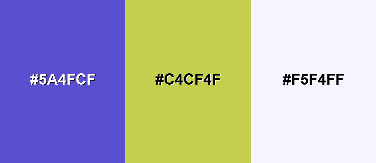
A complementary pairing brings out the energy in blue iris by balancing it with a warm, yellow-leaning partner. This contrast is great for calls to action, charts, and focal points that need immediate clarity.
Complementary Palette Example: Combine Blue Iris with a mellow yellow-green and a pale lavender-white to keep the contrast bold but polished.
Analogous Color Schemes
Analogous colors sit adjacent to each other on the color wheel, creating harmonious, cohesive palettes with subtle variation.
A blue-leaning analogous set keeps things calm and cohesive while adding depth through nearby hues.
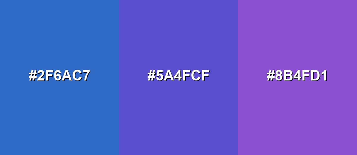
- Cobalt Stream: #2F6AC7
- Blue Iris: #5A4FCF
- Orchid Violet: #8B4FD1
A more purple-shifted analogous set feels creative and modern, ideal for expressive visuals.
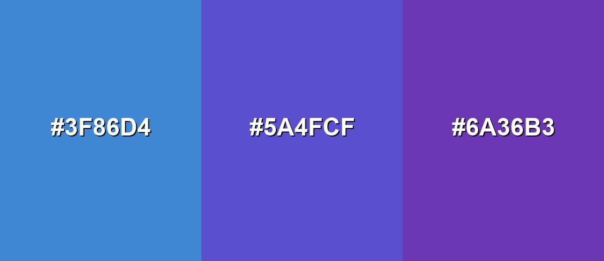
- Azure Glow: #3F86D4
- Blue Iris: #5A4FCF
- Royal Amethyst: #6A36B3
Triadic & Tetradic Combinations
A triadic palette creates a lively, balanced mix without relying on extreme contrast.
Use Blue Iris with a warm red accent and a fresh green to build playful, high-clarity layouts.
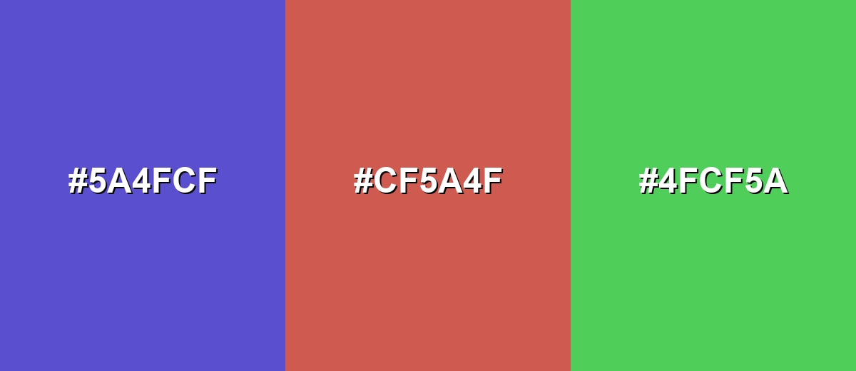
- Blue Iris: #5A4FCF
- Coral Ember: #CF5A4F
- Spring Mint: #4FCF5A
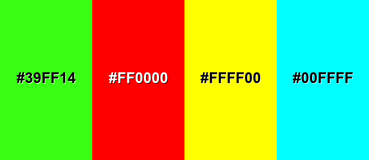
Colors to Avoid
While blue iris is remarkably versatile, certain combinations can create problematic visual effects:
- Neon Lime (#39FF14) - The extreme brightness competes with blue iris and can look harsh on screens, especially in UI highlights.
- Pure Red (#FF0000) - This high-intensity pairing can feel aggressive and distracting, reducing readability and perceived trust.
- Pure Yellow (#FFFF00) - The combination can create visual vibration and glare, which is uncomfortable in large areas or text.
- Electric Cyan (#00FFFF) - Both hues are highly saturated and cool, often producing a loud, synthetic look with weak hierarchy.
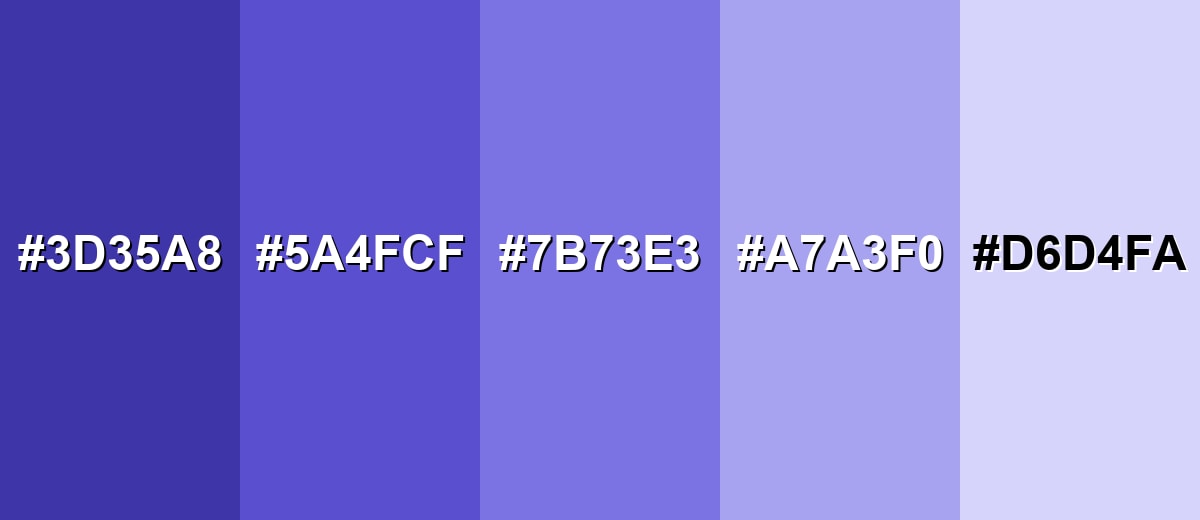
Shades, Tints & Variations of Blue Iris
From deeper, moodier versions to airy pastel tints, blue iris has a range that's useful for building consistent UI states, brand systems, and layered layouts. These variations help you keep the same hue identity while changing contrast and intensity for different surfaces.
- Deep Blue Iris (#3D35A8) - A darker, more grounded version that keeps the violet-blue character while feeling more serious. It's best used for Headers, hero backgrounds, premium packaging accents, and dark-mode surfaces.
- Blue Iris (#5A4FCF) - The core shade: vivid bluish purple with a clean, modern balance of calm and creativity. It's best used for Primary accents, brand anchors, buttons, links, and highlight elements.
- Soft Blue Iris (#7B73E3) - A lighter, friendlier take that feels airy while staying clearly within the iris family. It's best used for Secondary UI states, cards, banners, and gentle gradients.
- Misty Iris (#A7A3F0) - A muted pastel tint that reduces intensity and adds a calm, spacious feel. It's best used for Background panels, onboarding screens, subtle data visualization, and calming interiors.
- Iris Tint (#D6D4FA) - A very light tint with a faint violet-blue cast that reads clean and soft. It's best used for Page backgrounds, form fields, dividers, and minimal, modern layouts.
Industry Applications
Blue iris fits industries that need a blend of trust and imagination. It can feel smart and modern without becoming overly loud, making it a versatile pick for digital-first brands.
Fashion & Beauty
- Use blue iris as a premium packaging accent for beauty and personal care lines that want a refined, expressive mood.
- Pair it with soft off-whites or lavender-leaning neutrals to keep campaigns clean, luminous, and modern.
- Apply it to secondary brand elements (patterns, borders, labels) to add personality without overpowering product visuals.
- For launches and seasonal edits, gradients that shift toward violet can amplify the artistic side of the hue.
Interior Design & Decor
- Use blue iris on textiles, decor objects, or a feature wall to add a cool statement color that still feels calm.
- Balance it with warm lighting, wood tones, and light neutrals so it stays vibrant rather than cold.
- In low-light rooms, consider lighter tints (like Misty Iris or Iris Tint) to keep the space open and welcoming.
- For modern interiors, combine it with clean accents while avoiding overly saturated cool pairings that can feel synthetic.
Branding & Marketing
- In technology and SaaS, blue iris works well for UI accents, product highlights, and illustration systems that need clarity.
- For education and learning platforms, it supports focus and structured content while staying approachable.
- In wellness and lifestyle branding, it can feel calming and uplifting—especially when grounded with warm neutrals.
- For entertainment and creative tools, it signals imagination, craft, and modern aesthetics without relying on loud neon color.
Conclusion
Blue iris color is a vivid bluish purple that brings together calm focus and creative energy in one modern shade. With its anchor HEX code #5A4FCF, it's a strong choice for UI accents, brand systems, packaging, and decor—especially when you support it with soft neutrals, warm complements, or nearby blues and purples. Keep an eye on contrast for accessibility, avoid harsh high-saturation pairings, and use tints and deeper variations to build a cohesive palette that stays readable and intentional across screens and print.
Design Smarter with AI: Media.io is an online AI studio that empowers creators with advanced image generation and enhancement tools. From text-to-image and image-to-image creation to AI upscaling and color optimization, it enables fast, creative, and professional results—all in your browser.

Frequently Asked Questions About Blue Iris Color
Blue iris is a vivid bluish purple shade that sits between blue and violet. It often looks clean and luminous, especially under neutral daylight.
The HEX value commonly used for blue iris is #5a4fcf. This code is a reliable reference for web and digital design.
It is commonly associated with calm focus, creative thinking, and a modern, refined tone. Depending on context, it can also feel slightly cool or distant if overused.
Blue iris pairs well with yellow-greens, soft off-whites, gentle lavenders, and clean teals. It also works with warm neutrals like sand or beige to avoid a cold look.
Yes, it can be excellent for UI accents, but contrast depends on the background and text size. Use contrast checking tools and consider lighter tints for dark mode interactive elements.
Start with its CMYK conversion and run a proof on your chosen paper. Coated papers often keep it vibrant, while uncoated stocks can soften and mute the bluish purple tone.


