

 TL;DR:
Aqua (#00FFFF), which is completely identical to pure cyan on RGB displays, is a highly luminous blue-green hue best utilized as a crisp visual accent rather than a dominant background.
● Pure aqua lacks sufficient contrast for readable body text on white screens, requiring designers to darken it into deep teal shades or reserve it strictly for UI highlights, icons, and badges.
● Balance the color's high visual intensity by anchoring it with deep navy or warm coral tones, and avoid pairings with pure white, neon yellow, or hot magenta to prevent glare and harsh visual vibration.
● Because aqua achieves its bright glow by maximizing green and blue light on digital displays, translating the color into ink-based CMYK printing requires rigorous proofing to prevent the hue from shifting into a dull finish.
Ask AI for a summary
 ChatGPT
 Perplexity
 Gemini
 Claude
 Grok
Grok
Aqua color is a vivid blue-green that looks like clear tropical water with a bright, cooling glow. Its standard digital reference is #00FFFF, sitting right between blue and green on the spectrum.
Because aqua is the same as pure cyan on RGB screens, it can feel extra luminous in modern interfaces. Below, you'll find its color codes, conversions, meaning, pairings, shade ideas, and practical contrast tips.
Aqua Color: Codes & Values
If you want aqua to look consistent across tools and platforms, start with its core values below and adjust lightness only when you need more readability.
| Parameters | VALUE |
| HEX Code | #00FFFF |
| RGB DECIMAL | 0, 255, 255 |
| RGB PERCENTAGE | 0%, 100%, 100% |
| CMYK | 100%,0%,0%,0% |
| HSL | 180°, 100%, 50% |
| HSV (HSB) | 180°, 100%, 100% |
| Web Safe | #00FFFF |
Key Color Space Explanations:
- HEX - HEX is the most common web identifier for a specific hue. Use #00ffff to reproduce aqua consistently across digital design tools.
- RGB - RGB defines the mix of red, green, and blue light used on screens. Aqua is made by maxing green and blue (0, 255, 255) with no red.
- CMYK - CMYK is used for ink-based printing and can shift depending on paper and profiles. As a bright cyan-leaning hue, aqua often prints best with careful proofing to avoid dullness.
- HSL - HSL describes hue, saturation, and lightness in a way that is easy to tweak for UI themes. Aqua sits at 180° with full saturation, so small lightness changes quickly create usable tints and shades.
- Web Safe - Web-safe values are the legacy palette that display reliably across systems. Aqua is already web-safe, so #00ffff maps cleanly without approximation.
Use the HEX code for most web workflows, switch to RGB when you're working in screen-based apps, and rely on HSL when you want quick tint/shade variations without changing the hue.
Aqua Color Conversions
These conversions help you match aqua across design software, printing workflows, and technical color pickers without guesswork.
| Parameters | VALUE | CSS |
| HEX | #00ffff | #00ffff |
| RGB DECIMAL | 0, 255, 255 | rgb(0,255,255) |
| RGB PERCENTAGE | 0%, 100%, 100% | rgb(0%,100%,100%) |
| CMYK | 100%,0%,0%,0% | cmyk(100%,0%,0%,0%) |
| HSL | 180°, 100%, 50% | hsl(180°, 100%, 50%) |
| HSV (or HSB) | 180°, 100%, 100% | -- |
| Web Safe | 00ffff | #00ffff |
| CIE-LAB | 91.07, -48.00, -14.20 | -- |
| XYZ | 53.81, 78.74, 106.97 | -- |
| xyY | x=0.2246, y=0.3287, Y=78.74 | -- |
| CIE-LCH | 91.07, 50.00, 196.50° | -- |
| CIE-LUV | 91.07, -70.30, -15.10 | -- |
| Hunter-Lab | 88.75, -43.60, -15.40 | -- |
| Binary | 00000000 11111111 11111111 | -- |
Want to generate Aqua Color photos or posters? Try Media.io's AI Image Generator now!
Aqua Color Meaning & Symbolism
Aqua is commonly linked with water, clarity, and a breezy sense of openness. Because it feels both crisp and bright, it often signals cleanliness and modern simplicity in everyday visuals. This is why Aqua Color meaning is frequently tied to freshness, ease, and a light, optimistic mood.
Psychological Effects
Aqua tends to shift the feel of a layout quickly because it's bright, cool, and highly saturated.
- Lightness - Makes screens and spaces feel more open and breathable, especially when used in tints.
- Fresh Energy - Adds a "new and clean" vibe that can make interfaces feel fast and modern.
- Clarity - Helps key UI moments (like badges or highlights) feel crisp and easy to spot.
- Calm Coolness - Communicates a cooling, water-like calm without turning dull or muted.
- Overuse Risk - Too much can feel cold, sterile, or clinical, particularly against lots of white.
Positive Associations
When balanced well, aqua reads upbeat and clean while still feeling relaxed.
- Freshness - Suggests clean air and clean water, making designs feel revitalizing.
- Cleanliness - Often used to imply hygiene, simplicity, and well-kept presentation.
- Optimism - Brings a bright, sunny mood without the heaviness of darker blues.
- Modern Simplicity - Fits minimalist layouts and product-led visuals that want a crisp finish.
- Tech Forward - Feels digital and luminous on RGB displays, which can signal innovation.
Cultural Significance Across the World
Across contexts, aqua frequently borrows its meaning from water and renewal, plus its strong presence in digital color systems.
- Water Symbolism - Commonly linked with oceans, pools, and cleansing rituals.
- Renewal - Often connected to refresh, reset, and a "starting over" feeling.
- Wellness Cues - Regularly used in spa-like visuals to reinforce calm routines and clarity.
- Digital Culture - Strongly associated with modern UI styling due to its high-intensity screen glow.
Design Applications
Aqua works best when you treat it as a high-energy blue-green: strong in highlights, clean in backgrounds, and striking next to warm tones. The key is controlling contrast so it stays readable and doesn't overpower nearby elements.
Graphic Design Tips
- Use aqua as an accent for icons, tags, and emphasis elements rather than large, full-saturation blocks.
- Soften glare by switching from pure aqua to a light tint for section backgrounds and cards.
- Anchor aqua with darker tones in the same family for headers, rails, and navigation.
- Pair aqua with warm neutrals to keep the overall mood friendly instead of clinical.
- Test contrast early—pure aqua on white often looks bright but reads weak for small details.
Pro tip: If aqua feels too neon, reduce saturation slightly or darken it into a deeper aqua/teal for text-adjacent elements—your layout will instantly feel more premium and less "glowy."
Aqua Color in Photography & Video
- Use aqua in color grading to push a clean "water + sky" mood for travel and lifestyle scenes.
- Keep skin tones natural by limiting aqua shifts to shadows or background elements.
- In product shots, aqua works well as a reflective accent (glass, water, glossy props) rather than the main fill.
- For thumbnails, a small aqua highlight can create a crisp focal point without clutter.
- On bright displays, watch clipping—fully saturated aqua can lose detail in highlights.
Recommended Tool for Image Enhancement: When incorporating aqua color into your photography projects, Media.io's AI Image tools can help you achieve more refined results. With AI-powered color enhancement, photo colorization, image upscaling, and old photo restoration, you can easily enrich aqua color tones, improve overall image quality, and highlight the color's elegant and sophisticated aesthetic.
Color Combinations
Aqua pairs easily because it sits between blue and green, but it performs best with a strong anchor tone and one warm counterpoint. Use the palettes below to build contrast, keep layouts readable, and create a balanced mood.
Complementary Colors
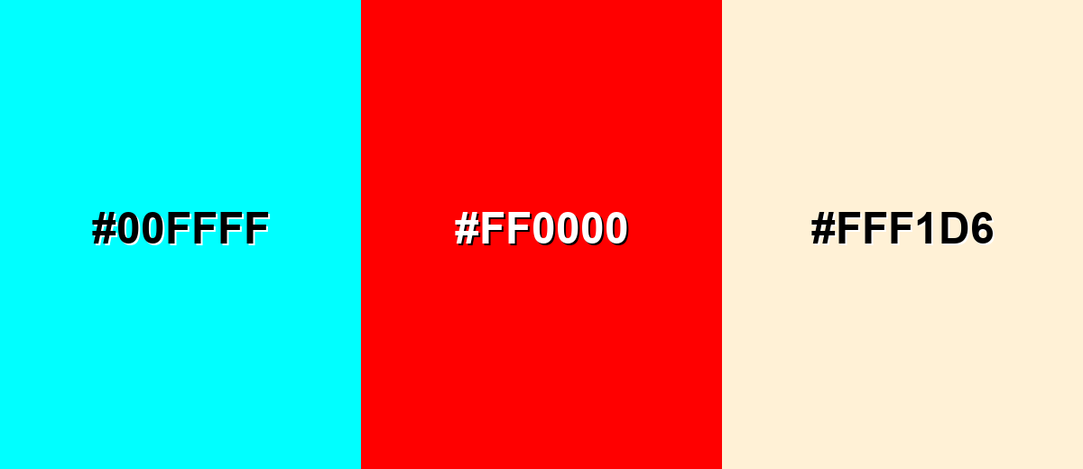
The complementary match for aqua is a red-based hue, creating the strongest possible contrast. This pairing feels energetic and modern, so it works well for calls to action, sports styling, and bold visual campaigns.
Complementary Palette Example: Try aqua with vivid red and a soft warm neutral to keep the look punchy but not harsh.
Analogous Color Schemes
Analogous colors sit adjacent to each other on the color wheel, creating harmonious, cohesive palettes with subtle variation.
A blue-leaning analogous set creates a clean, ocean-like gradient that feels calm and contemporary.
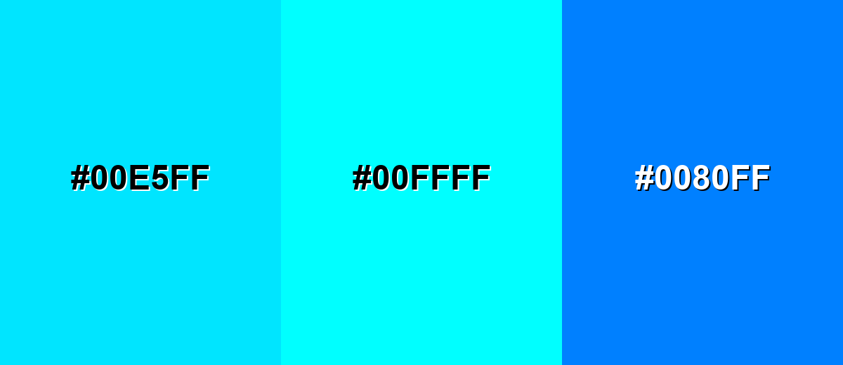
- Sky Cyan: #00E5FF
- Aqua: #00FFFF
- Azure Blue: #0080FF
A green-leaning analogous set feels fresh and tropical, great for friendly, upbeat visuals.
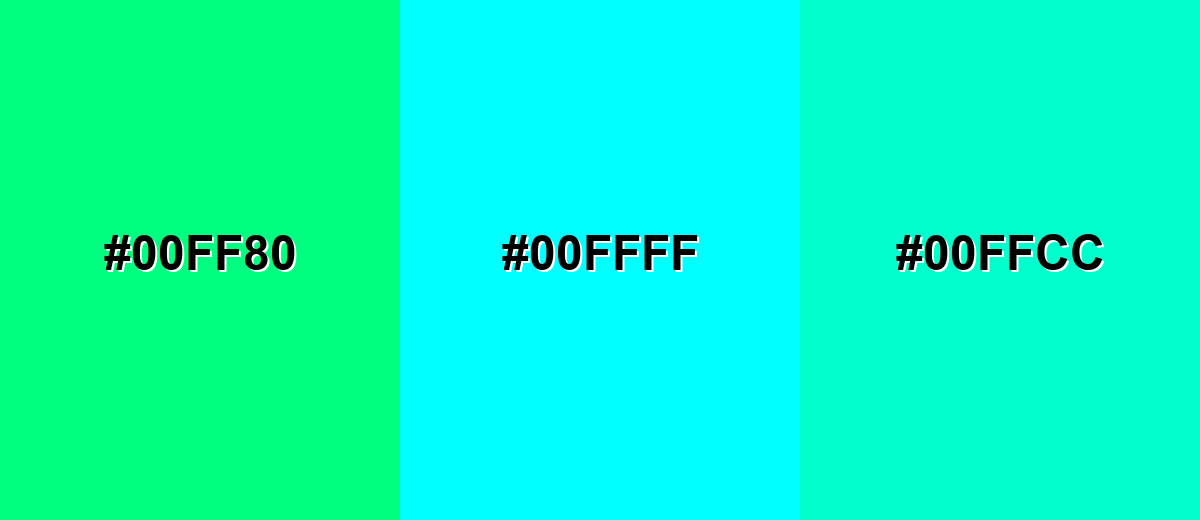
- Spring Green: #00FF80
- Aqua: #00FFFF
- Aqua Mint: #00FFCC
Triadic & Tetradic Combinations
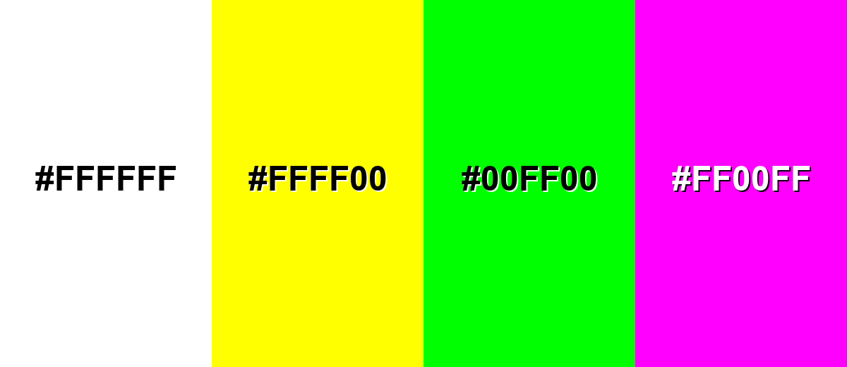
A triadic palette balances aqua with two evenly spaced hues for a lively, playful look.
Use yellow for brightness and magenta for punch, then let aqua keep the layout crisp and cool.
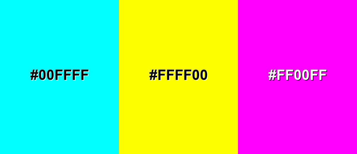
- Aqua: #00FFFF
- Bright Yellow: #FFFF00
- Electric Magenta: #FF00FF
Colors to Avoid
While aqua color is remarkably versatile, certain combinations can create problematic visual effects:
- Pure White (#FFFFFF) - On bright screens, aqua next to pure white can look glaring and reduce perceived contrast for small UI details.
- Neon Yellow (#FFFF00) - This combination can feel harsh and visually noisy, making text and icons harder to scan quickly.
- Neon Green (#00FF00) - Because both are highly saturated and close in brightness, the pairing can vibrate and feel unstable in layouts.
- Hot Magenta (#FF00FF) - At full saturation, the mix can become overly intense for long-form reading or calm brand impressions unless carefully moderated.
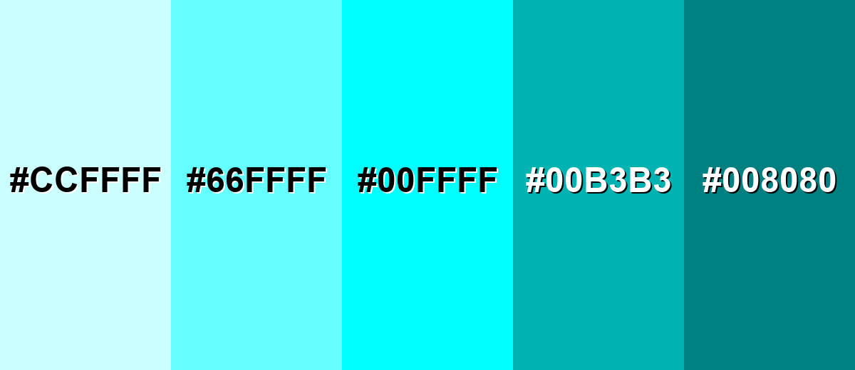
Shades, Tints & Variations of Aqua Color
Aqua isn't just one "pool blue" moment—its range includes soft, airy tints for backgrounds and deeper, steadier shades for UI anchors. Using variations helps you keep the same fresh personality while improving contrast, hierarchy, and comfort for long viewing.
- Pale Aqua (#CCFFFF) - A very light tint that keeps the watery feel but reads softer and less intense. It's best used for Large backgrounds, cards, subtle sections, and gentle gradients.
- Light Aqua (#66FFFF) - A brighter tint that still feels airy, with enough presence for UI panels and highlights. It's best used for Secondary backgrounds, hover states, and friendly data highlights.
- Pure Aqua (#00FFFF) - The most vivid, high-intensity aqua, matching the standard screen cyan. It's best used for Accents, icons, emphasis elements, and energetic visual moments.
- Deep Aqua (#00B3B3) - A darker, more grounded take that feels cleaner and more usable for text-adjacent elements. It's best used for Buttons, headers, UI rails, and more accessible accent blocks.
- Dark Aqua (#008080) - A teal-leaning shade that adds maturity and stability while staying in the same family. It's best used for Navigation, footers, charts, and strong brand anchors.
Industry Applications
Because aqua reads as clean, modern, and water-adjacent, it appears across industries that benefit from a fresh, clear visual tone. The strongest results usually come from pairing it with darker anchors and warm accents.
Fashion & Beauty
- Works well for fresh, clean packaging looks—especially when you lean into softer tints.
- Great for "hydration" or "cooling" product stories where clarity is the main message.
- Use as a small accent in layouts to keep the premium feel without turning neon.
- Pairs nicely with off-white styling to keep visuals bright but not overly clinical.
Interior Design & Decor
- Creates an airy, spa-like mood in bathrooms, kitchens, and sunlit rooms.
- Looks natural alongside light wood, linen, and stone textures.
- Warm accents help balance aqua so spaces feel welcoming instead of chilly.
- Deep aqua/teal-leaning shades work well for statement pieces and anchors.
Branding & Marketing
- Useful for product-led brands that want a crisp, modern, easy-to-use vibe.
- Performs strongly in UI highlights, onboarding cues, and promotional badges.
- Best practice is to pair it with a darker "trust" tone for legibility and stability.
- In print, test proofs to avoid dull shifts compared to its screen brightness.
Conclusion
Aqua color stands out for its bright blue-green clarity and its strong connection to water, freshness, and modern simplicity. Using #00FFFF as your reference makes it easy to match across digital tools, then you can shift into lighter tints or deeper aqua/teal shades to improve comfort and contrast. For the cleanest results in UI, branding, or interiors, treat pure aqua as an energetic accent and balance it with grounded, darker elements—your design stays readable, polished, and unmistakably fresh.
Design Smarter with AI: Media.io is an online AI studio that empowers creators with advanced image generation and enhancement tools. From text-to-image and image-to-image creation to AI upscaling and color optimization, it enables fast, creative, and professional results—all in your browser.

Frequently Asked Questions About Aqua Color
Quick answers to the most common questions designers ask when working with aqua in digital, print, and branding.
Aqua is a bright blue-green hue that resembles clear, shallow water. In digital design, it is commonly represented by #00ffff.
In standard web and RGB terms, aqua and cyan refer to the same exact value. Both are the fully saturated mix of green and blue light with no red.
Aqua is often associated with freshness, clarity, cleanliness, and a light, calming energy. It can also feel modern and tech-forward because it appears very luminous on screens.
Aqua pairs well with warm reds and corals for contrast, and with deep navy or charcoal to keep designs grounded. It also blends smoothly with nearby blue and green tones for ocean-like palettes.
Pure aqua is usually too light for readable body text on white. For accessibility, use it as an accent or darken it into deeper aqua/teal shades when it must be used for text.
Reduce saturation slightly, increase lightness for pastel tints, or shift it toward teal with a darker value. Pairing it with warm neutrals and natural textures also helps it feel softer and less intense.


