

Viva magenta color is a vivid red-magenta that reads like rich raspberry with a warm, slightly crimson undertone. Its HEX code is #BB2649, a strong shade that holds up well on screens and in print.
Often perceived as confident, spirited, and creatively bold, this modern hue also nods to historical dye traditions known for intense red-magenta pigments. Below, you'll find its meaning, color codes, combinations, shades, and practical ways to use it.
Viva Magenta Color: Codes & Values
If you're matching viva magenta color across web, UI, and print, start with the core codes below to keep your designs consistent.
| Parameters | VALUE |
| HEX Code | #BB2649 |
| RGB DECIMAL | 187, 38, 73 |
| RGB PERCENTAGE | 73.33%, 14.90%, 28.63% |
| CMYK | 0%,80%,61%,27% |
| HSL | 346°, 66%, 44% |
| HSV (HSB) | 346°, 80%, 73% |
| Web Safe | #CC3366 |
Key Color Space Explanations:
- HEX - HEX is the most common way to specify this shade in web design and UI. Use #bb2649 to match viva magenta precisely across digital projects.
- RGB - RGB describes how much red, green, and blue light forms the hue on screens. Higher red with low green creates the punchy red-magenta look.
- CMYK - CMYK is used for printing and estimates how inks combine on paper. This mix leans heavily on magenta and yellow, with black added for depth.
- HSL - HSL expresses hue, saturation, and lightness, which can be easier for picking tints and shades. Viva magenta sits near the red-magenta angle with strong saturation.
- Web Safe - Web safe is the closest legacy browser-safe approximation. #cc3366 is a practical fallback when you need limited-palette consistency.
Use HEX/RGB for digital interfaces and HSL when you're adjusting tints or depth; for print, rely on CMYK plus proofing to confirm how the color lands on your chosen paper.
Viva Magenta Color Conversions
Need to move between color systems (CSS, print specs, or color science values)? Here are the most common conversions for viva magenta color.
| Parameters | VALUE | CSS |
| HEX | #bb2649 | #bb2649 |
| RGB DECIMAL | 187, 38, 73 | rgb(187,38,73) |
| RGB PERCENTAGE | 73.33%, 14.90%, 28.63% | rgb(73.33%,14.90%,28.63%) |
| CMYK | 0%,80%,61%,27% | cmyk(0%,80%,61%,27%) |
| HSL | 346°, 66%, 44% | hsl(346°, 66%, 44%) |
| HSV (or HSB) | 346°, 80%, 73% | -- |
| Web Safe | cc3366 | #cc3366 |
| CIE-LAB | 43.0, 62.0, 15.0 | -- |
| XYZ | 23.7, 12.6, 7.3 | -- |
| xyY | 0.47, 0.25, 12.6 | -- |
| CIE-LCH | 43.0, 63.8, 13.6° | -- |
| CIE-LUV | 43.0, 92.0, 25.0 | -- |
| Hunter-Lab | 35.0, 50.0, 18.0 | -- |
| Binary | 101110110010011001001001 | -- |
Want to generate Viva Magenta Color photos or posters? Try Media.io's AI Image Generator now!
Viva Magenta Color Meaning & Symbolism
Viva magenta is commonly associated with confidence, vitality, and a bold kind of optimism. Because it sits between red and magenta, it often feels both energetic and expressive in everyday visuals. In simple terms, viva magenta color symbolism tends to signal presence, passion, and creative momentum.
Psychological Effects
This shade can make designs feel more alive and intentional, especially when used as an accent.
- Instant Attention - It draws the eye quickly, which is why it's often used for highlights and key moments in a layout.
- Energy Boost - The red-magenta balance creates a lively, upbeat mood that can make visuals feel more dynamic.
- Intentional Focus - Used sparingly, it makes hierarchy clearer by signaling "this matters" in UI and editorial design.
- Emotional Warmth - Its warm undertone can make modern designs feel less cold and more human.
- Overstimulation Risk - In large blocks, its saturation may feel loud or visually tiring without neutral balance.
Positive Associations
In branding and UI, it often reads bold without the sharp aggression of pure red.
- Confidence - A strong, self-assured tone that helps key elements feel decisive.
- Courage - Commonly linked with a brave, forward-moving attitude in campaign visuals.
- Creative Momentum - Its expressive magenta side supports playful, modern creativity.
- Drive - Works well for action-oriented moments like CTAs, badges, and announcements.
- Personality - Adds warmth and character to minimalist layouts without feeling dated.
Cultural Significance Across the World
Red-magenta tones have long appeared in textiles, decoration, and ceremonial details—often signaling celebration and status.
- Textile Heritage - Historically, intense red-magenta dyes have been used to create rich, premium-looking fabrics.
- Celebratory Details - Similar hues are frequently seen in festive visuals and decorative accents across cultures.
- Symbolic Presence - Bold red-magenta tones can imply importance, making them popular for standout elements.
- Modern Trend Language - Today, viva magenta is often used to express confident, forward-looking style without a single regional meaning.
Design Applications
Viva magenta is easiest to use when you treat it as a deliberate focal point rather than a default base, so its energy supports readability instead of fighting it.
Graphic Design Tips
- Use it for CTA buttons, badges, and key highlights in UI where quick attention matters.
- Apply it as a brand accent in logos, packaging, and social graphics instead of a full background.
- Pair it with soft off-whites and warm grays to keep layouts clean and reduce visual strain.
- For a lively, modern contrast, lean into pairings with greens or teals (especially as secondary accents).
- Avoid using it for long paragraphs or dense tables—reserve it for headings, pull quotes, and focal highlights.
Pro tip: If viva magenta is your hero accent, keep the rest of the palette quiet—use one strong neutral base, one supporting color, and plenty of whitespace so the magenta feels premium rather than noisy.
Viva Magenta Color in Photography & Video
- Use viva magenta props or wardrobe as a controlled pop of color against neutral sets for instant subject separation.
- In color grading, apply it to highlights (or selective skin-safe areas) rather than pushing overall saturation.
- For product shots, test it under warm vs. cool lighting—its crimson undertone can shift noticeably.
- In motion graphics, keep magenta overlays subtle so details and faces don't look overly tinted.
- When compressing for social platforms, check banding in gradients and reduce saturation slightly if needed.
Recommended Tool for Image Enhancement: When incorporating viva magenta color into your photography projects, Media.io's AI Image tools can help you achieve more refined results. With AI-powered color enhancement, photo colorization, image upscaling, and old photo restoration, you can easily enrich viva magenta color tones, improve overall image quality, and highlight the color's elegant and sophisticated aesthetic.
Color Combinations
Viva magenta pairs well with calm neutrals and clear opposites on the color wheel. Use the palettes below as starting points, then adjust saturation and spacing based on your project and medium.
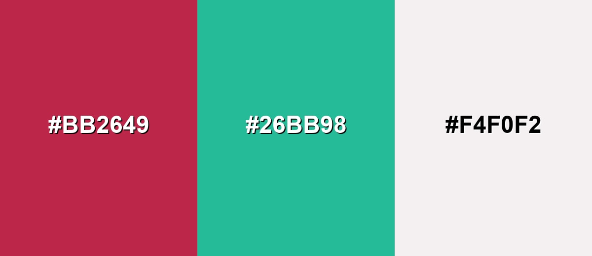
Complementary Colors
A complementary scheme uses the opposite hue to create crisp, high-energy contrast. With viva magenta, a blue-leaning teal is a natural match that feels modern and balanced.
Complementary Palette Example: Try viva magenta with teal and a soft off-white to keep the contrast bold but usable in real layouts.
Analogous Color Schemes
Analogous colors sit adjacent to each other on the color wheel, creating harmonious, cohesive palettes with subtle variation.
Analogous palette 1: shift toward pink and warm red-orange for a lively, cohesive range.
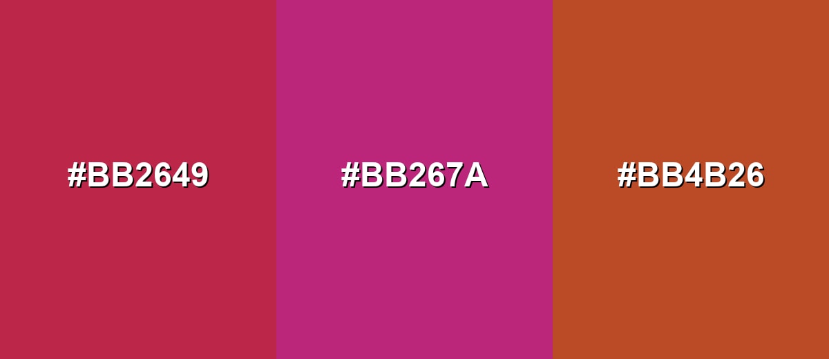
- Viva Magenta: #BB2649
- Berry Pink: #BB267A
- Red-Orange: #BB4B26
Analogous palette 2: deepen one side and brighten the other for a richer editorial look.
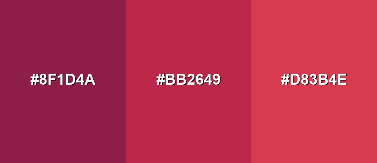
- Deep Wine: #8F1D4A
- Viva Magenta: #BB2649
- Warm Crimson: #D83B4E
Triadic & Tetradic Combinations
A triadic scheme uses three evenly spaced hues for variety without chaos.
Triadic pairing: combine viva magenta with a fresh green and a strong blue for energetic, modern contrast.
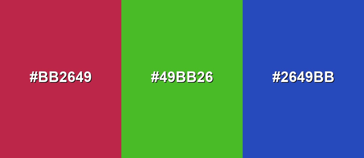
- Viva Magenta: #BB2649
- Leaf Green: #49BB26
- Royal Blue: #2649BB
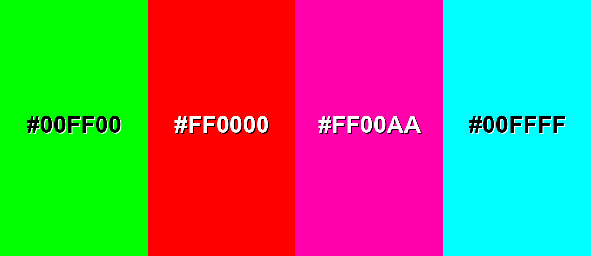
Colors to Avoid
While viva magenta color is remarkably versatile, certain combinations can create problematic visual effects:
- Pure Neon Green (#00FF00) - Competes aggressively with viva magenta, creating a harsh vibration that can feel cheap or chaotic.
- Pure Red (#FF0000) - The hues are too close but not harmonious, which can look like an unintentional mismatch in branding and UI.
- Neon Hot Pink (#FF00AA) - Overlaps in intensity and saturation, reducing hierarchy and making accents hard to distinguish.
- Electric Cyan (#00FFFF) - Creates extreme contrast that can distract from content, especially on screens at high brightness.
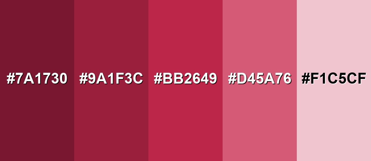
Shades, Tints & Variations of Viva Magenta Color
Viva magenta isn't just one "loud" accent—its range includes deeper wine tones and softer rose tints that help you control intensity. This makes it easier to build a full palette for branding, UI states, backgrounds, and premium editorial layouts.
- Deep Magenta (#7A1730) - A dark, wine-leaning version that feels grounded and premium. It's best used for Luxury packaging, headers, or dark-mode accents with controlled contrast.
- Dark Raspberry (#9A1F3C) - A deeper raspberry tone that keeps warmth while reducing brightness. It's best used for Brand secondary color, hover states, and editorial typography.
- Viva Magenta (#BB2649) - The signature saturated red-magenta with strong presence and modern energy. It's best used for Primary accent, CTAs, logo details, and focal highlights.
- Soft Magenta (#D45A76) - A gentler, more approachable tint that still reads confident. It's best used for Background panels, illustrations, and softer marketing layouts.
- Pale Rose (#F1C5CF) - A light, airy tint that feels warm and supportive rather than loud. It's best used for UI surfaces, subtle gradients, and calm backdrop sections.
Industry Applications
Because it is bold but still refined, viva magenta shows up across many visual industries. It is most effective when used with clear hierarchy and a supporting neutral base.
Fashion & Beauty
- Reads energetic and modern in textiles, making statement pieces feel current rather than retro.
- Works well in lip colors and beauty accents where saturation communicates confidence.
- Pairs smoothly with neutrals for everyday wear or clean packaging systems.
- Combines with metallics for a high-impact, editorial finish in both styling and product design.
Interior Design & Decor
- Use it on a feature wall for warmth and personality without repainting an entire room.
- Try it in upholstery or cushions to add a bold focal point with easy reversibility.
- Balance it with natural textures and wood tones so the saturation feels intentional.
- Soft lighting and warm neutrals help prevent the space from feeling overwhelmed.
Branding & Marketing
- Use as a signature accent to signal confidence and creativity.
- Works well in campaigns that need immediate attention in feeds, banners, and thumbnails.
- Supports clear hierarchy when applied to key messages, badges, and promotional modules.
- Pairs best with off-white surfaces and muted supporting colors to keep the brand system readable.
Conclusion
Viva magenta color is a saturated red-magenta that instantly grabs attention while still feeling warm and modern—especially when you treat it as an accent and support it with calm neutrals or well-chosen opposites. For consistent results across platforms, start with #BB2649, then fine-tune with HSL for tints/shades and validate CMYK with print proofing. Used with clear hierarchy, viva magenta becomes a reliable tool for branding, UI highlights, packaging, and visual storytelling without overpowering the rest of your design.
Design Smarter with AI: Media.io is an online AI studio that empowers creators with advanced image generation and enhancement tools. From text-to-image and image-to-image creation to AI upscaling and color optimization, it enables fast, creative, and professional results—all in your browser.

Frequently Asked Questions About Viva Magenta Color
It looks like a vivid raspberry red with a magenta twist, often reading warm and saturated rather than pastel. In different lighting, it can shift slightly toward crimson or berry.
It sits between the two, but most people perceive it as a red-magenta. Compared with typical pinks, it is darker, warmer, and more saturated.
It is usually better as an accent than as body text because its saturation can reduce comfort over long reading. If you must use it for text, increase size and weight and test contrast carefully.
Teals and blue-leaning greens create crisp complementary contrast, while off-whites and warm grays keep layouts clean. For a richer look, pair it with wine shades or deep navy.
The closest web-safe approximation is #cc3366. It will not be identical, but it keeps a similar red-magenta feel when you need a legacy-friendly palette.
It can print well, but the result depends on paper, ink, and calibration. For best consistency, use a proof, adjust saturation if needed, and consider spot or brand-specific print standards when accuracy is critical.


