

 TL;DR:
Lavender (#B57EDC) is a soft, calming light purple best utilized in digital and print design as a background wash or subtle accent alongside darker anchor colors like deep plum to maintain visual hierarchy and text readability.
● Implement Hex #B57EDC or RGB (181, 126, 220) for digital interfaces, but switch to CMYK (18%, 43%, 0%, 14%) for print workflows, testing on final paper stock since the color routinely renders lighter and less saturated on uncoated paper.
● Pair lavender with soft lime, sage green, periwinkle, or orchid for harmonious palettes, while strictly avoiding Pitch Black, Pure Red, Vivid Yellow, and Neon Green to prevent harsh, vibrating contrasts or unbalanced visual noise.
● Restrict lavender usage to large surface areas rather than typography, and when utilizing it in video production, closely monitor LED lighting environments as purple hues can skew rapidly under mixed lighting conditions.
Ask AI for a summary
 ChatGPT
 Perplexity
 Gemini
 Claude
 Grok
Grok
Lavender is a soft, light purple with a calm, airy presence—typically perceived as a gentle blend of violet with a subtle pink undertone. It feels delicate yet refined, making it a favorite in designs that aim for softness without losing sophistication.
On this page, you'll discover how lavender appears across digital and print formats, what it communicates psychologically and culturally, and how to confidently pair it with complementary, neutral, and accent colors in your designs.
Lavender Color: Codes & Values
If you're building a color palette, developing a brand style guide, or preparing artwork for print, using standardized lavender color codes is essential for visual consistency. Below are the most commonly used HEX, RGB, CMYK, and HSL values to help you reproduce lavender accurately across websites, mobile interfaces, marketing materials, and professional print projects. Whether you're working in digital design tools or prepress workflows, these codes ensure your lavender stays soft, balanced, and true to tone across different screens, devices, and paper stocks.
| Parameters | VALUE |
| HEX Code | #B57EDC |
| RGB DECIMAL | 181, 126, 220 |
| RGB PERCENTAGE | 71%, 49%, 86% |
| CMYK | 18%,43%,0%,14% |
| HSL | 275°, 57%, 68% |
| HSV (HSB) | 275°, 43%, 86% |
| Web Safe | #CC66CC |
Key Color Space Explanations:
- HEX is the most common way to specify lavender in web design and UI work. Use it in CSS, design systems, and style guides for consistent color rendering.
- RGB describes lavender using red, green, and blue light values for screens. It's the go-to format for digital graphics, video, and UI components.
- CMYK is used for printing, mixing cyan, magenta, yellow, and black inks. It helps you predict how lavender may shift on paper compared to a monitor.
- HSL expresses lavender by hue, saturation, and lightness, which is intuitive for choosing tints and tones. It's helpful for building harmonious palettes and hover/active states.
- Web Safe is the closest legacy palette match intended to reduce banding on older displays. Today it's mainly useful for quick approximation and compatibility references.
Use HEX/RGB for screens, switch to CMYK when you're preparing print files, and lean on HSL when you need quick tints and hover states that still feel "lavender."
Want to generate lavender color photos or posters? Try Media.io's AI Image Generator now!
Lavender Color Conversions
Need lavender in a different format for design tools, printing, or color grading? Here are the most common conversions in one place.
| Parameters | VALUE | CSS |
| HEX | #b57edc | #b57edc |
| RGB DECIMAL | 181, 126, 220 | rgb(181,126,220) |
| RGB PERCENTAGE | 71%, 49%, 86% | rgb(71%,49%,86%) |
| CMYK | 18%,43%,0%,14% | cmyk(18%,43%,0%,14%) |
| HSL | 275°, 57%, 68% | hsl(275°,57%,68%) |
| HSV (or HSB) | 275°, 43%, 86% | -- |
| Web Safe | cc66cc | #cc66cc |
| CIE-LAB | L* 63.6, a* 28.7, b* -38.0 | -- |
| XYZ | 39.40, 28.35, 70.10 | -- |
| xyY | 0.285, 0.205, 28.35 | -- |
| CIE-LCH | L* 63.6, C* 47.5, h° 306.5 | -- |
| CIE-LUV | L* 63.6, u* 20.0, v* -55.0 | -- |
| Hunter-Lab | L 53.2, a 20.4, b -34.7 | -- |
| Binary | 10110101, 01111110, 11011100 | -- |
Lavender Color Meaning & Symbolism
Lavender sits delicately between purple and pink, giving it a personality that feels both thoughtful and gentle. Because it blends the creativity of violet with the warmth of pink, its meaning can shift depending on context—ranging from quiet luxury and refinement to playful softness and romantic charm.
Psychological Effects
Psychologically, lavender's light value makes it naturally calming, while its purple foundation still communicates creativity and intention. This balance allows it to relax the viewer without feeling dull or passive.
- Soothing Mood - Helps visuals feel low-pressure, soft, and easy to spend time with.
- Gentle Focus - Supports a quiet, "clear head" feeling without the starkness of pure neutrals.
- Emotional Warmth - Adds a friendly, caring tone, especially when it leans slightly pink.
- Modern Creativity - Suggests imagination and originality without the intensity of deep violet.
- Airy Lightness - Keeps layouts feeling open and breathable, especially as a background wash.
Positive Associations
When used with thoughtful contrast and spacing, lavender can communicate both softness and sophistication. It has the flexibility to feel comforting and welcoming, yet polished and elevated—making it especially effective in branding and digital interfaces.
- Comfort - A reassuring, gentle look that feels welcoming in UI and packaging.
- Elegance - Reads refined when paired with clean whites or cool grays.
- Dreaminess - Creates a romantic, nostalgic atmosphere in editorial and event design.
- Clean Aesthetic - Feels tidy and fresh in minimalist layouts and product pages.
- Approachable Premium - Can feel boutique and elevated without looking "too serious."
Cultural Significance Across the World
Across cultures and design contexts, lavender is commonly associated with softness, sentiment, and understated elegance. While interpretations vary by region, it frequently appears in spaces where emotional warmth, refinement, and gentle optimism are central themes.
- Romantic Styling - Frequently used in weddings, invitations, and floral themes for a delicate mood.
- Wellness Language - Common in self-care and mindfulness visuals where calm is the main message.
- Soft Luxury - Appears in boutique branding to signal taste and subtle confidence.
- Seasonal Freshness - Often used in spring/summer palettes for light, airy, optimistic design.
Design Applications
Lavender is highly versatile in both digital and print design. It can function as a soft background wash, a subtle accent, or even a primary brand color depending on how it's styled. The key to using lavender successfully is managing contrast, hierarchy, and supporting neutrals so the color feels intentional rather than faded or overly sweet.
Graphic Design Tips
- Use lavender as a soft surface color for sections, cards, and banners to keep layouts feeling light and visually breathable.
- For readable typography, place dark text on lavender (rather than lavender text on a light background) to maintain strong contrast and accessibility.
- Keep saturation consistent across your palette so lavender doesn't look "dusty" next to brighter or more saturated pastels.
- Reserve stronger, higher-contrast colors for primary CTAs, while letting lavender handle secondary highlights such as tags, badges, chips, and subtle UI states.
- In print projects, always test on your final paper stock—lavender often appears lighter and less saturated on uncoated paper than it does on screen.
Pro tip: if lavender is your hero color, treat it like lighting—use it in larger areas (backgrounds and panels), then add structure with a darker companion shade for headings, outlines, and key UI elements.
Lavender Color in Photography & Video
- Use lavender backdrops to create a soft, editorial look for portraits and product shots.
- In color grading, keep skin tones natural by isolating purple/magenta adjustments from reds.
- Pair lavender props with neutral styling to avoid color clashes and keep the subject clear.
- For dreamy scenes, lift shadows slightly and reduce contrast so lavender stays airy, not heavy.
- When filming, watch for LED lighting shifts—purple hues can skew quickly under mixed lighting.
Recommended Tool for Image Enhancement: When incorporating lavender color into your photography projects, Media.io's AI Image tools can help you achieve more refined results. With AI-powered color enhancement, photo colorization, image upscaling, and old photo restoration, you can easily enrich lavender color tones, improve overall image quality, and highlight the color's elegant and sophisticated aesthetic.
Color Combinations
Lavender pairs best with either fresh greens (for balance), nearby purples and pinks (for harmony), or soft warm accents (for contrast). Use the palettes below as quick starting points.
Complementary Colors
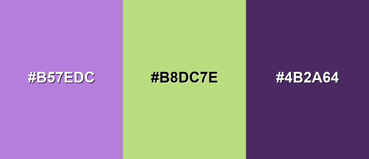
A complementary palette places lavender opposite a yellow-green, creating crisp contrast while staying soft if you keep both colors pastel.
Complementary Palette Example: Try lavender with a soft lime accent and a deep plum anchor for a balanced, modern look.
Analogous Color Schemes
Analogous colors sit adjacent to each other on the color wheel, creating harmonious, cohesive palettes with subtle variation.
Periwinkle Blue, Lavender, and Orchid Pink create a smooth, dreamy gradient-like harmony.
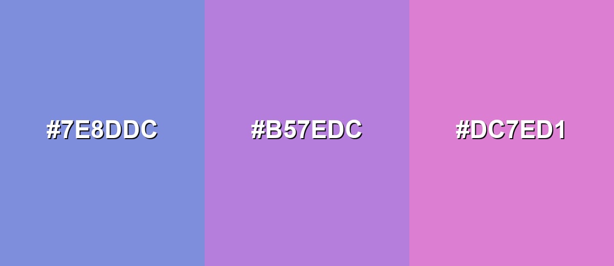
- Periwinkle Blue: #7E8DDC
- Lavender: #B57EDC
- Orchid Pink: #DC7ED1
Iris, Lavender, and Berry Mauve keep the palette cohesive while adding a warmer rosy pull.
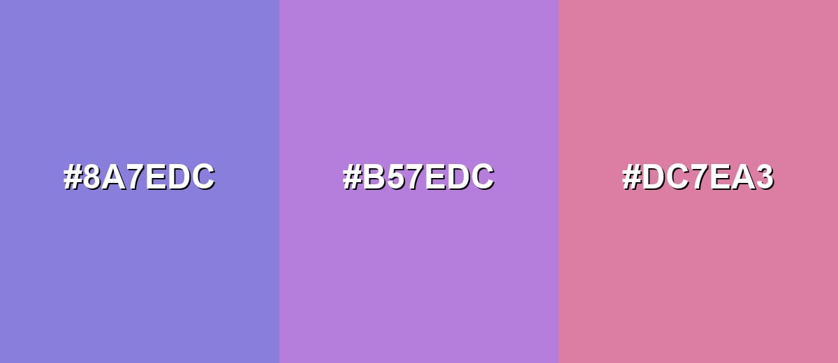
- Iris: #8A7EDC
- Lavender: #B57EDC
- Berry Mauve: #DC7EA3
Triadic & Tetradic Combinations
A triadic scheme spaces hues evenly, giving you variety without losing balance.
Lavender, Soft Coral, and Seafoam feel lively yet still gentle—great for friendly brands and illustrations.
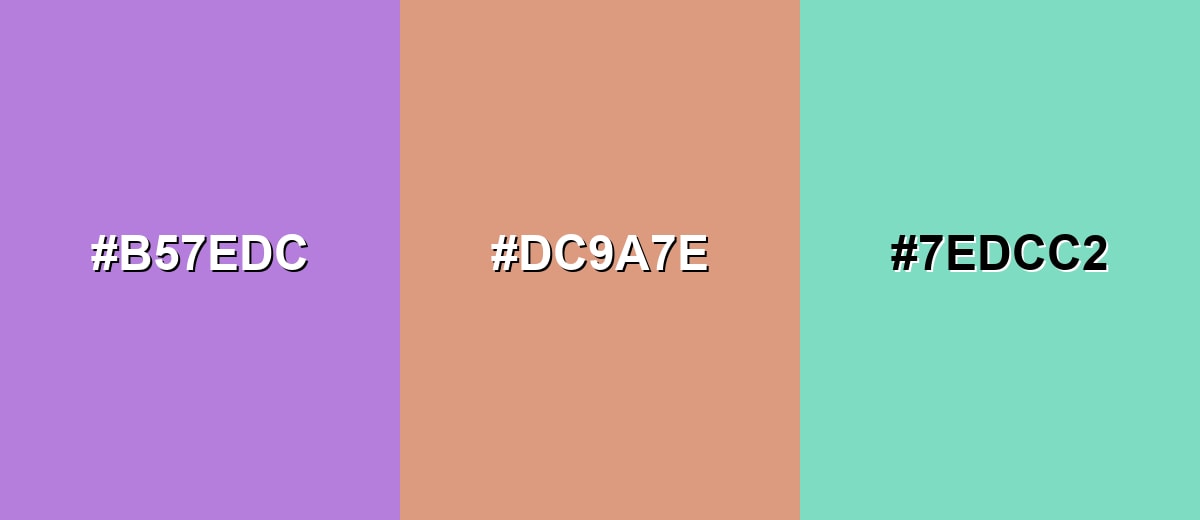
- Lavender: #B57EDC
- Soft Coral: #DC9A7E
- Seafoam: #7EDCC2
Colors to Avoid
While lavender color is remarkably versatile, certain combinations can create problematic visual effects:
- Neon Green (#39FF14) - The extreme saturation can overpower lavender and create a harsh, vibrating contrast that feels noisy.
- Pure Red (#FF0000) - Highly intense red fights lavender's softness, often reading as accidental or overly aggressive in UI and branding.
- Vivid Yellow (#FFFF00) - Bright yellow can wash out lavender's subtlety and make compositions feel unbalanced unless carefully muted.
- Pitch Black (#000000) - Black can look too stark next to lavender, turning a gentle palette into a high-contrast, heavy look; deep plum is usually a better anchor.

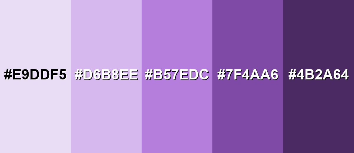
Shades, Tints & Variations of Lavender Color
Lavender isn't just one pastel purple—there's a full range from barely-there tints to rich plum-leaning anchors. Having a few variations ready makes it easier to design hierarchy (backgrounds, surfaces, accents, and readable text) without leaving the lavender "family."
- Lavender Mist (#E9DDF5) - A very light, airy tint of lavender that reads almost like a soft lilac-white. It's best used for Large backgrounds, subtle sections, and minimal UI surfaces where you want a clean, calming wash.
- Soft Lavender (#D6B8EE) - A gentle pastel lavender with more visible color while staying light and friendly. It's best used for Cards, badges, form highlights, and packaging where you want softness without losing definition.
- Classic Lavender (#B57EDC) - The balanced lavender tone—soft, floral, and versatile across digital and print. It's best used for Primary brand color, hero accents, illustrations, and themed palettes that need a recognizable lavender identity.
- Deep Lavender (#7F4AA6) - A darker, more saturated lavender that leans toward purple and adds weight. It's best used for Headings, buttons, outlines, and contrast elements paired with lighter lavender tints.
- Lavender Plum (#4B2A64) - A rich plum-leaning shade that complements lavender as a strong, elegant anchor. It's best used for Text on lavender backgrounds, premium branding details, and high-contrast UI elements.
Industry Applications
Lavender appears across many industries because it's expressive without being loud. It can feel calming, creative, or refined depending on the supporting palette and typography.
Fashion & Beauty
- Use lavender as a hero packaging color to communicate softness and a clean, gentle premium vibe.
- Pair lighter lavender tints with minimal typography for skincare, fragrance, and self-care products.
- Use deeper lavender shades for labels and small details so text stays crisp and readable.
- Build seasonal drops around lavender + soft pastels for a fresh, photo-friendly aesthetic.
Interior Design & Decor
- Apply lavender as an accent wall or textile color to add calm without darkening a room.
- Mix lavender with light neutrals for an airy look that still feels styled and intentional.
- Use deeper lavender tones in decor accents to create depth and visual structure.
- Keep finishes consistent (matte vs glossy) so lavender reads smooth and cohesive across materials.
Branding & Marketing
- Use lavender to signal friendly creativity for modern digital products and creative tools.
- Design onboarding screens and highlight states with lavender to guide attention gently.
- For premium positioning, keep layouts clean and let lavender do the emotional heavy lifting.
- In campaigns, pair lavender with a contrasting accent color to create clear CTA hierarchy.
Conclusion
Lavender color (#B57EDC) is a soft, calming purple that can feel elegant, dreamy, or modern depending on the palette around it. Use it confidently for backgrounds, highlights, and branding—then add depth with darker lavender variations for structure and readable contrast. If you want more energy, bring in a gentle complementary accent, and keep your tints consistent so the overall look stays clean and cohesive across web, print, photography, and video.
Design Smarter with AI: Media.io is an online AI studio that empowers creators with advanced image generation and enhancement tools. From text-to-image and image-to-image creation to AI upscaling and color optimization, it enables fast, creative, and professional results—all in your browser.

Frequently Asked Questions About Lavender Color
Lavender is a light, soft purple inspired by the lavender flower. It usually sits between violet and pink, giving it a gentle, calming appearance.
A widely used lavender color code is #b57edc. In RGB, it's 181, 126, 220—useful for screens and digital design.
Lavender pairs well with soft lime or sage greens for balance, deep plum for contrast, and pastel neighbors like periwinkle or orchid for a harmonious palette.
Lavender is generally considered a cool color because it's rooted in purple and blue undertones. If it leans pink, it can feel slightly warmer and more romantic.
Use lavender mainly as a background, surface, or accent rather than small text. Pair it with a dark anchor (like deep plum) for headings and body text, and check contrast with accessibility tools.
Common variations include very light tints like Lavender Mist, balanced mid-tones like Classic Lavender, and deeper options like Deep Lavender or Lavender Plum for contrast and emphasis.


