

Glaucous color is a muted blue-green gray that looks like sea glass with a soft, powdery haze. Its signature tone is commonly represented by the hex code #7FA7A6.
Often perceived as calm, clean, and quietly natural, glaucous has a slightly cool, reserved feel rooted in its name—originally used to describe the bluish-gray "bloom" on certain leaves and fruits. Below, you'll find its meaning, codes, combinations, shades, and practical ways to use it in modern design.
Glaucous Color: Codes & Values
Use these standard color codes to recreate glaucous accurately across web, UI, and print projects.
| Parameters | VALUE |
| HEX Code | #7FA7A6 |
| RGB DECIMAL | 127, 167, 166 |
| RGB PERCENTAGE | 50%, 65%, 65% |
| CMYK | 24%,0%,1%,35% |
| HSL | 178°, 19%, 58% |
| HSV (HSB) | 178°, 24%, 66% |
| Web Safe | #669999 |
Key Color Space Explanations:
- HEX - HEX is the most common way to specify this shade for web and UI work. Use #7fa7a6 to reproduce a consistent glaucous tone across screens.
- RGB - RGB defines the mix of red, green, and blue light used on digital displays. Higher green and blue values give glaucous its cool, marine-leaning cast.
- CMYK - CMYK is used for print, describing ink percentages rather than light. Glaucous typically needs modest cyan with low magenta and yellow plus a noticeable black component for its gray softness.
- HSL - HSL describes hue, saturation, and lightness in a designer-friendly way. Its low saturation is what keeps it muted instead of bright teal.
- Web Safe - Web-safe is the closest legacy palette match used on older displays. #669999 is a practical fallback when you need a simplified, widely compatible approximation.
If you're building a palette, start with HEX for UI consistency, then use RGB for motion/video workflows and CMYK when outputting printed materials.
Glaucous Color Conversions
Need glaucous in multiple formats for different tools? Here are quick conversions you can copy into your workflow.
| Parameters | VALUE | CSS |
| HEX | #7fa7a6 | #7fa7a6 |
| RGB DECIMAL | 127, 167, 166 | rgb(127,167,166) |
| RGB PERCENTAGE | 50%, 65%, 65% | rgb(50%,65%,65%) |
| CMYK | 24%,0%,1%,35% | cmyk(24%,0%,1%,35%) |
| HSL | 178°, 19%, 58% | hsl(178°,19%,58%) |
| HSV (or HSB) | 178°, 24%, 66% | -- |
| Web Safe | 669999 | #669999 |
| CIE-LAB | 66, -14, -4 | -- |
| XYZ | 29.5, 35.0, 41.2 | -- |
| xyY | 0.279, 0.331, 35.0 | -- |
| CIE-LCH | 66, 15, 196° | -- |
| CIE-LUV | 66, -21, -3 | -- |
| Hunter-Lab | 59.2, -11.8, -3.4 | -- |
| Binary | 01111111 10100111 10100110 | -- |
Want to generate Glaucous Color photos or posters? Try Media.io's AI Image Generator now!
Glaucous Color Meaning & Symbolism
Glaucous often represents quiet balance, clarity, and a grounded connection to nature. Because it sits between blue, green, and gray, it can feel both fresh and steady in everyday settings. This mix makes it a reliable choice when you want a calm, modern impression without looking icy or overly clinical.
Psychological Effects
Glaucous is known for calming busy visuals while still feeling clean and intentional.
- Reduced Visual Noise - Its muted saturation softens a layout, helping screens and rooms feel less cluttered.
- Breathable Atmosphere - On large surfaces (backgrounds, panels, walls), it creates a more open, airy baseline.
- Focus Support - The steady blue-green-gray mix can encourage concentration and a sense of order.
- Mature Trust - Because it isn't bright or playful, it often reads as reliable and competent in branding.
- Coolness Risk - In low light or overuse, it may feel distant, so pairing with warm neutrals helps.
Positive Associations
When balanced well, glaucous tends to communicate modern calm with a natural edge.
- Calm - The softened tone feels relaxing rather than loud or attention-seeking.
- Clarity - Its clean, misty look supports tidy layouts and editorial-style design.
- Reliability - The gray undertone adds seriousness and steadiness to visual identity work.
- Nature Connection - Sea-glass and botanical "bloom" references make it feel quietly organic.
- Modern Neutrality - It behaves like a contemporary neutral that still brings subtle color.
Cultural Significance Across the World
Glaucous is strongly tied to natural descriptions, which shapes how it's interpreted across contexts.
- Botanical Language - The word Glaucous Colorglaucous" comes from nature writing describing a pale bluish coating on leaves and fruit.
- Coastal Impressions - Its sea-glass vibe often suggests ocean air, weathered paint, and relaxed coastal palettes.
- Stone & Durability - The gray cast can recall weathered stone, lending a sense of quiet resilience.
- Understated Refinement - Its restraint is frequently associated with composed, modern aesthetics rather than flashy trends.
Design Applications
Glaucous is easiest to work with when you treat it as a modern neutral that happens to lean blue-green. It can anchor a palette, calm a busy composition, and add a refined, airy feel without demanding attention.
Graphic Design Tips
- Use It as a Base - Apply glaucous on page backgrounds, app shells, and large blocks to set a relaxed tone.
- Build Clear Hierarchy - Use deeper glaucous shades for headers/nav and lighter tints for cards and section panels.
- Keep CTAs Obvious - For primary actions, lean on deeper teal accents so buttons don't disappear into the mid-tone base.
- Prioritize Readability - Place dark text over glaucous and reserve light text for its darker variations.
- Limit Bright Competition - Avoid mixing glaucous with multiple saturated brights, which can feel uncoordinated.
Combine it with one warm accent to keep compositions from feeling too cool.
Glaucous Color in Photography & Video
- Editorial Backgrounds - Use glaucous as a soft backdrop that reduces harsh contrast in product and lifestyle shots.
- Clean Color Grading - Its blue-green-gray balance helps create a calm, modern grade without looking icy.
- Structured Content Blocks - Glaucous works well behind pull quotes, captions, and overlays that need a light-but-defined panel.
- Consistency Across Sets - Treat it like a neutral: it pairs naturally with off-whites and soft grays for cohesive scenes.
- Depth via Tonal Steps - Add dimension by stacking pale and deep glaucous shades instead of introducing loud colors.
Recommended Tool for Image Enhancement: When incorporating glaucous color into your photography projects, Media.io's AI Image tools can help you achieve more refined results. With AI-powered color enhancement, photo colorization, image upscaling, and old photo restoration, you can easily enrich glaucous color tones, improve overall image quality, and highlight the color's elegant and sophisticated aesthetic.
Color Combinations
Glaucous plays well with both cool neighbors and warm contrasts. The palettes below cover classic harmony rules so you can quickly build combinations for UI, branding, interiors, and graphics.
Complementary Colors
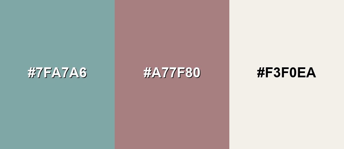
A complementary palette pairs glaucous with a softened red-rose opposite on the wheel. This contrast feels balanced and modern when you keep saturation under control.
Complementary Palette Example: Try glaucous as the base, muted rose as the accent, and a warm off-white to keep the look airy and readable.
Analogous Color Schemes
Analogous colors sit adjacent to each other on the color wheel, creating harmonious, cohesive palettes with subtle variation.
For a calm, coastal feel, blend glaucous with nearby blue-gray and green-mint tones.
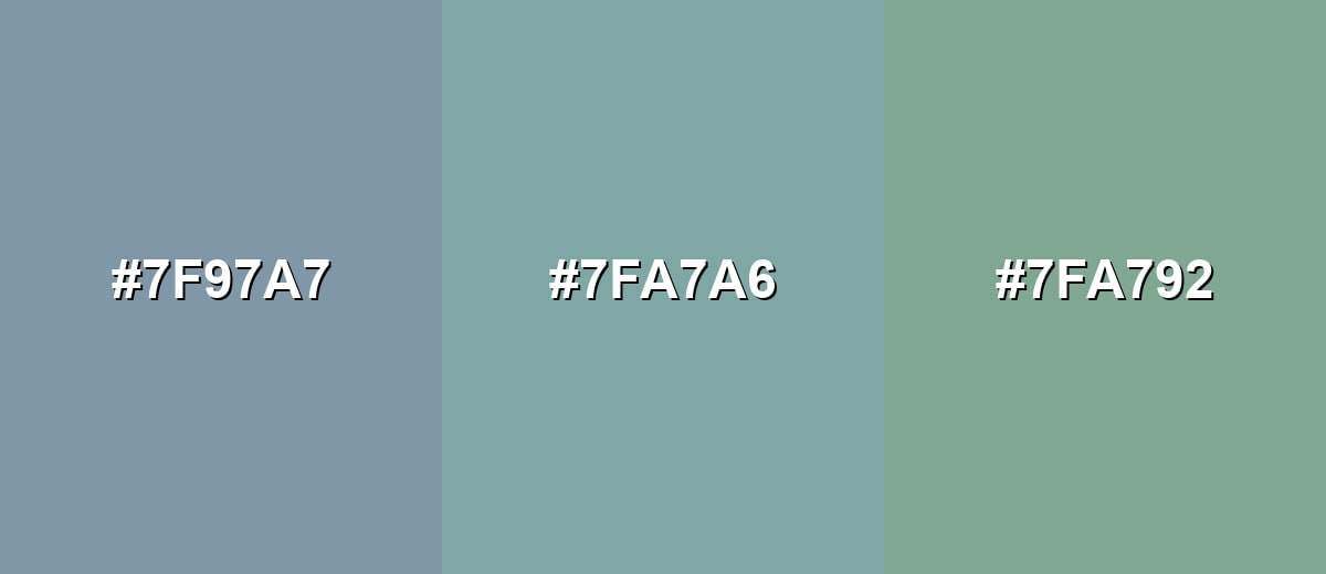
- Steel Blue Gray: #7F97A7
- Glaucous: #7FA7A6
- Muted Mint: #7FA792
For more depth, pair a deep teal with glaucous and a pale aqua highlight.
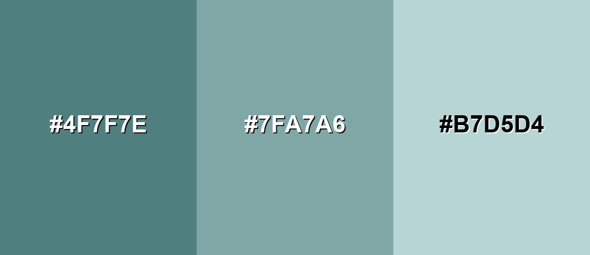
- Deep Teal: #4F7F7E
- Glaucous: #7FA7A6
- Pale Aqua: #B7D5D4
Triadic & Tetradic Combinations
A triadic palette uses three evenly spaced hues for lively balance without overwhelming contrast.
Combine glaucous with a muted lavender and a soft sand tone for a friendly, design-forward mix.
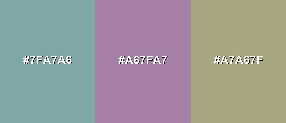
- Glaucous: #7FA7A6
- Muted Lavender: #A67FA7
- Soft Sand: #A7A67F
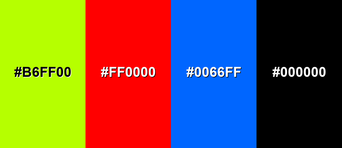
Colors to Avoid
While glaucous color is remarkably versatile, certain combinations can create problematic visual effects:
- Neon Lime (#B6FF00) - The intensity overwhelms glaucous and makes the palette feel noisy instead of calm.
- Pure Red (#FF0000) - This high-saturation red creates a harsh, vibrating contrast that can look unrefined in UI and branding.
- Electric Blue (#0066FF) - A strong, vivid blue competes with glaucous and can push the overall look toward cold and digital.
- Jet Black (#000000) - Pure black can feel too stark next to glaucous; a softer charcoal is usually a better typographic partner.
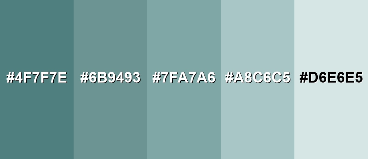
Shades, Tints & Variations of Glaucous Color
The glaucous range runs from deeper, moodier teals to pale, frosted tints. Having a few variations on hand makes it easier to create contrast, hierarchy, and depth—without losing the calm, misty character that defines the color.
- Deep Glaucous (#4F7F7E) - A darker, moodier take that leans more teal while keeping the same muted character. It's best used for Primary buttons, headers, nav bars, and strong accents.
- Dusty Glaucous (#6B9493) - A softened mid-dark shade that feels steady and slightly weathered. It's best used for Secondary UI elements, borders, icons, and supporting graphics.
- Classic Glaucous (#7FA7A6) - The balanced blue-green gray most people associate with the glaucous look. It's best used for Backgrounds, brand foundations, and calming large areas.
- Pale Glaucous (#A8C6C5) - A lighter, airier version that reads clean and spacious without turning icy. It's best used for Cards, section panels, subtle highlights, and light-themed UI.
- Icy Glaucous (#D6E6E5) - A very light tint with a gentle cool cast and an almost frosted finish. It's best used for Large backgrounds, negative space, and minimal layouts.
Industry Applications
Because it is calm, modern, and easy to pair, glaucous shows up across many industries where clarity and trust matter. It works especially well as a base tone that lets content, products, or data take the spotlight.
Fashion & Beauty
- Minimal Packaging Accents - Adds a refined, understated look that feels modern and clean.
- Product Shot Backgrounds - Works as a calm backdrop that helps labels and textures stand out.
- Refined Web Layouts - Supports sleek, minimal ecommerce pages without looking sterile.
- Textiles Inspiration - Its soft blue-green-gray tone translates well to fabric and material palettes.
Interior Design & Decor
- Paint Inspiration - Makes a relaxed wall color that feels contemporary and breathable.
- Large Surfaces - Useful on big areas to create a calm baseline that doesn't demand attention.
- Natural Texture Pairing - Pairs well with wood, linen, and stone for a quietly organic feel.
- Soft, Structured Styling - Helps interiors feel light but organized—ideal for modern, minimal spaces.
Branding & Marketing
- Technology & SaaS - A strong choice for dashboard backgrounds, cards, and calm onboarding screens that reduce visual fatigue.
- Healthcare & Wellness - Helps brands feel clean and reassuring without turning overly clinical.
- Finance & Professional Services - Communicates steadiness, structure, and reliability in identity systems and web design.
- Education & Nonprofits - Supports readable, approachable communication design that feels supportive and calm.
Conclusion
Glaucous color is a muted blue-green gray that feels natural, composed, and quietly modern—making it a dependable "soft neutral" for everything from UI backgrounds to brand systems and interiors. Start with #7FA7A6 as your foundation, then add contrast through deeper tonal steps (like #4F7F7E) or a restrained warm accent (like #A77F80) to keep layouts readable and intentional. When you lean into its strength—restraint—glaucous supports hierarchy and content instead of competing for attention, delivering that calm, sea-glass finish across modern design styles.
Design Smarter with AI: Media.io is an online AI studio that empowers creators with advanced image generation and enhancement tools. From text-to-image and image-to-image creation to AI upscaling and color optimization, it enables fast, creative, and professional results—all in your browser.

Frequently Asked Questions About Glaucous Color
Glaucous looks like a muted mix of blue, green, and gray with a soft, powdery haze. People often compare it to sea glass, weathered coastal paint, or the waxy bluish bloom on certain leaves and fruits.
A commonly used digital reference for glaucous is #7fa7a6. Depending on lighting and material, real-world versions can shift slightly more green or more gray.
Glaucous is generally cool because it leans toward blue-green and has low saturation. You can make it feel warmer by pairing it with creamy off-whites, muted rose accents, or natural wood tones.
It pairs well with warm off-whites, soft sands, muted roses, and gentle blue-grays. For a calm look, choose analogous neighbors; for more energy, use a restrained complementary accent.
Use glaucous for backgrounds, panels, and secondary elements, then reserve darker shades for text and primary actions. Always check contrast for body text, small UI labels, icons, and disabled states to ensure readability.
Teal is usually more saturated and vivid, while glaucous is softened with gray, giving it a misty, understated finish. If teal feels bold or sporty, glaucous tends to feel calmer and more neutral.


