

Teal green color is a deep blue-green that looks a bit like ocean water with a clear green undertone. A common digital reference for this tone is #0F8B8D, which reads as cool, clean, and naturally vibrant.
It's often associated with balance, clarity, and calm confidence rather than loud energy. Below, you'll find the exact codes, conversions, pairings, shades, and practical ways to use teal green in design.
Teal Green Color: Codes & Values
These are the most-used color codes for teal green, so you can match it accurately across web, UI, and print.
| Parameters | VALUE |
| HEX Code | #0F8B8D |
| RGB DECIMAL | 15, 139, 141 |
| RGB PERCENTAGE | 6%, 55%, 55% |
| CMYK | 89%,1%,0%,45% |
| HSL | 181°, 81%, 31% |
| HSV (HSB) | 181°, 89%, 55% |
| Web Safe | #009999 |
Key Color Space Explanations:
- HEX - HEX is the most common way to specify teal green on screens and in web design. Use #0f8b8d for consistent results across UI and digital graphics.
- RGB - RGB describes teal green by mixing red, green, and blue light. It is helpful for screen-based work and CSS when you need numeric channel control.
- CMYK - CMYK is used for print workflows, where inks combine to reproduce the shade on paper. Values can vary by printer, stock, and color profile, so proof when accuracy matters.
- HSL - HSL represents the hue angle plus saturation and lightness, which is convenient for making lighter or darker versions. It is often used in design systems to build predictable ramps.
- Web Safe - Web Safe is the closest legacy-safe approximation for older displays and limited palettes. For teal green, the nearest match is #009999.
Use HEX or RGB for anything screen-based, lean on HSL for building tints/shades, and switch to CMYK when you're preparing teal green for print.
Teal Green Color Conversions
If you need teal green in a specific format (or want to copy-paste into CSS), this conversion table keeps everything consistent.
| Parameters | VALUE | CSS |
| HEX | #0f8b8d | #0f8b8d |
| RGB DECIMAL | 15, 139, 141 | rgb(15,139,141) |
| RGB PERCENTAGE | 6%, 55%, 55% | rgb(6%,55%,55%) |
| CMYK | 89%,1%,0%,45% | cmyk(89%,1%,0%,45%) |
| HSL | 181°, 81%, 31% | hsl(181°, 81%, 31%) |
| HSV (or HSB) | 181°, 89%, 55% | -- |
| Web Safe | 009999 | #009999 |
| CIE-LAB | 50.1, -30.4, -10.2 | -- |
| XYZ | 19.7, 28.1, 30.6 | -- |
| xyY | 0.25, 0.36, 28.1 | -- |
| CIE-LCH | 50.1, 32.1, 198.6° | -- |
| CIE-LUV | 50.1, -39.0, -13.0 | -- |
| Hunter-Lab | 43.2, -26.8, -6.4 | -- |
| Binary | 000011111000101110001101 | -- |
Want to generate teal green color photos or posters? Try Media.io's AI Image Generator now!
Teal Green Meaning & Symbolism
Teal green often represents balance: it mixes the freshness of green with the clarity of blue. In everyday life it can feel both natural and refined, which is why it shows up in wellness visuals, tech interfaces, and modern interiors.
Psychological Effects
In design, teal green tends to create calm attention—focused, steady, and easy to trust.
- Calm Focus - Supports concentration and clarity, which is helpful in dashboards, product UI, and instructional layouts.
- Trust & Stability - Feels composed and reliable, making messages land with quiet confidence.
- Cleanliness - Can suggest a fresh, tidy, "well-designed" look when paired with light neutrals.
- Balanced Energy - Adds personality without the loudness of high-saturation brights.
- Cool Distance - If used in large blocks without warmth, it can feel a bit clinical or emotionally distant.
Positive Associations
Because it sits between blue and green, teal green pulls meaning from both sides—natural yet modern.
- Balance - Suggests an even, grounded mood rather than extremes.
- Clarity - Helps visuals feel organized, readable, and "sorted out."
- Renewal - Echoes water and growth, which can hint at refresh, reset, and forward motion.
- Modern Craft - Often reads as contemporary and refined, not overly traditional.
- Calm Confidence - Communicates capability without being aggressive.
Cultural Significance Across the World
Blue-green tones have wide symbolism, but the meaning can shift depending on where and how they're used.
- Water & Renewal - Commonly tied to water imagery, suggesting freshness and restoration.
- Protection - Blue-green shades are sometimes linked with protective symbolism in traditional contexts.
- Modern Care - Today it often signals wellness, cleanliness, and thoughtful product design.
- Context Matters - Meaning changes by culture and application, so pairing and messaging still do the heavy lifting.
Design Applications
Teal green is versatile because it can look sleek in digital products and organic in real spaces—contrast and supporting tones decide the final mood.
Graphic Design Tips
- Use teal green as a primary brand accent for health, sustainability, finance, and productivity themes.
- Apply it to UI elements like active states, toggles, badges, and data highlights for calm emphasis.
- Pair it with warm neutrals (sand, cream, light beige) to soften the cool feel and keep layouts approachable.
- Add a coral/terracotta accent when you need energy and a clear CTA hierarchy.
- Test contrast carefully—avoid similar-value cyans/greens for important states, since edges can blur.
Pro tip: If teal green is your hero color, keep the rest of the palette quiet—then use one warm accent to guide attention (buttons, key stats, or headings).
Teal Green in Photography & Video
- Use teal green in overlays to create a clean, modern mood without darkening the frame too much.
- For travel or spa visuals, lean into its water association to make scenes feel fresher and more relaxing.
- Balance it with warm skin tones or beige props so subjects don't look cold or desaturated.
- In product shots, teal green backgrounds can make white packaging and metallic details feel crisp.
- When color grading, keep an eye on greens/cyans—small shifts can change teal green from "premium" to "neon."
Recommended Tool for Image Enhancement: When incorporating teal green into your photography projects, Media.io's AI Image tools can help you achieve more refined results. With AI-powered color enhancement, photo colorization, image upscaling, and old photo restoration, you can easily enrich teal green tones, improve overall image quality, and highlight the color's elegant and sophisticated aesthetic.
Color Combinations
Teal green pairs well with warm complements, soft neutrals, and a few saturated accents when you need bold contrast. The palettes below give you ready-to-use options for UI, branding, illustration, and décor.
Complementary Colors
A complementary palette uses the opposite side of the hue wheel to create clear contrast and lively balance.
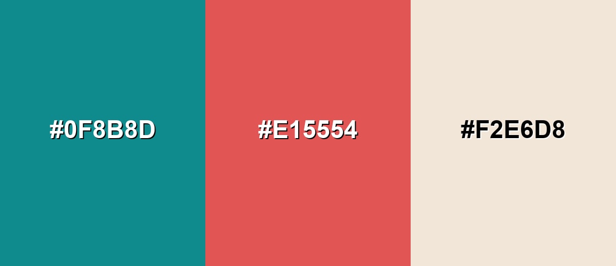
Complementary Palette Example: Pair teal green with a warm coral and a sandy neutral for a modern, approachable look.
Analogous Color Schemes
Analogous colors sit adjacent to each other on the color wheel, creating harmonious, cohesive palettes with subtle variation.
Deep teal, teal green, and ocean blue create a smooth, cool gradient that feels cohesive and professional.
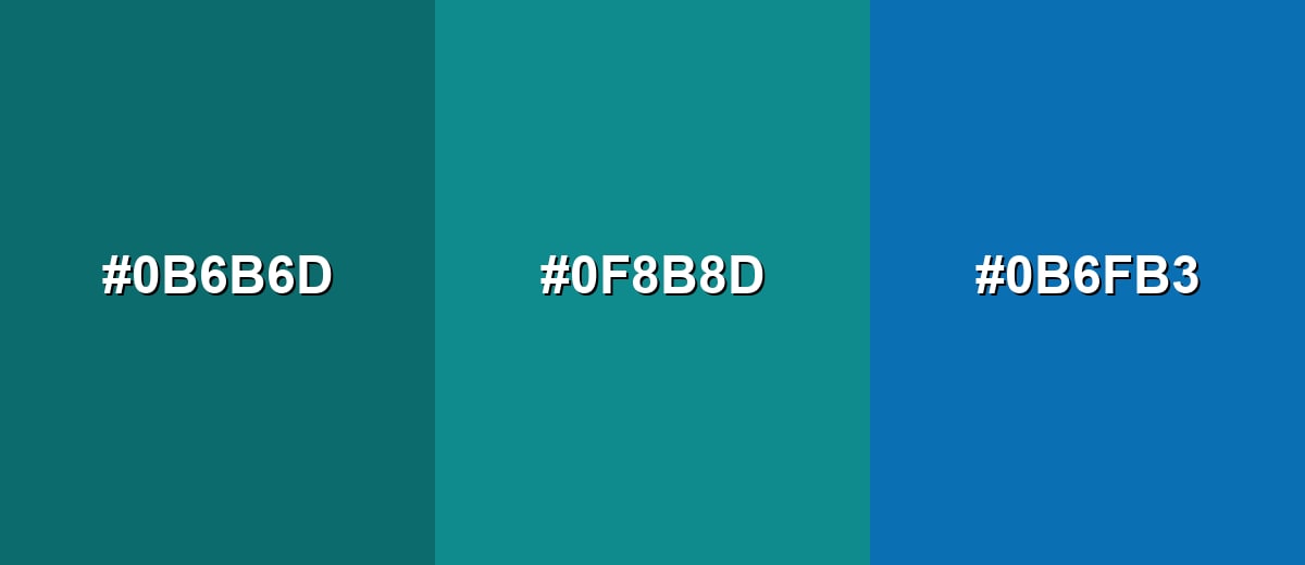
- Deep Teal: #0B6B6D
- Teal Green: #0F8B8D
- Ocean Blue: #0B6FB3
Aqua, teal green, and jade green lean more natural and energetic while staying harmonious.
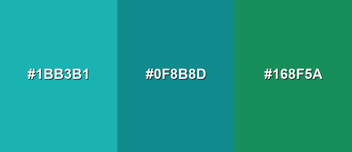
- Bright Aqua: #1BB3B1
- Teal Green: #0F8B8D
- Jade Green: #168F5A
Triadic & Tetradic Combinations
Triadic schemes use three evenly spaced hues for contrast that still feels balanced.
Teal green with mustard and berry purple gives you a confident, creative palette for highlights and hierarchy.
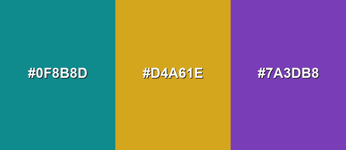
- Teal Green: #0F8B8D
- Golden Mustard: #D4A61E
- Berry Purple: #7A3DB8
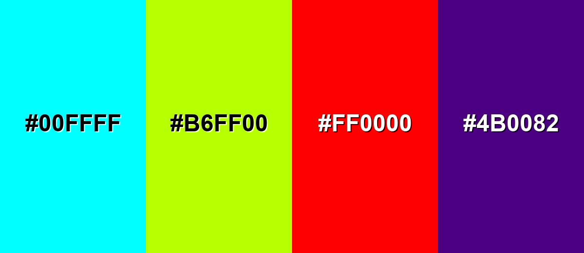
Colors to Avoid
While teal green is remarkably versatile, certain combinations can create problematic visual effects:
- Electric Cyan (#00FFFF) - Too close in temperature and saturation, so key elements can look noisy and lose clear edges.
- Neon Lime (#B6FF00) - Extremely bright next to teal green, which can feel harsh and distract from your main message.
- Pure Red (#FF0000) - Creates aggressive contrast that can overpower teal green, especially in UI alerts and small components.
- Deep Purple (#4B0082) - Both tones can read heavy together, reducing clarity unless you add a light neutral for separation.
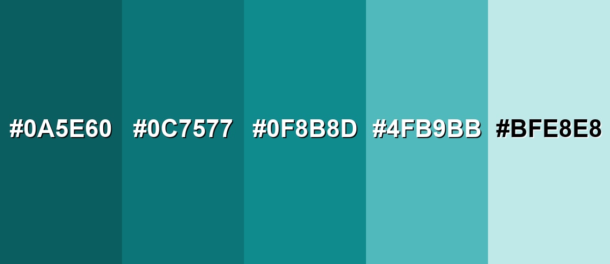
Shades, Tints & Variations of Teal Green
Teal green has a useful range—from deep, inky tones that feel premium to pale tints that read fresh and airy. Building a small shade ramp makes it easier to keep contrast consistent across components, backgrounds, and accents.
- Deep Teal Green (#0A5E60) - A darker, inkier version that feels grounded and premium while staying distinctly blue-green. It's best used for Headers, footers, navigation bars, and serious brand foundations..
- Dark Teal Green (#0C7577) - A strong mid-dark shade that keeps contrast high without looking near-black. It's best used for Buttons, emphasis text, icons, and charts where you need clear hierarchy..
- Classic Teal Green (#0F8B8D) - The balanced reference tone, sitting neatly between teal and green with a clean, modern feel. It's best used for Primary accents, UI states, and brand marks that need calm confidence..
- Soft Teal Green (#4FB9BB) - A lighter, friendlier tint that feels airy and approachable. It's best used for Background panels, cards, secondary highlights, and gentle gradients..
- Pale Teal Green (#BFE8E8) - A very light tint that reads fresh and clean with minimal visual weight. It's best used for Large backgrounds, subtle section breaks, and calm interior walls or surfaces..
Industry Applications
Because teal green can feel both natural and precise, it works across industries that need trust, freshness, and a modern edge.
Fashion & Beauty
- Use teal green as a clean, modern backdrop for skincare and beauty visuals, especially with sand/cream neutrals.
- Pair deeper teal greens with metallic packaging details to push a premium, "spa-luxe" feel.
- Use lighter tints for seasonal launches where you want freshness without looking neon.
- Keep accents warm (coral-like tones) when you want the brand to feel more human and less clinical.
Interior Design & Decor
- Use pale teal green tints on larger walls or surfaces to keep rooms bright and calm.
- Bring in dark teal green for cabinetry, feature walls, or built-ins when you want structure and depth.
- Pair with warm neutrals (beige, cream, sand) to balance the cool temperature.
- Layer natural textures (wood, linen, stone) to make teal green feel organic instead of glossy.
Branding & Marketing
- In Technology & SaaS, teal green works well for active states, success-adjacent highlights, and calm dashboards.
- In Health, Wellness & Fitness, pair teal green with soft neutrals to suggest freshness and care.
- In Finance & Professional Services, deeper teal greens can signal stability—then add warm accents for approachability.
- In Hospitality & Travel, use teal green in overlays and wayfinding to lean into water and relaxation cues.
Conclusion
Teal green is a balanced blue-green that feels calm, capable, and modern—making it a smart choice for everything from product UI to branding and interiors. Start with #0F8B8D as your anchor, then shape the personality with warm complements and soft neutrals to keep it friendly and readable. With the right contrast and a simple shade ramp, teal green stays consistent across screens and print while still feeling fresh, grounded, and memorable.
Design Smarter with AI: Media.io is an online AI studio that empowers creators with advanced image generation and enhancement tools. From text-to-image and image-to-image creation to AI upscaling and color optimization, it enables fast, creative, and professional results—all in your browser.

Frequently Asked Questions About Teal Green Color
Teal green looks like a deep blue-green with a noticeable green undertone, similar to ocean water or polished turquoise stone but slightly greener.
A commonly used teal green hex code is #0f8b8d. Depending on the palette and brand system, nearby blue-green values may also be labeled teal green.
Teal green is often used to suggest balance, clarity, and calm confidence. It can feel clean and modern, which makes it popular in UI, wellness visuals, and contemporary branding.
It works with both, but warm accents like coral, terracotta, and sand make it feel friendlier and more human. Cool neighbors like aqua and ocean blue create a sleek, cohesive look.
Yes. Teal green can be excellent for active states, badges, and emphasis areas because it draws attention without feeling overly aggressive. Always verify contrast for text and small UI components.
For large backgrounds, pick a lighter tint (like a pale teal green) to reduce visual weight and improve readability. Save darker shades for navigation, headers, or sections where you want strong structure.


