

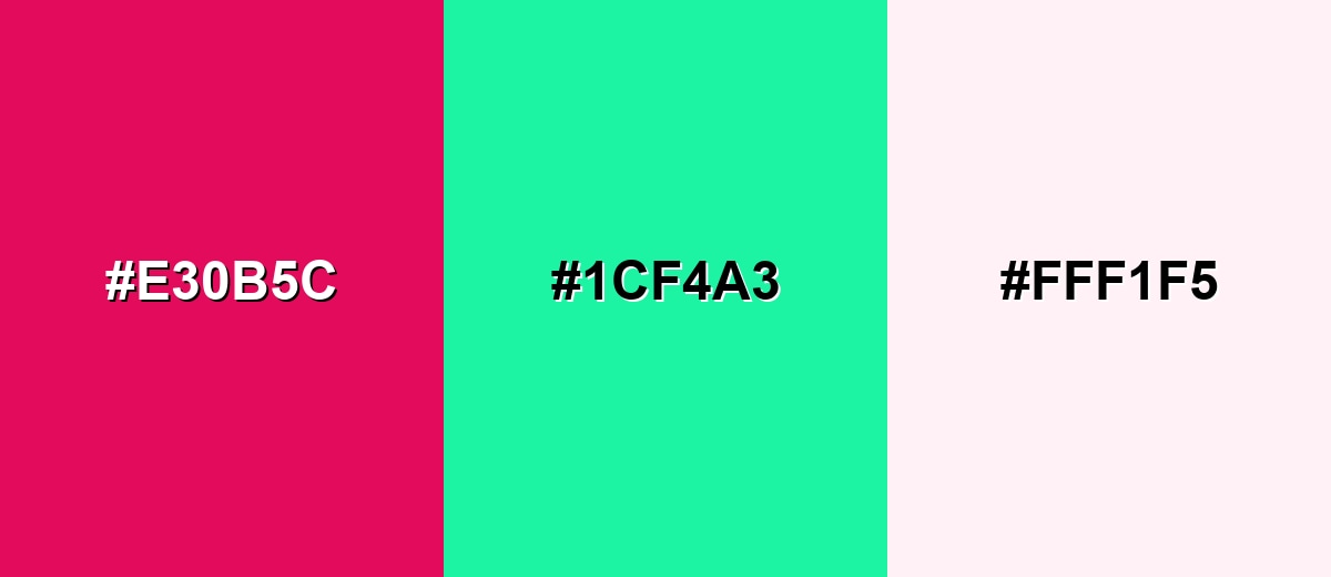
Raspberry color is a bold, juicy pink-red that looks like ripe raspberries—deeper than hot pink, but brighter than burgundy. Its signature digital value is #E30B5C, a high-impact shade that reads lively and modern on screens and in print.
It's often linked to passion, playful confidence, and a sweet romantic edge. Because it's fruit-inspired, raspberry can feel more natural and appetizing than purely synthetic magentas—especially in print and pigment-based materials.
Raspberry Color: Codes & Values
If you want a consistent raspberry across web, UI, and print, these are the key values designers use most often.
| Parameters | VALUE |
| HEX Code | #E30B5C |
| RGB DECIMAL | 227, 11, 92 |
| RGB PERCENTAGE | 89%, 4%, 36% |
| CMYK | 0%,95%,59%,11% |
| HSL | 338°, 91%, 47% |
| HSV (HSB) | 338°, 95%, 89% |
| Web Safe | #CC0066 |
Key Color Space Explanations:
- HEX - HEX is the most common way to specify raspberry for web and UI. Use #e30b5c to reproduce this exact berry-toned pink-red.
- RGB - RGB mixes red, green, and blue light for screens. Raspberry is driven by a strong red channel with a small amount of blue and very little green.
- CMYK - CMYK is used for ink and print workflows. Raspberry typically requires heavy magenta with some yellow and a touch of black to keep the tone rich.
- HSL - HSL describes hue, saturation, and lightness in a more intuitive way for designers. Raspberry sits near the red-magenta region with high saturation and mid lightness.
- Web Safe - Web-safe values are a legacy palette designed for older displays. The closest web-safe match to raspberry is #cc0066.
Use HEX/RGB for screens, CMYK for print proofs, and HSL/HSV when you're adjusting saturation and brightness while keeping the raspberry hue consistent.
Raspberry Color Conversions
Need raspberry in another format for your workflow? Here are common conversions you can copy into design tools and style sheets.
| Parameters | VALUE | CSS |
| HEX | #e30b5c | #e30b5c |
| RGB DECIMAL | 227, 11, 92 | rgb(227,11,92) |
| RGB PERCENTAGE | 89%, 4%, 36% | rgb(89%,4%,36%) |
| CMYK | 0%,95%,59%,11% | cmyk(0%,95%,59%,11%) |
| HSL | 338°, 91%, 47% | hsl(338°, 91%, 47%) |
| HSV (or HSB) | 338°, 95%, 89% | -- |
| Web Safe | cc0066 | #cc0066 |
| CIE-LAB | L* 48.7, a* 75.5, b* 16.4 | -- |
| XYZ | 33.8, 17.4, 11.7 | -- |
| xyY | 0.537, 0.276, 17.4 | -- |
| CIE-LCH | L* 48.7, C* 77.3, h° 12.3 | -- |
| CIE-LUV | L* 48.7, u* 134.4, v* 3.9 | -- |
| Hunter-Lab | L 41.7, a 67.0, b 10.0 | -- |
| Binary | 11100011 00001011 01011100 | -- |
Want to generate Raspberry Color photos or posters? Try Media.io's AI Image Generator now!
Raspberry Color Meaning & Symbolism
Raspberry is often read as energetic, romantic, and expressive—like a bolder, more grown-up cousin of pink. In everyday life, it tends to signal warmth and excitement without feeling as heavy as dark reds, which is why it shows up in fashion, cosmetics, and punchy brand accents.
Psychological Effects
Because it sits between red and pink, raspberry can feel both exciting and emotionally expressive.
- Attention-Grabbing - Raspberry stands out fast, so it naturally pulls focus to key elements like buttons and highlights.
- Playful Confidence - In small doses, it adds an upbeat, modern edge that feels bold without being harsh.
- Warmth & Energy - The berry-red base makes it feel inviting, lively, and a little celebratory.
- Romantic Intensity - It can communicate passion and self-expression more strongly than soft pinks.
- Visual Fatigue Risk - Overusing it (or pairing it with other highly saturated hues) can make layouts feel loud and tiring.
Positive Associations
Raspberry's fruit-inspired vibe often reads sweet, fresh, and memorable in modern design.
- Love - Shares pink's romantic undertone while leaning more mature and expressive.
- Vitality - Feels energetic and "alive," making compositions look more dynamic.
- Celebration - Works well for launches, promos, and festive moments thanks to its boldness.
- Appetite Appeal - The berry connection can make food and lifestyle visuals feel more delicious and natural.
- Modern Femininity - Often communicates feminine-but-bold styling in fashion and beauty contexts.
Cultural Significance Across the World
Raspberry's symbolism overlaps with red and pink themes, but its fruit tone keeps it fresh and contemporary.
- Festive Mood - Commonly used in celebratory visuals where warmth and excitement matter.
- Romance Themes - Frequently appears in love, gifting, and relationship-focused design narratives.
- Food & Lifestyle - Reads as appetizing and playful in menus, packaging, and seasonal promotions.
- Contemporary Expression - Often signals individuality and bold self-expression in modern branding and editorial design.
Design Applications
Raspberry works best when you want a bright focal point that still feels stylish and human. The key is to treat it like a powerful accent and let supporting tones do the heavy lifting for balance.
Graphic Design Tips
- Use raspberry for primary or secondary CTAs when you want energy without the severity of pure red.
- Keep most backgrounds neutral so raspberry feels intentional (not overwhelming) and hierarchy stays clear.
- Pair it with clean typography and generous spacing to maintain a premium, modern look.
- In print, consider a controlled CMYK build or spot color to avoid shifts toward purple or orange.
- Test accessibility and contrast for text, icons, and small UI states (hover/active/disabled).
Pro tip: If raspberry is your hero accent, limit it to one main role (CTA, highlight, or key label) and let the rest of the system rely on neutrals—your design will feel sharper and more "designed," not just louder.
Raspberry Color in Photography & Video
- Use raspberry props (flowers, fabric, packaging) as a focal point against simple, light backgrounds.
- Balance the tone with natural textures (wood, stone, skin tones) so it stays rich rather than neon.
- For product shots, control reflections—high saturation can clip highlights if lighting is too harsh.
- In video, keep raspberry consistent across scenes by matching white balance and doing quick hue checks in grading.
- For social content, raspberry accents help thumbnails pop—just avoid stacking it with multiple high-chroma colors.
Recommended Tool for Image Enhancement: When incorporating raspberry color into your photography projects, Media.io's AI Image tools can help you achieve more refined results. With AI-powered color enhancement, photo colorization, image upscaling, and old photo restoration, you can easily enrich raspberry color tones, improve overall image quality, and highlight the color's elegant and sophisticated aesthetic.
Color Combinations
Raspberry pairs beautifully with fresh greens, clean neutrals, and cool blues. Use the schemes below to build palettes that feel either playful and vibrant or refined and editorial.
Complementary Colors
A complementary pairing creates maximum contrast and makes raspberry feel even more vivid. Add a soft neutral to keep the look controlled and usable in real layouts.
Complementary Palette Example: Combine Raspberry with a Mint Teal complement and a Soft Cream base for crisp, modern contrast.
Analogous Color Schemes
Analogous colors sit adjacent to each other on the color wheel, creating harmonious, cohesive palettes with subtle variation.
Fuchsia, Raspberry, and Crimson create a warm, berry-forward analogous blend that feels cohesive and bold.
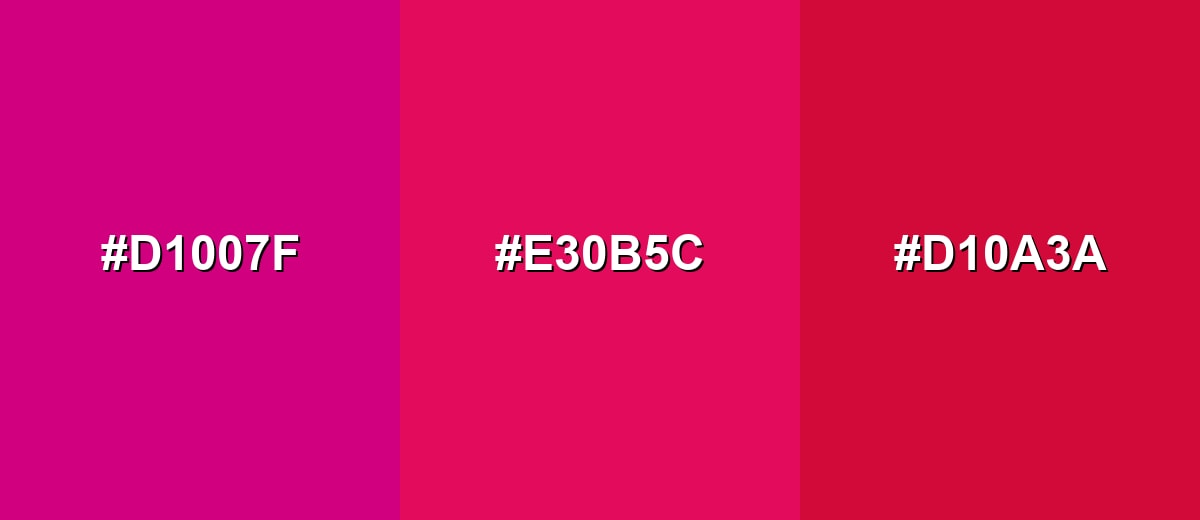
- Fuchsia: #D1007F
- Raspberry: #E30B5C
- Crimson: #D10A3A
Raspberry, Hot Pink, and Orchid Purple shift toward a more playful, nightlife-inspired look with a strong magenta lean.
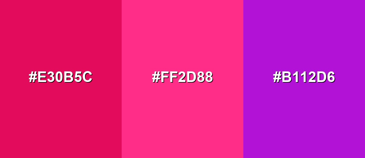
- Raspberry: #E30B5C
- Hot Pink: #FF2D88
- Orchid Purple: #B112D6
Triadic & Tetradic Combinations
A triadic scheme spreads hues evenly for a lively, balanced palette that still feels intentional.
Raspberry, Lime Green, and Azure Blue work well for posters, playful brands, and high-contrast illustrations.
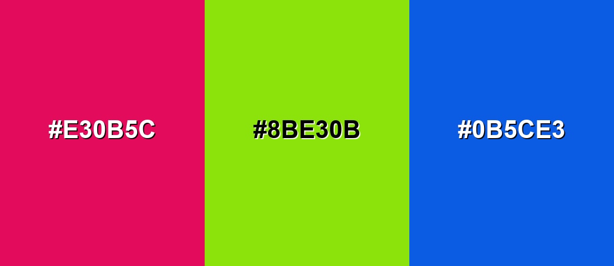
- Raspberry: #E30B5C
- Lime Green: #8BE30B
- Azure Blue: #0B5CE3
Colors to Avoid
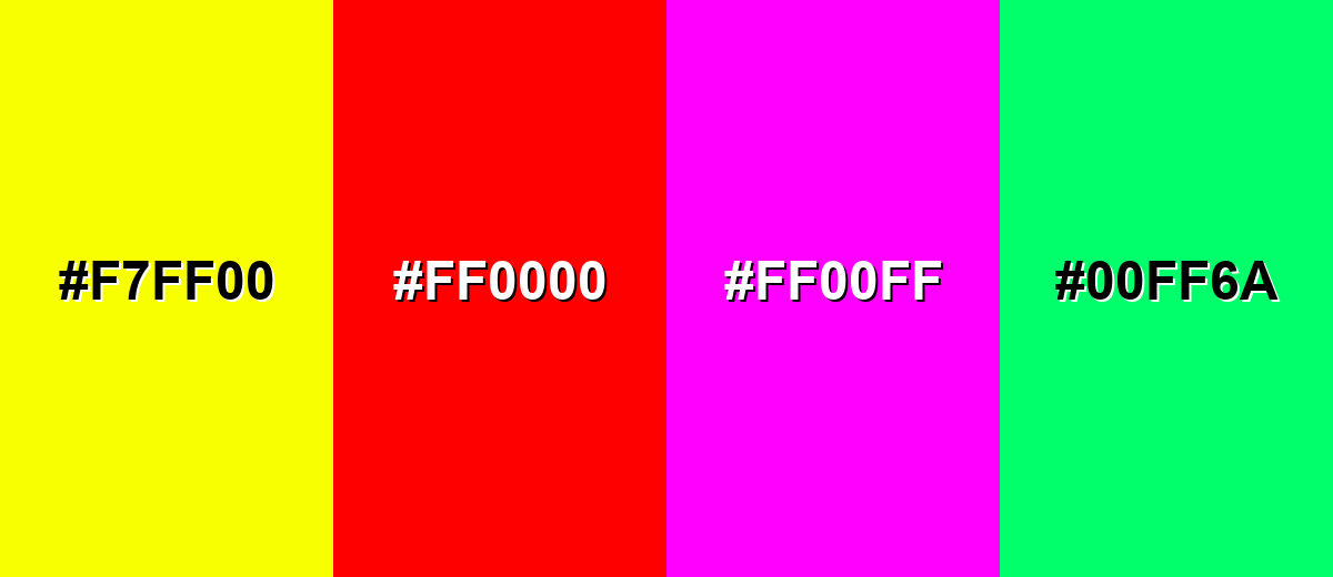
While raspberry color is remarkably versatile, certain combinations can create problematic visual effects:
- Neon Yellow (#F7FF00) - Both shades are extremely intense, so the pairing can vibrate and feel visually aggressive, especially in UI.
- Pure Red (#FF0000) - Too close in temperature but different in saturation, which can make layouts feel chaotic and reduce hierarchy.
- Electric Magenta (#FF00FF) - The hues compete and can read as overly synthetic, making raspberry lose its fruit-like character.
- Bright Spring Green (#00FF6A) - High-chroma green against raspberry can look harsh and distract from text and key elements unless carefully muted.
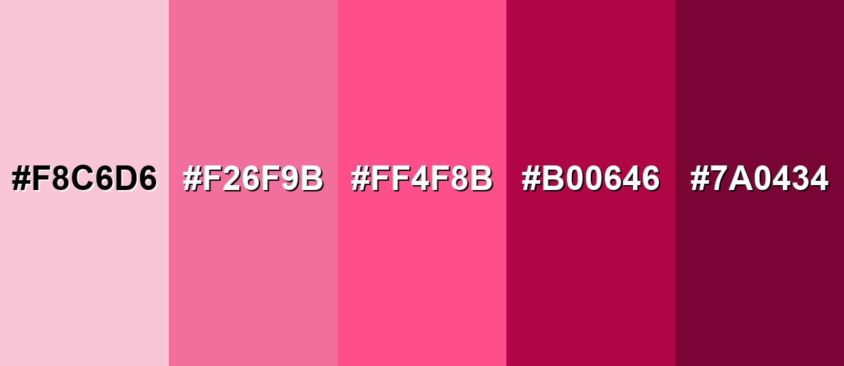
Shades, Tints & Variations of Raspberry Color
Raspberry isn't just one loud berry tone—you can build a full range from soft, airy tints to deep, wine-like shades. Mixing lighter and darker variations helps you create hierarchy (backgrounds, accents, headlines) while keeping the palette cohesive.
- Soft Raspberry (#F8C6D6) - A pale, powdery tint that keeps the berry feel while turning it gentle and airy. It's best used for Backgrounds, large UI surfaces, and subtle romantic themes.
- Raspberry Tint (#F26F9B) - A lighter, friendly version that reads upbeat and approachable without losing warmth. It's best used for Illustrations, highlights, and secondary accents in branding.
- Raspberry Pink (#FF4F8B) - A brighter, more playful take that pushes closer to pop pink while staying berry-based. It's best used for Social graphics, youth-forward products, and energetic callouts.
- Deep Raspberry (#B00646) - A darker, more sophisticated shade with stronger depth and a slightly moody edge. It's best used for Headlines, premium packaging accents, and eveningwear palettes.
- Raspberry Wine (#7A0434) - A rich, wine-like dark tone that feels dramatic and grounded. It's best used for Elegant interiors, luxury branding details, and dark-mode accents.
Industry Applications
Raspberry shows up across industries where a bold emotional signal helps people notice, feel, and remember. It can read playful or premium depending on the neutrals, typography, and finish you pair it with.
Fashion & Beauty
- Use raspberry in lip and blush visuals to communicate bold femininity and high energy.
- Build shade naming systems around berry tones to keep collections cohesive and memorable.
- Pair raspberry accents with darker neutrals for editorial layouts and statement fashion moments.
- Lean into the "nightlife" vibe with glossy finishes, then tone it down with matte for a softer premium feel.
Interior Design & Decor
- Use raspberry as a statement accent (pillows, art, small furniture) instead of a full-wall color.
- Balance it with warm off-whites and wood textures to keep the room welcoming.
- Layer it with muted greens or soft blushes for a cozy, modern palette.
- In darker spaces, deeper raspberry variations can add drama without feeling flat.
Branding & Marketing
- Apply raspberry to badges, promo banners, and product highlights when you want urgency and excitement.
- Use it for app onboarding moments, empty states, or notification accents—then test contrast carefully.
- For food and beverage, raspberry pairs naturally with cream tones for appetizing, seasonal campaigns.
- Keep it as an accent within a neutral system so your brand stays clean, readable, and scalable.
Conclusion
Raspberry color is a vibrant berry-toned pink-red that feels energetic, expressive, and subtly romantic—memorable without the heaviness of darker reds. Start with #E30B5C, then control its impact by treating it as an accent and pairing it with clean neutrals, soft creams, or fresh greens for balance. With smart contrast and spacing, raspberry becomes an easy win for modern branding, UI hierarchy, packaging, and bold editorial visuals.
Design Smarter with AI: Media.io is an online AI studio that empowers creators with advanced image generation and enhancement tools. From text-to-image and image-to-image creation to AI upscaling and color optimization, it enables fast, creative, and professional results—all in your browser.

Frequently Asked Questions About Raspberry Color
Raspberry is a saturated pink-red with a berry vibe—brighter than burgundy and less purple than many magentas. It usually reads lively, juicy, and modern.
A widely used digital value for raspberry is #e30b5c. It's a vivid pink-red that works well as an accent in web and brand palettes.
Raspberry sits between pink and red, but it typically leans red with a noticeable pink-magenta undertone. The exact lean depends on lighting, material, and nearby colors.
Raspberry pairs well with soft creams, warm off-whites, charcoal, teal-mint greens, and cool blues. These partners help it feel intentional rather than overpowering.
Use raspberry as an accent for primary actions, badges, or highlights, and keep most surfaces neutral. Test contrast for text and interactive states, especially on dark mode.
Common variations include soft tints for backgrounds, brighter raspberry pinks for playful accents, and deeper wine-like shades for premium or dramatic looks. Mixing light and dark versions helps build hierarchy.


