

Saffron color is a rich golden-orange tone that brings to mind warm spice threads, late-afternoon sunlight, and glowing marigold petals. The most common digital reference is #F4C430, sitting between yellow and orange with a bright, radiant feel.
Because it reads as energetic, optimistic, and attention-getting (without the harshness of pure orange), saffron works best when you use it with intention. Below, you'll find its color codes, conversions, meanings, pairings, and practical design ideas.
Saffron Color: Codes & Values
If you want saffron color to look consistent across screens, print, and brand assets, start with these core values.
| Parameters | VALUE |
| HEX Code | #F4C430 |
| RGB DECIMAL | 244, 196, 48 |
| RGB PERCENTAGE | 95.7%, 76.9%, 18.8% |
| CMYK | 0%,20%,80%,4% |
| HSL | 45°, 90%, 57% |
| HSV (HSB) | 45°, 80%, 96% |
| Web Safe | #FFCC33 |
Key Color Space Explanations:
- HEX - HEX is the most common way to specify saffron in web and UI design. Use #f4c430 for consistent rendering across apps and devices.
- RGB - RGB describes saffron using red, green, and blue light for screens. Higher red and green with a lower blue channel creates its warm golden look.
- CMYK - CMYK is used for print production and ink mixing. Saffron typically relies on strong yellow with moderate magenta and minimal cyan.
- HSL - HSL explains saffron by hue, saturation, and lightness, which helps when building tints and tones. It is useful for adjusting brightness while keeping the same warm character.
- Web Safe - Web Safe is the closest legacy palette match used on older systems. The nearest web-safe alternative to saffron is #ffcc33.
Use HEX or RGB for digital design, lean on HSL when you need controlled tints/tones, and treat CMYK as a starting point for print—then confirm with proofs.
Saffron Color Conversions
Need saffron in multiple formats for different tools? Use this conversion chart as a quick copy/paste reference.
| Parameters | VALUE | CSS |
| HEX | #f4c430 | #f4c430 |
| RGB DECIMAL | 244, 196, 48 | rgb(244,196,48) |
| RGB PERCENTAGE | 95.7%, 76.9%, 18.8% | rgb(95.7%,76.9%,18.8%) |
| CMYK | 0%,20%,80%,4% | cmyk(0%,20%,80%,4%) |
| HSL | 45°, 90%, 57% | hsl(45°,90%,57%) |
| HSV (or HSB) | 45°, 80%, 96% | -- |
| Web Safe | ffcc33 | #ffcc33 |
| CIE-LAB | 81.2, 4.0, 74.0 | -- |
| XYZ | 57.6, 59.0, 11.1 | -- |
| xyY | 0.451, 0.462, 59.0 | -- |
| CIE-LCH | 81.2, 74.1, 86.9° | -- |
| CIE-LUV | 81.2, 40.7, 79.9 | -- |
| Hunter-Lab | 76.8, 3.8, 44.4 | -- |
| Binary | 11110100 11000100 00110000 | -- |
Want to generate Saffron Color photos or posters? Try Media.io's AI Image Generator now!
Saffron Color Meaning & Symbolism
Saffron is commonly linked with warmth, vitality, and a sense of positive momentum. It tends to read as inviting and premium because it resembles sunlit gold and natural pigments used in textiles and dyes. In everyday visuals, it works well when you want something to feel upbeat, noticeable, and friendly without turning harsh.
Psychological Effects
In most designs, saffron adds perceived brightness and energy—especially when used as a highlight.
- Instant Visibility - The eye notices saffron quickly, making it a strong choice for emphasis and key actions.
- Warmth & Welcome - Its golden-orange glow can make interfaces and rooms feel more inviting.
- Optimism & Momentum - Saffron often signals forward motion, cheer, and positive progress.
- Premium Warmth - Because it echoes sunlit gold and natural pigments, it can feel more refined than neon brights.
- Overstimulation Risk - In large blocks, it may feel loud or tiring on bright screens, reducing calm or seriousness.
Positive Associations
These are common "good vibes" people read from saffron when it's balanced with neutrals and cool tones.
- Sunshine - A bright, sunlit cue that feels upbeat and open.
- Harvest - A seasonal warmth that suggests ripeness, abundance, and comfort.
- Handcrafted Materials - A natural-dye look that can support artisanal or maker-style branding.
- Friendly Confidence - Bold enough to stand out, but typically less aggressive than pure orange.
- Trustworthy Energy - A lively tone that can still feel purposeful when used with structure and contrast.
Cultural Significance Across the World
Saffron can carry different meanings depending on region and context, so audience awareness matters.
- Spirituality - In some contexts, saffron is connected to spiritual practice and reverence.
- Celebration - Often tied to festivals, joy, and ceremonial warmth.
- Tradition - Linked to historical textile dyeing and the cultural value of the saffron spice.
- Context Sensitivity - Meaning can vary widely, so it's smart to validate symbolism with your target users.
Design Applications
Saffron is easiest to use when you decide what job it should do—accent, brand signature, or a softer background tint. Because it's naturally bright, surrounding colors can quickly push it more golden or more amber.
Graphic Design Tips
- Use saffron (#F4C430) for highlights, badges, and key callouts rather than covering entire pages.
- For readable layouts, pair saffron accents with dark neutrals such as #1F2933.
- If a section feels too intense, switch to a lighter tint like #F7D05A or #F9DD7A for larger fills.
- In print, test on the real paper stock—warm golds can shift depending on coating and lighting.
- Keep hierarchy clear: saffron works best when it has "breathing room" and isn't competing with other brights.
Pro tip: When saffron is your brand accent, lock it as a token (HEX/RGB) and build a small tint set for UI surfaces—this keeps the warmth consistent across pages, ads, and product screens.
Saffron Color in Photography & Video
- Use saffron tones to enhance golden-hour scenes, food shots, and warm lifestyle frames.
- When skin tones look too yellow, reduce saturation slightly and protect highlights to keep a natural feel.
- Balance saffron-heavy scenes with cooler shadows to avoid an overly "orange cast."
- For product footage, saffron props can add warmth without reading as "urgent" like strong reds.
- On thumbnails, saffron accents can guide attention—just keep text dark for clarity.
Recommended Tool for Image Enhancement: When incorporating saffron color into your photography projects, Media.io's AI Image tools can help you achieve more refined results. With AI-powered color enhancement, photo colorization, image upscaling, and old photo restoration, you can easily enrich saffron color tones, improve overall image quality, and highlight the color's elegant and sophisticated aesthetic.
Color Combinations
Saffron pairs best with deep cool tones, grounded neutrals, and nearby warm hues that reinforce its glow. Use these palettes as starting points, then adjust saturation to match your brand or scene.
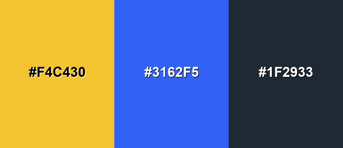
Complementary Colors
A complementary pairing puts saffron against a deep blue to create crisp, energetic contrast. This is a reliable choice for UI accents and bold marketing layouts where you need immediate visual separation.
Complementary Palette Example: Try saffron #f4c430 with vivid blue #3162f5 and charcoal #1f2933 to keep the brightness controlled.
Analogous Color Schemes
Analogous colors sit adjacent to each other on the color wheel, creating harmonious, cohesive palettes with subtle variation.
Warm, sunlit analogous tones that stay close to saffron for a smooth, friendly gradient.
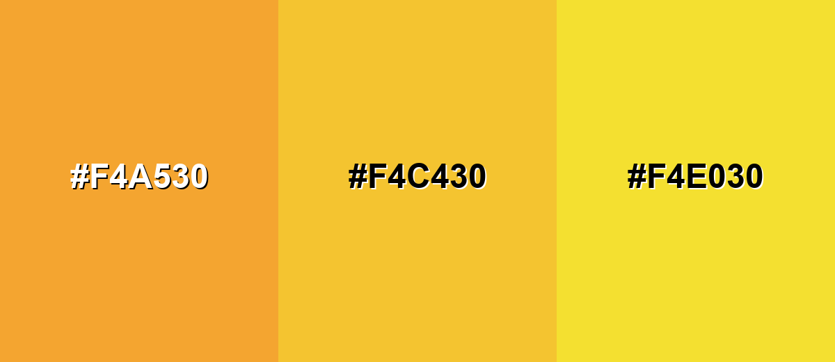
- Orange Glow: #F4A530
- Saffron: #F4C430
- Golden Yellow: #F4E030
A punchier analogous mix that leans into spice and citrus for playful, attention-forward designs.
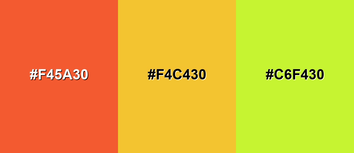
- Spiced Orange: #F45A30
- Saffron: #F4C430
- Citrus Lime: #C6F430
Triadic & Tetradic Combinations
A triadic palette spreads hues evenly for variety while keeping balance.
Use saffron with bright mint-teal and vivid purple to create a lively, modern look that works well in illustrations and campaign graphics.
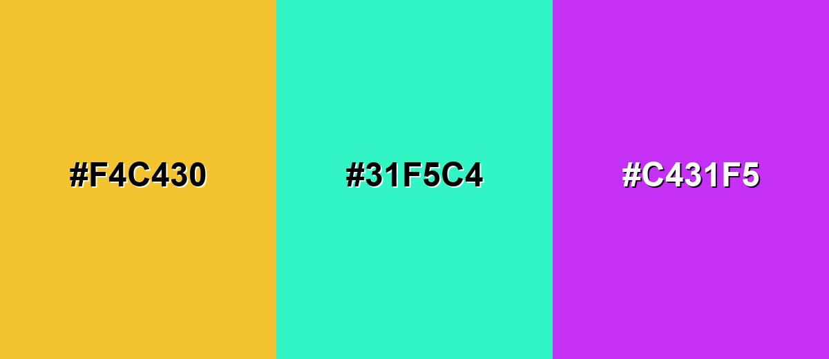
- Saffron: #F4C430
- Mint Teal: #31F5C4
- Vivid Purple: #C431F5
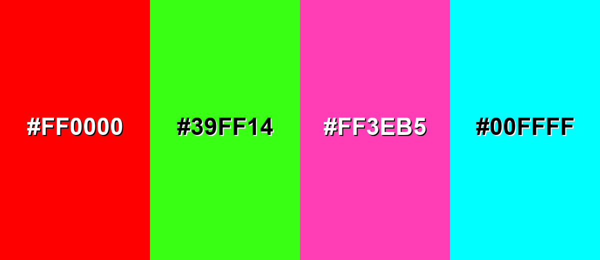
Colors to Avoid
While saffron color is remarkably versatile, certain combinations can create problematic visual effects:
- Pure Red (#FF0000) - Red and saffron can compete for attention, making layouts feel urgent and noisy rather than warm and focused.
- Neon Green (#39FF14) - High-intensity green creates harsh vibration against saffron and can look unrefined in branding and UI.
- Hot Pink (#FF3EB5) - Both are loud, high-energy hues; together they often read chaotic unless you have plenty of neutral space.
- Bright Cyan (#00FFFF) - Cyan can overpower the warm tone and push the palette toward a toy-like look, which may not fit serious applications.
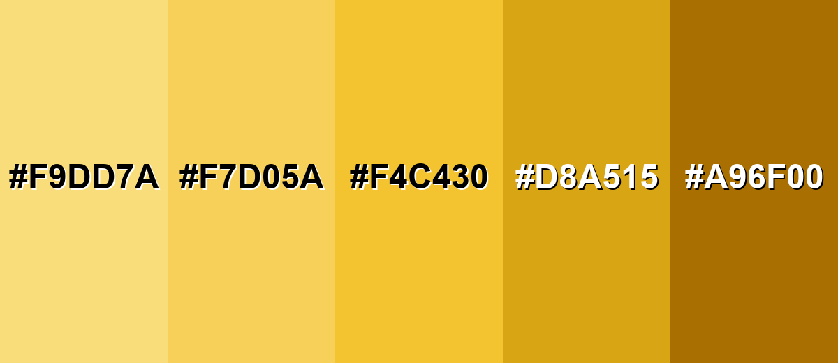
Shades, Tints & Variations of Saffron Color
Saffron isn't just one flat tone—its range includes soft tints for backgrounds, classic midtones for branding, and deeper amber variations for contrast. Having a small, reliable set of shades makes it much easier to keep your UI, print, or interior palette cohesive.
- Light Saffron (#F9DD7A) - A soft tint that keeps the sunny feel while reducing intensity. It's best used for Background fills, gentle highlights, and large UI surfaces.
- Soft Saffron (#F7D05A) - A slightly muted version that feels warm and approachable. It's best used for Cards, secondary buttons, and editorial accents.
- Classic Saffron (#F4C430) - The signature golden-orange tone most people recognize as saffron. It's best used for Brand accents, icons, badges, and key callouts.
- Deep Saffron (#D8A515) - A deeper, more grounded shade that reads more amber than yellow. It's best used for Headings, packaging details, and warm shadows in illustrations.
- Burnt Saffron (#A96F00) - A dark, earthy variation that feels rustic and premium. It's best used for Text on light saffron tints, borders, and sophisticated brand palettes.
Industry Applications
Saffron is widely used when a project needs warmth, visibility, and a hint of craft. It can signal flavor, sunshine, and energy while still feeling more refined than neon alternatives.
Fashion & Beauty
- Warm seasonal capsules where golden tones feel optimistic and wearable.
- Beauty packaging accents that suggest glow, radiance, and "sun-kissed" energy.
- Editorial styling where saffron works as a statement detail against simple neutrals.
- Accessory highlights (scarves, trims, labels) that add warmth without overpowering the full look.
Interior Design & Decor
- Decor accents that add warmth to neutral rooms.
- Textiles and artwork where golden tones create a cozy mood.
- Seasonal styling that complements wood and natural materials.
- Warm lighting scenarios where gold tones feel natural.
Branding & Marketing
- Hero highlights that feel optimistic and high-impact.
- Promotional banners that need warm emphasis without using red.
- Event visuals that aim for celebratory warmth.
- Brand marks that need warmth without relying on saturated red.
Conclusion
Saffron color stands out for its golden-orange glow—sunny, energetic, and naturally eye-catching—yet it can still feel polished when it's paired with dark neutrals and cool contrasts. Whether you're building a brand palette, designing a UI accent, planning packaging, or adding warmth to an interior, #f4c430 is a dependable starting point that captures the classic saffron look. Keep it intentional (especially in large areas), explore softer tints for backgrounds, and use deeper variations for hierarchy, and you'll get a result that feels both optimistic and well-designed.
Design Smarter with AI: Media.io is an online AI studio that empowers creators with advanced image generation and enhancement tools. From text-to-image and image-to-image creation to AI upscaling and color optimization, it enables fast, creative, and professional results—all in your browser.

Frequently Asked Questions About Saffron Color
Saffron is a warm golden-orange that sits between yellow and orange. It often resembles sunlit gold, marigold petals, and the saffron spice dye tone.
A widely used hex code for saffron is #f4c430. It produces a bright golden-orange that works well for accents and highlights.
It usually reads as a yellow-leaning orange. On bright screens and under cool lighting it can look more golden, while warmer lighting can push it toward amber.
Deep blues and dark neutrals create strong contrast, while nearby warm tones create smooth blends. For example, it pairs cleanly with #3162f5 and #1f2933 for a bold, modern palette.
Treat saffron as an accent rather than a full background, and give it plenty of neutral space. If you need a softer surface, use lighter tints like #f7d05a or #f9dd7a and keep text dark for readability.
The closest web-safe match is #ffcc33. It keeps a similar golden feel and can be helpful for legacy styling needs.


