

 TL;DR:
Ivory (HEX #FFFFF0) is a warm, off-white neutral with a subtle yellow undertone that reduces screen glare and serves as a softer, premium background alternative to stark pure white.
● Avoid pairing ivory directly with pure white, neon yellow, or pale beige, as these specific combinations can cause the color to appear visually dingy, muddy, or unrefined.
● To maintain accessibility and establish a clear visual hierarchy when using ivory as a primary digital canvas, pair it exclusively with low-saturation dark text colors like charcoal or deep navy.
● Distinguish ivory from cream by its lighter, less yellow appearance, utilizing RGB (255, 255, 240) for screen rendering and CMYK (0%, 0%, 5.88%, 0%) as a baseline for print proofing.
Ask AI for a summary
 ChatGPT
 Perplexity
 Gemini
 Claude
 Grok
Grok
Ivory is a soft, warm off-white color with a subtle yellow undertone that gives it more depth and warmth than pure white. The ivory color meaning is often linked to elegance, refinement, and quiet sophistication. While it maintains the clean, minimal look associated with white, ivory feels softer and more welcoming—making it a popular neutral color for website backgrounds, luxury branding, wedding palettes, and high-end interior design.
In this guide, you'll discover ivory color codes (HEX, RGB, CMYK), practical color combinations, shades and variations, and expert tips for using ivory consistently across digital and print projects.
Ivory Color : Codes & Values
Use these ivory color codes to match the shade accurately across web, UI, and print workflows.
| Parameters | VALUE |
| HEX Code | #FFFFF0 |
| RGB DECIMAL | 255, 255, 240 |
| RGB PERCENTAGE | 100%, 100%, 94.12% |
| CMYK | 0%,0%,5.88%,0% |
| HSL | 60°, 100%, 97.06% |
| HSV (HSB) | 60°, 5.88%, 100% |
| Web Safe | #FFFFEE |
Key Color Space Explanations:
- HEX - HEX is the most common way to define ivory for websites and UI design. It's a compact code used in CSS, design tools, and theme tokens.
- RGB - RGB describes ivory as a mix of red, green, and blue light on screens. It's the standard for digital images, video, and web rendering.
- CMYK - CMYK estimates how ivory translates to ink for printing. It helps you control warmth and paper interaction when preparing files for press.
- HSL - HSL explains ivory by hue, saturation, and lightness, which is useful for creating consistent tints and UI states. It's also easier to reason about when building palettes.
- Web Safe - Web safe is the closest approximation from the classic browser-safe color set. It's mainly helpful for legacy workflows and quick compatibility checks.
For digital design, start with HEX or RGB; for print production, use CMYK as a reference and always proof on the intended paper stock.
Want to generate ivory color photos or posters? Try Media.io's AI Image Generator now!
Ivory Color Conversions
Here are common ivory color conversions you can copy into design tools, code editors, and print specs.
| Parameters | VALUE | CSS |
| HEX | #fffff0 | #fffff0 |
| RGB DECIMAL | 255, 255, 240 | rgb(255,255,240) |
| RGB PERCENTAGE | 100%, 100%, 94.12% | rgb(100%,100%,94.12%) |
| CMYK | 0%,0%,5.88%,0% | cmyk(0%,0%,5.88%,0%) |
| HSL | 60°, 100%, 97.06% | hsl(60°,100%,97.06%) |
| HSV (or HSB) | 60°, 5.88%, 100% | -- |
| Web Safe | ffffee | #ffffee |
| CIE-LAB | 99.64, -2.50, 6.98 | -- |
| XYZ | 92.75, 99.08, 96.76 | -- |
| xyY | 0.3214, 0.3434, 99.08 | -- |
| CIE-LCH | 99.64, 7.41, 109.7° | -- |
| CIE-LUV | 99.64, 0.78, 10.88 | -- |
| Hunter-Lab | 99.54, -2.64, 7.16 | -- |
| Binary | 11111111, 11111111, 11110000 | -- |
Ivory Color Meaning & Symbolism
Ivory sits between white and beige, so it carries "clean" associations without the starkness. Its warmth makes it feel approachable and quietly luxurious.
Psychological Effects
Ivory's soft warmth can subtly change how a layout feels, especially on large surfaces.
- Reduced glare - Compared with pure white, ivory can feel easier on the eyes during long reading or browsing sessions.
- Gentle calm - Its warm undertone softens visual sharpness and supports a more relaxed, welcoming mood.
- Quiet luxury - Ivory often reads as premium because it resembles natural fibers, aged paper, and refined materials.
- Clean without sterility - It keeps interfaces minimal while avoiding the "clinical" feel that bright white can create.
- Better focus on content - As a near-neutral backdrop, ivory helps other colors and imagery stand out without competing for attention.
Positive Associations
When used intentionally, ivory communicates warmth, quality, and understated confidence.
- Warmth and calm - Ivory softens bright layouts and reduces visual harshness. It's often chosen when you want a peaceful, gentle tone.
- Classic and refined - Because it resembles aged paper and natural materials, ivory can suggest tradition, quality, and craftsmanship.
- Minimal but not sterile - Ivory supports minimalist design while keeping it human and welcoming. It pairs especially well with natural textures and muted colors.
- Clarity and readability - As a light neutral, ivory helps content breathe and can improve comfort during long reading sessions—when contrast is handled well.
- Approachability - The slight warmth makes brands feel friendlier and more personable than a stark white system.
Cultural Significance Across the World
Because ivory resembles natural materials and traditional paper tones, its meaning can shift by region and use case.
- Ceremony and formality - Ivory is often used in invitations, stationery, and formal design where a softer "white" feels more elegant.
- Heritage and tradition - It can evoke archival documents and classic printing, lending a timeless, established impression.
- Nature and craft - Ivory can signal handmade quality when paired with textures like linen, uncoated stock, or natural fibers.
- Modern wellness aesthetic - In contemporary branding, ivory frequently appears in calm, clean systems for beauty and wellness.
Design Applications
Ivory is flexible: it can be a clean background, a subtle highlight, or the "paper" tone that makes other colors look intentional. The key is managing contrast and undertone consistency.
Graphic Design Tips
- Use it as a soft background - Ivory is ideal for landing pages, product galleries, and editorial layouts where pure white feels too sharp.
- Pair with strong text contrast - Choose dark, low-saturation text colors (charcoal, deep navy, or dark brown) to keep readability high and avoid a washed-out look.
- Lean into natural textures - Ivory looks especially convincing with paper grain, linen, ceramic, or matte finishes—perfect for premium branding and mockups.
- Match undertones across neutrals - Combine ivory with other warm neutrals for harmony, or introduce a cool counterbalance (like soft periwinkle) for modern contrast.
- Add structure with boundaries - Because it's very light, use subtle shadows, strokes, or deeper surfaces so cards and inputs don't blend into the background.
Pro tip: if ivory is your main canvas, define one "anchor" dark color early (for headings, buttons, and icons) so the whole system keeps clear hierarchy.
Ivory Color in Photography & Video
- Soft overlay panels - Ivory works well for captions and lower-thirds when you want a warm look without bright-white hotspots.
- Product backdrop styling - It complements wood, stone, and warm metals, helping materials look natural and premium.
- Vintage or editorial tone - Ivory can mimic paper-like highlights for stationery aesthetics, bookish themes, and lifestyle edits.
- Skin-tone friendly warmth - The gentle yellow undertone can feel flattering compared to cooler whites, especially in soft lighting.
- Cleaner highlights in composites - As a near-white, it can keep scenes bright while avoiding the harsh edge contrast that pure white can introduce.
Recommended Tool for Image Enhancement: When incorporating ivory color into your photography projects, Media.io's AI Image tools can help you achieve more refined results. With AI-powered color enhancement, photo colorization, image upscaling, and old photo restoration, you can easily enrich ivory color tones, improve overall image quality, and highlight the color's elegant and sophisticated aesthetic.
Color Combinations
Because ivory is a near-neutral, it pairs well with most palettes. The combinations below show easy ways to create contrast, mood, and hierarchy without losing ivory's soft character.
Complementary Colors
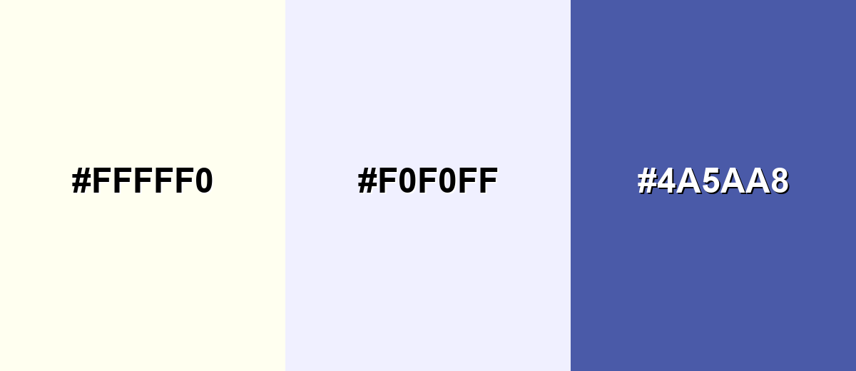
A complementary pairing adds cool counterbalance to ivory's warmth. This is a clean way to make ivory feel more modern and crisp.
Complementary Palette Example: Use ivory as the base, then add a pale periwinkle for softness and a deeper blue for contrast and focus states.
Analogous Color Schemes
Analogous colors sit adjacent to each other on the color wheel, creating harmonious, cohesive palettes with subtle variation.
Warm analogous: ivory with buttery and beige tones for cozy, natural harmony.
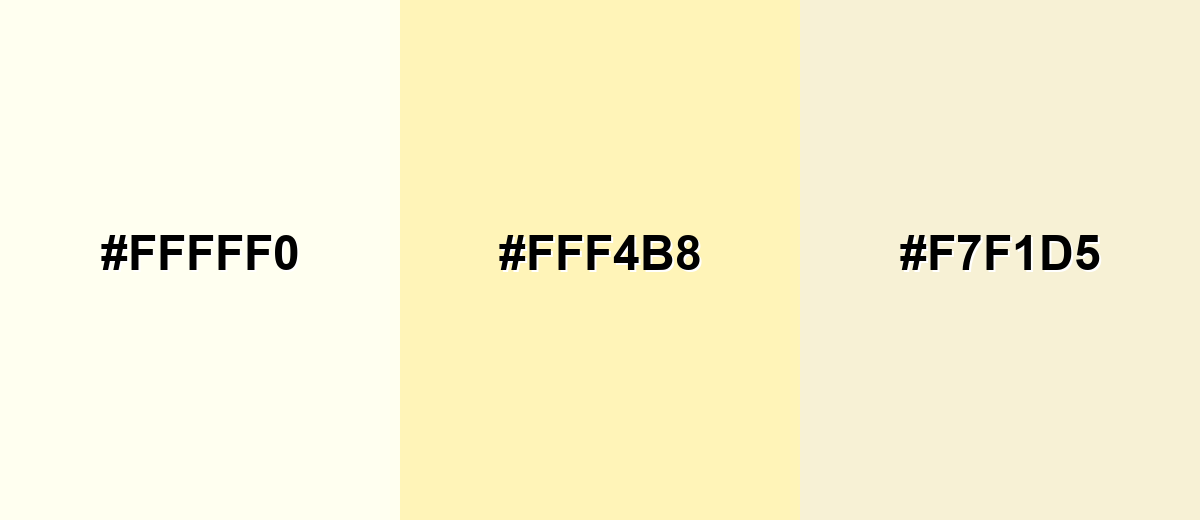
- Ivory: #FFFFF0
- Soft Butter: #FFF4B8
- Champagne Beige: #F7F1D5
Fresh analogous: ivory with pale green tints for a clean, spa-like feel.
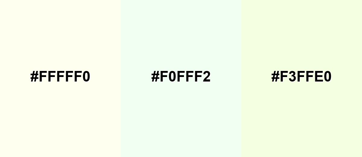
- Ivory: #FFFFF0
- Pale Celadon: #F0FFF2
- Honeydew Tint: #F3FFE0
Triadic & Tetradic Combinations
Triadic palettes keep balance while adding gentle color variety.
Ivory + soft aqua + blush pink creates a light, playful set that still feels premium.
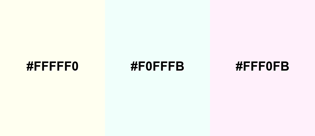
- Ivory: #FFFFF0
- Powder Aqua: #F0FFFB
- Blush Pink: #FFF0FB
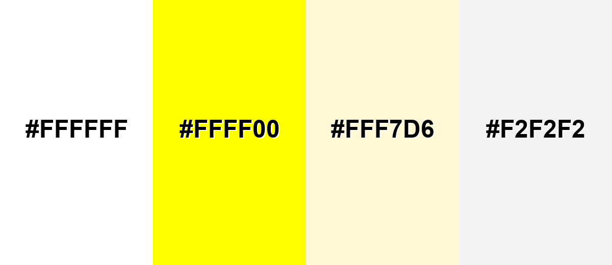
Colors to Avoid
While ivory color is remarkably versatile, certain combinations can create problematic visual effects:
- Pure White (#FFFFFF) - It can make ivory look dingy or yellow by comparison, especially on large backgrounds.
- Neon Yellow (#FFFF00) - The shared yellow bias can feel overly loud and reduce sophistication.
- Pale Beige (#FFF7D6) - Too close in value and undertone, it can look muddy or indistinct without clear separation.
- Light Gray (#F2F2F2) - If used together without darker anchors, the palette may lack contrast and visual hierarchy.
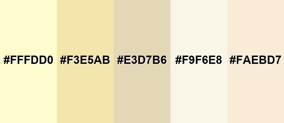
Shades, Tints & Variations of Ivory Color
Ivory sits in a helpful middle ground between bright white and beige, and its variations let you fine-tune warmth, depth, and material feel across a full design system.
- Cream (#FFFDD0) - A warmer, more noticeably yellow-tinted off-white than ivory. It's best used for Soft backgrounds, food and lifestyle branding, and cozy interior palettes..
- Vanilla (#F3E5AB) - A deeper, golden-leaning light neutral with a sunlit feel. It's best used for Accents, highlights, and warm UI surfaces that still read light..
- Bone (#E3D7B6) - A muted beige-ivory shade that feels earthy and grounded. It's best used for Secondary backgrounds, packaging, and natural-material color systems..
- Alabaster (#F9F6E8) - A very light, refined off-white with subtle warmth and minimal color cast. It's best used for Premium editorial layouts, minimalist interfaces, and clean product pages..
- Antique White (#FAEBD7) - A peach-leaning off-white that feels vintage and decorative. It's best used for Classic themes, wedding-style aesthetics, and warm, nostalgic visuals..
Industry Applications
Ivory's versatility makes it common across both digital and physical design. It works especially well anywhere you need a bright canvas that still feels warm.
Fashion & Beauty
- Beauty and wellness packaging - Builds a clean, calming base that feels soft and premium rather than stark.
- Editorial-style product pages - Keeps layouts airy and high-end while letting product photography stand out.
- Minimal labeling systems - Works well for typography-forward designs where readability and whitespace matter.
- Texture-led visuals - Pairs naturally with linen, matte finishes, and subtle grain for a refined look.
Interior Design & Decor
- Light, airy base walls - Creates brightness with less "coldness" than pure white.
- Natural material pairings - Complements wood, stone, and warm metals without turning overly yellow.
- Layered neutral palettes - Supports tonal depth when combined with other warm off-whites and beiges.
- Soft contrast styling - Helps darker accents and furniture lines feel intentional and balanced.
Branding & Marketing
- Web and SaaS UI backgrounds - Great for dashboards, onboarding, and card layouts that feel softer than pure white.
- Ecommerce product backdrops - Highlights materials and texture in photography while keeping pages bright.
- Publishing and education templates - Supports reading-focused layouts where comfort matters over long sessions.
- Photo and video overlays - Useful for warm title cards and captions that avoid harsh highlight clipping.
Conclusion
Ivory is a warm, near-white neutral that brings clarity without the stark feel of pure white. With the right contrast and a thoughtfully chosen palette, it can look modern, classic, or cozy—making it one of the most reliable foundations for web design, branding, interiors, and print. Use the ivory HEX (#FFFFF0) and matching RGB/CMYK values to keep your color consistent, then build hierarchy with darker anchors and intentional accents for a polished, premium finish.
Design Smarter with AI: Media.io is an online AI studio that empowers creators with advanced image generation and enhancement tools. From text-to-image and image-to-image creation to AI upscaling and color optimization, it enables fast, creative, and professional results—all in your browser.

Frequently Asked Questions About Ivory Color
Ivory is a light off-white with a subtle yellow undertone. It's brighter than beige, warmer than pure white, and often used as a soft neutral base.
A widely used ivory color code is shown on this page in HEX, along with matching RGB, CMYK, HSL, and HSV values for design and print workflows.
Not exactly. Cream is typically warmer and more yellow, while ivory is closer to white and usually looks slightly cleaner and lighter.
Ivory pairs well with deep blues, charcoal tones, muted greens, blush pinks, and warm metallic accents. It also works beautifully with natural wood and stone-inspired palettes.
Yes—ivory is a popular alternative to pure white because it reduces harshness. Just ensure enough contrast for text, icons, and buttons so the interface stays accessible.
Avoid placing it next to pure white, and use a darker anchor color for structure and contrast. Keeping undertones consistent across neutrals also helps ivory stay clean and intentional.


