

Light magenta color is a bright, airy pink-purple that looks like magenta softened with white, similar to a candy-like orchid tint. Its hex code is #ff80ff, giving it a vivid feel while still reading as gentle.
People often see it as playful, creative, and slightly romantic without being heavy. Because it sits between red and blue in both light and pigment mixes, small changes in tint can quickly shift it warmer or cooler; this guide covers meaning, codes, combinations, shades, and practical uses.
Light Magenta Color: Codes & Values
If you want a consistent light magenta across screens, print files, and brand assets, these values are the most practical starting point.
| Parameters | VALUE |
| HEX Code | #FF80FF |
| RGB DECIMAL | 255, 128, 255 |
| RGB PERCENTAGE | 100%, 50.2%, 100% |
| CMYK | 0%,50%,0%,0% |
| HSL | 300°, 100%, 75% |
| HSV (HSB) | 300°, 50%, 100% |
| Web Safe | #FF99FF |
Key Color Space Explanations:
- HEX - HEX is the most common way to specify this shade in web design. Use #ff80ff in CSS and design tools to match light magenta precisely.
- RGB - RGB defines the mix of red, green, and blue used on screens. Light magenta is high in red and blue with a mid-level green for a softer, lighter look.
- CMYK - CMYK is used for printing with cyan, magenta, yellow, and black inks. The CMYK values help you estimate how this shade may reproduce on paper and packaging.
- HSL - HSL describes hue, saturation, and lightness, which is useful for building palettes. With a 300° hue and high saturation, it stays clearly purple-pink even as you adjust lightness.
- Web Safe - Web safe is the closest legacy-safe approximation built from a limited set of RGB steps. #ff99ff is a near match when you need a simplified, grid-based alternative.
In practice, use HEX or RGB for digital UI, HSL to fine-tune tints and gradients, and CMYK as your print baseline (then proof and adjust for your paper and ink profile).
Light Magenta Color Conversions
Need light magenta translated for different tools? Use this quick conversion table to copy-and-paste the right format.
| Parameters | VALUE | CSS |
| HEX | #ff80ff | #ff80ff |
| RGB DECIMAL | 255, 128, 255 | rgb(255,128,255) |
| RGB PERCENTAGE | 100%, 50.2%, 100% | rgb(100%,50.2%,100%) |
| CMYK | 0%,50%,0%,0% | cmyk(0%,50%,0%,0%) |
| HSL | 300°, 100%, 75% | hsl(300°,100%,75%) |
| HSV (or HSB) | 300°, 50%, 100% | -- |
| Web Safe | ff99ff | #ff99ff |
| CIE-LAB | 72.2, 65.0, -42.2 | -- |
| XYZ | 67.1, 44.0, 99.6 | -- |
| xyY | 0.318, 0.209, 44.0 | -- |
| CIE-LCH | 72.2, 77.5, 327° | -- |
| CIE-LUV | 72.2, 59.7, -77.1 | -- |
| Hunter-Lab | 66.3, 70.0, -50.0 | -- |
| Binary | 11111111 10000000 11111111 | -- |
Want to generate Light Magenta Color photos or posters? Try Media.io's AI Image Generator now!
Light Magenta Color Meaning & Symbolism
Light magenta is often linked with imagination, warmth, and a friendly sense of self-expression. Because it blends pink energy with purple flair, it can feel both playful and slightly luxe in everyday visuals.
Psychological Effects
Light magenta tends to land as cheerful and creative, but it's at its best when balanced with calmer neutrals.
- Uplifting Mood - The bright pink-purple tint can feel upbeat and optimistic, especially in clean, light layouts.
- Creative Energy - It signals imagination and originality, making designs feel more expressive and personal.
- Friendly Attention - As an accent, it draws the eye without the aggressive push of deeper reds.
- Modern Playfulness - The candy-like tone adds a trendy, pop aesthetic that works well in contemporary visuals.
- Overstimulation Risk - Used too widely at full saturation, it can feel loud, sugary, or distracting and may cause eye fatigue.
Positive Associations
When used with intention, light magenta communicates warmth and confidence while staying approachable.
- Self-Expression - The pink-and-purple blend often reads as bold personality in a friendly, non-intimidating way.
- Imagination - It's frequently tied to creative thinking, art-forward brands, and playful storytelling.
- Affection - The soft romantic undertone can suggest care, sweetness, and celebration without feeling heavy.
- Polished Fun - Paired with deep neutrals, it can look polished and premium rather than childish.
- Fresh Optimism - Its lightness helps keep compositions airy, lively, and forward-looking.
Cultural Significance Across the World
Like most bright tints, the meaning can shift depending on the audience, so context and testing matter.
- Pop Aesthetics - Light magenta is widely linked to modern pop visuals, digital culture, and playful branding.
- Individuality - Magenta-family colors are often used to suggest independence, uniqueness, and standing out.
- Celebration - In many design contexts it overlaps with festive energy, joy, and upbeat event styling.
- Industry-Driven Meaning - In beauty, fashion, and media it can feel trendy and expressive, while in serious sectors it may need heavier neutrals to stay credible.
Design Applications
Light magenta works best when you treat it as an accent or a featured highlight with plenty of breathing room. Below are practical ways to use it across digital and physical design.
Graphic Design Tips
- Use light magenta for featured moments like campaign graphics, seasonal drops, or limited-edition callouts.
- Anchor it with deep neutrals so it reads polished (especially in logos, headers, and packaging accents).
- Give it space: thin lines, badges, and small blocks often look better than full-page fills.
- Pair it with clean whites or soft off-whites to keep the palette bright but not overwhelming.
- If you're building gradients, blend through nearby pinks/violets to keep transitions smooth and modern.
Pro tip: If light magenta feels "too sweet," lower the saturation slightly or switch to a softer tint for large areas, then bring #FF80FF back for key highlights.
Light Magenta Color in Photography & Video
- Use it as a color accent in props, wardrobe, or set dressing to create a modern pop without dominating the frame.
- In color grading, keep skin tones natural by pushing magenta mostly into midtone accents rather than overall white balance.
- For product shots, light magenta backgrounds can work well with strong shadows and neutral styling to avoid a "candy overload."
- In motion graphics, reserve it for titles, lower-thirds, or UI-style highlights instead of long text blocks.
- Test on multiple displays—bright pink-purple hues can look different across phones, monitors, and TVs.
Recommended Tool for Image Enhancement: When incorporating light magenta color into your photography projects, Media.io's AI Image tools can help you achieve more refined results. With AI-powered color enhancement, photo colorization, image upscaling, and old photo restoration, you can easily enrich light magenta color tones, improve overall image quality, and highlight the color's elegant and sophisticated aesthetic.
Color Combinations
Because light magenta sits between pink and purple, it pairs well with fresh greens, airy blues, and warm tints that keep it balanced. Use these schemes as starting points, then adjust lightness for your layout.
Complementary Colors
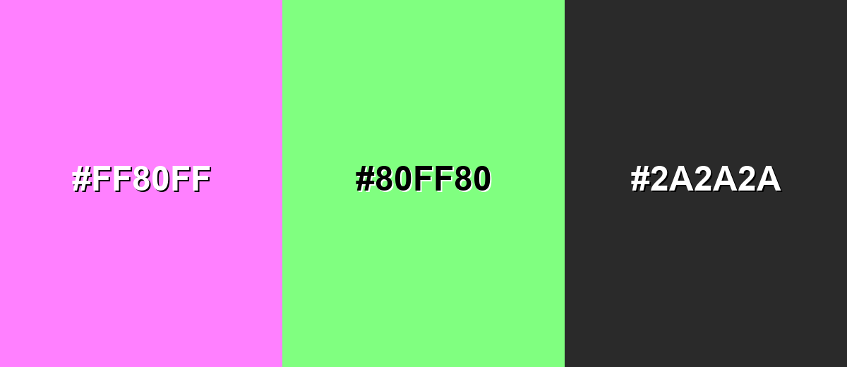
The complementary pairing adds crisp contrast by balancing pink-purple with a light, spring-like green. This is a strong option for attention-grabbing accents and modern graphics.
Complementary Palette Example: Try Light Magenta with Soft Mint and Deep Charcoal for a vibrant but controlled look.
Analogous Color Schemes
Analogous colors sit adjacent to each other on the color wheel, creating harmonious, cohesive palettes with subtle variation.
Stay in the same family with Light Violet, Light Magenta, and Rose Pink for a smooth, trendy gradient-friendly set.
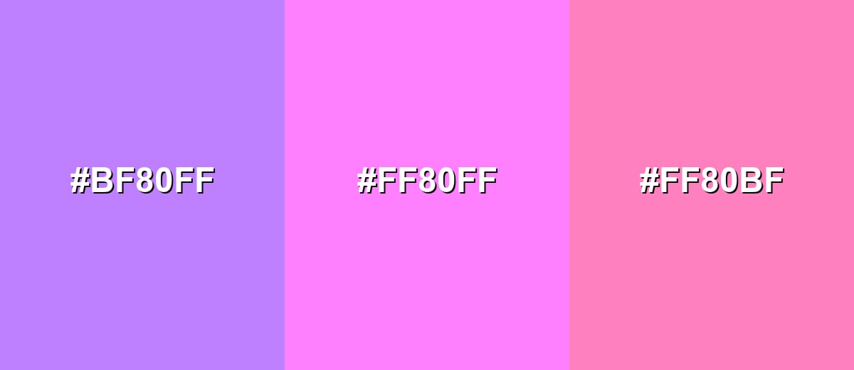
- Light Violet: #BF80FF
- Light Magenta: #FF80FF
- Rose Pink: #FF80BF
For a slightly more orchid-leaning feel, combine Orchid Tint, Light Magenta, and Pink Orchid to keep the harmony soft but lively.
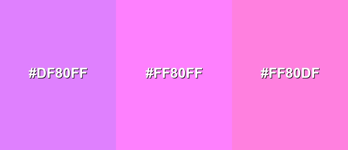
- Orchid Tint: #DF80FF
- Light Magenta: #FF80FF
- Pink Orchid: #FF80DF
Triadic & Tetradic Combinations
A triadic scheme gives variety while keeping balance, which is useful for illustrations, dashboards, and playful branding.
Mix Light Magenta with Light Yellow and Light Cyan for a bright, candy-like palette that still feels organized.
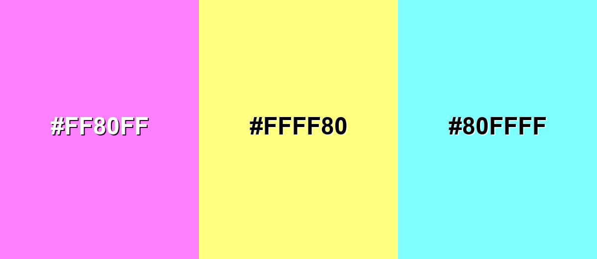
- Light Magenta: #FF80FF
- Light Yellow: #FFFF80
- Light Cyan: #80FFFF
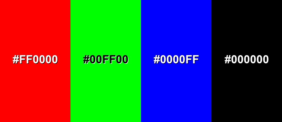
Colors to Avoid
While light magenta color is remarkably versatile, certain combinations can create problematic visual effects:
- Pure Red (#FF0000) - Both hues compete at high intensity, which can feel noisy and reduce hierarchy in UI and posters.
- Neon Green (#00FF00) - The pairing can create harsh vibration and makes light magenta feel less refined, especially on large areas.
- Electric Blue (#0000FF) - This combo skews very saturated and can make screens feel harsh, with poor balance for reading-focused layouts.
- Pure Black (#000000) - The contrast is extremely strong and can make the palette feel edgy; a softer charcoal often looks more intentional.
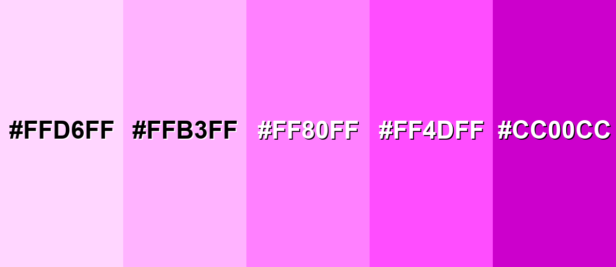
Shades, Tints & Variations of Light Magenta Color
From barely-there pastels to deeper, more premium magentas, this range helps you keep the same color "personality" while adjusting contrast, mood, and readability across different layouts.
- Pale Magenta (#FFD6FF) - A near-pastel tint that feels airy and gentle, with just a hint of purple. It's best used for Backgrounds, subtle panels, and soft gradients where you want warmth without strong saturation.
- Soft Light Magenta (#FFB3FF) - A sweet, friendly pink-purple that stays noticeable while being easier on the eyes than the base shade. It's best used for Cards, chips, illustrations, and brand accents that need a softer touch.
- Light Magenta (#FF80FF) - The core shade: bright, clean, and expressive with a modern pop feel. It's best used for CTAs, highlights, product accents, and feature visuals where you want energy and personality.
- Vivid Magenta (#FF4DFF) - A stronger, more electric version that leans bolder and more attention-grabbing. It's best used for Badges, promotional labels, and short headline accents when you need extra punch.
- Deep Magenta (#CC00CC) - A darker magenta-purple that adds depth and feels more dramatic and premium. It's best used for Text or icon accents on light backgrounds, outlines, and contrast anchors in palettes.
Industry Applications
Light magenta shows up most where brands want a confident, expressive tone that still feels friendly. These examples highlight common, practical fits.
Fashion & Beauty
- Packaging accents for skincare, fragrance, and makeup lines.
- Social creatives that need a modern, playful glow.
- Seasonal drops, lookbooks, and editorial graphics.
- Accessories and pattern work where a pink-purple pop is desired.
Interior Design & Decor
- Accent pieces like cushions, throws, or art prints to add energy without overpowering a room.
- Pairing with soft whites, pale woods, and muted greens to keep spaces calm and balanced.
- Party-ready styling for invites, signage, and themed decorations.
- Color-coding elements in kids' creative spaces when balanced with clear neutrals.
Branding & Marketing
- Event posters, livestream branding, and creator graphics with a modern pop aesthetic.
- Feature callouts, badges, and highlight states in apps and digital products.
- Onboarding illustrations that need a friendly, upbeat tone.
- Craft and learning materials where the color supports playful, creative positioning.
Conclusion
Light magenta (#FF80FF) is a bright but softened pink-purple that brings creativity, warmth, and modern energy to visual design—especially when you treat it as a highlight rather than a full-bleed background. With reliable code values for HEX, RGB, CMYK, and HSL, it's easy to keep consistent across UI, branding, and print, while thoughtful pairings (like mint and deep neutrals) help it feel polished instead of overpowering. If you're building new concepts or want to explore fresh palettes fast, Media.io makes it simple to generate, test, and refine light magenta-forward visuals right in your browser.
Design Smarter with AI: Media.io is an online AI studio that empowers creators with advanced image generation and enhancement tools. From text-to-image and image-to-image creation to AI upscaling and color optimization, it enables fast, creative, and professional results—all in your browser.

Frequently Asked Questions About Light Magenta Color
It looks like a bright pink-purple that has been softened into a lighter tint. Compared with pure magenta, it feels less intense and more airy.
A commonly used digital hex value for light magenta is #ff80ff. Depending on the palette source, nearby tints may also be labeled similarly.
Not exactly. Pink typically leans toward red, while light magenta sits closer to the purple side because it combines strong red and blue.
Fresh greens (like soft mint), light cyans, pale yellows, and deep neutrals pair well. These options either balance it with contrast or keep the look smooth and modern.
Use it for small emphasis areas such as badges, highlights, and active states rather than large backgrounds. Balance it with light neutrals and ensure text and icons meet strong contrast requirements.
It can shift in print because bright pink-purple tones are sensitive to ink profiles, paper, and lighting. For critical work, run a proof and adjust the magenta level or choose a slightly deeper or softer tint as needed.


