

Pale pink color is a light, soft pink with a muted, milky look—like a gentle blush washed with white. Its common digital reference is hex #f7c6d0, which reads warm and airy on most screens.
People often perceive it as caring, calm, and approachable, though it can feel overly sweet if overused. This guide breaks down its meaning, codes, combinations, shades, and practical ways to use it.
Pale Pink Color: Codes & Values
If you're building a palette or matching visuals across web and print, these are the core pale pink values to keep everything consistent.
| Parameters | VALUE |
| HEX Code | #F7C6D0 |
| RGB DECIMAL | 247, 198, 208 |
| RGB PERCENTAGE | 96.9%, 77.6%, 81.6% |
| CMYK | 0%,20%,16%,3% |
| HSL | 348°, 75%, 87% |
| HSV (HSB) | 348°, 20%, 97% |
| Web Safe | #FFCCCC |
Key Color Space Explanations:
- HEX - HEX is the most common way to specify pale pink for websites and UI. Use #f7c6d0 to keep the tone consistently soft and warm.
- RGB - RGB defines the red, green, and blue light values used by screens. This pale pink is built from high red with softened green and blue for a gentle blush look.
- CMYK - CMYK is used for print and describes ink percentages. Because pale pink is light, small shifts in magenta and yellow can noticeably change the final result.
- HSL - HSL describes hue, saturation, and lightness, which is helpful when creating lighter or deeper variations. A high lightness value explains why it feels airy and delicate.
- Web Safe - Web safe values are legacy approximations designed for older displays. The nearest web safe match helps when you need a simple, widely supported fallback.
Use HEX or RGB for digital designs, and switch to CMYK when you're preparing print files—especially for packaging or invitations where paper and lighting can shift pale tones.
Pale Pink Color Conversions
Need pale pink in a different format for your workflow? Use this conversion table to copy the right value for CSS, design tools, and print prep.
| Parameters | VALUE | CSS |
| HEX | #f7c6d0 | #f7c6d0 |
| RGB DECIMAL | 247, 198, 208 | rgb(247,198,208) |
| RGB PERCENTAGE | 96.9%, 77.6%, 81.6% | rgb(96.9%,77.6%,81.6%) |
| CMYK | 0%,20%,16%,3% | cmyk(0%,20%,16%,3%) |
| HSL | 348°, 75%, 87% | hsl(348°, 75%, 87%) |
| HSV (or HSB) | 348°, 20%, 97% | -- |
| Web Safe | ffcccc | #ffcccc |
| CIE-LAB | 84.5, 18.5, 1.8 | -- |
| XYZ | 69.9, 64.8, 68.4 | -- |
| xyY | 0.344, 0.319, 64.8 | -- |
| CIE-LCH | 84.5, 18.6, 5.6° | -- |
| CIE-LUV | 84.5, 28.8, 4.6 | -- |
| Hunter-Lab | 80.5, 18.6, 1.7 | -- |
| Binary | 11110111 11000110 11010000 | -- |
Want to generate pale pink color photos or posters? Try Media.io's AI Image Generator now!
Pale Pink Meaning & Symbolism
Pale pink is widely associated with tenderness, softness, and reassurance. In everyday life it often signals gentleness and care, which is why it shows up in calming visuals, friendly packaging, and welcoming spaces. This makes pale pink color meaning especially useful when you want warmth without intensity.
Psychological Effects
Because it's light and low-pressure, pale pink tends to influence mood subtly rather than demanding attention.
- Approachability - As a light, low-intensity color, pale pink can make layouts feel welcoming and easy to engage with.
- Visual Softening - It reduces harshness in busy designs, helping interfaces, posters, and rooms feel less sharp and more comfortable.
- Warmth Cue - Pale pink gently nudges perception toward kindness and care, which can support empathetic messaging.
- Lower Perceived Pressure - Used as a background tone, it can make content feel less "loud," encouraging people to stay and read longer.
- Sweetness Overload - When overused, it can feel overly delicate or childish, especially with playful typography or bright accents.
Positive Associations
When balanced with clean neutrals and clear hierarchy, pale pink reads modern, friendly, and polished.
- Tenderness - The soft blush quality naturally suggests gentleness and emotional warmth.
- Calm - Its high lightness keeps the vibe airy and restful rather than intense.
- Care - It's often used in visuals that aim to feel supportive, personal, and human.
- Romance - In many modern contexts, pale pink is tied to affection and subtle celebration.
- Modern Minimalism - Treated like a warm neutral, it can feel clean and contemporary instead of "cute."
Cultural Significance Across the World
Meanings can vary by audience and setting, so it's best to pair the color with clear typography, imagery, and tone of voice.
- Affection - Pale pink is commonly linked with love, kindness, and gentle connection in modern visual culture.
- Celebration - It's a popular choice for weddings, showers, and light-hearted events where softness supports elegant details.
- Context-Dependent Meaning - The message shifts with styling: minimal layouts feel modern, while playful layouts can read youthful.
- Soft Signal, Stronger Story - Across regions, pale pink works best as a friendly cue—while copy and imagery carry the main message.
Design Applications
Pale pink is easiest to use when you treat it like a soft neutral. It can support content, soften harsh contrast, and add warmth without pulling attention away from key elements.
Graphic Design Tips
- Use pale pink as a background or card surface to create a welcoming tone without overpowering content.
- Pair it with a dark neutral for text (like charcoal) so headings and body copy stay readable.
- Keep primary CTAs higher-contrast; use pale pink for secondary buttons, badges, or gentle highlights.
- Avoid using pale pink for small text or thin icons on white—details can disappear fast.
- Test on different screens and in dim lighting, where subtle pinks can flatten into off-white.
Pro tip: if your layout feels "too sweet," bring in a grounded neutral surface and let pale pink show up in just one or two repeatable accents (like tags, dividers, or section headers).
Pale Pink in Photography & Video
- Use pale pink backdrops to soften skin tones and reduce harsh contrast in portraits and product shots.
- In video graphics, pale pink works well for lower-thirds and overlays when text is set in a darker neutral.
- Watch white balance—warm indoor light can push pale pink toward peach, while cool light can make it look washed out.
- For social posts, pair pale pink with clean spacing and a single stronger accent color to keep layouts crisp.
- When color grading, small saturation changes make a big difference—adjust gently to keep the tone airy.
Recommended Tool for Image Enhancement: When incorporating pale pink into your photography projects, Media.io's AI Image tools can help you achieve more refined results. With AI-powered color enhancement, photo colorization, image upscaling, and old photo restoration, you can easily enrich pale pink tones, improve overall image quality, and highlight the color's elegant and sophisticated aesthetic.
Color Combinations
The best combinations for pale pink keep the palette airy while adding enough contrast to define structure. Use the schemes below as starting points, then adjust saturation or darkness based on your layout and lighting conditions.
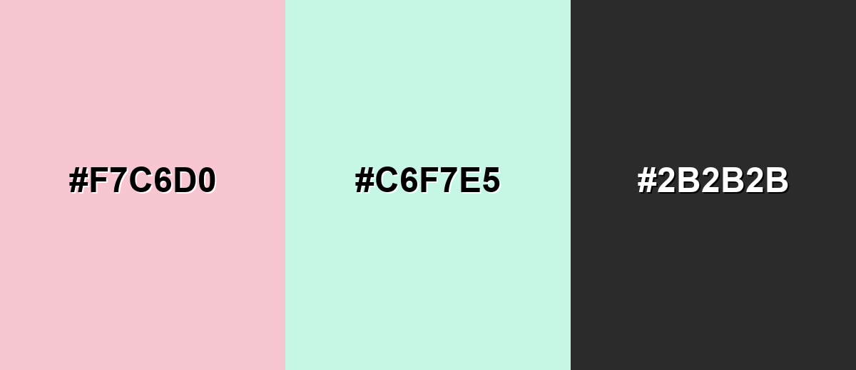
Complementary Colors
A complementary mix adds a fresh counterbalance: soft mint offsets pale pink's warmth without turning the look loud. Add a deep neutral to keep edges and text crisp.
Complementary Palette Example: Try Pale Pink with Soft Mint and Charcoal for a clean, modern balance.
Analogous Color Schemes
Analogous colors sit adjacent to each other on the color wheel, creating harmonious, cohesive palettes with subtle variation.
A warm, romantic flow: Pale Peach, Pale Pink, and Pale Orchid sit close together for a gentle gradient.
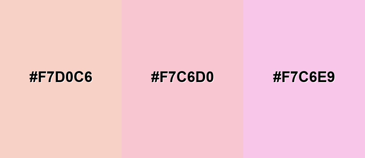
- Pale Peach: #F7D0C6
- Pale Pink: #F7C6D0
- Pale Orchid: #F7C6E9
A cooler blush range: Soft Lilac, Pale Pink, and Pale Orchid create a dreamy, modern pastel set.
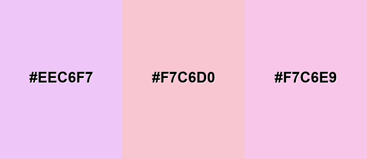
- Soft Lilac: #EEC6F7
- Pale Pink: #F7C6D0
- Pale Orchid: #F7C6E9
Triadic & Tetradic Combinations
A triadic scheme brings variety while staying balanced.
Use Pale Pink with Soft Green and Periwinkle to get playful contrast without harsh saturation.
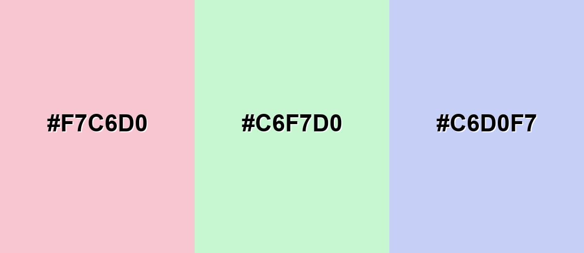
- Pale Pink: #F7C6D0
- Soft Green: #C6F7D0
- Periwinkle: #C6D0F7
Colors to Avoid
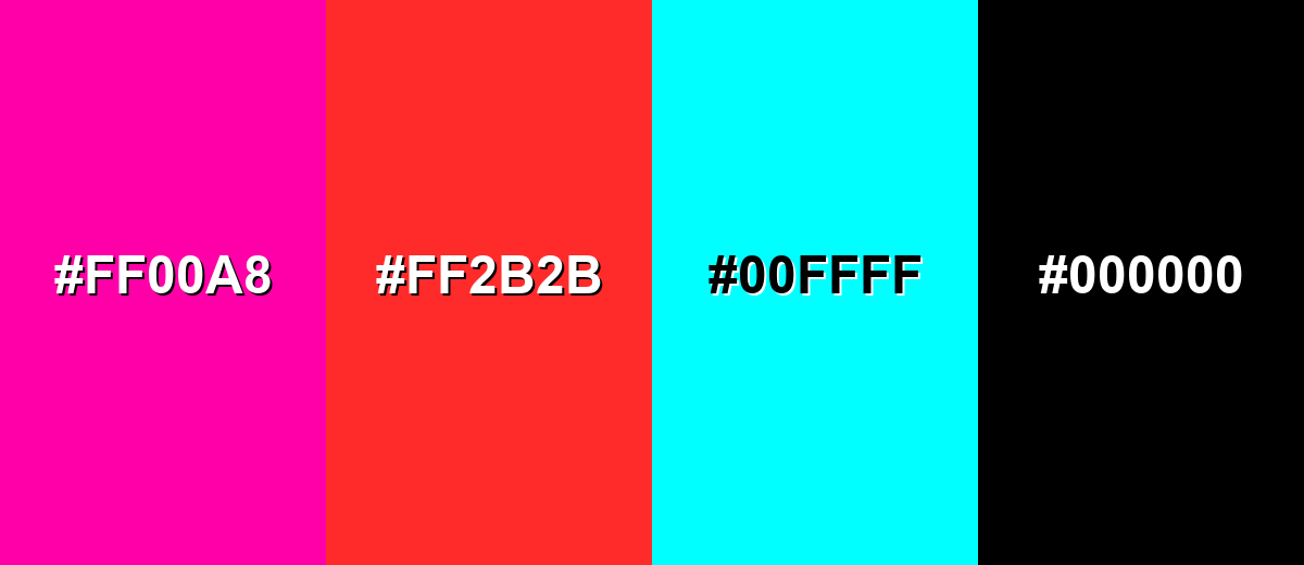
While pale pink is remarkably versatile, certain combinations can create problematic visual effects:
- Neon Magenta (#FF00A8) - Too saturated next to pale pink, making the palette feel noisy and pulling attention away from content.
- Bright Red (#FF2B2B) - Creates a sharp, urgent vibe that can conflict with pale pink's calm tone and can look unbalanced in UI.
- Pure Cyan (#00FFFF) - High-intensity contrast can make pale pink look grayish and can feel visually jarring in most layouts.
- Pure Black (#000000) - Maximum contrast can turn the look harsh; a softer dark neutral often reads more refined and consistent.
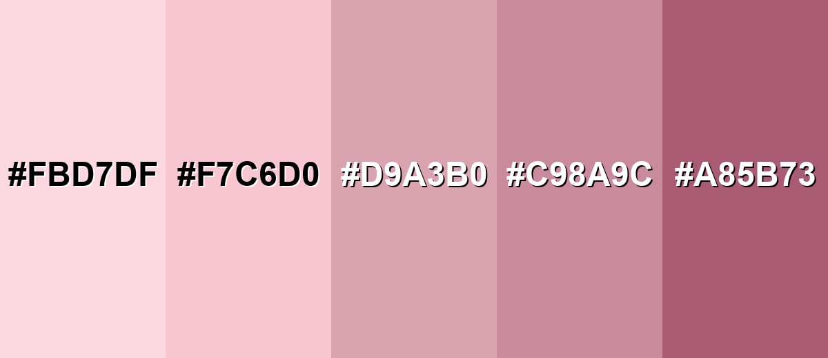
Shades, Tints & Variations of Pale Pink
Pale pink has a surprisingly usable range—from extra-light, airy tints to deeper blush tones that hold up in small UI elements. Mixing a few of these shades helps you keep the look soft while still building clear contrast and hierarchy.
- Baby Pink (#FBD7DF) - A lighter, more delicate version that feels airy and sweet. It's best used for large backgrounds, soft overlays, and subtle gradients.
- Pale Pink (#F7C6D0) - The classic pale pink tone—warm, soft, and easy to pair with neutrals. It's best used for UI surfaces, packaging, and gentle brand accents.
- Dusty Rose (#D9A3B0) - Muted and slightly gray, with a more mature and grounded feel. It's best used for typography accents, apparel palettes, and editorial layouts.
- Rose Quartz (#C98A9C) - A deeper, calmer rose that holds up better in smaller elements. It's best used for buttons, icons, and highlight elements that need more definition.
- Deep Blush (#A85B73) - A richer shade that adds contrast while staying within a soft pink family. It's best used for headings, outlines, and call-to-action details on light surfaces.
Industry Applications
Pale pink shows up across industries because it's flexible: it can be romantic, minimal, or modern depending on what you pair it with. These examples focus on practical ways it supports messaging and clarity.
Fashion & Beauty
- Use pale pink as a soft base for beauty packaging to create a clean, comforting shelf presence.
- Pair it with muted neutrals for a modern "skin-first" aesthetic that still feels warm.
- Bring in deeper rose tones for labels and icons so small details stay legible.
- In apparel palettes, blend it with dusty rose for a more grounded, mature look.
Interior Design & Decor
- Use pale pink on walls or textiles to add warmth without making a room feel heavy.
- Pair it with warm whites and light woods for a calm, airy studio or bedroom vibe.
- Muted greens are a great counterbalance when you want the space to feel fresh, not sugary.
- In lounges and shared spaces, treat it like a warm neutral and keep accents simple.
Branding & Marketing
- Use pale pink in secondary marks, backgrounds, and packaging details to communicate friendliness and care.
- In digital campaigns, keep typography dark and crisp so the message stays clear.
- For UI and product design, it's ideal for onboarding screens and gentle feedback surfaces.
- In editorial and social graphics, it frames portraits and product shots beautifully when hierarchy is strong.
Conclusion
Pale pink stands out for its soft, milky warmth that feels gentle without looking flat when it's paired well. It's a reliable choice for backgrounds, accents, and brand systems that aim for comfort, care, and approachability—and in digital work, #F7C6D0 is easy to build around as long as you protect contrast for text and key actions. Keep things modern by anchoring it with grounded neutrals, then add muted greens or cool purples for balance. Used with restraint, pale pink supports clear visual communication while adding a calm, human touch.
Design Smarter with AI: Media.io is an online AI studio that empowers creators with advanced image generation and enhancement tools. From text-to-image and image-to-image creation to AI upscaling and color optimization, it enables fast, creative, and professional results—all in your browser.

Frequently Asked Questions About Pale Pink Color
Pale pink is a light, softened pink that looks like blush mixed with white. It's commonly used to create gentle, welcoming visuals in design and decor.
A widely used hex value for pale pink is #f7c6d0. It produces a warm, airy pink that works well as a soft background or subtle accent.
It's often associated with tenderness, kindness, and calm. In visual communication, it can suggest care and approachability when balanced with clear typography and structure.
Muted mint, periwinkle, soft violet, warm butter, and charcoal are strong options. These pairings keep the palette light while adding enough contrast to define sections and text.
Yes, especially for backgrounds, cards, and gentle highlights. For accessibility, avoid using it for body text and pair it with dark neutrals like charcoal for readable UI.
Pale pink is typically lighter and more "washed" with white, while blush pink often has a slightly deeper, warmer tone. In practice, blush usually holds contrast better in small UI elements.


