

Mahogany color is a rich reddish-brown that resembles polished hardwood, with warm copper and brick undertones. A common digital reference for this tone is #C04000.
It's often seen as grounded, mature, and quietly luxurious—bringing warmth without shouting for attention. Below, you'll find its key color codes, meaning, best pairings, popular shades, and practical ways to use it in design.
Mahogany Color: Codes & Values
Use these standard values to keep your mahogany color consistent across design tools, web layouts, and print files.
| Parameters | VALUE |
| HEX Code | #C04000 |
| RGB DECIMAL | 192, 64, 0 |
| RGB PERCENTAGE | 75.3%, 25.1%, 0% |
| CMYK | 0%,67%,100%,25% |
| HSL | 20°, 100%, 38% |
| HSV (HSB) | 20°, 100%, 75% |
| Web Safe | #CC3300 |
Key Color Space Explanations:
- HEX - HEX is the most common way to specify a shade for web and UI work. Use #c04000 in CSS and design tools to match this mahogany tone consistently.
- RGB - RGB mixes red, green, and blue light for screens and digital assets. Mahogany here is 192, 64, 0, which creates a warm, high-red look with very little blue.
- CMYK - CMYK is used for print, combining cyan, magenta, yellow, and black ink. The values 0%,67%,100%,25% are a practical starting point, but final results can shift with paper and calibration.
- HSL - HSL describes hue, saturation, and lightness, which is helpful when building tints and shades. With a 20° hue and full saturation, small lightness changes quickly move it from deep wood tones to terracotta-like tints.
- Web Safe - Web-safe colors are an older standard based on a limited palette. The closest web-safe match to this mahogany is #cc3300.
For most digital projects, start with the HEX or RGB values; for print pieces, use CMYK as a baseline and proof if possible to avoid unexpected shifts.
Mahogany Color Conversions
Need mahogany in a different color space? Here's a handy conversion table you can copy into your workflow.
| Parameters | VALUE | CSS |
| HEX | #c04000 | #c04000 |
| RGB DECIMAL | 192, 64, 0 | rgb(192,64,0) |
| RGB PERCENTAGE | 75.3%, 25.1%, 0% | rgb(75.3%,25.1%,0%) |
| CMYK | 0%,67%,100%,25% | cmyk(0%,67%,100%,25%) |
| HSL | 20°, 100%, 38% | hsl(20°,100%,38%) |
| HSV (or HSB) | 20°, 100%, 75% | -- |
| Web Safe | cc3300 | #cc3300 |
| CIE-LAB | 44.6, 52.3, 60.4 | -- |
| XYZ | 27.5, 17.1, 2.1 | -- |
| xyY | 0.59, 0.37, 17.1 | -- |
| CIE-LCH | 44.6, 80.0, 49.0 | -- |
| CIE-LUV | 44.6, 94.0, 46.0 | -- |
| Hunter-Lab | 41.4, 44.0, 39.2 | -- |
| Binary | 11000000 01000000 00000000 | -- |
Want to generate Mahogany Color photos or posters? Try Media.io's AI Image Generator now!
Mahogany Color Meaning & Symbolism
Mahogany is commonly associated with warmth, quality, and tradition, thanks to its link to fine wood finishes and crafted interiors. In everyday life it can read as dependable and premium without feeling flashy. People searching for Mahogany Color meaning often want a tone that feels confident, grounded, and welcoming.
Psychological Effects
Mahogany's depth and warmth can shape how a layout, room, or product story feels at first glance.
- Warmth - Mahogany tends to make spaces and compositions feel cozy and inviting.
- Established Mood - Its richness can make designs feel more grounded and “already trusted.”
- Heritage Signal - In branding and packaging, it often communicates craftsmanship and seriousness.
- Intimacy - Because it's deep and saturated, it can feel protective and lounge-like in hospitality or storytelling.
- Visual Heaviness - Overuse may feel dark, dated, or overly formal, and low contrast can reduce readability.
Positive Associations
Used with restraint, mahogany can bring a premium, human touch to modern design systems.
- Quality - The wood-inspired look is tied to fine finishes and well-made materials.
- Tradition - Mahogany often suggests timeless taste rather than trend-chasing styling.
- Craftsmanship - It pairs naturally with clean typography to reinforce a handcrafted narrative.
- Confidence - The hue feels assured and dependable without the urgency of bright red.
- Quiet Luxury - It reads premium and mature without feeling flashy.
Cultural Significance Across the World
Mahogany's symbolism is strongly influenced by how mahogany wood has been used historically.
- Fine Furniture - Mahogany wood is widely associated with durable, long-lasting furniture making.
- Musical Instruments - Its use in instruments reinforces a connection to craft and tradition.
- Decorative Finishes - Mahogany-like stains and finishes have long been used to create refined interiors.
- Refined Warmth - Across contexts, it's often read as traditional and warm rather than playful.
Design Applications
Mahogany works best as a grounding base or a confident accent, depending on how much visual weight you want. Its warmth pairs well with neutral backgrounds and muted blues and greens, making it versatile across digital and physical design.
Graphic Design Tips
- Balance mahogany with plenty of light neutral space so the layout doesn't feel heavy.
- Use subtle texture (paper grain, wood, or soft gradients) to enhance its material-like character.
- Keep layouts simple and typography clean for a modern, premium look.
- Use it as an accent for brand marks, seals, labels, or highlight blocks where richness matters.
- For print, run a proof when possible—reds and oranges can shift based on paper and color profiles.
If you're building a brand kit, treat mahogany like a “hero accent”: pair it with restrained neutrals for clarity, then add a cool counter-color in small doses for a more contemporary edge.
Mahogany Color in Photography & Video
- Lean into warm lighting and natural materials (wood, leather, ceramics) to make mahogany tones feel authentic.
- Use neutral backdrops to prevent the red-brown from muddying skin tones or product edges.
- In color grading, keep saturation controlled—mahogany looks best when rich, not loud.
- Reserve mahogany for focal props or set elements so the frame stays readable and balanced.
- Watch contrast in darker scenes; lift shadows slightly if the overall image starts feeling too heavy.
Recommended Tool for Image Enhancement: When incorporating mahogany color into your photography projects, Media.io's AI Image tools can help you achieve more refined results. With AI-powered color enhancement, photo colorization, image upscaling, and old photo restoration, you can easily enrich mahogany color tones, improve overall image quality, and highlight the color's elegant and sophisticated aesthetic.
Color Combinations
Mahogany pairs naturally with clean neutrals, cool blues, and earthy greens. Use the combinations below to create balanced palettes for branding, UI themes, interiors, and illustration.
Complementary Colors
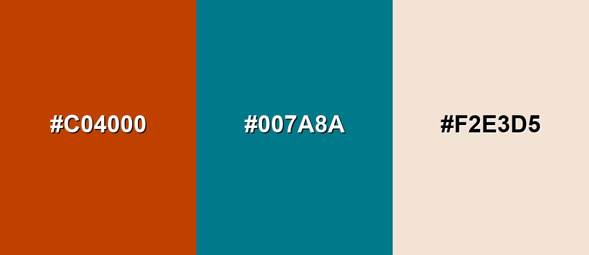
A complementary pairing puts mahogany against a cool blue-green for strong, balanced contrast. This is a reliable choice for modern branding, callouts, and hero sections where you want the warm tone to stand out.
Complementary Palette Example: Use Mahogany as the anchor, Deep Teal for contrast, and Soft Sand to keep the palette airy and readable.
Analogous Color Schemes
Analogous colors sit adjacent to each other on the color wheel, creating harmonious, cohesive palettes with subtle variation.
A warm analogous set that moves from dark red-brown to amber for a cozy, appetizing feel.
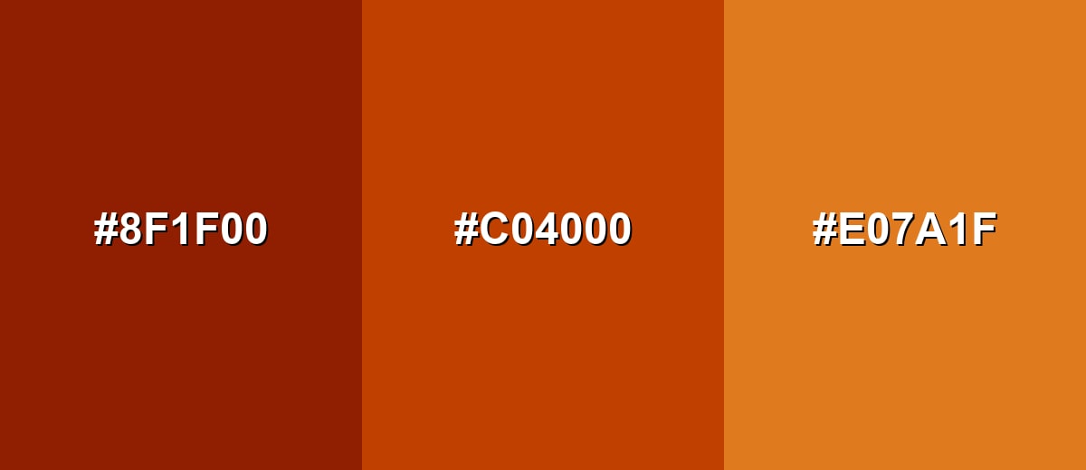
- Smoked Brick: #8F1F00
- Mahogany: #C04000
- Burnt Amber: #E07A1F
A wood-inspired analogous blend with deeper browns and a brighter orange accent for depth.
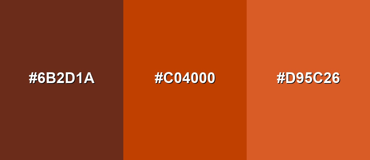
- Walnut Brown: #6B2D1A
- Mahogany: #C04000
- Copper Clay: #D95C26
Triadic & Tetradic Combinations
A triadic palette adds variety while keeping balance, making it useful for multi-section layouts and infographics.
Pair Mahogany with a calm green and a deep violet for contrast that still feels refined.
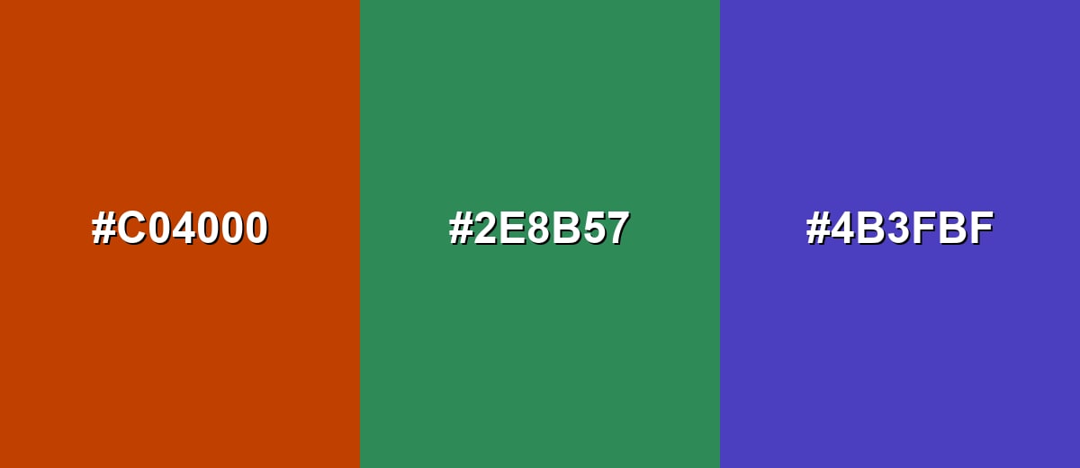
- Mahogany: #C04000
- Sea Green: #2E8B57
- Blue Violet: #4B3FBF
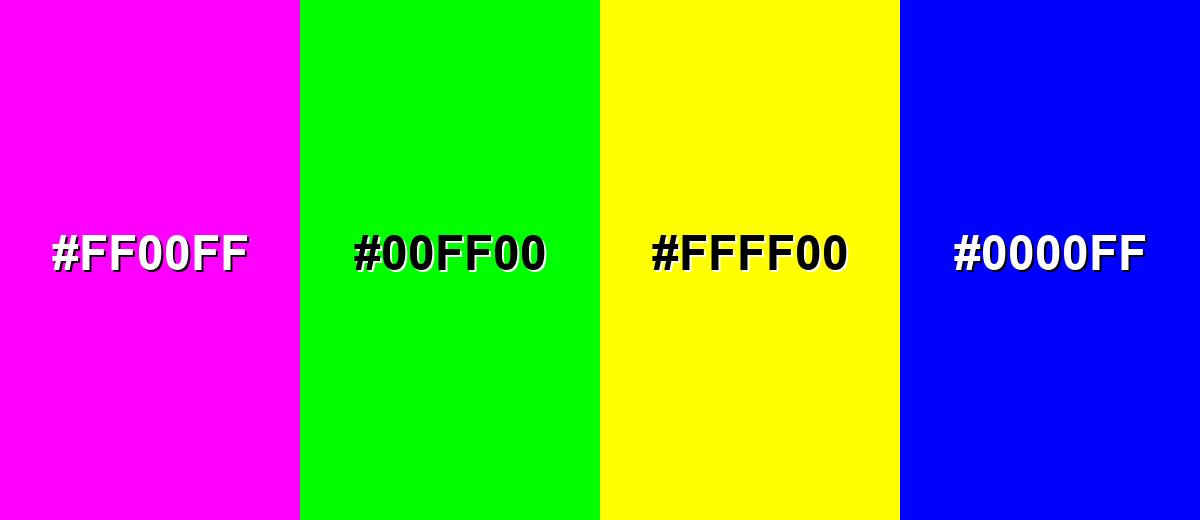
Colors to Avoid
While mahogany color is remarkably versatile, certain combinations can create problematic visual effects:
- Neon Magenta (#FF00FF) - Competes aggressively with mahogany and can make layouts feel chaotic and low-end.
- Pure Neon Green (#00FF00) - Creates a harsh, vibrating contrast that reads more novelty than refined.
- Bright Lemon Yellow (#FFFF00) - Overpowers the warm brown-red base and can look unbalanced without careful tone control.
- Pure Blue (#0000FF) - Too saturated against mahogany, often producing a blunt contrast that can feel dated in modern UI.
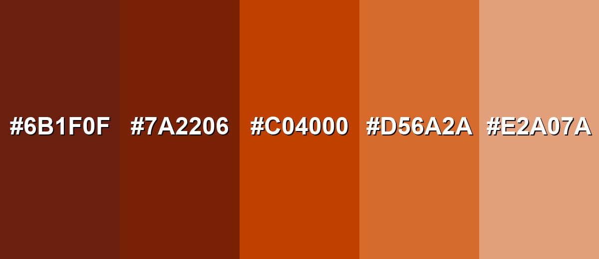
Shades, Tints & Variations of Mahogany Color
Mahogany isn't just one fixed swatch—it ranges from deep, moody wood tones to lighter copper-leaning tints. Having a few variations ready makes it easier to build hierarchy in UI, add depth to illustrations, or create a more flexible brand palette.
- Deep Mahogany (#6B1F0F) - A very dark, wood-like version with a subtle red undertone that feels traditional and substantial. It's best used for Headers, premium packaging, backgrounds, and moody interiors..
- Dark Mahogany (#7A2206) - A strong, grounded shade that keeps the warmth but reduces brightness for a more serious tone. It's best used for Navigation bars, editorial accents, and leather or wood product themes..
- Mahogany (#C04000) - The classic reference tone: warm, reddish-brown with a confident, crafted feel. It's best used for Brand accents, buttons, labels, and focal elements..
- Warm Mahogany (#D56A2A) - A lighter, more copper-leaning take that feels friendly and energetic without turning neon. It's best used for Illustrations, highlights, seasonal themes, and supportive UI accents..
- Light Mahogany (#E2A07A) - A soft, muted tint that brings the mahogany character into airy palettes and gentle backgrounds. It's best used for Background panels, large surfaces, gradients, and subtle UI states..
Industry Applications
Mahogany is a practical choice in industries that want warmth and credibility. It can communicate craftsmanship in physical products and add a grounded accent in digital systems when paired with clean neutrals.
Fashion & Beauty
- Use mahogany-like tones to evoke leather, suede, and other classic accessories materials.
- It fits naturally into autumn palettes for lookbooks, product drops, and seasonal campaigns.
- For styling and editorial shots, mahogany accents can add a refined, timeless mood.
- Pair it with darker neutrals or soft off-whites to keep the look balanced and wearable.
Interior Design & Decor
- Mahogany works as an anchor tone in wood-forward palettes for cozy, classic spaces.
- Try it in textiles, feature walls, or decor accents when you want warmth without bright red.
- Keep the room from feeling too dark by layering soft neutrals and lighter surfaces.
- Subtle textures and finishes help mahogany read as rich and intentional rather than heavy.
Branding & Marketing
- Use mahogany for wordmarks, seals, and accent blocks to suggest heritage, quality, and confidence.
- In packaging (gourmet food, coffee, spirits, artisan goods), it adds depth that boosts perceived quality.
- In UI and product design, apply it to badges, active states, or key highlights for warm authority.
- For a premium feel, lean into restrained secondary accents and matte, tactile-looking textures.
Conclusion
Mahogany stands out for its rich reddish-brown character that feels warm, crafted, and dependable. It's a strong choice when you want an accent with substance—especially for branding, packaging, interiors, and UI highlights—and using #C04000 as your reference makes it easy to stay consistent across tools. Pair it with light neutrals for clarity, or bring in cool blues and greens for a modern contrast that still feels refined. With the right balance, mahogany color symbolism supports designs that aim to feel premium, welcoming, and built to last.
Design Smarter with AI: Media.io is an online AI studio that empowers creators with advanced image generation and enhancement tools. From text-to-image and image-to-image creation to AI upscaling and color optimization, it enables fast, creative, and professional results—all in your browser.

Frequently Asked Questions About Mahogany Color
A commonly used hex code for mahogany is #c04000. In design work, it represents a warm reddish-brown similar to polished mahogany wood.
Mahogany is a warm tone. Its strong red and orange undertones make it feel cozy and grounded rather than crisp or icy.
Mahogany pairs well with soft neutrals (cream, sand), cool blue-greens (teal), and earthy greens. These pairings balance its warmth and keep palettes from feeling too heavy.
A complementary direction for mahogany sits in the blue-green range. Teal and deep cyan tones are common complementary choices because they contrast the warm red-brown base.
Use it as an accent rather than a full background, and add plenty of light neutral space around it. For small text and icons, ensure strong contrast and consider lighter variations for better readability.
Mahogany is typically more brown and orange-leaning, resembling wood tones. Burgundy is usually deeper and more purple-red, with a wine-like feel and less earthy warmth.


