

Phthalo blue is an intense, deep blue that often reads cool and slightly green-leaning in real life, like a saturated ocean depth. Its commonly used digital reference is hex #0b3d91.
Many people associate it with focus, trust, and a strong sense of depth, which is why it feels both confident and calming. It also traces back to modern pigment chemistry, where phthalocyanine blues became popular for their strong tinting power and clean, transparent look in mixes.
Phthalo Blue Color: Codes & Values
If you need a reliable reference for UI, print, or brand work, these phthalo blue codes make it easy to match the color across tools and formats.
| Parameters | VALUE |
| HEX Code | #0B3D91 |
| RGB DECIMAL | 11, 61, 145 |
| RGB PERCENTAGE | 4%, 24%, 57% |
| CMYK | 92%,58%,0%,43% |
| HSL | 218°, 86%, 31% |
| HSV (HSB) | 218°, 92%, 57% |
| Web Safe | #003399 |
Key Color Space Explanations:
- HEX is the most common way to specify a screen-ready value in web and UI work. Use #0b3d91 in CSS, design tools, and product interfaces.
- RGB defines the red, green, and blue light values used by displays. It is useful for on-screen graphics, motion, and any workflow built around additive color.
- CMYK is used for ink-based printing and helps predict how a blue will reproduce on paper. Final results can vary by paper, coating, and press profiles, so proofing matters.
- HSL describes hue, saturation, and lightness in a way that is easy to tweak for tints and tones. It is helpful when creating consistent UI states like hover, active, and disabled.
- Web Safe is the closest legacy-safe value from a limited palette historically used by older displays. It is mainly a reference today, but can help when you want a simpler, stepped palette.
For most digital work, start with HEX #0B3D91, then use HSL to build lighter tints for hover states and deeper shades for dark-mode surfaces.
Phthalo Blue Color Conversions
Working across apps, screens, and print? Use the conversions below to keep phthalo blue consistent from one workflow to the next.
| Parameters | VALUE | CSS |
| HEX | #0b3d91 | #0b3d91 |
| RGB DECIMAL | 11, 61, 145 | rgb(11,61,145) |
| RGB PERCENTAGE | 4%, 24%, 57% | rgb(4%,24%,57%) |
| CMYK | 92%,58%,0%,43% | cmyk(92%,58%,0%,43%) |
| HSL | 218°, 86%, 31% | hsl(218°,86%,31%) |
| HSV (or HSB) | 218°, 92%, 57% | -- |
| Web Safe | 003399 | #003399 |
| CIE-LAB | 28, 20, -51 | -- |
| XYZ | 6.92, 5.45, 27.46 | -- |
| xyY | 0.174, 0.137, 5.45 | -- |
| CIE-LCH | 28, 54, 291° | -- |
| CIE-LUV | 28, -13, -66 | -- |
| Hunter-Lab | 23, 14, -59 | -- |
| Binary | 00001011 00111101 10010001 | -- |
Want to generate phthalo blue color photos or posters? Try Media.io's AI Image Generator now!
Phthalo Blue Meaning & Symbolism
Phthalo blue is often read as dependable, deep, and deliberate, with a modern clarity that feels more vivid than many traditional navies. In phthalo blue color meaning, that depth tends to connect to trust, focus, and a sense of distance, making it a frequent choice for interfaces and brand systems that need confidence without loudness.
Psychological Effects
Because it's dark and saturated, phthalo blue can strongly shape the mood of a layout.
- Focus - The deep tone helps reduce visual noise and supports concentrated reading and decision-making.
- Order - It can make pages feel structured, organized, and intentionally designed.
- Depth - The color naturally adds a "distance" effect that makes visuals feel layered and dimensional.
- Calm Confidence - It often communicates control and steadiness without feeling flashy.
- Cool Reserve - Used too heavily, it can feel brisk, emotionally distant, or slightly heavy, especially in large blocks.
Positive Associations
These are common "good" signals designers lean on when choosing phthalo blue.
- Trust - A dependable blue foundation that feels credible in brand and product contexts.
- Professionalism - A polished, modern alternative to basic black that still feels serious.
- Clarity - Crisp contrast that helps typography and UI elements read cleanly.
- Stability - A grounded presence that can make systems feel consistent and reliable.
- Modern Craft - A subtle nod to 20th-century pigment innovation and contemporary visual culture.
Cultural Significance Across the World
Deep blues show up in many visual traditions, often linked to authority and dependability.
- Reliability - In many contexts, deep blue is widely tied to responsibility and trustworthiness.
- Authority - Dark blues can signal leadership and institutional strength in formal design systems.
- Professional Identity - A common choice for organizations that want to look capable and established.
- Modern Art & Print - Phthalo blue is closely associated with modern painting and printing due to its intense, clean chroma.
Design Applications
Phthalo blue works best when you want a crisp, high-contrast foundation with a refined, modern feel. Use it to anchor layouts, create hierarchy, and establish a confident tone without relying on pure black.
Graphic Design Tips
- Use phthalo blue as a primary background or header tone with white text for strong readability.
- Pair it with warm orange or sand-like neutrals to prevent the palette from feeling too cold.
- Reserve the most saturated usage for key panels, hero areas, or brand anchors; use lighter tints for secondary UI states.
- In data visualization, treat it as a core series color and add differentiated neighbors (teal, violet) for additional categories.
- For cleaner hierarchy, keep body backgrounds light and let phthalo blue carry navigation, titles, and "active" indicators.
If you're building a full system, create a small scale of tints and shades first (for backgrounds, borders, and hover states) so the blue stays consistent across every screen and asset.
Phthalo Blue in Photography & Video
- Use it to push a cool, cinematic mood in night scenes, shadows, and low-key lighting.
- Keep skin tones natural by balancing the cool cast with neutral whites and controlled saturation.
- Enhance ocean, sky, and urban tones by selectively adjusting blues instead of applying a heavy global grade.
- In product shots, use phthalo blue backdrops to make light subjects pop with clean contrast.
- For social content, add subtle gradients and texture so the deep blue doesn't look flat after compression.
Recommended Tool for Image Enhancement: When incorporating phthalo blue into your photography projects, Media.io's AI Image tools can help you achieve more refined results. With AI-powered color enhancement, photo colorization, image upscaling, and old photo restoration, you can easily enrich phthalo blue tones, improve overall image quality, and highlight the color's elegant and sophisticated aesthetic.
Color Combinations
Phthalo blue is versatile because it can act like a classic dark base while still feeling vibrant. The palettes below cover common harmony options you can use for branding, UI, illustration, and presentation design.
Complementary Colors
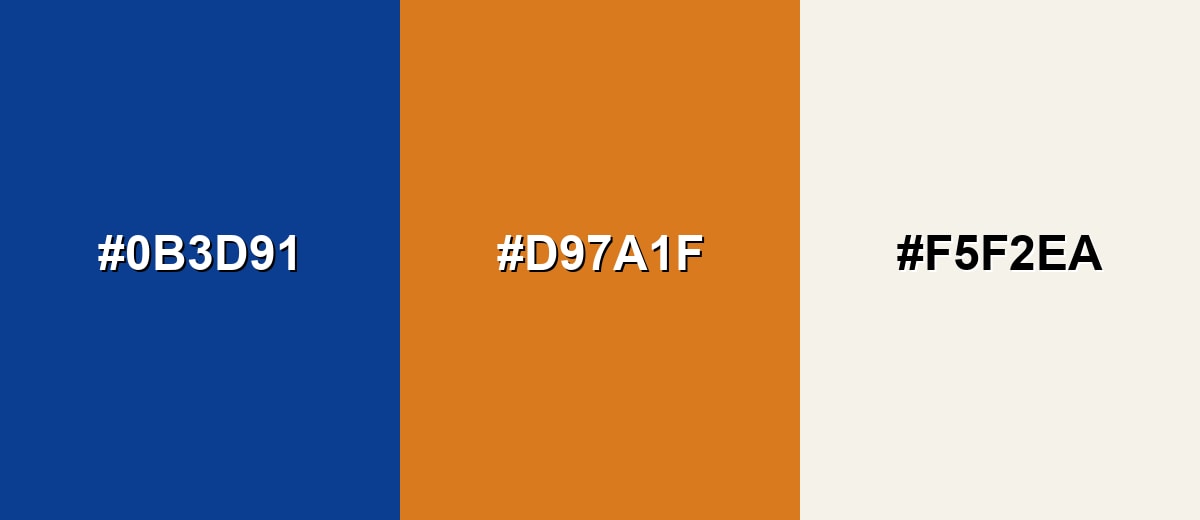
A warm orange complement makes phthalo blue feel energetic and balanced. This pairing is great when you need a reliable base plus a standout accent for buttons, highlights, or key messages.
Complementary Palette Example: Try phthalo blue with a burnt orange accent and a soft off-white to keep the contrast clean and modern.
Analogous Color Schemes
Analogous colors sit adjacent to each other on the color wheel, creating harmonious, cohesive palettes with subtle variation.
For a smooth, ocean-like feel, blend phthalo blue with teal and indigo.
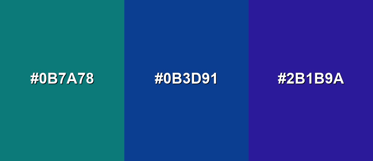
- Deep Teal: #0B7A78
- Phthalo Blue: #0B3D91
- Indigo: #2B1B9A
For a cleaner digital palette, pair it with bright azure and deep violet.
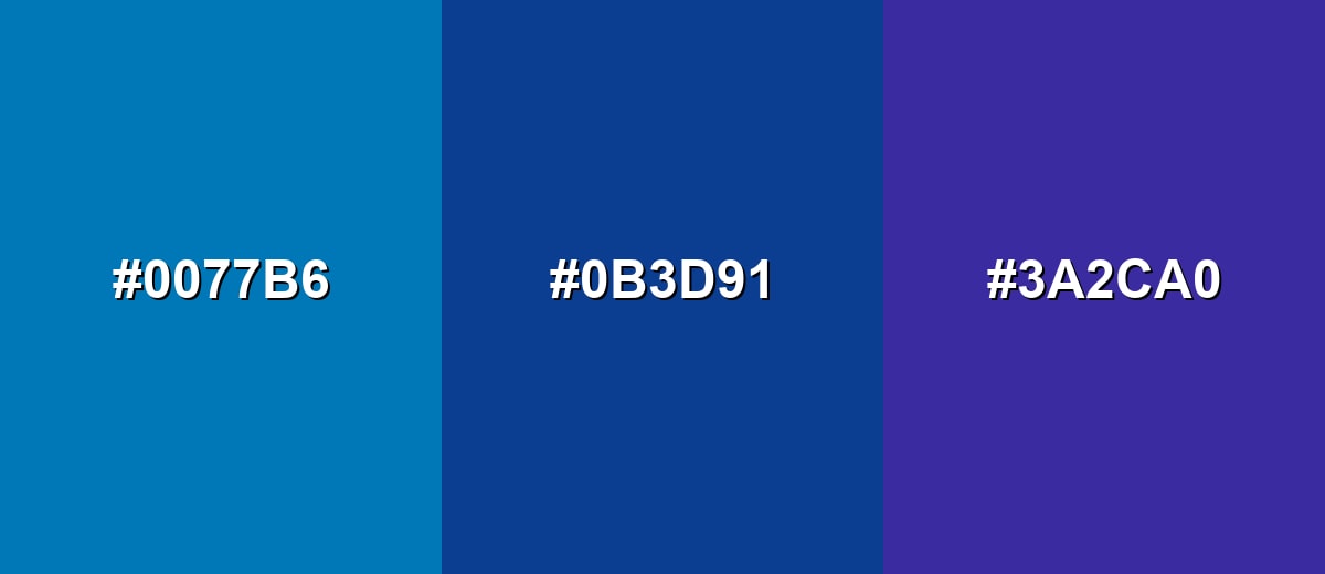
- Azure: #0077B6
- Phthalo Blue: #0B3D91
- Deep Violet: #3A2CA0
Triadic & Tetradic Combinations
A triadic scheme gives you contrast without the sharpness of a direct complement.
Use phthalo blue with a leafy green and a rich magenta for bold, balanced variety.
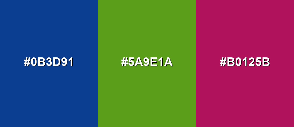
- Phthalo Blue: #0B3D91
- Leaf Green: #5A9E1A
- Raspberry Magenta: #B0125B
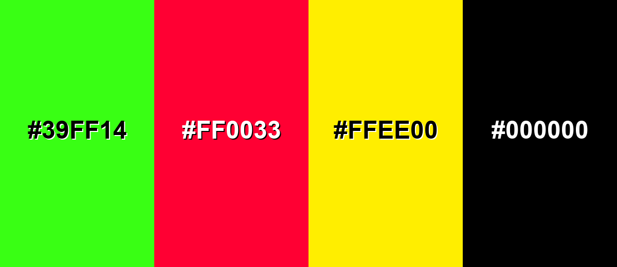
Colors to Avoid
While phthalo blue is remarkably versatile, certain combinations can create problematic visual effects:
- Neon Green (#39FF14) - Extremely high saturation next to phthalo blue can create harsh vibration and distract from content, especially in UI.
- Electric Red (#FF0033) - A high-energy red can overpower the blue and make layouts feel tense or overly urgent.
- Pure Yellow (#FFEE00) - Bright yellow can feel glaring against a deep blue base and may reduce perceived readability in large blocks.
- True Black (#000000) - Using black next to phthalo blue often collapses detail and makes the blue look flatter; a softened charcoal is usually easier to balance.
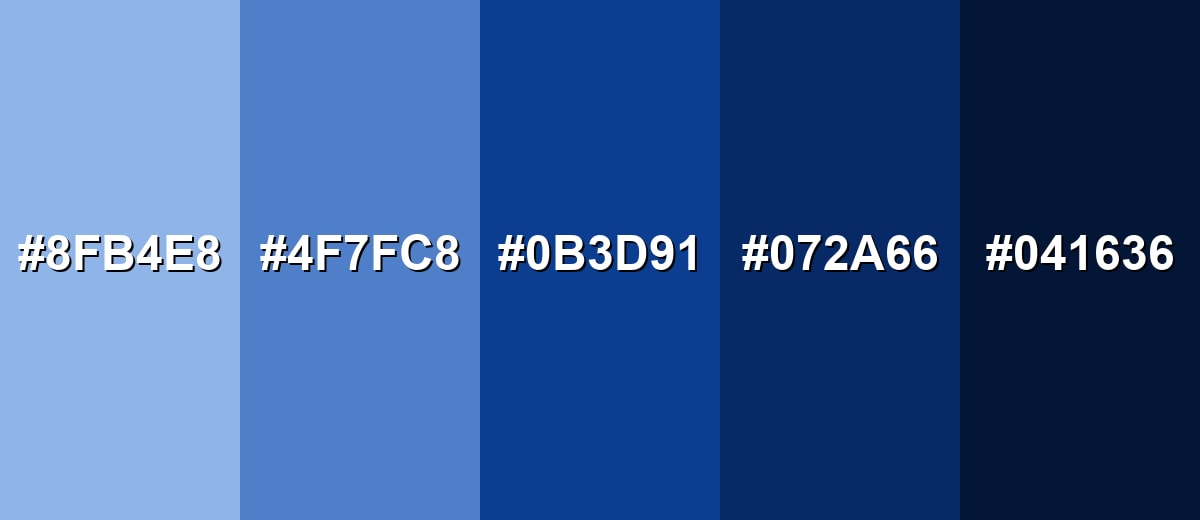
Shades, Tints & Variations of Phthalo Blue
The beauty of phthalo blue is how well it scales from airy tints to near-black navies. Building a small range helps you keep contrast consistent across buttons, backgrounds, charts, and dark-mode layouts.
- Mist Blue (#8FB4E8) - A light, airy tint that keeps the cool character while feeling softer and more approachable. It's best used for Backgrounds, empty states, subtle cards, and gentle gradients.
- Sky Denim (#4F7FC8) - A mid-tone that reads friendly and modern, with less intensity than the fully saturated base. It's best used for Secondary buttons, links, charts, and supporting brand accents.
- Phthalo Blue (#0B3D91) - The core deep tone with strong saturation and a cool, slightly green-leaning presence. It's best used for Brand anchors, headers, navigation, and high-contrast UI surfaces.
- Deep Ocean Blue (#072A66) - A darker shade that feels more serious and weighted while staying distinctly blue. It's best used for Footers, sidebars, dark-mode panels, and premium packaging details.
- Midnight Navy (#041636) - An almost-black navy that preserves blue identity while maximizing depth. It's best used for Dark themes, typography on light tints, and cinematic backdrops.
Industry Applications
Because phthalo blue is bold yet controlled, it shows up in many practical design contexts. It supports clear hierarchy, strong contrast, and a polished, dependable tone.
Fashion & Beauty
- Use it for premium, cool-toned packaging that feels modern and confident.
- In lookbooks and campaigns, it works well as a deep backdrop for high-contrast typography.
- For beauty visuals, it can add a clean, editorial feel when balanced with bright highlights.
- As an accent in patterns or accessories, it reads bold without becoming loud.
Interior Design & Decor
- Works as a statement wall color when you want depth and a calm, focused atmosphere.
- Pairs nicely with warm textures (wood, woven fabrics) to keep the room from feeling too cold.
- Great for home offices and libraries where a grounded, organized mood helps.
- Use lighter tints on trim or decor pieces to keep the palette cohesive.
Branding & Marketing
- Strong choice for brand systems that need trust, competence, and modern depth.
- Supports clean hierarchy in campaigns, especially when you lean on whitespace.
- Useful for dashboards, reports, and B2B assets where readability and authority matter.
- Works best when a warmer accent handles primary CTAs, keeping the blue as the stable base.
Conclusion
Phthalo blue stands out for its saturated depth and crisp, modern feel—right between classic navy and a more vibrant ocean blue. As a design color, it's a dependable anchor because it holds contrast well, supports clear hierarchy, and looks confident without shouting. Start with HEX #0B3D91 for digital projects, then build a small set of tints and deeper shades to cover UI states, charts, and backgrounds. Pair it with warm accents and softer neutrals to keep the overall look balanced, readable, and inviting.
Design Smarter with AI: Media.io is an online AI studio that empowers creators with advanced image generation and enhancement tools. From text-to-image and image-to-image creation to AI upscaling and color optimization, it enables fast, creative, and professional results—all in your browser.

Frequently Asked Questions About Phthalo Blue Color
It is a deep, saturated blue with a cool feel that can lean slightly toward green. It often resembles the look of deep ocean water or a vivid midnight blue rather than a soft sky tone.
A common web-friendly reference used for phthalo blue is #0b3d91. Depending on the brand palette or pigment source, you may see slightly different interpretations.
Phthalo blue is generally considered cool. Its undertone can lean greenish compared to ultramarine, which tends to lean more violet.
Warm oranges and sandy neutrals create a clean complement, while teal and indigo form smooth analogous palettes. For bolder variety, try pairing it with leaf green and a rich magenta in a triadic scheme.
Yes, it works well as a dark base because it can provide strong contrast with white text and light UI elements. Use lighter tints for secondary surfaces and keep a warm accent for primary calls to action.
Screens mix light using RGB, while print relies on inks and paper using CMYK, so saturation and darkness can shift. Device calibration, paper type, and press profiles can all change how the tone appears.


