

 TL;DR:
Brass (#B5A642) is a warm, metallic yellow-brown positioned between gold and bronze, best applied as a minimal accent to convey craftsmanship and understated luxury.
● Use RGB (181, 166, 66) for screen rendering and CMYK (0%, 8%, 64%, 29%) for print, while utilizing HSL (52°, 47%, 48%) to fine-tune the tone for specific lighting or material textures.
● Pair this color with deep blues, teals, and soft ivories to balance its warmth, but strictly avoid pure yellow, hot orange, bright fuchsia, and neon lime (#B5FF00) which will clash with or flatten the muted metallic character.
● Restrict brass to small, intentional UI touches like premium badges, icons, or borders on darker backgrounds, as large full-field applications risk looking flat and dated in low-contrast layouts.
Ask AI for a summary
 ChatGPT
 Perplexity
 Gemini
 Claude
 Grok
Grok
Brass color is a warm, metallic yellow-brown that recalls polished brass hardware with a soft golden glow. A common digital reference is #B5A642, which sits between gold and bronze with a slightly earthy undertone.
Because brass is inspired by a copper-and-zinc alloy, it shifts noticeably with lighting—reading more golden in highlights and more olive-brown in shadow. Below, you'll find brass color codes, conversions, pairings, shades, and practical ways to use it in design.
Brass Color: Codes & Values
If you want a dependable "classic brass" baseline for digital work, these values map the look of warm metallic yellow-brown in common color spaces.
| Parameters | VALUE |
| HEX Code | #B5A642 |
| RGB DECIMAL | 181, 166, 66 |
| RGB PERCENTAGE | 71%, 65%, 26% |
| CMYK | 0%,8%,64%,29% |
| HSL | 52°, 47%, 48% |
| HSV (HSB) | 52°, 64%, 71% |
| Web Safe | #CC9933 |
Key Color Space Explanations:
- HEX - HEX is the most common way to specify brass in web and UI design. Use #b5a642 to match this standard brass tone in digital projects.
- RGB - RGB defines the mix of red, green, and blue light on screens. Brass is made with strong red and green plus a smaller amount of blue, which creates its warm yellow-brown look.
- CMYK - CMYK is used for printing with cyan, magenta, yellow, and black ink. The CMYK values help you reproduce brass in print while accounting for paper and ink limits.
- HSL - HSL describes brass by hue, saturation, and lightness, which can feel more intuitive for adjusting tone. It's useful when you want a lighter, darker, or slightly more muted brass variation.
- Web Safe - Web safe is the closest hex that maps to the older 216-color browser palette. It's helpful for legacy constraints and quick approximations when exact rendering is less critical.
Use HEX/RGB for screens, CMYK for print, and HSL/HSV when you need to fine-tune brass to match lighting, material texture, or a specific brand mood.
Brass Color Conversions
Need brass color in another format? Use this conversion table to move between web, print, and more technical color models.
| Parameters | VALUE | CSS |
| HEX | #b5a642 | #b5a642 |
| RGB DECIMAL | 181, 166, 66 | rgb(181,166,66) |
| RGB PERCENTAGE | 71%, 65%, 26% | rgb(71%,65%,26%) |
| CMYK | 0%,8%,64%,29% | cmyk(0%,8%,64%,29%) |
| HSL | 52°, 47%, 48% | hsl(52°,47%,48%) |
| HSV (or HSB) | 52°, 64%, 71% | -- |
| Web Safe | cc9933 | #cc9933 |
| CIE-LAB | 67.5, -5.5, 51.6 | -- |
| XYZ | 33.8, 37.6, 10.7 | -- |
| xyY | 0.412, 0.458, 37.6 | -- |
| CIE-LCH | 67.5, 51.9, 96.0° | -- |
| CIE-LUV | 67.5, 15.1, 60.2 | -- |
| Hunter-Lab | 61.3, -5.7, 31.7 | -- |
| Binary | 10110101 10100110 01000010 | -- |
Want to generate Brass Color photos or posters? Try Media.io's AI Image Generator now!
Brass Color Meaning & Symbolism
Brass is typically linked with craftsmanship, reliability, and a refined warmth that feels more grounded than bright gold. In everyday life it shows up in fixtures, instruments, and decorative details, so it often signals quality and tradition without feeling fragile.
Psychological Effects
In design, brass can shape how "premium" and established a layout feels.
- Confidence - Brass can make a layout feel established and self-assured without the flashiness of brighter metallics.
- Warmth - It adds a golden warmth that makes interfaces and visuals feel more inviting next to clean neutrals.
- Visual Weight - Brass introduces a grounded heaviness that helps anchor dividers, icons, and key UI details.
- Attention Direction - It naturally draws the eye, which makes it useful for badges, premium markers, and feature highlights.
- Balance Sensitivity - Overused or too bright, brass may look dated or dull in low-contrast UI, so it works best as an accent.
Positive Associations
These associations are why brass is a go-to for heritage and quietly luxe aesthetics.
- Craftsmanship - Brass is often linked with careful making and detail-oriented finishing.
- Reliability - Its history in tools and fittings supports a "durable and dependable" impression.
- Tradition - Brass fixtures and decor cues can make a brand feel classic and time-tested.
- Refined Warmth - Compared with bright gold, brass feels sophisticated, warm, and more grounded.
- Subtle Luxury - It suggests premium quality in a confident, understated way.
Cultural Significance Across the World
Brass symbolism often comes from the objects and settings people commonly associate with the material.
- Utility & Function - Historically used for tools and fittings, reinforcing practicality and use-value.
- Artistry - Brass musical instruments connect the color to performance, culture, and craftsmanship.
- Quality Materials - Decorative brass details often signal well-made, considered design choices.
- Achievement & Prestige - When polished to a metal-like finish, brass can lean toward recognition and status.
Design Applications
Brass is easiest to use when you treat it like a metal accent: small, intentional touches that add warmth and a sense of craft.
Graphic Design Tips
- Use brass for premium labels, award markers, and feature callouts to create confident emphasis.
- Pair brass accents with understated typography and matte backgrounds for a modern, high-quality feel.
- Keep large brass areas slightly muted in print so the result doesn't look flat.
- Consider spot treatments, foils, or textured stocks on packaging to mimic real metal depth.
- Check contrast for small text and thin lines—brass often reads better as an accent on darker backgrounds.
Pro tip: If brass is the highlight, let neutrals and deep, muted tones do the heavy lifting—brass works best when it elevates the layout instead of filling it.
Brass Color in Photography & Video
- Lean into brass's natural "highlight vs. shadow" shift by shaping light to bring out a soft golden glow.
- Balance brass against clean neutrals or deep, muted tones to keep the frame from feeling heavy.
- When brass details are important (handles, instruments, fixtures), protect highlights so the metallic look stays refined.
- Use brass sparingly as a focal detail (badges, props, trims) instead of a full-field background color.
- For a more vintage read, push brass slightly muted rather than overly bright.
Recommended Tool for Image Enhancement: When incorporating brass color into your photography projects, Media.io's AI Image tools can help you achieve more refined results. With AI-powered color enhancement, photo colorization, image upscaling, and old photo restoration, you can easily enrich brass color tones, improve overall image quality, and highlight the color's elegant and sophisticated aesthetic.
Color Combinations
Brass works best with palettes that either cool it down (blues and teals) or reinforce its warmth (earth tones and soft neutrals). The combinations below give you practical starting points for branding, UI accents, and interior-inspired schemes.
Complementary Colors
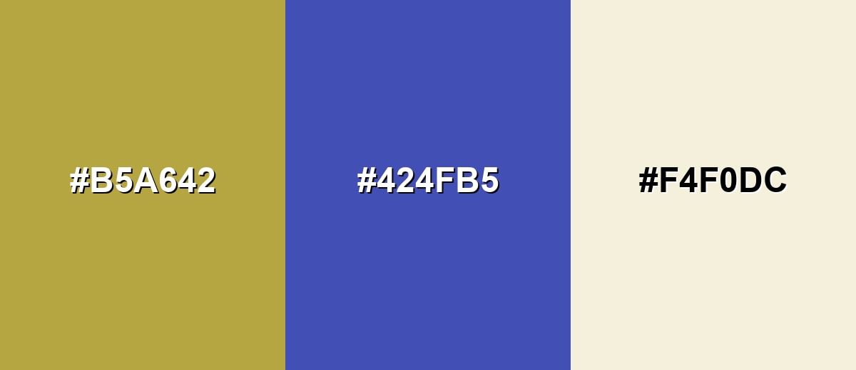
A complementary palette pairs brass with a blue-leaning opposite for crisp contrast. This is a reliable option when you want brass details to pop without feeling overly bright.
Complementary Palette Example: Try brass as the hero accent, indigo as the anchor, and ivory for breathing room.
Analogous Color Schemes
Analogous colors sit adjacent to each other on the color wheel, creating harmonious, cohesive palettes with subtle variation.
This analogous set moves from yellow-green through brass into warm golden brown for a cohesive, earthy feel.
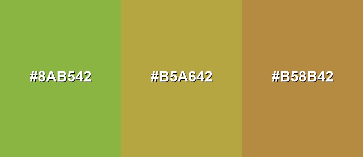
- Leafy Chartreuse: #8AB542
- Brass: #B5A642
- Saffron Bronze: #B58B42
A softer analogous option that blends pale brass highlights with deeper antique undertones for a vintage look.
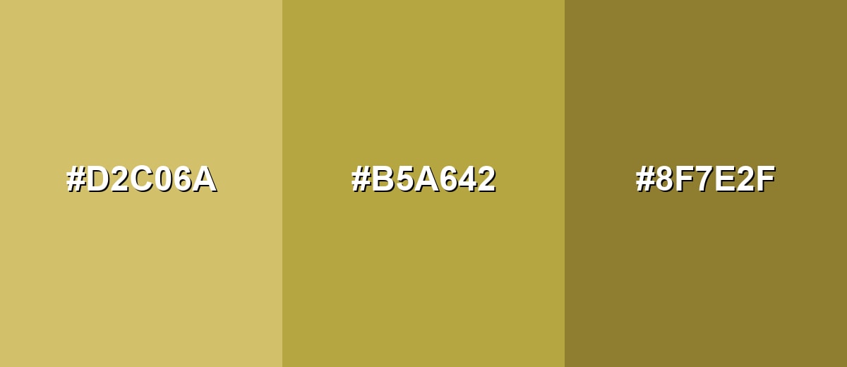
- Pale Brass: #D2C06A
- Brass: #B5A642
- Deep Antique Brass: #8F7E2F
Triadic & Tetradic Combinations
A triadic palette adds energy while staying balanced, which is useful for dashboards, illustrations, and bold brand systems.
Combine brass with teal and purple accents to create a lively but controlled contrast.
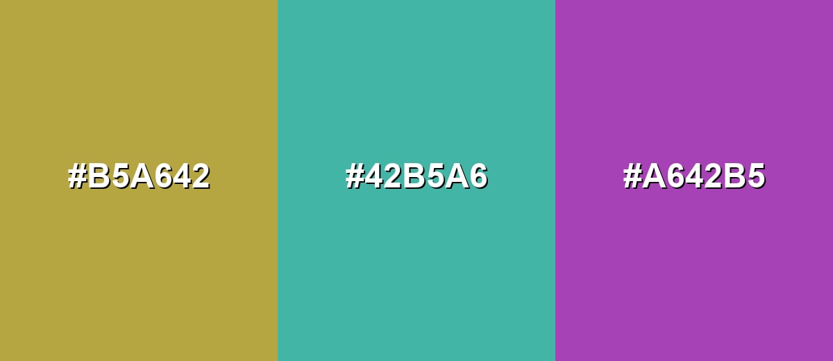
- Brass: #B5A642
- Seafoam Teal: #42B5A6
- Orchid Purple: #A642B5
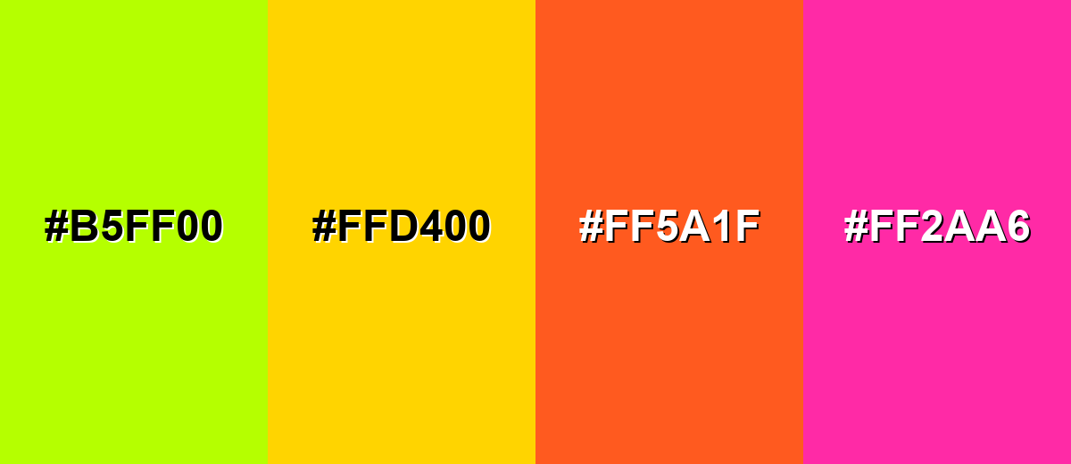
Colors to Avoid
While brass color is remarkably versatile, certain combinations can create problematic visual effects:
- Neon Lime (#B5FF00) - The brightness overwhelms brass and can create a harsh, highlighter-like look that feels unstable in UI and print.
- Pure Yellow (#FFD400) - It competes with brass's warm base and can make the overall palette feel flat and overly saturated.
- Hot Orange (#FF5A1F) - This combination can skew loud and busy, reducing the refined, crafted impression brass usually provides.
- Bright Fuchsia (#FF2AA6) - The intensity clashes with brass's muted metallic character, often making accents look mismatched rather than intentional.
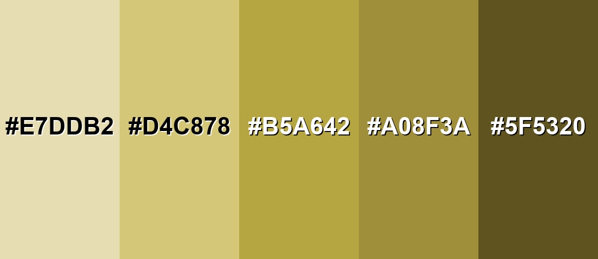
Shades, Tints & Variations of Brass Color
Brass isn't a single flat tone—its range runs from pale, vintage highlights to deep olive-brown shadows. Exploring these variations helps you keep the "metal" feel while adjusting contrast, mood, and readability across UI, print, and interiors.
- Pale Brass (#E7DDB2) - A light, softened brass tone that feels airy and slightly vintage, like aged metal in bright light. It's best used for Background panels, spacious layouts, and subtle product packaging..
- Soft Brass (#D4C878) - A warmer, lighter option that keeps the brass character while reading more approachable and less heavy. It's best used for UI highlights, dividers, and gentle decorative accents..
- Classic Brass (#B5A642) - The standard brass reference: warm yellow-brown with a muted metallic feel. It's best used for Primary accent, premium markers, and brand details..
- Antique Brass (#A08F3A) - A slightly darker, more aged brass look that leans traditional and crafted. It's best used for Heritage branding, editorial elements, and rustic interiors..
- Deep Brass (#5F5320) - A dark, olive-brown brass shade that feels grounded and dramatic. It's best used for Headings, borders, and contrast-rich accents on lighter surfaces..
Industry Applications
Brass is widely used as an accent tone when a project needs warmth, durability, or a classic premium cue without the flash of bright gold.
Fashion & Beauty
- Use brass-toned accents to give accessory and jewelry presentation a quietly luxe finish.
- Pair brass with soft ivories or deep tones for an elevated, editorial product feel.
- Lean on brass details for "premium tier" styling without relying on high-gloss gold.
- Apply brass sparingly as trims, icons, or highlights so it reads intentional and refined.
Interior Design & Decor
- Bring brass-like warmth into trims, handles, lamps, and frames to soften modern minimal rooms.
- Balance brass accents with wood, stone, or textured fabrics for a crafted, grounded palette.
- Use brass details to enrich classic styles while keeping the overall room from feeling overly formal.
- Keep brass as an accent rather than a full-field color to avoid a busy look.
Branding & Marketing
- Choose brass for heritage branding where tradition, quality, and reliability are key cues.
- Use it in UI themes for premium tiers, badges, and achievement systems to draw attention to key states.
- Apply brass to artisanal and heritage packaging for a vintage, upscale impression.
- Support brass with clean neutrals or deep muted tones so it stays readable and intentional.
Conclusion
Brass color is a warm metallic yellow-brown that feels crafted, confident, and quietly luxurious—especially when you use it like a finish rather than a flat fill. With #B5A642 as a reliable reference, you can build consistent palettes for UI, branding, packaging, and interiors by anchoring brass with supportive neutrals or cooler counterparts for contrast. Keep it accent-led, watch contrast for small details, and explore lighter and darker brass shades to match the mood you want—classic, heritage, or modern-premium.
Design Smarter with AI: Media.io is an online AI studio that empowers creators with advanced image generation and enhancement tools. From text-to-image and image-to-image creation to AI upscaling and color optimization, it enables fast, creative, and professional results—all in your browser.

Frequently Asked Questions About Brass Color
Brass is a warm metallic yellow-brown inspired by polished brass metal. It often looks like a muted gold with a slightly earthy, olive undertone.
A widely used hex code for brass is #b5a642. This value is a practical reference for web, UI, and digital design when you want a classic brass look.
Brass usually sits between gold and bronze. It tends to be less bright than gold and less reddish-brown than bronze, which makes it feel warm but more grounded.
For #b5a642, the RGB decimal values are 181, 166, 66. A common print conversion is CMYK 0%, 8%, 64%, 29%, though results can vary by paper and ink.
Brass pairs well with deep blues, teals, soft ivories, and earthy greens because they balance its warmth and help it read like a refined accent. It also looks good with muted browns and warm neutrals for a cohesive, vintage-inspired palette.
Use brass sparingly for high-impact details like icons, borders, badges, or small decorative elements. Pair it with clean neutrals, simple typography, and plenty of negative space so the finish feels intentional and contemporary.


