

Ultramarine blue color is a deep, saturated blue with a subtle violet lean, similar to a vivid ink or a twilight sky. Its commonly used digital reference is #120A8F.
Often read as confident, thoughtful, and premium, ultramarine also carries a rich history as a prized lapis lazuli pigment. Below, you'll find its core codes, meaning, best pairings, shade ideas, and practical ways to use it in real designs.
Ultramarine Blue Color: Codes & Values
If you want ultramarine blue to stay consistent across UI, print, and brand assets, start by standardizing these core values.
| Parameters | VALUE |
| HEX Code | #120A8F |
| RGB DECIMAL | 18, 10, 143 |
| RGB PERCENTAGE | 7.1%, 3.9%, 56.1% |
| CMYK | 87%,93%,0%,44% |
| HSL | 244°, 87%, 30% |
| HSV (HSB) | 244°, 93%, 56% |
| Web Safe | #000099 |
Key Color Space Explanations:
- HEX - A HEX code is the most common way to specify a digital shade for web and UI. Use it to keep ultramarine blue consistent across pages and components.
- RGB - RGB defines the mix of red, green, and blue light on screens. It is helpful for animations, overlays, and any work that involves on-screen rendering.
- CMYK - CMYK is used for ink-based printing and packaging. It helps you estimate how ultramarine blue may shift when translated from screen to paper.
- HSL - HSL expresses hue, saturation, and lightness, which is handy when building tints and shades. Designers often use it to tune contrast and create consistent UI states.
- Web Safe - Web safe refers to the closest legacy-safe approximation used on older displays. It is mainly a compatibility reference rather than a modern requirement.
For most projects, lock in #120A8F as your single source of truth, then build tints/shades from HSL to keep states, backgrounds, and accents visually related.
Ultramarine Blue Color Conversions
These conversions help you carry ultramarine blue between design tools, CSS, printing workflows, and color-managed environments.
| Parameters | VALUE | CSS |
| HEX | #120a8f | #120a8f |
| RGB DECIMAL | 18, 10, 143 | rgb(18,10,143) |
| RGB PERCENTAGE | 7.1%, 3.9%, 56.1% | rgb(7.1%,3.9%,56.1%) |
| CMYK | 87%,93%,0%,44% | cmyk(87%,93%,0%,44%) |
| HSL | 244°, 87%, 30% | hsl(244°, 87%, 30%) |
| HSV (or HSB) | 244°, 93%, 56% | -- |
| Web Safe | 000099 | #000099 |
| CIE-LAB | 16.9, 48.5, -67.2 | -- |
| XYZ | 5.30, 2.33, 26.05 | -- |
| xyY | 0.157, 0.069, 2.33 | -- |
| CIE-LCH | 16.9, 82.9, 305.7 | -- |
| CIE-LUV | 16.9, -4.1, -64.1 | -- |
| Hunter-Lab | 15.3, 3.5, -9.1 | -- |
| Binary | 00010010 00001010 10001111 | -- |
Want to generate ultramarine blue color photos or posters? Try Media.io's AI Image Generator now!
Ultramarine Blue Meaning & Symbolism
Ultramarine blue is widely linked with depth, integrity, and a sense of steady focus. Because it sits on the darker, more saturated side of blue, it often reads as premium and intentional in everyday visuals. In practical terms, ultramarine blue color meaning tends to lean toward confidence and clarity rather than playfulness.
Psychological Effects
How a shade feels depends on where and how you use it, but ultramarine has some reliable patterns in visual communication.
- Trust And Structure - In interfaces and branding, ultramarine can make information feel more trustworthy and well-structured.
- Focus Support - It supports concentration, which is why it works well for navigation, headings, and stable UI elements.
- Serious Tone - Because it is dark and saturated, it can feel serious when used as the dominant color across a layout.
- Visual Weight - Large blocks may read as heavy, especially in low-light environments or on small screens.
- Attention Guidance - Used thoughtfully, it guides attention well when paired with lighter neutrals and reserved for emphasis.
Positive Associations
In day-to-day design work, ultramarine is often chosen for the "quietly confident" messages it carries.
- Integrity - It's commonly associated with honesty, reliability, and a sense of doing things the right way.
- Clarity - Ultramarine helps content feel organized, making hierarchy and key information easier to spot.
- Premium Craft - Its rich saturation can signal refinement and care, especially when paired with warm neutrals.
- Calm Authority - It feels steady and decisive without the aggressive edge of brighter, louder colors.
- Depth - The slight violet lean adds dimension, giving simple layouts a more layered, high-end feel.
Cultural Significance Across the World
Ultramarine has a distinctive history that influences how it is perceived today.
- Prestige From Rarity - Historically, the pigment was made from lapis lazuli and valued for its rarity, linking it with prestige.
- Craftsmanship - Its origin story often implies skilled making and materials chosen with intention.
- Dignity - In many visual traditions, deep blues are connected with dignity and formality.
- Devotion - Deep blue can also suggest devotion, though meanings can vary by context and application.
Design Applications
Ultramarine blue is most effective when you treat it as a strong anchor: it defines hierarchy, frames content, and adds authority without needing extra effects.
Graphic Design Tips
- Primary Anchor - Use it for primary actions, key navigation, or brand marks when you want a confident, dependable tone.
- Balance With Neutrals - Pair it with warm whites, light grays, or soft off-whites so the layout doesn't feel heavy.
- Keep Gradients Subtle - If you use gradients, keep them refined so ultramarine stays premium rather than electric.
- Print Proofing - In print, it can darken depending on paper and coverage, so check proofs when possible (especially on uncoated stock).
- Contrast First - Use light text on ultramarine backgrounds, avoid mid-grays that wash out, and test hover/focus/disabled states.
Pro tip: If your layout starts feeling "too dark," keep ultramarine for headers and CTAs, then switch large backgrounds to a pale tint or an off-white—your content will breathe, and the blue will look even richer.
Ultramarine Blue in Photography & Video
- Moody Color Grading - Ultramarine works beautifully in low-key scenes, adding depth without turning everything into navy.
- Wardrobe And Props - A single ultramarine accent (jacket, product box, backdrop) can look premium and intentional on camera.
- Skin Tone Balance - Keep an eye on overall temperature—pair ultramarine-heavy grades with warm highlights to avoid a cold cast.
- Clean Titles And Lower Thirds - Use ultramarine for text bars or graphic frames, then set type in near-white for crisp legibility.
- Controlled Saturation - Deep blues can clip or band after compression, so slightly reduce saturation before export when needed.
Recommended Tool for Image Enhancement: When incorporating ultramarine blue into your photography projects, Media.io's AI Image tools can help you achieve more refined results. With AI-powered color enhancement, photo colorization, image upscaling, and old photo restoration, you can easily enrich ultramarine blue tones, improve overall image quality, and highlight the color's elegant and sophisticated aesthetic.
Color Combinations
Ultramarine blue pairs best with warm yellows, clean neutrals, and select high-chroma accents. The palettes below cover classic harmony sets plus a few combinations that can cause visual strain.
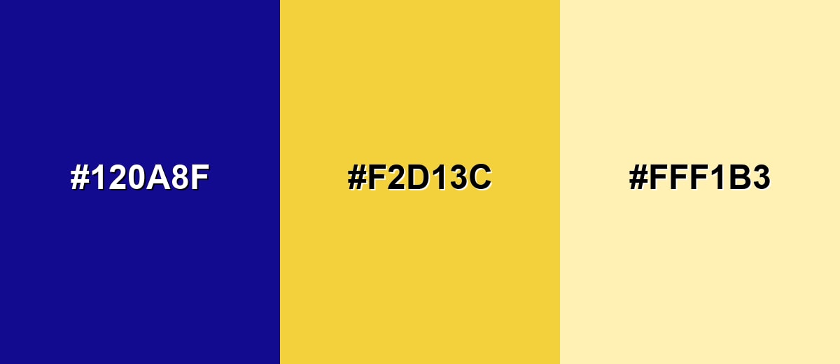
Complementary Colors
A complementary pairing places ultramarine opposite a warm yellow tone, creating crisp energy and instant contrast. This is a strong choice for calls to action, highlights, and editorial layouts.
Complementary Palette Example: Pair Ultramarine Blue with Saffron Gold, then soften the look with Cream for breathable contrast.
Analogous Color Schemes
Analogous colors sit adjacent to each other on the color wheel, creating harmonious, cohesive palettes with subtle variation.
Indigo-leaning analogous tones for a cohesive, elegant gradient feel.
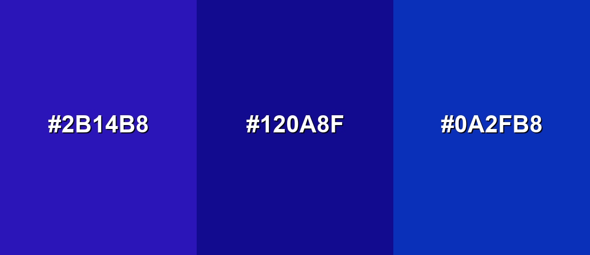
- Deep Indigo: #2B14B8
- Ultramarine Blue: #120A8F
- Cobalt Blue: #0A2FB8
Violet-to-azure analogous tones for creative work that still feels structured.
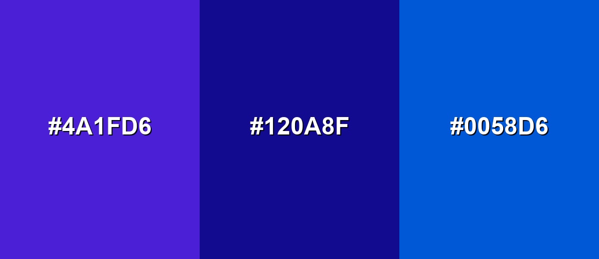
- Blue Violet: #4A1FD6
- Ultramarine Blue: #120A8F
- Azure Blue: #0058D6
Triadic & Tetradic Combinations
A triadic scheme adds two accents spaced evenly around the wheel, giving you variety without losing balance.
Use Ultramarine Blue with Warm Red and Fresh Green for bold, modern contrast in graphics and campaigns.
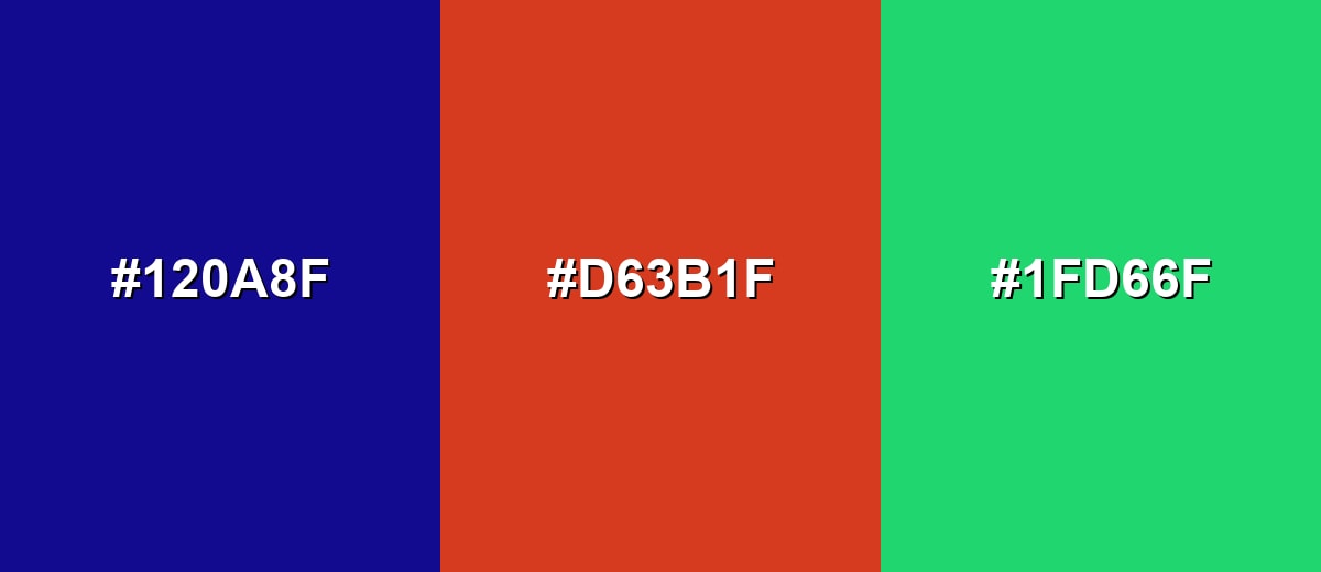
- Ultramarine Blue: #120A8F
- Warm Red: #D63B1F
- Fresh Green: #1FD66F
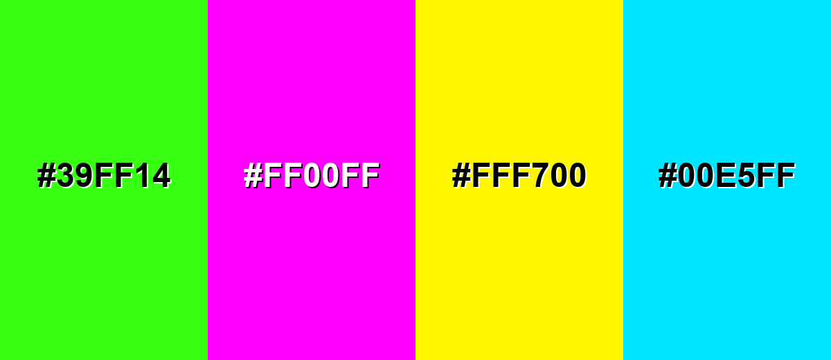
Colors to Avoid
While ultramarine blue is remarkably versatile, certain combinations can create problematic visual effects:
- Neon Green (#39FF14) - Very high saturation against ultramarine can create a vibrating edge that feels harsh and quickly tires the eyes.
- Pure Magenta (#FF00FF) - This pairing is extremely intense and can look noisy in UI, especially for text, icons, or thin lines.
- Highlighter Yellow (#FFF700) - The brightness jump can overpower the layout, pulling attention away from content and reducing perceived polish.
- Electric Cyan (#00E5FF) - Both hues compete in the cool range, which can reduce hierarchy and make interactive states harder to read at a glance.
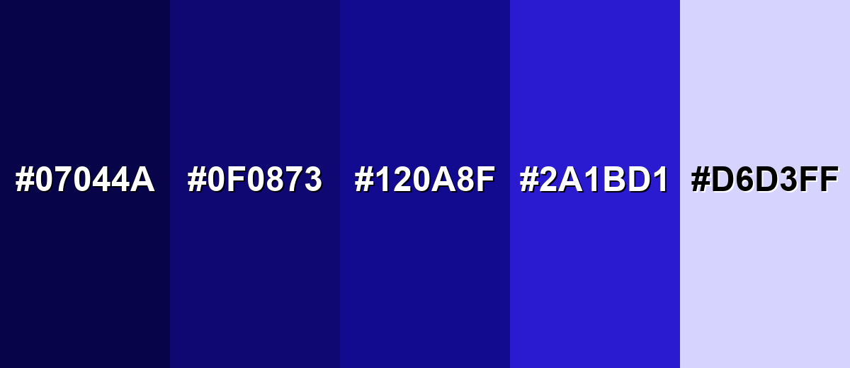
Shades, Tints & Variations of Ultramarine Blue
Ultramarine blue isn't just one "perfect" swatch—its darker shades add drama, while lighter tints make layouts feel open and modern. Having a small, consistent range helps you design clearer hierarchy (backgrounds, surfaces, text, and accents) without drifting off-brand.
- Midnight Ultramarine (#07044A) - An almost-black ultramarine that keeps the blue identity while adding a dramatic, grounded feel. It's best used for Backgrounds, hero headers, and high-contrast UI frames..
- Deep Ultramarine (#0F0873) - A darker, slightly softer take that feels refined and less intense than the core shade. It's best used for Navigation bars, charts, and subdued brand accents..
- Ultramarine Blue (#120A8F) - The classic reference point: saturated, confident, and distinctly blue with a violet edge. It's best used for Primary brand color, CTAs, headings, and key highlights..
- Vivid Ultramarine (#2A1BD1) - A brighter, more energetic ultramarine that feels modern and digital-first. It's best used for Buttons, links, badges, and attention-grabbing accents..
- Pale Ultramarine (#D6D3FF) - A light tint with a gentle lavender cast that keeps layouts airy while echoing the base tone. It's best used for Section backgrounds, subtle UI fills, and soft gradients..
Industry Applications
Because ultramarine blue reads as both premium and dependable, it shows up in many industries where clarity and trust matter. The key is choosing the right proportion: dominant for bold identity, or accent-only for a clean, modern system.
Fashion & Beauty
- Statement Pieces - Use ultramarine as a hero color in lookbooks to signal confidence and polish.
- Premium Packaging - Deep blues can feel high-end on boxes, labels, and gift sets when paired with clean neutrals.
- Editorial Contrast - Ultramarine backgrounds with near-white typography help product shots and messaging pop.
- Seasonless Appeal - It works across seasons, reading crisp and modern rather than trendy or overly playful.
Interior Design & Decor
- Accent Walls - Ultramarine can anchor a room when used on one wall with lighter surrounding surfaces.
- Material Pairings - It looks especially refined alongside warm neutrals and subtle metallic finishes.
- Finish Matters - Matte reads calm and velvety; glossy can feel more dramatic and formal under lighting.
- Textiles And Details - Try it in cabinetry, rugs, or cushions for depth without making the space feel smaller.
Branding & Marketing
- Trust-Forward Identity - Ultramarine helps brands look dependable and intentional, especially in digital-first spaces.
- Clear Hierarchy - Use it for headings, navigation, and key CTAs to guide attention without extra effects.
- Campaign Graphics - It holds up well as a bold base for posters, banners, and launch assets when balanced with light space.
- Accessible UI - With near-white text and tested states, it supports strong contrast and readable interfaces.
Conclusion
Ultramarine blue (#120A8F) is a powerful anchor color: deep, saturated, and slightly violet, with a confident tone that works beautifully in UI, branding, and print. When you balance it with light neutrals, use warm accents for contrast, and build a small set of consistent shades for states and surfaces, ultramarine becomes both expressive and highly practical—helping you create layouts that feel premium, focused, and easy to navigate.
Design Smarter with AI: Media.io is an online AI studio that empowers creators with advanced image generation and enhancement tools. From text-to-image and image-to-image creation to AI upscaling and color optimization, it enables fast, creative, and professional results—all in your browser.

Frequently Asked Questions About Ultramarine Blue Color
Ultramarine blue is a rich, deep blue with a subtle violet undertone. It often resembles vivid ink, making it feel more intense than soft sky blues but not as dark as navy.
A common digital reference for ultramarine blue is #120a8f. Exact values can vary by palette and pigment, so it is smart to standardize on one code for your project.
Warm yellows and golds create strong contrast, while off-whites and light grays keep the look clean and modern. Teal and magenta accents can also work when you want a more energetic, creative palette.
Yes. It reads as confident and dependable, which helps with navigation, primary actions, and brand identity. Use it with plenty of light space so layouts do not feel heavy.
Light text is usually the safest choice on ultramarine backgrounds, especially for body copy. Test your specific font sizes and weights, and avoid mid-tone grays that can lose contrast.
They are related but not identical. Royal blue typically appears brighter and slightly less violet, while ultramarine blue tends to be deeper and more saturated with a faint purple lean.


