

Marsala color is a warm, muted red-brown that looks like aged wine with a soft, earthy undertone. Its classic reference point in digital design is hex #955251.
People often read it as grounded, refined, and quietly confident rather than loud or flashy. Named after Marsala wine, it behaves like a deep neutral in many palettes, shifting warmer in daylight and richer under indoor lighting.
Marsala Color: Codes & Values
If you want marsala to look consistent across web, print, and product mockups, start with these core color values.
| Parameters | VALUE |
| HEX Code | #955251 |
| RGB DECIMAL | 149, 82, 81 |
| RGB PERCENTAGE | 58.43%, 32.16%, 31.76% |
| CMYK | 0%,45%,46%,42% |
| HSL | 1°, 30%, 45% |
| HSV (HSB) | 1°, 46%, 58% |
| Web Safe | #996666 |
Key Color Space Explanations:
- HEX - HEX is the most common way to specify marsala on the web and in UI design. Use it for CSS, design tokens, and consistent theme colors across screens.
- RGB - RGB defines how much red, green, and blue light creates marsala on displays. It is the go-to format for digital visuals, video, and on-screen rendering.
- CMYK - CMYK is used for printing and describes ink percentages. Because marsala is deep and muted, test prints are helpful to avoid dull results on different papers.
- HSL - HSL describes hue, saturation, and lightness in a way many designers find intuitive. It is useful for generating lighter tints or darker shades while keeping the same overall character.
- Web Safe - Web safe is the closest legacy palette match for broad compatibility. Modern design usually uses the exact HEX value, but web-safe can help in constrained environments.
Use HEX for UI and branding files, RGB for screens and video work, and CMYK when you're sending anything to print.
Marsala Color Conversions
Need marsala in a specific format for CSS, printing, or color-managed workflows? Here are the most common conversions in one place.
| Parameters | VALUE | CSS |
| HEX | #955251 | #955251 |
| RGB DECIMAL | 149, 82, 81 | rgb(149,82,81) |
| RGB PERCENTAGE | 58.43%, 32.16%, 31.76% | rgb(58.43%,32.16%,31.76%) |
| CMYK | 0%,45%,46%,42% | cmyk(0%,45%,46%,42%) |
| HSL | 1°, 30%, 45% | hsl(1°,30%,45%) |
| HSV (or HSB) | 1°, 46%, 58% | -- |
| Web Safe | 996666 | #996666 |
| CIE-LAB | 42.8, 27.5, 13.0 | -- |
| XYZ | 16.94, 13.02, 9.38 | -- |
| xyY | 0.431, 0.331, 13.02 | -- |
| CIE-LCH | 42.8, 30.4, 25.3° | -- |
| CIE-LUV | 42.8, 46.7, 10.6 | -- |
| Hunter-Lab | 36.1, 20.8, 10.1 | -- |
| Binary | 10010101 01010010 01010001 | -- |
Want to generate Marsala Color photos or posters? Try Media.io's AI Image Generator now!
Marsala Color Meaning & Symbolism
Marsala is often associated with warmth, maturity, and a sense of well-made quality. Because it sits between red and brown, it can feel both expressive and stable, making it easy to use as a grounding accent in everyday visuals. In daily life, it often reads as cozy, tasteful, and a little nostalgic without feeling dated.
Psychological Effects
These are common "felt" impressions marsala creates in design and space.
- Inviting Warmth - Feels cozy and welcoming compared to brighter reds.
- Quiet Confidence - Communicates steady emphasis without shouting for attention.
- Premium Depth - Makes product visuals and materials appear richer and more refined.
- Craft & Tradition - Suggests heritage, handmade quality, and trustworthiness in brand systems.
- Visual Heaviness - Large solid fills can look serious or dense, especially on small screens or in low light.
Positive Associations
Use these themes when you want marsala to support your message.
- Comfort - Brings a homey, relaxed mood that still feels polished.
- Refinement - Reads tasteful and curated rather than trendy or flashy.
- Maturity - Signals experience, stability, and a "well-made" sensibility.
- Hospitality - Ties naturally to food, gatherings, and warm environments.
- Nostalgia - Adds a subtle vintage note without looking outdated when balanced with modern neutrals.
Cultural Significance Across the World
Meanings vary by context, so pair the color with the right typography, imagery, and materials.
- Wine Heritage - The Marsala wine connection reinforces richness, dining, and tradition.
- Seasonal Warmth - Often associated with autumnal tones, harvest palettes, and cozy interiors.
- Artisan Aesthetic - Works well in craft goods and handmade branding where texture matters.
- Modern Neutral Use - Frequently treated as a deep neutral in contemporary palettes, grounding brighter accents.
Design Applications
Marsala works like a deep neutral that still has personality. It is most effective when balanced with lighter backdrops, simple typography, and one or two supporting tones.
Graphic Design Tips
- Use marsala as an accent for headlines, badges, or key callouts to add warmth without over-saturating the page.
- Pair it with light, warm backgrounds to keep layouts airy and readable.
- Create a small tint-and-shade scale for consistent UI states (hover, active, disabled) and brand assets.
- Choose clean typography and give the layout plenty of spacing so marsala doesn't feel too heavy.
- In print, proof on the actual paper stock—deep muted reds can shift depending on coating and texture.
If you're using marsala for a CTA or label, keep the surrounding palette quiet (off-white, warm gray, soft neutrals) so the color reads as intentional—not muddy.
Marsala Color in Photography & Video
- Use warm key lighting to bring out marsala's wine-like richness; cool lighting can push it toward dull brown.
- In color grading, control saturation gently—marsala looks best slightly muted rather than overly vibrant.
- For product shots, pair marsala props or backdrops with natural textures (wood, leather, matte ceramics) for a premium feel.
- In portraits, keep skin tones natural by watching red channel clipping, especially under tungsten lighting.
- For video overlays and lower-thirds, use marsala on solid panels with high-contrast text for clarity.
Recommended Tool for Image Enhancement: When incorporating marsala color into your photography projects, Media.io's AI Image tools can help you achieve more refined results. With AI-powered color enhancement, photo colorization, image upscaling, and old photo restoration, you can easily enrich marsala color tones, improve overall image quality, and highlight the color's elegant and sophisticated aesthetic.
Color Combinations
Because marsala is muted and warm, it pairs best with softened companions rather than highly saturated brights. Use these palettes as starting points, then adjust lightness to fit your layout or material.
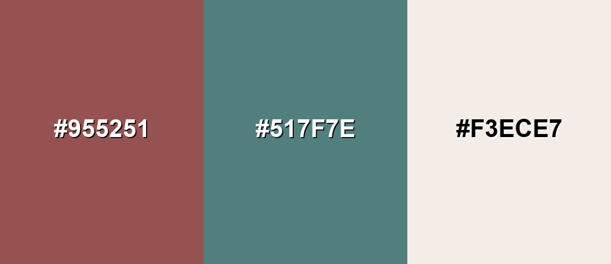
Complementary Colors
A complementary scheme balances marsala with a muted blue-green. This contrast feels sophisticated when both sides are slightly desaturated, helping each tone stand out without looking loud.
Complementary Palette Example: Pair marsala with dusty teal and a warm ivory to keep the look rich, calm, and easy to read.
Analogous Color Schemes
Analogous colors sit adjacent to each other on the color wheel, creating harmonious, cohesive palettes with subtle variation.
For a warm, tonal look, blend marsala with deeper brick and a soft dusty rose.
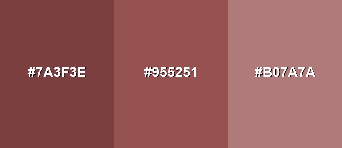
- Brick: #7A3F3E
- Marsala: #955251
- Dusty Rose: #B07A7A
For a richer gradient, combine marsala with plum and terracotta for a layered, autumnal feel.
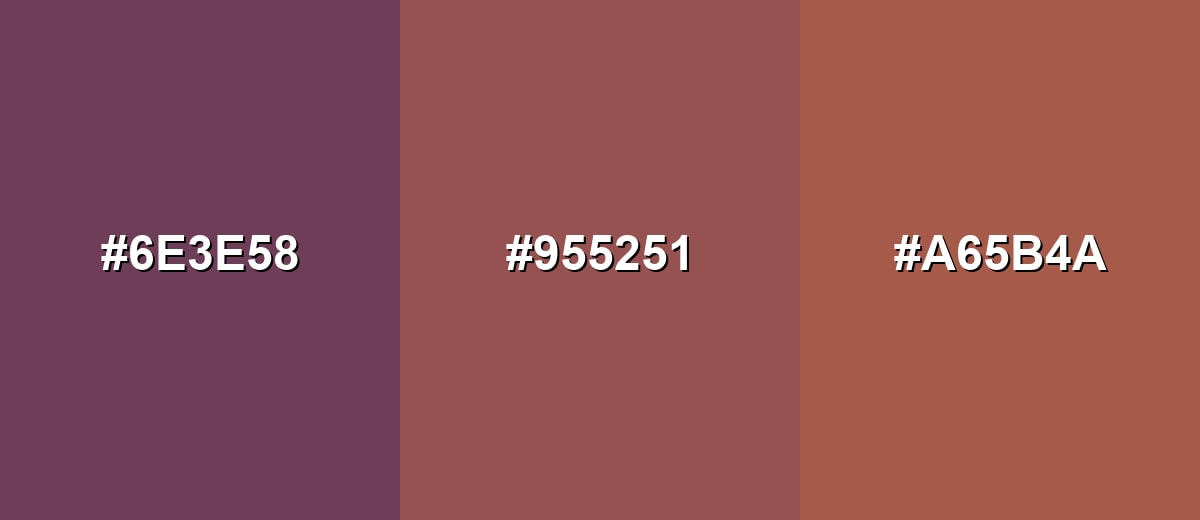
- Plum: #6E3E58
- Marsala: #955251
- Terracotta: #A65B4A
Triadic & Tetradic Combinations
A triadic palette adds variety while staying balanced across warm and cool notes.
Use marsala with muted sage and slate blue for a composed, modern contrast that still feels natural.
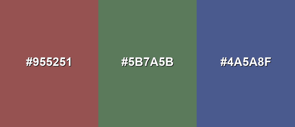
- Marsala: #955251
- Muted Sage: #5B7A5B
- Slate Blue: #4A5A8F
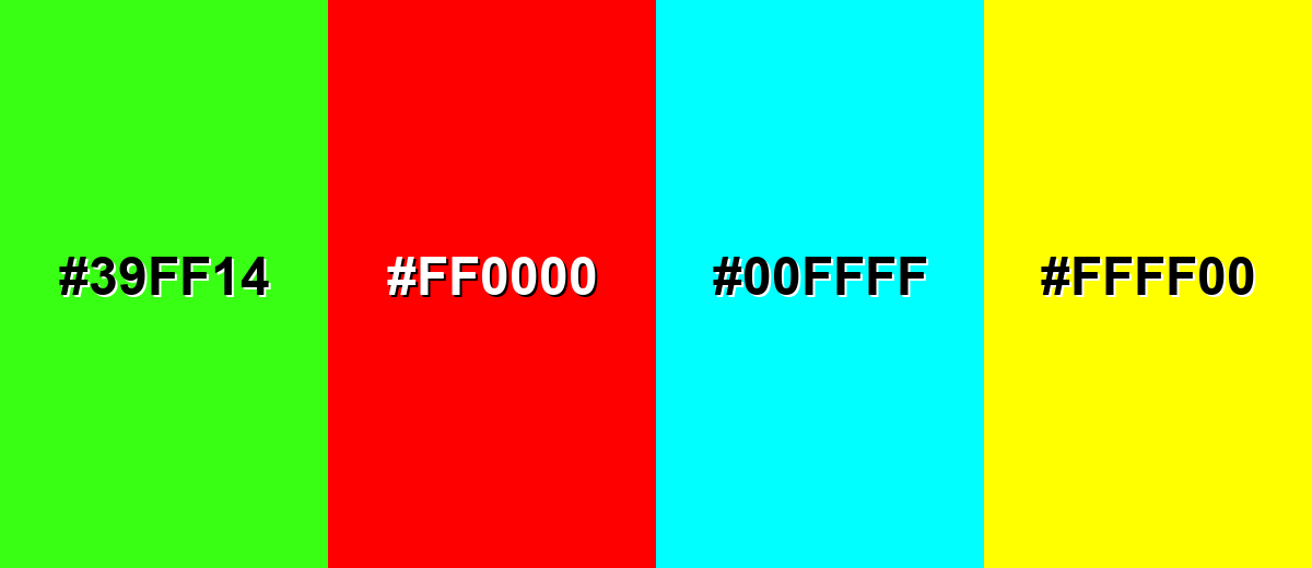
Colors to Avoid
While marsala color is remarkably versatile, certain combinations can create problematic visual effects:
- Neon Green (#39FF14) - The intensity clashes with marsala's muted character and can make designs feel unbalanced or harsh.
- Pure Red (#FF0000) - High-saturation red competes with marsala and can turn the palette into an overly aggressive red-on-red look.
- Cyan (#00FFFF) - Strong cyan creates a sharp, synthetic contrast that often overwhelms marsala's earthy tone.
- Bright Yellow (#FFFF00) - This high-energy yellow can look glaring next to marsala and may reduce legibility in UI accents.
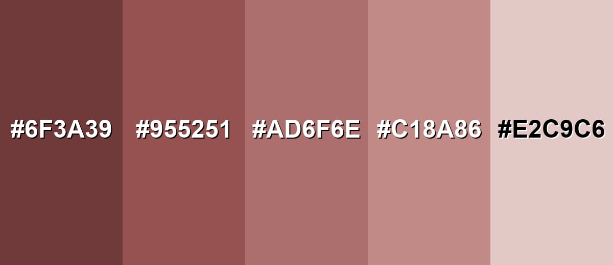
Shades, Tints & Variations of Marsala Color
Marsala isn't just one fixed swatch—it has a useful range from deeper, cocoa-leaning shades to soft blush tints. Having a few variations makes it easier to design consistent UI states, build gradients, and keep layouts feeling balanced.
- Deep Marsala (#6F3A39) - A darker, more shadowed take that leans toward cocoa and dried berry. It's best used for Headers, footers, premium packaging accents, and dark-mode sections..
- Classic Marsala (#955251) - The balanced, wine-inspired base tone with a muted red-brown body. It's best used for Brand accents, CTAs, editorial highlights, and feature areas..
- Dusty Marsala (#AD6F6E) - A softened version with more airiness, reducing the heavy feel. It's best used for Background panels, UI surfaces, and large blocks in editorial layouts..
- Rosy Marsala (#C18A86) - A warmer, rosier tint that reads friendlier and more approachable. It's best used for Lifestyle visuals, beauty branding, and supportive secondary accents..
- Pale Marsala (#E2C9C6) - A light tint with a gentle blush warmth and subtle depth. It's best used for Page backgrounds, cards, and soft gradients paired with darker text..
Industry Applications
Marsala shows up across industries because it feels timeless yet current. It can either act as a statement accent or as a warm anchor that makes other elements feel more intentional.
Fashion & Beauty
- Use marsala as a seasonless "hero shade" in apparel palettes for a refined, wearable look.
- In beauty campaigns, it works especially well for lip and nail visuals with warm, soft lighting.
- Pair it with muted neutrals in styling to keep the focus on texture (knit, leather, suede).
- For eCommerce images, marsala backdrops can make products feel richer without looking too bold.
Interior Design & Decor
- Try marsala on feature walls, upholstery, or cabinetry when you want warmth with depth.
- Combine it with cream or soft neutrals to avoid making the room feel heavy.
- Accents like walnut wood and leather reinforce marsala's earthy, premium undertone.
- Matte finishes tend to look more modern and "grounded" than high-gloss marsala surfaces.
Branding & Marketing
- Use marsala as a signature accent in logos, packaging, and brand patterns where craft and heritage matter.
- It pairs naturally with serif typography and minimalist layouts for a curated feel.
- For web and app design, it's strong for buttons and selected states when you want softer urgency than bright red.
- In print, review proofs—deep muted reds can shift with paper stock and coating.
Conclusion
Marsala stands out for its wine-like depth and earthy softness, giving it the rare ability to feel both expressive and grounded. It works well as a brand accent, a UI highlight, or a décor statement when you balance it with light neutrals and keep saturation under control. Its core digital reference, #955251, is a reliable starting point for building palettes and consistent design tokens. When you apply marsala thoughtfully, it can support a warm, refined message without looking loud or trendy—making it a smart, versatile choice for modern visual communication.
Design Smarter with AI: Media.io is an online AI studio that empowers creators with advanced image generation and enhancement tools. From text-to-image and image-to-image creation to AI upscaling and color optimization, it enables fast, creative, and professional results—all in your browser.

Frequently Asked Questions About Marsala Color
Marsala is a muted red-brown that resembles aged red wine. It usually appears warm and earthy rather than bright or cherry-red.
A widely used digital HEX reference for marsala is #955251. Small variations exist across palettes, so confirm the exact value in your brand guidelines.
It typically sits between them. Marsala is often less purple than burgundy and deeper and more muted than many terracotta tones.
Soft neutrals (ivory, warm gray), dusty teal, muted sage, and slate blue are reliable partners. These keep the overall look balanced and sophisticated.
Yes, especially as an accent for buttons, highlights, or selected states. Use enough contrast and avoid filling entire screens with it, since it can feel heavy at large scale.
Increase lightness by using tints such as pale blush-leaning versions and pair them with off-whites. You can also add airy spacing, lighter backgrounds, and minimal typography to reduce visual weight.


