

Pearl color is a soft, creamy off-white inspired by natural nacre—light, warm, and gently luminous rather than stark. A dependable digital reference is #F0EAD6.
It's often read as refined, calm, and clean with a subtle touch of luxury, making it a strong choice when pure white feels too sharp. Below, you'll find pearl color codes, conversions, pairing ideas, shades, and practical ways to use it.
Pearl Color: Codes & Values
Use these standard pearl color code and values to match pearl color across UI, print, and brand assets without guesswork.
| Parameters | VALUE |
| HEX Code | #F0EAD6 |
| RGB DECIMAL | 240, 234, 214 |
| RGB PERCENTAGE | 94.1%, 91.8%, 83.9% |
| CMYK | 0%,2%,11%,6% |
| HSL | 47°, 46%, 89% |
| HSV (HSB) | 47°, 11%, 94% |
| Web Safe | #FFFFCC |
Key Color Space Explanations:
- HEX - HEX is the most common way to specify pearl in web design and digital tools. Use #f0ead6 for consistent display across UI and graphics apps.
- RGB - RGB defines pearl using red, green, and blue light values for screens. It is useful for UI components, overlays, and effects where opacity and blending matter.
- CMYK - CMYK is used for print workflows and helps estimate ink coverage. Pearl-like tones can shift on paper, so proofs and paper choice are important.
- HSL - HSL describes hue, saturation, and lightness, making it easier to build lighter or warmer variations. Designers often adjust lightness to create subtle sections and cards.
- Web Safe - Web Safe is the closest older-browser-safe approximation based on a limited palette. #ffffcc is a nearby substitute when strict web-safe values are required.
If you're building a consistent system, start with HEX for UI, use RGB for overlays and transparency, and reference CMYK when preparing print proofs.
Pearl Color Conversions
This conversion table helps you copy the exact pearl color values into popular design tools and workflows.
| Parameters | VALUE | CSS |
| HEX | #f0ead6 | #f0ead6 |
| RGB DECIMAL | 240, 234, 214 | rgb(240,234,214) |
| RGB PERCENTAGE | 94.1%, 91.8%, 83.9% | rgb(94.1%,91.8%,83.9%) |
| CMYK | 0%,2%,11%,6% | cmyk(0%,2%,11%,6%) |
| HSL | 47°, 46%, 89% | hsl(47°, 46%, 89%) |
| HSV (or HSB) | 47°, 11%, 94% | -- |
| Web Safe | ffffcc | #ffffcc |
| CIE-LAB | L* 93.0, a* -3.0, b* 11.0 | -- |
| XYZ | 77.4, 82.2, 75.2 | -- |
| xyY | 0.330, 0.350, 82.2 | -- |
| CIE-LCH | L* 93.0, C* 11.4, h° 105.3 | -- |
| CIE-LUV | L* 92.8, u* 4.6, v* 16.0 | -- |
| Hunter-Lab | L 90.7, a -1.5, b 10.1 | -- |
| Binary | 11110000 11101010 11010110 | -- |
Want to generate Pearl Color photos or posters? Try Media.io's AI Image Generator now!
Pearl Color Meaning & Symbolism
Pearl is often linked with elegance, softness, and quiet confidence. Because it sits between white and beige, it reads as clean and polished without feeling harsh.
Psychological Effects
Pearl brings visual "breathing room" while keeping a warm, approachable tone.
- Calming Backdrop - Reduces visual noise and helps pages feel less busy and more breathable.
- Soft Warmth - Lowers the visual temperature of a layout without turning cold or clinical.
- Refined Contrast - Makes muted blues, greens, and warm metallic accents look more intentional and premium.
- Gentle Minimalism - Supports minimal interfaces where pure white might feel sharp or sterile.
- Needs Clear Hierarchy - Can look washed out if contrast is too low, so strong type and accents matter.
Positive Associations
Use pearl when you want a quiet, elevated look that doesn't rely on loud color.
- Elegance - Suggests polished taste and understated luxury rather than flashy status.
- Purity - Feels clean and orderly, similar to white but softer and more forgiving.
- Quality - Often signals care and craftsmanship, especially in product and packaging design.
- Comfort - Adds warmth that can make modern layouts feel more human and welcoming.
- Timelessness - Reads classic and enduring, making it safer for long-term brand systems.
Cultural Significance Across the World
Pearl symbolism tends to be consistent—ceremony, milestones, and heirloom value—with context shaping the details.
- Ceremony & Milestones - Commonly tied to weddings, anniversaries, and formal occasions.
- Heirloom Value - Echoes the idea of something kept, treasured, and passed down.
- Classic Refinement - Communicates refinement in a quiet way, not loud status.
- Context-Dependent Meaning - Can feel modern, classic, or organic depending on pairings and materials.
Design Applications
Pearl works best as a light foundation shade that adds warmth while keeping a clean look. It's especially useful when pure white feels too sharp or sterile.
Graphic Design Tips
- Use pearl as a primary background to reduce glare while staying bright and premium-looking.
- Pair it with a dark, cool anchor color for navigation, headings, and UI chrome to keep contrast crisp.
- Layer soft borders and subtle shadows so cards and sections don't blend into the background.
- Keep accent colors muted and intentional (one main accent is often enough) to protect pearl's calm mood.
- Avoid beige-on-beige layouts; create hierarchy with weight, spacing, and clearly darker text.
Pro tip: If your layout feels "too quiet," don't add more neutrals—add one confident accent and increase typography contrast (weight and size) to sharpen hierarchy.
Pearl Color in Photography & Video
- Use pearl backdrops for product shots to keep highlights soft and reduce harsh white reflections.
- Warm the white balance slightly to maintain the creamy undertone without turning yellow.
- Separate subjects from pearl backgrounds with gentle edge light, shadow control, or a darker prop.
- For video, avoid overexposure—pearl clips quickly and can lose its subtle luminous character.
- In color grading, protect midtone detail and use careful contrast so pearl stays clean, not muddy.
Recommended Tool for Image Enhancement: When incorporating pearl color into your photography projects, Media.io's AI Image tools can help you achieve more refined results. With AI-powered color enhancement, photo colorization, image upscaling, and old photo restoration, you can easily enrich pearl color tones, improve overall image quality, and highlight the color's elegant and sophisticated aesthetic.
Color Combinations
Because pearl is light and softly warm, it pairs best with grounded contrasts and muted accents. These palettes help you keep the airy feel while adding structure and hierarchy.
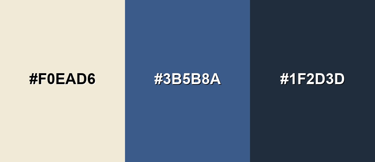
Complementary Colors
A blue-leaning complement adds crisp contrast and makes pearl look cleaner and brighter. Use the darkest tone for type and navigation, and the mid-tone for buttons or emphasis.
Complementary Palette Example: Try pearl with slate blue and deep navy for an elegant, high-contrast look that still feels soft.
Analogous Color Schemes
Analogous colors sit adjacent to each other on the color wheel, creating harmonious, cohesive palettes with subtle variation.
Warm neutrals around pearl create a cozy, seamless gradient for backgrounds and packaging.
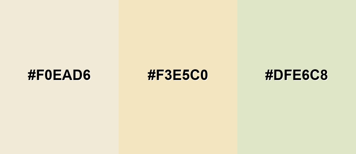
- Pearl: #F0EAD6
- Champagne: #F3E5C0
- Pistachio Mist: #DFE6C8
A slightly greener analogous mix keeps things fresh while staying understated.
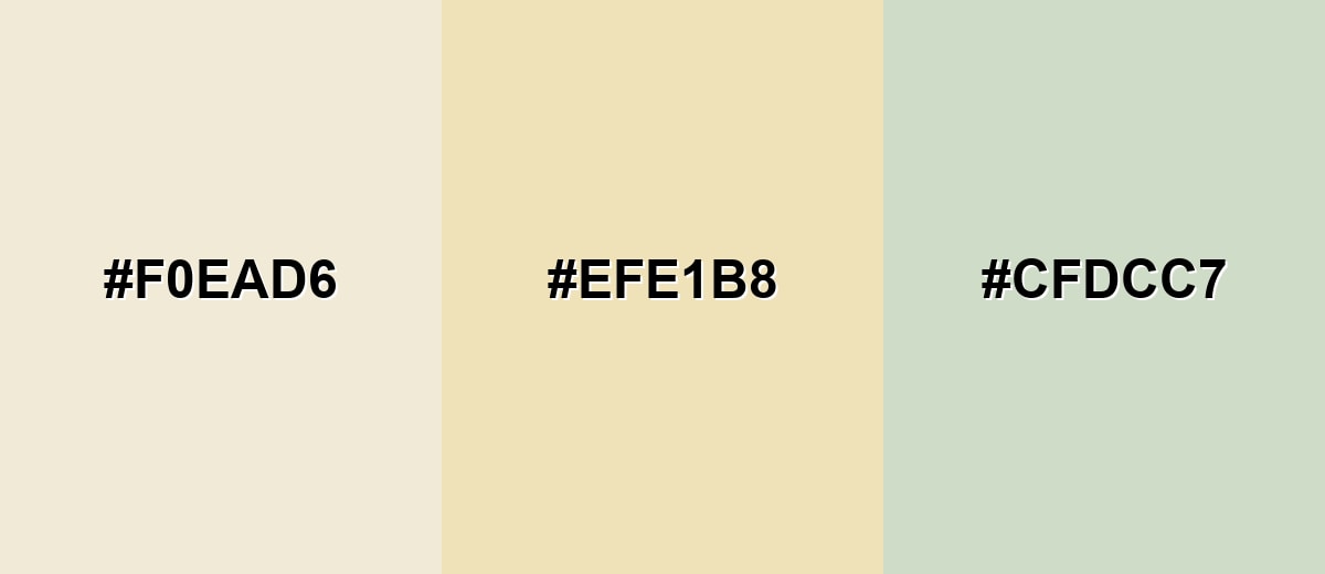
- Pearl: #F0EAD6
- Ivory Sand: #EFE1B8
- Soft Sage: #CFDCC7
Triadic & Tetradic Combinations
A triadic palette gives pearl more energy while keeping it sophisticated.
Pair pearl with seafoam teal and dusty lavender for a balanced, modern mix that works in lifestyle and creative branding.
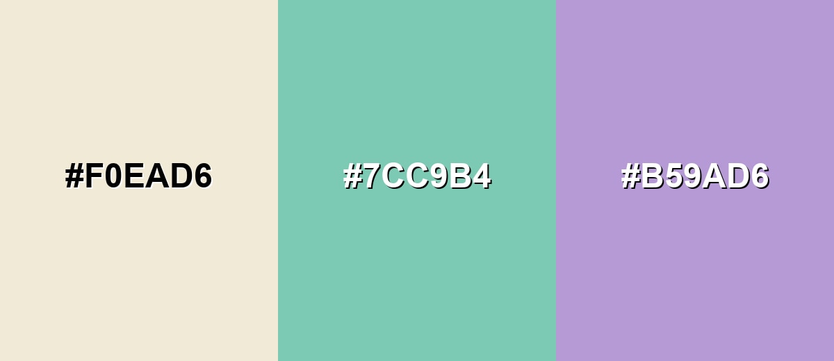
- Pearl: #F0EAD6
- Seafoam Teal: #7CC9B4
- Dusty Lavender: #B59AD6
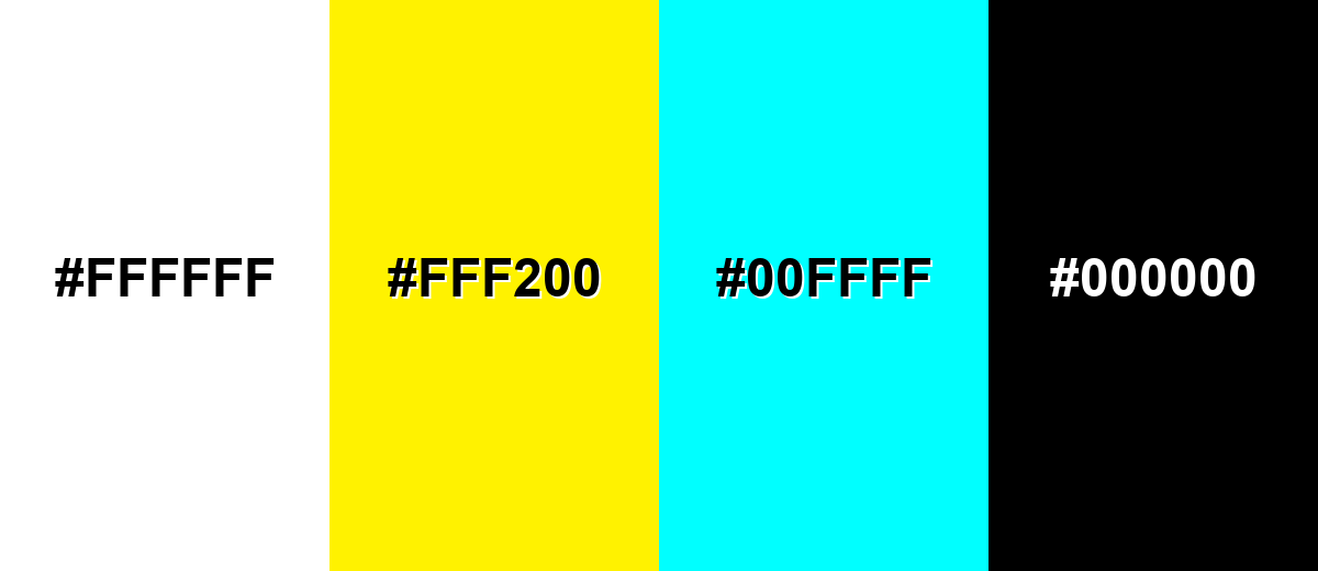
Colors to Avoid
While pearl color is remarkably versatile, certain combinations can create problematic visual effects:
- Pure White (#FFFFFF) - Large white areas can make pearl look dull or yellowed; use off-white highlights or texture instead.
- Neon Yellow (#FFF200) - High-saturation neon overwhelms pearl and breaks the refined, soft mood.
- Electric Cyan (#00FFFF) - The intensity and coolness clash with pearl's gentle warmth and can feel visually harsh.
- Pitch Black (#000000) - Extreme contrast can look too stark; deep navy or charcoal usually reads smoother with pearl.
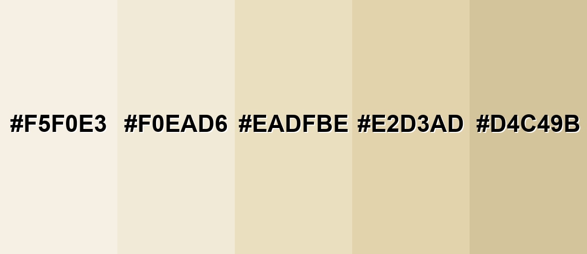
Shades, Tints & Variations of Pearl Color
Pearl isn't a single "one and done" off-white—small shifts in lightness and warmth can change the mood fast. This range helps you build soft depth for backgrounds, panels, packaging, and print where subtle contrast matters.
- Soft Pearl (#F5F0E3) - A brighter, airier take that keeps the creamy character with extra lightness. It's best used for Large page backgrounds, editorial layouts, and soft gradients.
- Classic Pearl (#F0EAD6) - Balanced off-white with a warm undertone and a subtle, refined feel. It's best used for UI foundations, product photography backdrops, and premium branding.
- Warm Pearl (#EADFBE) - A more golden-beige variation that feels cozy without turning tan. It's best used for Hospitality, packaging, and inviting interior palettes.
- Antique Pearl (#E2D3AD) - Slightly deeper and more vintage, with a gentle aged warmth. It's best used for Classic themes, heritage branding, and textured print work.
- Deep Pearl Beige (#D4C49B) - A grounded beige-leaning shade that still reads soft and natural. It's best used for Secondary panels, separators, and warm neutral supporting surfaces.
Industry Applications
Pearl is a versatile neutral that can look modern, classic, or organic depending on what you pair it with. It often supports premium positioning because it feels clean and intentional without the sharpness of pure white.
Fashion & Beauty
- Works beautifully for bridal and formal styling where you want softness without looking yellow.
- Makes cosmetic packaging feel elevated, especially with minimal typography and subtle finishes.
- Pairs well with muted accent tones for seasonal collections that still feel timeless.
- Creates a "clean" backdrop in product photography that's less harsh than bright white.
Interior Design & Decor
- Ideal for wall tones and textiles that soften a space while keeping it bright.
- Balances natural materials like wood and stone, helping a room feel calm and cohesive.
- Supports layered neutrals (rugs, linens, upholstery) without pushing the palette too beige.
- Plays nicely with brushed metal and warm finishes for an understated luxury look.
Branding & Marketing
- Acts as a premium base for logos, labels, and unboxing design—clean but not clinical.
- Helps products and typography stand out with less glare than pure white backgrounds.
- Works for lifestyle and wellness storytelling where you want space, softness, and calm.
- Pairs naturally with embossed details and subtle metallic accents for a refined finish.
Conclusion
Pearl color is a creamy off-white that feels luminous, calm, and quietly premium—perfect for backgrounds, packaging, and interfaces when bright white looks too sharp. With #F0EAD6 as a reliable starting point, you can build consistent palettes, shade systems, and layouts that stay clean without turning sterile. For the best results, treat pearl as your foundation, then add structure with confident dark accents and one muted highlight so everything remains readable, balanced, and intentional.
Design Smarter with AI: Media.io is an online AI studio that empowers creators with advanced image generation and enhancement tools. From text-to-image and image-to-image creation to AI upscaling and color optimization, it enables fast, creative, and professional results—all in your browser.

Frequently Asked Questions About Pearl Color
Pearl is a soft, creamy off-white inspired by the look of natural nacre. It appears warm, light, and slightly luminous compared to plain white.
A widely used hex reference for pearl is #f0ead6. Depending on lighting and materials, pearl can also be represented by nearby off-white tones.
Pearl usually reads warm because it has a subtle yellow-beige undertone. However, it can feel cooler if you pair it with icy blues or cool grays.
Pearl pairs well with deep navy, slate blue, charcoal, sage, muted teal, dusty lavender, and soft rose tones. These add contrast without overpowering the base shade.
They are similar but not identical. Ivory often looks more yellow and traditional, while pearl tends to look lighter and cleaner with a gentle, luminous warmth.
Use pearl as a background, then choose dark text (navy or charcoal) and clear accent colors for buttons and links. Avoid light gray text and make sure interactive states differ by more than just lightness.


