

Cool grey color is a balanced grey with a subtle blue undertone, so it looks crisp rather than warm or beige in real life. A reliable reference for this shade is hex #8a9099.
People often read it as calm, modern, and professional, though it can feel a little reserved if overused. Because it sits between blue and neutral in how we perceive it, it shifts slightly with lighting and nearby hues; this guide covers meaning, codes, combinations, shades, and practical uses.
Cool Grey Color: Codes & Values
If you want a consistent cool grey across screens and print, these are the core values to save in your design system.
| Parameters | VALUE |
| HEX Code | #8A9099 |
| RGB DECIMAL | 138, 144, 153 |
| RGB PERCENTAGE | 54.1%, 56.5%, 60.0% |
| CMYK | 10%,6%,0%,40% |
| HSL | 216°, 7%, 57% |
| HSV (HSB) | 216°, 10%, 60% |
| Web Safe | #999999 |
Key Color Space Explanations:
- HEX - HEX is the most common way to define this shade for web and UI work. Use it in CSS and design tools to keep cool grey consistent across screens.
- RGB - RGB describes how much red, green, and blue light make up the shade on digital displays. It is useful for UI states, overlays, and motion graphics.
- CMYK - CMYK is used for printing and is based on ink percentages rather than light. It helps you plan how cool grey will reproduce on coated and uncoated stock.
- HSL - HSL shows the hue, saturation, and lightness, which is handy for generating lighter or darker variations. It also makes it easier to keep the same undertone while adjusting contrast.
- Web Safe - Web safe is the closest legacy-safe approximation for older displays and constrained palettes. It is mainly useful when you need a simplified fallback for consistency.
In practice, use HEX/RGB for digital work, CMYK for print planning, and HSL/HSV when you're building a full range of tints and deeper shades.
Cool Grey Color Conversions
Need the same cool grey in different formats? Here's the conversion table you can copy into your workflow.
| Parameters | VALUE | CSS |
| HEX | #8a9099 | #8a9099 |
| RGB DECIMAL | 138, 144, 153 | rgb(138,144,153) |
| RGB PERCENTAGE | 54.1%, 56.5%, 60.0% | rgb(54.1%,56.5%,60.0%) |
| CMYK | 10%,6%,0%,40% | cmyk(10%,6%,0%,40%) |
| HSL | 216°, 7%, 57% | hsl(216°, 7%, 57%) |
| HSV (or HSB) | 216°, 10%, 60% | -- |
| Web Safe | 999999 | #999999 |
| CIE-LAB | 59.2, -0.6, -6.1 | -- |
| XYZ | 26.8, 28.9, 35.1 | -- |
| xyY | 0.296, 0.319, 28.9 | -- |
| CIE-LCH | 59.2, 6.1, 264° | -- |
| CIE-LUV | 59.2, -5.2, -9.8 | -- |
| Hunter-Lab | 53.9, -0.8, -6.9 | -- |
| Binary | 10001010 10010000 10011001 | -- |
Want to generate cool grey color photos or posters? Try Media.io's AI Image Generator now!
Cool Grey Meaning & Symbolism
Cool grey is commonly associated with balance, composure, and a quietly modern attitude. Because it carries a faint blue bias, it often feels cleaner and more technical than warm greys. In everyday life, it shows up wherever you want a neutral that supports content without calling attention to itself.
Psychological Effects
In visual communication, cool grey tends to cool down a layout and make information feel more organized.
- Calm Structure - It can lower the emotional temperature of a layout and make pages feel orderly.
- Steady Presence - It often reads as calm and steady, especially with clear typography and generous spacing.
- Modern Restraint - The blue-leaning undertone can feel clean and technical rather than warm and cozy.
- Coldness Risk - Too much cool grey can come across as cold, distant, or unfriendly in more personal branding.
- Flat Contrast - In low-contrast combinations it may look washed out, reducing clarity in UI and signage.
Positive Associations
Used in the right balance, cool grey supports content and makes accents feel more intentional.
- Balance - It's commonly linked with balance, helping a layout feel stable and considered.
- Composure - It suggests composure and control, which fits information-heavy pages and interfaces.
- Professional Tone - Grey signals professionalism and restraint in many modern contexts.
- Clean, Technical Feel - The cool undertone can hint at technology and precision without being flashy.
- Supports Content - It stays neutral and unobtrusive, letting imagery, typography, and key data stand out.
Cultural Significance Across the World
Like most neutrals, cool grey's meaning changes based on context, materials, and surrounding colors.
- Neutrality - Grey often represents neutrality, making it a common choice for backgrounds and systems.
- Professionalism - In modern settings, it's frequently read as professional and measured.
- Technology & Precision - A cooler undertone can subtly suggest a more technical, precise vibe.
- Context Sensitivity - Meanings shift with surrounding hues and materials, so it can feel softer or sharper depending on the palette.
Design Applications
Cool grey works best as a supporting neutral that improves legibility and keeps layouts feeling controlled. Use it to structure information, build hierarchy, and give accent hues a cleaner stage.
Graphic Design Tips
- Use cool grey on backgrounds, panels, and dividers to keep the focus on content.
- Pair it with one warm accent for emphasis (buttons, icons, highlights) so the palette doesn't feel sterile.
- Avoid stacking multiple similar greys; increase lightness differences to keep UI surfaces distinct.
- For print, plan with CMYK and check proofs—cool neutrals can shift and appear more blue on certain papers.
- Treat it as a mid-tone in accessibility: darker shades work better for critical text and controls.
Pro tip: build your hierarchy first (type size, spacing, and surface contrast), then add cool grey as the “glue” color—finish with a small warm accent to keep the system feeling human.
Cool Grey in Photography & Video
- Use it as a clean backdrop tone so subjects and products remain the hero.
- Watch your lighting: daylight vs. warm indoor light can make the blue undertone feel more or less noticeable.
- In grading, cool grey helps create a modern, understated mood without pushing a strong color cast.
- For overlays and lower-thirds, choose deeper cool greys to maintain crisp readability over footage.
- When mixing greys in motion graphics, separate values clearly so borders and secondary text don't disappear.
Recommended Tool for Image Enhancement: When incorporating cool grey into your photography projects, Media.io's AI Image tools can help you achieve more refined results. With AI-powered color enhancement, photo colorization, image upscaling, and old photo restoration, you can easily enrich cool grey tones, improve overall image quality, and highlight the color's elegant and sophisticated aesthetic.
Color Combinations
Because cool grey is restrained, it pairs well with both warm and cool accents. The best combinations either add warmth for energy or stay in neighboring blue-greys for a seamless, modern look.
Complementary Colors
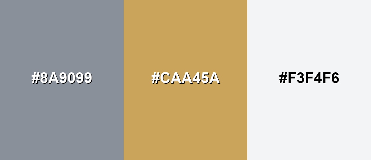
A warm amber complement brings life and contrast to cool grey without becoming loud. This pairing is ideal when you want a neutral foundation plus a friendly highlight for buttons, icons, or key data points.
Complementary Palette Example: Use Cool Grey as the base, Soft Amber for emphasis, and Porcelain White to keep the layout airy.
Analogous Color Schemes
Analogous colors sit adjacent to each other on the color wheel, creating harmonious, cohesive palettes with subtle variation.
Lean into nearby blue-greys for a calm, cohesive palette that feels technical and clean.
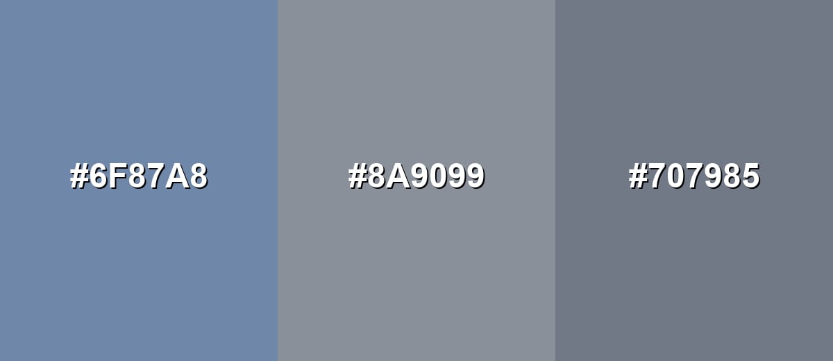
- Dusty Blue: #6F87A8
- Cool Grey: #8A9099
- Slate Grey: #707985
Shift slightly toward violet for a softer, more refined set that still stays understated.
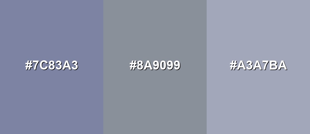
- Blue Violet Grey: #7C83A3
- Cool Grey: #8A9099
- Lavender Grey: #A3A7BA
Triadic & Tetradic Combinations
A triadic approach adds variety while keeping balance, especially when all three hues are slightly muted.
Pair Cool Grey with Sage Green and Dusty Mauve for a modern, lifestyle-friendly contrast.
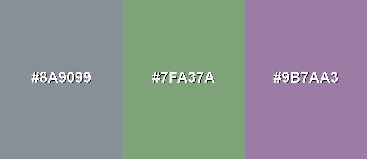
- Cool Grey: #8A9099
- Sage Green: #7FA37A
- Dusty Mauve: #9B7AA3
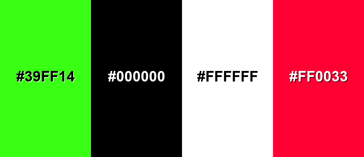
Colors to Avoid
While cool grey is remarkably versatile, certain combinations can create problematic visual effects:
- Neon Green (#39FF14) - The intensity can overpower cool grey and make the overall look feel harsh and unbalanced.
- Pure Black (#000000) - High contrast can look severe; deep charcoals often create a smoother, more premium hierarchy.
- Pure White (#FFFFFF) - On its own it can make cool grey feel colder; a softer off-white usually looks more natural.
- Vivid Red (#FF0033) - The saturation can clash with the muted undertone and pull attention away from content clarity.
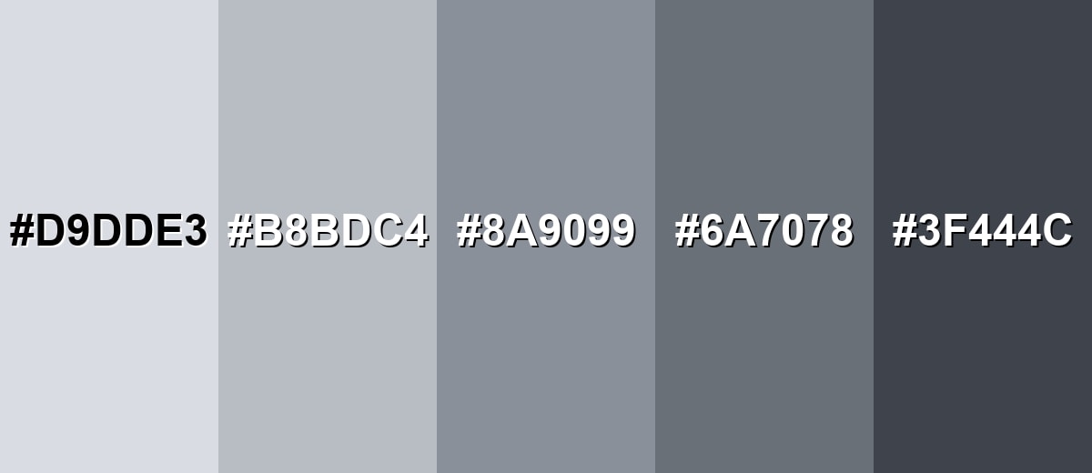
Shades, Tints & Variations of Cool Grey
From airy, frosty tints to darker, modern charcoals, cool grey has a surprisingly flexible range. These variations make it easy to build hierarchy (backgrounds, surfaces, text, and outlines) while keeping the same crisp undertone.
- Icy Cool Grey (#D9DDE3) - A light, frosty tint with a clear blue-leaning neutrality. It's best used for Backgrounds, large surfaces, and subtle UI panels.
- Mist Cool Grey (#B8BDC4) - A soft mid-light option that stays crisp without feeling stark. It's best used for Cards, borders, secondary backgrounds, and quiet infographics.
- Classic Cool Grey (#8A9099) - The balanced reference shade: neutral at first glance with a cool undertone. It's best used for Base neutrals in systems, typography support, and product UI.
- Deep Cool Grey (#6A7078) - A darker, steadier version that adds structure and weight. It's best used for Headings, navigation, outlines, and darker surface layers.
- Charcoal Cool Grey (#3F444C) - A cool charcoal that feels modern and more approachable than pure black. It's best used for Primary text, icons, and high-contrast UI components.
Industry Applications
Cool grey is a workhorse neutral across industries because it supports information, reduces visual noise, and pairs easily with accent hues. It's especially useful when clarity and structure matter more than decoration.
Fashion & Beauty
- Use cool grey as an understated base so product imagery and skin tones remain the focus.
- Lean into its modern, restrained feel for premium-minimal visuals where typography does the heavy lifting.
- Choose softer off-whites alongside cool grey to avoid a cold, overly clinical presentation.
- Keep contrast intentional—cool greys that are too close in value can look flat in lookbooks and social layouts.
Interior Design & Decor
- It reads clean on walls, tile, and metal finishes, especially with natural daylight.
- Balance it with warm wood, creamy whites, or textured fabrics to keep spaces from feeling too chilly.
- Matte and eggshell finishes soften the undertone, while glossy surfaces can make it look sharper and more blue.
- Test it in different lighting since the subtle blue undertone can shift across rooms and times of day.
Branding & Marketing
- Use cool grey as a foundational neutral to anchor a brand palette while a single accent handles emphasis.
- It's a strong fit for systems that value clarity and trust, such as reports, presentations, and information-first pages.
- For modern labels and instruction-heavy packaging, pair it with deep charcoal text for crisp readability.
- In UI-led brands, avoid stacking similar greys; clear hierarchy and spacing keep everything feeling premium.
Conclusion
Cool grey color is a crisp, blue-leaning neutral that gives designs a clean, modern backbone without feeling as heavy as deep charcoal. Its cool grey color meaning often reads as steady, organized, and professional—making it a natural fit for UI systems, branding foundations, and information-first layouts. With #8A9099 as a dependable reference, you can keep your palette consistent across web and print, then add warmth (like soft amber) or muted accents to make the overall look feel more approachable. Use the lighter tints for space, the deeper shades for structure, and always test contrast so the calm vibe doesn't turn into low readability.
Design Smarter with AI: Media.io is an online AI studio that empowers creators with advanced image generation and enhancement tools. From text-to-image and image-to-image creation to AI upscaling and color optimization, it enables fast, creative, and professional results—all in your browser.

Frequently Asked Questions About Cool Grey Color
Cool grey is a neutral grey that leans slightly toward blue rather than beige or brown. It typically looks crisp and modern, especially next to warm whites and wood tones.
It is cool-toned. The faint blue undertone makes it feel cleaner and more technical than warm greys, which tend to lean yellow, red, or brown.
For the reference shade in this guide, RGB is 138, 144, 153 and CMYK is 10%,6%,0%,40%. These values help you reproduce it across digital and print workflows.
Warm accents like soft amber and sand add friendly contrast, while neighboring blue-greys and muted teals keep a calm, minimal look. Off-whites also help it feel less cold than pairing it with pure white.
Yes, but choose darker shades for body text and verify contrast on your background. Mid-tone greys can look elegant yet fail contrast requirements if they are too close to the surface tone.
Because it has a subtle blue undertone, it can shift depending on the light source and surrounding hues. Daylight, warm indoor lighting, and nearby warm materials can all change how cool or neutral it appears.


