

Oxblood color is a deep, brown-leaning red that looks like dried wine or rich, aged leather in real life. Its signature hex code is #4A1F2C, giving it a grounded, muted intensity rather than a bright pop.
People often read it as confident, classic, and a little dramatic. This guide covers oxblood meaning, color codes, combinations, shades, and practical uses.
Oxblood Color: Codes & Values
If you want oxblood to look consistent across UI, print, and brand assets, start with the core codes below and build from there.
| Parameters | VALUE |
| HEX Code | #4A1F2C |
| RGB DECIMAL | 74, 31, 44 |
| RGB PERCENTAGE | 29%, 12%, 17% |
| CMYK | 0%,58%,40%,71% |
| HSL | 342°, 41%, 21% |
| HSV (HSB) | 342°, 58%, 29% |
| Web Safe | #333333 |
Key Color Space Explanations:
- HEX - HEX is the most common way to specify oxblood on web pages and in digital products. Use it for CSS, design tokens, and UI style guides.
- RGB - RGB defines oxblood by mixing red, green, and blue light on screens. It is useful for UI components, video work, and any display-based project.
- CMYK - CMYK is used for printing and packaging where inks are layered on paper. Oxblood can print darker than expected, so proofs help when precision matters.
- HSL - HSL describes hue, saturation, and lightness, making it easier to build consistent tints and shades. It is especially handy when creating hover states or theme variants.
- Web Safe - Web-safe is the closest legacy-safe approximation for older display constraints. It is mainly a reference today rather than a requirement.
Use HEX for web and product UI, RGB when you’re working across screens and video, and CMYK for print—then verify with proofs and on-device testing to avoid unexpected darkening.
Oxblood Color Conversions
Need oxblood in a different color space for design, printing, or dev handoff? Here are the most common conversions in one place.
| Parameters | VALUE | CSS |
| HEX | #4a1f2c | #4a1f2c |
| RGB DECIMAL | 74, 31, 44 | rgb(74,31,44) |
| RGB PERCENTAGE | 29%, 12%, 17% | rgb(29%,12%,17%) |
| CMYK | 0%,58%,40%,71% | cmyk(0%,58%,40%,71%) |
| HSL | 342°, 41%, 21% | hsl(342°,41%,21%) |
| HSV (or HSB) | 342°, 58%, 29% | -- |
| Web Safe | 333333 | #333333 |
| CIE-LAB | 18.5, 22.0, 1.0 | -- |
| XYZ | 3.78, 2.63, 2.69 | -- |
| xyY | 0.415, 0.289, 2.63 | -- |
| CIE-LCH | 18.5, 22.0, 3° | -- |
| CIE-LUV | 18.5, 23.3, -1.6 | -- |
| Hunter-Lab | 16.2, 14.6, 0.7 | -- |
| Binary | 01001010 00011111 00101100 | -- |
Want to generate oxblood color photos or posters? Try Media.io's AI Image Generator now!
Oxblood Meaning & Symbolism
Oxblood is often linked with maturity, depth, and understated luxury. In everyday life it can feel more grounded than bright red, making it a strong choice when you want warmth without loudness. In oxblood color meaning, it commonly signals confidence, tradition, and serious intent.
Psychological Effects
Because it’s dark and muted, oxblood tends to shape mood quickly—especially when used in large areas.
- Stable And Controlled - Because it is dark and muted, oxblood tends to feel stable and controlled.
- Anchoring Effect - It can help a layout or space feel anchored, especially when used on headers, buttons, or key accents.
- Premium Drama - It also has a dramatic side. Used sparingly, it reads as premium and intentional; used everywhere, it can feel heavy or overly formal, particularly in small interfaces or dim rooms.
- Perceived Quality - Oxblood can influence perception of quality, making products or brands seem classic and durable.
- Clash Risk - If paired with harsh contrasts or overly saturated companions, it may come across as stern or dated.
Positive Associations
When the context fits, oxblood can feel confident and refined without being flashy.
- Maturity - Oxblood is often linked with maturity, depth, and understated luxury.
- Depth - It can feel more grounded than bright red, making it a strong choice when you want warmth without loudness.
- Confidence - People often read it as confident, classic, and a little dramatic.
- Tradition - In oxblood color meaning, it commonly signals confidence, tradition, and serious intent.
- Durability - Oxblood can influence perception of quality, making products or brands seem classic and durable.
Cultural Significance Across the World
Oxblood carries strong heritage cues, so it’s worth thinking about where and how it’s used.
- Heritage Styling - Oxblood is often associated with heritage styling, formal wear, and leather goods.
- Formal Wear - Oxblood is often associated with heritage styling, formal wear, and leather goods.
- Leather Goods - Oxblood is often associated with heritage styling, formal wear, and leather goods.
- Seriousness And Context - Its name and appearance can also evoke themes of endurance and seriousness, so context matters when choosing it for sensitive topics.
Design Applications
Oxblood is easiest to work with when you treat it like a deep neutral with a red undertone. It supports modern minimal layouts, classic branding, and rich editorial visuals when paired thoughtfully.
Graphic Design Tips
- Primary brand accent on logos, monograms, seals, and badges
- Premium product lines where you want heritage cues without using bright red
- Editorial and storytelling brands that rely on mood and depth
- Use it for emphasis elements like nav bars, CTAs, or packaging highlights rather than large, uninterrupted backgrounds.
- Use a proofing step because dark reds can deepen in print, especially on uncoated stock.
Combine oxblood with warm off-whites and muted metallics to keep it refined, not aggressive. Avoid placing oxblood text on near-black backgrounds, where it can lose separation and readability.
Oxblood in Photography & Video
- Historically, the name comes from the pigment-like look of darkened blood tones, which can appear warmer or cooler depending on lighting and surrounding materials.
- RGB defines oxblood by mixing red, green, and blue light on screens. It is useful for UI components, video work, and any display-based project.
- Balance it with light neutrals and warm textures to keep it inviting.
- Contrast testing is essential with dark, red-leaning tones because perceived contrast can vary by display and ambient light.
- Check contrast in both normal and dim viewing conditions.
Recommended Tool for Image Enhancement: When incorporating oxblood into your photography projects, Media.io's AI Image tools can help you achieve more refined results. With AI-powered color enhancement, photo colorization, image upscaling, and old photo restoration, you can easily enrich oxblood tones, improve overall image quality, and highlight the color's elegant and sophisticated aesthetic.
Color Combinations
Oxblood pairs best with grounded greens, warm neutrals, and dark blues that match its depth. The palettes below offer easy starting points for brand systems, UI themes, and interiors.
Complementary Colors
A complementary pairing uses the opposite side of the color wheel to create clear separation and a balanced push-pull feel.
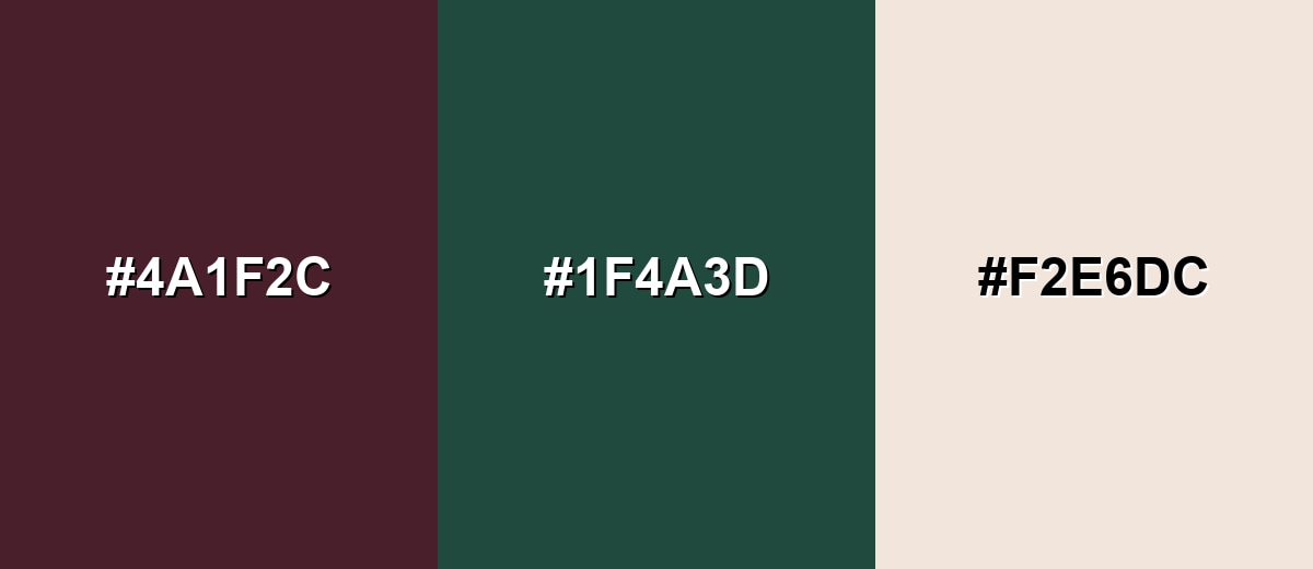
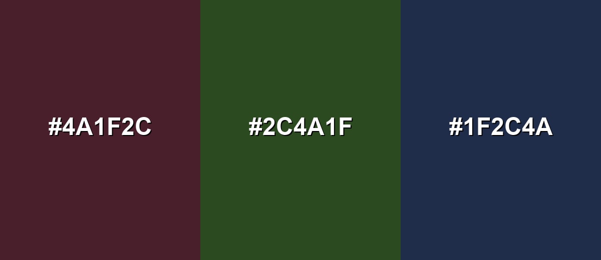
Complementary Palette Example: Pair oxblood with deep teal and a warm ivory to keep the contrast elegant rather than loud.
Analogous Color Schemes
Analogous colors sit adjacent to each other on the color wheel, creating harmonious, cohesive palettes with subtle variation.
An analogous set that leans into plum and brick tones for a cohesive, moody look.
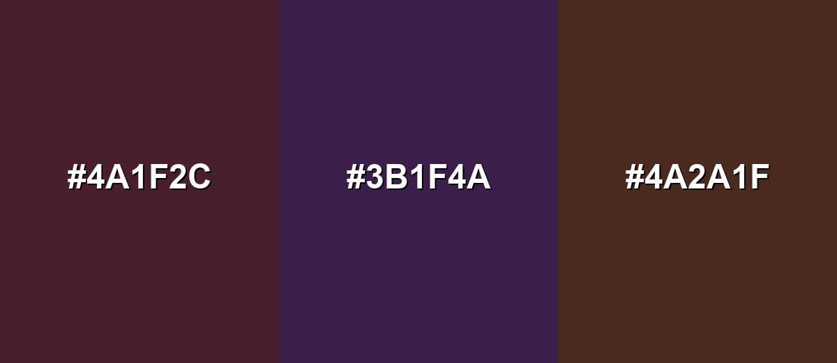
- Oxblood: #4A1F2C
- Deep Plum: #3B1F4A
- Brick Brown: #4A2A1F
A warmer analogous scheme that keeps the palette earthy and wearable, great for editorial and lifestyle visuals.
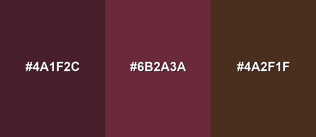
- Oxblood: #4A1F2C
- Rosewood: #6B2A3A
- Cocoa Brown: #4A2F1F
Triadic & Tetradic Combinations
Triadic palettes create energy while staying balanced by spacing hues evenly around the wheel.
Use oxblood with olive moss and midnight blue for a bold, grounded system that still feels premium.
- Oxblood: #4A1F2C
- Olive Moss: #2C4A1F
- Midnight Blue: #1F2C4A
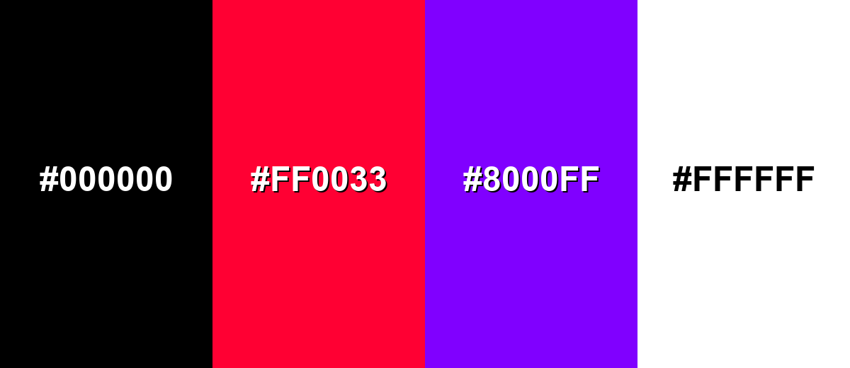
Colors to Avoid
While oxblood is remarkably versatile, certain combinations can create problematic visual effects:
- Pure Black (#000000) - Black next to oxblood can erase detail and make both areas feel flat, especially in UI where subtle separations matter.
- Neon Red (#FF0033) - Highly saturated reds can clash with oxblood and make it look dull or muddy by comparison.
- Electric Purple (#8000FF) - Intense purples can push oxblood toward an unintended magenta direction and create a harsh, stylized look.
- Pure White (#FFFFFF) - Stark white can feel too clinical against oxblood; warmer off-whites usually keep the palette more natural and refined.
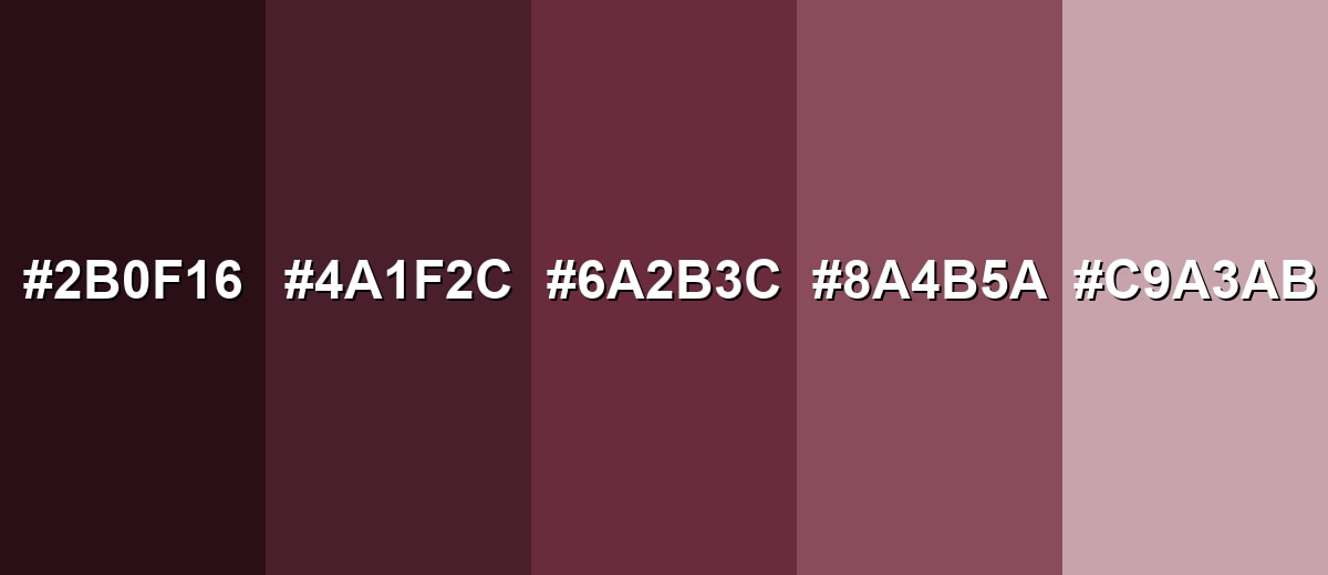
Shades, Tints & Variations of Oxblood
Oxblood isn’t a single “fixed” look—small shifts in depth and softness can make it feel dramatic, approachable, or even airy. Use the variations below to build cleaner hierarchies in UI, richer gradients in visuals, or more flexible brand accents.
- Dark Oxblood (#2B0F16) - A deeper, near-blackened version that feels dramatic and dense. It’s best used for Use for luxury accents, headers, or background panels where you want maximum depth..
- Classic Oxblood (#4A1F2C) - The standard oxblood tone: wine-like, muted, and slightly brown-leaning. It’s best used for Great as a signature accent for branding, UI highlights, and editorial elements..
- Soft Oxblood (#6A2B3C) - A lighter, slightly more approachable take that reads warmer on screen. It’s best used for Use for secondary accents, cards, and subtle emphasis without heavy contrast..
- Dusty Rosewood (#8A4B5A) - A muted mid-tone that blends oxblood with a dusty rose feel. It’s best used for Works well in backgrounds, gradients, and lifestyle visuals where softness matters..
- Oxblood Tint (#C9A3AB) - A pale tint that keeps the undertone while feeling light and airy. It’s best used for Ideal for UI surfaces, empty states, or large areas where classic oxblood would be too intense..
Industry Applications
Oxblood shows up across industries because it reads as durable, classic, and premium without relying on bright saturation. These are common places it fits naturally.
Fashion & Beauty
- Leather goods
- Footwear accents
- Lip and nail shades
- Editorial packaging
Interior Design & Decor
- Textiles
- Statement furniture pieces
- Accent decor paired with warm neutrals and wood finishes
- Upholstery, rugs, and curtains for a grounded focal point
Branding & Marketing
- Labels and menus for wine-inspired branding, artisan products, and premium gifting lines
- Accent UI elements for mature brands, especially when paired with clean neutrals and strong typography
- Invitations, programs, and signage for formal occasions where you want a classic, elevated mood
- Wine, fragrance, and artisan packaging palettes
Conclusion
Oxblood stands out for its deep, wine-like look and its ability to feel both traditional and modern depending on what you pair it with. With #4A1F2C as a reliable reference point, it’s easy to build consistent accents, shade steps, and supporting palettes for branding, UI, print, and interiors—without the sharp intensity of a bright red. Keep it readable with light neutrals, avoid near-black clashes, and proof dark reds in print when accuracy matters. Used intentionally, oxblood delivers a confident visual tone that reads refined, durable, and quietly premium.
Design Smarter with AI: Media.io is an online AI studio that empowers creators with advanced image generation and enhancement tools. From text-to-image and image-to-image creation to AI upscaling and color optimization, it enables fast, creative, and professional results—all in your browser.

Frequently Asked Questions About Oxblood Color
Oxblood is a very dark, muted red with noticeable brown undertones. It often resembles dried wine, burgundy leather, or deep red wood stains.
A commonly used digital value for oxblood is #4a1f2c. Slight variations exist depending on the brand palette or material reference.
Oxblood usually sits closer to burgundy because it leans wine-like and slightly purple-brown. Maroon often reads more red-brown and can feel less plum-leaning.
Warm off-whites, deep teals, olive greens, charcoal grays, and midnight blues pair well with oxblood. Muted metallics like antique gold can also add a premium finish.
Use it as an accent rather than a full background, and give it breathing room with light neutrals. Test contrast for text and icons, and avoid stacking it against near-black surfaces.
It can, especially on uncoated paper or when a palette is already dark. If accurate matching matters, run a proof and consider slightly lifting lightness for large printed areas.


