

Dark magenta color is a rich, deep purple-pink that feels like classic magenta with the brightness turned down—think saturated berry or orchid ink. With its standard HEX value of #8B008B, it has a bold presence without going neon.
Because it sits strongly between red and blue light, dark magenta reads as expressive, confident, and slightly dramatic. Below, you'll find the exact codes, conversions, pairings, and practical tips for using it in digital and print design.
Dark Magenta Color: Codes & Values
If you want dark magenta to look consistent across mockups, UI, and print files, these are the core values to save in your style guide.
| Parameters | VALUE |
| HEX Code | #8B008B |
| RGB DECIMAL | 139, 0, 139 |
| RGB PERCENTAGE | 54.51%, 0%, 54.51% |
| CMYK | 0%,100%,0%,45% |
| HSL | 300°, 100%, 27% |
| HSV (HSB) | 300°, 100%, 55% |
| Web Safe | #990099 |
Key Color Space Explanations:
- HEX - HEX is the most common way to specify this shade for web graphics and UI. Use #8b008b to reproduce dark magenta consistently in digital design.
- RGB - RGB defines the mix of red, green, and blue light used on screens. Dark magenta is built from strong red and blue with no green, creating a vivid purple-pink.
- CMYK - CMYK is used for printing with cyan, magenta, yellow, and black inks. Dark magenta typically needs heavy magenta plus black to keep it deep and reduce brightness.
- HSL - HSL describes hue, saturation, and lightness, which is helpful for picking matching tints and shades. At 300° with high saturation, it sits firmly in the magenta family but with low lightness for a darker look.
- Web Safe - Web-safe values are older, simplified screen colors used for maximum legacy compatibility. The closest web-safe match to dark magenta is #990099.
Use HEX or RGB for screen work (web, apps, video graphics), and switch to CMYK when you're preparing files for print so the depth stays true after ink and paper come into play.
Dark Magenta Color Conversions
Need dark magenta in a different format for your workflow? Here are the most common conversions designers reference for web, UI, and print.
| Parameters | VALUE | CSS |
| HEX | #8b008b | #8b008b |
| RGB DECIMAL | 139, 0, 139 | rgb(139,0,139) |
| RGB PERCENTAGE | 54.51%, 0%, 54.51% | rgb(54.51%,0%,54.51%) |
| CMYK | 0%,100%,0%,45% | cmyk(0%,100%,0%,45%) |
| HSL | 300°, 100%, 27% | hsl(300°,100%,27%) |
| HSV (or HSB) | 300°, 100%, 55% | -- |
| Web Safe | 990099 | #990099 |
| CIE-LAB | 32.3, 62.5, -39.6 | -- |
| XYZ | 15.36, 7.38, 25.12 | -- |
| xyY | 0.3209, 0.1541, 7.38 | -- |
| CIE-LCH | 32.3, 74.0, 327.7° | -- |
| CIE-LUV | 32.3, 45.0, -58.1 | -- |
| Hunter-Lab | 27.2, 56.5, -40.5 | -- |
| Binary | 10001011 00000000 10001011 | -- |
Want to generate Dark Magenta Color photos or posters? Try Media.io's AI Image Generator now!
Dark Magenta Color Meaning & Symbolism
Dark magenta is commonly associated with creativity, individuality, and bold self-expression, but with a more mature tone than bright magenta. In everyday life it can feel artistic and confident, often used when a design needs energy without looking flashy. This mix of intensity and depth is a big part of Dark Magenta Color meaning in modern visuals.
Psychological Effects
Because it's deep and saturated, dark magenta tends to grab attention fast and set a confident mood.
- High Impact - Naturally draws the eye, making it great for focal points like CTAs and headlines.
- Premium Energy - Feels rich and elevated compared to brighter magentas, especially against clean neutrals.
- Creative Spark - Adds an artistic, expressive tone that helps designs feel less generic.
- Dramatic Weight - In large blocks it can read intense or moody, so balance matters.
- Strong Hierarchy - Works well for emphasis (active states, badges, highlights) when used sparingly.
Positive Associations
Used with enough breathing room, dark magenta communicates bold personality without being flashy.
- Confidence - Suggests self-assurance and a clear point of view.
- Individuality - Signals uniqueness and a willingness to stand out from standard palettes.
- Creativity - Fits artistic brands, editorial layouts, and imaginative campaigns.
- Sophistication - The darker value adds maturity, often reading as refined and intentional.
- Expressiveness - Brings emotion and character to otherwise minimal interfaces or packaging.
Cultural Significance Across the World
Magenta-family colors often carry "stand out" symbolism, and darker versions push that feeling toward elegance.
- Art & Imagination - Frequently linked with creativity, experimentation, and modern visual culture.
- Fashion Forward - Common in beauty and style contexts where boldness and self-expression are celebrated.
- Evening Elegance - Darker tones can feel night-time, dramatic, and event-ready in posters and invitations.
- Modern Identity - Often used as a distinctive brand accent for creators and digital-first products.
Design Applications
Dark magenta works best when it has a clear job to do—guiding attention, strengthening hierarchy, or adding a confident accent without taking over the entire layout.
Graphic Design Tips
- Use dark magenta for accents (icons, keylines, active states, tags) rather than full-page fills.
- Pair it with light neutrals to keep typography crisp and prevent the palette from feeling heavy.
- Reserve the richest saturation for key actions (buttons, promo badges) and use softer tints for supporting areas.
- When building gradients, keep transitions within nearby purple-pink neighbors for a smoother, premium look.
- For print, do a proof check—deep purples can shift based on paper stock and ink limits.
Pro tip: If dark magenta is your brand accent, define one primary value (#8B008B) and one lighter supporting tint in your design system so components stay consistent across pages and campaigns.
Dark Magenta Color in Photography & Video
- Use it as a background wash for portraits to create a dramatic, editorial feel.
- In product shots (beauty, fashion), dark magenta accents can make metallics and glass look more premium.
- For thumbnails and social graphics, it helps text and shapes pop—especially with clean off-whites.
- In video overlays, keep it to lower-thirds, labels, and highlights to avoid overpowering skin tones.
- When color grading, watch for crushed shadows—deep magenta can lose detail if contrast is pushed too far.
Recommended Tool for Image Enhancement: When incorporating dark magenta color into your photography projects, Media.io's AI Image tools can help you achieve more refined results. With AI-powered color enhancement, photo colorization, image upscaling, and old photo restoration, you can easily enrich dark magenta color tones, improve overall image quality, and highlight the color's elegant and sophisticated aesthetic.
Color Combinations
Pairing dark magenta is easier when you decide whether you want contrast (fresh and energetic) or harmony (smooth and refined). The palettes below include reliable options for branding, UI accents, illustrations, and print layouts.
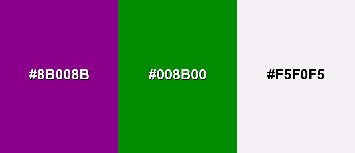
Complementary Colors
A green opposite dark magenta creates strong contrast and a lively, modern look. Keep one shade dominant and use the other as an accent to avoid a competing, noisy layout.
Complementary Palette Example: Use dark magenta with deep green and a soft off-white for crisp contrast that still feels controlled.
Analogous Color Schemes
Analogous colors sit adjacent to each other on the color wheel, creating harmonious, cohesive palettes with subtle variation.
Purple-leaning neighbors create a smooth, nocturnal palette that feels cohesive and artistic.
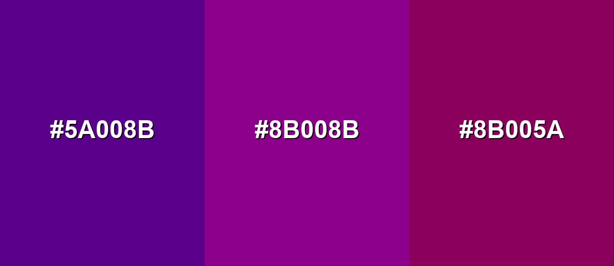
- Deep Violet: #5A008B
- Dark Magenta: #8B008B
- Berry Wine: #8B005A
A tighter magenta band with deeper and brighter steps works well for gradients and layered UI states.
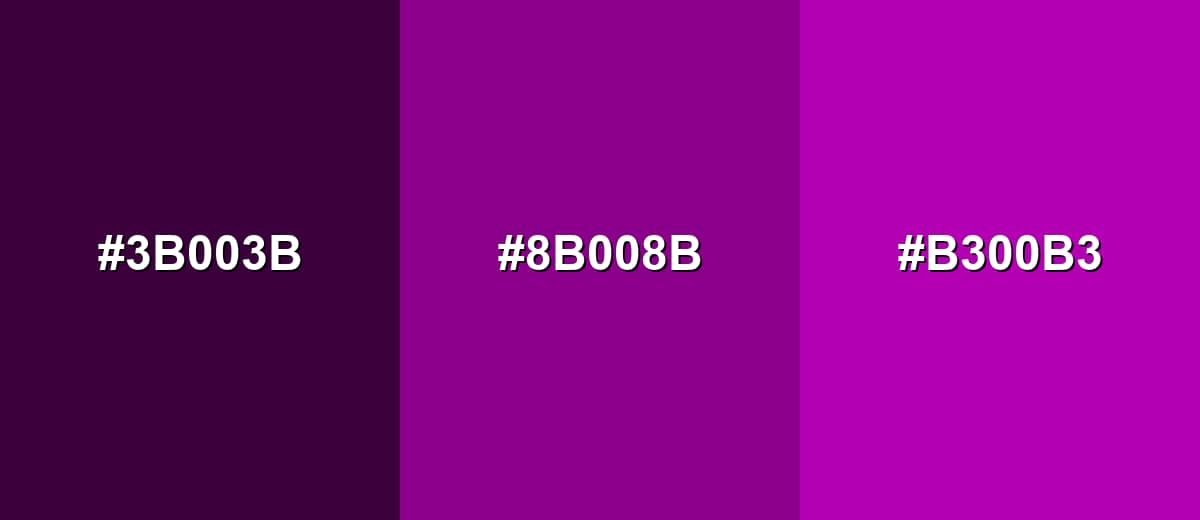
- Eggplant: #3B003B
- Dark Magenta: #8B008B
- Rich Orchid: #B300B3
Triadic & Tetradic Combinations
A triadic palette spreads hues evenly for bold variety while keeping balance.
Dark magenta pairs well with dark teal and olive for playful contrast that still feels grounded.
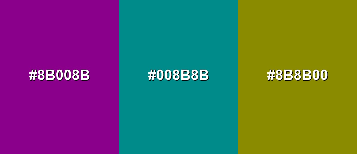
- Dark Magenta: #8B008B
- Dark Teal: #008B8B
- Olive Gold: #8B8B00
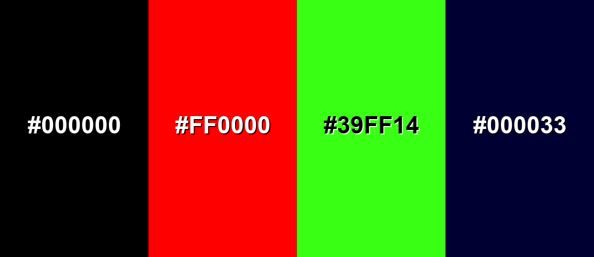
Colors to Avoid
While dark magenta color is remarkably versatile, certain combinations can create problematic visual effects:
- Pure Black (#000000) - Too much darkness can flatten details, making dark magenta look muddy and reducing legibility in UI.
- Pure Red (#FF0000) - High-saturation red next to dark magenta can create a vibrating edge effect that feels harsh and distracting.
- Neon Green (#39FF14) - The intensity mismatch makes the palette feel chaotic, often reading as overly loud or unpolished.
- Deep Navy (#000033) - Both are very dark, so contrast is weak and elements can merge, especially in low-light viewing.
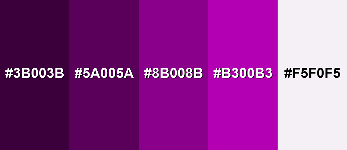
Shades, Tints & Variations of Dark Magenta Color
Dark magenta has a surprisingly useful range—from near-black plum tones to soft, tinted off-whites. Exploring these variations helps you build depth, hierarchy, and flexible UI states while keeping the palette cohesive.
- Eggplant (#3B003B) - A very dark, near-black magenta-purple that keeps the same family but feels more mysterious. It's best used for Backgrounds, luxury themes, and subtle depth behind brighter accents..
- Deep Plum (#5A005A) - A grounded, darker step that stays saturated while feeling slightly more restrained than the base shade. It's best used for Headers, sidebars, and brand blocks where you want weight without pure black..
- Dark Magenta (#8B008B) - The core shade: a deep purple-pink with strong saturation and a confident presence. It's best used for Accent UI, logos, hero highlights, and statement typography..
- Rich Orchid (#B300B3) - A brighter, more energetic variation that pushes closer to vivid magenta while staying rich. It's best used for CTAs, badges, gradients, and lively illustrations..
- Soft Orchid White (#F5F0F5) - A very light, slightly tinted off-white that echoes magenta without competing with it. It's best used for Clean backgrounds, cards, and negative space to balance deep accents..
Industry Applications
Dark magenta shows up in industries that want to feel expressive, premium, or creative. It's especially effective when used as an accent with plenty of neutral space.
Fashion & Beauty
- Use it as a packaging accent to signal richness and individuality on shelves.
- Pair it with off-white backgrounds for clean, editorial product layouts.
- Works well for seasonal drops and night-out collections where drama fits the mood.
- Great for highlighting limited editions, "new" tags, and premium product tiers.
Interior Design & Decor
- Use it in small doses (pillows, throws, artwork) to add a statement without darkening the room.
- Looks sophisticated with soft neutrals for a modern, layered space.
- In accent walls, keep surrounding decor simple to avoid a heavy, saturated feel.
- Works nicely for night-time spaces like lounges or bedrooms where a moody palette is welcome.
Branding & Marketing
- Strong choice for brand accents in creative fields where standing out matters.
- Effective for callouts and highlights in tech UI when you want a distinctive alternative to blue.
- Ideal for entertainment and event promotions that lean into a dramatic, evening vibe.
- Useful as one category color in data visualization when paired with calmer supporting hues.
Conclusion
Dark magenta is a deep purple-pink with a confident, expressive edge—perfect for accents, focal points, and premium brand moments when you don't want the brightness of neon magenta. Start with the core value #8B008B, balance it with light neutrals for breathing room, and lean on complementary greens or grounded teals for clean contrast. With a quick contrast check and the right palette strategy, dark magenta becomes a versatile, modern color you can use across UI, print, and content design with consistent results.
Design Smarter with AI: Media.io is an online AI studio that empowers creators with advanced image generation and enhancement tools. From text-to-image and image-to-image creation to AI upscaling and color optimization, it enables fast, creative, and professional results—all in your browser.

Frequently Asked Questions About Dark Magenta Color
Here are quick answers to the most common questions designers ask when working with dark magenta in digital and print projects.
Dark magenta is a deep, saturated purple-pink. It looks like classic magenta with reduced brightness, giving it a richer and more dramatic appearance.
A common digital hex value for dark magenta is #8b008b. This code is widely used for web design and UI styling to keep the shade consistent.
They are related but not identical. Dark magenta sits closer to magenta (between red and blue) and usually looks pinker than many purples, which often lean more toward blue.
It pairs well with soft off-whites, deep greens, teals, and muted gold or olive tones. These combinations create either clean contrast or a balanced, modern palette.
Yes, but test contrast carefully. It often works best as button fills or accent text on very light backgrounds, while dark backgrounds can reduce readability.
In CMYK printing, dark magenta is typically achieved with strong magenta plus black to deepen it. Always check a proof, since paper type and ink limits can shift deep purples.


