

Salmon color is a warm pink-orange shade inspired by the soft, rosy flesh of salmon fish. Its commonly used reference value is hex #FA8072.
Many people see it as friendly, nourishing, and optimistic without feeling too loud. Because it's named after a natural subject (not a single pigment), salmon can look more pink in cool light and more orange in warm light—so it's worth checking it on the surface or screen you'll actually use.
Salmon Color: Codes & Values
Here are the standard salmon color codes designers use for UI, branding, and print production.
| Parameters | VALUE |
| HEX Code | #FA8072 |
| RGB DECIMAL | 250, 128, 114 |
| RGB PERCENTAGE | 98%, 50%, 45% |
| CMYK | 0%,49%,54%,2% |
| HSL | 6°, 93%, 71% |
| HSV (HSB) | 6°, 54%, 98% |
| Web Safe | #FF9966 |
Key Color Space Explanations:
- HEX is the standard way to specify a digital shade in web design and apps. For salmon, #fa8072 defines the exact red, green, and blue mix in a single code.
- RGB expresses the shade as red, green, and blue light values for screens. It's the most direct format for UI work, motion graphics, and on-screen visuals.
- CMYK is used for printing and describes the ink mix needed to approximate the shade on paper. Because printing depends on paper and profiles, proofs help keep salmon looking consistent.
- HSL describes hue, saturation, and lightness, which is handy for creating lighter or darker variations. It's a practical way to build a cohesive palette around salmon while keeping the same character.
- Web Safe values are an older set of screen-safe approximations. The nearest web-safe match helps when you need compatibility with limited palettes or legacy workflows.
Use HEX and RGB for web/UI, lean on HSL to build clean tints and shades, and treat CMYK as a starting point for print (then proof it on your real paper stock).
Salmon Color Conversions
If you're moving between design tools, here's salmon translated into common color spaces and CSS-ready formats.
| Parameters | VALUE | CSS |
| HEX | #fa8072 | #fa8072 |
| RGB DECIMAL | 250, 128, 114 | rgb(250,128,114) |
| RGB PERCENTAGE | 98%, 50%, 45% | rgb(98%,50%,45%) |
| CMYK | 0%,49%,54%,2% | cmyk(0%,49%,54%,2%) |
| HSL | 6°, 93%, 71% | hsl(6°,93%,71%) |
| HSV (or HSB) | 6°, 54%, 98% | -- |
| Web Safe | ff9966 | #ff9966 |
| CIE-LAB | 67.17, 46.25, 28.60 | -- |
| XYZ | 50.17, 36.92, 20.48 | -- |
| xyY | 0.4665, 0.3432, 36.92 | -- |
| CIE-LCH | 67.17, 54.40, 31.6° | -- |
| CIE-LUV | 67.17, 90.70, 27.20 | -- |
| Hunter-Lab | 60.75, 45.80, 20.90 | -- |
| Binary | 111110101000000001110010 | -- |
Want to generate Salmon Color photos or posters? Try Media.io's AI Image Generator now!
Salmon Color Meaning & Symbolism
Salmon is often linked with warmth, openness, and a gentle kind of energy. It sits between pink and orange, so it can feel caring and approachable while still looking lively. In everyday life, the Salmon Color meaning commonly shows up in spaces and visuals meant to feel welcoming rather than intense.
Psychological Effects
In visual design, salmon tends to add warmth without the pressure that strong reds can bring.
- Humanizing - Softens layouts and makes interfaces feel more approachable and "people-first."
- Supportive Energy - Feels upbeat and encouraging, which works well in onboarding and gentle CTAs.
- Freshness Cue - Can suggest healthy, clean, and "fresh" when paired with simple neutrals.
- Cozy Comfort - Reads as warm and flattering in spaces, especially next to wood and textured fabrics.
- Clarity Sensitivity - When overused or placed behind small text, it can reduce perceived sharpness and contrast.
Positive Associations
Because it's a warm pink-orange, salmon often lands as friendly and easygoing rather than formal.
- Warmth - Creates an inviting tone that helps content feel welcoming.
- Openness - Suggests approachability and friendliness in branding and messaging.
- Optimism - Adds brightness and lift without looking aggressive.
- Comfort - Feels cozy and familiar, especially in lifestyle and home visuals.
- Wholesomeness - As a natural reference shade, it can read as nourishing and "real."
Cultural Significance Across the World
Salmon is generally interpreted through modern lifestyle and design contexts more than strict tradition.
- Everyday Informality - Often reads as casual, friendly, and non-ceremonial in global design use.
- Food-Adjacent Freshness - As a named natural shade, it can imply edible, fresh, and comforting cues.
- Modern Lifestyle Aesthetic - Frequently used in wellness, self-care, and hospitality visuals to feel approachable.
- Context-Dependent Meaning - Shifts with lighting, materials, and pairing choices (more pink vs. more orange changes the vibe).
Design Applications
Salmon is versatile because it can act like a softened warm accent or a modern alternative to bright red. The key is deciding whether you want it to lead the palette or support it.
Graphic Design Tips
- Use It as an Accent - Apply salmon to badges, icons, and highlights to add warmth without overwhelming the layout.
- Build Contrast on Purpose - Pair salmon blocks with darker typography so headings and small UI labels stay crisp.
- Lean on Cool Balance - Cool teals and aquas help salmon feel cleaner and more modern in brand systems.
- Create Smooth Warm Gradients - Adjacent warm tones (peachy and rosy) make salmon-based gradients look natural and premium.
- Keep It From Feeling "Sugary" - Add a grounding neutral so the overall palette stays grown-up and readable.
Pro tip: if salmon is your hero color, limit it to a few high-impact elements (CTA, key illustration shapes, and one background section) and let neutrals do the heavy lifting everywhere else.
Salmon Color in Photography & Video
- Watch White Balance - Cooler light pushes salmon pinker; warmer light makes it read more orange.
- Use Soft, Flattering Highlights - Salmon works well for skin-adjacent accents, lifestyle scenes, and cozy interior shots.
- Control Saturation - Dial back saturation slightly to avoid a dated or overly sweet look in edits.
- Try Overlays for Mood - Light salmon overlays can add a sunlit, welcoming feel without heavy color grading.
- Protect Readability in Motion - For titles and captions, use high-contrast text and avoid thin fonts over salmon areas.
Recommended Tool for Image Enhancement: When incorporating salmon color into your photography projects, Media.io's AI Image tools can help you achieve more refined results. With AI-powered color enhancement, photo colorization, image upscaling, and old photo restoration, you can easily enrich salmon color tones, improve overall image quality, and highlight the color's elegant and sophisticated aesthetic.
Color Combinations
Salmon pairs best with cool counterbalances, airy neutrals, and adjacent warm tones. Use the palettes below to build anything from soft lifestyle looks to sharper, modern layouts.
Complementary Colors
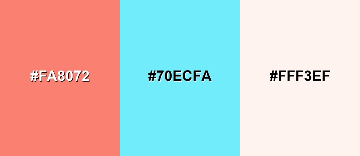
A teal-leaning complement makes salmon feel cleaner and more contemporary, helping it pop without becoming harsh.
Complementary Palette Example: Use Salmon with Bright Aqua and a calm neutral for balanced contrast.
Analogous Color Schemes
Analogous colors sit adjacent to each other on the color wheel, creating harmonious, cohesive palettes with subtle variation.
A cozy warm range that shifts gently from rosy to peachy.
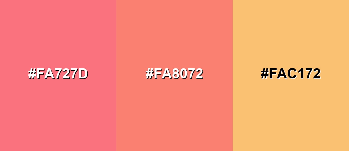
- Warm Rose: #FA727D
- Salmon: #FA8072
- Peach Gold: #FAC172
A slightly richer warm set for energetic accents and gradients.
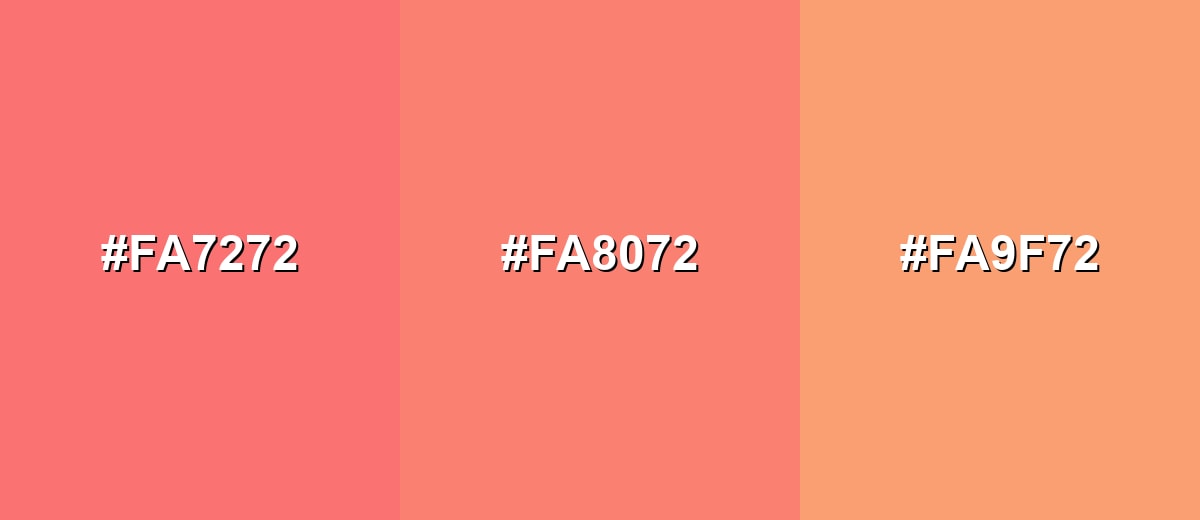
- Soft Red: #FA7272
- Salmon: #FA8072
- Apricot: #FA9F72
Triadic & Tetradic Combinations
Triadic palettes create variety while staying balanced, making them useful for product UI and illustration systems.
Combine Salmon with a fresh green and a soft violet-blue for a lively, modern mix.
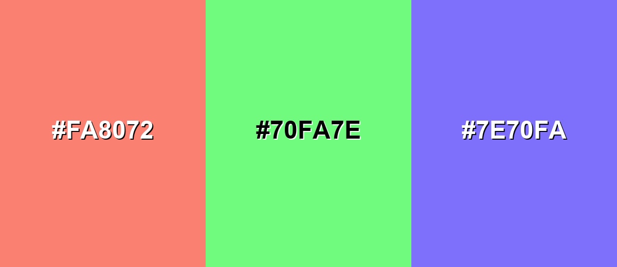
- Salmon: #FA8072
- Spring Green: #70FA7E
- Soft Violet Blue: #7E70FA
Colors to Avoid
While salmon color is remarkably versatile, certain combinations can create problematic visual effects:
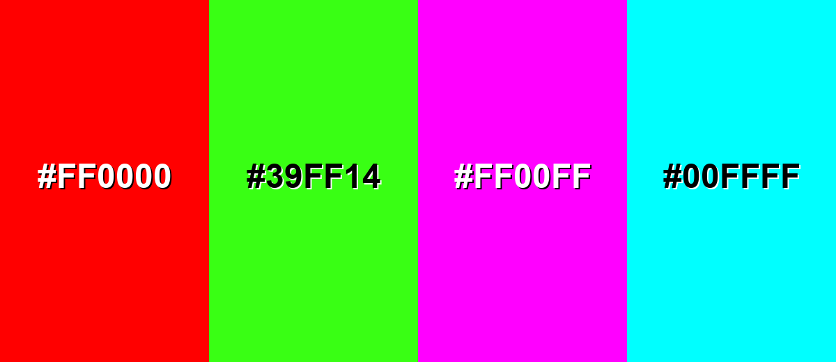
- Pure Red (#FF0000) - Competes with salmon's warm undertone and can make layouts feel loud and visually tense.
- Neon Green (#39FF14) - Creates a harsh, high-energy clash that can look unrefined and distract from content.
- Pure Magenta (#FF00FF) - Overpowers salmon's softness and often reads as overly saturated when placed side by side.
- Bright Cyan (#00FFFF) - The contrast is intense and can feel fluorescent, reducing the calm, welcoming tone salmon is known for.
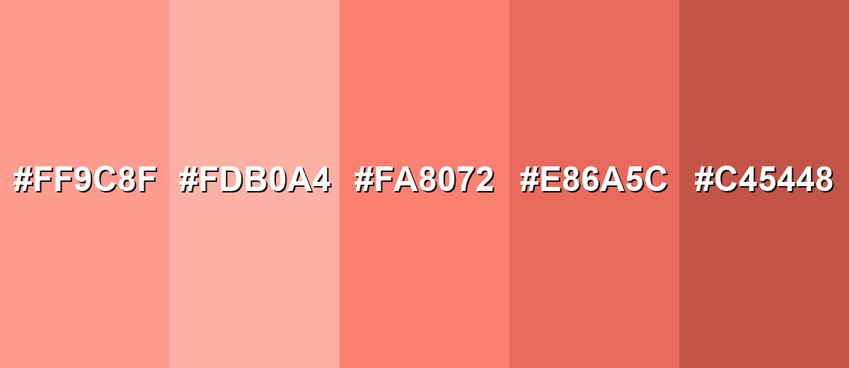
Shades, Tints & Variations of Salmon Color
Salmon isn't just one fixed swatch—there's a useful range from airy, pastel tints to deeper, more grounded shades. Exploring these variations helps you keep the same warm personality while adjusting contrast, hierarchy, and mood across a full design system.
- Light Salmon (#FF9C8F) - A lighter, airier take that feels fresh and gentle, with less visual weight. It's best used for Large backgrounds, soft gradients, and lifestyle imagery overlays..
- Soft Salmon (#FDB0A4) - A muted, creamy variation that leans slightly more pastel and relaxed. It's best used for Calm UI sections, cards, and editorial layouts that need warmth without intensity..
- Classic Salmon (#FA8072) - The familiar salmon reference shade with a balanced mix of pink and orange. It's best used for Accents, highlights, icons, and brand details that should feel friendly and modern..
- Deep Salmon (#E86A5C) - A deeper version with more red presence, adding richness and contrast. It's best used for Buttons, banners, and emphasis elements where you want stronger warmth..
- Dark Salmon (#C45448) - A grounded, darker shade that feels more mature and less sweet. It's best used for Text on light salmon backgrounds, strong accents, and paired use with light neutrals..
Industry Applications
Because salmon reads as warm and approachable, it shows up across digital products and physical design where a friendly tone matters.
Fashion & Beauty
- Lively Accents - Works well as an apparel highlight that looks bright without going neon.
- Warm, Healthy Impression - Fits cosmetics palettes designed to feel fresh, glowy, and flattering.
- Lookbook-Friendly Backdrops - Adds gentle warmth in product photography backgrounds.
- Modern, Wearable Color Stories - Helps balance soft neutrals with a touch of personality in seasonal drops.
Interior Design & Decor
- Cozy Accents - Great for cushions, throws, and art where you want a warm glow.
- Natural Material Pairing - Looks especially inviting next to wood, stone, and textured fabrics.
- Flattering Vanity Spaces - Popular for bathrooms and dressing areas thanks to its warm cast.
- Soft Feature Moments - Works as a controlled accent wall color in modern, relaxed palettes.
Branding & Marketing
- Human-First Palettes - A strong fit for wellness, lifestyle, and service brands that want to feel approachable.
- Warm Seasonal Creative - Adds warmth without heavy holiday symbolism.
- Fresh Packaging Details - Helps packaging feel comforting and "new," especially with clean neutrals.
- Welcoming Digital Campaigns - Useful for social visuals and promos when you want energy without urgency.
Conclusion
Salmon stands out as a warm pink-orange shade that feels friendly, lively, and easy to live with—making it a smart choice for modern branding, UI accents, and welcoming backgrounds. Start with #FA8072, then fine-tune with lighter or deeper salmon variations depending on your contrast needs and the mood you're aiming for. For pairings, cool counterbalances like aqua keep it crisp, while nearby warm tones make gradients and lifestyle palettes feel seamless. As long as you plan contrast carefully (especially for small text), salmon can add a polished, human touch without overpowering the design.
Design Smarter with AI: Media.io is an online AI studio that empowers creators with advanced image generation and enhancement tools. From text-to-image and image-to-image creation to AI upscaling and color optimization, it enables fast, creative, and professional results—all in your browser.

Frequently Asked Questions About Salmon Color
Salmon is a warm pink-orange shade inspired by the natural tone of salmon flesh. It typically looks softer than orange and less sugary than many bright pinks.
A widely used standard reference is #fa8072. Depending on lighting, materials, and screens, nearby shades may look slightly more pink or more orange.
For digital work, salmon is commonly represented as RGB 250, 128, 114. For print workflows, a practical starting point is CMYK 0%,49%,54%,2%, though results vary by paper and color profile.
Not exactly. Coral often leans brighter and more red, while peach usually appears lighter and more yellow-orange; salmon sits between them with a balanced rosy warmth.
Cool teals and aquas create clean contrast, warm peaches and reds make smooth gradients, and light neutrals help salmon feel modern and readable. The best pairing depends on whether you want a calm, cozy look or a sharper, high-contrast one.
Use salmon mostly for accents, large shapes, and supportive backgrounds, then keep text and key icons high-contrast and simple. Always test contrast for small type and interactive states, especially on light backgrounds.


