

 TL;DR:
Charcoal (HEX #36454F) is a deep, cool-toned gray that serves as a softer, less visually straining alternative to pure black for digital interfaces, print layouts, and branding foundations.
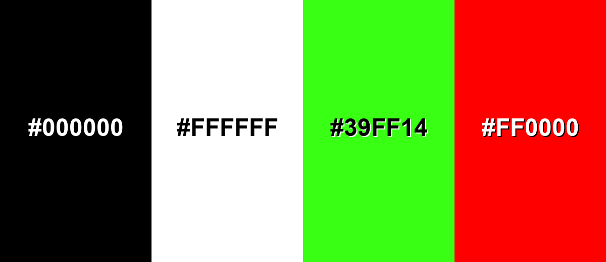
● Pair charcoal with soft off-whites rather than pure white (#FFFFFF) to prevent harsh glare, and avoid stacking it with pure black (#000000) or neon green (#39FF14) to prevent visual heaviness and vibration.
● When applying charcoal to ink-based printing, always evaluate a physical proof and adjust CMYK ink limits, as these deep neutrals can shift and appear muddy depending on paper stock warmth.
● If utilizing charcoal for UI text and labels, increase your baseline font weight and sizing to maintain readability, and ensure interactive hover states shift in lightness rather than just saturation.
Ask AI for a summary
 ChatGPT
 Perplexity
 Gemini
 Claude
 Grok
Grok
Charcoal color is a deep, smoky gray that looks like cooled ash or a soft, blackened stone. The standard charcoal hex code is #36454F, giving it a slightly cool, blue-gray cast rather than a flat black.
It's often perceived as grounded, serious, and modern—confident without the harshness of true black. Below, you'll find charcoal's color codes, conversions, pairing ideas, popular shades, and practical ways to use it in design.
Charcoal Color: Codes & Values
Use these values to match charcoal consistently across web, print, and product design—especially when you need a dark neutral with a cool undertone.
| Parameters | VALUE |
| HEX Code | #36454F |
| RGB DECIMAL | 54, 69, 79 |
| RGB PERCENTAGE | 21%, 27%, 31% |
| CMYK | 32%,13%,0%,69% |
| HSL | 204°, 19%, 26% |
| HSV (HSB) | 204°, 32%, 31% |
| Web Safe | #336666 |
Key Color Space Explanations:
- HEX - HEX is the most common way to specify a digital shade for web and UI. Use this value to match charcoal consistently across screens.
- RGB - RGB defines how much red, green, and blue light make the shade on displays. It is useful for CSS, app interfaces, and motion graphics.
- CMYK - CMYK is used for ink-based printing, where darker tones rely heavily on black (K). For best results, always check a proof because deep neutrals can shift on paper.
- HSL - HSL describes hue, saturation, and lightness, which is handy for building harmonious palettes. Charcoal sits in a cool hue range with low saturation and low lightness.
- Web Safe - Web-safe values approximate the shade using a limited palette used by older displays. It is mostly a fallback reference rather than a modern requirement.
Tip: lock in HEX (#36454F) for UI components, use RGB for on-screen animation/video work, and rely on CMYK with a printed proof to avoid unexpected shifts.
Charcoal Color Conversions
Need charcoal in a different color system? This conversion table helps you move between common formats without losing consistency.
| Parameters | VALUE | CSS |
| HEX | #36454f | #36454f |
| RGB DECIMAL | 54, 69, 79 | rgb(54,69,79) |
| RGB PERCENTAGE | 21%, 27%, 31% | rgb(21%,27%,31%) |
| CMYK | 32%,13%,0%,69% | cmyk(32%,13%,0%,69%) |
| HSL | 204°, 19%, 26% | hsl(204°, 19%, 26%) |
| HSV (or HSB) | 204°, 32%, 31% | -- |
| Web Safe | 336666 | #336666 |
| CIE-LAB | 28.3, -3.5, -7.8 | -- |
| XYZ | 5.06, 5.61, 8.18 | -- |
| xyY | 0.268, 0.298, 5.61 | -- |
| CIE-LCH | 28.3, 8.6, 246° | -- |
| CIE-LUV | 28.3, -7.3, -8.9 | -- |
| Hunter-Lab | 23.7, -3.3, -3.9 | -- |
| Binary | 00110110 01000101 01001111 | -- |
Want to generate Charcoal Color photos or posters? Try Media.io's AI Image Generator now!
Charcoal Color Meaning & Symbolism
Charcoal is commonly associated with stability, self-control, and understated sophistication. Because it sits between black and mid-gray, it often feels serious without being severe, which is a big part of Charcoal Color meaning in everyday choices like clothing, interiors, and digital products.
Psychological Effects
Charcoal can make a design feel calmer and more intentional—especially when it replaces pure black.
- Reduced Visual Noise - Charcoal helps simplify busy screens and layouts so key elements feel clearer.
- Quiet Focus - It supports concentration by keeping contrast controlled and backgrounds less distracting.
- Modern Professionalism - The tone reads mature and practical, which fits editorial and service-oriented design.
- Eye Comfort - Compared with true black, charcoal can feel softer for large blocks of color or long reading sessions.
- Potential Heaviness - Overusing charcoal without softer neutrals can make a page or room feel distant or overly formal.
Positive Associations
When balanced well, charcoal communicates confidence without shouting for attention.
- Stability - A steady, dependable base that helps other colors look more intentional.
- Sophistication - Understated elegance that feels premium without being flashy.
- Self-Control - A restrained tone that suggests discipline and clarity.
- Craftsmanship - Its link to drawing charcoal can hint at making, building, and hands-on skill.
- Resilience - Associations with ash and fire can subtly suggest endurance and strength.
Cultural Significance Across the World
Charcoal is more of a modern neutral than a single fixed symbol, so meaning often comes from context and materials.
- Fire And Ash References - Ties to charcoal and ash can imply survival, transformation, and persistence.
- Art And Drawing - As a classic sketching material, it can signal creativity, study, and craftsmanship.
- Minimalist Modern Neutral - In many regions, it's used as a sleek alternative to black in contemporary design.
- Context-Driven Meaning - Its symbolism often depends on lighting, textures, and surrounding tones more than tradition.
Design Applications
Charcoal is a versatile neutral that works as a foundation tone, a text alternative to pure black, or a grounding background for brighter accents.
Graphic Design Tips
- Use As A Base Neutral - Build your layout on charcoal, then introduce one accent color for hierarchy.
- Choose Softer Whites - Pair charcoal with off-whites for a friendlier look than pure #FFFFFF-style contrast.
- Plan Contrast Early - Increase font weight and sizing if you're using charcoal for text or UI labels.
- Control Your Accents - Keep bright colors for CTAs and highlights so the interface stays focused.
- Add A Second Neutral - Mix in warm neutrals or subtle grays to avoid a flat, overly dense composition.
Pro tip: if charcoal is your main background, test your full type scale (not just headings) and make hover/focus states shift lightness—not only saturation—so interactions stay obvious.
Charcoal Color in Photography & Video
- Use For Moody Backdrops - Charcoal backgrounds make skin tones and product highlights pop without the harshness of black.
- Protect Shadow Detail - Lift the deepest shadows slightly so charcoal areas don't crush to pure black in export.
- Pair With Warm Materials - Wood, paper, and fabric textures help charcoal look rich instead of cold.
- Keep Accents Muted - Dusty blues, olives, and plums hold the cinematic feel without visual vibration.
- Match Across Scenes - Use a consistent charcoal reference so sets, props, and graphics feel cohesive.
Recommended Tool for Image Enhancement: When incorporating charcoal color into your photography projects, Media.io's AI Image tools can help you achieve more refined results. With AI-powered color enhancement, photo colorization, image upscaling, and old photo restoration, you can easily enrich charcoal color tones, improve overall image quality, and highlight the color's elegant and sophisticated aesthetic.
Color Combinations
Charcoal plays well with both cool and warm partners. Use it as a base, then decide whether you want the palette to feel crisp and modern, earthy and grounded, or bold with controlled contrast.
Complementary Colors
A warm, earthy counterpart brings out charcoal's cool undertone and adds natural contrast without looking neon.
Complementary Palette Example: Pair charcoal with a deep warm umber and a soft ivory for a balanced, modern-neutral palette.
Analogous Color Schemes
Analogous colors sit adjacent to each other on the color wheel, creating harmonious, cohesive palettes with subtle variation.
Charcoal with deep teal and steel blue feels calm, technical, and clean.
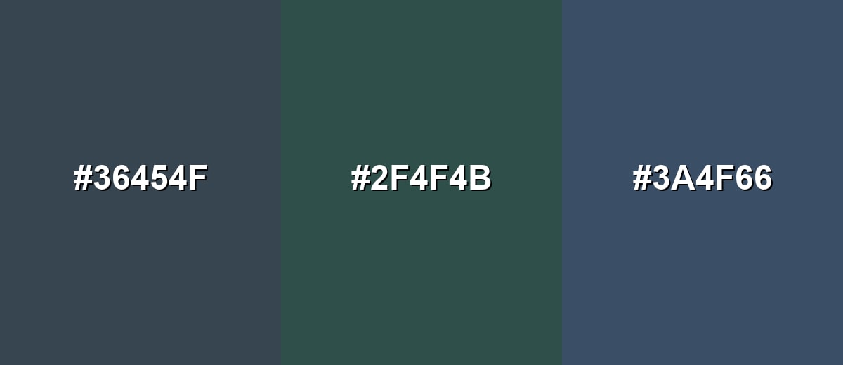
- Charcoal: #36454F
- Deep Teal: #2F4F4B
- Steel Blue Gray: #3A4F66
Charcoal with blue-gray and green-gray creates a subtle, nature-meets-urban look.
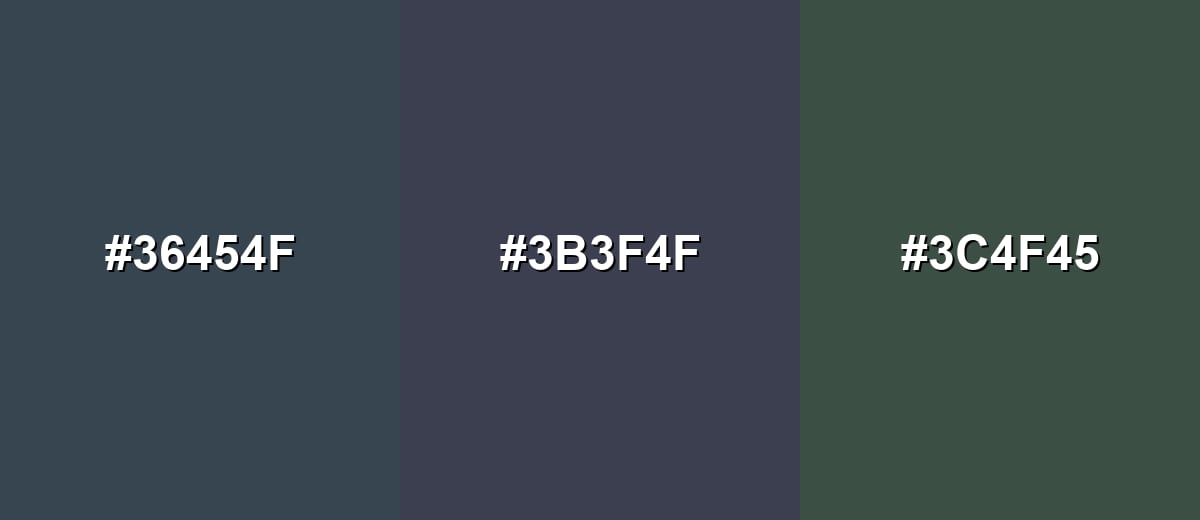
- Charcoal: #36454F
- Blue Gray: #3B3F4F
- Green Gray: #3C4F45
Triadic & Tetradic Combinations
A triadic set adds variety while staying controlled and muted.
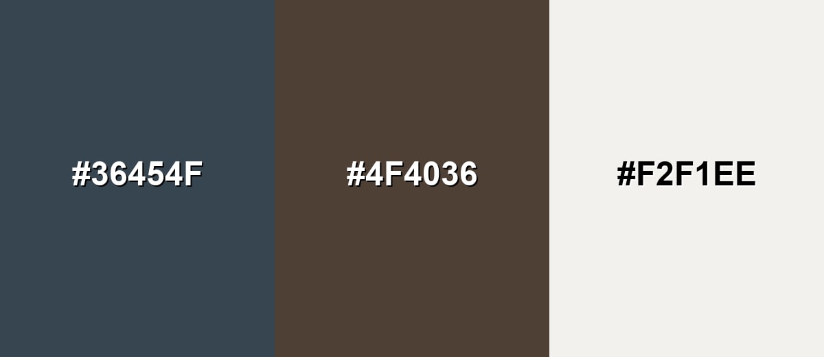
Charcoal with muted plum and olive supports modern branding, editorial layouts, and product palettes.
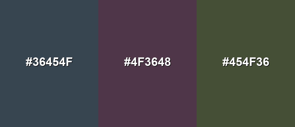
- Charcoal: #36454F
- Muted Plum: #4F3648
- Muted Olive: #454F36
Colors to Avoid
While charcoal color is remarkably versatile, certain combinations can create problematic visual effects:
- Pure Black (#000000) - Stacking pure black with charcoal often removes separation and makes layouts feel overly heavy.
- Pure White (#FFFFFF) - High-contrast white can look stark and clinical against charcoal, especially on large surfaces.
- Neon Green (#39FF14) - Extremely bright neon accents can overpower charcoal and create visual vibration in UI and print.
- Pure Red (#FF0000) - Fully saturated red can feel harsh next to charcoal and may dominate the message unless carefully toned down.
Shades, Tints & Variations of Charcoal Color
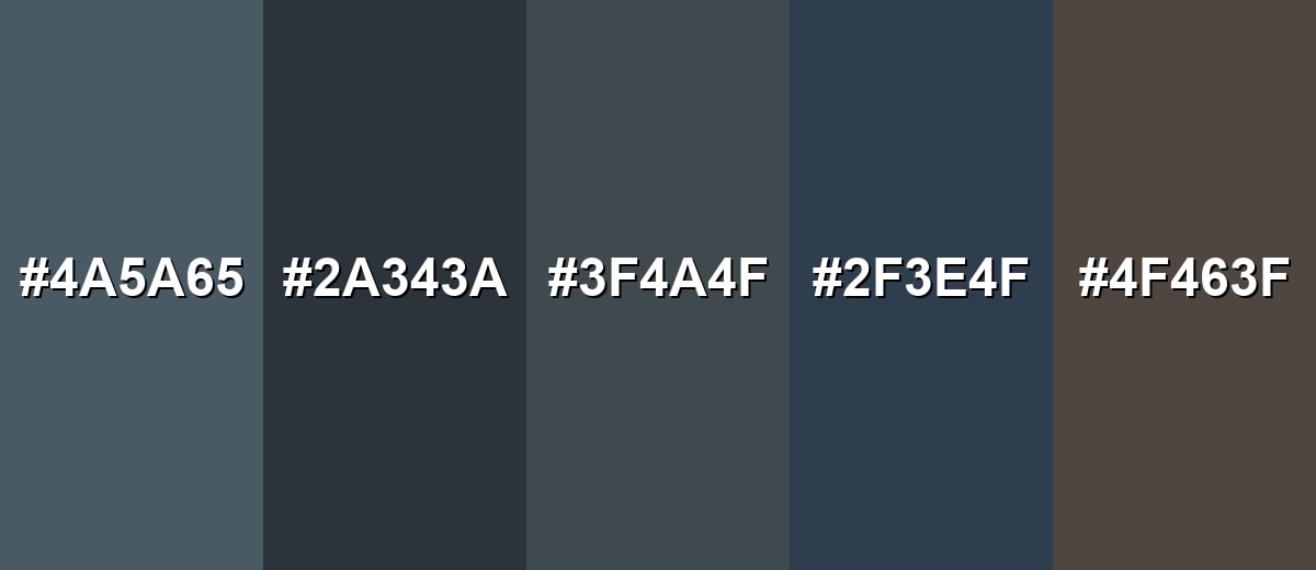
Charcoal isn't just one shade—it ranges from lighter smoky grays to near-black depths, plus warmer and bluer twists. Exploring these variations makes it easier to keep your palette consistent while still building clear hierarchy across backgrounds, typography, and accents.
- Soft Charcoal (#4A5A65) - A lighter, airier take on charcoal that keeps the smoky character with less weight. It's best used for Large backgrounds, cards, and secondary panels where pure dark tones feel too intense.
- Deep Charcoal (#2A343A) - A darker, near-black shade that still holds a subtle cool undertone. It's best used for Headers, navigation bars, hero sections, and premium packaging accents.
- Charcoal Gray (#3F4A4F) - A balanced gray that sits close to the classic charcoal look with a neutral feel. It's best used for Body text alternatives, outlines, icons, and understated branding systems.
- Charcoal Blue (#2F3E4F) - A cooler, bluer variation that leans more technical and modern. It's best used for Tech UI themes, dashboards, and palettes that need a crisp, cool foundation.
- Warm Charcoal (#4F463F) - A slightly warmer version that feels more earthy and less steely. It's best used for Interiors, lifestyle branding, and designs that pair with wood, tan, or cream neutrals.
Industry Applications
Because it is neutral, strong, and easy to pair, charcoal shows up across many industries as a base tone or supporting shade—especially when you want a modern look without the sharpness of pure black.
Fashion & Beauty
- Everyday Wardrobe Base - Works as a dependable neutral for basics, tailoring, and layering pieces.
- Premium Minimal Styling - Creates a high-end feel with fewer colors and cleaner lines.
- Easy Seasonal Pairing - Supports muted greens, dusty blues, and warm neutrals without clashing.
- Modern Editorial Look - Reads sophisticated in lookbooks, packaging, and campaign layouts.
Interior Design & Decor
- Feature Walls And Cabinetry - Adds depth without the stark, dramatic edge of true black.
- Metal And Hardware Finishes - Fits fixtures, trims, and accents that aim for a modern, durable vibe.
- Warm Material Balance - Pairs naturally with wood tones, linen textures, and creamy neutrals.
- Inviting Contrast - Helps light decor elements stand out while keeping the room grounded.
Branding & Marketing
- Confident Brand Foundation - Supports premium, technical, and service-oriented identities with a calm voice.
- Better Than Pure Black For UI - Often feels friendlier and easier on the eyes in digital touchpoints.
- Accent-First Recognition - Lets one signature accent color do the talking while charcoal keeps systems consistent.
- Clean Editorial Layouts - Works well for headlines, pull quotes, and photo-forward compositions.
Conclusion
Charcoal is a smoky, near-black neutral that feels modern, steady, and easier to live with than pure black. Anchored by HEX #36454F, it's a smart choice for backgrounds, typography, and brand systems where you want structure without harsh contrast. Pair it with soft off-whites for comfort, bring in warm browns or muted greens for balance, and explore its variations—from Soft Charcoal to Deep Charcoal—when you need clear hierarchy across a design. Used thoughtfully, charcoal stays timeless across UI, print, photography, and interiors.
Design Smarter with AI: Media.io is an online AI studio that empowers creators with advanced image generation and enhancement tools. From text-to-image and image-to-image creation to AI upscaling and color optimization, it enables fast, creative, and professional results—all in your browser.

Frequently Asked Questions About Charcoal Color
Charcoal is a very dark gray that resembles cooled ash or burnt wood. It often has a slight blue-gray undertone, which makes it feel softer than pure black.
It can be either, but the most common charcoal leans cool because of subtle blue undertones. Warmer versions add a bit of brown, which helps it pair well with creams and wood textures.
Soft off-whites, warm browns, muted greens, dusty blues, and gentle pinks or plums all work well. Charcoal is easiest to style when you keep the partner tones slightly muted rather than fully saturated.
No. Black is the absence of light in digital terms, while charcoal is a dark gray with visible tone and undertone. That difference often improves readability and reduces harsh contrast.
For body text, use a soft off-white instead of pure white to avoid glare. For accents and links, pick a single brighter hue that still meets contrast requirements at your chosen font size.
Start with the CMYK values as a guide, then proof on the actual paper stock. Deep neutrals can shift with ink limits and paper warmth, so small adjustments to black and cyan often help keep it crisp.


