

Lime color is a vivid yellow-green inspired by the bright peel and juice of a fresh lime. On screens, it's commonly represented as #00FF00, a highly saturated green that reads instantly.
Because it sits right between green and yellow, lime feels energetic and fresh—but it can look intense if you don't balance it. Below, you'll find the key color codes, smart pairings, shade options, and practical design tips.
Lime Color: Codes & Values
These are the standard lime color values designers use across web, UI, and print workflows.
| Parameters | VALUE |
| HEX Code | #00FF00 |
| RGB DECIMAL | 0, 255, 0 |
| RGB PERCENTAGE | 0%, 100%, 0% |
| CMYK | 100%,0%,100%,0% |
| HSL | 120°, 100%, 50% |
| HSV (HSB) | 120°, 100%, 100% |
| Web Safe | #00FF00 |
Key Color Space Explanations:
- HEX - HEX is the most common way to define lime for web and UI work. It represents the red, green, and blue channels as a six-digit code.
- RGB - RGB describes lime by mixing light on screens using red, green, and blue values. It is the most direct format for digital displays and animations.
- CMYK - CMYK is used for printing and describes how much cyan, magenta, yellow, and black ink is applied. Bright lime can shift in print, so a proof helps.
- HSL - HSL explains lime by hue, saturation, and lightness, which is useful for creating consistent tints and tones. It is often easier to adjust than RGB when building palettes.
- Web Safe - Web-safe values are a legacy set of colors that historically displayed consistently across older systems. Lime is already a web-safe value in this palette.
For most digital projects, start with HEX (#00FF00) or RGB (0, 255, 0), then fine-tune with HSL if you need softer tints or deeper tones.
Lime Color Conversions
Need lime in another format? Use this quick reference table for common design, print, and color-science conversions.
| Parameters | VALUE | CSS |
| HEX | #00ff00 | #00ff00 |
| RGB DECIMAL | 0, 255, 0 | rgb(0,255,0) |
| RGB PERCENTAGE | 0%, 100%, 0% | rgb(0%,100%,0%) |
| CMYK | 100%,0%,100%,0% | cmyk(100%,0%,100%,0%) |
| HSL | 120°, 100%, 50% | hsl(120°,100%,50%) |
| HSV (or HSB) | 120°, 100%, 100% | -- |
| Web Safe | 00ff00 | #00ff00 |
| CIE-LAB | 87.73, -86.18, 83.18 | -- |
| XYZ | 0.3576, 0.7152, 0.1192 | -- |
| xyY | 0.3000, 0.6000, 0.7152 | -- |
| CIE-LCH | 87.73, 119.78, 136.60° | -- |
| CIE-LUV | 87.73, -83.08, 107.40 | -- |
| Hunter-Lab | 84.80, -74.40, 74.40 | -- |
| Binary | 00000000 11111111 00000000 | -- |
Want to generate Lime Color photos or posters? Try Media.io's AI Image Generator now!
Lime Color Meaning & Symbolism
Lime color is widely associated with freshness, energy, and a sense of motion. It often reads as young, modern, and active, which is why it shows up in sporty branding, tech highlights, and safety-style cues. In everyday life, this shade can signal something lively and new, like growth, zest, or a bold update.
Psychological Effects
Lime is a fast "look at me" color, so it tends to influence attention and perceived energy right away.
- Instant Attention - Because lime is so bright, it grabs attention quickly and naturally pulls the eye through a layout.
- Momentum & Motion - It can make a design feel active and forward-moving, which is why it's common in sporty and techy visuals.
- Freshness Cue - Lime often signals "new" or "clean," helping interfaces feel lighter when used in small doses.
- Focus on Status - In UI, lime can spotlight success states, active toggles, key numbers, or progress indicators.
- Visual Fatigue Risk - Large lime areas can feel harsh on screens, so it's usually better as an accent than a full-page background.
Positive Associations
When lime is balanced with stable neutrals, it reads modern, upbeat, and easy to spot.
- Fresh And Zesty - It hints at citrus, spring-like energy, and a crisp "just updated" vibe.
- High Visibility - Lime reads quickly, making it useful for highlights, callouts, and attention-led design.
- Modern And Energetic - The color feels current and digital-friendly, especially in clean UI systems.
- Clean Contrast - Against deep neutrals, lime looks sharp and organized rather than messy or loud.
- Accent-Friendly - Used sparingly, it boosts hierarchy and scannability without adding heaviness.
Cultural Significance Across the World
Across many contexts, lime connects to nature cues and modern visibility signals.
- Nature & Growth - Lime is often tied to plants, spring, and growth-oriented visuals.
- Citrus & Fresh Flavor - It's strongly associated with lime fruit, zest, and refreshing food-and-drink cues.
- Alertness & Visibility - Similar yellow-green tones suggest high visibility, which is why they show up in sporty or safety-inspired styling.
- Modern Youthfulness - In contemporary design, lime can signal a young, active, trend-forward feel.
Design Applications
Lime works best when you treat it like a spotlight. Start with a clear role for it in the layout, then control contrast and spacing so it feels intentional instead of overwhelming.
Graphic Design Tips
- Use It For Hierarchy - Reserve lime for key actions (CTAs), badges, or one "hero" highlight so it stays meaningful.
- Anchor With Neutrals - Pair lime with deep charcoal or structured grays to keep the overall look stable and readable.
- Keep Backgrounds Calm - Avoid large fields of pure lime; use it in smaller blocks, lines, or icon fills instead.
- Mind Text Contrast - Dark text is usually clearer on lime than white, especially for small type.
- Soften When Needed - If it feels too neon, shift slightly toward a deeper green or reduce saturation using HSL adjustments.
Pro tip: If lime starts to overpower your layout, swap it from "primary" to "accent" and give it more breathing room—spacing often fixes what color tweaking can't.
Lime Color in Photography & Video
- Accent Props - Use lime-colored items (clothing, packaging, small objects) to create a crisp focal point.
- Controlled Highlights - Boost lime in selective areas rather than globally to avoid a harsh, neon cast.
- Clean Background Choices - Neutral backdrops (gray, charcoal, deep green) help lime pop without looking noisy.
- UI-Style Motion Graphics - Lime works well for progress bars, data overlays, and energetic title treatments.
- Print vs Screen Checks - If the work will be printed, test proofs—bright greens can shift depending on paper and ink.
Recommended Tool for Image Enhancement: When incorporating lime color into your photography projects, Media.io's AI Image tools can help you achieve more refined results. With AI-powered color enhancement, photo colorization, image upscaling, and old photo restoration, you can easily enrich lime color tones, improve overall image quality, and highlight the color's elegant and sophisticated aesthetic.
Color Combinations
Lime is easiest to style when you choose one strong partner and one stabilizing neutral. The palettes below show dependable ways to build contrast, harmony, and variety without losing control of the overall look.
Complementary Colors
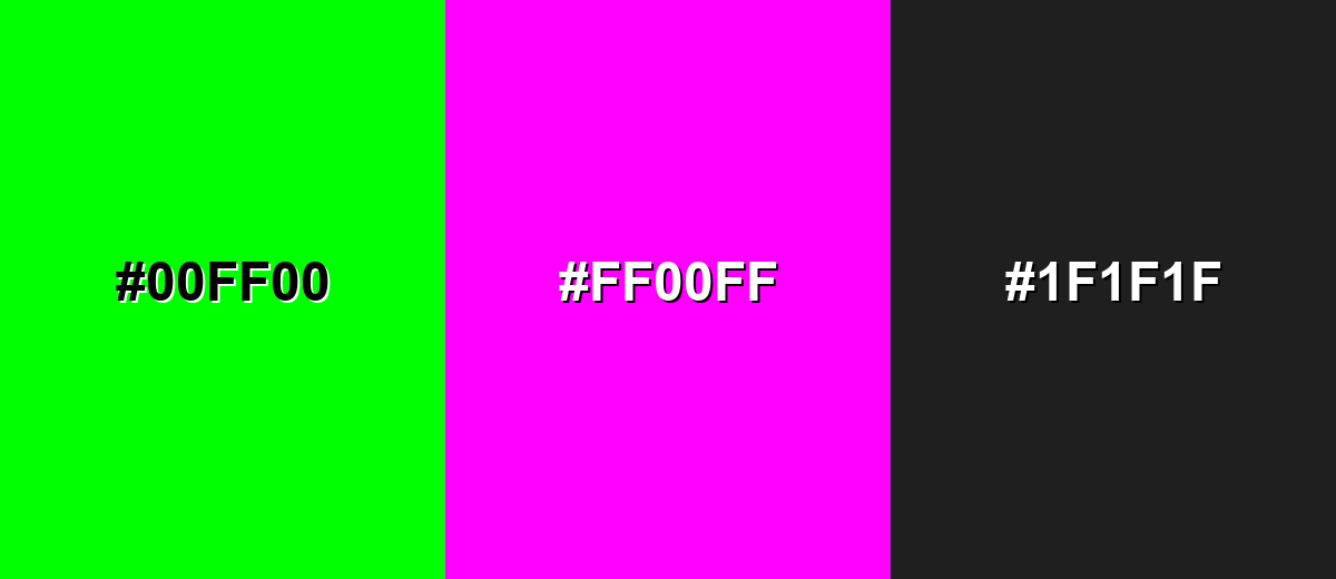
A complementary partner sits opposite lime on the color wheel, creating maximum contrast and a bold, modern feel. This is ideal for attention-led layouts, but it works best when one shade is dominant and the other is used as an accent.
Complementary Palette Example: Pair lime with vivid magenta, then anchor the set with a dark neutral for balance.
Analogous Color Schemes
Analogous colors sit adjacent to each other on the color wheel, creating harmonious, cohesive palettes with subtle variation.
Yellow-lime to green creates a zesty, nature-forward gradient that feels fast and fresh.
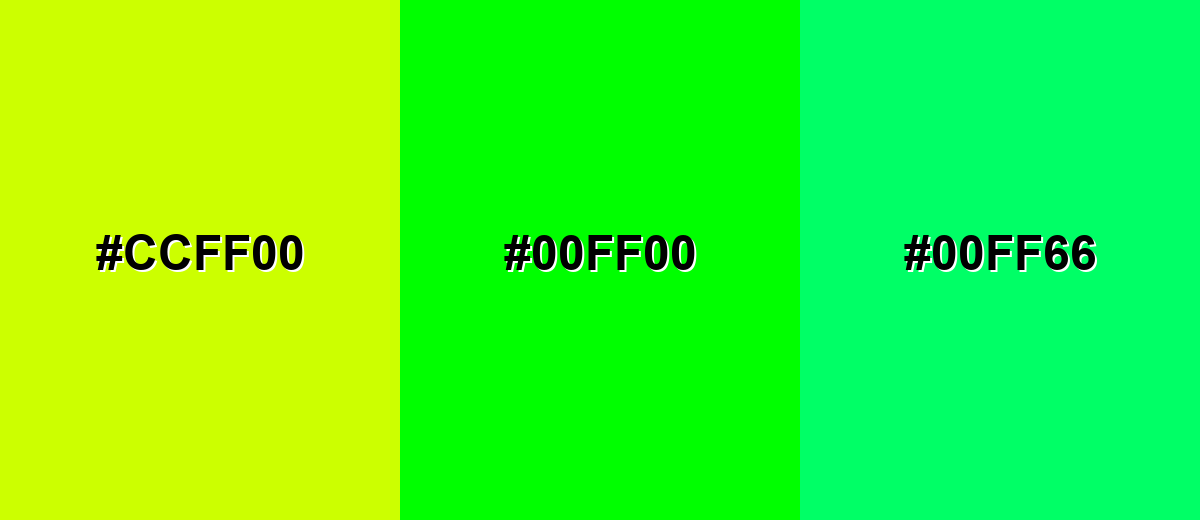
- Acid Yellow: #CCFF00
- Lime: #00FF00
- Spring Green: #00FF66
Green to aqua-leaning tones feels cooler and more digital, great for modern UI accents.
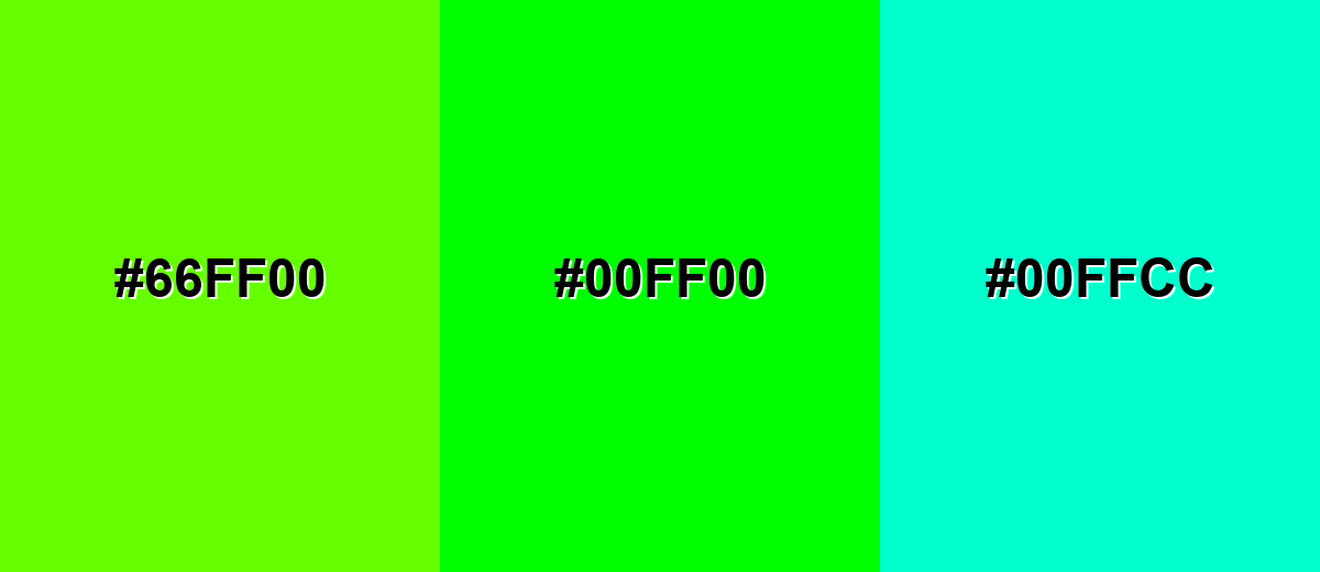
- Yellow-Green: #66FF00
- Lime: #00FF00
- Aqua Mint: #00FFCC
Triadic & Tetradic Combinations
A triadic palette uses three evenly spaced hues for strong contrast with a playful, balanced energy.
Lime with red and blue creates a high-impact set that works well for bold graphics and sports-style visuals.
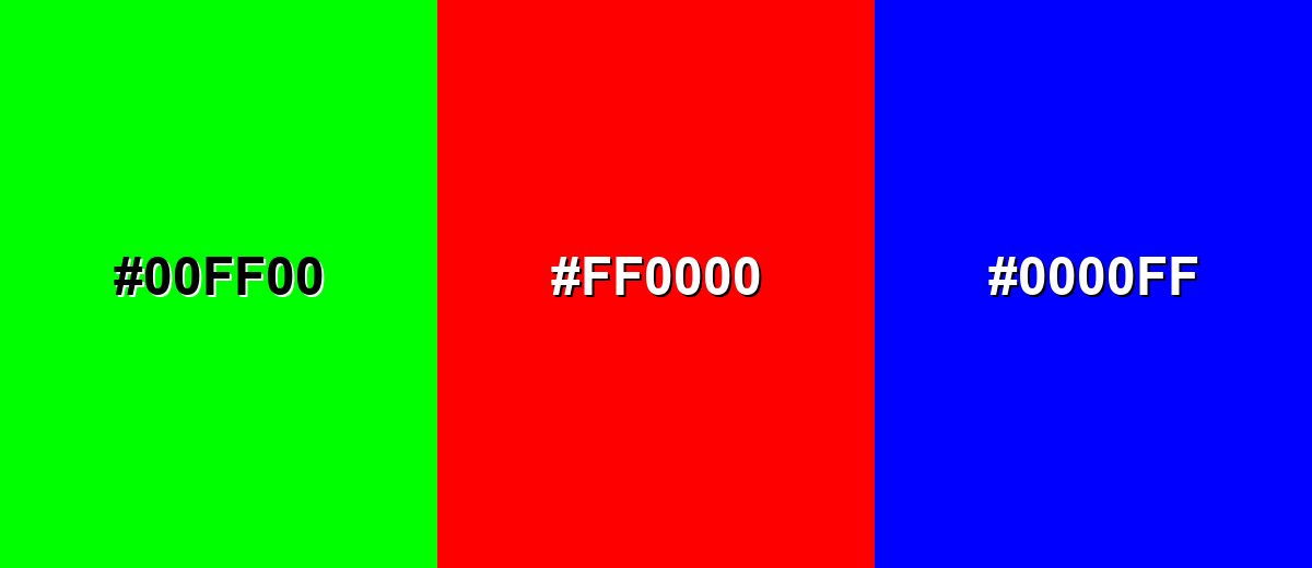
- Lime: #00FF00
- Red: #FF0000
- Blue: #0000FF
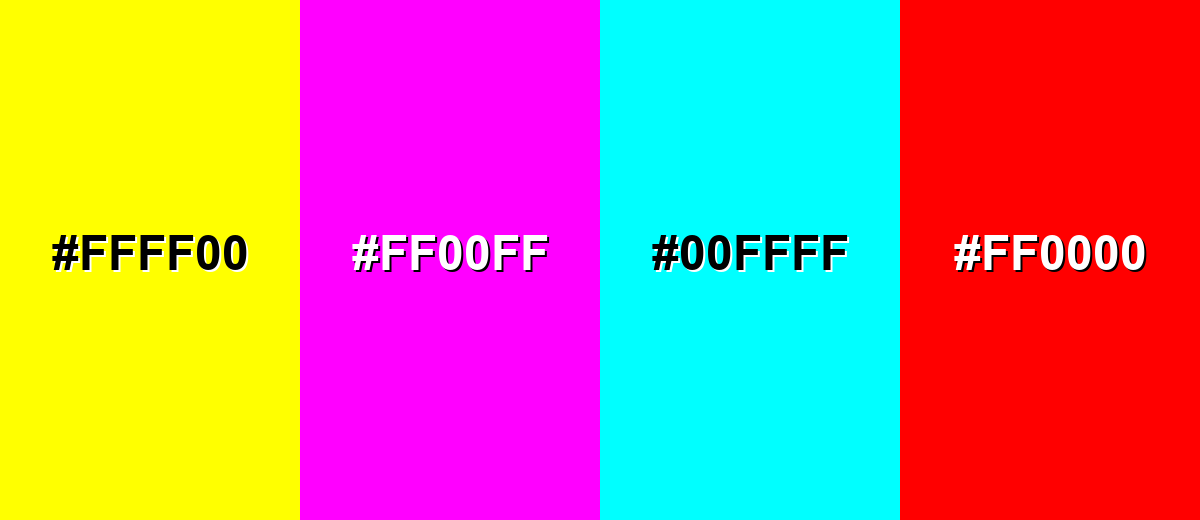
Colors to Avoid
While lime color is remarkably versatile, certain combinations can create problematic visual effects:
- Pure Yellow (#FFFF00) - Close in brightness and intensity, it can blur edges and reduce readability, especially in UI highlights.
- Neon Magenta (#FF00FF) - High saturation against lime can create visual vibration, making text and thin shapes feel unstable.
- Pure Cyan (#00FFFF) - Both are extremely bright and compete for attention, which can make layouts feel noisy and unfocused.
- Pure Red (#FF0000) - Strong contrast can look aggressive and can be hard to balance; it often reads as warning-like when combined with lime.
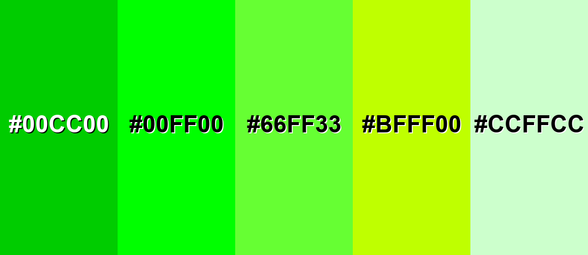
Shades, Tints & Variations of Lime Color
Lime isn't just one "neon" look—there's a useful range from softer, airy tints to deeper greens that feel easier on the eyes. Exploring variations helps you keep the same energetic personality while dialing the intensity up or down for different layouts.
- Deep Lime (#00CC00) - A darker, calmer version that keeps the lively character but feels less neon. It's best used for Buttons, icons, and charts where you want lime energy with better comfort..
- Classic Lime (#00FF00) - The brightest, most recognizable lime tone with maximum saturation. It's best used for Accents, highlights, and attention cues in modern digital layouts..
- Electric Lime (#66FF33) - A slightly warmer, more playful lime that reads energetic without being as harsh as pure lime. It's best used for Brand accents, posters, and sporty visuals..
- Yellow Lime (#BFFF00) - A yellow-leaning variation that feels zesty and citrus-forward. It's best used for Food, beverage, and summer-themed graphics..
- Soft Lime Tint (#CCFFCC) - A pale tint that suggests freshness while staying gentle on the eyes. It's best used for Background panels, subtle UI fills, and lightweight packaging..
Industry Applications
Because lime reads quickly and feels modern, it shows up in industries that value speed, freshness, and visibility. The key is controlling how much you use and what you pair it with.
Fashion & Beauty
- Sporty Streetwear Accents - Lime works well for high-energy trims, logos, and details where visibility matters.
- Performance-Inspired Styling - Use it to suggest motion and activity, especially when paired with dark neutrals.
- Pop Color Drops - A small lime accessory or nail/liner accent can deliver a bold, modern punch without overwhelming the look.
- Campaign Graphics - Lime brings instant "newness" to promotional visuals, especially for active or youth-forward collections.
Interior Design & Decor
- Statement Details - Keep lime to cushions, art, or one standout object for a clean, intentional effect.
- Ground It With Texture - Lime pairs nicely with light woods, concrete grays, and natural materials to avoid a neon feel.
- Modern Contrast - Use deep greens or charcoal nearby to stabilize the space while letting lime pop.
- Small Zones - Try lime in a limited area (like a nook or shelf styling) instead of a full wall for better comfort.
Branding & Marketing
- UI Highlights For Tech - Lime is great for active states, toggles, and performance cues in SaaS and apps.
- Packaging Shelf Impact - It adds strong "shelf pop," especially when paired with matte neutrals or kraft-like textures.
- Fresh Flavor Signals - In food and beverage, lime instantly suggests citrus and freshness for seasonal promos or labels.
- Clear Callouts - Use lime for badges, stickers, and key steps in education/creator tools where scannability matters.
Conclusion
Lime color stands out for its bright yellow-green punch and its ability to feel fresh, fast, and modern at a glance. When you use #00FF00 as an accent—paired with stable neutrals or deeper greens—it can sharpen hierarchy, boost scannability, and make UI, branding, packaging, and content graphics feel more energetic without turning chaotic. The trick is balance: test contrast in real layouts, keep large blocks to a minimum, and adjust saturation or choose a calmer shade when you want the same lime personality with a softer mood.
Design Smarter with AI: Media.io is an online AI studio that empowers creators with advanced image generation and enhancement tools. From text-to-image and image-to-image creation to AI upscaling and color optimization, it enables fast, creative, and professional results—all in your browser.

Frequently Asked Questions About Lime Color
Lime is a vivid yellow-green that looks bright, fresh, and highly saturated. It is often used as an accent because it attracts attention quickly.
A commonly used digital lime value is #00ff00. It is a pure, fully saturated green in the RGB system.
They are related but not identical. Neon green often looks similar or slightly cooler, while chartreuse usually leans more yellow; lime typically sits between green and yellow with a sharp, bright feel.
Lime pairs well with deep neutrals like charcoal, with complementary magenta for bold contrast, and with nearby yellow-green or aqua tones for smooth gradients. For calmer palettes, add grays, dark greens, or muted blues.
Use it in smaller areas, add plenty of whitespace, and pair it with dark neutrals. You can also reduce saturation, shift it slightly toward a deeper green, or choose a softer tint for backgrounds.
Lime can work well for UI accents, but text contrast needs care. Dark text on lime is usually more readable than white text, and thin elements may need a darker shade for clear visibility.


