

Cerise color is a vivid pink-red that looks like ripe cherry skin with a bright, slightly magenta edge. Its defining hex code is #DE3163, giving it a saturated, lively look on screens.
Often seen as energetic, romantic, and attention-grabbing (without the sharpness of pure red), cerise shifts warmer or cooler depending on lighting and nearby tones. Below, you'll find its exact color codes, conversions, pairings, shades, and practical design uses.
Cerise Color: Codes & Values
If you're building a cerise palette for web, print, or branding, these are the core values you'll want to copy and paste.
| Parameters | VALUE |
| HEX Code | #DE3163 |
| RGB DECIMAL | 222, 49, 99 |
| RGB PERCENTAGE | 87%, 19%, 39% |
| CMYK | 0%,89%,55%,13% |
| HSL | 343°, 72%, 53% |
| HSV (HSB) | 343°, 78%, 87% |
| Web Safe | #CC3399 |
Key Color Space Explanations:
- HEX - HEX is the most common way to specify cerise for web design and digital tools. Use it for consistent UI styling, brand guidelines, and quick palette building.
- RGB - RGB defines cerise using red, green, and blue light values for screens. It is the go-to format for video, UI components, and any display-based work.
- CMYK - CMYK is used for printing and describes ink percentages. Because cerise is highly saturated, proofs and paper choice can noticeably change how it looks in print.
- HSL - HSL explains cerise in terms of hue, saturation, and lightness, which is helpful for making lighter tints or darker accents. Designers often tweak lightness to improve readability and contrast.
- Web Safe - Web safe is the closest legacy-safe approximation for older display constraints. It is useful when you want a simplified fallback that stays visually close to cerise.
For most digital projects, start with HEX (#DE3163) or RGB (222, 49, 99), then adjust HSL lightness for hover states, backgrounds, and accessible variations.
Cerise Color Conversions
Need cerise in another format for a specific tool or workflow? Here's a quick conversion table you can reference for design, development, and print production.
| Parameters | VALUE | CSS |
| HEX | #de3163 | #de3163 |
| RGB DECIMAL | 222, 49, 99 | rgb(222,49,99) |
| RGB PERCENTAGE | 87%, 19%, 39% | rgb(87%,19%,39%) |
| CMYK | 0%,89%,55%,13% | cmyk(0%,89%,55%,13%) |
| HSL | 343°, 72%, 53% | hsl(343°,72%,53%) |
| HSV (or HSB) | 343°, 78%, 87% | -- |
| Web Safe | cc3399 | #cc3399 |
| CIE-LAB | L* 50.8, a* 67.9, b* 18.2 | -- |
| XYZ | 31.2, 18.7, 13.0 | -- |
| xyY | 0.494, 0.296, 18.7 | -- |
| CIE-LCH | 50.8, 70.3, 15° | -- |
| CIE-LUV | 50.8, 112.4, 6.5 | -- |
| Hunter-Lab | 43.2, 54.1, 15.0 | -- |
| Binary | 11011110 00110001 01100011 | -- |
Want to generate Cerise Color photos or posters? Try Media.io's AI Image Generator now!
Cerise Color Meaning & Symbolism
Cerise is commonly linked to vitality, playful confidence, and a modern kind of romance. In everyday life, it often reads as expressive and youthful, making it a strong choice when you want a message to feel upbeat and memorable. When people look up Cerise Color meaning, they are usually trying to understand why it feels both bold and friendly at the same time.
Psychological Effects
Cerise brings high energy, so it naturally pulls focus in a layout or scene.
- Attention Boost - Cerise tends to raise visual excitement, making it ideal for highlights and key moments.
- Approachable Boldness - The pink influence can feel friendlier than classic red while still being strong and confident.
- Creative Spark - In branding, it often suggests creativity, optimism, and expressive personality.
- Modern Romance - It signals romance in a fresher, more playful way than deeper reds.
- Overstimulation Risk - Used too heavily, it may feel loud or distracting, especially in dense layouts and bright environments.
Positive Associations
When balanced with calmer tones, cerise can feel upbeat, stylish, and memorable.
- Confidence - A bold, forward color that reads self-assured without being harsh.
- Celebration - Its cherry-bright vibe fits festive moments and launch-style messaging.
- Youthful Energy - Often perceived as lively and fresh, especially in digital design.
- Playfulness - Adds personality and charm to otherwise neutral, minimal palettes.
- Expressiveness - Helps brands and visuals feel more emotive and human.
Cultural Significance Across the World
Like many saturated pink-red hues, cerise can change meaning based on context, audience, and setting.
- Cherry Inspiration - The name's link to cherries gives it a naturally sweet, bright, celebratory feel.
- Fashion-Forward Style - Common in expressive aesthetics where bold color is part of identity.
- Romantic Signals - Frequently connected to modern romance, flirtation, and gifting moments.
- Event Energy - Often used in party, nightlife, and seasonal visuals to feel vivid and memorable.
Design Applications
Cerise is easiest to use when it has a clear role: accent, emphasis, or a signature brand hue. The key is balancing its saturation with calmer tones so it stays vibrant without overpowering the layout.
Graphic Design Tips
- Use cerise as a focal color for CTAs, badges, price tags, or key highlights rather than full-page fills.
- Give it breathing room with clean spacing so it reads intentional, not noisy.
- Pair it with calm neutrals in typography-heavy layouts to keep long reads comfortable.
- Create hierarchy with tints and deeper variations (instead of adding more competing brights).
- In brand systems, define a primary cerise and a darker support shade for consistency across sizes and surfaces.
Pro tip: if cerise feels "too loud," don't desaturate first—try lowering its usage area (accent-only) and tightening the surrounding palette for a cleaner, more premium look.
Cerise Color in Photography & Video
- Use cerise props or wardrobe as a controlled pop that anchors the subject in lifestyle shoots.
- In color grading, keep an eye on reds and magentas so skin tones don't skew too pink.
- For product shots, test lighting temperature—cerise can look warmer under tungsten and cooler under daylight.
- In motion graphics, reserve cerise for key beats (titles, transitions, markers) to guide attention.
- For social content, balance cerise with simpler backgrounds so compression doesn't muddy fine details.
Recommended Tool for Image Enhancement: When incorporating cerise color into your photography projects, Media.io's AI Image tools can help you achieve more refined results. With AI-powered color enhancement, photo colorization, image upscaling, and old photo restoration, you can easily enrich cerise color tones, improve overall image quality, and highlight the color's elegant and sophisticated aesthetic.
Color Combinations
Cerise pairs well with cool greens for contrast, soft neutrals for balance, and deep blues for a more editorial feel. The palettes below give you reliable starting points for branding, UI, illustration, and styling.
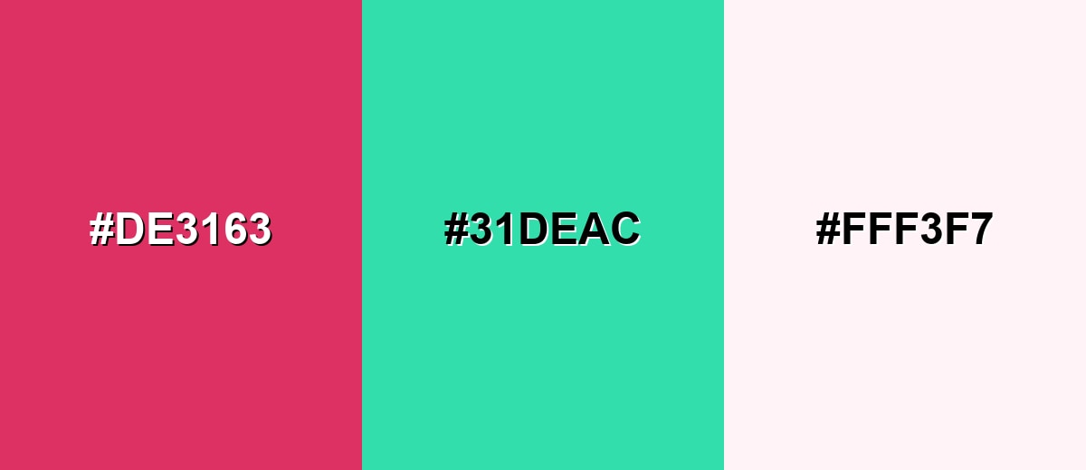
Complementary Colors
The complementary palette uses a green-turquoise opposite to cerise to create strong, lively contrast. This is great for callouts, sports-style graphics, and bold brand moments where you want instant separation.
Complementary Palette Example: Try cerise with a fresh seafoam counterpoint and a warm, near-white base to keep the overall look clean.
Analogous Color Schemes
Analogous colors sit adjacent to each other on the color wheel, creating harmonious, cohesive palettes with subtle variation.
A pink-leaning analogous set that stays bright but cohesive for beauty, lifestyle, and playful UI accents.
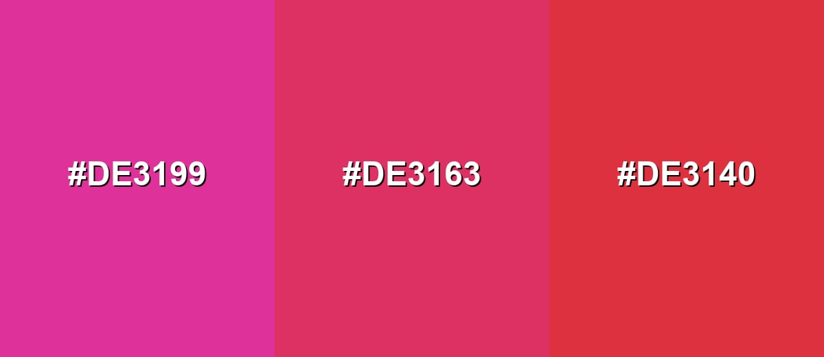
- Pink Magenta: #DE3199
- Cerise: #DE3163
- Cherry Red: #DE3140
A warmer-to-cooler neighboring mix that feels dynamic while still harmonious in illustrations and hero graphics.
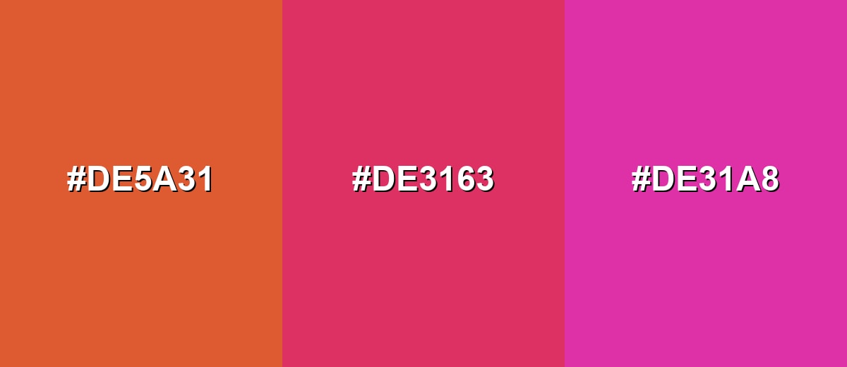
- Coral Ember: #DE5A31
- Cerise: #DE3163
- Orchid Pink: #DE31A8
Triadic & Tetradic Combinations
A triadic palette spreads hues evenly for a colorful, upbeat look that still feels intentional.
Use cerise with a lively green and a clear blue to build energetic visuals with distinct sections.
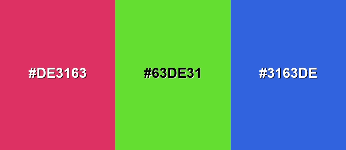
- Cerise: #DE3163
- Spring Green: #63DE31
- Royal Blue: #3163DE
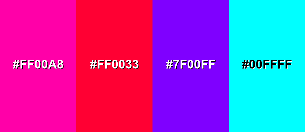
Colors to Avoid
While cerise color is remarkably versatile, certain combinations can create problematic visual effects:
- Neon Fuchsia (#FF00A8) - Too close in intensity and saturation, which can create harsh vibration and make cerise look dull or uneven.
- Hot Signal Red (#FF0033) - Competes directly with cerise and can push the palette into an aggressive, warning-like feel.
- Electric Violet (#7F00FF) - The strong blue bias can clash with cerise and produce a noisy, high-contrast look that is hard to balance.
- Pure Cyan (#00FFFF) - Extremely bright and cool, making cerise appear muddy by comparison and increasing eye strain in digital layouts.
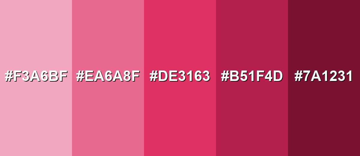
Shades, Tints & Variations of Cerise Color
Cerise isn't just one "loud" pink-red—its tints and deeper shades help you build contrast, hierarchy, and mood without switching to a totally different hue. Use lighter options for backgrounds and subtle UI, and lean into deeper cerise tones for premium accents and strong anchors.
- Pale Cerise (#F3A6BF) - A soft, airy tint that keeps a rosy character without the strong punch of full cerise. It's best used for Background washes, subtle highlights, onboarding screens, and gentle packaging accents.
- Soft Cerise (#EA6A8F) - A balanced mid-light berry tone that feels friendly and modern with less visual intensity. It's best used for Secondary buttons, UI chips, editorial graphics, and lifestyle branding.
- Classic Cerise (#DE3163) - The vivid pink-red core shade with high saturation and a cherry-like brightness. It's best used for Brand accents, hero highlights, calls to action, and statement details in visuals.
- Deep Cerise (#B51F4D) - A darker, richer version that reads more mature and premium while staying expressive. It's best used for Headers, emphasis text on light backgrounds, luxury packaging, and evening-style palettes.
- Dark Cerise (#7A1231) - A wine-like shade that adds depth and contrast with a muted cherry undertone. It's best used for Background panels, elegant typography, UI navigation bars, and contrast anchoring.
Industry Applications
Cerise shows up across digital products and physical design because it is memorable and easy to spot at a glance. It works best when the palette gives it room to breathe and a clear job to do.
Fashion & Beauty
- Cerise reads as playful and confident, making it a natural fit for cosmetics, accessories, and statement pieces.
- Use it as a hero shade for seasonal drops, limited editions, or bold packaging moments.
- Balance it with calm supporting tones to avoid an overly sweet or neon feel.
- In beauty visuals, keep color grading consistent so cerise stays vibrant without shifting toward purple.
Interior Design & Decor
- Works best as an accent in textiles, art, or small furniture details rather than wall-to-wall coverage.
- Pair with warm neutrals and natural textures to keep the space inviting, not intense.
- Use deeper cerise shades for a more mature, evening-style mood in lounges or bedrooms.
- Test under your room lighting—cerise can swing warmer or cooler depending on bulbs and daylight.
Branding & Marketing
- Cerise helps campaigns feel bold, upbeat, and modern-romantic, especially for launches and promos.
- Use it as an accent for CTAs, badges, and key highlights where quick recognition matters.
- Maintain accessibility by pairing it with strong contrast and adding non-color cues for states.
- For print collateral, proof it on your chosen stock since saturation can shift across finishes.
Conclusion
Cerise is a vivid pink-red that feels energetic, expressive, and instantly memorable—perfect when you want a design to look modern and alive without leaning into harsh, warning-style red. With its signature HEX #DE3163, you can keep your digital work consistent, then build hierarchy using lighter tints and deeper cerise variations. For pairings, cool greens add punch, neutrals keep it balanced, and deep blues give it a more editorial edge. Used with intention (especially as an accent), cerise delivers that confident "spark" audiences notice right away.
Design Smarter with AI: Media.io is an online AI studio that empowers creators with advanced image generation and enhancement tools. From text-to-image and image-to-image creation to AI upscaling and color optimization, it enables fast, creative, and professional results—all in your browser.

Frequently Asked Questions About Cerise Color
Quick answers to the most common questions about Cerise Color, including how it compares to similar pink-red shades and how to use it well.
Cerise is a vivid pink-red shade inspired by the look of ripe cherries. It sits between red and magenta, with a bright, saturated finish that reads lively on screen and in print.
Cerise typically reads as red with a noticeable pink/magenta influence. Whether it looks pinker or redder depends on lighting and nearby tones, especially cool blues (pinker) or warm neutrals (redder).
For #de3163, the RGB values are 222, 49, 99 and the CMYK values are 0%,89%,55%,13%. Use RGB for screens and CMYK for print workflows.
Cerise pairs well with teal and seafoam greens for strong contrast, with off-whites and grays for balance, and with deep navy or royal blue for a more editorial feel. Soft blush tints also help create gentle, cohesive palettes.
Fuchsia is usually a more purple-leaning, intensely magenta tone, while cerise keeps a clearer red base with a cherry-like warmth. Side by side, cerise often feels slightly more natural and less neon.
Use cerise for accents like buttons, badges, and active states, and keep body text in dark neutrals for clarity. Check contrast ratios, avoid small cerise text on white, and add non-color cues (icons or labels) for key states.


