

Burnt sienna is a warm, earthy red-orange that looks like sunbaked clay, rusted terracotta, or fired brick.
Its hex code is #e97451—a balanced mix of orange warmth and brown depth—often read as grounded, creative, and comfortably nostalgic rather than loud or flashy.
Burnt Sienna Color: Codes & Values
If you're using burnt sienna color in branding, UI, or print, these color codes help you keep the shade consistent across tools and outputs.
| Parameters | VALUE |
| HEX Code | #E97451 |
| RGB DECIMAL | 233, 116, 81 |
| RGB PERCENTAGE | 91%, 45%, 32% |
| CMYK | 0%,50%,65%,9% |
| HSL | 14°, 78%, 62% |
| HSV (HSB) | 14°, 65%, 91% |
| Web Safe | #FF6666 |
Key Color Space Explanations:
- HEX - HEX is the most common way to specify this shade for web and UI work. Use #e97451 in CSS, design tools, and brand guidelines for consistent rendering.
- RGB - RGB mixes red, green, and blue light to display the hue on screens. Burnt sienna uses 233, 116, 81 to achieve its warm, clay-like look.
- CMYK - CMYK is used for print, blending cyan, magenta, yellow, and black inks. The values 0%,50%,65%,9% are a practical starting point, though print results can vary by paper and profile.
- HSL - HSL describes the hue angle plus saturation and lightness, which is helpful for building matching palettes. With 14°, 78%, 62%, it sits in a vivid orange-red zone with moderate brightness.
- Web Safe - Web-safe colors are an older reduced palette designed for consistent display on limited devices. The closest web-safe match to burnt sienna is #ff6666.
Use HEX/RGB for screens, CMYK for print, and HSL/HSV when you want to build easy tints and matching palettes without drifting away from the original tone.
Burnt Sienna Color Conversions
Need burnt sienna in a different format for your workflow? Here's a quick conversion chart you can copy into design tools, CSS, or documentation.
| Parameters | VALUE | CSS |
| HEX | #e97451 | #e97451 |
| RGB DECIMAL | 233, 116, 81 | rgb(233,116,81) |
| RGB PERCENTAGE | 91%, 45%, 32% | rgb(91%,45%,32%) |
| CMYK | 0%,50%,65%,9% | cmyk(0%,50%,65%,9%) |
| HSL | 14°, 78%, 62% | hsl(14°, 78%, 62%) |
| HSV (or HSB) | 14°, 65%, 91% | -- |
| Web Safe | ff6666 | #ff6666 |
| CIE-LAB | 63.1, 38.7, 37.4 | -- |
| XYZ | 43.8, 33.7, 12.8 | -- |
| xyY | 0.44, 0.34, 33.7 | -- |
| CIE-LCH | 63.1, 53.9, 44.0° | -- |
| CIE-LUV | 63.1, 74.2, 33.9 | -- |
| Hunter-Lab | 58.1, 33.6, 23.1 | -- |
| Binary | 111010, 010111, 010001, 010001 | -- |
Want to generate Burnt Sienna Color photos or posters? Try Media.io's AI Image Generator now!
Burnt Sienna Color Meaning & Symbolism
Burnt sienna color is commonly associated with warmth, stability, and a natural, handcrafted feel. Because it sits between orange energy and brown reliability, it often reads as friendly but grounded in everyday life. This makes it a useful choice when you want something earthy without looking dull, which is central to Burnt Sienna Color meaning in many modern palettes.
Psychological Effects
In design, burnt sienna tends to feel inviting and mature, especially when it's balanced with lighter neutrals or cooler contrasts.
- Welcoming Warmth - It can make spaces and interfaces feel warmer and more inviting than neutral grays while staying grown-up.
- Mature Energy - It brings orange-like liveliness, but with brown depth that keeps the mood steady and grounded.
- Softer Attention - As an accent, it highlights buttons, badges, and featured elements without the harsh "alarm" feeling of bright red.
- Crafted, Organic Tone - It supports brand moods that feel artisanal, outdoors-inspired, or material-focused without going overly rustic.
- Risk Of Feeling Dated - When overused (especially with heavy dark tones), it can read dusty or overly autumnal unless you lighten the palette.
Positive Associations
Because it's tied to natural pigments and earthy materials, burnt sienna often carries "real-world" credibility in modern palettes.
- Stability - The brown undertone adds a dependable feel that works well in everyday visuals.
- Warmth - Its red-orange base communicates comfort and friendliness without being flashy.
- Handcrafted Feel - It's commonly linked to a handmade, tactile look inspired by clay, brick, and pigment.
- Resilience - It often suggests strength and durability, like sunbaked earth and fired materials.
- Creative Grounding - It supports expressive design while still feeling practical and down-to-earth.
Cultural Significance Across the World
Burnt sienna's roots in earth pigments give it a long, cross-cultural connection to making, building, and natural materials.
- Earth Pigment Heritage - Historically linked to sienna pigments used in drawing and painting, tying it to traditional craft and studio work.
- Tradition - Its familiar clay/brick character can signal heritage, process, and a respect for materials.
- Connection To Land - The earthy tone often suggests nature, terrain, and grounded living.
- Handmade Craft - It commonly communicates a handcrafted look—useful for visuals that highlight texture, ceramics, and natural surfaces.
Design Applications
Burnt sienna is flexible: it can act as a main surface tone, a supporting background, or a confident accent. The key is deciding whether you want a cozy, natural mood or a sharper contrast moment.
Graphic Design Tips
- Pair it with soft creams to keep layouts airy, modern, and warm at the same time.
- Add a teal or blue-green counterpoint when you need crisp separation in UI or hero visuals.
- Use muted greens for a calm, natural palette that feels grounded rather than trendy.
- Introduce deep browns sparingly—too much can make the overall look feel heavy or overly vintage.
- For readability, test contrast with your actual background and font weight before finalizing buttons, labels, and small text.
Pro tip: if burnt sienna is your main accent, keep most backgrounds light and neutral, then use burnt sienna on high-intent elements (CTAs, tags, active states) so it feels deliberate—not "everywhere."
Burnt Sienna Color in Photography & Video
- Lean into clay, brick, linen, leather, and wood textures to make burnt sienna feel natural on camera.
- Balance the warmth with cooler counter-tones (especially blue-greens) to avoid an overly "autumn" cast.
- Use burnt sienna as a wardrobe or prop accent to guide attention without overpowering the scene.
- Keep skin tones in mind—dial saturation carefully so warm highlights look flattering, not muddy.
- For a modern grade, pair warm mids with cleaner neutrals instead of stacking multiple deep browns.
Recommended Tool for Image Enhancement: When incorporating burnt sienna color into your photography projects, Media.io's AI Image tools can help you achieve more refined results. With AI-powered color enhancement, photo colorization, image upscaling, and old photo restoration, you can easily enrich burnt sienna color tones, improve overall image quality, and highlight the color's elegant and sophisticated aesthetic.
Color Combinations
Burnt sienna pairs best with light neutrals, cool blue-greens, and muted earth tones. Use these schemes as starting points, then adjust saturation and lightness to fit your layout and contrast needs.
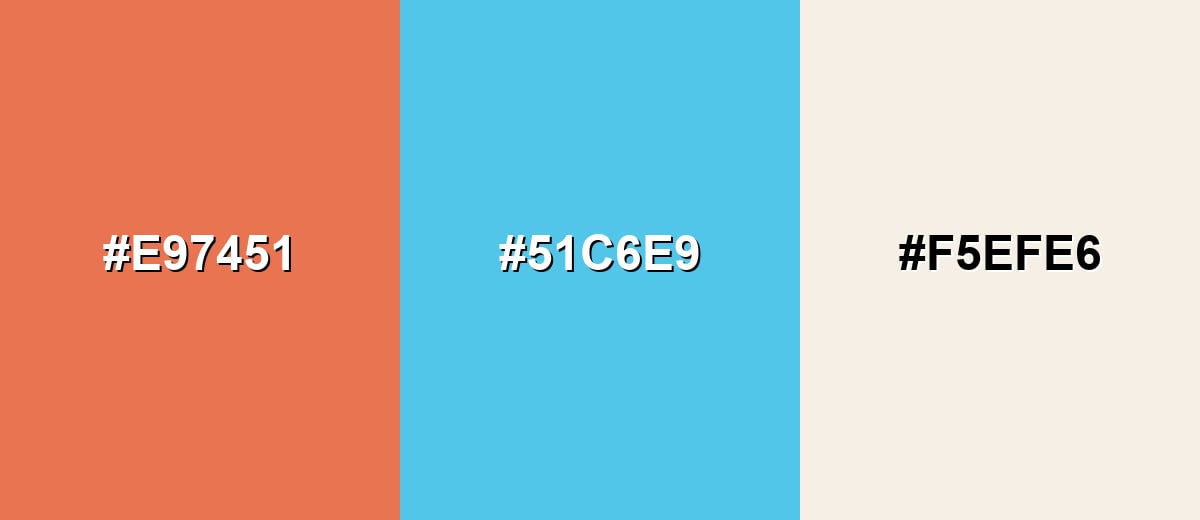
Complementary Colors
A complementary scheme places burnt sienna against a cool blue-green for high, clean contrast. This is a strong option for UI emphasis, modern brand palettes, and hero sections where you need immediate separation.
Complementary Palette Example: Combine Burnt Sienna with Clear Teal and Soft Cream for an earthy-meets-fresh balance.
Analogous Color Schemes
Analogous colors sit adjacent to each other on the color wheel, creating harmonious, cohesive palettes with subtle variation.
For a warm flow, use Burnt Sienna with Terracotta Red and Warm Ochre.
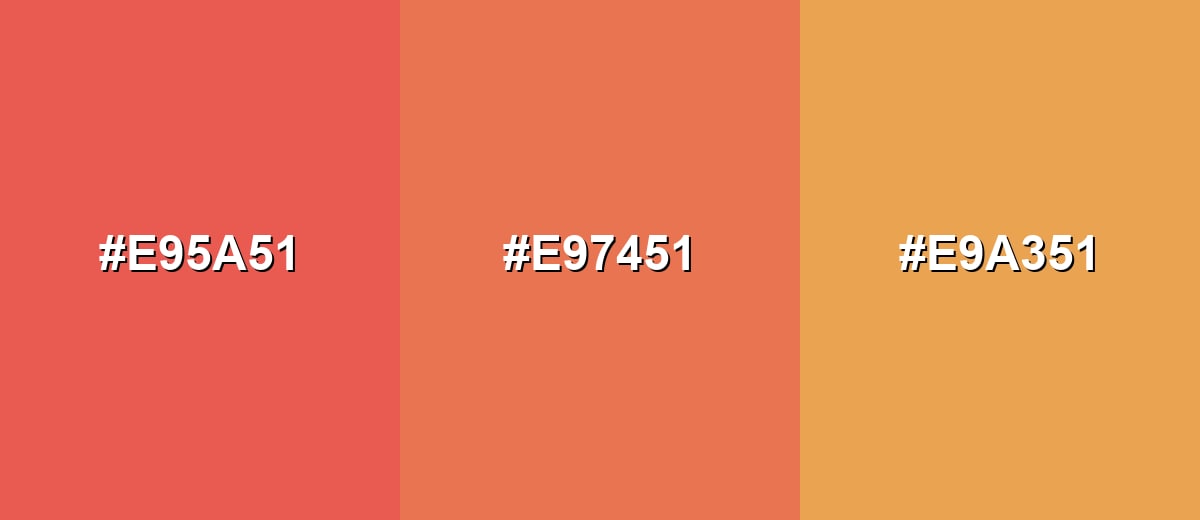
- Terracotta Red: #E95A51
- Burnt Sienna: #E97451
- Warm Ochre: #E9A351
For a deeper earthy set, pair Burnt Sienna with Deep Brick and Honey Tan.
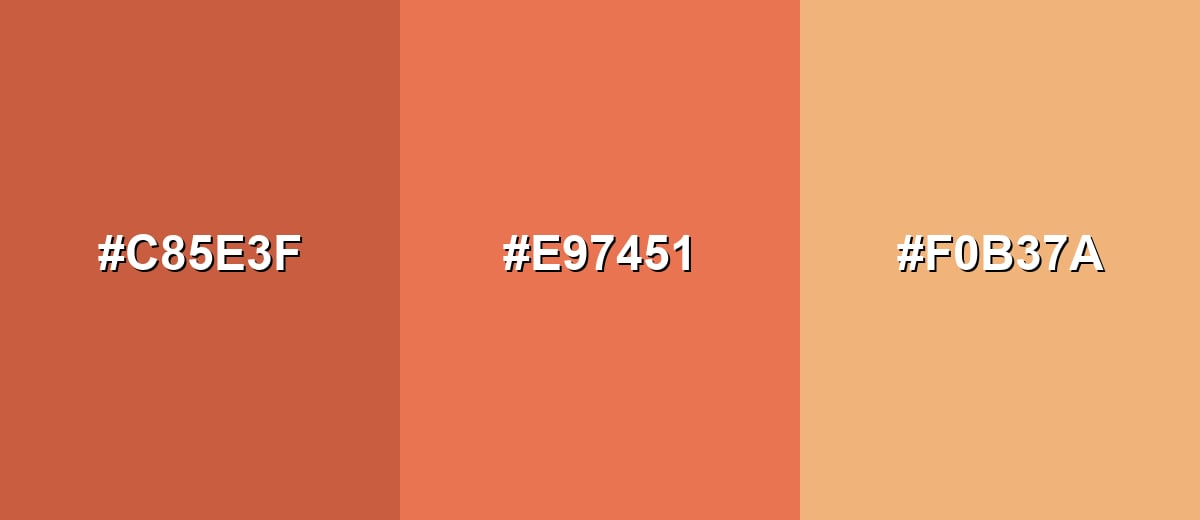
- Deep Brick: #C85E3F
- Burnt Sienna: #E97451
- Honey Tan: #F0B37A
Triadic & Tetradic Combinations
A triadic palette adds two evenly spaced hues for variety while staying balanced.
Try Burnt Sienna with Mint Green and Blue Violet for a lively but controlled contrast.
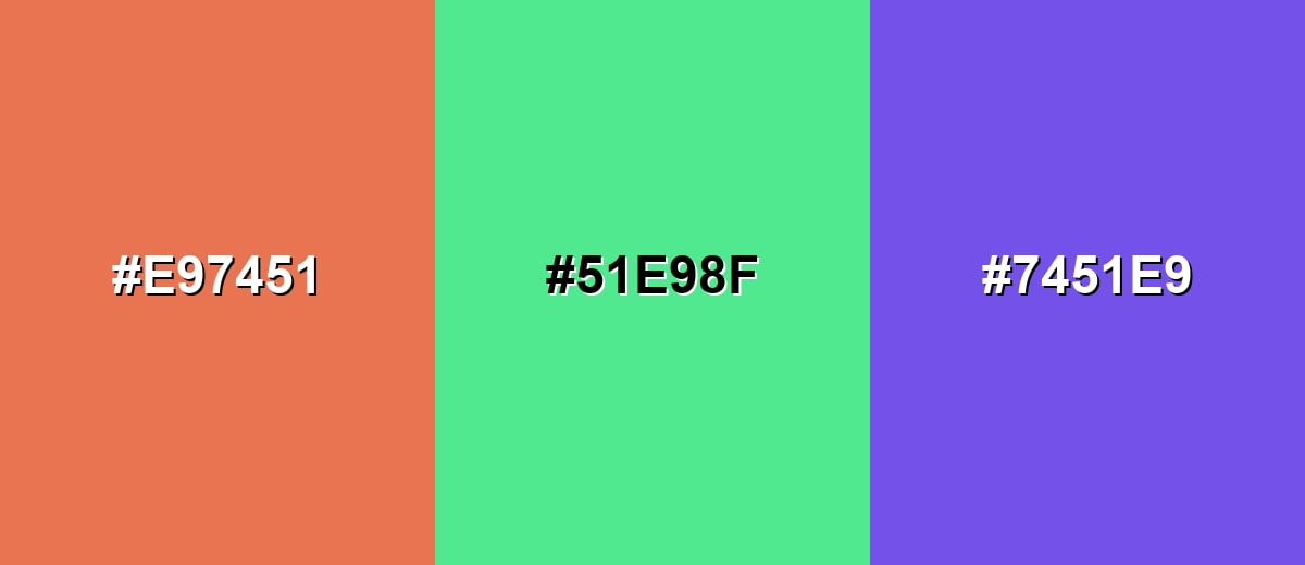
- Burnt Sienna: #E97451
- Mint Green: #51E98F
- Blue Violet: #7451E9
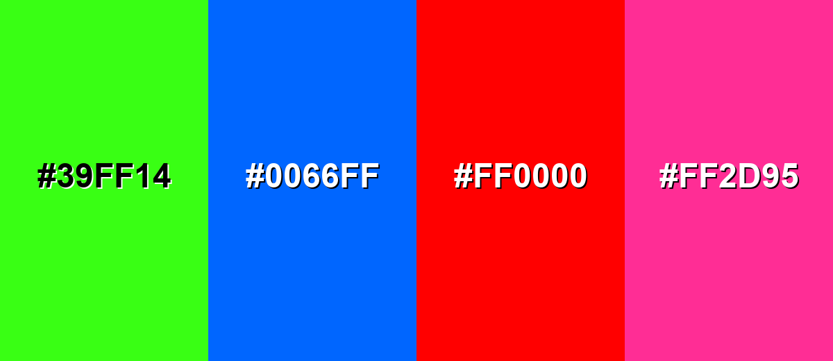
Colors to Avoid
While burnt sienna color is remarkably versatile, certain combinations can create problematic visual effects:
- Neon Green (#39FF14) - The high intensity clashes with burnt sienna's natural, earthy tone and can make layouts feel noisy.
- Electric Blue (#0066FF) - This saturated blue creates a harsh edge that can overpower burnt sienna and reduce the handcrafted feel.
- Pure Red (#FF0000) - Both hues compete in the same warm range, often reading as aggressive instead of grounded.
- Hot Pink (#FF2D95) - The playful brightness can push the palette into a mismatched, trendy look unless carefully muted.
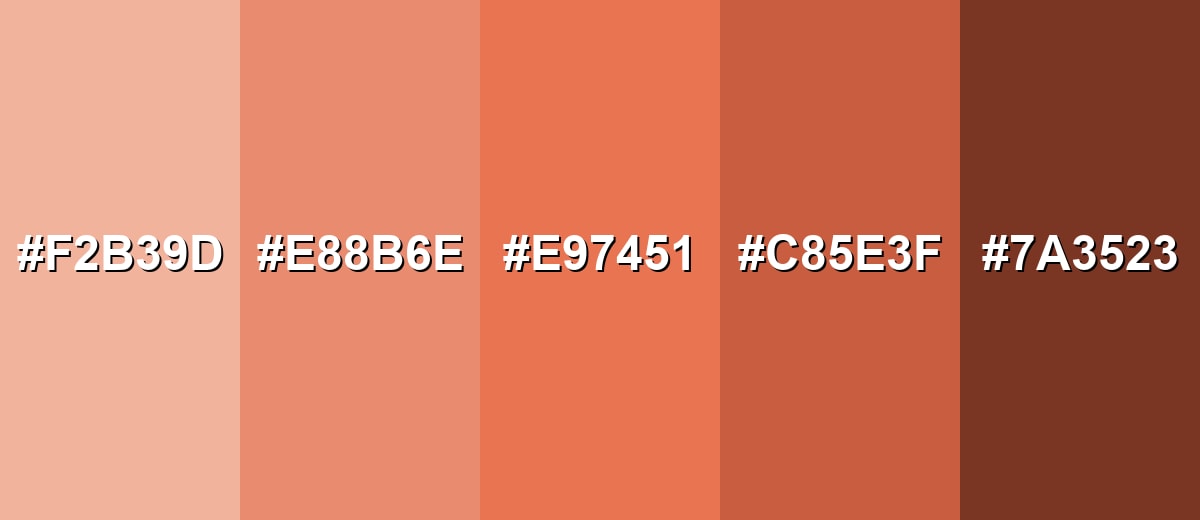
Shades, Tints & Variations of Burnt Sienna Color
Burnt sienna has a surprisingly usable range—from soft clay tints for backgrounds to deep brick-like shades for contrast. This makes it easy to build a full palette that stays warm and cohesive without feeling flat.
- Light Sienna (#F2B39D) - A soft tint that keeps the clay warmth while feeling airy and modern. It's best used for Background panels, cards, and large surfaces where you want warmth without heaviness.
- Soft Terracotta (#E88B6E) - A gentler, less intense variation with a friendly, approachable tone. It's best used for Secondary accents, illustrations, and UI highlights that should feel calm.
- Burnt Sienna (#E97451) - The classic fired-clay red-orange with a balanced earthy depth. It's best used for Primary brand accents, buttons, badges, and key visual elements.
- Deep Sienna (#C85E3F) - A darker shade that leans more brick-like and mature. It's best used for Headers, outlines, icon fills, and areas needing stronger visual weight.
- Dark Sienna Brown (#7A3523) - A rich, grounded brown-red that feels rugged and traditional. It's best used for Text on light tints, shadows, premium packaging accents, and contrast detailing.
Industry Applications
Because burnt sienna feels natural and expressive, it shows up across many industries that want warmth with credibility. It also adapts well, from minimalist layouts to textured, handcrafted styles.
Fashion & Beauty
- Use it in knitwear, leather accessories, and outerwear accents for a grounded, flattering warm tone.
- Build autumn-inspired collections without relying on overly bright seasonal oranges.
- Pair it with denim blues, olives, and off-whites for easy, wearable contrast.
- Bring it into editorial styling to add warmth while keeping the overall palette mature.
Interior Design & Decor
- Try it on accent walls, textiles, and ceramics to add cozy depth without going too dark.
- Use it in earth-toned mood boards and material palettes to connect colors to real textures.
- Combine with creams, woods, and muted greens for warm minimal spaces that still feel fresh.
- Layer it as a supporting tone so neutrals stay clean while the room feels inviting.
Branding & Marketing
- Works well for artisanal food and beverage labels that want a handcrafted, ingredient-forward vibe.
- Fits wellness, yoga, and natural skincare visuals where warmth should feel calm, not loud.
- Supports craft and maker brands that emphasize materials and process over gloss.
- In UI and campaigns, use it for CTAs, tags, and selected states when you want warmth instead of "alarm red."
Conclusion
Burnt sienna (#E97451) stands out for its fired-clay warmth and its ability to feel both creative and dependable. Whether you use it as a brand accent, a UI highlight, or a supporting tone in an earthy palette, it looks best when balanced with light neutrals or a cool blue-green contrast for clarity. With the right pairings and a few well-chosen tints and shades, burnt sienna delivers a natural, handcrafted mood that still reads polished in modern design.
Design Smarter with AI: Media.io is an online AI studio that empowers creators with advanced image generation and enhancement tools. From text-to-image and image-to-image creation to AI upscaling and color optimization, it enables fast, creative, and professional results—all in your browser.

Frequently Asked Questions About Burnt Sienna Color
It looks like a warm red-orange with a brown, clay-like undertone—similar to terracotta pottery, brick dust, or rusted earth.
It sits between the two, but most people perceive it as an orange-red that's been muted by brown. The result is warm, earthy, and less bright than standard orange.
For the common digital version shown here, RGB is 233, 116, 81. This mix produces the warm clay tone seen in many palettes.
Soft creams, sand tones, muted greens, and blue-greens (teal) pair especially well. These combinations keep it grounded while adding contrast and clarity.
Use it as an accent for buttons, tags, and highlights, then support it with light neutrals and a cool counter-color like teal. Always check contrast for small text and thin icons.
Terracotta is usually lighter and more orange-pink, while burnt sienna is deeper with more brown-red depth. In practice, burnt sienna tends to feel more grounded and slightly richer.


