

Buff color is a soft, warm yellow-tan that looks like sunlit sand, wheat straw, or lightly tanned leather.
A common digital reference for it is hex #F0DC82, sitting between pale gold and beige—calm, welcoming, and naturally understated, with roots in the look of historical buff leather used in textiles and uniforms.
Buff Color: Codes & Values
Use these values to keep buff consistent across UI, branding, and print workflows.
| Parameters | VALUE |
| HEX Code | #F0DC82 |
| RGB DECIMAL | 240, 220, 130 |
| RGB PERCENTAGE | 94.12%, 86.27%, 50.98% |
| CMYK | 0%,8%,46%,6% |
| HSL | 49°, 79%, 73% |
| HSV (HSB) | 49°, 46%, 94% |
| Web Safe | #FFCC99 |
Key Color Space Explanations:
- HEX - HEX is the six-digit code used on the web to display buff consistently on screens. Use #f0dc82 in CSS and design tools for the same swatch.
- RGB - RGB mixes red, green, and blue light to create buff on digital displays. The values 240, 220, 130 produce a light, warm, muted tone.
- CMYK - CMYK is used for printing with cyan, magenta, yellow, and black inks. Buff is typically low in cyan and magenta, higher in yellow, and slightly reduced with black for softness.
- HSL - HSL describes buff by hue, saturation, and lightness, which is helpful for building matching UI states. Its hue sits in the yellow range with moderate saturation and high lightness.
- Web Safe - Web-safe colors are a limited palette that displays reliably on older systems. The closest web-safe match to buff is #ffcc99.
Start with #F0DC82 for your base, then tweak lightness (HSL/HSV) for hover states, borders, or deeper accents without changing the overall warmth.
Buff Color Conversions
Need buff in a specific format? Here are the most common conversions for design tools and dev handoff.
| Parameters | VALUE | CSS |
| HEX | #f0dc82 | #f0dc82 |
| RGB DECIMAL | 240, 220, 130 | rgb(240,220,130) |
| RGB PERCENTAGE | 94.12%, 86.27%, 50.98% | rgb(94.12%,86.27%,50.98%) |
| CMYK | 0%,8%,46%,6% | cmyk(0%,8%,46%,6%) |
| HSL | 49°, 79%, 73% | hsl(49°,79%,73%) |
| HSV (or HSB) | 49°, 46%, 94% | -- |
| Web Safe | ffcc99 | #ffcc99 |
| CIE-LAB | 87.6, -5.0, 47.0 | -- |
| XYZ | 65.54, 71.15, 31.45 | -- |
| xyY | 0.390, 0.423, 71.15 | -- |
| CIE-LCH | 87.6, 47.3, 96.0° | -- |
| CIE-LUV | 87.6, 18.0, 60.7 | -- |
| Hunter-Lab | 84.4, -4.5, 33.7 | -- |
| Binary | 11110000 11011100 10000010 | -- |
Want to generate Buff Color photos or posters? Try Media.io's AI Image Generator now!
Buff Color Meaning & Symbolism
Buff commonly represents warmth, simplicity, and natural comfort. Because it sits close to sand, wheat, and light leather, it often reads as grounded and reliable in everyday visual language. It is a practical neutral that softens a layout without feeling stark.
Psychological Effects
Buff brings gentle warmth without the intensity of a bright yellow.
- Approachability - Buff tends to make spaces and interfaces feel friendly and easy to enter.
- Lower Visual Tension - It can feel calmer than vivid yellows, reducing "shouty" color pressure.
- Soft Optimism - The warm undertone keeps a hint of sunshine and upbeat energy.
- Quiet Confidence - In UI and branding, buff often suggests honest craft and understated reliability.
- Needs Contrast - Too much buff can read flat or dusty, so it benefits from a dark anchor or crisp light accent.
Positive Associations
These are common "good vibes" buff communicates when used with enough hierarchy and contrast.
- Natural Comfort - Its sand-and-wheat feel reads warm, relaxed, and lived-in.
- Simplicity - Buff works like a practical neutral that doesn't fight your content.
- Honesty - The muted tone can feel sincere and straightforward rather than flashy.
- Craft & Heritage - Leather-adjacent warmth hints at hand-made quality and tradition.
- Welcoming Warmth - It creates a soft "hello" effect in packaging, interiors, and onboarding screens.
Cultural Significance Across the World
Buff is usually read as neutral and material-inspired, so it travels well across audiences.
- Material Roots - Historically tied to buff leather, giving it a utilitarian, heritage backdrop.
- Textile & Uniform Reference - Its name and look connect to practical dye and uniform traditions.
- Nature-First Reading - Often interpreted through sand, straw, and earth tones rather than strict symbolism.
- Broad Neutrality - In many contexts it functions as a warm neutral instead of a culture-specific statement.
Design Applications
Buff is easiest to use as a warm neutral base that supports typography and product imagery. It plays nicely with both cool and warm accents, making it flexible across digital and print design.
Graphic Design Tips
- Use buff for backgrounds, cards, and secondary sections when pure white feels too stark.
- Reserve white for high-clarity components and let buff soften larger surfaces to reduce glare.
- Pick a dark anchor for type (near-black, deep brown, or deep navy) and test body-text contrast early.
- Build hierarchy with slightly deeper buff shades for hover states, dividers, or section headers.
- In brand systems, treat buff as a supporting hue and add one saturated accent to keep things from looking washed out.
Pro tip: If your layout starts to feel "beige on beige," introduce one strong dark neutral and one clear accent color, then let spacing and typography do the rest.
Buff Color in Photography & Video
- Buff works great for warm, natural backdrops (sand, linen, paper, wood) that keep subjects looking approachable.
- Watch white balance—too warm can push buff into muddy yellow; too cool can make it look dull.
- Use buff as a highlight tone in skin-adjacent scenes (fashion, lifestyle) for a sunlit, soft finish.
- Pair buff sets with cool props (blues/teals) for clean contrast that still feels calm.
- For product shots, keep edges readable by adding a darker rim light, shadow, or contrasting surface under the item.
Recommended Tool for Image Enhancement: When incorporating buff color into your photography projects, Media.io's AI Image tools can help you achieve more refined results. With AI-powered color enhancement, photo colorization, image upscaling, and old photo restoration, you can easily enrich buff color tones, improve overall image quality, and highlight the color's elegant and sophisticated aesthetic.
Color Combinations
Because buff is a warm, light neutral, it pairs best with one strong anchor and one supporting accent. Use these schemes to create clear contrast while keeping the palette relaxed and natural.
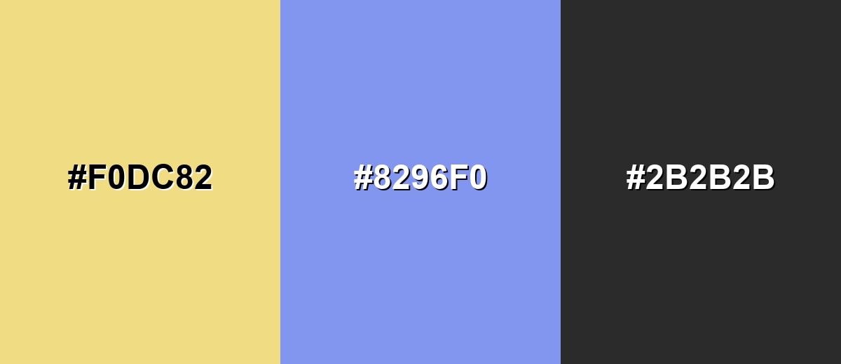
Complementary Colors
A cool blue complement makes buff feel brighter and more modern, while a dark neutral keeps the palette readable.
Complementary Palette Example: Pair Buff with Soft Cornflower and Charcoal for a balanced warm-cool contrast.
Analogous Color Schemes
Analogous colors sit adjacent to each other on the color wheel, creating harmonious, cohesive palettes with subtle variation.
Honey Beige, Buff, and Pale Lime create a sunlit, nature-friendly gradient.
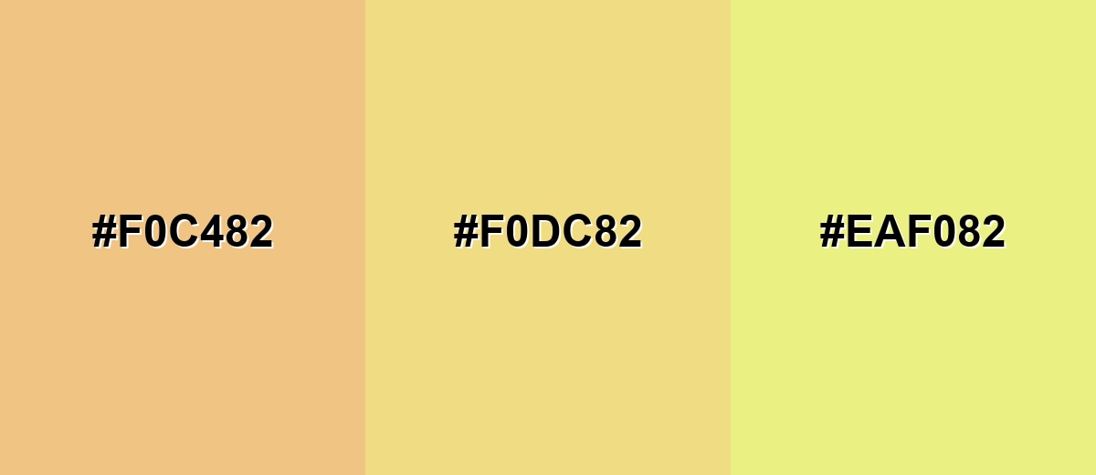
- Honey Beige: #F0C482
- Buff: #F0DC82
- Pale Lime: #EAF082
Cream Sand, Buff, and Muted Ochre feel earthy and quiet, great for minimal layouts.
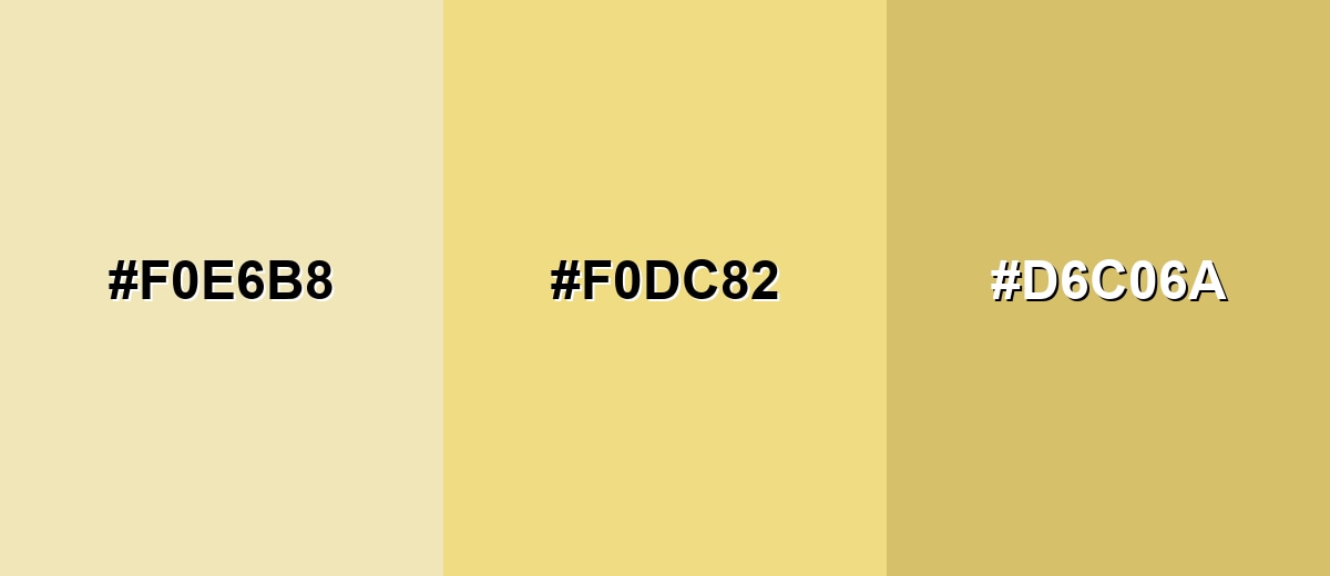
- Cream Sand: #F0E6B8
- Buff: #F0DC82
- Muted Ochre: #D6C06A
Triadic & Tetradic Combinations
A triadic scheme adds energy while keeping the base warm and approachable.
Buff with Aqua Mist and Orchid Pink gives playful contrast without harshness.
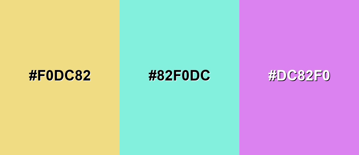
- Buff: #F0DC82
- Aqua Mist: #82F0DC
- Orchid Pink: #DC82F0
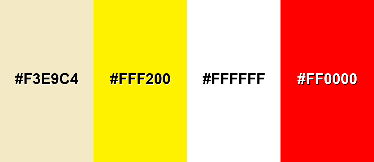
Colors to Avoid
While buff color is remarkably versatile, certain combinations can create problematic visual effects:
- Pale Oat (#F3E9C4) - Too close in lightness, so UI elements and cards can blend together without clear edges.
- Neon Yellow (#FFF200) - Overpowers buff and makes the palette feel harsh and unstable, especially on screens.
- Pure White (#FFFFFF) - Can make buff look dingy by comparison and reduces the soft, natural effect.
- Pure Red (#FF0000) - Creates strong visual vibration against buff and quickly dominates most compositions.
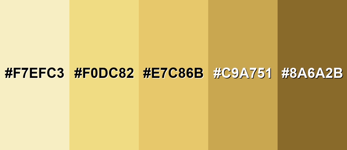
Shades, Tints & Variations of Buff Color
From creamy near-whites to leather-like browns, buff's range helps you keep the same warm personality while dialing contrast up or down for backgrounds, UI states, and accessible text.
- Light Buff (#F7EFC3) - An airy, creamy tint that keeps the warmth but feels closer to off-white. It's best used for large backgrounds, soft sections, and minimal layouts where you want gentle warmth.
- Classic Buff (#F0DC82) - The balanced reference shade: warm, muted, and clearly golden-beige without turning bright. It's best used for brand supporting color, cards, packaging bases, and friendly UI surfaces.
- Warm Buff (#E7C86B) - A slightly deeper, more golden variation with stronger presence. It's best used for buttons, highlights, icons, and accent blocks that still feel natural.
- Deep Buff (#C9A751) - A richer, earthy shade that leans toward ochre and reads more grounded. It's best used for headers, borders, illustration shadows, and warm contrast against light neutrals.
- Buff Brown (#8A6A2B) - A dark, leather-like shade that carries the same warmth with much higher contrast. It's best used for text, outlines, UI emphasis, and pairing anchor for accessibility-friendly designs.
Industry Applications
Buff shows up anywhere a warm, natural tone helps a product feel approachable. It is especially useful as a background or supporting hue that lets photos and typography do the heavy lifting.
Fashion & Beauty
- Neutral wardrobe staples where beige feels too cool or gray.
- Leather goods and accessories that benefit from a soft, heritage look.
- Warm, minimal beauty packaging that feels clean but not clinical.
- Seasonal styling (spring/summer) for sunlit, natural palettes.
Interior Design & Decor
- Wall paint inspiration when you want warmth without high saturation.
- Textiles, ceramics, and natural-material palettes that need softness.
- Pairings with wood tones, off-whites, and soft greens for an organic feel.
- Balanced rooms with darker trim or metal finishes to avoid monotone spaces.
Branding & Marketing
- Craft, food, wellness, and heritage-inspired brands that want a calm, trustworthy base tone.
- Packaging backgrounds that let product photography and labels stand out.
- Web sections, panels, and onboarding screens that feel friendly and reduce glare.
- Invitations, menus, and stationery that replace stark white with gentle warmth.
Conclusion
Buff is a warm, muted yellow-tan that feels natural, calm, and easy to live with—perfect when you need a friendly neutral for backgrounds, packaging, or interface surfaces without the sharpness of bright yellows. For the cleanest results, treat #F0DC82 as your starting point, add a clear dark anchor for readability, and introduce one accent color to keep your design from looking flat. Whether you're exploring buff color meaning for a brand refresh or choosing a comfortable interior palette, its soft, grounded character is the main reason it works so reliably.
Design Smarter with AI: Media.io is an online AI studio that empowers creators with advanced image generation and enhancement tools. From text-to-image and image-to-image creation to AI upscaling and color optimization, it enables fast, creative, and professional results—all in your browser.

Frequently Asked Questions About Buff Color
Quick answers to the most common questions about buff and how to use it in design.
Buff is a warm, muted yellow-tan shade that resembles light sand, wheat, or pale leather. It sits between beige and soft gold, usually with a gentle, natural look.
A commonly used hex code for buff is #f0dc82. Depending on the palette or material, buff can shift slightly warmer or more beige.
Not exactly. Beige often looks more neutral or slightly gray, while tan is usually deeper and browner. Buff tends to read as lighter and more yellow-golden than many beiges.
Buff pairs well with deep neutrals like charcoal, cool blues for contrast, and soft greens for a natural scheme. It also works with gentle accents like rose or teal when you want more energy.
Yes, buff is a good warm background for cards and sections, especially when you want a softer alternative to pure white. Use dark text and icons to keep contrast strong and readability high.
Add contrast and structure. Pair it with a crisp dark anchor (near-black, deep brown, or navy), include one clear accent hue, and use spacing and typography to create hierarchy.


