

 TL;DR:
Azure is a crisp, cool-toned blue (optimally represented by Hex #007FFF) that bridges sky and royal blue, widely applied in modern UI and branding to establish trust, clarity, and approachability.
● For digital consistency, lock the primary hue at HSL 210°, but strictly use darker shades like Midnight Azure (#003366) for typography because true azure fails accessibility contrast requirements for small body text on white backgrounds.
● Prevent eye strain and harsh visual vibration by avoiding direct pairings with Neon Yellow (#FFFF00), Pure Red (#FF0000), or Bright Lime (#00FF00), instead balancing the color's cool temperature with warm oranges or clean neutrals.
● When executing print production, begin with a CMYK baseline of 100%, 50%, 0%, 0%, but mandate physical proofing since this saturated digital blue frequently shifts depending on specific paper types and color profiles.
Ask AI for a summary
 ChatGPT
 Perplexity
 Gemini
 Claude
 Grok
Grok
Azure color is a bright, clean blue that sits between sky blue and royal blue—often described as the clear-blue of an open daytime sky. A common digital reference for it is #007FFF, which reads vivid without feeling neon.
Many people perceive azure as fresh, optimistic, and trustworthy, with a crisp, airy quality. This guide breaks down meaning, key codes, combinations, shades, and practical ways to use it across UI, print, and decor.
Azure Color: Codes & Values
If you want azure color to look consistent across screens and print, start with these core values and reuse them across your design system.
| Parameters | VALUE |
| HEX Code | #007FFF |
| RGB DECIMAL | 0, 127, 255 |
| RGB PERCENTAGE | 0%, 50%, 100% |
| CMYK | 100%,50%,0%,0% |
| HSL | 210°, 100%, 50% |
| HSV (HSB) | 210°, 100%, 100% |
| Web Safe | #0066FF |
Key Color Space Explanations:
- HEX - HEX is the most common way to specify this shade on screens using a six-digit code. Use #007fff to keep azure consistent across web and UI elements.
- RGB - RGB defines the mix of red, green, and blue light used for digital displays. Azure is 0, 127, 255, which makes it a saturated blue with strong brightness.
- CMYK - CMYK is used for print and describes ink percentages. 100%,50%,0%,0% is a practical starting point, but printed results can shift depending on paper and profiles.
- HSL - HSL describes hue, saturation, and lightness, which is handy for creating tints and shades. At 210°, 100%, 50%, azure stays punchy while remaining clearly blue.
- Web Safe - Web-safe values are legacy approximations intended to reduce banding on older displays. #0066ff is the closest web-safe match when you need a simplified palette.
For most web work, you can stick to HEX or RGB; for print files, start with the CMYK values and always proof, since paper and profiles can shift saturated blues.
Azure Color Conversions
Need azure in a different format for CSS, print, or color-managed workflows? Here are the most common conversions in one place.
| Parameters | VALUE | CSS |
| HEX | #007fff | #007fff |
| RGB DECIMAL | 0, 127, 255 | rgb(0,127,255) |
| RGB PERCENTAGE | 0%, 50%, 100% | rgb(0%,50%,100%) |
| CMYK | 100%,50%,0%,0% | cmyk(100%,50%,0%,0%) |
| HSL | 210°, 100%, 50% | hsl(210°, 100%, 50%) |
| HSV (or HSB) | 210°, 100%, 100% | -- |
| Web Safe | 0066ff | #0066ff |
| CIE-LAB | 54.4, 19.5, -71.6 | -- |
| XYZ | 25.63, 22.38, 97.58 | -- |
| xyY | 0.176, 0.154, 22.38 | -- |
| CIE-LCH | 54.4, 74.2, 285.2° | -- |
| CIE-LUV | 54.4, -29.0, -113.2 | -- |
| Hunter-Lab | 47.3, 16.9, -99.5 | -- |
| Binary | 00000000 01111111 11111111 | -- |
Want to generate Azure Color photos or posters? Try Media.io's AI Image Generator now!
Azure Color Meaning & Symbolism
Azure is widely linked with clear skies and open water, so it often signals calm, clarity, and forward momentum. In everyday visuals, it reads clean and modern, making it a popular choice when you want something friendly but still professional. This balance is a big reason people search for Azure Color meaning when picking a dependable blue for a brand, interface, or space.
Psychological Effects
In most modern design contexts, azure feels both refreshing and confidently bright.
- Mental Clarity - Its crisp blue quality can make layouts feel organized and easier to scan.
- Trust & Reliability - Azure keeps the dependable "blue" message without turning too formal or dark.
- Energy & Optimism - High saturation adds a positive lift that works well for forward-looking messaging.
- Focus & Guidance - Used for links, highlights, and active states, it naturally pulls attention without feeling heavy.
- Cool, Minimal Mood - Overuse in large solid blocks can feel cold or impersonal, especially under cool lighting.
Positive Associations
Because it sits between sky and ocean, azure tends to read "clean" and open at a glance.
- Freshness - A bright, airy tone that suggests a clean start and modern simplicity.
- Openness - The sky-like vibe can make brands and spaces feel more welcoming and transparent.
- Professional Friendliness - It balances approachable energy with a polished, business-ready look.
- Modern Confidence - Vivid enough to stand out, but not so loud that it feels neon.
- Exploration - Strong ties to sky and water can hint at movement, travel, and "bigger horizons."
Cultural Significance Across the World
Meanings vary by context, but azure is generally read as a positive, protective, sky-linked blue.
- Sky & Sea Symbolism - Often connected to nature's open spaces, calm weather, and clean water.
- Protection Motifs - Appears in visuals associated with shielding, safety, and reassurance.
- Art & Pigment History - Historically echoed in prized blue pigments tied to precious stone traditions.
- Modern "Clean Tech" Signal - Common in contemporary interfaces where clarity and usability are the priority.
Design Applications
Azure is easiest to work with when you treat it as a crisp accent or a confident primary hue supported by neutrals. The goal is to preserve its clarity while keeping contrast comfortable and the overall palette balanced.
Graphic Design Tips
- Use full-strength azure for emphasis (CTAs, tags, key icons) and switch to lighter tints for large backgrounds.
- Balance the cool tone with warm counterpoints (especially orange-leaning accents) to avoid a sterile look.
- Pair azure with deeper darks for typography so headings and body text stay readable and grounded.
- In infographics, assign azure to "primary" categories where you need instant recognition and clean separation.
- For branding, keep one consistent hero value (like #007FFF) and build a small shade ladder for flexibility.
Pro tip: If azure is your signature color, set it once as a design token and build tints/shades from the same hue (around 210°) so every screen and asset feels like the same brand.
Azure Color in Photography & Video
- Lean into natural sky and water scenes—azure enhances "open air" mood without overcomplicating the frame.
- Use azure accents in wardrobe or props to create a clean focal point against warm neutrals or earthy textures.
- When grading, watch saturation: vivid blues can clip or band in compressed exports if pushed too far.
- For product shots, azure backdrops work best with soft, even lighting to keep the tone smooth and premium.
- In UI demos or motion graphics, reserve azure for key callouts so attention goes exactly where you want.
Recommended Tool for Image Enhancement: When incorporating azure color into your photography projects, Media.io's AI Image tools can help you achieve more refined results. With AI-powered color enhancement, photo colorization, image upscaling, and old photo restoration, you can easily enrich azure color tones, improve overall image quality, and highlight the color's elegant and sophisticated aesthetic.
Color Combinations
Azure pairs well with warm oranges, clean neutrals, and nearby blue-green tones. Below are practical palettes you can use for web, branding, and illustration, plus a few high-risk pairings to handle carefully.
Complementary Colors
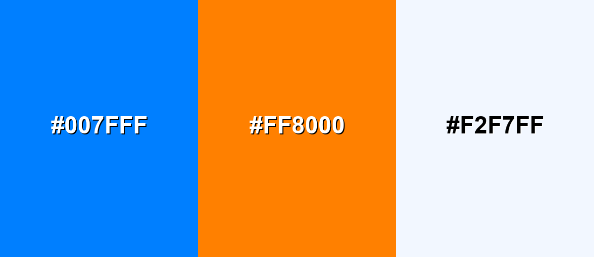
A complementary palette puts azure against a warm orange to create maximum visual energy. This is a strong choice for calls-to-action, sports graphics, and posters where you want the blue to pop.
Complementary Palette Example: Combine Azure with Vivid Orange and a soft off-white to keep the contrast bold but usable.
Analogous Color Schemes
Analogous colors sit adjacent to each other on the color wheel, creating harmonious, cohesive palettes with subtle variation.
Bright Cyan, Azure, and Royal Blue create a smooth, ocean-to-sky blend that feels cohesive and modern.
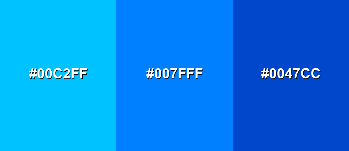
- Bright Cyan: #00C2FF
- Azure: #007FFF
- Royal Blue: #0047CC
Seafoam, Azure, and Blue Violet lean a bit more playful and creative while staying clearly in the cool family.
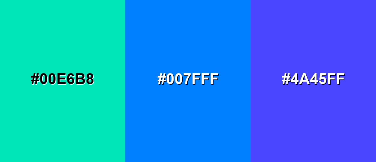
- Seafoam: #00E6B8
- Azure: #007FFF
- Blue Violet: #4A45FF
Triadic & Tetradic Combinations
A triadic scheme uses three evenly spaced hues for lively contrast with balance.
Azure, Spring Green, and Hot Magenta deliver a vibrant, youthful mix suited to creative campaigns and energetic UI accents.
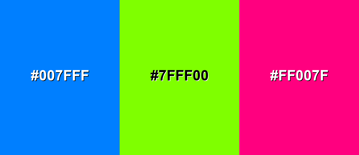
- Azure: #007FFF
- Spring Green: #7FFF00
- Hot Magenta: #FF007F
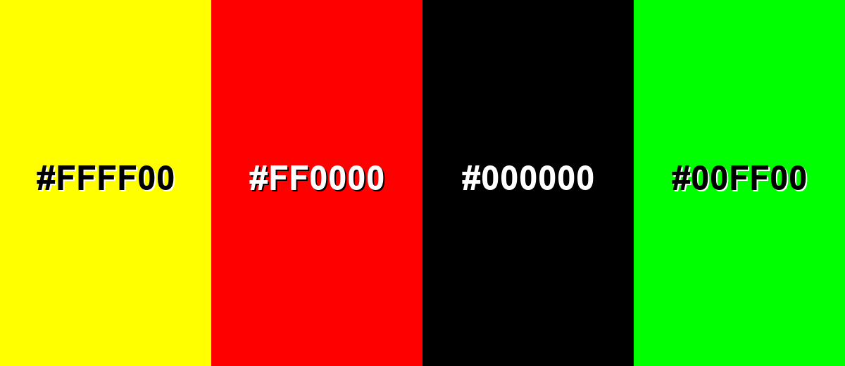
Colors to Avoid
While azure color is remarkably versatile, certain combinations can create problematic visual effects:
- Neon Yellow (#FFFF00) - The pairing can create harsh vibration and eye strain, especially for small text or thin UI strokes.
- Pure Red (#FF0000) - Both are intense primaries, and the contrast can feel aggressive or noisy without strong neutral buffering.
- Pure Black (#000000) - The jump can look overly sharp and heavy, making azure feel smaller and less airy in large blocks.
- Bright Lime (#00FF00) - This combo often reads like safety or warning signage and can look unrefined in polished brand systems.
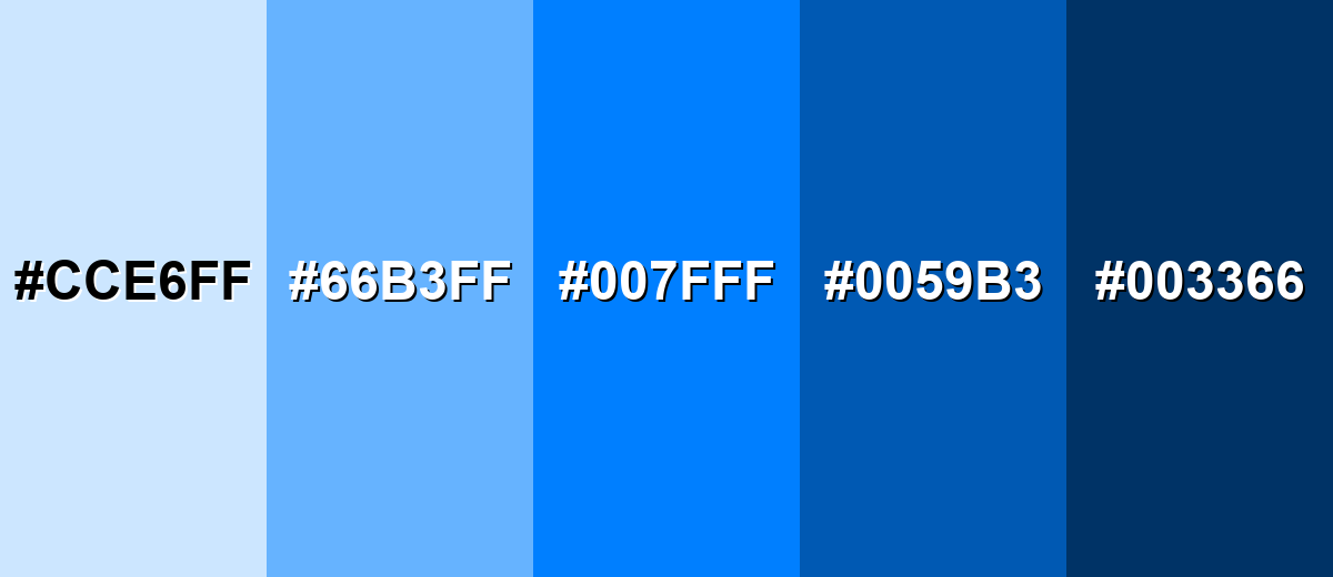
Shades, Tints & Variations of Azure Color
Azure isn't just one "sky blue"—it has a useful range from pale, background-friendly tints to deep, serious shades. Building with variations makes it easier to keep hierarchy clear (backgrounds, components, text, and accents) while still staying on-brand.
- Pale Azure (#CCE6FF) - A light, airy tint that keeps the sky-like feel while lowering intensity. It's best used for Large backgrounds, cards, and subtle sections in web layouts..
- Soft Sky Azure (#66B3FF) - A friendly mid-light tone that stays bright but becomes easier on the eyes. It's best used for UI highlights, charts, and secondary buttons..
- True Azure (#007FFF) - The vivid reference shade, crisp and confident with strong saturation. It's best used for Primary brand accents, links, and key interactive states..
- Deep Azure (#0059B3) - A darker, more grounded version that adds seriousness and contrast. It's best used for Headings, navigation bars, and high-contrast components..
- Midnight Azure (#003366) - A very dark blue with an azure undertone, calm but authoritative. It's best used for Text on light azure tints, footers, and premium-looking backgrounds..
Industry Applications
Because azure reads clear, modern, and approachable, it fits industries that need trust plus a sense of momentum. The trick is choosing the right shade: lighter tints for calm, deeper tones for authority, and true azure for attention.
Fashion & Beauty
- Use azure accents in packaging to signal freshness and a clean, modern formula story.
- Pair it with soft, pale tints for skincare visuals that need an airy, "just washed" feel.
- For athletic or swim collections, azure naturally reinforces water, speed, and outdoor energy.
- In beauty campaigns, keep backgrounds neutral so the blue reads crisp rather than overly cold.
Interior Design & Decor
- Light azure tints work well for walls or large surfaces when you want brightness without harshness.
- Use deeper azure shades for cabinetry, feature walls, or entry accents to add structure and contrast.
- Balance the cool tone with warm neutrals and natural textures (wood, linen-style fabrics) for comfort.
- In rooms with cool lighting, test samples—azure can shift chilly if everything else is blue-leaning.
Branding & Marketing
- Azure performs well for link color, active states, and UI highlights because it's vivid and easy to spot.
- For trust-heavy brands, support it with darker shades for typography and structure to keep the tone grounded.
- Use warm complements sparingly for CTA moments so campaigns feel energetic without visual noise.
- Create a small "azure ladder" (tints to shades) so every asset looks consistent across web and print.
Conclusion
Azure is a vivid, sky-clean blue that's easy to recognize and hard to misuse when you build around the right values—especially the popular digital reference #007FFF. It brings clarity and trust to interfaces, adds optimism to branding, and creates an airy, modern mood in visuals and spaces. To keep it comfortable, lean on tints for big areas, use deeper shades for structure and text, and add warm counterpoints when a design starts to feel too cool. With thoughtful pairings and a simple shade range, azure stays versatile for UI, print, and decor.
Design Smarter with AI: Media.io is an online AI studio that empowers creators with advanced image generation and enhancement tools. From text-to-image and image-to-image creation to AI upscaling and color optimization, it enables fast, creative, and professional results—all in your browser.

Frequently Asked Questions About Azure Color
Azure is typically a bit deeper and more saturated than a light sky blue. It still feels bright and airy, but it holds up better as an accent and stays vivid next to neutrals.
A commonly used digital hex value for azure is #007fff. Depending on the palette or system, you may see nearby variations that are slightly lighter or darker.
Azure is a cool-toned blue. It can feel crisp and refreshing, and it often looks best when balanced with warm neutrals, wood tones, or orange accents.
Strong pairings include warm orange, navy, charcoal, soft off-whites, and nearby cyan-to-blue tones. These combinations keep azure bright while maintaining comfortable contrast.
Azure is usually too bright to be used as small body text on white backgrounds, and white text on azure can also fail contrast depending on size. For readability, use very dark text on light azure tints, and test contrast for interactive elements.
To make tints, mix azure with white or increase lightness in HSL. To make shades, add a small amount of black or reduce lightness while keeping the hue near 210° so it stays distinctly azure.


