

Chocolate color is a deep, warm brown-orange that resembles melted dark milk chocolate with a toasted, slightly coppery undertone. A widely used reference point for this shade is #D2691E.
It feels comforting, grounded, and appetizing—so you'll see it often in cozy interiors, premium packaging, and brand accents. Depending on lighting and nearby hues, it can read darker, richer, or noticeably warmer.
Chocolate Color: Codes & Values
If you want consistent results across web, UI, and print, start with these standard chocolate color values.
| Parameters | VALUE |
| HEX Code | #D2691E |
| RGB DECIMAL | 210, 105, 30 |
| RGB PERCENTAGE | 82.35%, 41.18%, 11.76% |
| CMYK | 0%,50%,86%,18% |
| HSL | 25°, 75%, 47% |
| HSV (HSB) | 25°, 86%, 82% |
| Web Safe | #CC6633 |
Key Color Space Explanations:
- HEX - HEX is the most common way to specify this shade for web and UI work. For chocolate color, the hex value defines the exact mix of red, green, and blue on screens.
- RGB - RGB describes the light-based mix used by monitors and phones. It is useful for digital design tools and for fine-tuning brightness or warmth in UI elements.
- CMYK - CMYK is used for ink-based printing and packaging. The percentages help you predict how chocolate color will reproduce on paper, which can appear slightly duller than on screen.
- HSL - HSL maps the shade by hue, saturation, and lightness, making it easier to build consistent tints and shades. It is especially helpful when creating accessible hover states and subtle backgrounds.
- Web Safe - Web Safe is the closest legacy browser-safe approximation of the shade. It can be useful when you want a simplified fallback that stays visually similar across older displays.
Use HEX or RGB for screens, and switch to CMYK when you're preparing printed materials like labels, menus, or packaging proofs.
Chocolate Color Conversions
Here are the most common chocolate color conversions so you can copy the right format into your design tool, CSS, or print workflow.
| Parameters | VALUE | CSS |
| HEX | #d2691e | #d2691e |
| RGB DECIMAL | 210, 105, 30 | rgb(210,105,30) |
| RGB PERCENTAGE | 82.35%, 41.18%, 11.76% | rgb(82.35%,41.18%,11.76%) |
| CMYK | 0%,50%,86%,18% | cmyk(0%,50%,86%,18%) |
| HSL | 25°, 75%, 47% | hsl(25°,75%,47%) |
| HSV (or HSB) | 25°, 86%, 82% | -- |
| Web Safe | cc6633 | #cc6633 |
| CIE-LAB | 55.9, 37.0, 56.8 | -- |
| XYZ | 31.9, 23.9, 4.2 | -- |
| xyY | 0.532, 0.398, 23.9 | -- |
| CIE-LCH | 55.9, 67.8, 57.1° | -- |
| CIE-LUV | 55.9, 86.4, 47.6 | -- |
| Hunter-Lab | 48.9, 34.6, 28.7 | -- |
| Binary | 110100100110100100011110 | -- |
Want to generate Chocolate Color photos or posters? Try Media.io's AI Image Generator now!
Chocolate Color Meaning & Symbolism
Chocolate color is often linked with warmth, comfort, and reliability, with a hint of indulgence. In everyday life, it tends to feel familiar and inviting, which is why it is popular for cozy interiors, natural themes, and premium product styling. When people search for Chocolate Color meaning, they are usually trying to understand why it feels both grounded and appetizing at the same time.
Psychological Effects
Used well, chocolate supports calm, steady visuals while still feeling rich and flavorful.
- Grounding - Helps layouts feel stable and anchored, especially as a base tone.
- Warmth - Adds a cozy, welcoming mood without the sharpness of bright oranges.
- Comfort - Feels familiar and relaxing, which can reduce visual tension in busy designs.
- Craft & Quality - Suggests richness and craftsmanship, making products feel more premium.
- Heaviness Risk - Large blocks can look dark or dated if contrast and spacing aren't planned.
Positive Associations
These are the "good vibes" people commonly attach to chocolate tones in branding and everyday design.
- Indulgence - Connects naturally to treats, desserts, and a sense of reward.
- Reliability - Reads as dependable and down-to-earth, similar to other earth tones.
- Hospitality - Feels inviting, making it a strong choice for menus, cafes, and home brands.
- Natural Materials - Pairs well with wood, leather, and textured paper for an authentic look.
- Cozy Luxury - Balances "premium" with "approachable," especially with creamy neutrals.
Cultural Significance Across the World
Meanings can shift by context, but chocolate often keeps its warm, food-linked symbolism.
- Cacao & Roasting - Resembles roasted foods, so it's tied to warmth, aroma, and comfort.
- Earth-Tone Symbolism - Overlaps with nature, stability, and craftsmanship in many design traditions.
- Premium Cues - In packaging, deeper browns are often used to suggest quality and richness.
- Context-Dependent Mood - With cool accents it can feel modern; with beige and wood tones it leans rustic.
Design Applications
Chocolate is easiest to use when you treat it as a warm foundation and let lighter neutrals and cooler accents do the balancing. It can look modern, rustic, or premium depending on contrast and typography choices.
Graphic Design Tips
- Use chocolate as an accent color for buttons, tags, icons, and key highlights rather than a full-page fill.
- For clean readability, pair it with airy neutrals like latte-toned backgrounds and generous white space.
- In brand systems, combine chocolate with one cool counter-accent to keep the palette from feeling too warm.
- When designing packaging, test it on uncoated stock—warm browns can print slightly duller than on screen.
- For UI states (hover/active), adjust lightness in HSL to keep interactions consistent and accessible.
Pro tip: If chocolate starts to feel "muddy," reduce how often you use it for text and borders—keep it for strong moments (CTAs, badges, section headings) and let neutrals do the heavy lifting.
Chocolate Color in Photography & Video
- Chocolate tones look especially rich in warm lighting (golden hour, tungsten), but keep skin tones natural with careful white balance.
- For product shots (food, cosmetics, leather), add a soft cream or beige prop to improve separation and contrast.
- In color grading, chocolate works well in shadows and midtones; avoid crushing blacks or you'll lose texture.
- Use cool blue accents in the scene (background paper, wardrobe, props) to make warm browns pop.
- When shooting on phone cameras, watch for noise in darker browns—slight exposure lifts can preserve detail.
Recommended Tool for Image Enhancement: When incorporating chocolate color into your photography projects, Media.io's AI Image tools can help you achieve more refined results. With AI-powered color enhancement, photo colorization, image upscaling, and old photo restoration, you can easily enrich chocolate color tones, improve overall image quality, and highlight the color's elegant and sophisticated aesthetic.
Color Combinations
Chocolate pairs best with creamy neutrals, muted greens, and cool blues that sharpen its warmth. The palettes below are reliable starting points for branding, UI themes, and visual content where you want a cozy but clear look.
Complementary Colors
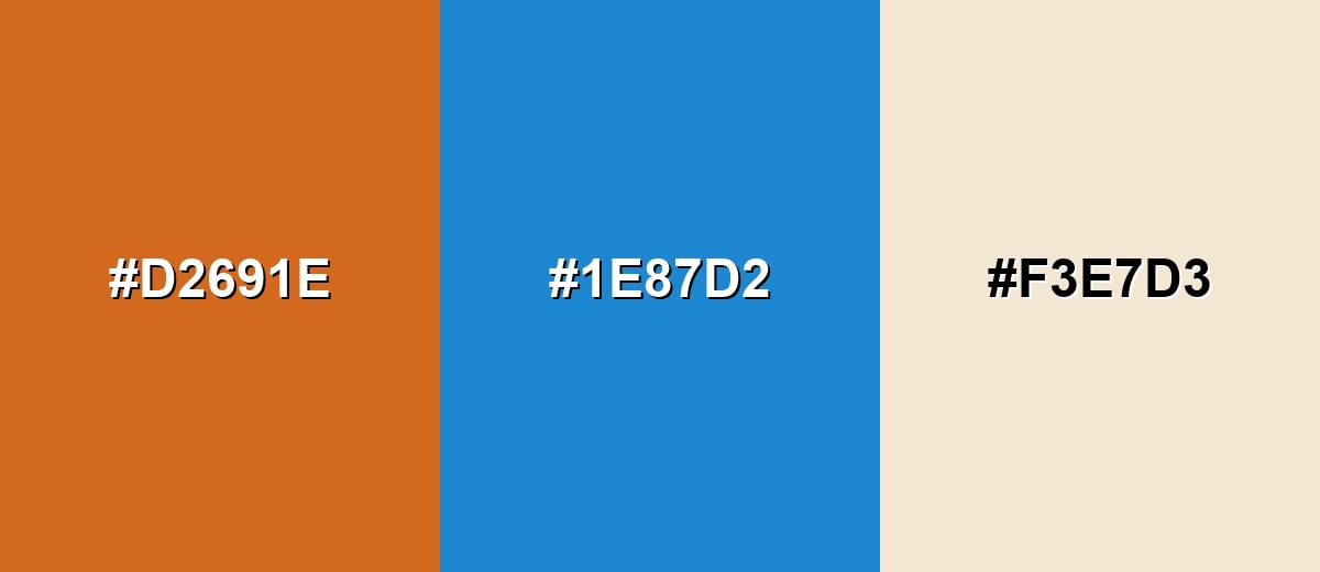
A complementary pairing adds crisp contrast by placing chocolate against a cool blue tone. This makes key elements pop while keeping the overall palette mature and balanced.
Complementary Palette Example: Use #d2691e with #1e87d2, and soften the contrast with a light neutral like #f3e7d3.
Analogous Color Schemes
Analogous colors sit adjacent to each other on the color wheel, creating harmonious, cohesive palettes with subtle variation.
Roasted Brown to Amber creates a warm, food-inspired gradient that feels cohesive and natural.
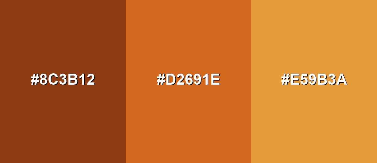
- Roasted Brown: #8C3B12
- Chocolate: #D2691E
- Caramel: #E59B3A
Cocoa to Ochre stays earthy and slightly muted, which is useful for calm, premium layouts.
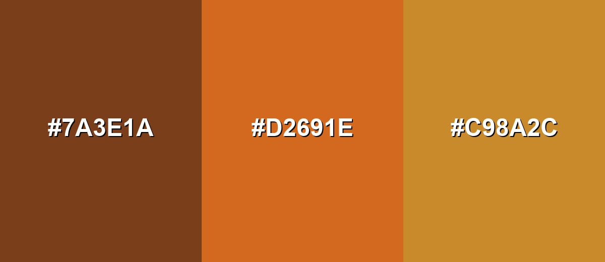
- Cocoa Brown: #7A3E1A
- Chocolate: #D2691E
- Golden Ochre: #C98A2C
Triadic & Tetradic Combinations
A triadic scheme gives you three distinct directions while keeping the palette lively.
Chocolate with green and purple accents works well for playful branding and standout illustrations when neutrals keep it controlled.
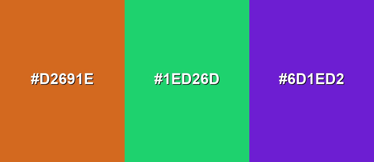
- Chocolate: #D2691E
- Fresh Green: #1ED26D
- Violet: #6D1ED2
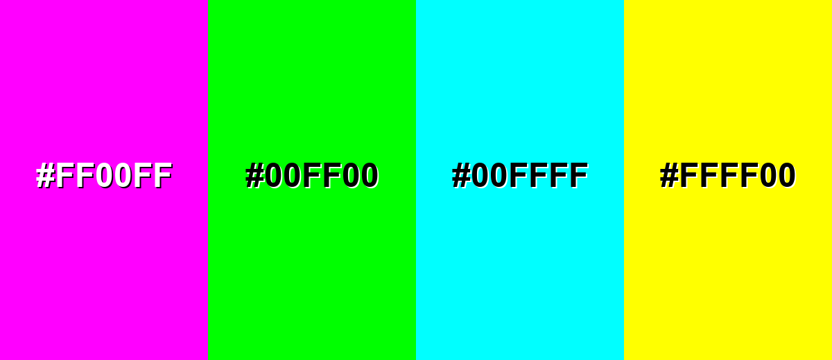
Colors to Avoid
While chocolate color is remarkably versatile, certain combinations can create problematic visual effects:
- Neon Magenta (#FF00FF) - It overwhelms chocolate and can make layouts feel noisy, reducing the cozy, grounded mood.
- Pure Neon Green (#00FF00) - The intensity clashes with chocolate and can read harsh in UI, especially in large blocks.
- Electric Cyan (#00FFFF) - The pairing can look unbalanced and distract from content, often hurting perceived quality in branding.
- Bright Yellow (#FFFF00) - It creates aggressive contrast and can feel warning-like rather than warm, particularly for backgrounds.
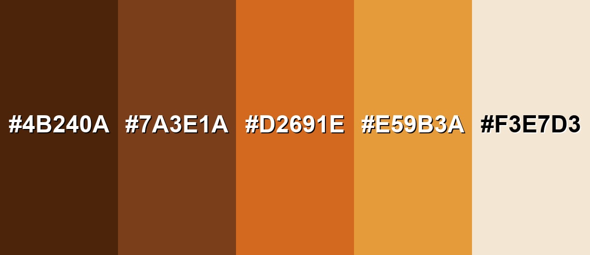
Shades, Tints & Variations of Chocolate Color
Chocolate isn't just one brown—there's a whole range from near-espresso depth to creamy latte lightness. Using a few related variations helps you build hierarchy (backgrounds, surfaces, accents) while keeping the overall look cohesive.
- Dark Chocolate (#4B240A) - A deep, near-espresso brown with warm undertones that feels heavy and luxurious. It's best used for Use for headers, footers, and premium packaging accents where you want depth without pure black.
- Cocoa Brown (#7A3E1A) - A roasted brown that sits close to chocolate but with a slightly deeper, more muted look. It's best used for Great for secondary surfaces, borders, and editorial elements that need warmth without dominating.
- Chocolate (#D2691E) - The classic warm brown-orange associated with cocoa and baked tones. It's best used for Ideal as a primary accent for buttons, highlights, and brand elements that should feel friendly and rich.
- Caramel (#E59B3A) - A lighter, golden-brown variation that feels sweet and sunny while staying earthy. It's best used for Use for highlights, icons, and supportive accents when the palette needs more light and energy.
- Latte Beige (#F3E7D3) - A creamy, warm neutral that pairs naturally with chocolate tones and improves readability. It's best used for Best for backgrounds, cards, and negative space to keep interfaces airy and balanced.
Industry Applications
Chocolate fits industries that benefit from warmth, authenticity, and a premium handcrafted feel. It is flexible enough for digital screens and print, as long as contrast is planned carefully.
Fashion & Beauty
- Warm, minimal brand palettes that feel calm, elevated, and craft-focused.
- Product photography backdrops for cosmetics, fragrance, and skincare—especially with creamy neutrals.
- Packaging accents that suggest richness and quality without relying on pure black.
- Seasonal campaigns (fall/winter) where earth tones feel natural and wearable.
Interior Design & Decor
- Accent walls or textiles that add warmth without the intensity of brighter oranges.
- Wood- and leather-inspired visuals for furniture catalogs and showrooms.
- Cozy, hospitality-style styling for cafes, lounges, and home decor content.
- Balanced palettes with light neutrals and a small cool accent to prevent a heavy look.
Branding & Marketing
- Food and beverage labels, menus, and social creatives with a roasted, indulgent mood.
- Retail packaging that aims to feel dependable, natural, and premium.
- Web apps and dashboards where chocolate works as a friendly accent for badges and emphasis areas.
- Editorial layouts that benefit from warm dividers, headers, and section highlights.
Conclusion
Chocolate color is a warm brown-orange that people instinctively read as cozy, grounded, and a little indulgent—making it a smart choice for branding, packaging, interiors, and modern UI accents. Start with #D2691E, then keep the look fresh by balancing it with lighter neutrals and (when you need pop) a cool counter-tone like blue. With the right contrast and spacing, chocolate can feel rustic, premium, or contemporary without ever shouting.
Design Smarter with AI: Media.io is an online AI studio that empowers creators with advanced image generation and enhancement tools. From text-to-image and image-to-image creation to AI upscaling and color optimization, it enables fast, creative, and professional results—all in your browser.

Frequently Asked Questions About Chocolate Color
Chocolate is a deep warm brown with an orange, roasted undertone, similar to melted chocolate or baked cocoa tones. It usually reads richer than tan and warmer than a neutral brown.
A common digital reference for chocolate is #d2691e. In design tools, you can use it directly for fills, strokes, and UI accents.
They are closely related, but chocolate often leans slightly more orange and saturated than many chocolate brown picks. For a deeper, more muted alternative, try a shade like #7a3e1a.
Creamy neutrals and cool blues are especially flattering. Try chocolate #d2691e with warm cream #f3e7d3 for balance, or add a cool accent like #1e87d2 for crisp contrast.
Keep chocolate as an accent for buttons, badges, and key highlights, and use a light background like #f3e7d3 for breathing room. Avoid large mid-tone blocks unless you also introduce strong contrast and clear spacing.
The closest web-safe approximation is #cc6633. It is a simplified legacy-safe match that stays in the same warm brown-orange family.


