
Pewter color is a soft, metal-inspired gray with a cool green-blue cast—close to the look of brushed alloy in real life. A common digital reference is #96A8A1, sitting neatly between neutral gray and muted teal.
It's often read as grounded, reliable, and quietly sophisticated rather than flashy. Because its undertone shifts with lighting and nearby colors, pairing and contrast choices make a big difference.
Pewter Color: Codes & Values
If you're trying to match pewter consistently across screens and print, these are the core codes to bookmark.
| Parameters | VALUE |
| HEX Code | #96A8A1 |
| RGB DECIMAL | 150, 168, 161 |
| RGB PERCENTAGE | 59%, 66%, 63% |
| CMYK | 11%,0%,4%,34% |
| HSL | 157°, 9%, 62% |
| HSV (HSB) | 157°, 11%, 66% |
| Web Safe | #999999 |
Key Color Space Explanations:
- HEX HEX is the most common way to specify pewter in digital design and CSS. Use #96a8a1 to match this pewter reference closely on screens.
- RGB RGB describes how much red, green, and blue light are mixed to create the shade. Pewter uses moderate values, which keeps it muted and easy on the eyes.
- CMYK CMYK is used for print, describing ink percentages rather than light. This mix stays low in saturation, helping pewter print as a refined neutral instead of a strong green.
- HSL HSL organizes the shade by hue, saturation, and lightness, which is helpful for building tints and shades. Pewter has low saturation and mid lightness, giving it a calm, understated look.
- Web Safe Web Safe is the closest legacy-safe match used in older palettes. For this pewter reference, the nearest web-safe option is #999999.
Use HEX for CSS and UI work, RGB for on-screen color mixing, and CMYK when you're preparing files for print so pewter stays true and doesn't skew too green.
Pewter Color Conversions
Here are pewter's most common conversions for design tools, development, and color-managed workflows.
| Parameters | VALUE | CSS |
| HEX | #96a8a1 | #96a8a1 |
| RGB DECIMAL | 150, 168, 161 | rgb(150,168,161) |
| RGB PERCENTAGE | 59%, 66%, 63% | rgb(59%,66%,63%) |
| CMYK | 11%,0%,4%,34% | cmyk(11%,0%,4%,34%) |
| HSL | 157°, 9%, 62% | hsl(157°,9%,62%) |
| HSV (or HSB) | 157°, 11%, 66% | -- |
| Web Safe | 999999 | #999999 |
| CIE-LAB | 67.8, -8.5, 1.6 | -- |
| XYZ | 33.4, 37.6, 39.7 | -- |
| xyY | 0.302, 0.339, 37.6 | -- |
| CIE-LCH | 67.8, 8.7, 169.3° | -- |
| CIE-LUV | 67.8, -10.0, 3.6 | -- |
| Hunter-Lab | 61.3, -7.1, 1.3 | -- |
| Binary | 10010110 10101000 10100001 | -- |
Want to generate Pewter Color photos or posters? Try Media.io's AI Image Generator now!
Pewter Color Meaning & Symbolism
Pewter is commonly associated with steadiness, restraint, and practical elegance. Because it resembles aged metal, it often reads as dependable and mature in everyday life, without feeling harsh like pure charcoal.
Psychological Effects
In design, pewter tends to quiet things down and make layouts feel more intentional.
- Calm Focus - Soft saturation reduces visual noise and supports concentration in busy layouts.
- Composed Mood - The cool cast creates a clean, controlled feel that doesn't compete with content.
- Background Stability - As a mid-light neutral, it helps other colors feel "placed" instead of floating.
- Perceived Maturity - Metal-like grays can read more grown-up and less playful than brighter neutrals.
- Risk Of Coldness - Overuse can feel distant or slightly gloomy without warmer balance.
Positive Associations
When balanced with light space and a gentle accent, pewter signals quality without shouting.
- Reliability - Often linked to trust and steadiness, making it a safe base for brand systems.
- Practical Elegance - Feels refined and "finished," like brushed hardware or premium materials.
- Balance - Sits between gray and muted teal, creating a neutral with personality.
- Modern Minimalism - Supports clean typography and structured grids without feeling stark.
- Quiet Sophistication - Adds polish while letting images, headlines, and CTAs stay in control.
Cultural Significance Across the World
Pewter's meaning often comes from what the material represents: craft, durability, and utility.
- Craft Tradition - Historically tied to functional metalware, suggesting skill and everyday durability.
- Heritage Utility - Can hint at heritage and practicality rather than luxury-for-luxury's sake.
- Industrial Influence - Reads well in modern, architectural settings that lean concrete/stone/metal.
- Minimalist Aesthetic - Works as a contemporary neutral that supports clean, global design styles.
Design Applications
Pewter works best when you treat it as a supportive neutral rather than the star of the palette. Its subtle undertone makes it flexible across digital design, print, and physical materials.
Graphic Design Tips
- Use pewter as a base neutral for layouts that need a calm, premium feel without pure gray flatness.
- Pair it with a bright, soft neutral like #F3F1EE to keep pages airy and avoid a heavy tone.
- Add one muted accent (like #A8969D) to introduce warmth and keep the palette from feeling cold.
- Build hierarchy with deeper companions such as #4B5A56 or #6F827C for headings, icons, and nav elements.
- Reserve lighter tints like #C7D1CD for subtle panels, dividers, and disabled states.
Pro tip: If pewter starts to look "flat," increase contrast through spacing and type weight first—then bring in a single accent like #A8969D or #969AA8 to guide the eye without breaking the refined mood.
Pewter Color in Photography & Video
- Use pewter backdrops or wardrobe to create a clean, modern look that doesn't steal focus from faces.
- In product shots, pewter surfaces help metals, glass, and stone read more premium and controlled.
- For color grading, keep saturation modest—pewter looks best when highlights stay soft and midtones stay smooth.
- Balance cool scenes with warm neutrals (like #F3F1EE) in props or set design to avoid a sterile feel.
- For UI overlays in video (lower thirds, charts), use darker pewter shades like #4B5A56 for crisp readability.
Recommended Tool for Image Enhancement: When incorporating pewter color into your photography projects, Media.io's AI Image tools can help you achieve more refined results. With AI-powered color enhancement, photo colorization, image upscaling, and old photo restoration, you can easily enrich pewter color tones, improve overall image quality, and highlight the color's elegant and sophisticated aesthetic.
Color Combinations
Pewter's strength is how easily it pairs with both cool and warm accents. The combinations below keep its muted metal character while adding clear contrast and visual hierarchy.
Complementary Colors
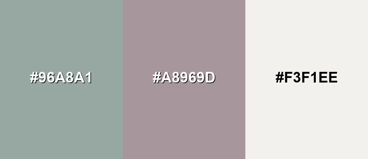
A muted mauve counterpart brings gentle contrast without overpowering pewter's quiet tone. This pairing feels modern, balanced, and slightly upscale when anchored with a soft neutral.
Complementary Palette Example: Use Pewter as the base, Dusty Mauve for accents, and Soft Ivory to keep the layout open and bright.
Analogous Color Schemes
Analogous colors sit adjacent to each other on the color wheel, creating harmonious, cohesive palettes with subtle variation.
This analogous set leans airy and coastal, moving gently between green-gray and blue-gray.
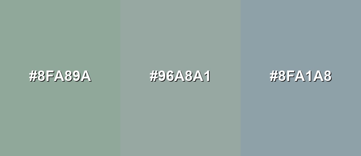
- Sage Gray: #8FA89A
- Pewter: #96A8A1
- Smoke Blue: #8FA1A8
A deeper, moodier analogous scheme that still feels clean and architectural.
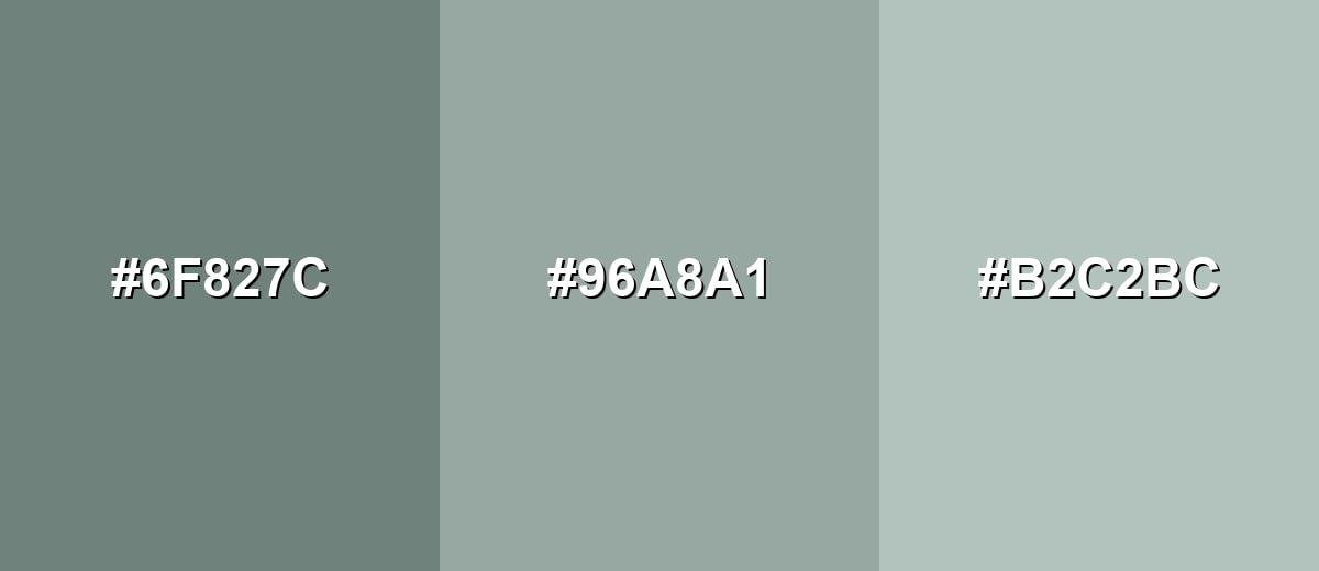
- Deep Pewter: #6F827C
- Pewter: #96A8A1
- Sea Mist: #B2C2BC
Triadic & Tetradic Combinations
Triadic palettes create variety while staying balanced when each tone is kept slightly muted.
Pewter with Muted Violet and Clay Tan gives a refined mix of cool and warm that works in branding and editorial design.
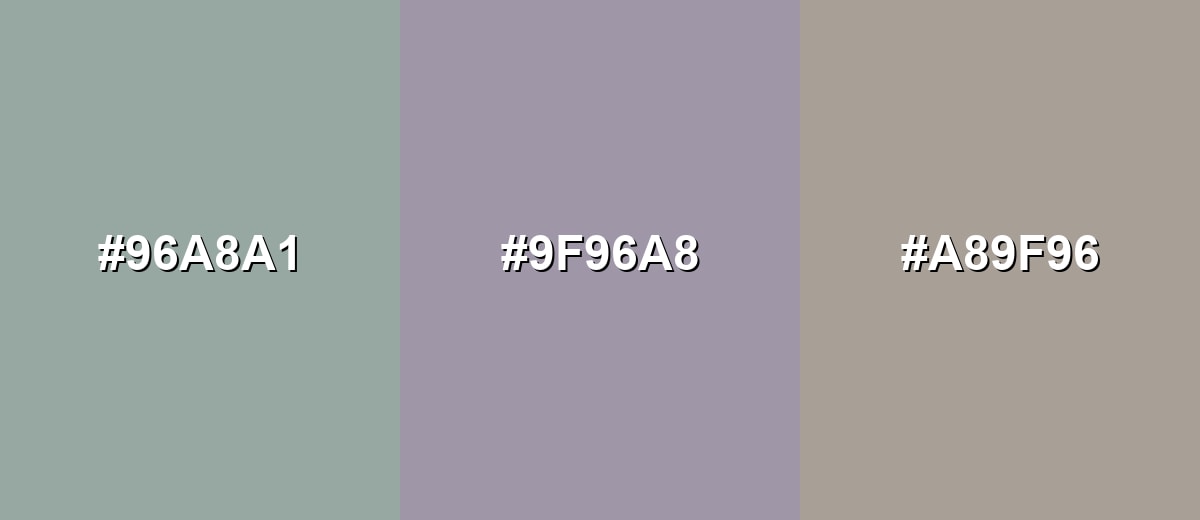
- Pewter: #96A8A1
- Muted Violet: #9F96A8
- Clay Tan: #A89F96
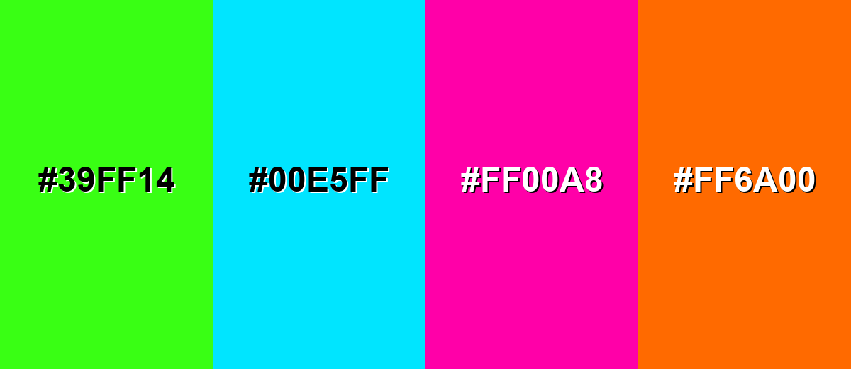
Colors to Avoid
While pewter color is remarkably versatile, certain combinations can create problematic visual effects:
- Neon Lime (#39FF14) - Its intense saturation overwhelms pewter's subtle undertone and can make the palette feel jarring.
- Electric Cyan (#00E5FF) - The brightness creates a sharp, techy contrast that often looks accidental next to a muted neutral.
- Vivid Magenta (#FF00A8) - Highly saturated pink can make pewter appear dull or muddy, reducing perceived quality in a design.
- Safety Orange (#FF6A00) - The strong warm punch competes with pewter and can break the calm, refined mood pewter typically supports.
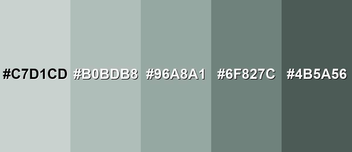
Shades, Tints & Variations of Pewter Color
Pewter has a surprisingly useful range—from airy, barely-there tints to deeper, architectural shades. These variations make it easier to build hierarchy in UI, add depth in print layouts, and keep interiors feeling layered instead of flat.
- Light Pewter (#C7D1CD) - A soft tint that feels airy and clean while keeping the same cool undertone. It's best used for large backgrounds, spacious UI sections, subtle panels.
- Pale Pewter (#B0BDB8) - A gentle mid-light option that reads neutral but still slightly mineral and modern. It's best used for secondary backgrounds, borders, quiet UI components.
- Classic Pewter (#96A8A1) - The balanced reference shade: muted, metal-leaning, and versatile across styles. It's best used for brand neutrals, cabinetry/fixtures, product surfaces, UI bases.
- Dark Pewter (#6F827C) - A deeper, more grounded version that adds weight without turning fully charcoal. It's best used for headings, icons, navigation bars, accent furniture.
- Charcoal Pewter (#4B5A56) - A strong, low-light shade that keeps the cool cast and improves contrast. It's best used for body text on light surfaces, high-contrast UI elements, outlines.
Industry Applications
Because pewter sits between classic gray and muted teal, it fits industries that need a calm, credible tone with a modern edge.
Fashion & Beauty
- Use pewter as a neutral for sleek packaging that feels premium without looking overly glossy.
- Works well as a background tone in skincare and wellness visuals for a clean, composed mood.
- Pairs naturally with minimalist typography and soft neutrals for an elevated, editorial look.
- In product photography, pewter props help reflective items read controlled and high quality.
Interior Design & Decor
- Ideal for mood boards that include metal, stone, or concrete finishes.
- Fits modern cabinetry, fixtures, and accents when you want a calm room with structure.
- Balances well with warm off-whites and natural wood textures to avoid a cold feel.
- Useful as a "bridge color" between cooler blue-grays and warmer neutrals.
Branding & Marketing
- Great for technology and SaaS dashboards where a softer neutral reduces glare.
- Strong in finance and professional services branding when you need trust and restraint.
- Supports clean layouts in presentations, reports, and editorial designs.
- Works as a dependable base for multi-level design systems (backgrounds, cards, dividers, and states).
Conclusion
Pewter is a refined neutral that feels like metal made soft—sitting comfortably between gray and a muted green-blue cast. With #96A8A1 as a reliable starting point, it can anchor brand systems, calm busy UI layouts, and add modern restraint to interiors and packaging. The key is treating pewter as a supporting tone: pair it with light neutrals for clarity, deepen it for contrast, and add one muted accent when you need warmth or direction—so the overall design stays intentional and quietly sophisticated.
Design Smarter with AI: Media.io is an online AI studio that empowers creators with advanced image generation and enhancement tools. From text-to-image and image-to-image creation to AI upscaling and color optimization, it enables fast, creative, and professional results—all in your browser.

Frequently Asked Questions About Pewter Color
Pewter is a muted, metal-inspired gray with cool green-blue undertones. It resembles brushed pewter alloy and often looks softer than standard medium gray.
Most pewter tones read cool because of their subtle green-blue cast. Lighting and nearby materials can shift it slightly, so pairing with #f3f1ee can keep it from feeling too cold.
Soft neutrals and muted accents work best, such as #f3f1ee for brightness and #a8969d for a gentle contrasting accent. For deeper contrast, try #6f827c or #4b5a56.
Standard gray is typically more neutral, while pewter usually has an undertone that hints at green or blue. That undertone makes pewter feel more material-like and dimensional in design.
For strong readability, use a darker companion such as #4b5a56 on light pewter tints, or use #f3f1ee on darker pewter shades. Avoid mid-tone text on #96a8a1 because contrast can drop quickly.
Use pewter as a foundation and add clear hierarchy with light space (#f3f1ee) and one or two muted accents like #a8969d or #969aa8. Mixing finishes (flat backgrounds, sharper typography, and deliberate spacing) also keeps it from feeling flat.
