

Umber color is a deep, earthy brown with a subtle muted warmth, similar to natural clay, soil, or aged wood. The standard digital reference often used for it is hex #635147.
It's often perceived as grounded, steady, and quietly sophisticated rather than flashy—and its history as a classic earth pigment helps explain its natural, material-rich feel in modern design.
Umber Color: Codes & Values
If you want umber to look consistent across screens, print proofs, and brand assets, these are the core values to save in your style guide.
| Parameters | VALUE |
| HEX Code | #635147 |
| RGB DECIMAL | 99, 81, 71 |
| RGB PERCENTAGE | 39%, 32%, 28% |
| CMYK | 0%,18%,28%,61% |
| HSL | 22°, 17%, 33% |
| HSV (HSB) | 22°, 28%, 39% |
| Web Safe | #666633 |
Key Color Space Explanations:
- HEX - HEX is the most common way to specify umber in digital design using a six-digit code. Use it in CSS, design tools, and brand guidelines for consistent rendering.
- RGB - RGB describes how much red, green, and blue light make up the shade on screens. It is especially useful for UI, video, and any work meant for displays.
- CMYK - CMYK is the ink-based formula used for printing. It helps you estimate how umber will reproduce on paper and packaging, where it can look slightly warmer or duller.
- HSL - HSL breaks the shade into hue, saturation, and lightness, making it easier to create tints, shades, and matching palettes. It is a practical way to adjust umber without changing its overall character.
- Web Safe - Web Safe is the nearest legacy-safe equivalent intended for older displays. It is not required today, but it can be useful when you want a simple fallback value.
For web and UI work, start with HEX (#635147) or RGB (99, 81, 71); for print packaging and labels, use the CMYK mix as your baseline and run a quick proof to confirm warmth on your chosen stock.
Umber Color Conversions
Need umber in a different format for a design tool, a print workflow, or a developer handoff? Use this conversion table as a quick reference.
| Parameters | VALUE | CSS |
| HEX | #635147 | #635147 |
| RGB DECIMAL | 99, 81, 71 | rgb(99,81,71) |
| RGB PERCENTAGE | 39%, 32%, 28% | rgb(39%,32%,28%) |
| CMYK | 0%,18%,28%,61% | cmyk(0%,18%,28%,61%) |
| HSL | 22°, 17%, 33% | hsl(22°,17%,33%) |
| HSV (or HSB) | 22°, 28%, 39% | -- |
| Web Safe | 666633 | #666633 |
| CIE-LAB | 34.6, 6.8, 9.7 | -- |
| XYZ | 10.2, 9.7, 7.1 | -- |
| xyY | 0.36, 0.34, 9.7 | -- |
| CIE-LCH | 34.6, 11.8, 55.0 | -- |
| CIE-LUV | 34.6, 10.2, 10.8 | -- |
| Hunter-Lab | 31.1, 6.4, 7.2 | -- |
| Binary | 01100011 01010001 01000111 | -- |
Want to generate Umber Color photos or posters? Try Media.io's AI Image Generator now!
Umber Color Meaning & Symbolism
Umber is commonly associated with earthiness, stability, and quiet strength. Because it resembles soil and natural pigments, it often reads as honest, reliable, and grounded in everyday life.
Psychological Effects
In most palettes, umber calms the composition and adds a steady, settled tone.
- Grounded Mood - It lowers the visual "temperature" and helps a layout feel calmer and more settled.
- Dependability - It can communicate restraint and reliability, especially in product-led designs.
- Focus Support - It stays in the background and reduces glare compared to brighter accents.
- Tactile Weight - It can make interiors and packaging feel sturdy, long-lasting, and material-first.
- Heaviness Risk - Overuse (especially with other muted tones) may feel heavy, dated, or slightly somber.
Positive Associations
These are the "best case" signals umber tends to send when it's balanced with light neutrals and clean spacing.
- Earthiness - Its soil-like character connects quickly to nature and real materials.
- Stability - The muted depth often reads as steady and dependable.
- Quiet Strength - It feels confident without being loud or attention-seeking.
- Craft & Heritage - Its pigment history ties it to craftsmanship and traditional making.
- Warmth - The subtle warm cast can make visuals feel welcoming and premium.
Cultural Significance Across the World
Umber's symbolism shifts with context, but it commonly tracks back to earth pigments, soil, and wood.
- Traditional Pigments - Historically linked to drawing and painting, reinforcing a "made by hand" feeling.
- Soil & Ground - Often associated with grounded living and everyday practicality.
- Wood & Natural Materials - Frequently tied to timber, leather, and stone in visual storytelling.
- Context-Driven Meaning - Surrounding tones can make it read rustic, premium, modern, or traditional.
Design Applications
Umber is most effective when you want a natural, understated base that still feels intentional—great for anchoring palettes, adding depth to neutrals, and making textures feel believable.
Graphic Design Tips
- Use umber as a grounding base for layouts that rely on natural textures like paper, leather, stone, or wood.
- Pair it with lighter neutrals to keep pages breathable and improve readability on dense screens.
- Reserve umber for headers, nav, dividers, or secondary surfaces instead of large text-heavy backgrounds.
- In print, test on your chosen stock—umber can read richer or flatter depending on finish and paper tone.
- For brand systems, umber works well as a primary brand neutral or a warm support tone behind product photography.
Choose one stronger accent tone for CTAs or highlights so the palette stays clear and modern.
Umber Color in Photography & Video
- Use umber as a target for earthy color grading when you want warm, grounded visuals.
- Try umber backgrounds or props to add realism and texture in sets and lifestyle shoots.
- Umber backdrops can make skin tones and natural materials look more cohesive.
- It's a strong fit for documentaries and outdoorsy storytelling where "material-first" looks intentional.
- Balance it with lighter neutrals to avoid frames feeling too dim or heavy.
Recommended Tool for Image Enhancement: When incorporating umber color into your photography projects, Media.io's AI Image tools can help you achieve more refined results. With AI-powered color enhancement, photo colorization, image upscaling, and old photo restoration, you can easily enrich umber color tones, improve overall image quality, and highlight the color's elegant and sophisticated aesthetic.
Color Combinations
Because umber sits in a warm, earthy range, it pairs well with muted blues and greens for contrast, and with sandy neutrals for softness. Use these schemes as starting points, then adjust lightness to fit your layout and readability needs.
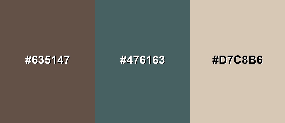
Complementary Colors
A complementary pairing balances umber's warm brown base with a cool blue-green opposite, creating clean contrast without looking harsh. This is useful for accents, buttons, and visual hierarchy.
Complementary Palette Example: Pair Umber with Dusty Teal, then soften the look with Warm Sand for spacing and backgrounds.
Analogous Color Schemes
Analogous colors sit adjacent to each other on the color wheel, creating harmonious, cohesive palettes with subtle variation.
This analogous set leans red-brown and golden-olive for an earthy, autumn-like flow.
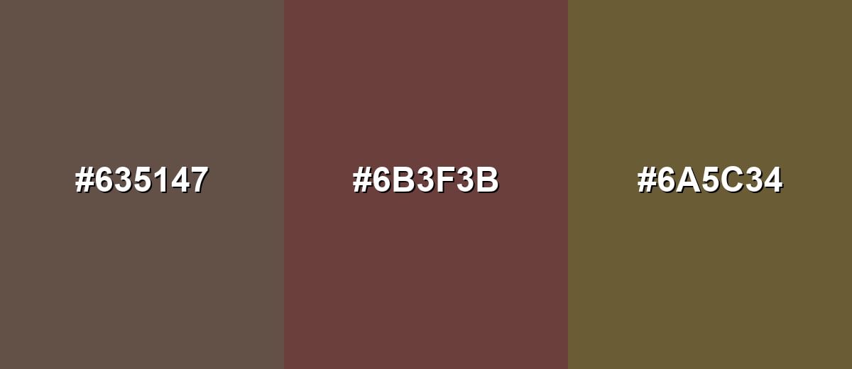
- Umber: #635147
- Rust Brown: #6B3F3B
- Olive Ochre: #6A5C34
This softer analogous set stays close to umber with deeper and lighter browns for subtle, tone-on-tone layouts.
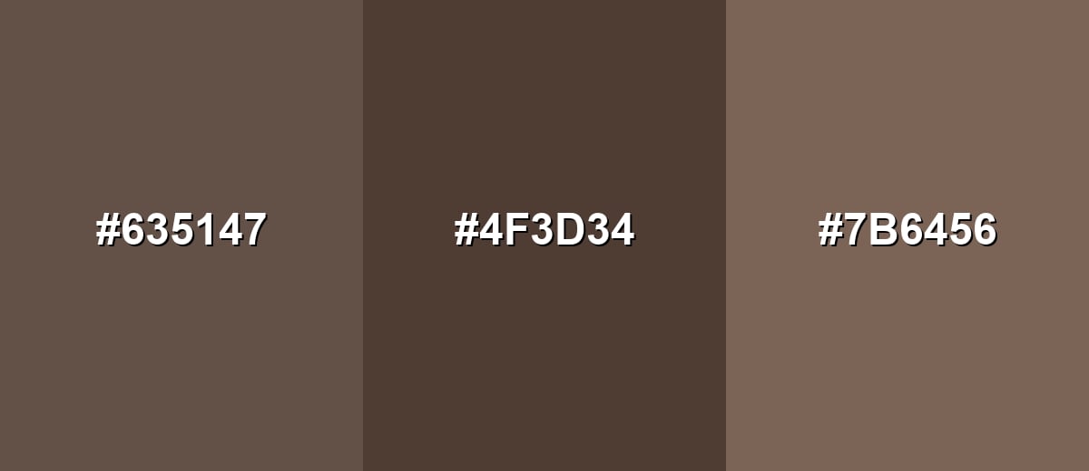
- Umber: #635147
- Deep Bark: #4F3D34
- Warm Taupe: #7B6456
Triadic & Tetradic Combinations
A triadic scheme uses three evenly spaced hues for variety while staying balanced.
Combine Umber with Earthy Green and Dusty Purple for a grounded palette that still feels creative.
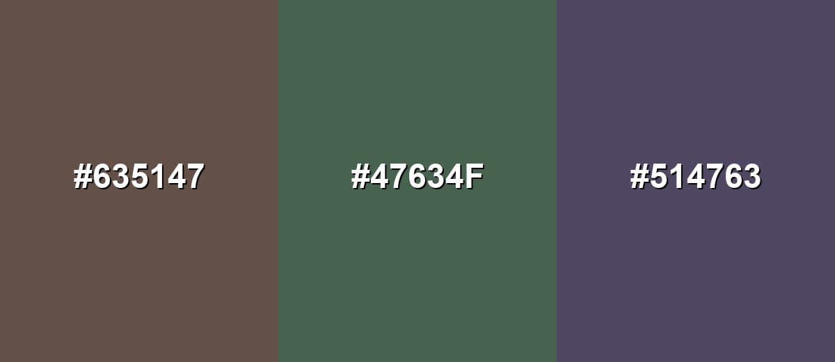
- Umber: #635147
- Earthy Green: #47634F
- Dusty Purple: #514763
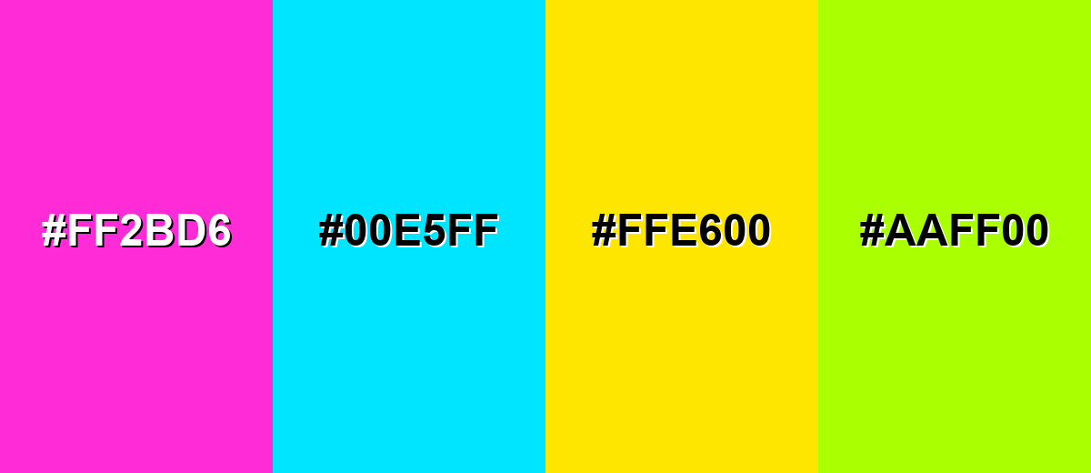
Colors to Avoid
While umber color is remarkably versatile, certain combinations can create problematic visual effects:
- Neon Magenta (#FF2BD6) - The intensity can make umber look dull and muddy, creating a clash that feels more accidental than intentional.
- Electric Cyan (#00E5FF) - High-chroma cyan can overpower umber and push the palette into a harsh, high-contrast look that breaks its natural mood.
- Pure Lemon Yellow (#FFE600) - Bright yellow can create a jarring jump in value and warmth, making designs feel unbalanced and noisy.
- Vivid Lime (#AAFF00) - Strong lime greens often fight umber's muted undertone, resulting in a palette that looks inconsistent across screens and print.
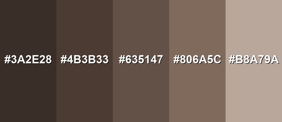
Shades, Tints & Variations of Umber Color
Umber isn't a single flat brown—it runs from near-espresso depths to dusty beige-brown tints. Having a small range of umber variations makes it easier to build hierarchy (headers, surfaces, borders, backgrounds) while keeping the overall mood grounded and cohesive.
- Dark Umber (#3A2E28) - A near-espresso brown with a subtle warm undertone that adds strong depth. It's best used for Use for headers, frames, or grounding elements where you want a heavier anchor without using black.
- Deep Umber (#4B3B33) - A richer, slightly warmer version that keeps an earthy, natural look. It's best used for Great for navigation bars, packaging backgrounds, and layered UI surfaces.
- Classic Umber (#635147) - The reference umber shade: balanced, muted, and soil-like with a calm presence. It's best used for Ideal as a primary brand neutral, background blocks, and supporting text accents in warm palettes.
- Soft Umber (#806A5C) - A lighter, more approachable brown that feels relaxed and lived-in. It's best used for Use for cards, secondary backgrounds, and interior paint inspiration where you want warmth without heaviness.
- Pale Umber (#B8A79A) - A dusty beige-brown tint that reads as gentle and natural. It's best used for Works well for large backgrounds, whitespace alternatives, and subtle pattern fills.
Industry Applications
Umber's strength is its versatility: it can look rustic, premium, modern, or traditional depending on finish and companion colors—making it a dependable earthy neutral across creative industries.
Fashion & Beauty
- Use umber as a grounded neutral in capsule wardrobes and earthy, outdoors-inspired collections.
- Pair umber with sandy neutrals for warm, natural-looking editorial styling.
- In beauty branding, umber supports "clean," "crafted," and material-first positioning.
- Use deeper umbers for premium, restraint-forward packaging that avoids harsh black.
Interior Design & Decor
- Build cozy, grounded rooms by pairing umber with organic textures like wood, leather, and stone.
- Use it in mood boards when you need natural depth without stark contrast.
- Balance umber with good lighting and lighter companion tones to avoid a closed-in feel.
- Apply umber as an accent on frames, trims, or feature elements for calm structure.
Branding & Marketing
- Support heritage, durability, handcrafted quality, and sustainability-minded brand stories.
- Use umber as a tone-setting background for product storytelling and photography.
- In UI, apply it to secondary surfaces, dividers, and navigation areas for a warmer system neutral.
- For packaging and print, umber fits kraft-inspired aesthetics and labels that signal authenticity.
Conclusion
Umber is an earthy brown that feels natural, steady, and quietly refined—perfect when you want a grounded base color that doesn't steal attention from content. With HEX #635147 as a reliable starting point, you can build anything from rustic palettes to modern, minimal systems by pairing it with light neutrals and adding a cool counterbalance like muted teal or green. Whether you're working on branding, UI surfaces, interiors, or print packaging, umber brings depth, warmth, and a sense of lasting craftsmanship when used with thoughtful contrast and spacing.
Design Smarter with AI: Media.io is an online AI studio that empowers creators with advanced image generation and enhancement tools. From text-to-image and image-to-image creation to AI upscaling and color optimization, it enables fast, creative, and professional results—all in your browser.

Frequently Asked Questions About Umber Color
Umber is a deep, muted brown with an earthy, slightly warm cast. It often resembles natural soil, clay, or aged wood, which is why it reads as organic and grounded.
Raw umber is typically cooler and more olive-brown, while burnt umber is darker and warmer due to additional processing in traditional pigments. In digital work, the names can vary, so it is best to rely on exact codes and swatches.
Most umber shades lean warm, but they are usually muted, so the warmth feels subtle rather than golden. It can look cooler next to very warm reds or oranges, and warmer next to cooler blues and grays.
Muted blue-greens, dusty teals, and soft sandy neutrals tend to pair naturally with umber. For more variety, try earthy greens or subdued purples to keep the palette balanced without getting overly bright.
Use it as a secondary surface or structural tone rather than covering large areas behind dense text. Add generous spacing, keep backgrounds lighter, and rely on one clear accent hue for primary actions to maintain energy and clarity.
A common nearest web-safe approximation is #666633. It will not match umber perfectly, but it can serve as a simple fallback for legacy constraints.


