

Scarlet color is a vivid, warm red with a noticeable orange undertone—think heated embers or bright poppy petals. On screens, it's high-impact and energetic, with a popular reference point of #FF2400.
Because it reads as urgent and confident, scarlet is best used with intention—either as a focal color or a sharp accent. Below, you'll find its color codes, conversions, pairings, shades, and practical design uses.
Scarlet Color: Codes & Values
Use these standard values to match scarlet accurately across web, UI, and print workflows.
| Parameters | VALUE |
| HEX Code | #FF2400 |
| RGB DECIMAL | 255, 36, 0 |
| RGB PERCENTAGE | 100%, 14.1%, 0% |
| CMYK | 0%,86%,100%,0% |
| HSL | 8°, 100%, 50% |
| HSV (HSB) | 8°, 100%, 100% |
| Web Safe | #FF3300 |
Key Color Space Explanations:
- HEX - HEX is the most common web format for specifying a shade in HTML and design tools. For scarlet, it is written as #ff2400.
- RGB - RGB mixes red, green, and blue light for screens and digital UI. Scarlet is high in red with a small amount of green and no blue, giving it that warm edge.
- CMYK - CMYK is used for ink-based printing and describes how much cyan, magenta, yellow, and black are needed. Scarlet typically relies heavily on magenta and yellow to stay bright.
- HSL - HSL describes hue, saturation, and lightness, which is helpful for making tints and tones. Scarlet sits at a low hue angle with full saturation and mid lightness.
- Web Safe - Web-safe values approximate a shade using a limited legacy palette. The closest web-safe match to scarlet is #ff3300.
If you're building a consistent system, start with #FF2400 as the base, then create lighter tints and deeper tones by adjusting lightness (HSL) rather than guessing by eye.
Scarlet Color Conversions
These conversions help you keep scarlet consistent across design tools, CSS, and print specs.
| Parameters | VALUE | CSS |
| HEX | #ff2400 | #ff2400 |
| RGB DECIMAL | 255, 36, 0 | rgb(255,36,0) |
| RGB PERCENTAGE | 100%, 14.1%, 0% | rgb(100%,14.1%,0%) |
| CMYK | 0%,86%,100%,0% | cmyk(0%,86%,100%,0%) |
| HSL | 8°, 100%, 50% | hsl(8°, 100%, 50%) |
| HSV (or HSB) | 8°, 100%, 100% | -- |
| Web Safe | ff3300 | #ff3300 |
| CIE-LAB | 54.6, 73.2, 65.7 | -- |
| XYZ | 44.8, 24.9, 2.8 | -- |
| xyY | 0.620, 0.344, 24.9 | -- |
| CIE-LCH | 54.6, 98.3, 41.6° | -- |
| CIE-LUV | 54.6, 158.2, 54.6 | -- |
| Hunter-Lab | 49.9, 63.0, 38.6 | -- |
| Binary | 111111110010010000000000 | -- |
Want to generate scarlet color photos or posters? Try Media.io's AI Image Generator now!
Scarlet Meaning & Symbolism
Scarlet is commonly associated with intensity, strong emotion, and action. In everyday life it often signals importance, from attention-grabbing graphics to moments that need a clear visual cue.
Psychological Effects
Scarlet has a "fast" visual temperature, so it tends to feel immediate and hard to ignore.
- Urgency - Pulls attention quickly, making messages feel time-sensitive or high priority.
- Energy - Adds momentum and excitement, especially in bold headlines and CTAs.
- Closeness - Warm hues can appear nearer, helping focal elements feel more prominent.
- Tension - Heavy saturation and strong contrast can feel aggressive when overused.
- Visual Fatigue - Large areas of scarlet may cause strain, so it performs best with breathing room.
Positive Associations
When balanced with neutrals, scarlet reads as confident, spirited, and expressive.
- Passion - Communicates strong emotion and intensity in a direct, memorable way.
- Courage - Feels bold and decisive, supporting messages of action and confidence.
- Celebration - Works well for launches, promos, and upbeat moments that need impact.
- Strength - Adds a powerful tone to branding elements and key visual highlights.
- Focus - Creates clear hierarchy by guiding the eye to what matters most.
Cultural Significance Across the World
Scarlet's meaning can shift by context, but its visibility has long made it a color of "importance."
- Prestige - Historically tied to valuable dyes and standout textiles, linking it to prominence.
- Love - Often associated with romance and heartfelt expression in art and design.
- Warning - Common in signals and alerts where quick recognition is essential.
- Sacrifice - Can suggest seriousness or high stakes depending on the message and setting.
Design Applications
Scarlet is easiest to use when you decide whether it should lead the design or simply punctuate it. Because it is vivid and warm, small choices in spacing, contrast, and pairing can change the overall feel quickly.
Graphic Design Tips
- Use It as an Accent - Keep scarlet for key moments (badges, buttons, highlights) rather than full backgrounds.
- Balance with Neutrals - Pair with white or deep neutrals to prevent the layout from feeling overly loud.
- Build Clear Hierarchy - Let scarlet own the primary CTA, while secondary actions stay muted.
- Watch Contrast Edges - Reduce "vibration" by avoiding ultra-saturated neighbors in the same area.
- Stay Consistent - Lock the base value (#FF2400) in your style guide so UI states don't drift.
Pro tip: If scarlet feels too intense, don't switch hues right away—try a darker shade or a softer tint first to keep the brand energy without the glare.
Scarlet in Photography & Video
- Use as a Subject Color - Scarlet clothing, props, or typography overlays instantly create a focal point.
- Control Skin Tones - Avoid pushing reds too far in grading so skin doesn't turn overly warm.
- Lean on Neutrals - Gray, cream, and dark backgrounds help scarlet pop without clipping highlights.
- Mind Compression - Highly saturated reds can break up in video; keep an eye on banding and noise.
- Match Lighting Temperature - Warm light can exaggerate scarlet; cooler fill light can rebalance the scene.
Recommended Tool for Image Enhancement: When incorporating scarlet into your photography projects, Media.io's AI Image tools can help you achieve more refined results. With AI-powered color enhancement, photo colorization, image upscaling, and old photo restoration, you can easily enrich scarlet tones, improve overall image quality, and highlight the color's elegant and sophisticated aesthetic.
Color Combinations
Scarlet pairs best with shades that either cool it down, ground it, or echo its warmth in a controlled way. The palettes below cover reliable options for contrast, harmony, and balance.
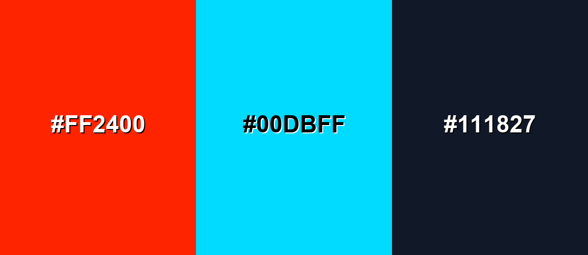
Complementary Colors
A complementary pairing places scarlet opposite a blue-green tone, creating strong contrast and instant visual energy. This is great for calls to action, sports-style graphics, and bold hero sections when you want clear separation.
Complementary Palette Example: Use scarlet for the focal element, bright cyan for contrast, and charcoal to stabilize the overall look.
Analogous Color Schemes
Analogous colors sit adjacent to each other on the color wheel, creating harmonious, cohesive palettes with subtle variation.
Vermilion, scarlet, and hot pink keep the warmth while adding a playful, modern edge.
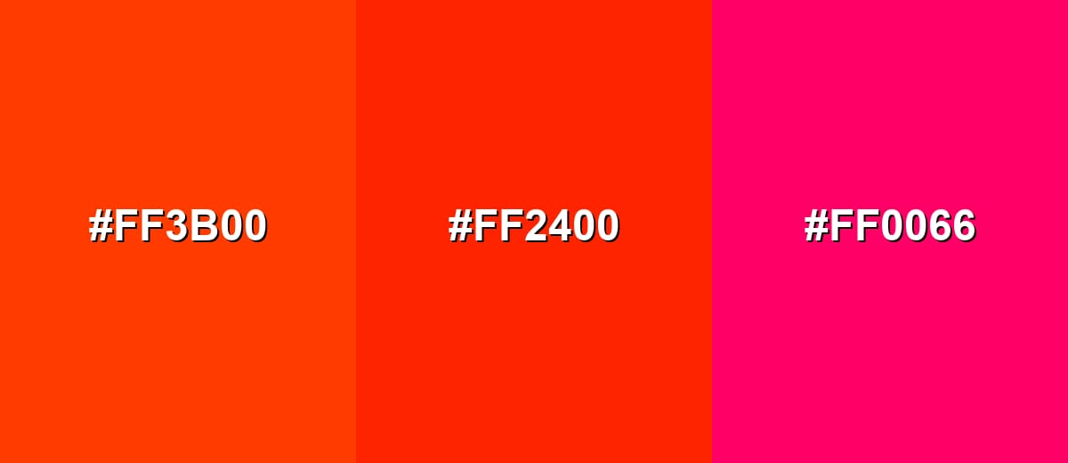
- Vermilion: #FF3B00
- Scarlet: #FF2400
- Hot Pink: #FF0066
Crimson, scarlet, and orange-red create a rich warm range that feels bold but cohesive.
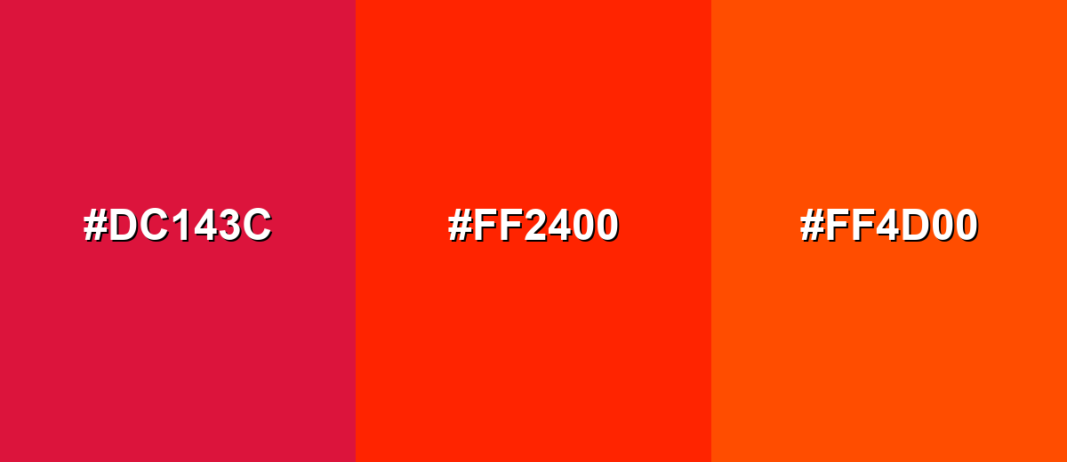
- Crimson: #DC143C
- Scarlet: #FF2400
- Orange-Red: #FF4D00
Triadic & Tetradic Combinations
A triadic palette spreads hues evenly for a lively, balanced look.
Scarlet with bright green and vivid blue is punchy and works well for playful branding and data highlights.
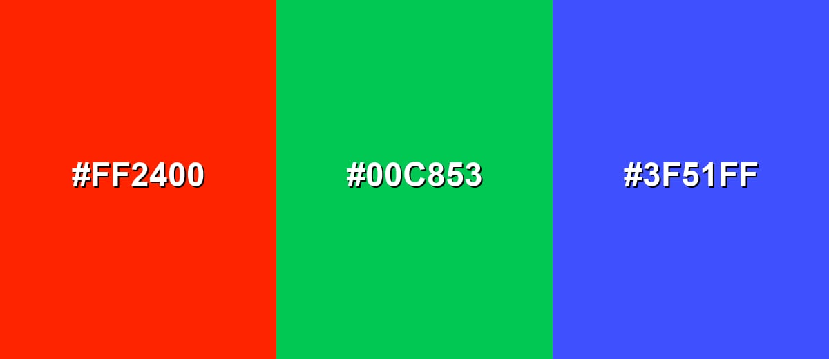
- Scarlet: #FF2400
- Bright Green: #00C853
- Vivid Blue: #3F51FF
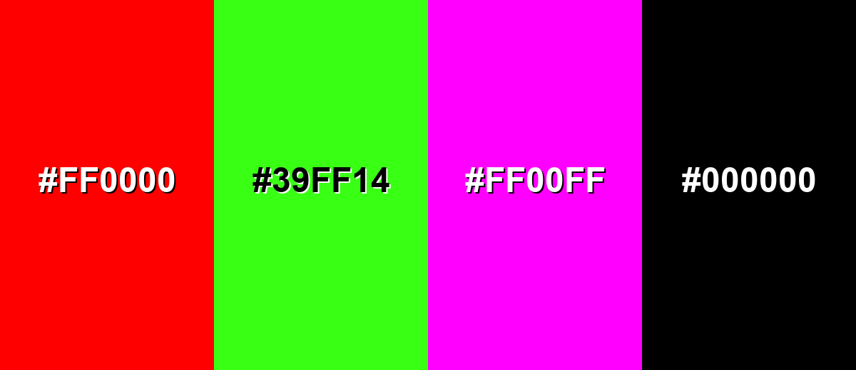
Colors to Avoid
While scarlet is remarkably versatile, certain combinations can create problematic visual effects:
- Pure Red (#FF0000) - Too close in hue and intensity, which can make scarlet accents look inconsistent or accidental.
- Neon Green (#39FF14) - The combined saturation can create harsh vibration on screens and feel visually noisy.
- Magenta (#FF00FF) - Competes for attention and can push the palette toward an overly loud, unbalanced look.
- Pure Black (#000000) - The contrast can be extremely stark, making the overall design feel severe unless carefully softened with spacing or secondary neutrals.
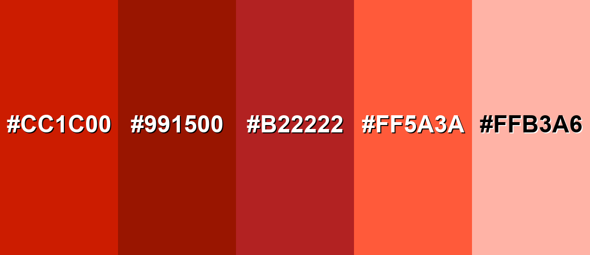
Shades, Tints & Variations of Scarlet
Scarlet isn't a single note—it ranges from deep, dramatic reds to soft, airy tints. Exploring these variations helps you keep the same warm, energetic character while adapting the mood for different layouts, lighting, and brand tones.
- Deep Scarlet (#CC1C00) - A darker, slightly muted take that keeps the warmth while reducing glare. It's best used for Headlines, premium packaging accents, and strong UI states where you want less brightness.
- Dark Scarlet (#991500) - A grounded shade that feels serious and dramatic without turning brown. It's best used for Background panels, banners, and sophisticated branding when bright scarlet is too intense.
- Brick Scarlet (#B22222) - An earthy, clay-like red that reads warmer and more traditional. It's best used for Interiors, lifestyle visuals, and editorial design where you want warmth with restraint.
- Soft Scarlet (#FF5A3A) - A lighter, friendlier variant that keeps the energetic feel. It's best used for UI highlights, illustrations, and onboarding screens that should feel inviting.
- Pale Scarlet (#FFB3A6) - A gentle tint with a warm blush character. It's best used for Background washes, subtle badges, and soft layouts that need warmth without urgency.
Industry Applications
Because scarlet reads quickly at a distance and on small screens, it is widely used where visibility and emotion matter. The best results come from treating it as a signal or focal point rather than a default base tone.
Fashion & Beauty
- Statement Pieces - Scarlet garments and accessories stand out instantly in streetwear and high-fashion edits.
- Athletic Accents - Works well for sporty trims, logos, and performance collections that need intensity.
- Seasonal Drops - A strong choice for holiday, summer, and limited collections where bold warmth sells the vibe.
- Beauty Branding - Adds a confident, energetic feel to packaging and campaign visuals when balanced with clean neutrals.
Interior Design & Decor
- Accent Textiles - Use scarlet in pillows, rugs, or throws to warm up minimal spaces.
- Feature Moments - A single art piece or statement chair in scarlet creates intentional drama without overload.
- Neutral Pairing - Creamy whites and muted tones keep scarlet comfortable and livable.
- Traditional Warmth - Earthier variants (like brick-leaning reds) fit editorial, classic, and rustic interiors.
Branding & Marketing
- High-Impact Campaigns - Ideal for promos and hero sections that need immediate attention.
- Product Highlights - Great for badges, price tags, and limited-time messaging where clarity matters.
- Memorable Marks - Strong for logos when paired with dark neutrals or clean whites for balance.
- Clear Hierarchy - Helps separate primary actions from secondary elements in ads, landing pages, and banners.
Conclusion
Scarlet is a warm, vivid red with an orange edge that naturally pulls focus—making it a smart choice for branding, UI emphasis, packaging, and any design that needs clear hierarchy. Start with #FF2400 as your reference, then fine-tune the shade using tints or deeper variations to match the mood you want. When you balance scarlet with neutrals or cooler contrasts, it stays bold and confident without overwhelming the viewer.
Design Smarter with AI: Media.io is an online AI studio that empowers creators with advanced image generation and enhancement tools. From text-to-image and image-to-image creation to AI upscaling and color optimization, it enables fast, creative, and professional results—all in your browser.

Frequently Asked Questions About Scarlet Color
Scarlet is a bright, warm red with a noticeable orange undertone. It often looks like a vivid red-orange that feels intense and eye-catching.
A commonly used hex code for scarlet is #ff2400. It represents a vivid, high-saturation red with a warm bias.
Scarlet is often used to communicate energy, urgency, passion, and bold emphasis. In design, it works best for focal elements like calls to action, highlights, and strong brand accents.
Scarlet pairs well with cool blue-greens like cyan for contrast, dark neutrals like charcoal for balance, and warm neighbors like vermilion or crimson for harmony. Choose pairings based on whether you want contrast or a cohesive warm range.
It is usually strongest as an accent because it is intense and visually dominant. If used as a main shade, add plenty of neutral space and softer supporting tones to avoid fatigue.
Limit it to key moments, soften the palette with neutrals, and reduce saturation through tints or darker shades. Also avoid placing scarlet next to multiple neon tones, which can amplify visual tension.


