

Coffee color is a deep, roasted brown that looks like brewed coffee with a hint of cocoa warmth. Its signature HEX code is #6F4E37.
It's often read as cozy, reliable, and down-to-earth—an earthy neutral that can feel both handcrafted and modern. Below, you'll find its key color codes, best pairings, shade ideas, and practical ways to use it in design.
Coffee Color: Codes & Values
Use these standard values to keep coffee color consistent across web, UI, and print workflows.
| Parameters | VALUE |
| HEX Code | #6F4E37 |
| RGB DECIMAL | 111, 78, 55 |
| RGB PERCENTAGE | 44%, 31%, 22% |
| CMYK | 0%,30%,50%,57% |
| HSL | 25°, 34%, 33% |
| HSV (HSB) | 25°, 50%, 44% |
| Web Safe | #666633 |
Key Color Space Explanations:
- HEX - HEX is the most common way to specify this shade for web design and UI. Use #6f4e37 to keep the coffee tone consistent across screens.
- RGB - RGB defines the red, green, and blue light values used on displays. Coffee color is made from 111, 78, 55, creating a warm, low-light brown.
- CMYK - CMYK is used for print and packaging where ink is mixed on paper. The values 0%,30%,50%,57% help reproduce a similar roasted brown in physical materials.
- HSL - HSL describes the hue, saturation, and lightness in a way that is easy to tweak. Coffee sits around 25° with moderate saturation and low lightness, so small lightness changes quickly create latte-to-espresso variations.
- Web Safe - Web-safe is the closest legacy palette match for older displays and constrained systems. The nearest web-safe approximation to coffee is #666633.
For most digital design, start with HEX #6F4E37; switch to RGB for on-screen motion/UI work and CMYK when you're preparing packaging or print layouts.
Coffee Color Conversions
If you're translating coffee color between apps (or double-checking how it will render in different pipelines), use this quick conversion table.
| Parameters | VALUE | CSS |
| HEX | #6f4e37 | #6f4e37 |
| RGB DECIMAL | 111, 78, 55 | rgb(111,78,55) |
| RGB PERCENTAGE | 44%, 31%, 22% | rgb(44%,31%,22%) |
| CMYK | 0%,30%,50%,57% | cmyk(0%,30%,50%,57%) |
| HSL | 25°, 34%, 33% | hsl(25°, 34%, 33%) |
| HSV (or HSB) | 25°, 50%, 44% | -- |
| Web Safe | 666633 | #666633 |
| CIE-LAB | 35.9, 11.1, 18.4 | -- |
| XYZ | 12.0, 10.8, 5.3 | -- |
| xyY | 0.425, 0.382, 10.8 | -- |
| CIE-LCH | 35.9, 21.5, 58.8° | -- |
| CIE-LUV | 35.9, 18.6, 21.9 | -- |
| Hunter-Lab | 32.9, 9.9, 14.6 | -- |
| Binary | 01101111 01001110 00110111 | -- |
Want to generate Coffee Color photos or posters? Try Media.io's AI Image Generator now!
Coffee Color Meaning & Symbolism
Coffee is commonly linked with warmth, comfort, and steadiness. Because it resembles roasted beans, wood, and soil, it often reads as natural and dependable in everyday visuals, from packaging to interiors.
Psychological Effects
As a warm, low-light brown, coffee can shape a design's mood in subtle but powerful ways.
- Grounded Mood - Coffee tones can make a layout feel stable and "rooted," which helps users feel at ease.
- Soft Authority - It can replace pure black for a structured look that feels warmer and less harsh.
- Cozy Intimacy - When paired with creamy neutrals, coffee reads as inviting and comfortable.
- Serious Weight - In large blocks, it can feel heavy or overly formal without enough light contrast.
- Screen Variability - On low-quality displays, small elements may look muddy, so clear contrast and typography matter.
Positive Associations
These are common "good" signals coffee color can communicate in branding and visuals.
- Reliability - It often suggests steadiness and trust, making it a safe foundation color.
- Craft & Handwork - The roasted tone can feel artisanal, like natural materials and small-batch products.
- Warmth - Coffee's undertone adds comfort without the sweetness of brighter hues.
- Natural Materials - It easily evokes wood, earth, and organic textures in a believable way.
- Richness - It can imply depth and quality, especially in packaging and product framing.
Cultural Significance Across the World
Because coffee is part of daily routines in many places, the color carries familiar cultural cues.
- Daily Ritual - The shade can hint at morning routines, comfort, and a "steady rhythm" lifestyle.
- Hospitality - It often borrows a welcoming tone from coffee culture and shared moments.
- Slow Living - Coffee color can signal calm, pause, and intentional experiences rather than fast trends.
- Tradition - In craft and material contexts, it may suggest durability, heritage, and time-tested quality.
Design Applications
Coffee is a versatile brown that can act as a main tone or a supporting neutral. It is especially effective when you want warmth and credibility without the harshness of pure black.
Graphic Design Tips
- Use coffee as a primary brand color for artisanal, natural, or heritage-inspired visuals.
- Pair it with creamy off-whites to create premium contrast that still feels soft.
- Add muted greens or dusty blues to keep the palette calm and contemporary.
- Reserve bright accents for small moments (icons, tags, CTAs) so the palette stays refined.
- Watch contrast in text-heavy layouts—coffee works best as a background or header color with light typography.
If coffee is your main tone, build your layout around light space (cream or off-white) and let coffee appear in repeatable "anchors" like headers, borders, and labels for a clean, consistent system.
Coffee Color in Photography & Video
- Use coffee-toned backdrops (wood, paper, textiles) to make product shots feel warm and grounded.
- In color grading, a gentle coffee tint can make scenes feel intimate and story-driven.
- Balance coffee shadows with creamy highlights to avoid a flat or overly dark look.
- For food and beverage content, coffee tones enhance "roasted" cues in chocolate, bread, and coffee imagery.
- Keep skin tones natural by applying brown warmth selectively (midtones/shadows) instead of globally.
Recommended Tool for Image Enhancement: When incorporating coffee color into your photography projects, Media.io's AI Image tools can help you achieve more refined results. With AI-powered color enhancement, photo colorization, image upscaling, and old photo restoration, you can easily enrich coffee color tones, improve overall image quality, and highlight the color's elegant and sophisticated aesthetic.
Color Combinations
Coffee pairs best with soft neutrals, muted greens, and cool blue-leaning accents that bring balance. The palettes below cover classic harmony types and a few combinations that usually look harsh or unstable.
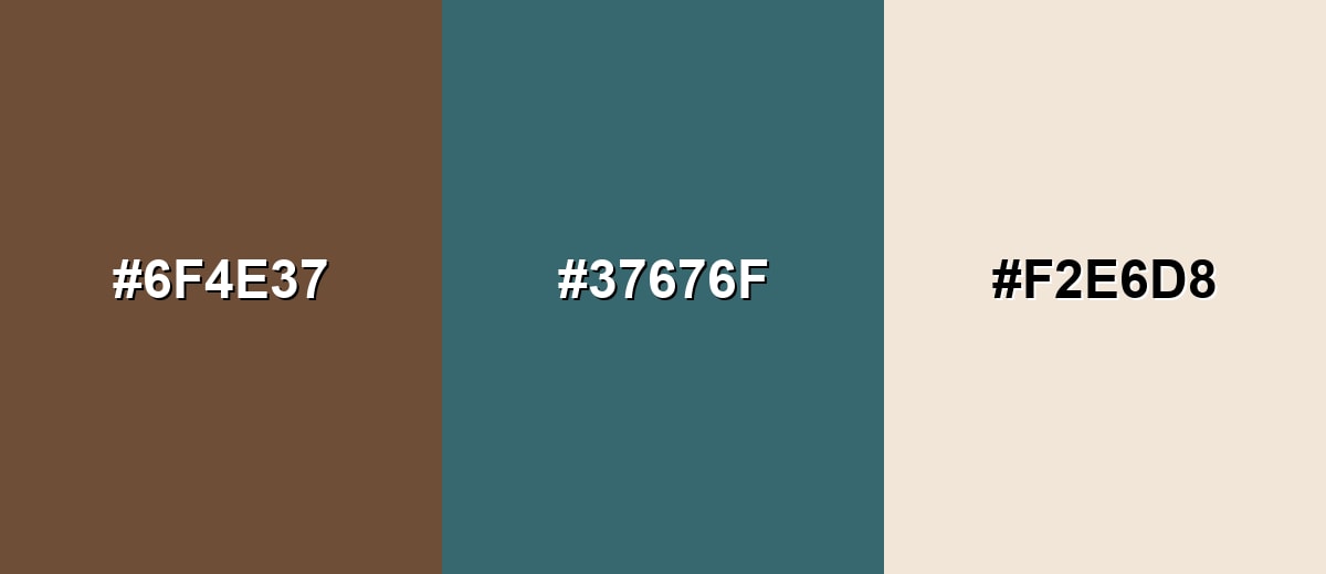
Complementary Colors
A blue-green complement adds crisp contrast to coffee while keeping the overall look sophisticated rather than loud. Adding a creamy neutral prevents the pair from feeling too heavy.
Complementary Palette Example: Try coffee with muted teal and warm cream for a grounded, modern contrast.
Analogous Color Schemes
Analogous colors sit adjacent to each other on the color wheel, creating harmonious, cohesive palettes with subtle variation.
Coffee, amber, and chestnut build a warm, roasted range that feels natural and cohesive.
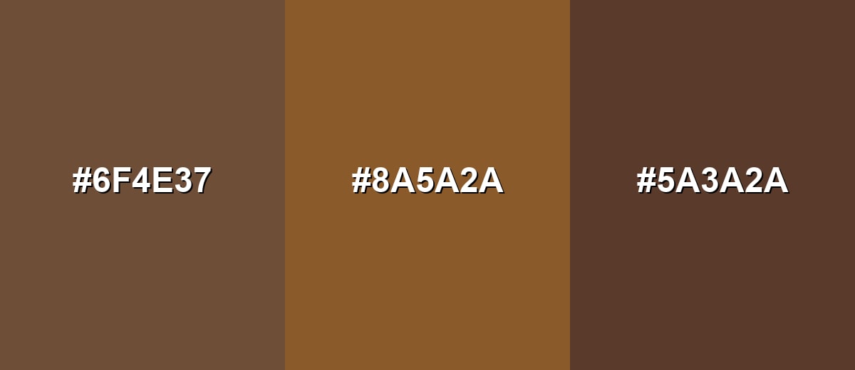
- Coffee: #6F4E37
- Warm Amber: #8A5A2A
- Deep Chestnut: #5A3A2A
Coffee with olive-brown and cocoa creates an earthy palette that works well for organic and outdoor themes.
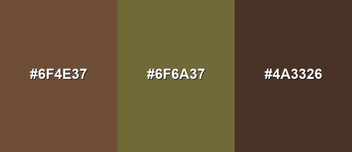
- Coffee: #6F4E37
- Olive Brown: #6F6A37
- Cocoa: #4A3326
Triadic & Tetradic Combinations
A triadic scheme spreads hues evenly for variety without losing balance.
Coffee with dusty plum and soft sage feels creative, calm, and mature when the supporting tones are kept muted.
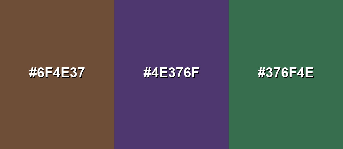
- Coffee: #6F4E37
- Dusty Plum: #4E376F
- Soft Sage: #376F4E
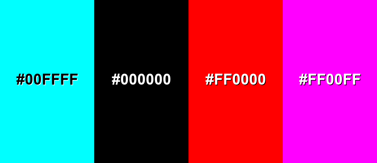
Colors to Avoid
While coffee color is remarkably versatile, certain combinations can create problematic visual effects:
- Neon Cyan (#00FFFF) - The intensity clashes with coffee's muted warmth and can look jarring in branding or UI accents.
- Pure Black (#000000) - Together they can feel heavy and closed-in, especially in large blocks or dark themes without enough highlights.
- Vivid Red (#FF0000) - The pairing can read as aggressive and seasonal, pulling attention away from coffee's calm, grounded character.
- Bright Magenta (#FF00FF) - The saturation overwhelms the palette and often makes coffee look dull or muddy by comparison.
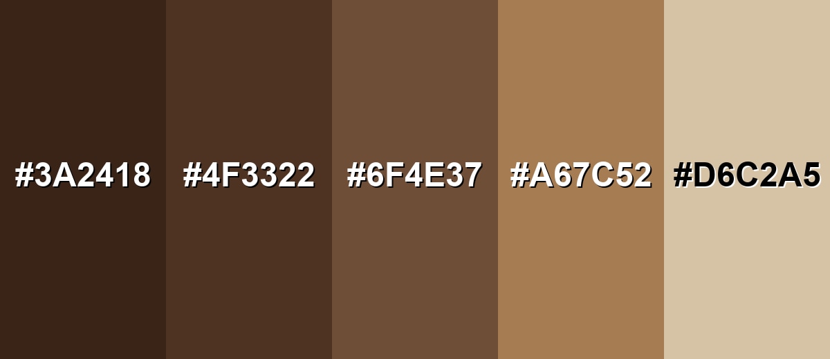
Shades, Tints & Variations of Coffee Color
Coffee isn't a single note—it stretches from near-black espresso browns to soft, creamy tans. Having a few related shades on hand makes it easier to design flexible systems (buttons, backgrounds, cards, and highlights) without losing that warm, roasted identity.
- Espresso (#3A2418) - A near-black brown with a roasted depth that feels bold and premium. It's best used for Headings, logos, dark mode surfaces, and high-end packaging accents.
- Dark Roast (#4F3322) - A dense, dark brown that keeps warmth while adding more weight and seriousness. It's best used for Navigation bars, product frames, and background panels behind light text.
- Coffee (#6F4E37) - A balanced roasted brown that sits between dark chocolate and warm wood tones. It's best used for Primary brand tone, UI highlights, and earthy palette foundations.
- Latte (#A67C52) - A lighter, milkier brown that feels approachable and soft without turning beige. It's best used for Secondary backgrounds, cards, and friendly lifestyle branding.
- Cappuccino Foam (#D6C2A5) - A creamy tan with a gentle warmth that brightens coffee-based palettes. It's best used for Page backgrounds, spacious layouts, and calming interior or wellness visuals.
Industry Applications
Because it reads as warm, natural, and dependable, coffee shows up across many industries where trust and comfort matter.
Fashion & Beauty
- Natural ingredient labels and packaging that want a grounded, earthy tone.
- Warm, minimal UI themes for skincare, spa, and wellness experiences.
- Earth-tone palettes that support "clean" positioning without feeling sterile.
- Product photography styling that pairs well with wood textures and creamy neutrals.
Interior Design & Decor
- Wood-like accents and textile palettes that create cozy, comfortable rooms.
- Mood boards for warm, grounded spaces (living rooms, cafés, studios).
- Material previews that need a natural brown anchor next to creams and tans.
- Background panels and trim colors that feel richer than plain gray neutrals.
Branding & Marketing
- Artisanal and heritage-inspired brand identities that aim to feel established.
- Packaging and labels where earthy tones signal richness and depth.
- E-commerce category headers and filters for cozy, premium product themes.
- Menu designs and warm product backdrops for coffee, chocolate, and bakery visuals.
Conclusion
Coffee color (#6F4E37) is a roasted brown that feels warm, steady, and familiar—strong enough to add structure, yet soft enough to stay inviting. It's easy to build around in branding, UI, packaging, and lifestyle visuals because it naturally pairs with creams, muted greens, and cool blue-leaning accents. When you want an earthy base that still looks refined (not flat or trendy), coffee is a dependable choice that communicates comfort, craft, and trust.
Design Smarter with AI: Media.io is an online AI studio that empowers creators with advanced image generation and enhancement tools. From text-to-image and image-to-image creation to AI upscaling and color optimization, it enables fast, creative, and professional results—all in your browser.

Frequently Asked Questions About Coffee Color
Coffee is a deep roasted brown with warm undertones, similar to brewed coffee or toasted beans. It is commonly used as an earthy neutral in design.
A widely used HEX value for coffee is #6f4e37. It delivers a balanced roasted brown that works well in both digital and print palettes.
In RGB, coffee is 111, 78, 55. For print workflows, a practical CMYK approximation is 0%,30%,50%,57%.
Creamy off-whites, muted teals, soft sages, and dusty plums pair well with coffee. These choices balance the warmth and help the palette feel modern and readable.
Use coffee for headers, buttons, or navigation when you want a warm, grounded tone. For legibility, pair it with light backgrounds and keep contrast strong for text and key UI states.
Coffee is a specific brown that leans roasted and slightly red-orange rather than neutral gray-brown. That warmth makes it feel cozier and more natural in many palettes.


